

Using colour and annotations for effective story telling
Workshops for Ukraine | #rstats #ggplot | 20th April 2023
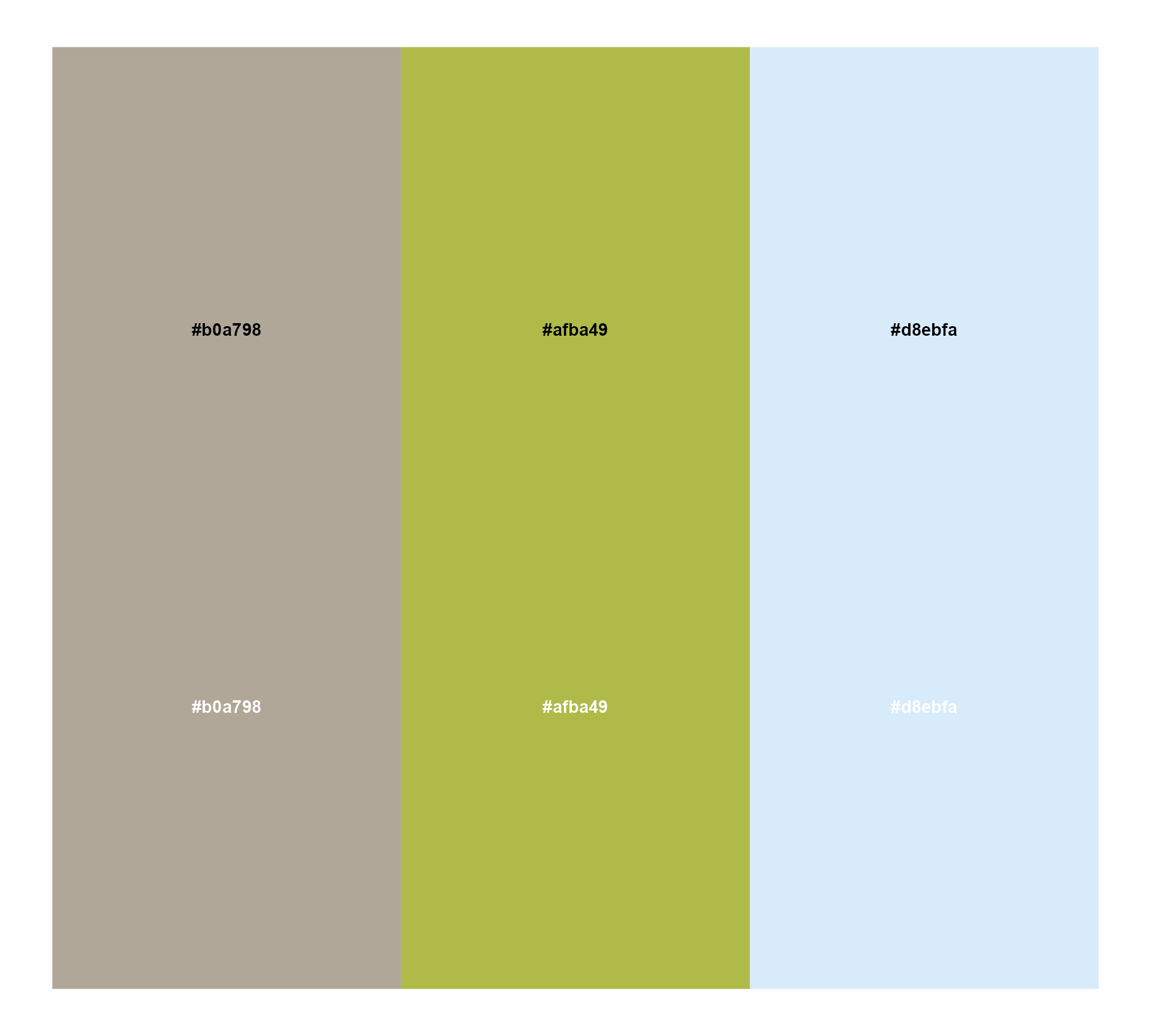
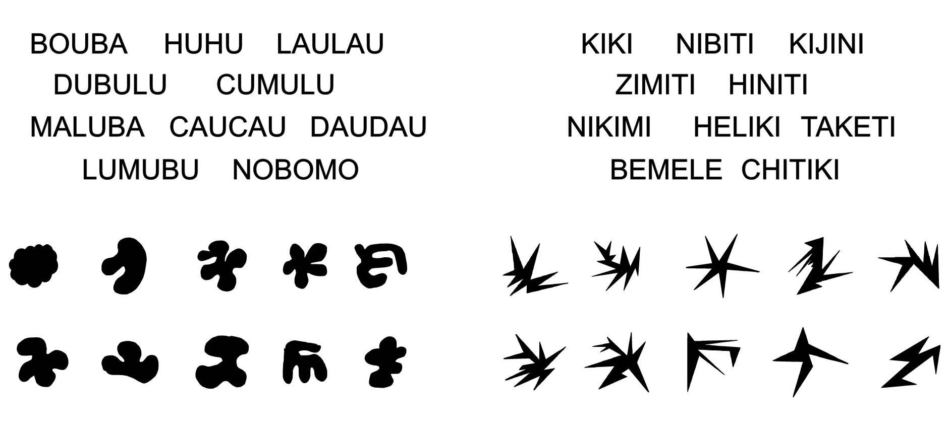
“Intuitive colour palettes?”

“Intuitive colour palettes?”
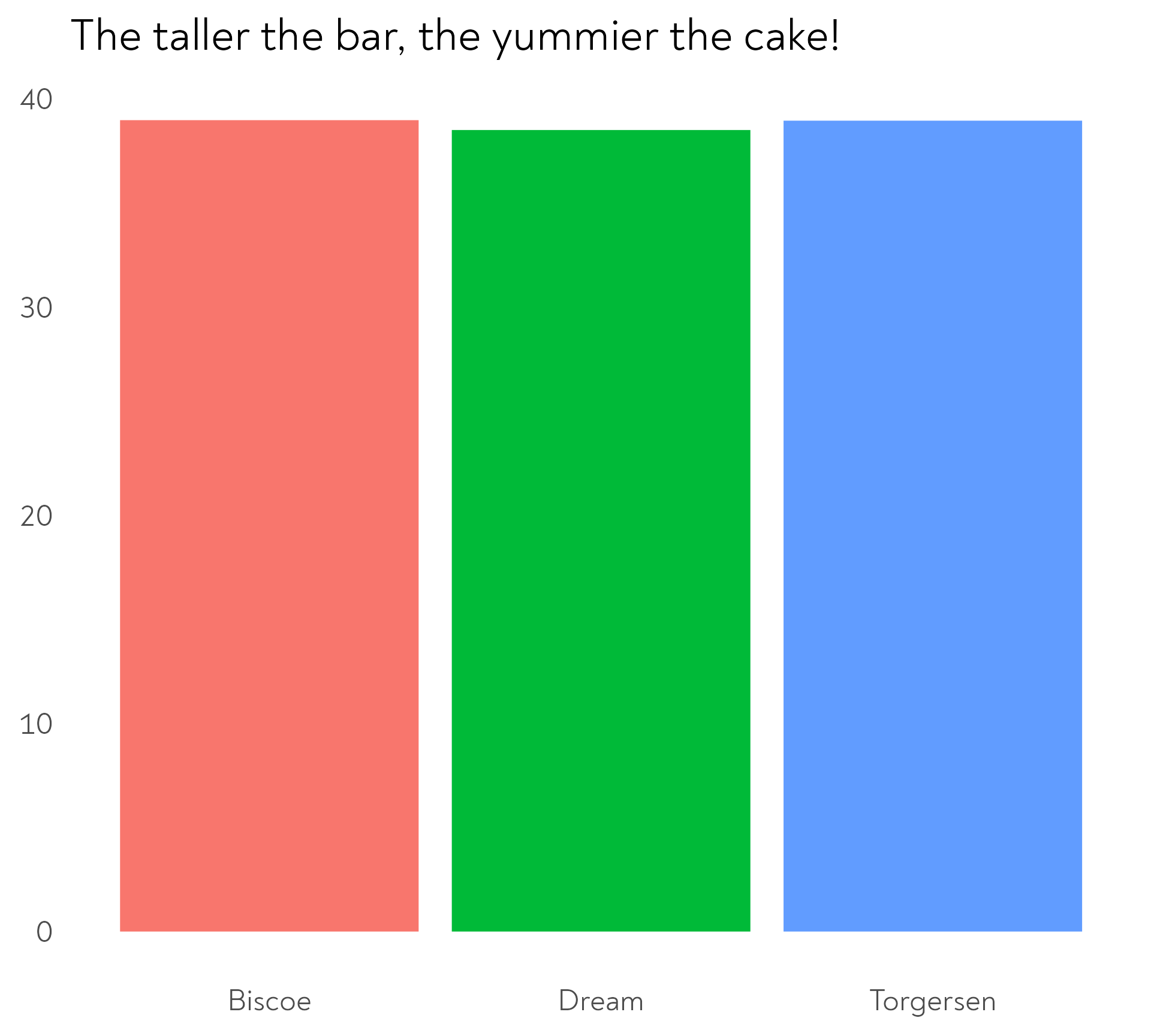
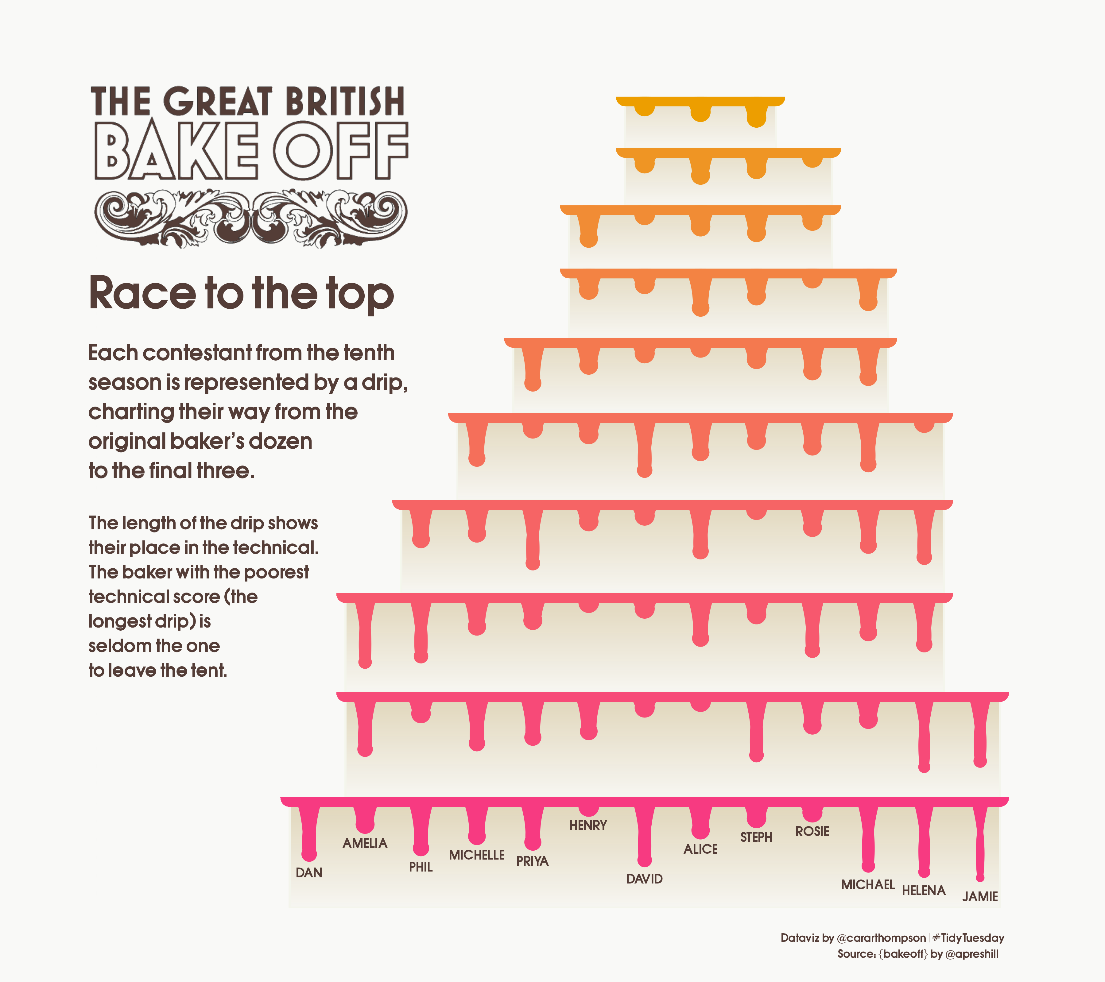
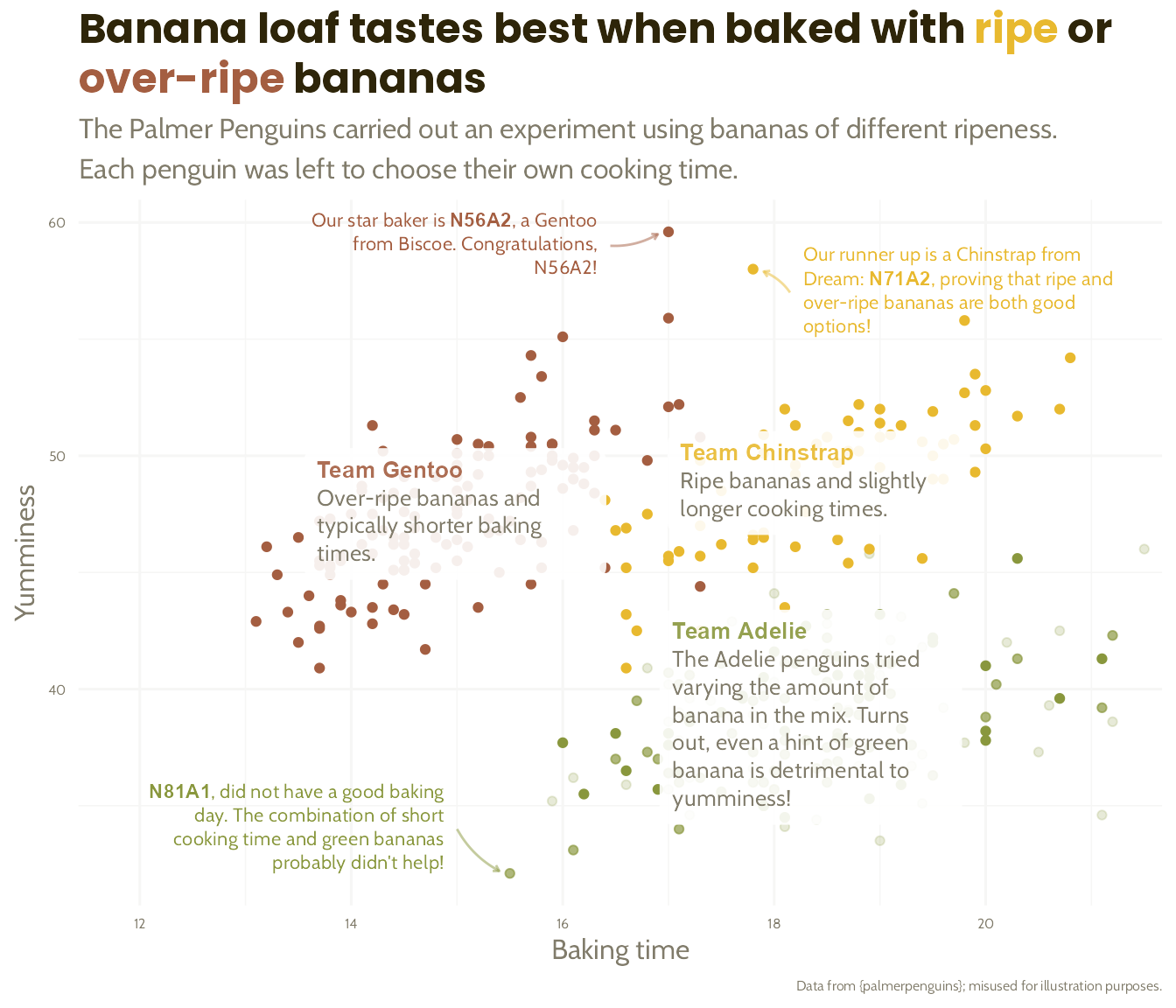
The Great Penguin Bake Off
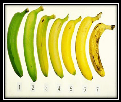
The penguins had a baking competition to see which species could make the best banana loaf. Each species was given bananas of a different level of ripeness.
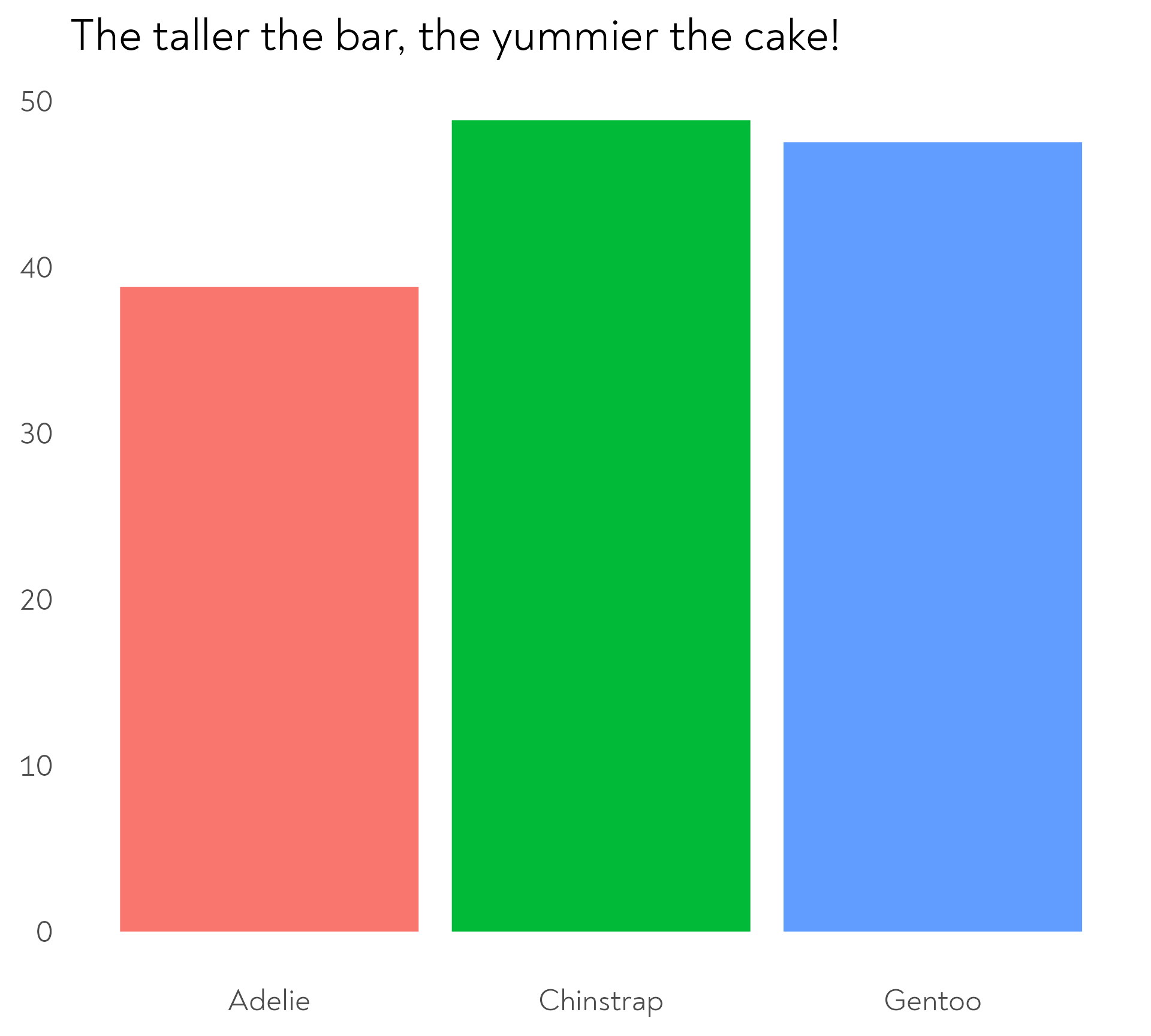
The Great Penguin Bake Off
The penguins had a baking competition to see which species could make the best banana loaf. Each species was given bananas of a different level of ripeness.
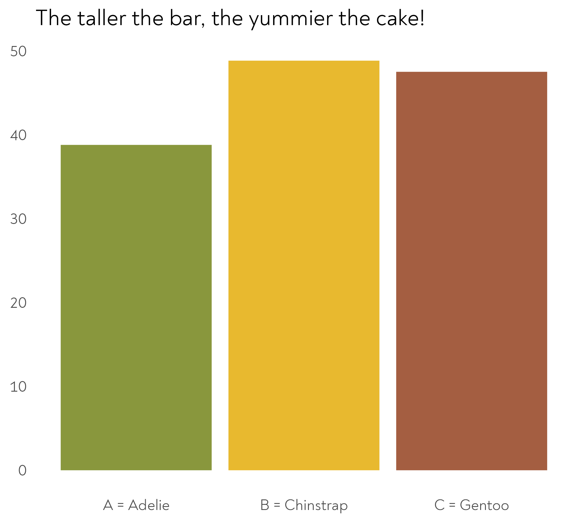
The Great Penguin Bake Off
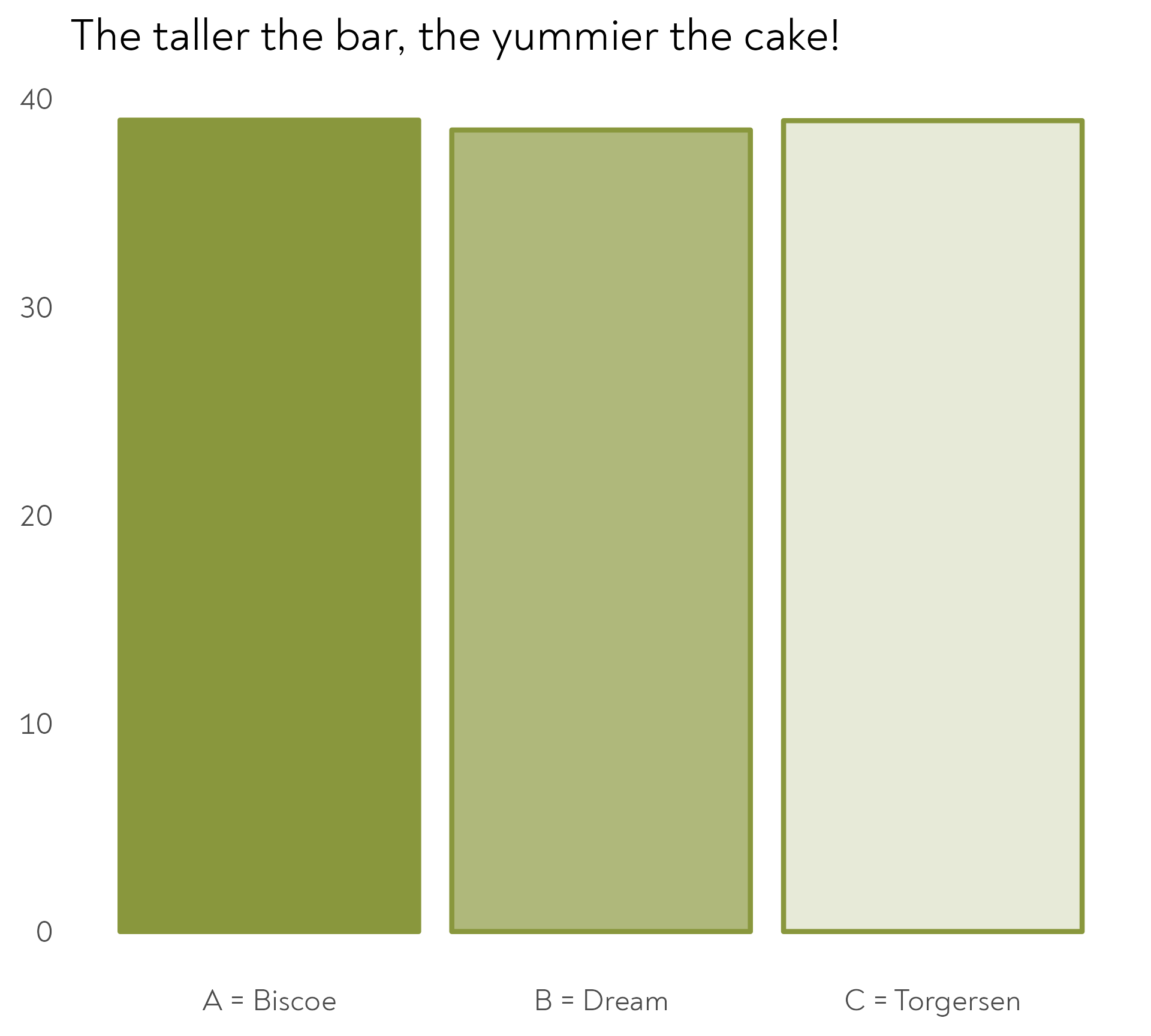
The Adelie penguins decided to experiment with different quantities of banana in their mix. Each island chose a different quantity.
The Great Penguin Bake Off
The Adelie penguins decided to experiment with different quantities of unripe banana in their mix. Each island chose a different quantity.
The Great Penguin Bake Off
They decided to go on a retreat to plan their bakes in different locations
The Great Penguin Bake Off
Each species was allowed to invite a different mentor…
The Great Penguin Bake Off
… and to choose a type of snack between practice bakes
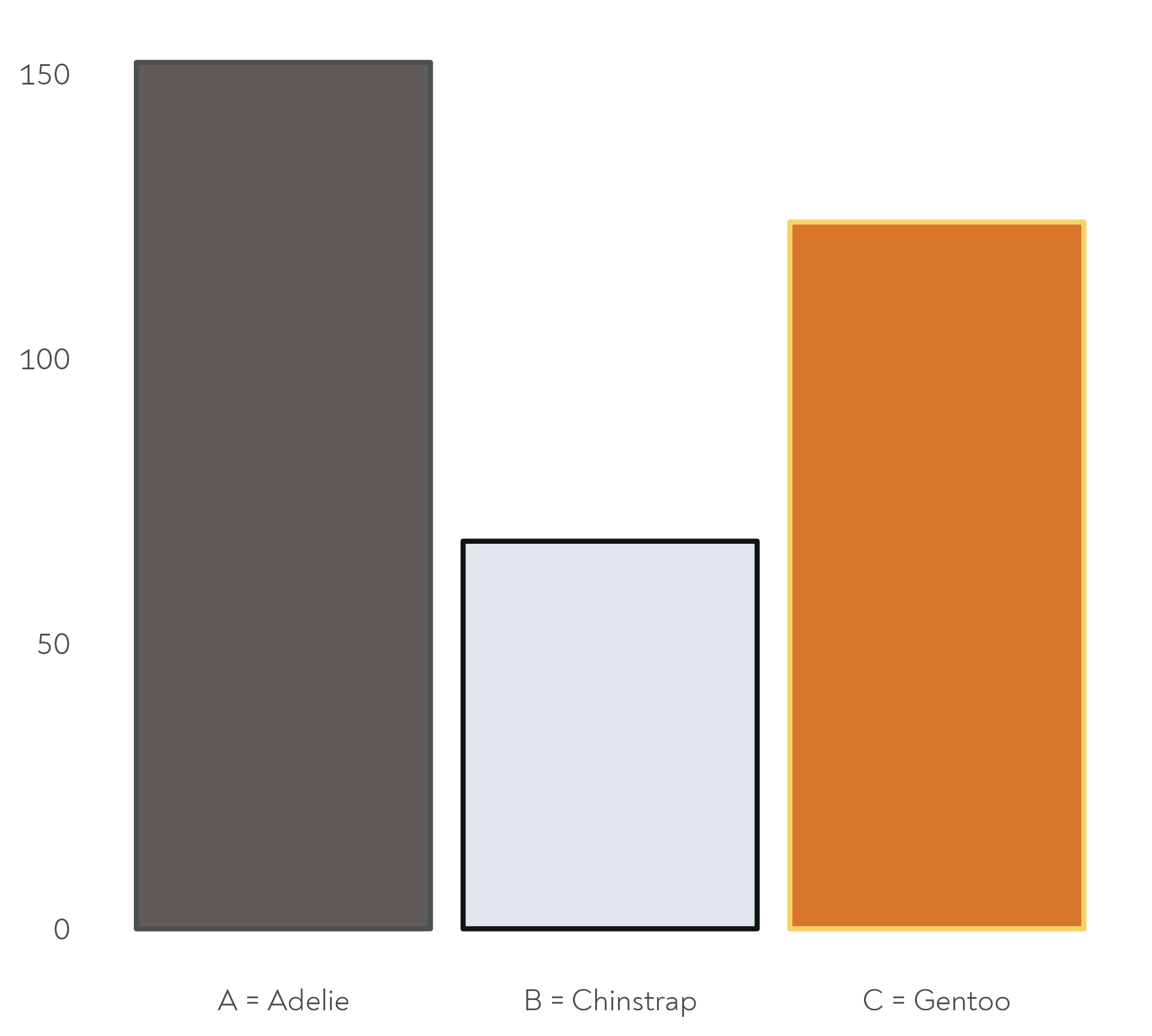
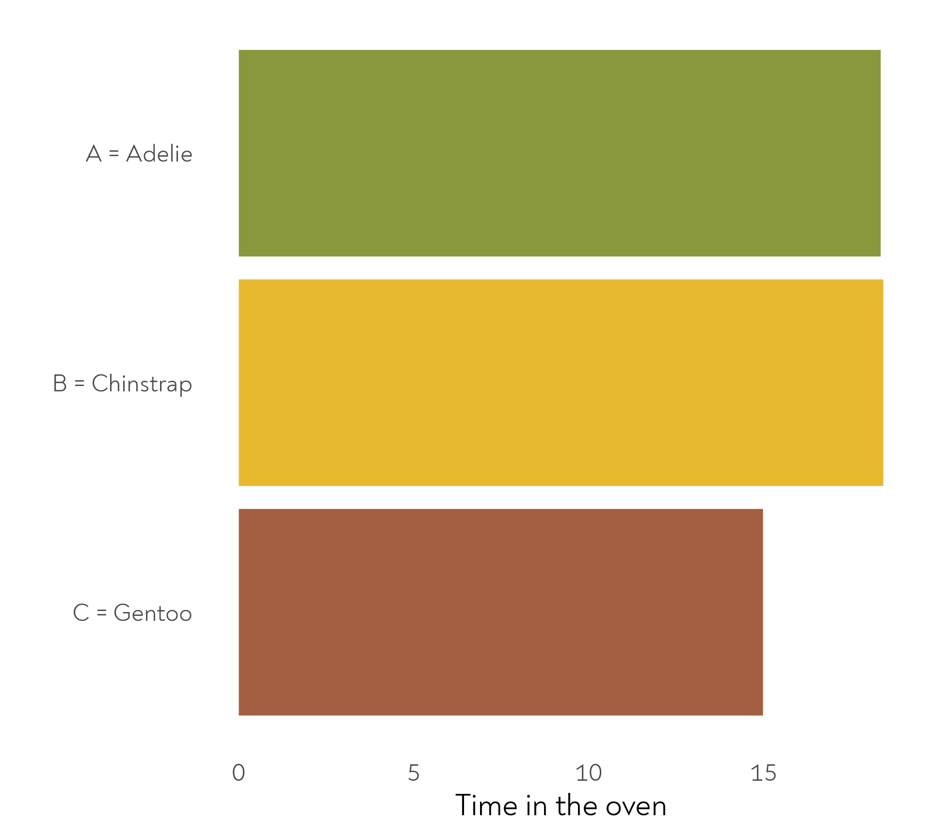
The Great Penguin Bake Off - Bonus round!
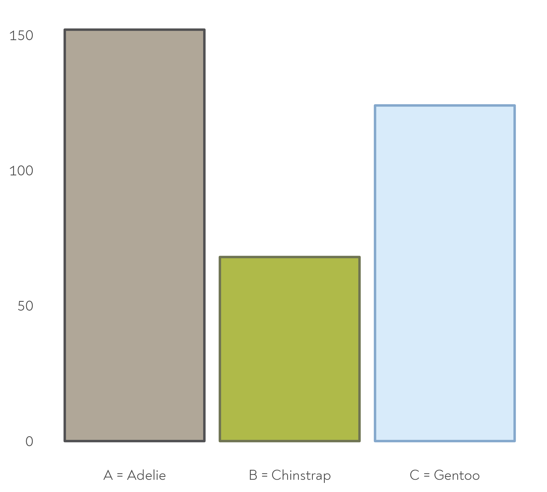
The penguins also baked their cakes for different amounts of time. Here are the mean durations per species.
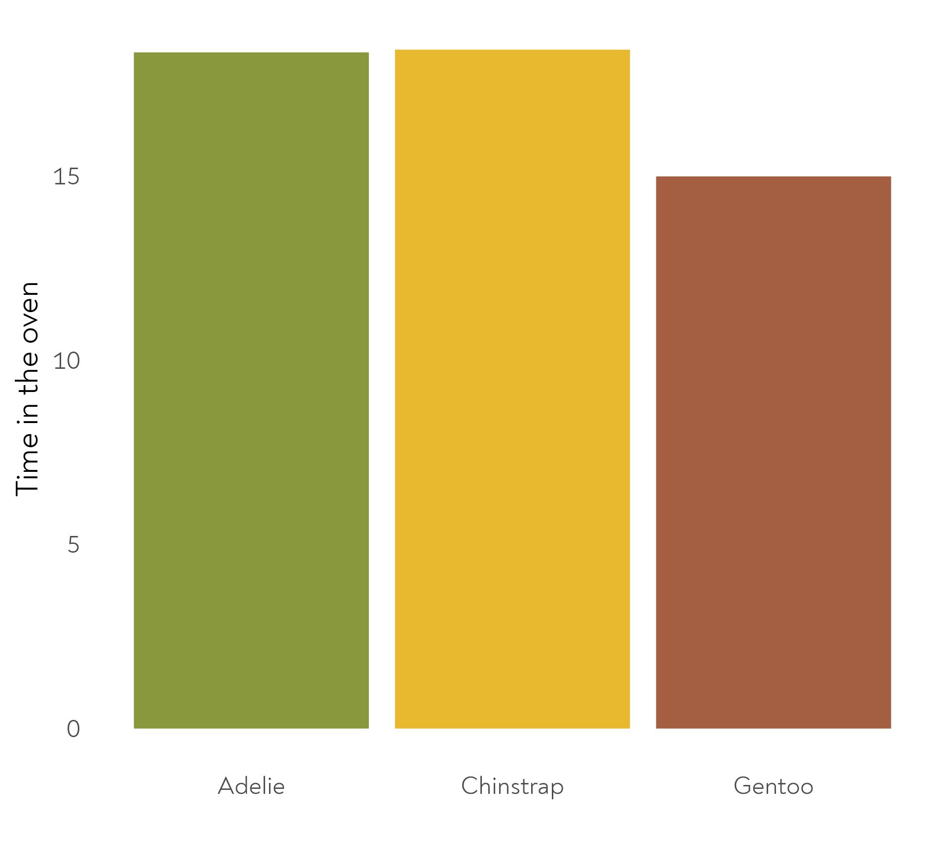
The Great Penguin Bake Off - Bonus round!
The penguins also baked their cakes for different amounts of time. Here are the mean durations per species.

#1 Use colour purposefully
#1 Use colour purposefully

#1 Use colour purposefully
#1 Use colour purposefully
#1 Use colour purposefully
#1 Use colour purposefully
Quick tip: Viewing your colours
#1 Use colour purposefully
Quick tip: Naming and viewing your colours
#1 Use colour purposefully
A few things to bear in mind
- Accessibility
- Race/Ethnicity - avoid stereotypes and be mindful of unintended messages
- Colour intensity - “more is more”
#1 Use colour purposefully
A few things to bear in mind
- Accessibility
- Race/Ethnicity - avoid stereotypes and be mindful of unintended messages
- Colour intensity - “more is more” - consider “dark mode”
#1 Use colour purposefully
A few things to bear in mind
- Accessibility
- Race/Ethnicity - avoid stereotypes and be mindful of unintended messages
- Colour intensity - “more is more” - consider “dark mode”
Setting up our first plot
Using the ToothGrowth dataset
- Built into R for easy “codealongability”
- Namespacing
package::function()🕵️
- Intriguing dataset (
?ToothGrowth) - Research question with a pattern to visualise and annotate
Setting up our first plot
With a few tips along the way

Setting up our first plot
With a few tips along the way
Setting up our first plot
With a few tips along the way

Setting up our first plot
Mini tip: get rid of abbreviations
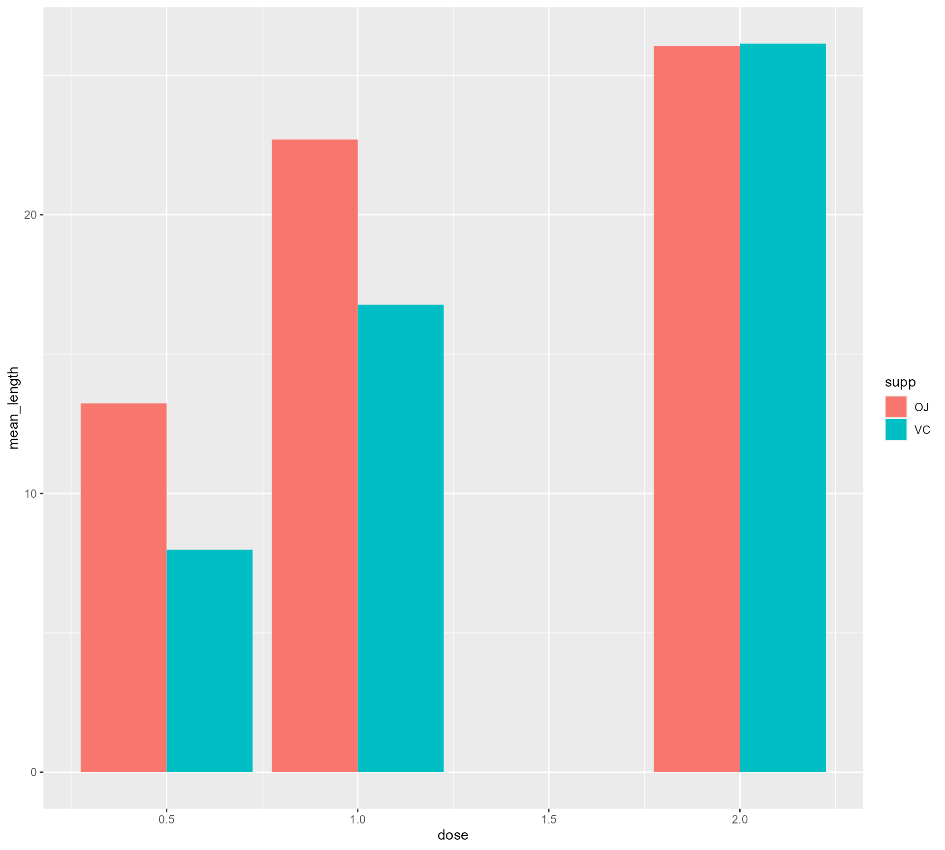
ToothGrowth %>%
  mutate(supplement =
           case_when(supp == "OJ" ~ "Orange Juice",
                     supp == "VC" ~ "Vitamin C",
                     TRUE ~ as.character(supp))) %>%
  group_by(supplement, dose) %>%
  summarise(mean_length = mean(len)) %>%
  ggplot(aes(x = dose,
             y = mean_length,
             fill = supplement)) +
  geom_bar(stat = "identity",
           position = "dodge",
           colour = "#FFFFFF",
           size = 2)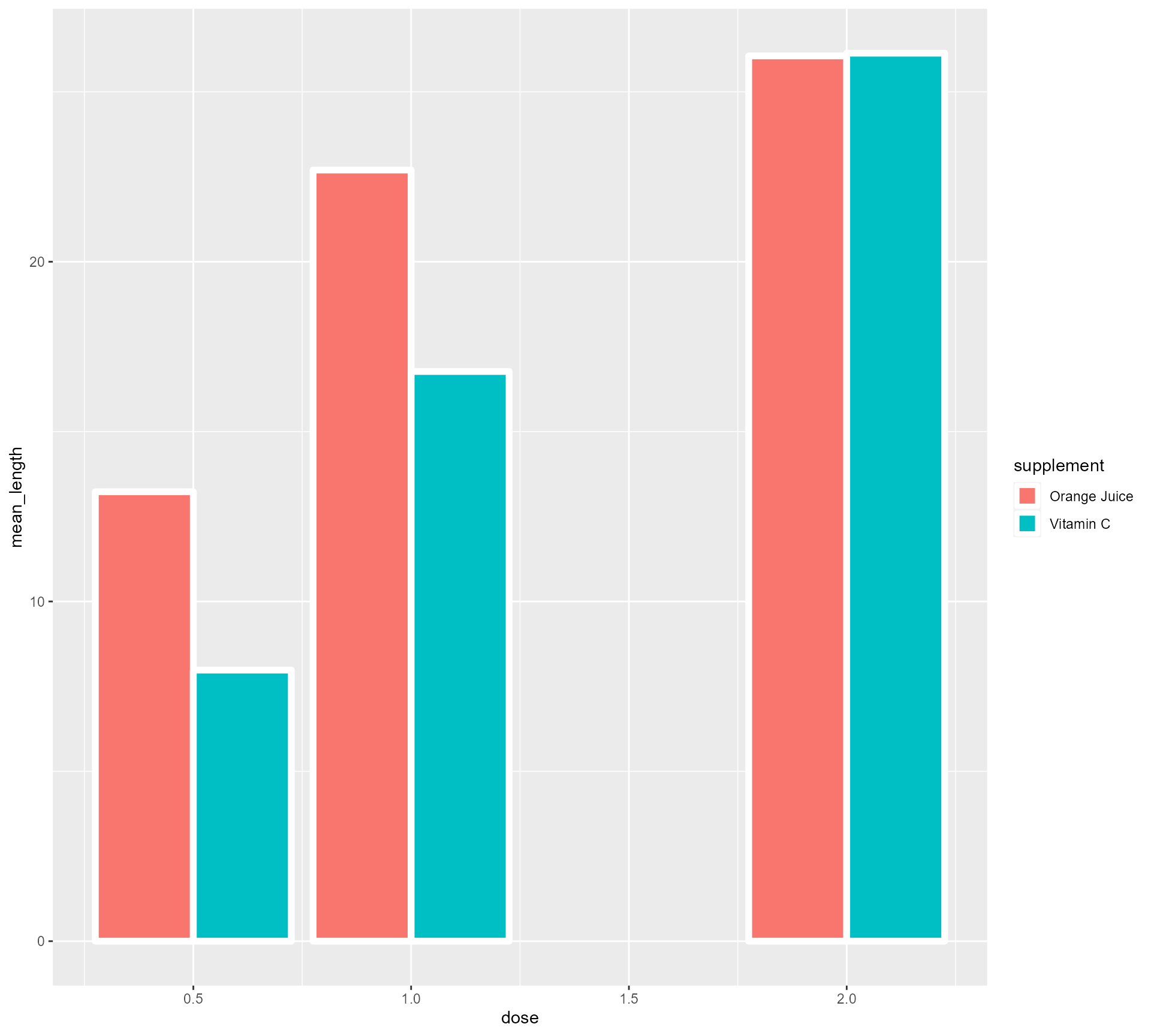
Setting up our first plot
Mini tip: theme_minimal()
ToothGrowth %>%
  mutate(supplement =
           case_when(supp == "OJ" ~ "Orange Juice", supp == "VC" ~ "Vitamin C", TRUE ~ as.character(supp))) %>%
  group_by(supplement, dose) %>%
  summarise(mean_length = mean(len)) %>%
  ggplot(aes(x = dose,
             y = mean_length,
             fill = supplement)) +
  geom_bar(stat = "identity",
           position = "dodge",
           colour = "#FFFFFF",
           size = 2) +
  theme_minimal()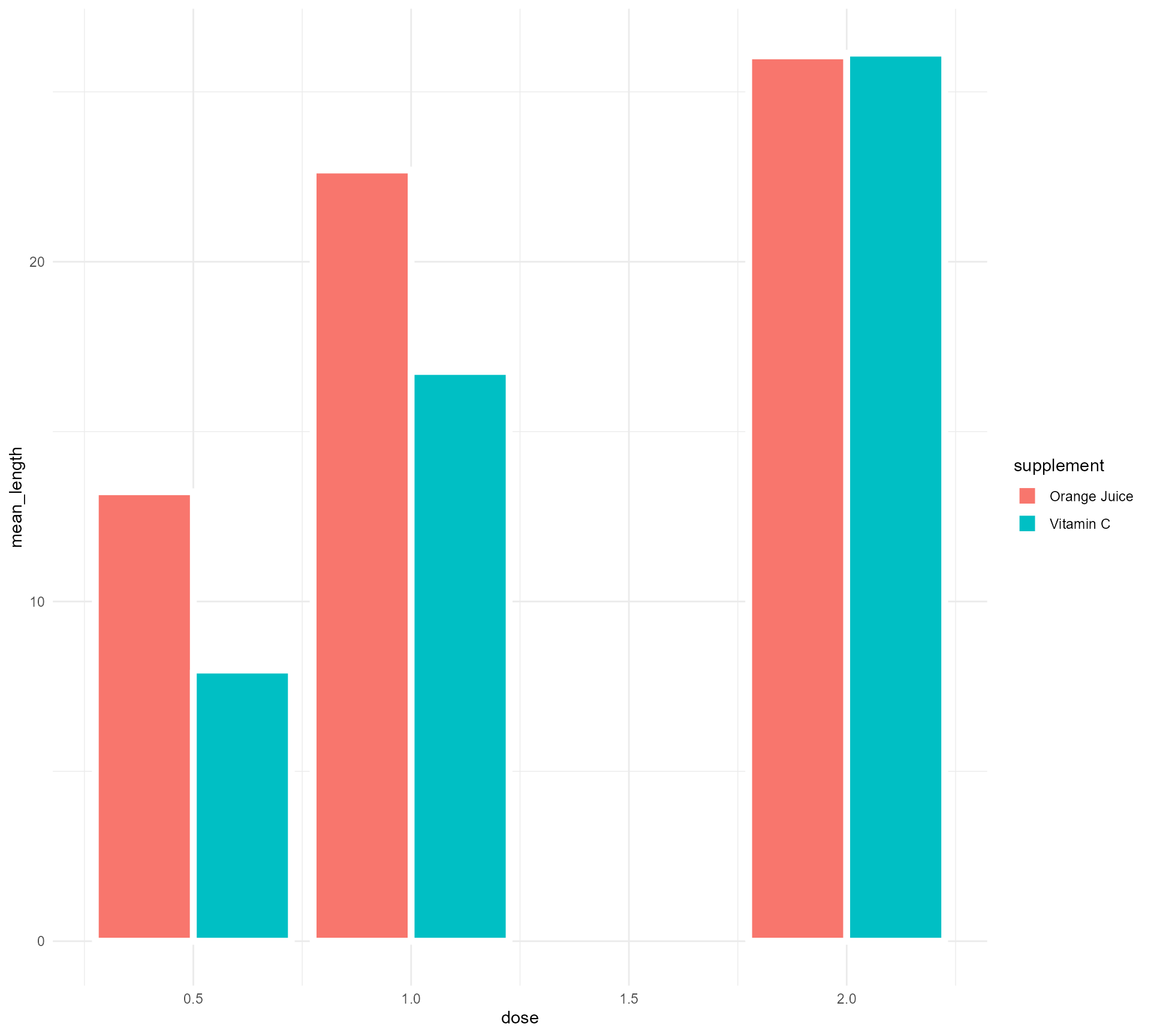
Setting up our first plot
Turning Dose into a categorical variable (fear not!)
ToothGrowth %>%
  mutate(supplement = case_when(supp == "OJ" ~ "Orange Juice", supp == "VC" ~ "Vitamin C", TRUE ~ as.character(supp))) %>%
  group_by(supplement, dose) %>%
  summarise(mean_length = mean(len)) %>%
  mutate(categorical_dose = factor(dose)) %>%
  ggplot(aes(x = categorical_dose,
             y = mean_length,
             fill = supplement)) +
  geom_bar(stat = "identity",
           position = "dodge",
           colour = "#FFFFFF",
           size = 2) +
  theme_minimal()
Setting up our first plot
Turning Dose into a categorical variable (fear not!) + facetting
ToothGrowth %>%
  mutate(supplement = case_when(supp == "OJ" ~ "Orange Juice", supp == "VC" ~ "Vitamin C", TRUE ~ as.character(supp))) %>%
  group_by(supplement, dose) %>%
  summarise(mean_length = mean(len)) %>%
  mutate(categorical_dose = factor(dose)) %>%
  ggplot(aes(x = categorical_dose,
             y = mean_length,
             fill = supplement)) +
  geom_bar(stat = "identity",
           colour = "#FFFFFF",
           size = 2) +
  facet_wrap(supplement ~ ., ncol = 1) +
  theme_minimal()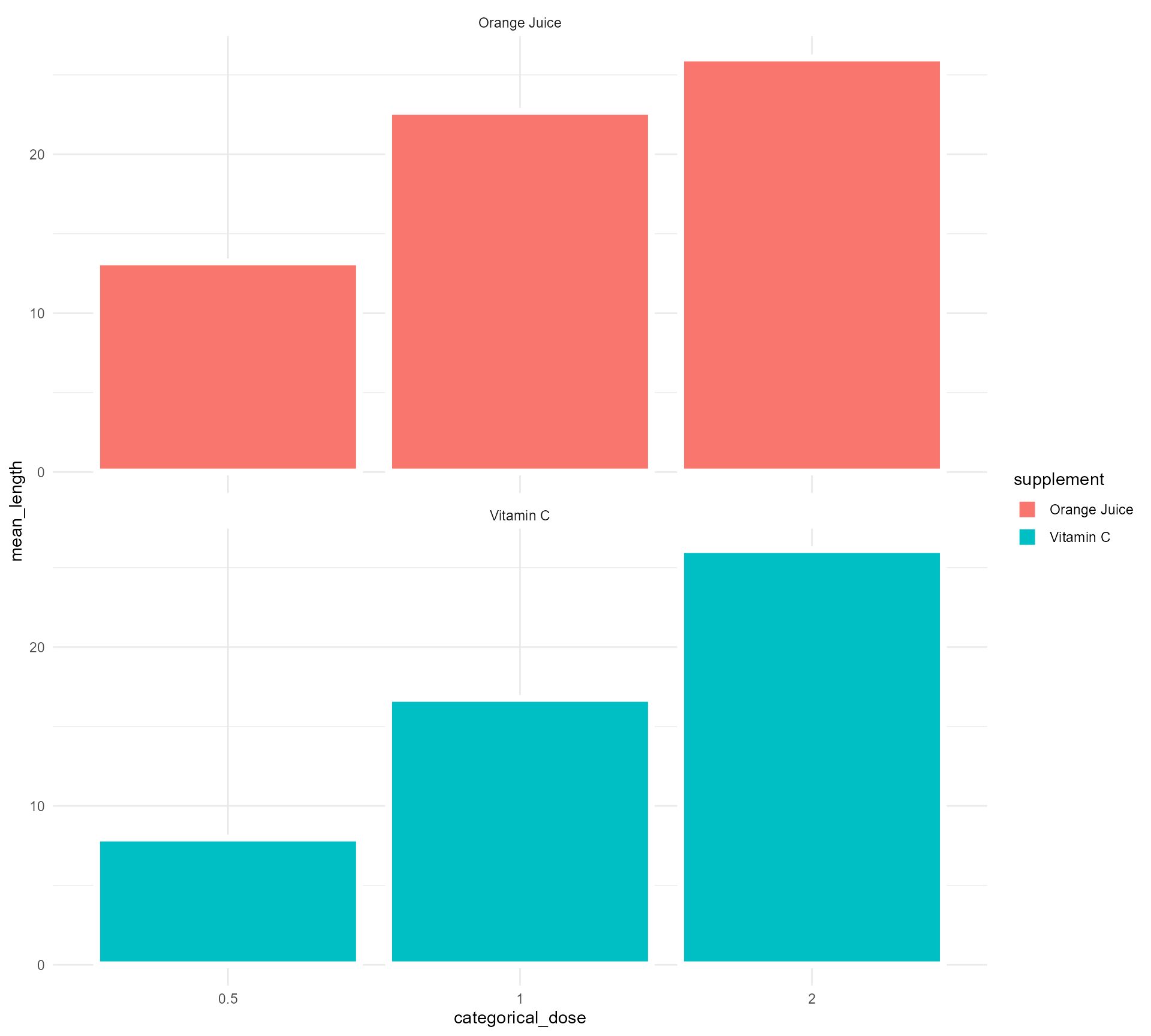
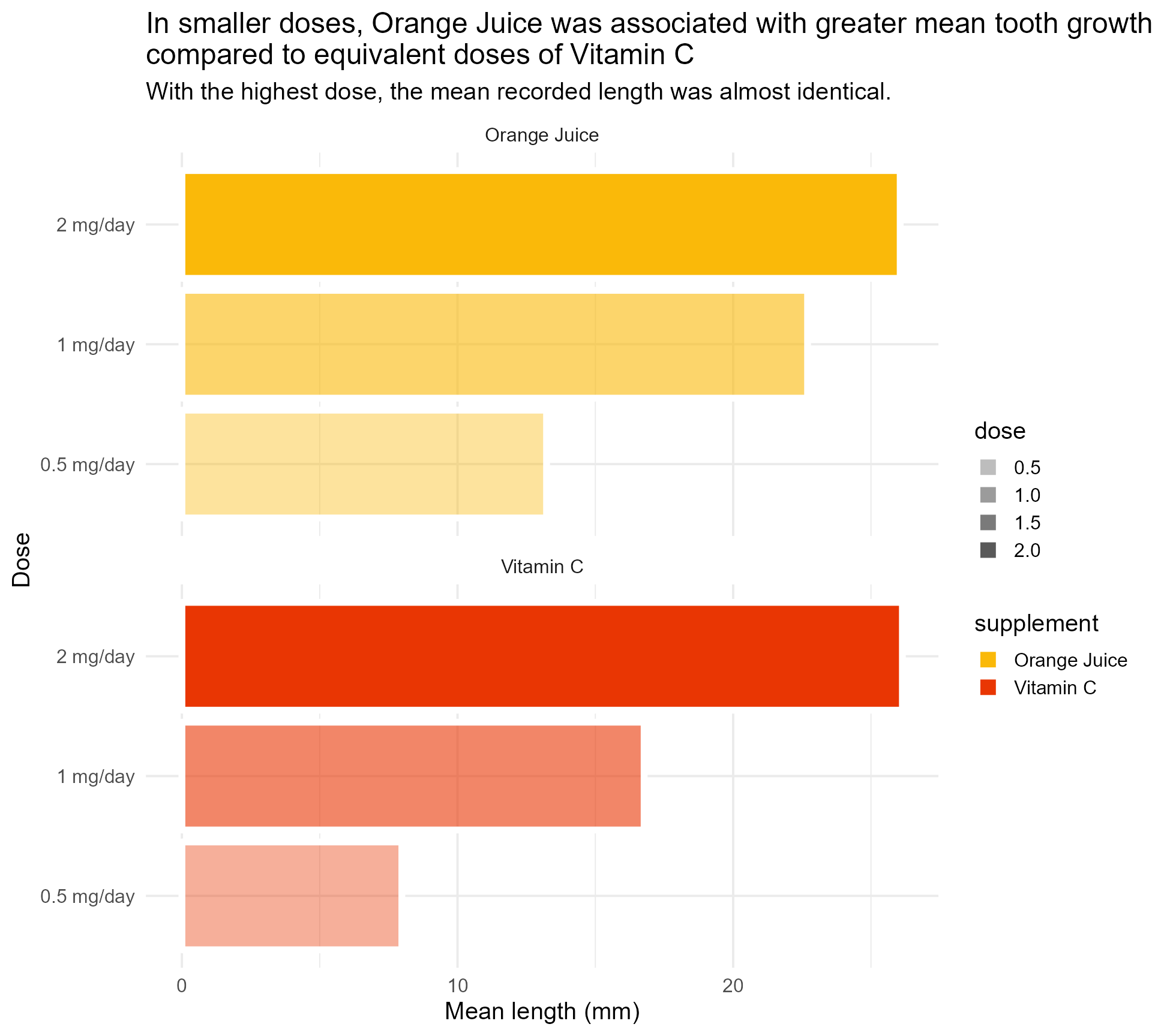
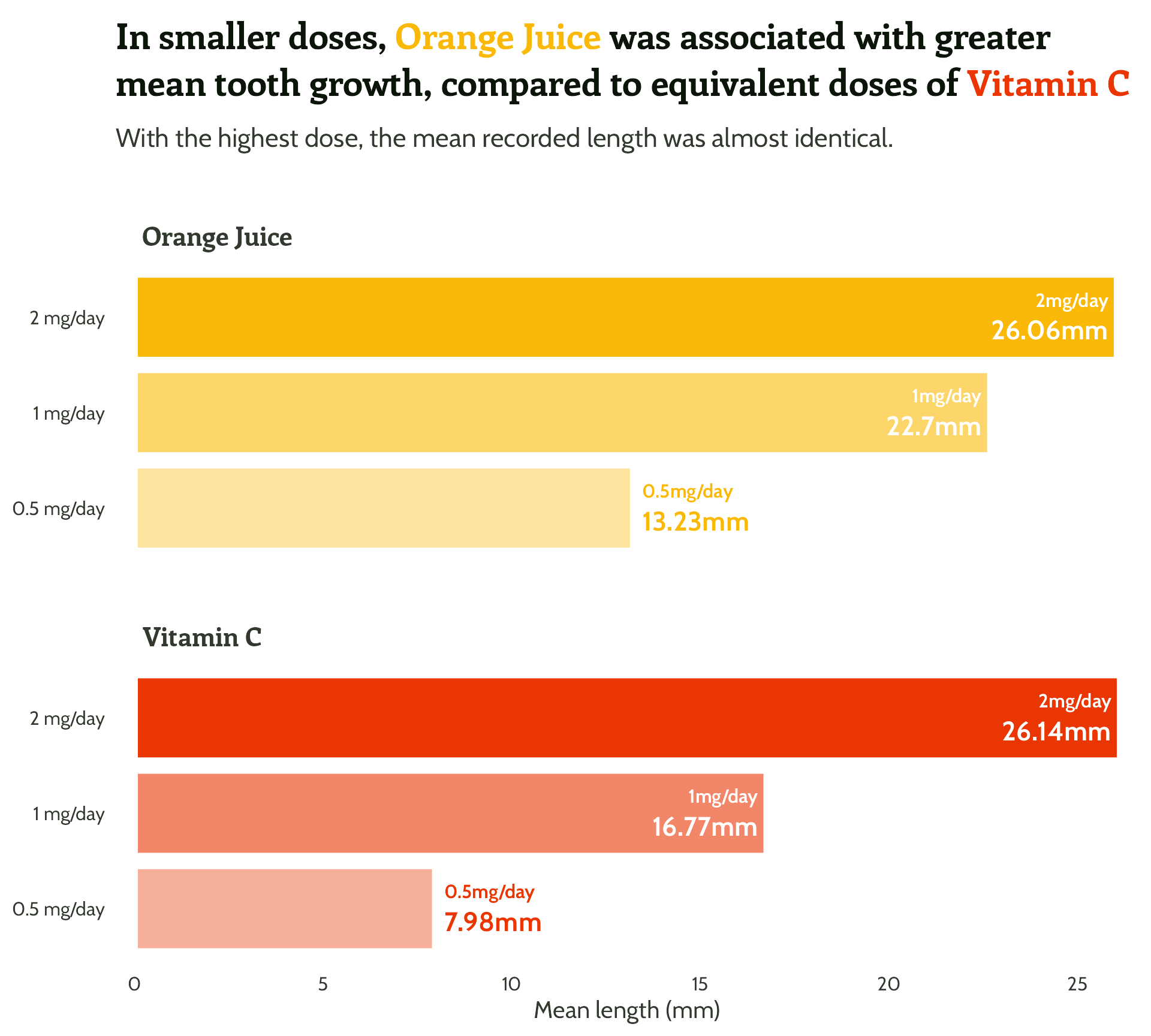
Setting up our first plot
Adding some text (finally!)
ToothGrowth %>%
mutate(supplement = case_when(supp == "OJ" ~ "Orange Juice", supp == "VC" ~ "Vitamin C", TRUE ~ as.character(supp))) %>%
group_by(supplement, dose) %>%
summarise(mean_length = mean(len)) %>%
mutate(categorical_dose = factor(dose)) %>%
ggplot(aes(x = categorical_dose,
y = mean_length,
fill = supplement)) +
geom_bar(stat = "identity",
colour = "#FFFFFF",
size = 2) +
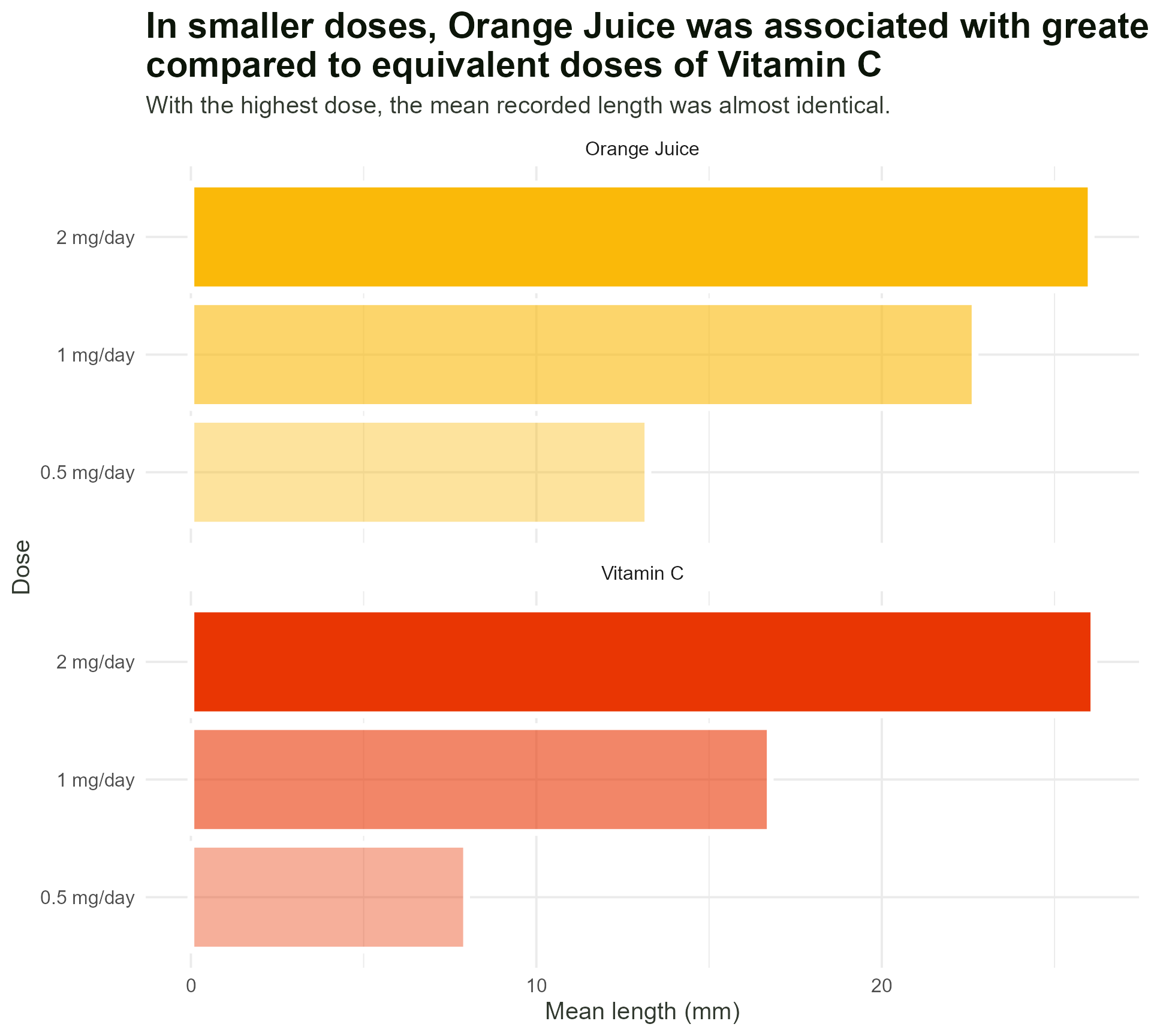
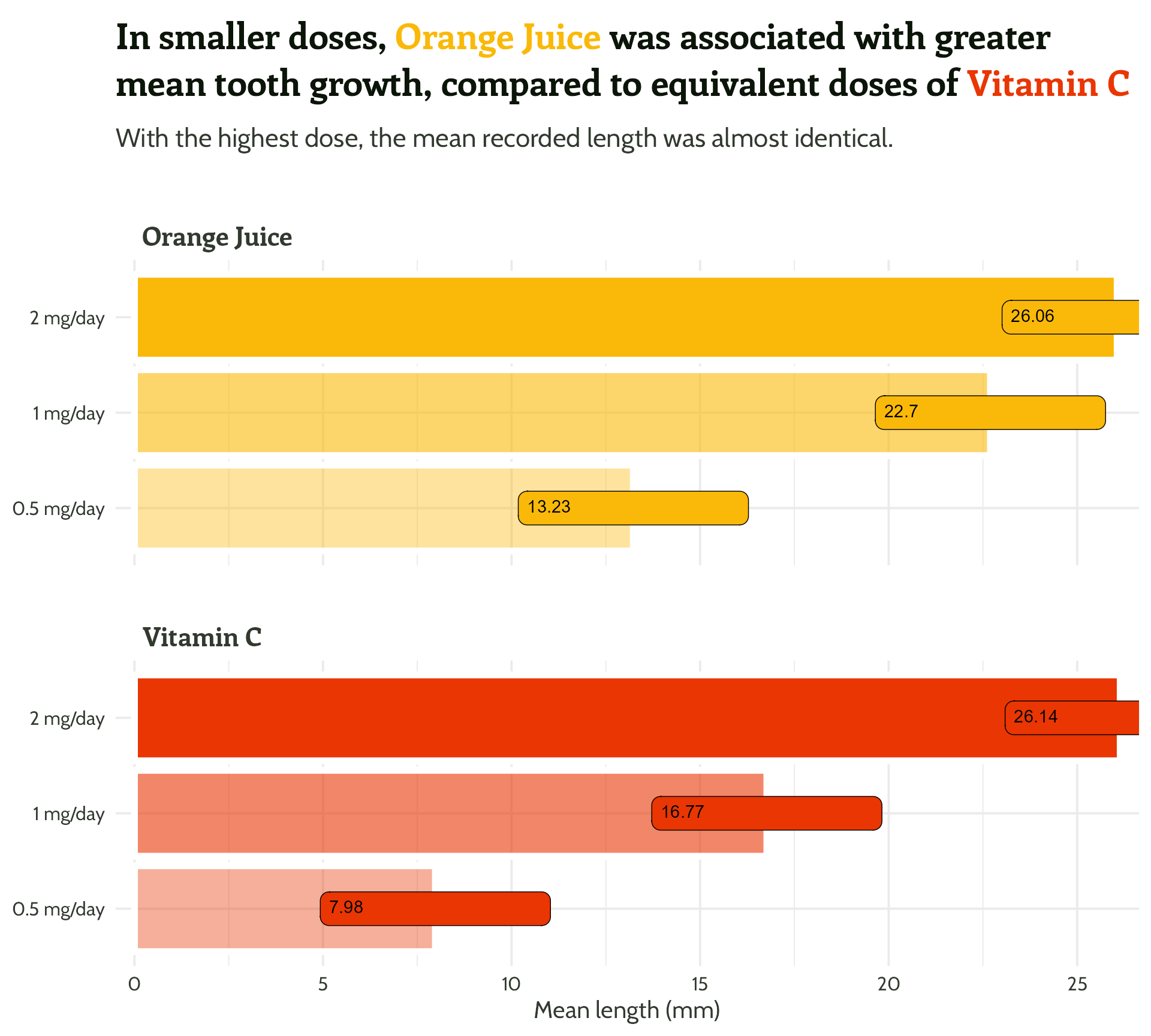
labs(x = "Dose",
y = "Mean length (mm)",
title = "In smaller doses, Orange Juice was associated with greater mean tooth growth,
compared to equivalent doses of Vitamin C",
subtitle = "With the highest dose, the mean recorded length was almost identical.") +
facet_wrap(supplement ~ ., ncol = 1) +
theme_minimal()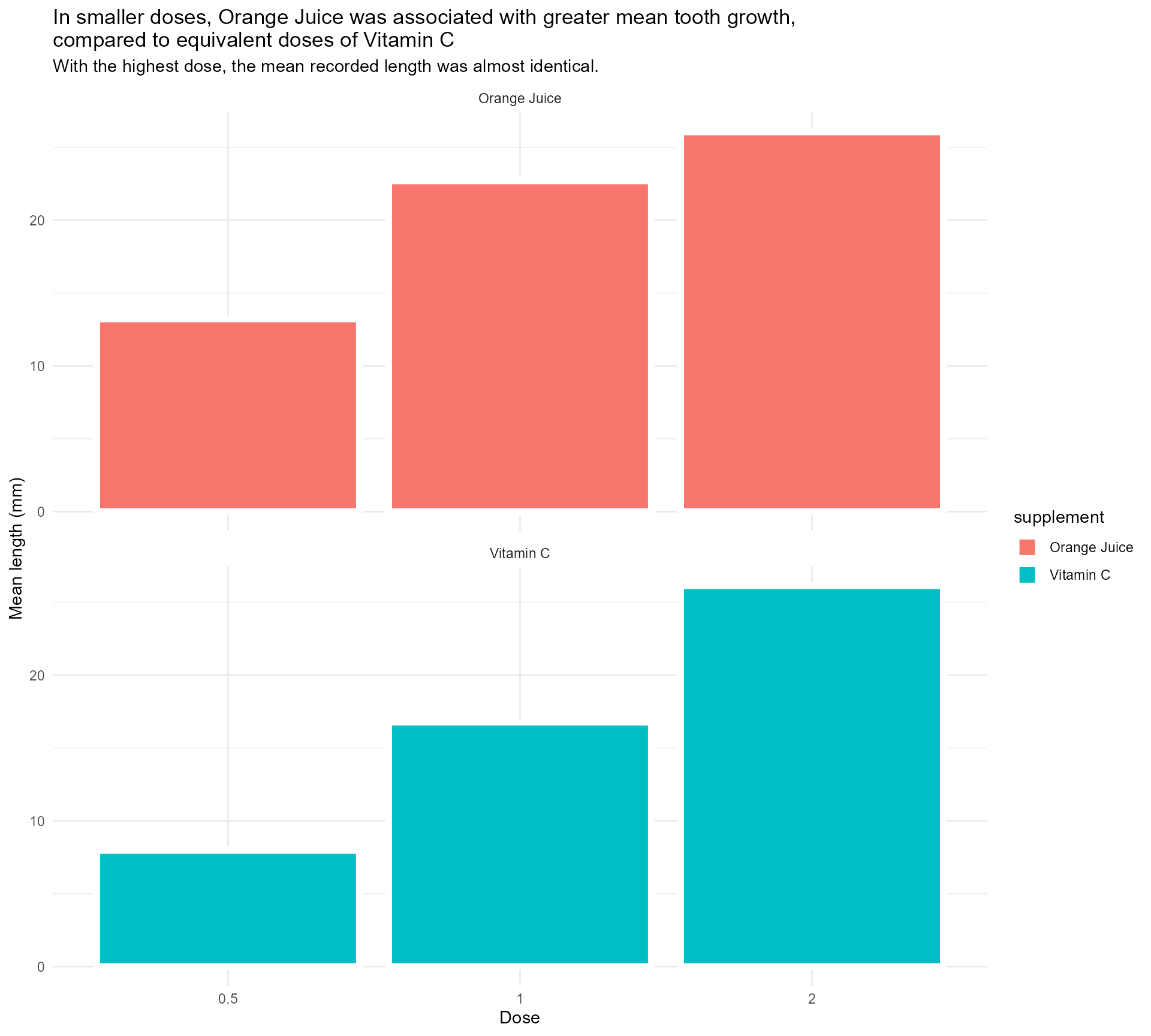
Setting up our first plot
Legend + facet strip + colour + title… Wait, which one is which?


#1 - Use colour purposefully
- Orange juice is… orange!
- Vitamin C is… also orange, but more red and “aggressive”
- Those green leaves look nice with those colours…
- imagecolorpicker.com
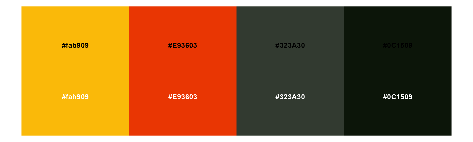
#1 - Use colour purposefully
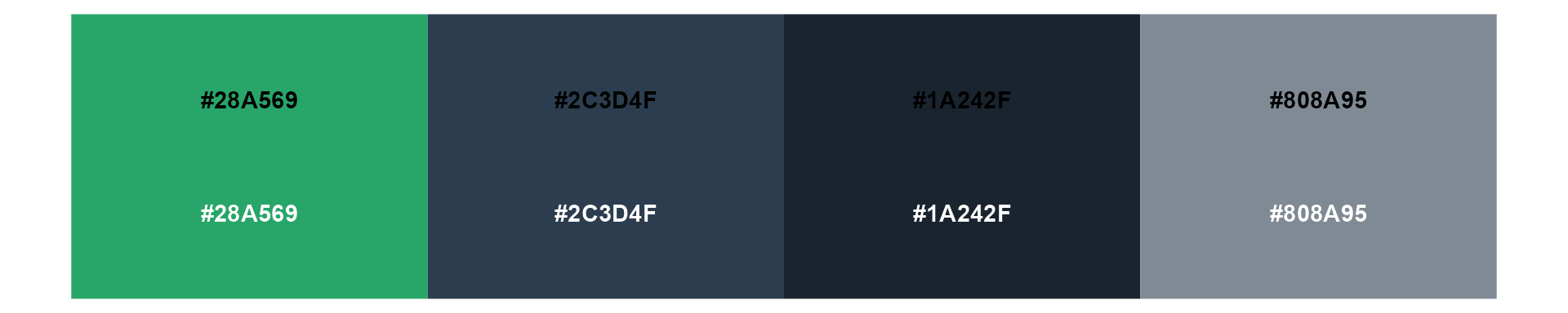
Generating a colour palette, starting with orange juice! #fab909

[1] "#DB5A05" "#E93603" "#F71201"
[1] "#3C6B30" "#0C1509"
[1] "#0C1509" "#323A30" "#595F57" "#80857F" "#A7AAA6" "#CED0CD"#1 - Use colour purposefully
Creating a named vector
#1 - Use colour purposefully
Back to the plot!
ToothGrowth %>%
  mutate(supplement = case_when(supp == "OJ" ~ "Orange Juice", supp == "VC" ~ "Vitamin C", TRUE ~ as.character(supp))) %>%
  group_by(supplement, dose) %>%
  summarise(mean_length = mean(len)) %>%
  mutate(categorical_dose = factor(dose)) %>%
  ggplot(aes(x = categorical_dose,
             y = mean_length,
             fill = supplement)) +
  geom_bar(stat = "identity",
           colour = "#FFFFFF",
           size = 2) +
  labs(x = "Dose",
       y = "Mean length (mm)",
       title = "In smaller doses, Orange Juice was associated with greater mean tooth growth,
compared to equivalent doses of Vitamin C",
subtitle = "With the highest dose, the mean recorded length was almost identical.") +
  facet_wrap(supplement ~ ., ncol = 1) +
  theme_minimal()
#1 - Use colour purposefully
Add in our colours
ToothGrowth %>%
  mutate(supplement = case_when(supp == "OJ" ~ "Orange Juice", supp == "VC" ~ "Vitamin C", TRUE ~ as.character(supp))) %>%
  group_by(supplement, dose) %>%
  summarise(mean_length = mean(len)) %>%
  mutate(categorical_dose = factor(dose)) %>%
  ggplot(aes(x = categorical_dose,
             y = mean_length,
             fill = supplement)) +
  geom_bar(stat = "identity",
           colour = "#FFFFFF",
           size = 2) +
  labs(x = "Dose",
       y = "Mean length (mm)",
       title = "In smaller doses, Orange Juice was associated with greater mean tooth growth,
compared to equivalent doses of Vitamin C",
subtitle = "With the highest dose, the mean recorded length was almost identical.") +
  scale_fill_manual(values = c("#fab909",
                               "#E93603")) +
  facet_wrap(supplement ~ ., ncol = 1) +
  theme_minimal()
#1 - Use colour purposefully
Add in our colours - wait, what?
ToothGrowth %>%
  mutate(supplement = case_when(supp == "OJ" ~ "Orange Juice", supp == "VC" ~ "Vitamin C", TRUE ~ as.character(supp))) %>%
  group_by(supplement, dose) %>%
  summarise(mean_length = mean(len)) %>%
  mutate(categorical_dose = factor(dose),
         supplement =
           factor(supplement,
                  levels = c("Vitamin C",
                             "Orange Juice"))) %>%
  ggplot(aes(x = categorical_dose,
             y = mean_length,
             fill = supplement)) +
  geom_bar(stat = "identity",
           colour = "#FFFFFF",
           size = 2) +
  labs(x = "Dose",
       y = "Mean length (mm)",
       title = "In smaller doses, Orange Juice was associated with greater mean tooth growth,
compared to equivalent doses of Vitamin C",
subtitle = "With the highest dose, the mean recorded length was almost identical.") +
  scale_fill_manual(values = c("#fab909",
                               "#E93603")) +
  facet_wrap(supplement ~ ., ncol = 1) +
  theme_minimal()
#1 - Use colour purposefully
Add in our colours - named vector to the rescue!
ToothGrowth %>%
  mutate(supplement = case_when(supp == "OJ" ~ "Orange Juice", supp == "VC" ~ "Vitamin C", TRUE ~ as.character(supp))) %>%
  group_by(supplement, dose) %>%
  summarise(mean_length = mean(len)) %>%
  mutate(categorical_dose = factor(dose),
         supplement =
           factor(supplement,
                  levels = c("Vitamin C",
                             "Orange Juice"))) %>%
  ggplot(aes(x = categorical_dose,
             y = mean_length,
             fill = supplement)) +
  geom_bar(stat = "identity",
           colour = "#FFFFFF",
           size = 2) +
  labs(x = "Dose",
       y = "Mean length (mm)",
       title = "In smaller doses, Orange Juice was associated with greater mean tooth growth,
compared to equivalent doses of Vitamin C",
subtitle = "With the highest dose, the mean recorded length was almost identical.") +
  scale_fill_manual(values = vit_c_palette) +
  facet_wrap(supplement ~ ., ncol = 1) +
  theme_minimal()
#1 - Use colour purposefully
Get rid of unused colours
ToothGrowth %>%
  mutate(supplement = case_when(supp == "OJ" ~ "Orange Juice", supp == "VC" ~ "Vitamin C", TRUE ~ as.character(supp))) %>%
  group_by(supplement, dose) %>%
  summarise(mean_length = mean(len)) %>%
  mutate(categorical_dose = factor(dose)) %>%
  ggplot(aes(x = categorical_dose,
             y = mean_length,
             fill = supplement)) +
  geom_bar(stat = "identity",
           colour = "#FFFFFF",
           size = 2) +
  labs(x = "Dose",
       y = "Mean length (mm)",
       title = "In smaller doses, Orange Juice was associated with greater mean tooth growth,
compared to equivalent doses of Vitamin C",
subtitle = "With the highest dose, the mean recorded length was almost identical.") +
  scale_fill_manual(values = vit_c_palette,
                    limits = force) +
  facet_wrap(supplement ~ ., ncol = 1) +
  theme_minimal()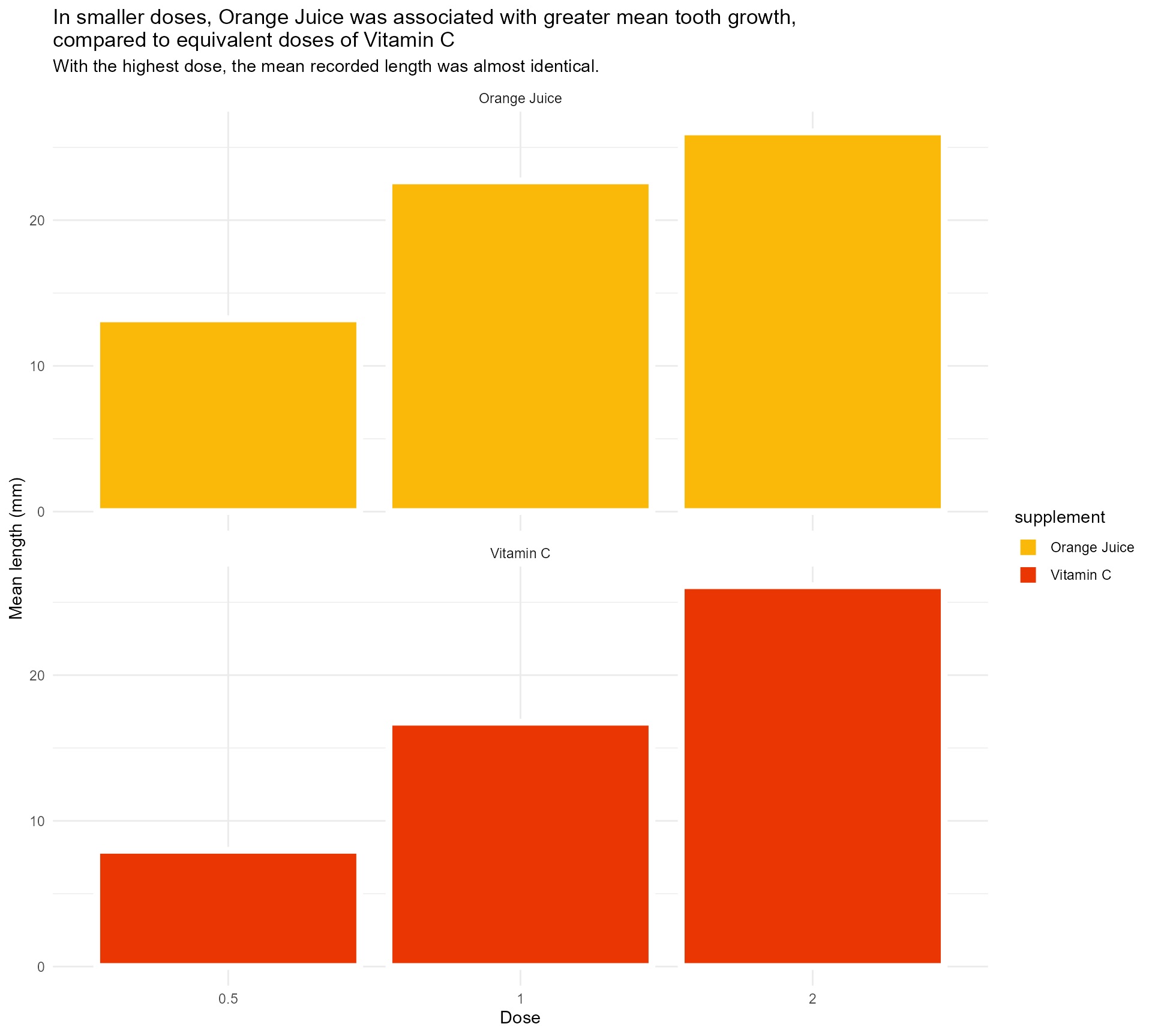
#1 - Use colour purposefully
Use transparency to indicate dose
ToothGrowth %>%
  mutate(supplement = case_when(supp == "OJ" ~ "Orange Juice", supp == "VC" ~ "Vitamin C", TRUE ~ as.character(supp))) %>%
  group_by(supplement, dose) %>%
  summarise(mean_length = mean(len)) %>%
  mutate(categorical_dose = factor(dose)) %>%
  ggplot(aes(x = categorical_dose,
             y = mean_length,
             fill = supplement)) +
  geom_bar(aes(alpha = dose),
           stat = "identity",
           colour = "#FFFFFF",
           size = 2) +
  labs(x = "Dose",
       y = "Mean length (mm)",
       title = "In smaller doses, Orange Juice was associated with greater mean tooth growth,
compared to equivalent doses of Vitamin C",
subtitle = "With the highest dose, the mean recorded length was almost identical.") +
  scale_fill_manual(values = vit_c_palette, limits = force) +
  facet_wrap(supplement ~ ., ncol = 1) +
  theme_minimal()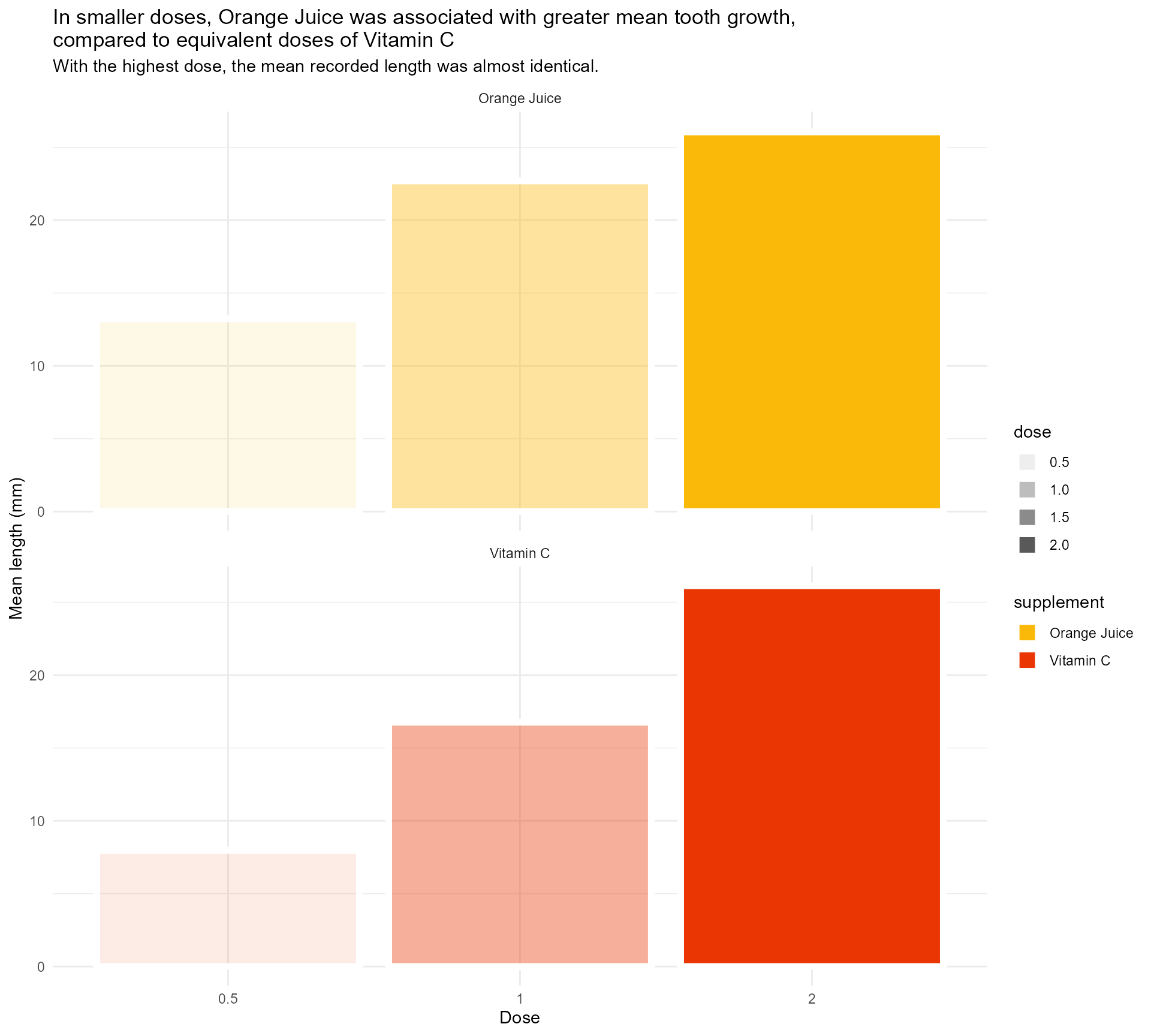
#1 - Use colour purposefully
Use transparency to indicate dose - within limits
ToothGrowth %>%
  mutate(supplement = case_when(supp == "OJ" ~ "Orange Juice", supp == "VC" ~ "Vitamin C", TRUE ~ as.character(supp))) %>%
  group_by(supplement, dose) %>%
  summarise(mean_length = mean(len)) %>%
  mutate(categorical_dose = factor(dose)) %>%
  ggplot(aes(x = categorical_dose,
             y = mean_length,
             fill = supplement)) +
  geom_bar(aes(alpha = dose),
           stat = "identity",
           colour = "#FFFFFF",
           size = 2) +
  labs(x = "Dose",
       y = "Mean length (mm)",
       title = "In smaller doses, Orange Juice was associated with greater mean tooth growth,
compared to equivalent doses of Vitamin C",
subtitle = "With the highest dose, the mean recorded length was almost identical.") +
  scale_fill_manual(values = vit_c_palette, limits = force) +
  scale_alpha(range = c(0.33, 1)) +
  facet_wrap(supplement ~ ., ncol = 1) +
  theme_minimal()
#1 - Use colour purposefully
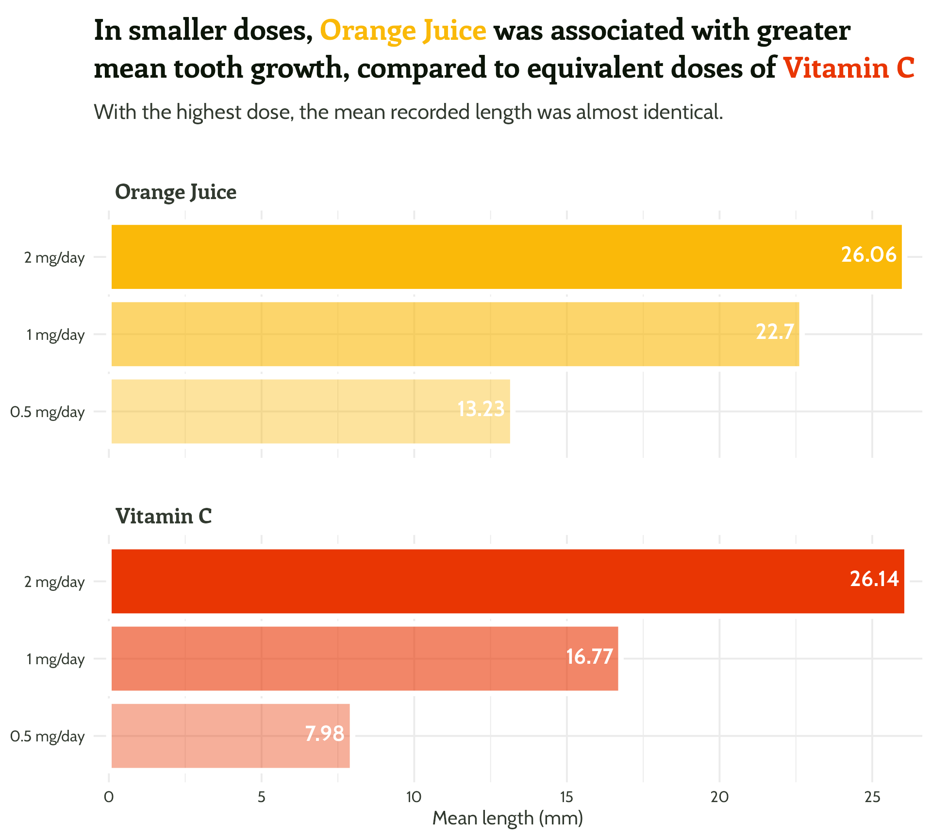
What is the dose unit again? ?ToothGrowth
ToothGrowth %>%
  mutate(supplement = case_when(supp == "OJ" ~ "Orange Juice", supp == "VC" ~ "Vitamin C", TRUE ~ as.character(supp))) %>%
  group_by(supplement, dose) %>%
  summarise(mean_length = mean(len)) %>%
  mutate(categorical_dose = factor(dose)) %>%
  ggplot(aes(x = categorical_dose,
             y = mean_length,
             fill = supplement)) +
  geom_bar(aes(alpha = dose),
           stat = "identity",
           colour = "#FFFFFF",
           size = 2) +
  labs(x = "Dose",
       y = "Mean length (mm)",
       title = "In smaller doses, Orange Juice was associated with greater mean tooth growth,
compared to equivalent doses of Vitamin C",
subtitle = "With the highest dose, the mean recorded length was almost identical.") +
  scale_fill_manual(values = vit_c_palette, limits = force) +
  scale_alpha(range = c(0.33, 1)) +
  scale_x_discrete(breaks = c("0.5", "1", "2"),
                   labels = function(x)
                     paste0(x, " mg/day")) +
  facet_wrap(supplement ~ ., ncol = 1) +
  theme_minimal()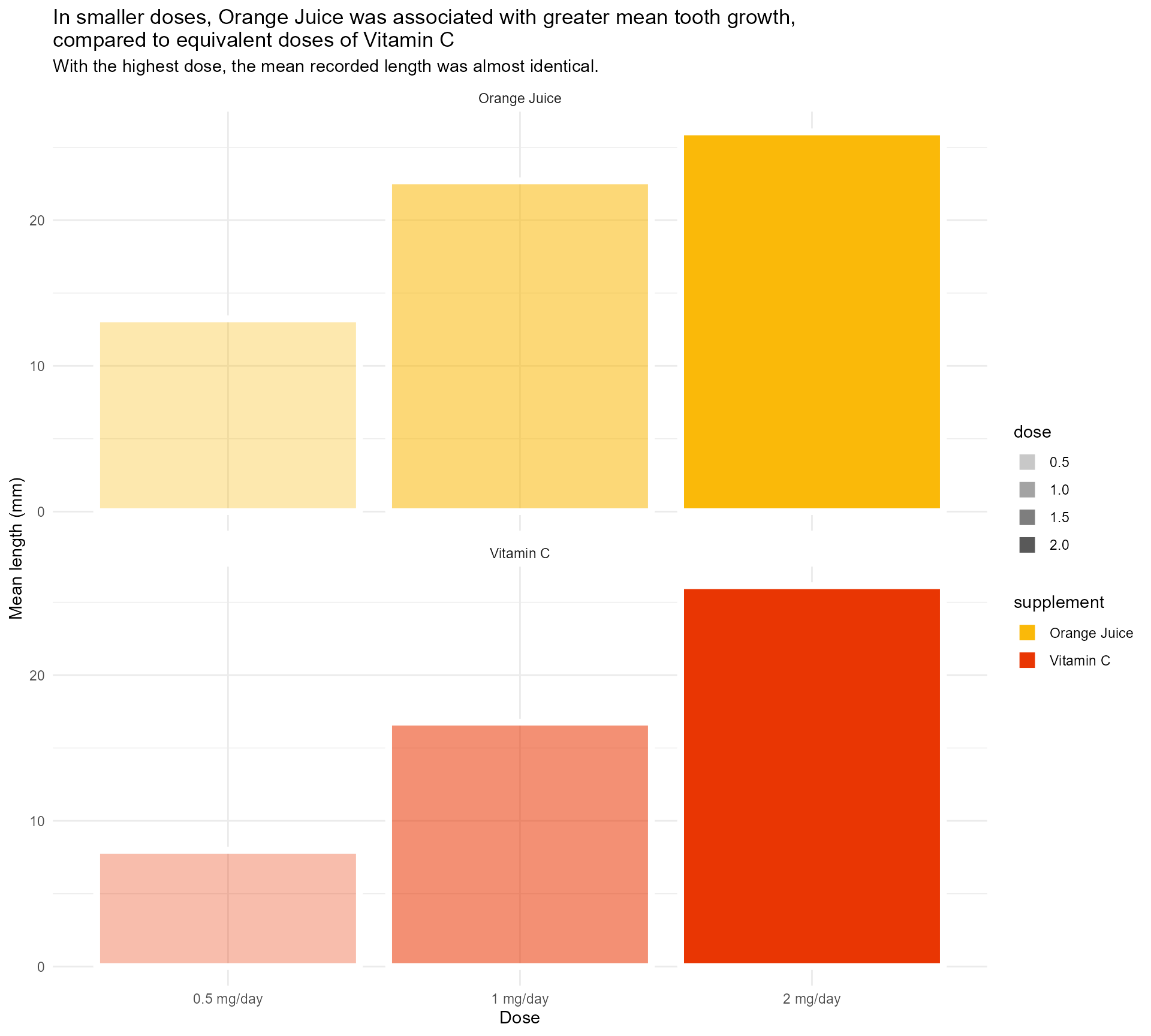
#1 - Use colour purposefully
Legend has always been redundant!
ToothGrowth %>%
  mutate(supplement = case_when(supp == "OJ" ~ "Orange Juice", supp == "VC" ~ "Vitamin C", TRUE ~ as.character(supp))) %>%
  group_by(supplement, dose) %>%
  summarise(mean_length = mean(len)) %>%
  mutate(categorical_dose = factor(dose)) %>%
  ggplot(aes(x = categorical_dose,
             y = mean_length,
             fill = supplement)) +
  geom_bar(aes(alpha = dose),
           stat = "identity",
           colour = "#FFFFFF",
           size = 2) +
  labs(x = "Dose",
       y = "Mean length (mm)",
       title = "In smaller doses, Orange Juice was associated with greater mean tooth growth,
compared to equivalent doses of Vitamin C",
subtitle = "With the highest dose, the mean recorded length was almost identical.") +
  scale_fill_manual(values = vit_c_palette, limits = force) +
  scale_alpha(range = c(0.33, 1)) +
  facet_wrap(supplement ~ ., ncol = 1) +
  scale_x_discrete(breaks = c("0.5", "1", "2"), labels = function(x) paste0(x, " mg/day")) +
  theme_minimal() +
  theme(legend.position = "none")
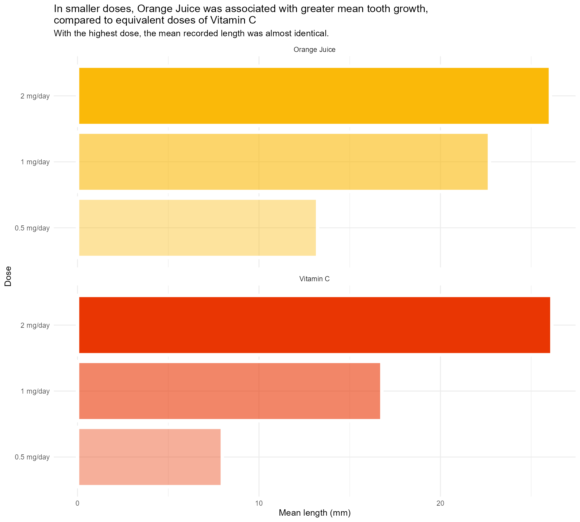
#1 - Use colour (and orientation) purposefully
And I find this so much less confusing!
ToothGrowth %>%
  mutate(supplement = case_when(supp == "OJ" ~ "Orange Juice", supp == "VC" ~ "Vitamin C", TRUE ~ as.character(supp))) %>%
  group_by(supplement, dose) %>%
  summarise(mean_length = mean(len)) %>%
  mutate(categorical_dose = factor(dose)) %>%
  ggplot(aes(x = categorical_dose,
             y = mean_length,
             fill = supplement)) +
  geom_bar(aes(alpha = dose),
           stat = "identity",
           colour = "#FFFFFF",
           size = 2) +
  labs(x = "Dose",
       y = "Mean length (mm)",
       title = "In smaller doses, Orange Juice was associated with greater mean tooth growth,
compared to equivalent doses of Vitamin C",
subtitle = "With the highest dose, the mean recorded length was almost identical.") +
  scale_fill_manual(values = vit_c_palette, limits = force) +
  scale_alpha(range = c(0.4, 1)) +
  scale_x_discrete(breaks = c("0.5", "1", "2"), labels = function(x) paste0(x, " mg/day")) +
  coord_flip() +
  facet_wrap(supplement ~ ., ncol = 1) +
  theme_minimal() +
  theme(legend.position = "none")
#1 - Use colour (and orientation) purposefully
So much clearer, and we haven’t even done any annotating!

#2 - Add text hierarchy
#2 - Add text hierarchy
Time to start playing with theme()!
basic_plot <- ToothGrowth %>%
  mutate(supplement = case_when(supp == "OJ" ~ "Orange Juice", supp == "VC" ~ "Vitamin C", TRUE ~ as.character(supp))) %>%
  group_by(supplement, dose) %>%
  summarise(mean_length = mean(len)) %>%
  mutate(categorical_dose = factor(dose)) %>%
  ggplot(aes(x = categorical_dose, y = mean_length, fill = supplement)) +
  geom_bar(aes(alpha = dose), stat = "identity", colour = "#FFFFFF", size = 2) +
  labs(x = "Dose",
       y = "Mean length (mm)",
       title = "In smaller doses, Orange Juice was associated with greater mean tooth growth,
compared to equivalent doses of Vitamin C",
subtitle = "With the highest dose, the mean recorded length was almost identical.") +
  scale_fill_manual(values = vit_c_palette, limits = force) +
  scale_alpha(range = c(0.4, 1)) +
  scale_x_discrete(breaks = c("0.5", "1", "2"), labels = function(x) paste0(x, " mg/day")) +
  coord_flip() +
  facet_wrap(supplement ~ ., ncol = 1) +
  theme_minimal(base_size = 15)

basic_plot
#2 - Add text hierarchy
Time to start playing with theme()!

#2 - Add text hierarchy
Time to start playing with theme()!

#2 - Add text hierarchy
Time to start playing with theme()!

#2 - Add text hierarchy
Time to start playing with theme()!
#2 - Add text hierarchy
Move away from the default fonts

#2 - Add text hierarchy
Move away from the default fonts
basic_plot +
  theme(legend.position = "none",
        text = element_text(colour = vit_c_palette["light_text"],
                            family = "Cabin"),
        plot.title = element_text(colour = vit_c_palette["dark_text"],
                                  size = rel(1.5),
                                  face = "bold",
                                  family = "Enriqueta"),
        strip.text = element_text(family = "Enriqueta",
                                  colour = vit_c_palette["light_text"],
                                  size = rel(1.1), face = "bold"),
        axis.text = element_text(colour = vit_c_palette["light_text"]))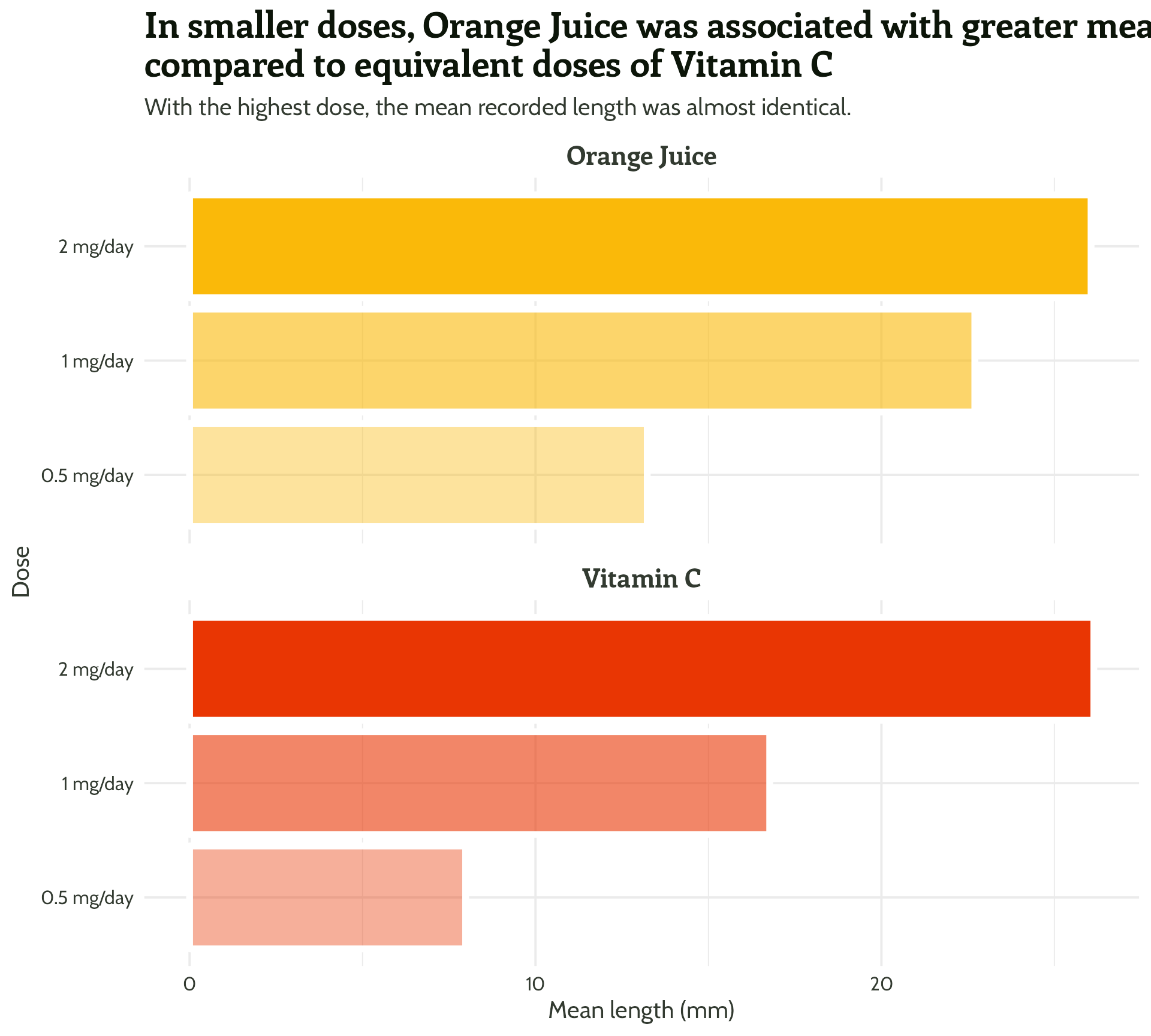
#2 - Add text hierarchy
#2 - Add text hierarchy
Choosing fonts can be tricky!
- Brand guidelines
- Datawrapper guidance - avoid fonts that are too wide/narrow!
- Websites + inspector tool
- Oliver Schöndorfer’s exploration of the Font Matrix
#2 - Add text hierarchy
Getting custom fonts to work can be frustrating!
Install fonts locally, restart R Studio + 📦
{systemfonts}({ragg}+{textshaping}) + Set graphics device to “AGG” + 🤞
knitr::opts_chunk$set(dev = “ragg_png”)

#2 - Add text hierarchy
See what fonts are available on your device
systemfonts::system_fonts() |> View()

#2 - Add text hierarchy
Give everything some space to breathe
basic_plot +
  theme(legend.position = "none",
        text = element_text(colour = vit_c_palette["light_text"],
                            family = "Cabin"),
        plot.title = element_text(colour = vit_c_palette["dark_text"],
                                  size = rel(1.5),
                                  face = "bold",
                                  family = "Enriqueta"),
        strip.text = element_text(family = "Enriqueta",
                                  colour = vit_c_palette["light_text"],
                                  size = rel(1.1), face = "bold"),
        axis.text = element_text(colour = vit_c_palette["light_text"]))
#2 - Add text hierarchy
Give everything some space to breathe
basic_plot +
  theme(legend.position = "none",
        text = element_text(colour = vit_c_palette["light_text"],
                            family = "Cabin"),
        plot.title = element_text(colour = vit_c_palette["dark_text"],
                                  size = rel(1.5),
                                  face = "bold",
                                  family = "Enriqueta",
                                  lineheight = 1.3,
                                  margin = margin(0.5, 0, 1, 0, "lines")),
        plot.subtitle = element_text(size = rel(1.1), lineheight = 1.3,
                                     margin = margin(0, 0, 1, 0, "lines")),
        strip.text = element_text(family = "Enriqueta",
                                  colour = vit_c_palette["light_text"],
                                  size = rel(1.1), face = "bold",
                                  margin = margin(2, 0, 0.5, 0, "lines")),
        axis.text = element_text(colour = vit_c_palette["light_text"]))
#2 - Add text hierarchy
Remove unnecessary text
basic_plot +
  theme(legend.position = "none",
        text = element_text(colour = vit_c_palette["light_text"],
                            family = "Cabin"),
        axis.title.y = element_blank(),
        plot.title = element_text(colour = vit_c_palette["dark_text"],
                                  size = rel(1.5),
                                  face = "bold",
                                  family = "Enriqueta",
                                  lineheight = 1.3,
                                  margin = margin(0.5, 0, 1, 0, "lines")),
        plot.subtitle = element_text(size = rel(1.1), lineheight = 1.3,
                                     margin = margin(0, 0, 1, 0, "lines")),
        strip.text = element_text(family = "Enriqueta",
                                  colour = vit_c_palette["light_text"],
                                  size = rel(1.1), face = "bold",
                                  margin = margin(2, 0, 0.5, 0, "lines")),
        axis.text = element_text(colour = vit_c_palette["light_text"]))
#2 - Add text hierarchy
Watch out for that title!
basic_plot +
  labs(title = "In smaller doses, Orange Juice was associated with greater mean tooth growth,
compared to equivalent doses of Vitamin C") +
  theme(legend.position = "none",
        text = element_text(colour = vit_c_palette["light_text"],
                            family = "Cabin"),
        axis.title.y = element_blank(),
        plot.title = element_text(colour = vit_c_palette["dark_text"],
                                  size = 36,
                                  face = "bold",
                                  family = "Enriqueta",
                                  lineheight = 1.3,
                                  margin = margin(0.5, 0, 1, 0, "lines")),
        plot.subtitle = element_text(size = rel(1.1), lineheight = 1.3,
                                     margin = margin(0, 0, 1, 0, "lines")),
        strip.text = element_text(family = "Enriqueta",
                                  colour = vit_c_palette["light_text"],
                                  size = rel(1.1), face = "bold",
                                  margin = margin(2, 0, 0.5, 0, "lines")),
        axis.text = element_text(colour = vit_c_palette["light_text"]))
#2 - Add text hierarchy
Watch out for that title!
basic_plot +
  labs(title = "In smaller doses, Orange Juice was associated with greater mean tooth growth, compared to equivalent doses of Vitamin C") +
  theme(legend.position = "none",
        text = element_text(colour = vit_c_palette["light_text"],
                            family = "Cabin"),
        axis.title.y = element_blank(),
        plot.title = element_text(colour = vit_c_palette["dark_text"],
                                  size = rel(1.5),
                                  face = "bold",
                                  family = "Enriqueta",
                                  lineheight = 1.3,
                                  margin = margin(0.5, 0, 1, 0, "lines")),
        plot.subtitle = element_text(size = rel(1.1), lineheight = 1.3,
                                     margin = margin(0, 0, 1, 0, "lines")),
        strip.text = element_text(family = "Enriqueta",
                                  colour = vit_c_palette["light_text"],
                                  size = rel(1.1), face = "bold",
                                  margin = margin(2, 0, 0.5, 0, "lines")),
        axis.text = element_text(colour = vit_c_palette["light_text"]))
#2 - Add text hierarchy
I ❤️ 📦 {ggtext}
basic_plot +
  labs(title = "In smaller doses, Orange Juice was associated with greater mean tooth growth, compared to equivalent doses of Vitamin C") +
  theme(legend.position = "none",
        text = element_text(colour = vit_c_palette["light_text"],
                            family = "Cabin"),
        axis.title.y = element_blank(),
        plot.title = ggtext::element_textbox_simple(
          colour = vit_c_palette["dark_text"],
          size = rel(1.5),
          face = "bold",
          family = "Enriqueta",
          lineheight = 1.3,
          margin = margin(0.5, 0, 1, 0, "lines")),
        plot.subtitle = ggtext::element_textbox_simple(
          size = rel(1.1),
          lineheight = 1.3,
          margin = margin(0, 0, 1, 0, "lines")),
        strip.text = element_text(family = "Enriqueta",
                                  colour = vit_c_palette["light_text"],
                                  size = rel(1.1), face = "bold",
                                  margin = margin(2, 0, 0.5, 0, "lines")),
        axis.text = element_text(colour = vit_c_palette["light_text"]))
#2 - Add text hierarchy + colour!
I ❤️ 📦 {ggtext}
basic_plot +
  labs(title =
         paste0("In smaller doses, **<span style='color:",
                vit_c_palette["Orange Juice"], "'>Orange Juice</span>**
                      was associated with greater mean tooth growth,
                      compared to equivalent doses of **<span style='color:",
                vit_c_palette["Vitamin C"], "'>Vitamin C</span>**")
  ) +
  theme(legend.position = "none",
        text = element_text(colour = vit_c_palette["light_text"],
                            family = "Cabin"),
        axis.title.y = element_blank(),
        plot.title = ggtext::element_textbox_simple(colour = vit_c_palette["dark_text"],
                                                    size = rel(1.5),
                                                    face = "bold",
                                                    family = "Enriqueta",
                                                    lineheight = 1.3,
                                                    margin = margin(0.5, 0, 1, 0, "lines")),
        plot.subtitle = ggtext::element_textbox_simple(family = "Cabin", size = rel(1.1), lineheight = 1.3,
                                                       margin = margin(0, 0, 1, 0, "lines")),
        strip.text = element_text(family = "Enriqueta",
                                  colour = vit_c_palette["light_text"],
                                  size = rel(1.1), face = "bold",
                                  margin = margin(2, 0, 0.5, 0, "lines")),
        axis.text = element_text(colour = vit_c_palette["light_text"]))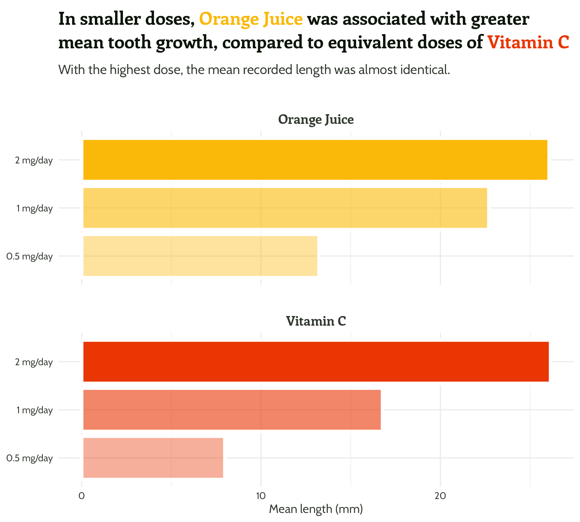
#2 - Add text hierarchy + colour!
#2 - Add text hierarchy
See for yourselves!

Packaging up
- Package development is a whole other workshop (but it’s easier than you think!)
- 📦
{usethis}
- 📦
- Any function or object you create can be added to a package
Packaging up

Packaging up

#3 - Reduce unnecessary eye movement
We’ve made it easy to see what’s what. Now, let’s make it even easier to compare values.

#3 - Reduce unnecessary eye movement
We’ve made it easy to see what’s what. Now, let’s make it even easier to compare values.

#3 - Reduce unnecessary eye movement
We’ve made it easy to see what’s what. Now, let’s make it even easier to compare values.

#3 - Reduce unnecessary eye movement
Time to add some text boxes!
#3 - Reduce unnecessary eye movement
Time to add some text boxes!

#3 - Reduce unnecessary eye movement
Time to add some text boxes!

#3 - Reduce unnecessary eye movement
Time to add some text boxes!
#3 - Reduce unnecessary eye movement
Now for the fun stuff…
themed_plot +
scale_y_continuous(expand = c(0, 0.5)) +
theme(strip.text = element_text(hjust = 0.03)) +
ggtext::geom_textbox(aes(
label = mean_length,
hjust = case_when(mean_length < 15 ~ 0,
TRUE ~ 1),
halign = case_when(mean_length < 15 ~ 0,
TRUE ~ 1)),
size = 6,
fill = NA,
box.colour = NA,
family = "Cabin",
fontface = "bold")
#3 - Reduce unnecessary eye movement
Now for the fun stuff…
themed_plot +
  scale_y_continuous(expand = c(0, 0.5)) +
theme(strip.text = element_text(hjust = 0.03)) +
ggtext::geom_textbox(aes(
label = mean_length,
hjust = case_when(mean_length < 15 ~ 0,
TRUE ~ 1),
halign = case_when(mean_length < 15 ~ 0,
TRUE ~ 1),
colour = case_when(mean_length > 15 ~ "#FFFFFF",
TRUE ~ vit_c_palette[supplement])),
size = 6,
fill = NA,
box.colour = NA,
family = "Cabin",
fontface = "bold")
#3 - Reduce unnecessary eye movement
??????
themed_plot +
  scale_y_continuous(expand = c(0, 0.5)) +
  theme(strip.text = element_text(hjust = 0.03)) +
  ggtext::geom_textbox(aes(
    label = mean_length,
    hjust = case_when(mean_length < 15 ~ 0,
                      TRUE ~ 1),
    halign = case_when(mean_length < 15 ~ 0,
                       TRUE ~ 1),
    colour = case_when(mean_length > 15 ~ "#FFFFFF",
                       TRUE ~ vit_c_palette[supplement])),
    size = 6,
    fill = NA,
    box.colour = NA,
    family = "Cabin",
    fontface = "bold")
#3 - Reduce unnecessary eye movement
scale_colour_identity() required!
themed_plot +
  scale_y_continuous(expand = c(0, 0.5)) +
  theme(strip.text = element_text(hjust = 0.03)) +
  scale_colour_identity() +
  ggtext::geom_textbox(aes(
    label = mean_length,
    hjust = case_when(mean_length < 15 ~ 0,
                      TRUE ~ 1),
    halign = case_when(mean_length < 15 ~ 0,
                       TRUE ~ 1),
    colour = case_when(mean_length > 15 ~ "#FFFFFF",
                       TRUE ~ vit_c_palette[supplement])),
    size = 6,
    fill = NA,
    box.colour = NA,
    family = "Cabin",
    fontface = "bold")
#3 - Reduce unnecessary eye movement
We might as well add a bit of extra info (with text hierarchy!) to our labels…
themed_plot +
  scale_y_continuous(expand = c(0, 0.5)) +
  theme(strip.text = element_text(hjust = 0.03)) +
  scale_colour_identity() +
  ggtext::geom_textbox(aes(
    label = paste0("<span style=font-size:12pt>",
                   dose, "mg/day</span><br>",
                   mean_length, "mm"),
    hjust = case_when(mean_length < 15 ~ 0,
                      TRUE ~ 1),
    halign = case_when(mean_length < 15 ~ 0,
                       TRUE ~ 1),
    colour = case_when(mean_length > 15 ~ "#FFFFFF",
                       TRUE ~ vit_c_palette[supplement])),
    size = 6,
    fill = NA,
    box.colour = NA,
    family = "Cabin",
    fontface = "bold")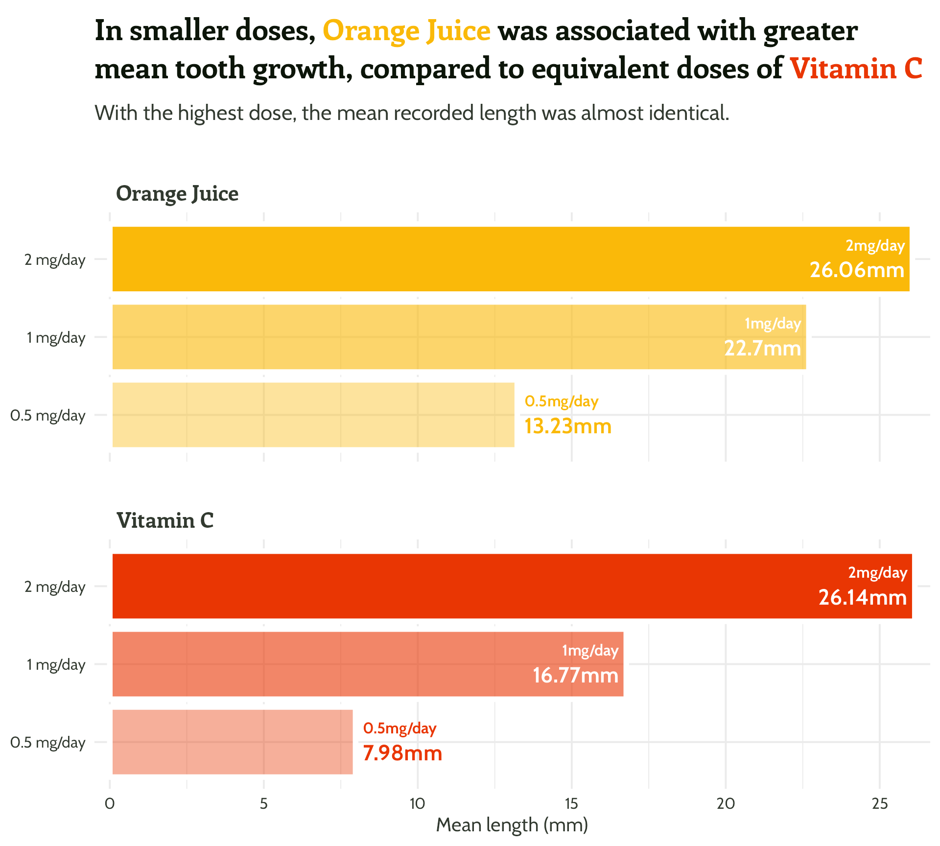
Wait, but why?

#3 - Reduce unnecessary eye movement
#3 - Reduce unnecessary eye movement
Easier than you think and makes a big difference! 🦸


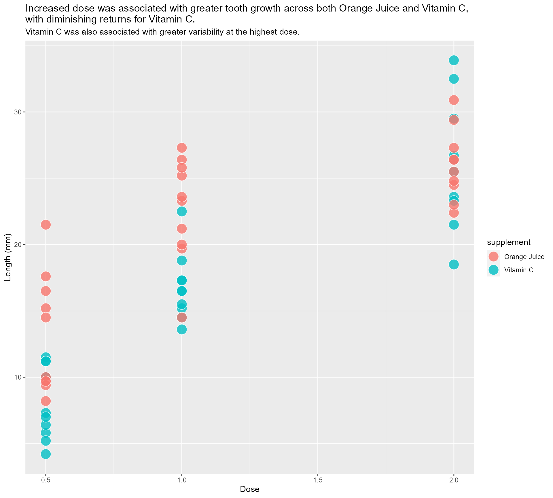
#4 - Highlight important patterns
“That’s all well and good, but we all know summary data can be misleading…”

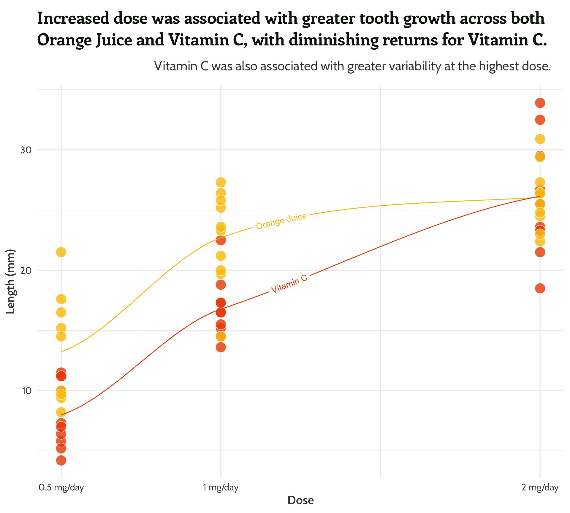
#4 - Highlight important patterns
I ❤️ 📦 {geomtextpath}

#4 - Highlight important patterns
I ❤️ 📦 {geomtextpath}
#4 - Highlight important patterns
I ❤️ 📦 {geomtextpath}
#4 - Highlight important patterns
I ❤️ 📦 {geomtextpath}

#4 - Highlight important patterns
More textboxes with markdown and conditional alignment (horizontal and vertical!)
themed_scatter_plot +
  geomtextpath::geom_textline(stat = "smooth", aes(label = supplement),
                              hjust = 0.1,
                              vjust = 0.3,
                              fontface = "bold",
                              family = "Cabin") +
  ggtext::geom_textbox(data = filter(min_max_gps,
                                     dose %in% c(1, 2)),
                       aes(x = case_when(dose < 1.5 ~ dose + 0.05,
                                         TRUE ~ dose - 0.05),
                           y = case_when(min_or_max  == "max"~ len * 1.1,
                                         TRUE ~ len * 0.9),
                           label = paste0("**<span style='font-family:Enriqueta'>",
                                          guinea_pig_name,
                                          "</span>** - ", len, " mm"),
                           hjust = case_when(dose < 1.5 ~ 0,
                                             TRUE ~ 1),
                           halign = case_when(dose < 1.5 ~ 0,
                                              TRUE ~ 1)),
                       family = "Cabin",
                       size = 4,
                       fill = NA,
                       box.colour = NA) +
  scale_colour_manual(values = vit_c_palette)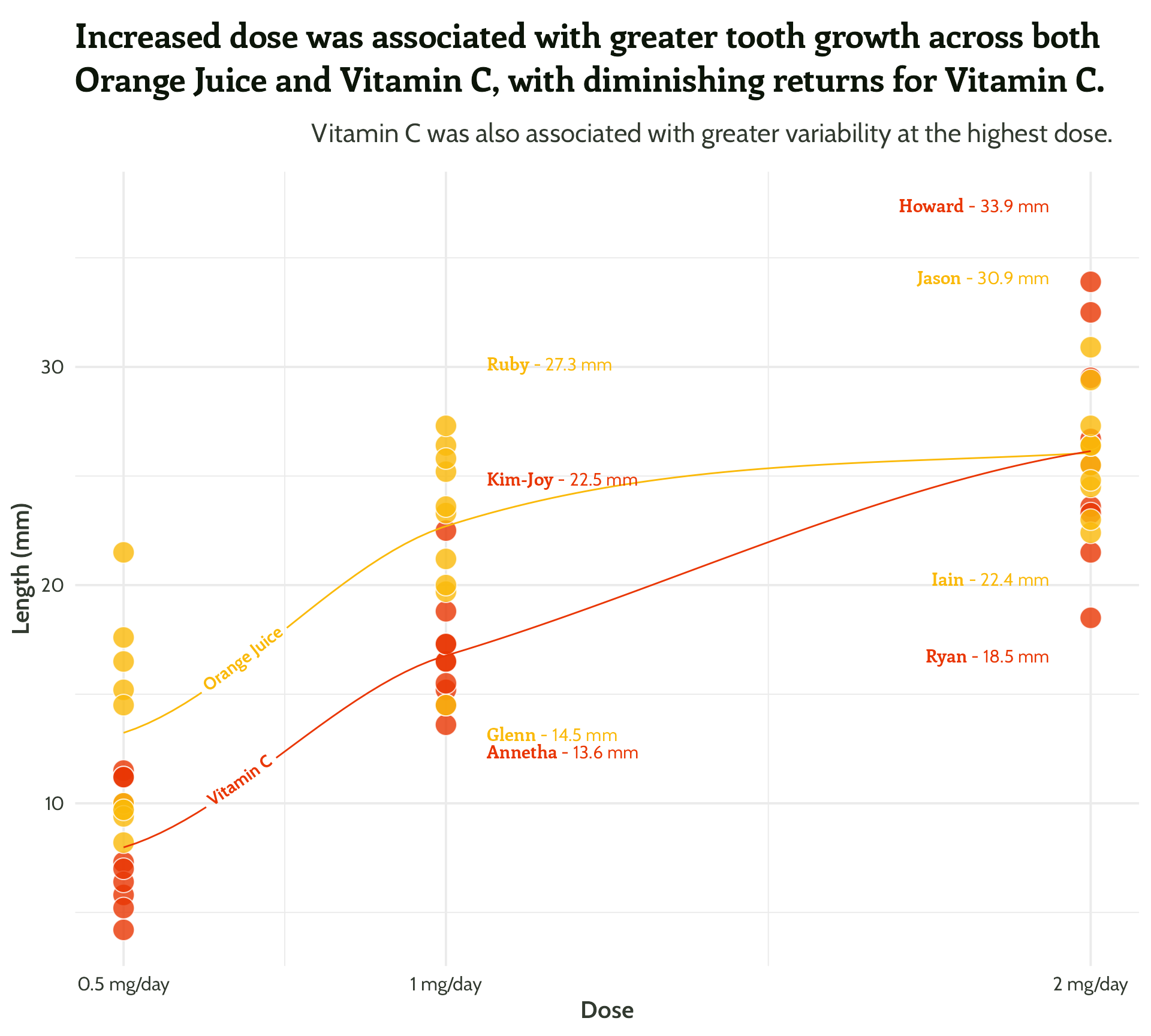
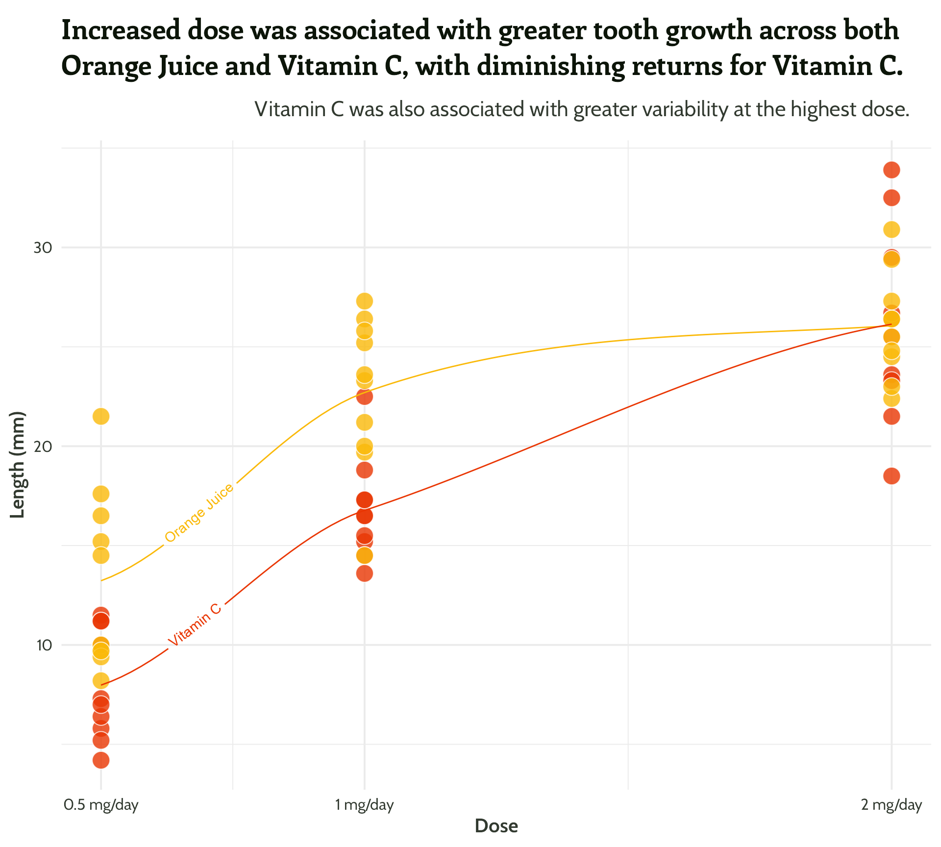
#4 - Highlight important patterns
Sometimes less is more!
themed_scatter_plot +
  geomtextpath::geom_textline(stat = "smooth", aes(label = supplement),
                              hjust = 0.1,
                              vjust = 0.3,
                              fontface = "bold",
                              family = "Cabin") +
  ggtext::geom_textbox(data = filter(min_max_gps,
                                     dose == 2),
                       aes(x = case_when(dose < 1.5 ~ dose + 0.05,
                                         TRUE ~ dose - 0.05),
                           y = case_when(min_or_max  == "max"~ len * 1.1,
                                         TRUE ~ len * 0.9),
                           label = paste0("**<span style='font-family:Enriqueta'>",
                                          guinea_pig_name,
                                          "</span>** - ", len, " mm"),
                           hjust = case_when(dose < 1.5 ~ 0,
                                             TRUE ~ 1),
                           halign = case_when(dose < 1.5 ~ 0,
                                              TRUE ~ 1)),
                       family = "Cabin",
                       size = 4,
                       fill = NA,
                       box.colour = NA) +
  scale_colour_manual(values = vit_c_palette)
#4 - Highlight important patterns
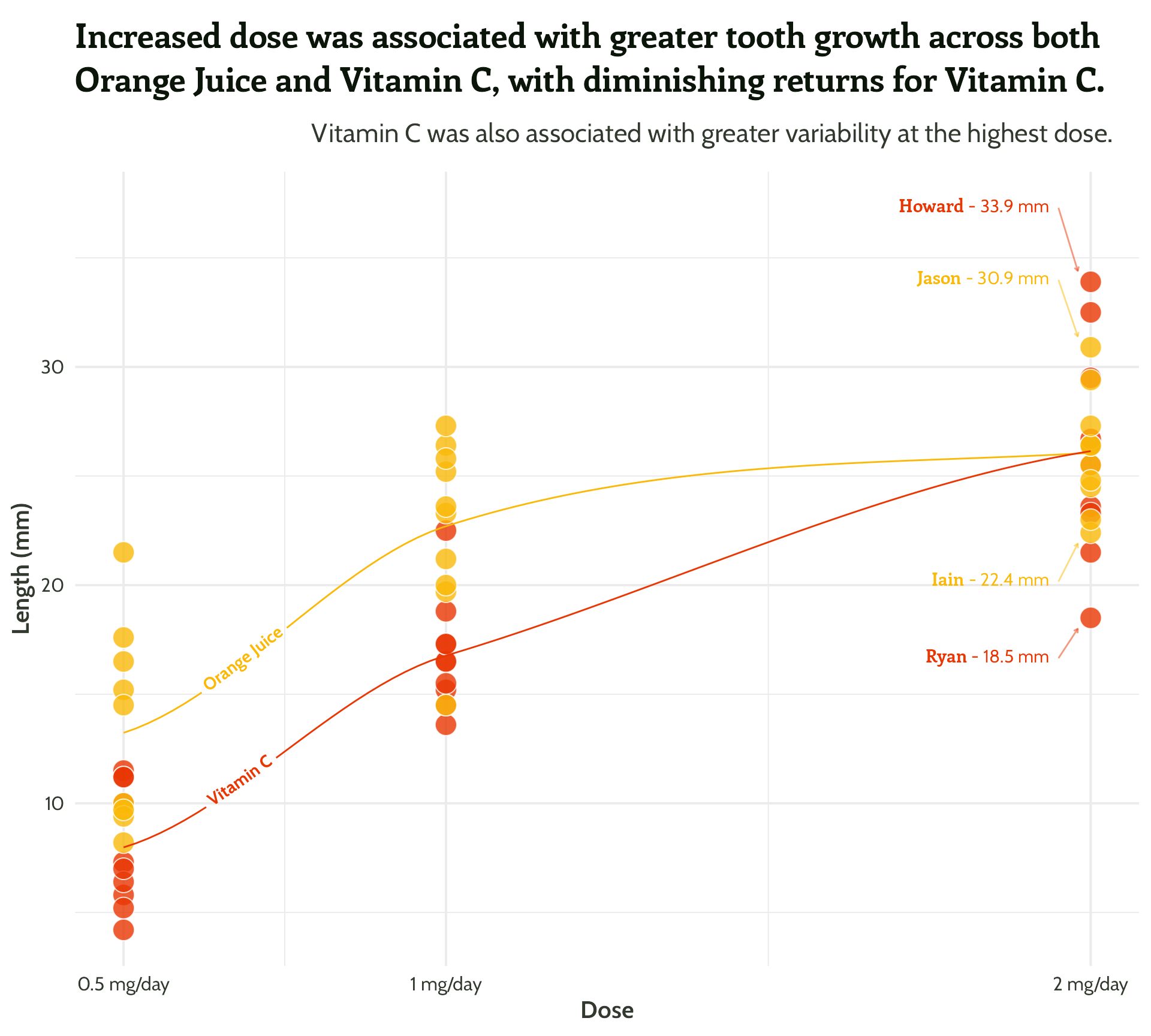
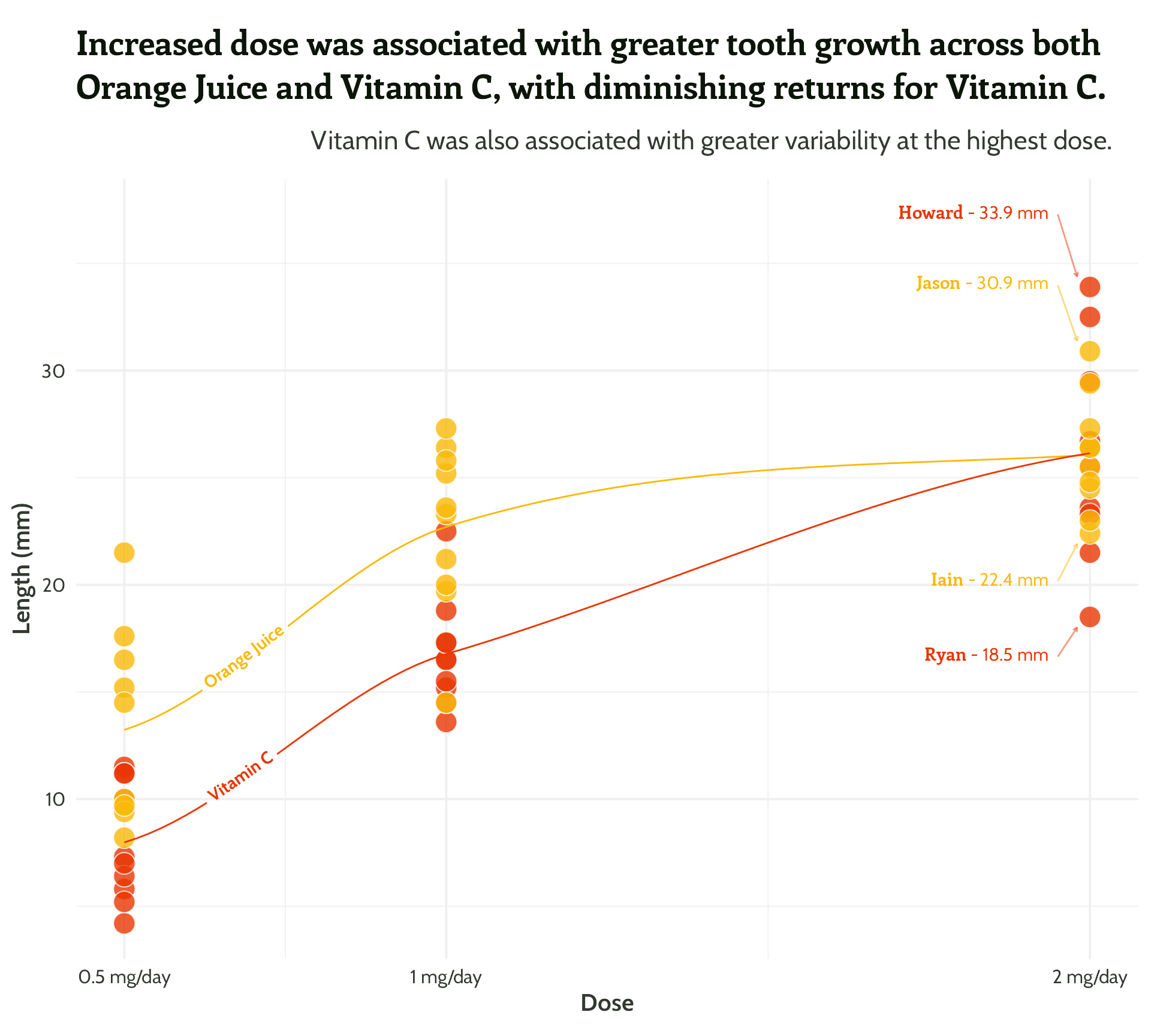
Same principle, let’s add in some arrows!
themed_scatter_plot +
  geomtextpath::geom_textline(stat = "smooth", aes(label = supplement),
                              hjust = 0.1,
                              vjust = 0.3,
                              fontface = "bold",
                              family = "Cabin") +
  ggtext::geom_textbox(data = filter(min_max_gps,
                                     dose == 2),
                       aes(x = case_when(dose < 1.5 ~ dose + 0.05, TRUE ~ dose - 0.05),
                           y = case_when(min_or_max  == "max"~ len * 1.1, TRUE ~ len * 0.9),
                           label = paste0("**<span style='font-family:Enriqueta'>", guinea_pig_name,"</span>** - ", len, " mm"),
                           hjust = case_when(dose < 1.5 ~ 0,TRUE ~ 1),
                           halign = case_when(dose < 1.5 ~ 0, TRUE ~ 1)),
                       family = "Cabin", size = 4, fill = NA, box.colour = NA) +
  geom_curve(data = filter(min_max_gps,
                           dose == 2),
             aes(x = case_when(dose < 1.5 ~ dose + 0.05,
                               TRUE ~ dose - 0.05),
                 y = case_when(min_or_max  == "max"~ len * 1.1,
                               TRUE ~ len * 0.9),
                 xend = case_when(dose < 1.5 ~ dose + 0.02,
                                  TRUE ~ dose - 0.02),
                 yend = case_when(min_or_max  == "max"~ len + 0.5,
                                  TRUE ~ len - 0.5)),
             arrow = arrow(length = unit(0.1, "cm")),
             alpha = 0.5) +
  scale_colour_manual(values = vit_c_palette)
#4 - Highlight important patterns
Same principle, let’s add in some arrows!
themed_scatter_plot +
  geomtextpath::geom_textline(stat = "smooth", aes(label = supplement),
                              hjust = 0.1,
                              vjust = 0.3,
                              fontface = "bold",
                              family = "Cabin") +
  ggtext::geom_textbox(data = filter(min_max_gps,
                                     dose == 2),
                       aes(x = case_when(dose < 1.5 ~ dose + 0.05, TRUE ~ dose - 0.05),
                           y = case_when(min_or_max  == "max"~ len * 1.1, TRUE ~ len * 0.9),
                           label = paste0("**<span style='font-family:Enriqueta'>", guinea_pig_name,"</span>** - ", len, " mm"),
                           hjust = case_when(dose < 1.5 ~ 0,TRUE ~ 1),
                           halign = case_when(dose < 1.5 ~ 0, TRUE ~ 1)),
                       family = "Cabin", size = 4, fill = NA, box.colour = NA) +
  geom_curve(data = filter(min_max_gps,
                           dose == 2),
             aes(x = case_when(dose < 1.5 ~ dose + 0.05,
                               TRUE ~ dose - 0.05),
                 y = case_when(min_or_max  == "max"~ len * 1.1,
                               TRUE ~ len * 0.9),
                 xend = case_when(dose < 1.5 ~ dose + 0.02,
                                  TRUE ~ dose - 0.02),
                 yend = case_when(min_or_max  == "max"~ len + 0.5,
                                  TRUE ~ len - 0.5)),
             curvature = 0.1,
             arrow = arrow(length = unit(0.1, "cm")),
             alpha = 0.5) +
  scale_colour_manual(values = vit_c_palette)
#4 - Highlight important patterns
Same principle, let’s add in some arrows!
themed_scatter_plot +
  geomtextpath::geom_textline(stat = "smooth", aes(label = supplement),
                              hjust = 0.1,
                              vjust = 0.3,
                              fontface = "bold",
                              family = "Cabin") +
  ggtext::geom_textbox(data = filter(min_max_gps,
                                     dose == 2),
                       aes(x = case_when(dose < 1.5 ~ dose + 0.05, TRUE ~ dose - 0.05),
                           y = case_when(min_or_max  == "max"~ len * 1.1, TRUE ~ len * 0.9),
                           label = paste0("**<span style='font-family:Enriqueta'>", guinea_pig_name,"</span>** - ", len, " mm"),
                           hjust = case_when(dose < 1.5 ~ 0,TRUE ~ 1),
                           halign = case_when(dose < 1.5 ~ 0, TRUE ~ 1)),
                       family = "Cabin", size = 4, fill = NA, box.colour = NA) +
  geom_curve(data = filter(min_max_gps,
                           dose == 2),
             aes(x = case_when(dose < 1.5 ~ dose + 0.05,
                               TRUE ~ dose - 0.05),
                 y = case_when(min_or_max  == "max"~ len * 1.1,
                               TRUE ~ len * 0.9),
                 xend = case_when(dose < 1.5 ~ dose + 0.02,
                                  TRUE ~ dose - 0.02),
                 yend = case_when(min_or_max  == "max"~ len + 0.5,
                                  TRUE ~ len - 0.5)),
             curvature = 0,
             arrow = arrow(length = unit(0.1, "cm")),
             alpha = 0.5) +
  scale_colour_manual(values = vit_c_palette)
#4 - Highlight important patterns
Nearly there, folks! Look how far we’ve come!

#4 - Highlight important patterns
#5 - See how much you can declutter
Be brave - try theme_void()
- Do we need the grid?
- Any text we don’t need?
- Any colours that don’t fit with our colour scheme?
#5 - See how much you can declutter
Tweak the grid lines, using a matching colour - {monochromeR}

#5 - See how much you can declutter
And add a bit of white space

#5 - See how much you can declutter

{gghighlight}
“But I have way more conditions than this, how can I highlight a more subtle pattern?”
Suppose we have data that has so many series that it is hard to identify them by their colours as the differences are so subtle…
{gghighlight}
Nicola Rennie’s Hollywood Age Gaps plot
Curved arrows
Conditional curvatures?
themed_scatter_plot +
  geomtextpath::geom_textline(stat = "smooth", aes(label = supplement), hjust = 0.1, vjust = 0.3, fontface = "bold", family = "Cabin") +
  ggtext::geom_textbox(data = filter(min_max_gps, dose == 2),
                       aes(x = case_when(dose < 1.5 ~ dose + 0.05, TRUE ~ dose - 0.05),
                           y = case_when(min_or_max  == "max"~ len * 1.1, TRUE ~ len * 0.9),
                           label = paste0("**<span style='font-family:Enriqueta'>", guinea_pig_name,"</span>** - ", len, " mm"),
                           hjust = case_when(dose < 1.5 ~ 0,TRUE ~ 1),
                           halign = case_when(dose < 1.5 ~ 0, TRUE ~ 1)),
                       family = "Cabin", size = 4, fill = NA, box.colour = NA) +
  geom_curve(data = filter(min_max_gps,
                           dose == 2 &
                             min_or_max == "max"),
             aes(x = case_when(dose < 1.5 ~ dose + 0.05, TRUE ~ dose - 0.05),
                 y = case_when(min_or_max  == "max"~ len * 1.1, TRUE ~ len * 0.9),
                 xend = case_when(dose < 1.5 ~ dose + 0.02, TRUE ~ dose - 0.02),
                 yend = case_when(min_or_max  == "max"~ len + 0.5,TRUE ~ len - 0.5)),
             curvature = -0.1,
             arrow = arrow(length = unit(0.1, "cm")),
             alpha = 0.5) +
  geom_curve(data = filter(min_max_gps,
                           dose == 2 &
                             min_or_max == "min"),
             aes(x = case_when(dose < 1.5 ~ dose + 0.05, TRUE ~ dose - 0.05),
                 y = case_when(min_or_max  == "max"~ len * 1.1, TRUE ~ len * 0.9),
                 xend = case_when(dose < 1.5 ~ dose + 0.02, TRUE ~ dose - 0.02),
                 yend = case_when(min_or_max  == "max"~ len + 0.5, TRUE ~ len - 0.5)),
             curvature = 0.1,
             arrow = arrow(length = unit(0.1, "cm")),
             alpha = 0.5) +
  scale_colour_manual(values = vit_c_palette)
Curved arrows
Over to you!
hello@cararthompson.com
Tw/Li: @cararthompson