On-brand, intuitive and accessible dataviz
Cara R Thompson, PhD | Data Visualisation Consultant
cararthompson.com/talks
So, what’s the plan?
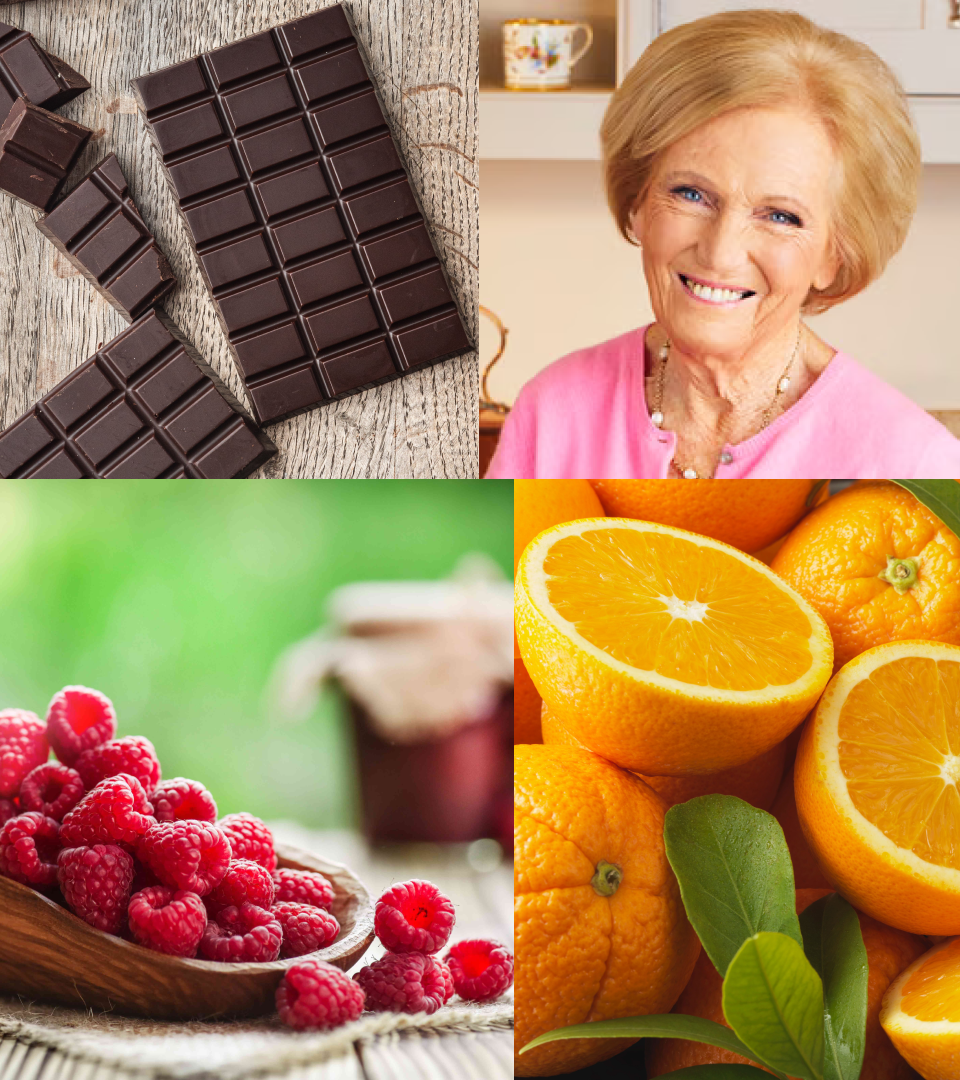
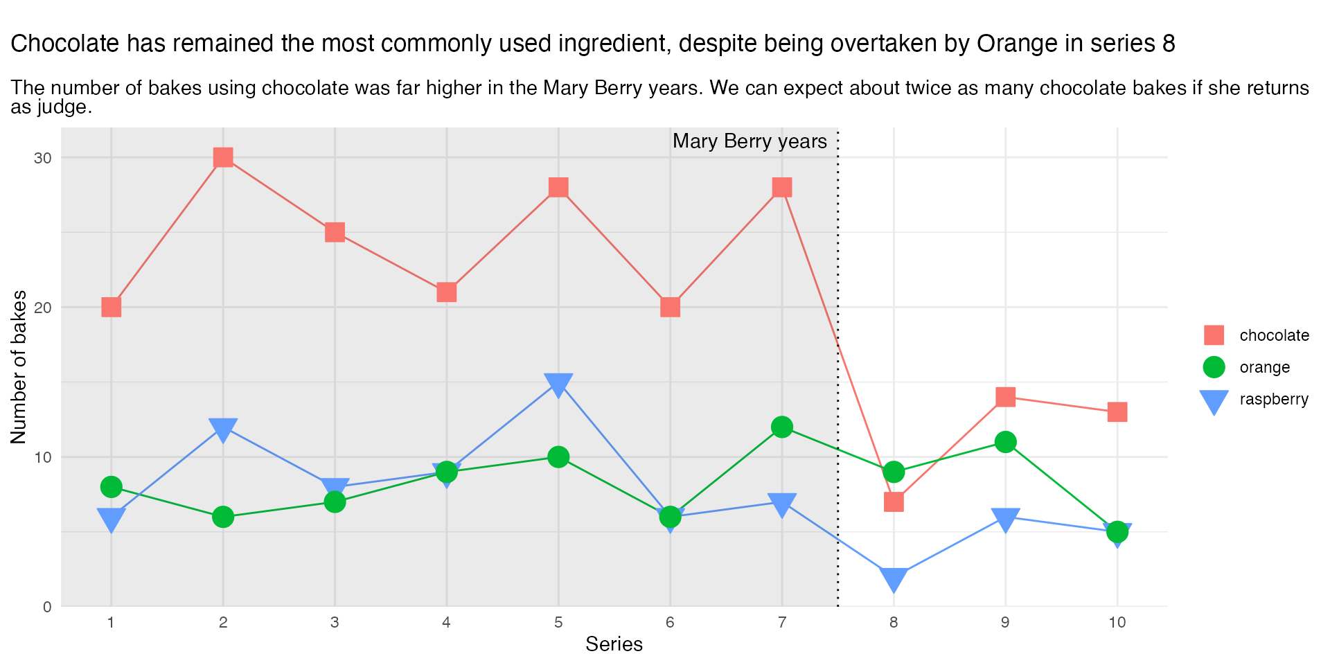
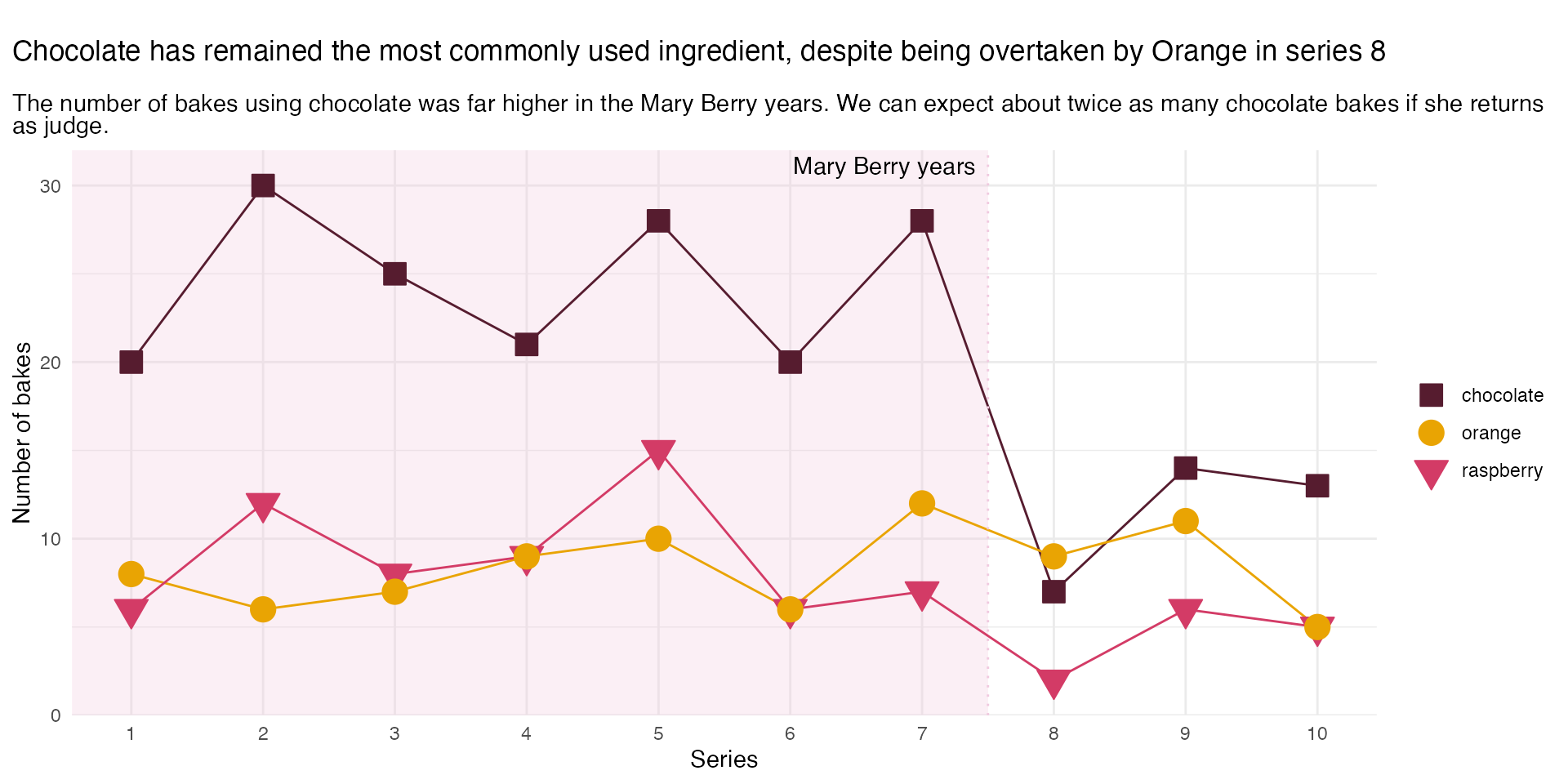
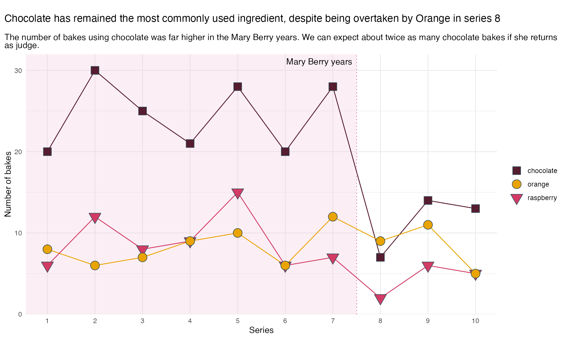
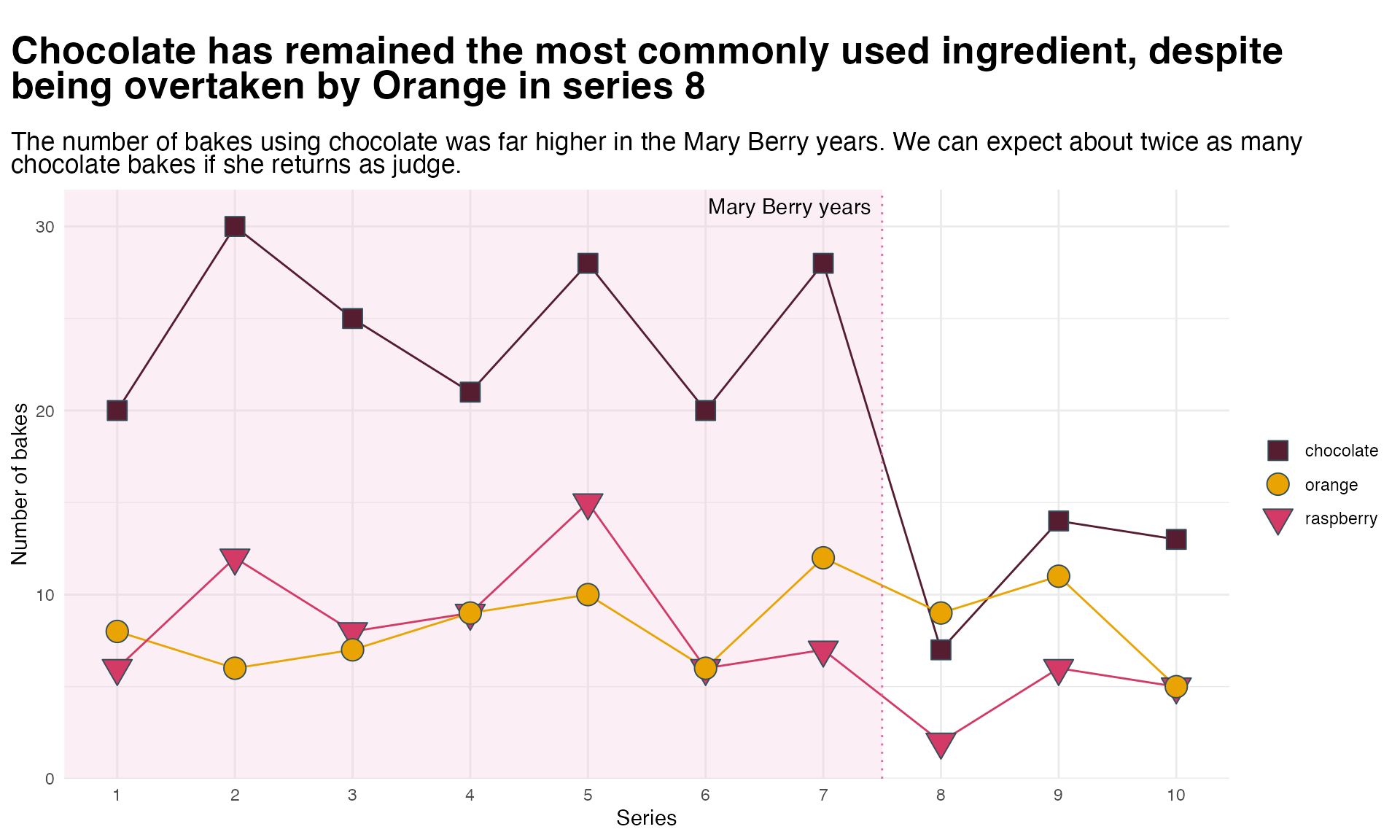
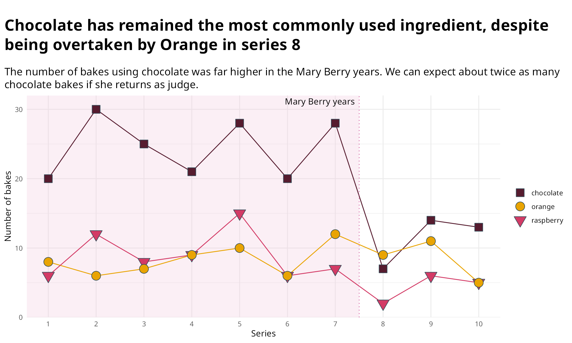
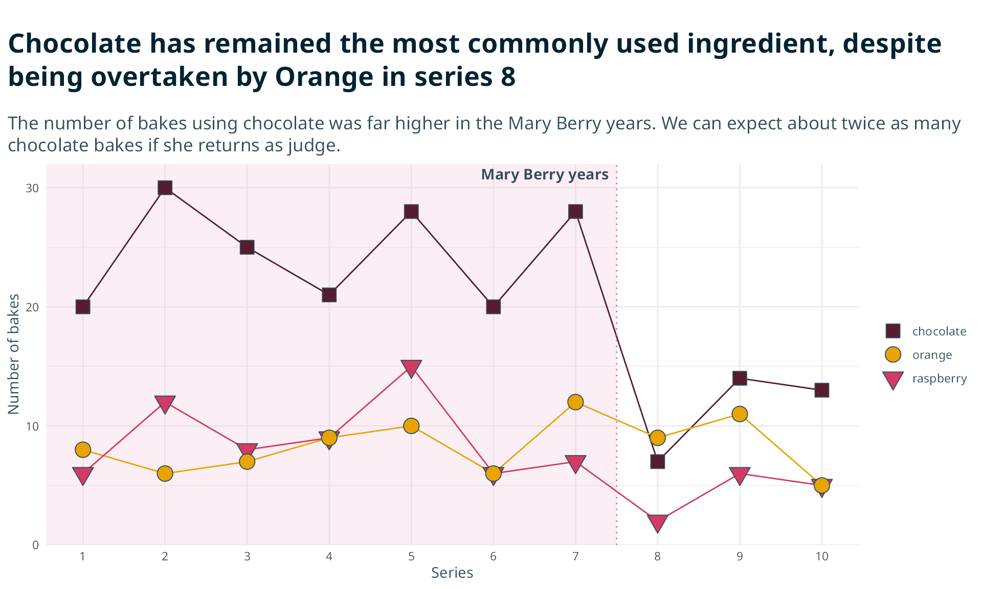
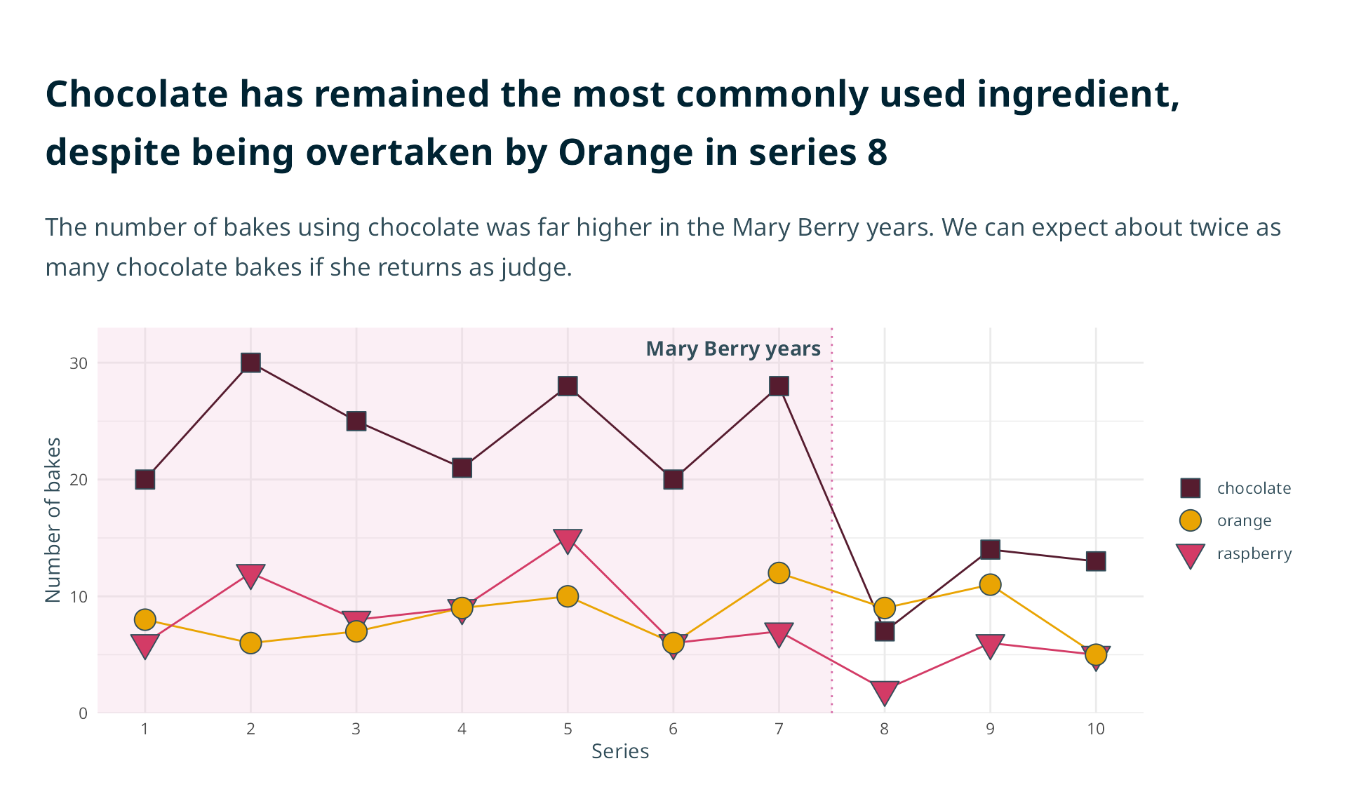
The RSS is hosting the next season of the Great British Bake Off.
Mary Berry might be back.
- How much chocolate should we buy in?
So, what’s the plan?
Your one graph needs to:
- “look like RSS”
- be intuitive
- answer the key question
- and be accessible

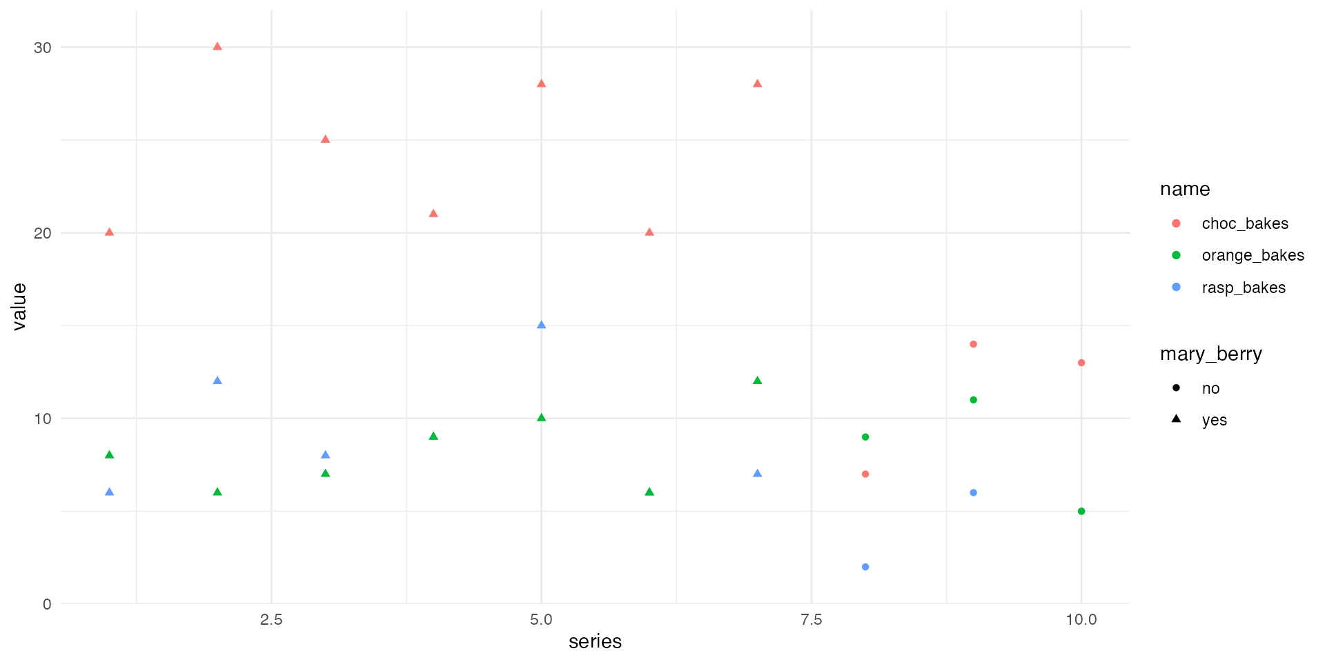
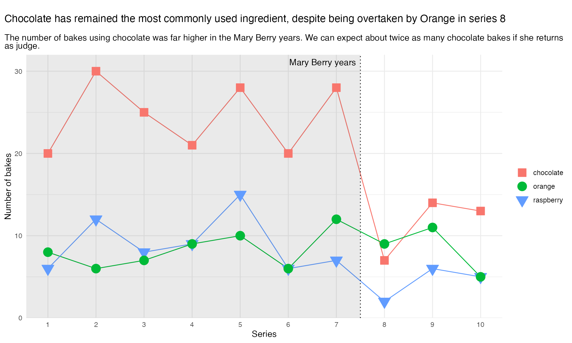
Let’s make a graph
Yikes!
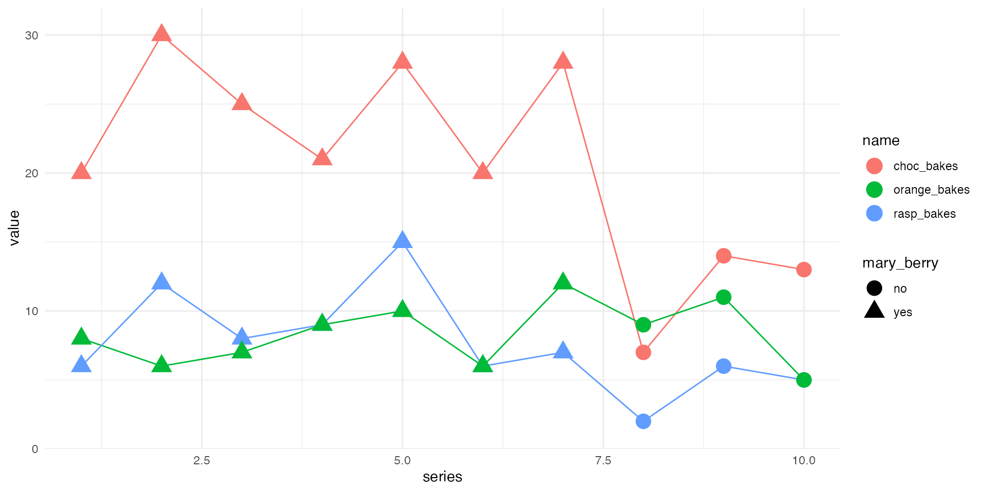
Let’s make a graph
Join the dots + make them bigger!
Let’s make a graph
Use shapes more sensibly
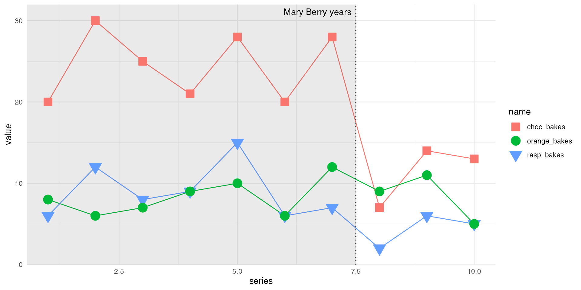
Let’s make a graph
Add some helpful text

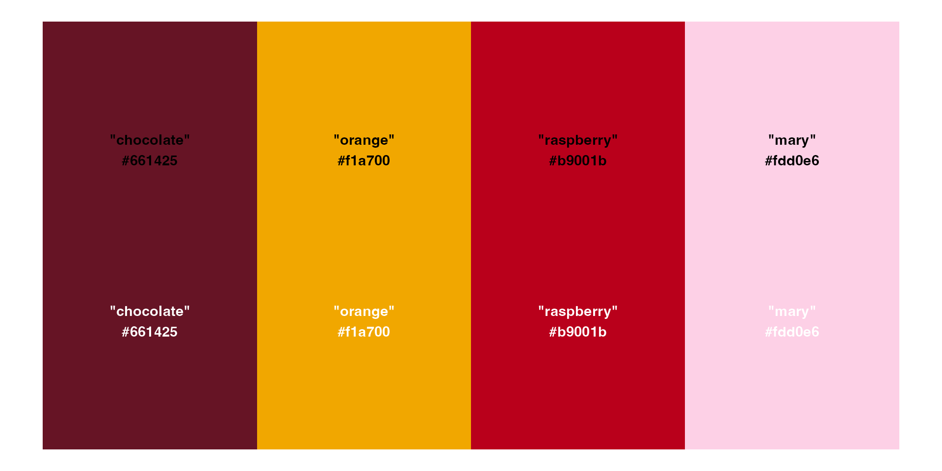
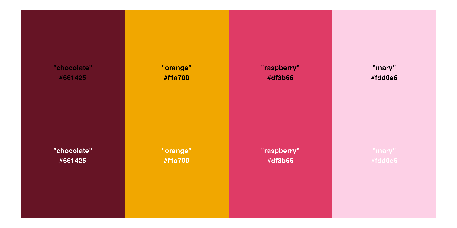
#1 - Choose intuitive colours
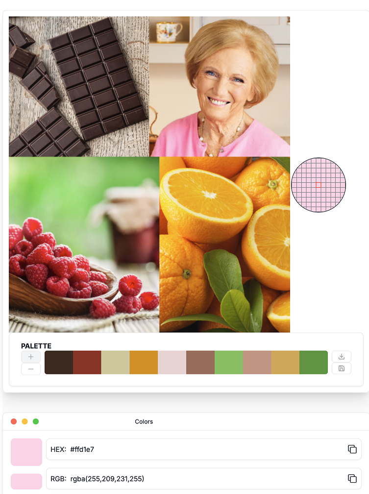
#1 - Choose intuitive colours
#2 - Check for colour-blind friendliness
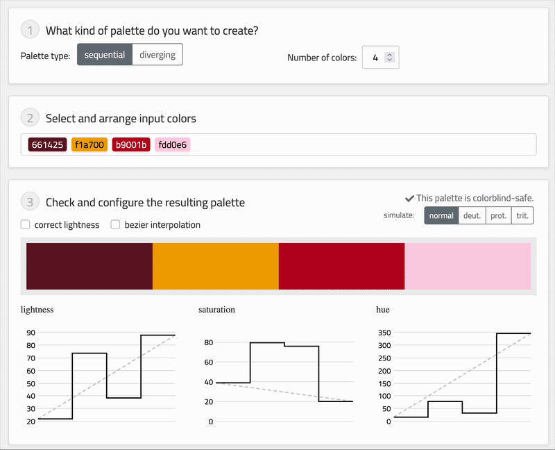
#2 - Check for colour-blind friendliness
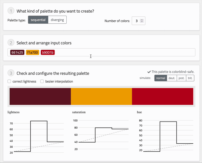
#2 - Check for colour-blind friendliness
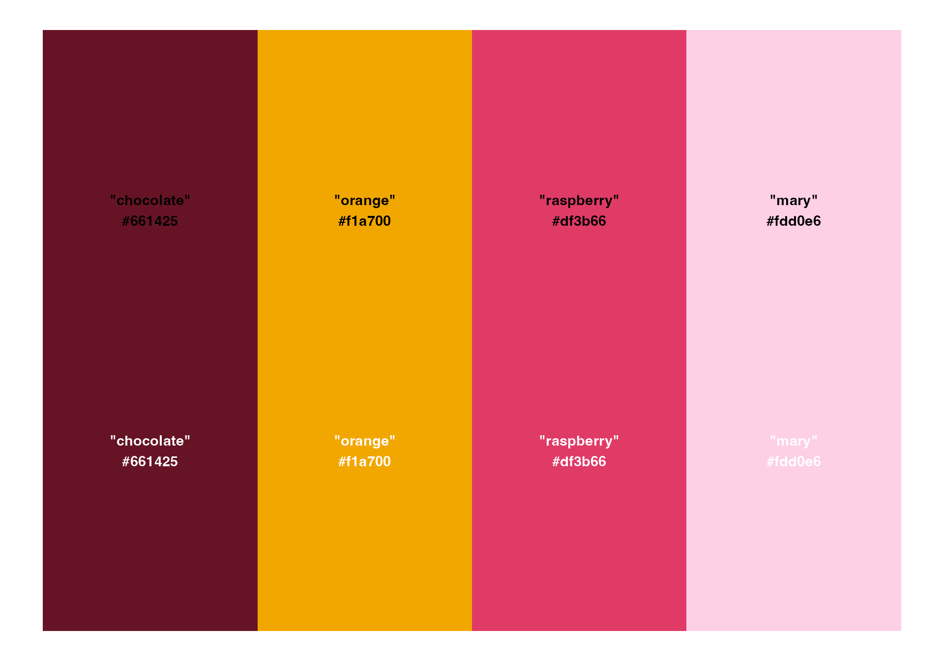
Before

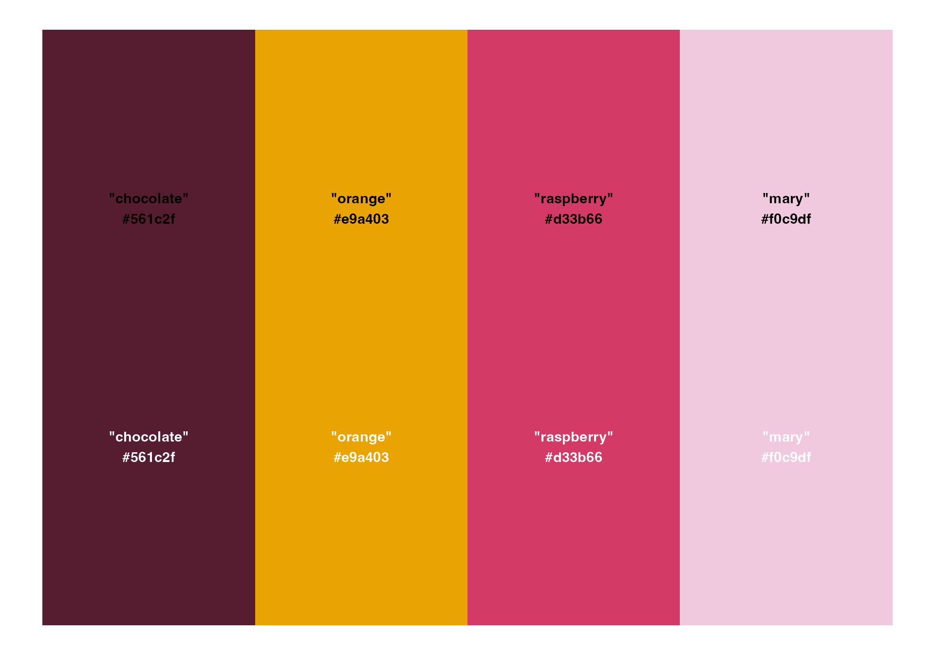
After
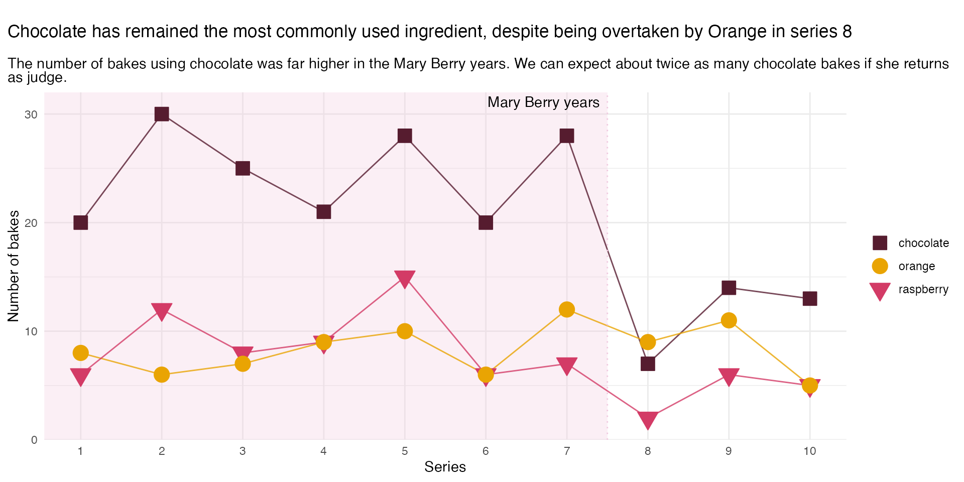
#3 - Blend in your brand colour
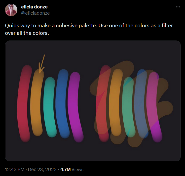
#3 - Blend in your brand colour
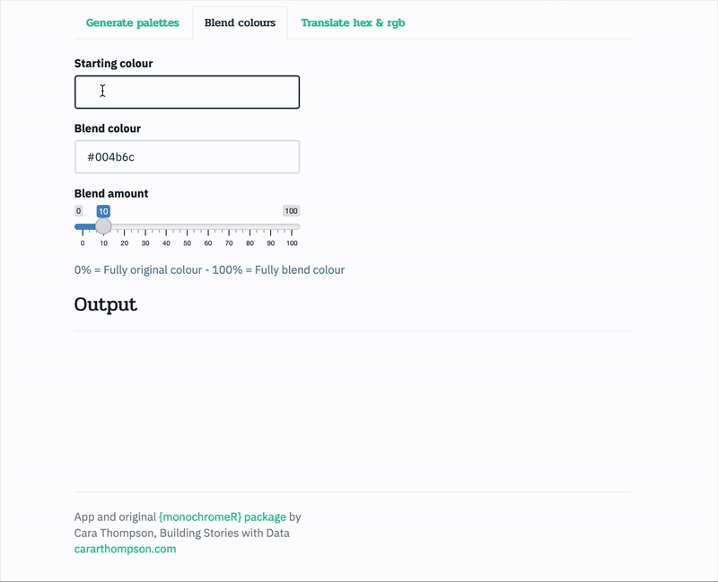
#3 - Blend in your brand colour
Before
After
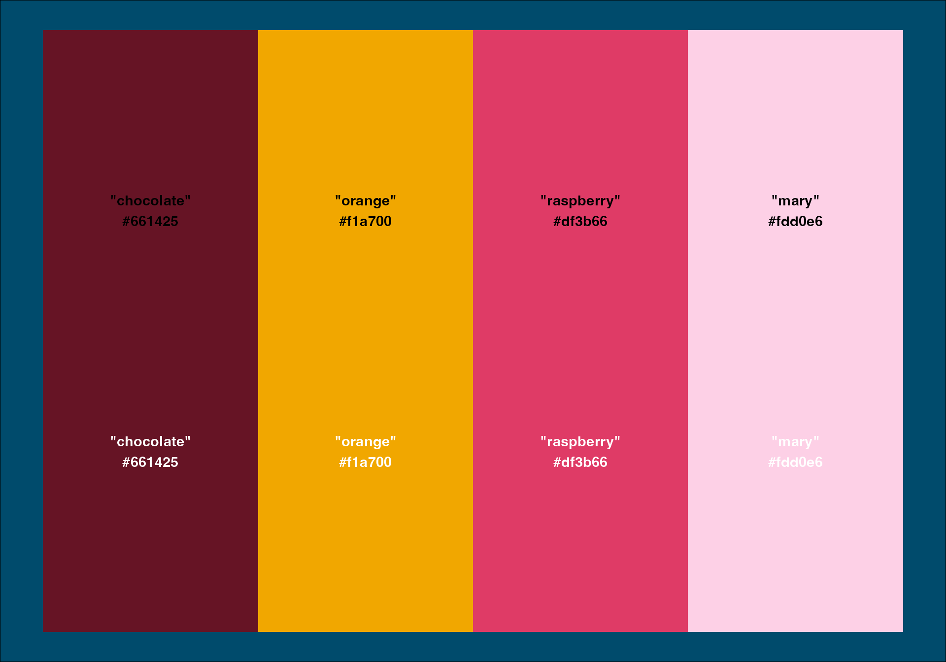
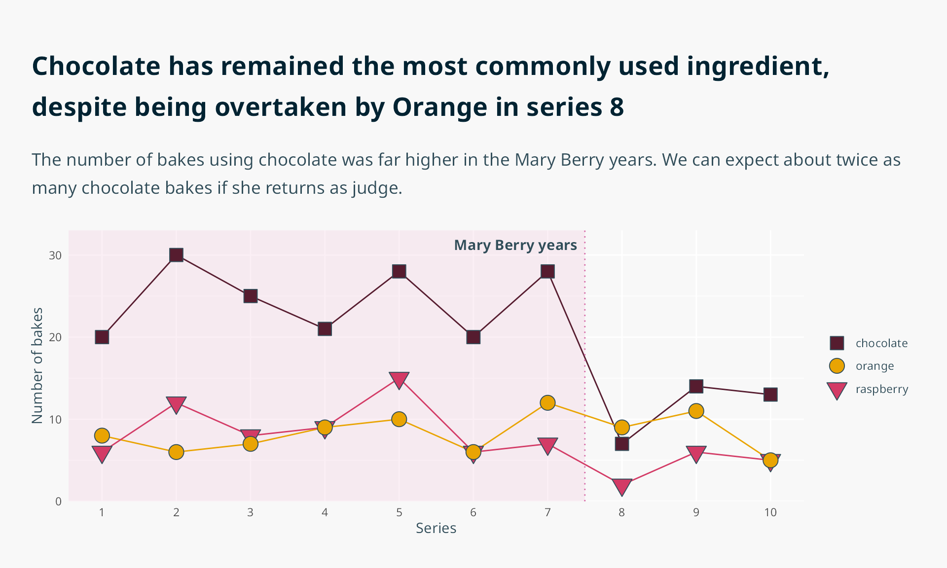
#4 - “Mute” your colours
Before (colour-blind tested)
“For many neurodivergent audiences, there is a preference for muted and pastel hues, and neutral tones.”
- Designing for neurodivergent audiences, Nightingale Issue 03
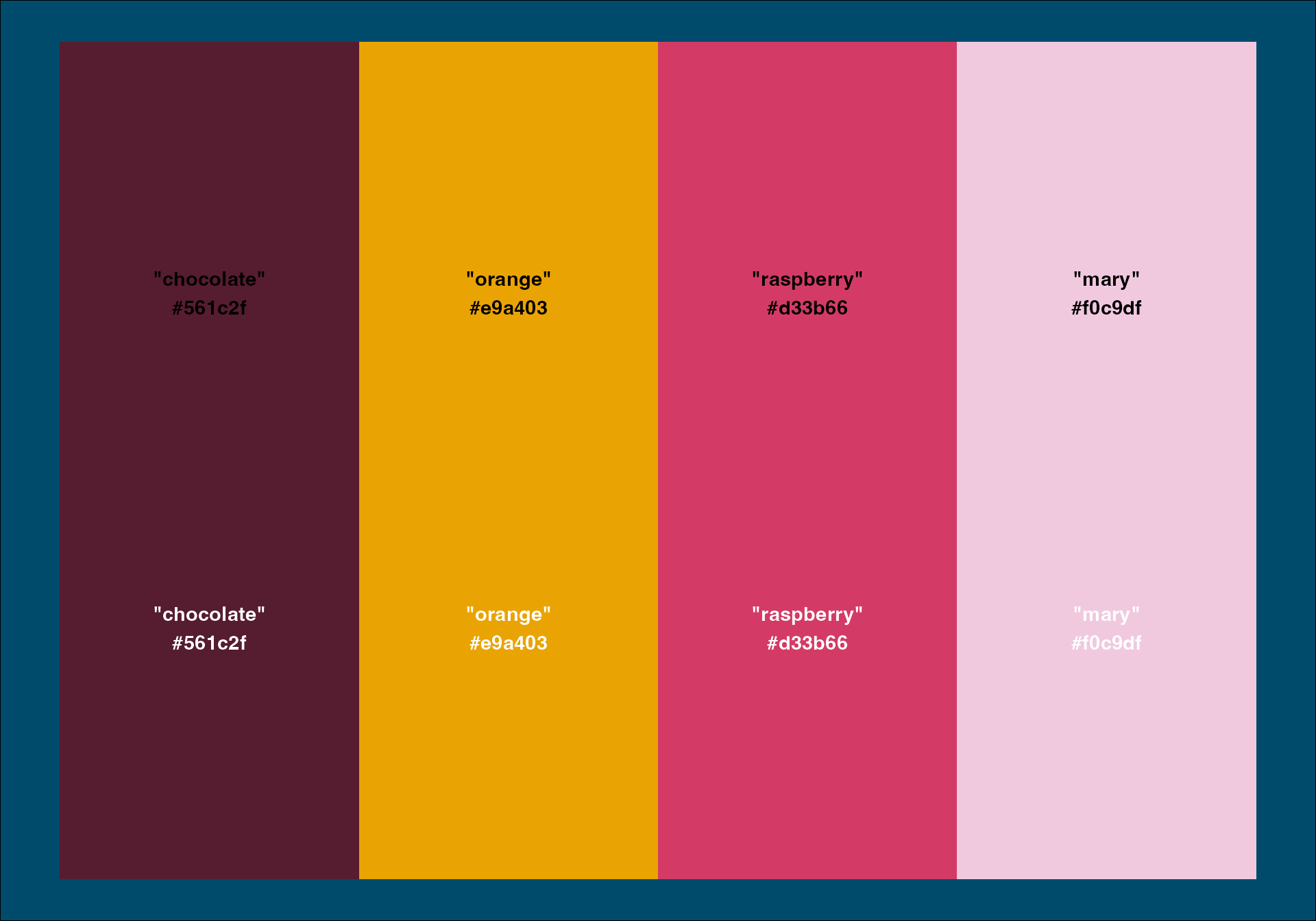
#4 - “Mute” your colours
After (brand colour mixed in)

“For many neurodivergent audiences, there is a preference for muted and pastel hues, and neutral tones.”
- Designing for neurodivergent audiences, Nightingale Issue 03
#4 - “Mute” your colours
After (brand colour mixed in)
Let’s take a look…
Let’s take a look…
#5 - Fix the background-to-foreground issue
#5 - Fix the background-to-foreground issue
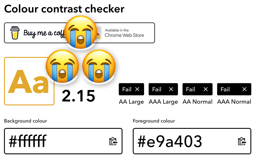
#5 - Fix the background-to-foreground issue
#5 - Fix the background-to-foreground issue
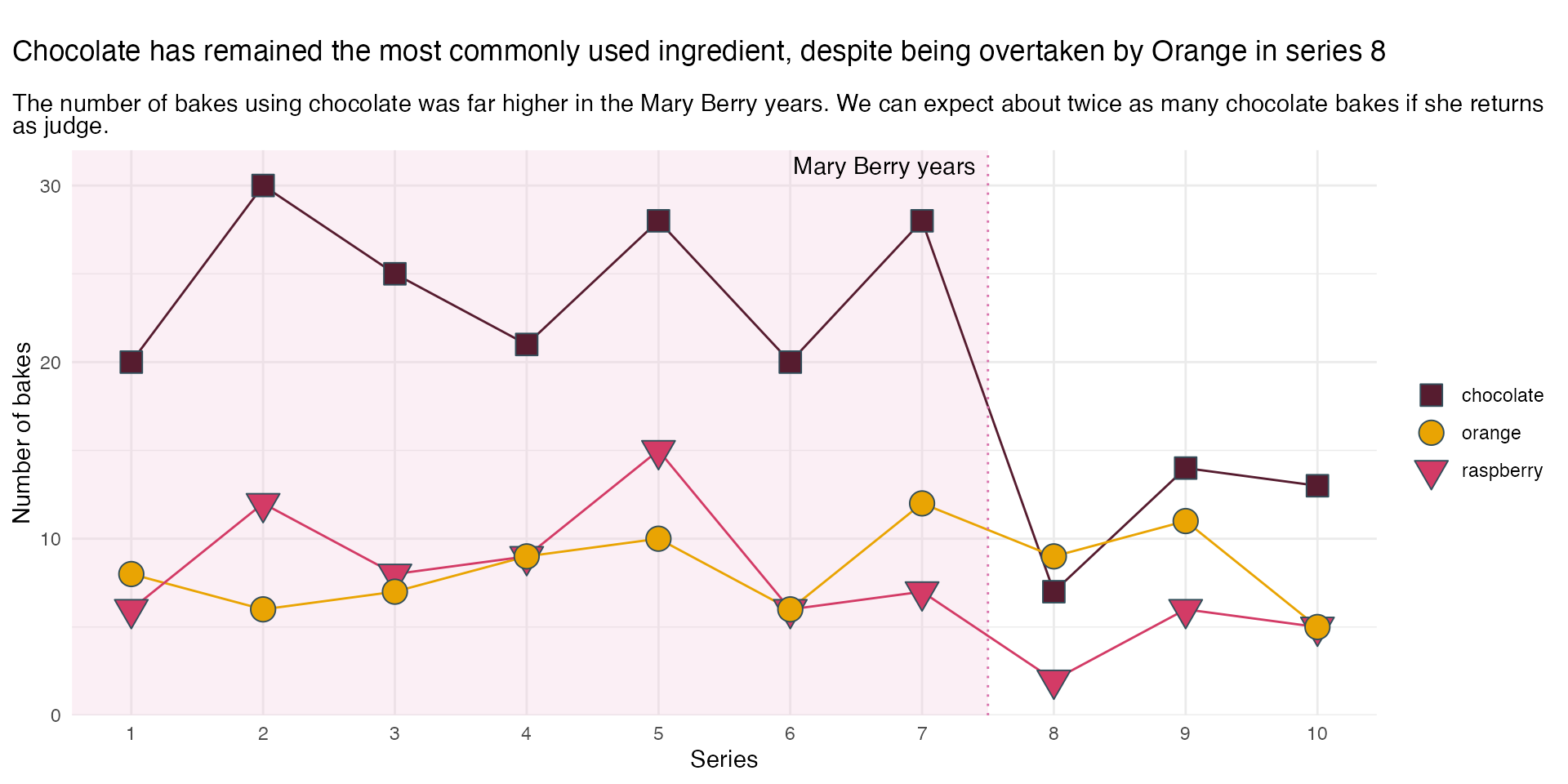
#6 - Improve text hierarchy
#6 - Improve text hierarchy
#6 - Improve text hierarchy

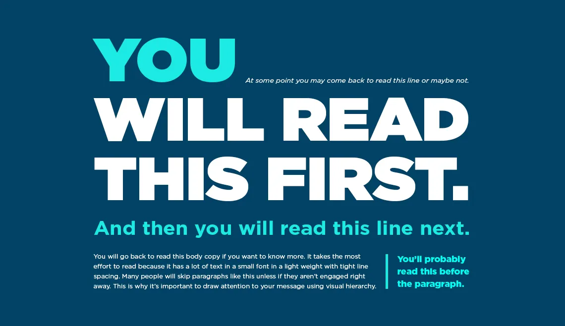
#7 - Add personality & readability
#7 - Add personality & readability
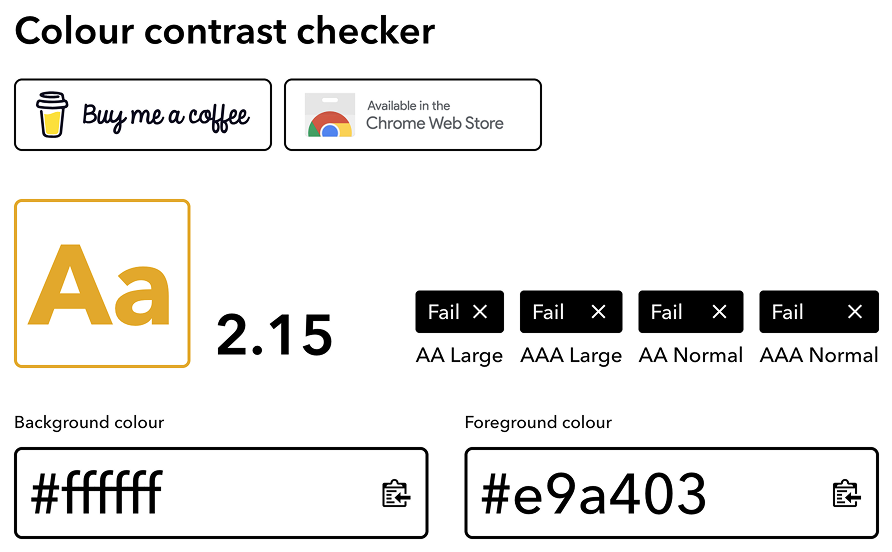
#8 - Optimise your text colours
#9 - Give everything space to breathe
#10 - Give the plot a background

#10 - Give the plot a background
Recap
Recap

Over to you…

Over to you…
![]()