machine <- "#061939"
human <- "#e25470"
monochromeR::generate_palette(machine,
                              blend_colour = human,
                              n_colours = 3,
                              view_palette = TRUE)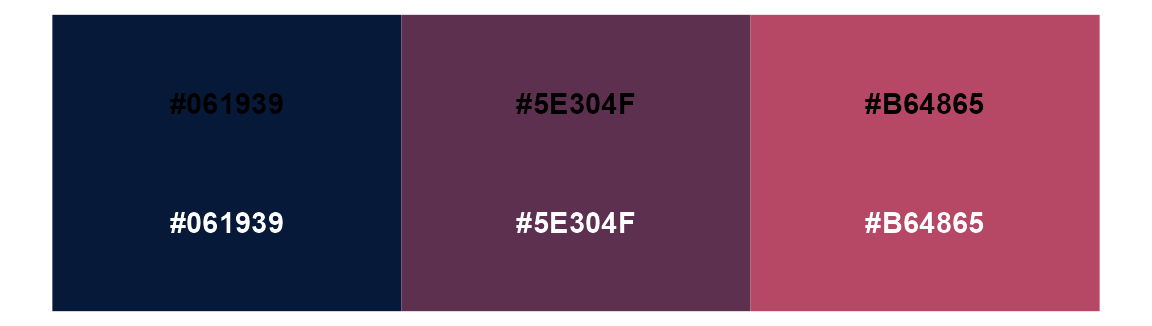
NHS-R 2022 | Online Workshop | 4th November 2022
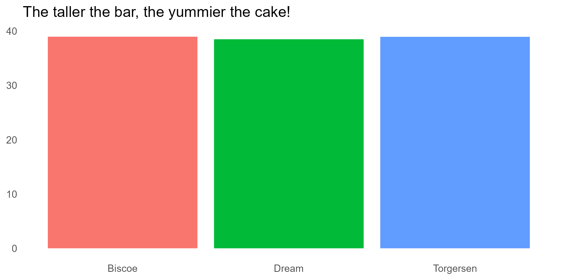
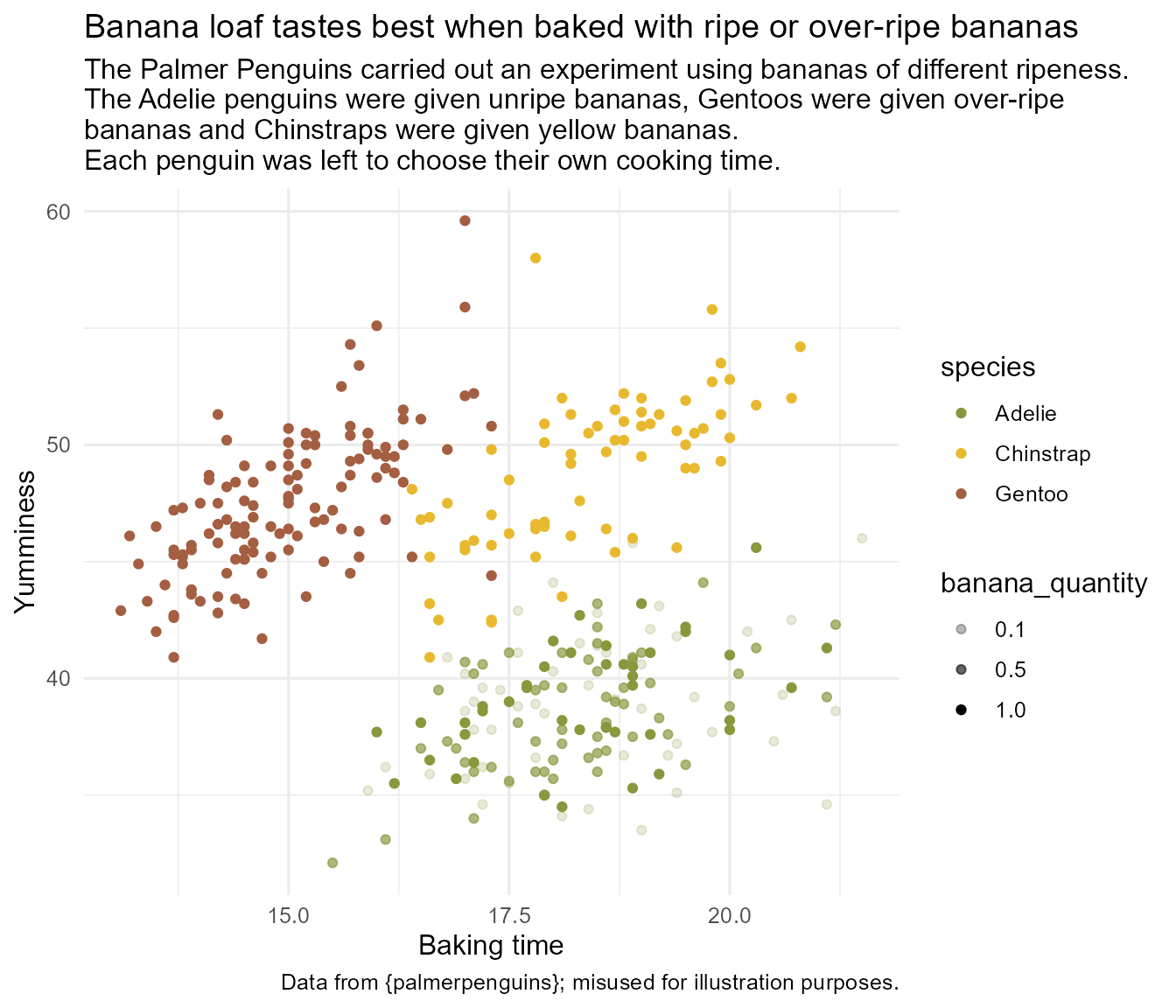
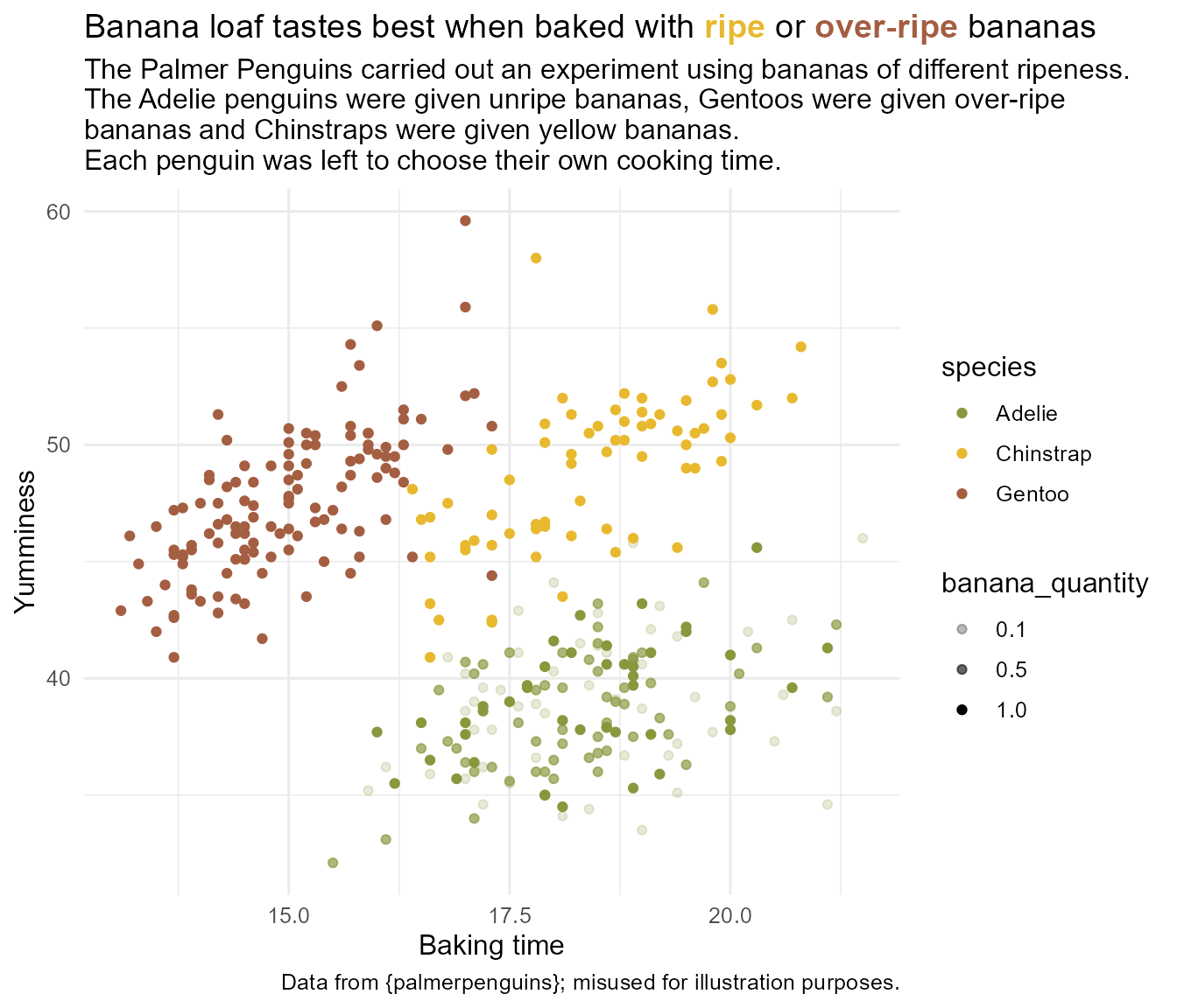
The penguins had a baking competition to see which species could make the best banana loaf. Each species was given bananas of a different level of ripeness.
The penguins had a baking competition to see which species could make the best banana loaf. Each species was given bananas of a different level of ripeness.
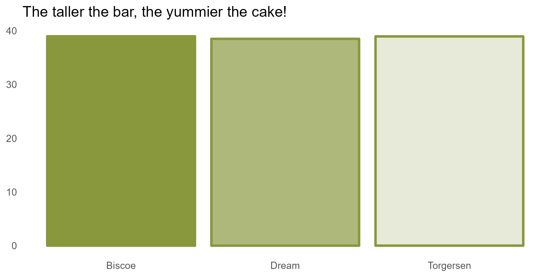
The Adelie penguins decided to experiment with different quantities of banana in their mix. Each island chose a different quantity.
The Adelie penguins decided to experiment with different quantities of banana in their mix. Each island chose a different quantity.
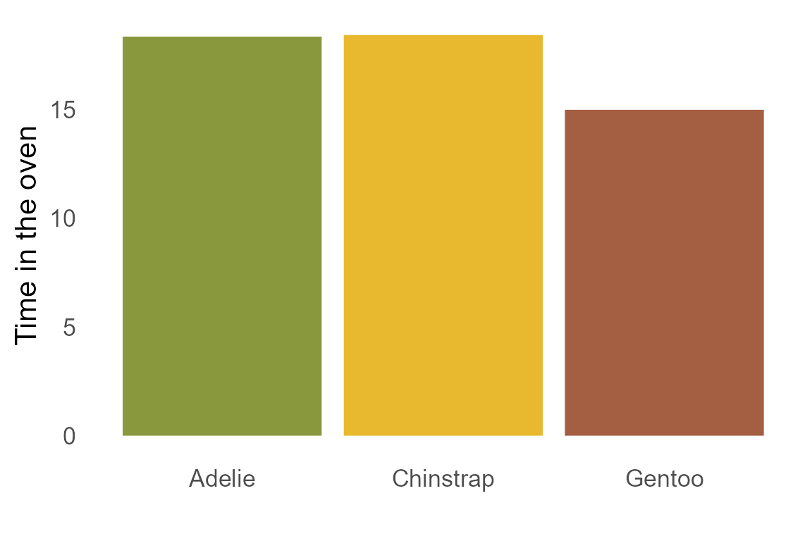
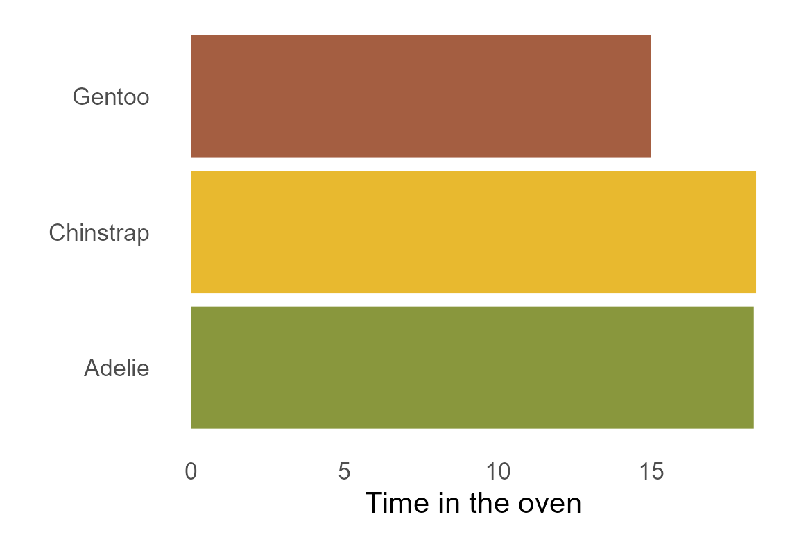
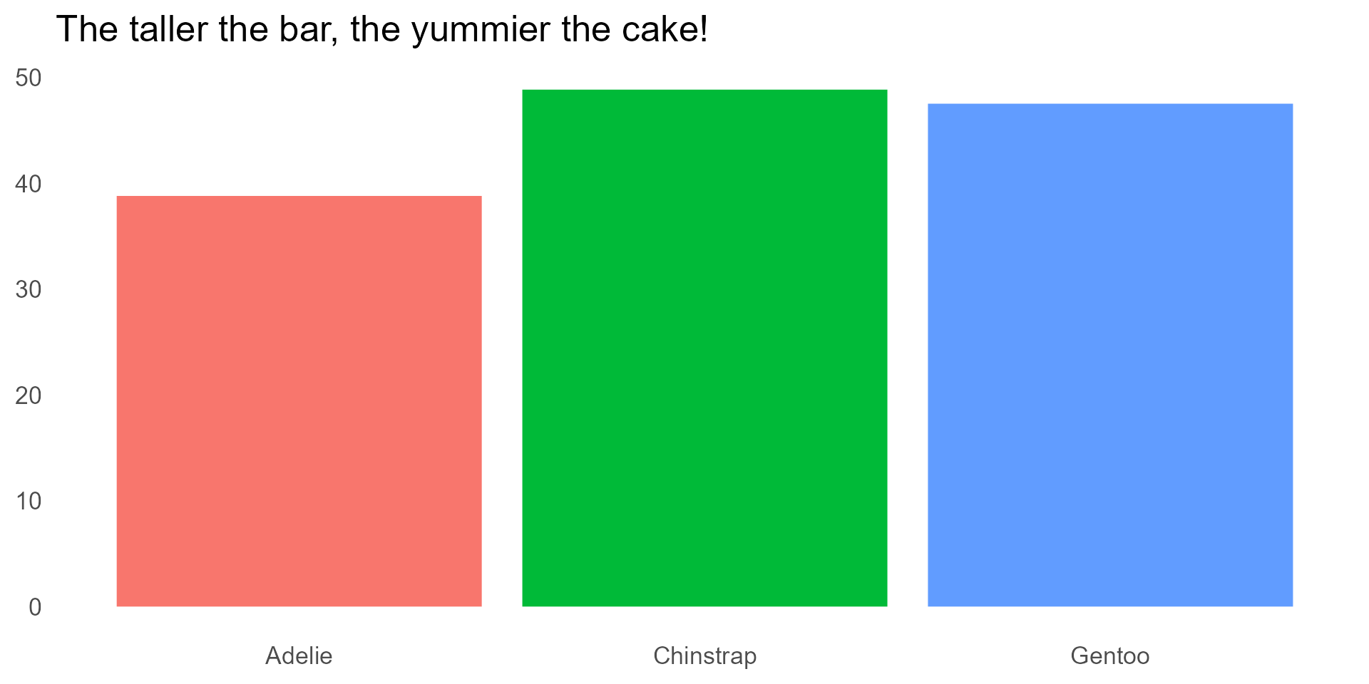
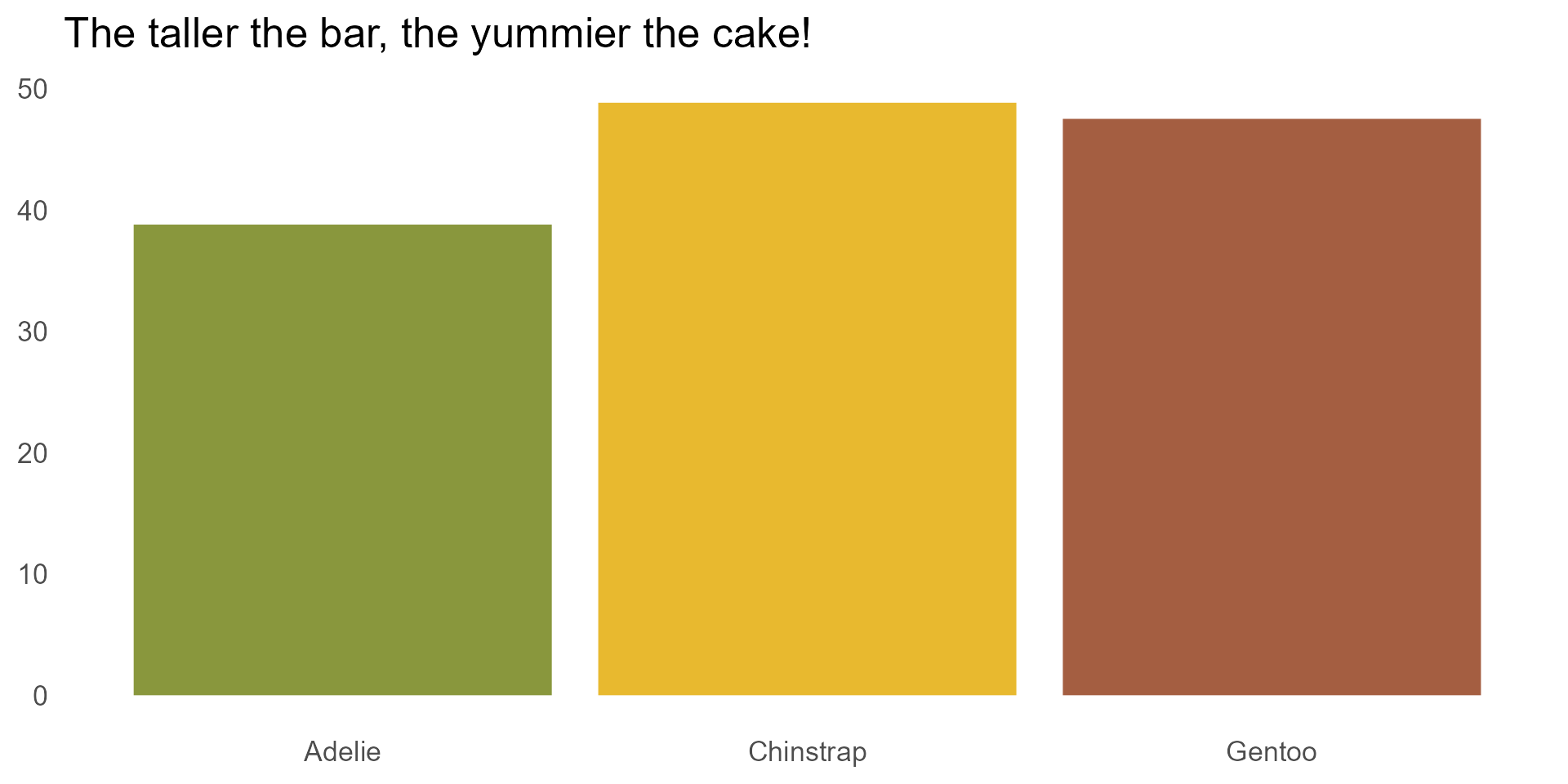
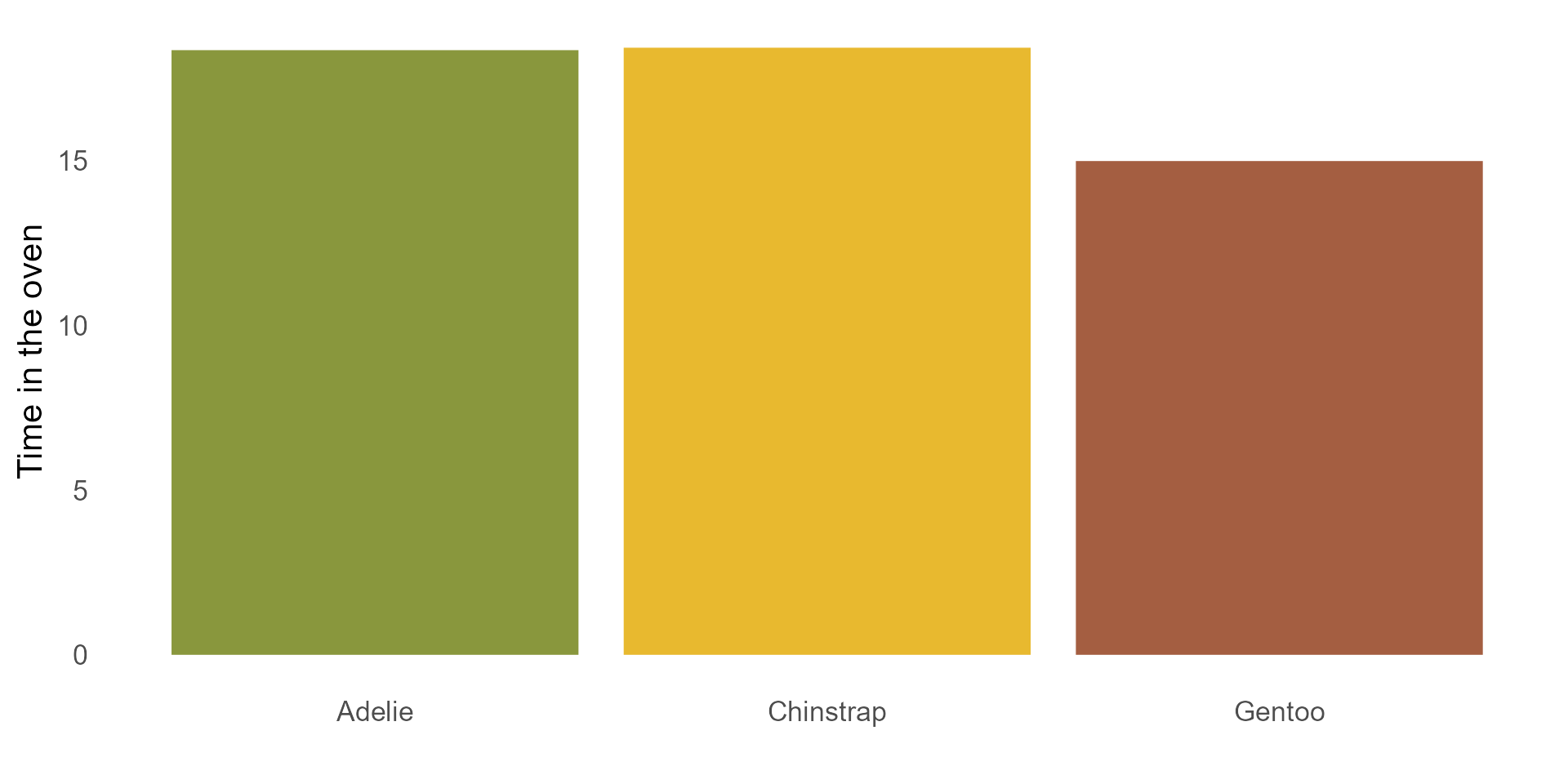
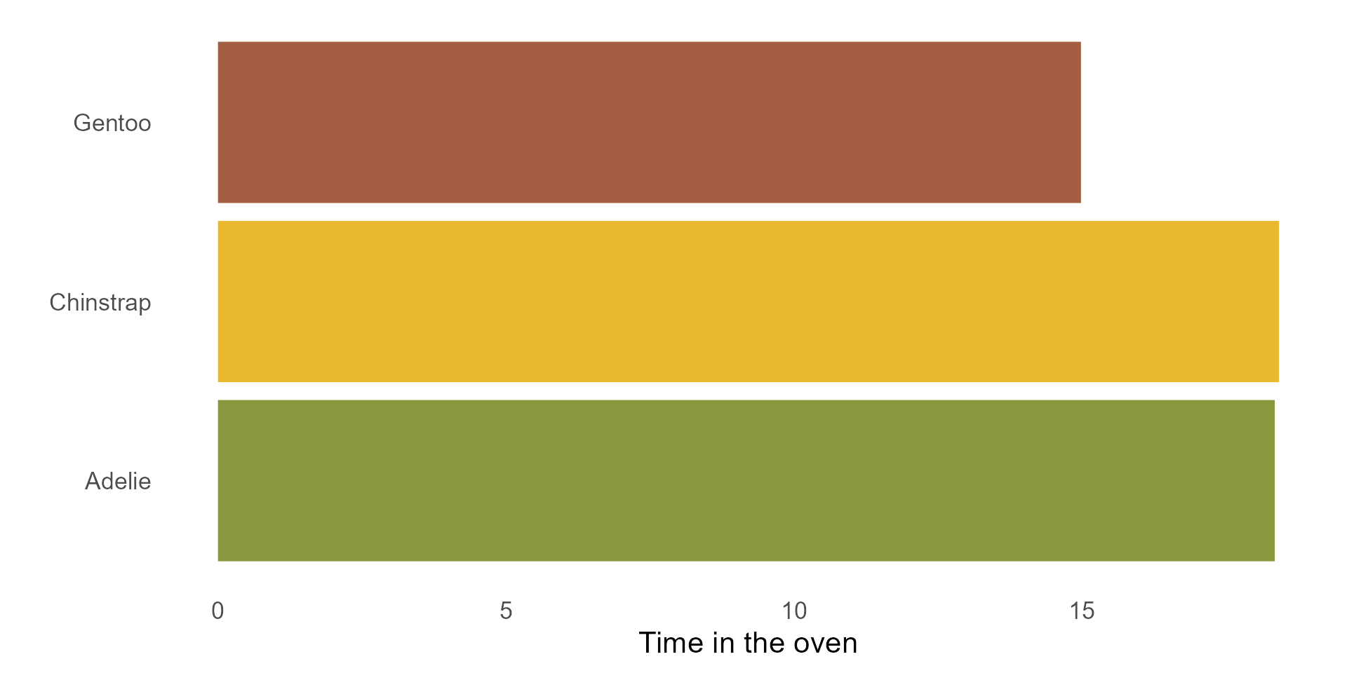
The penguins also baked their cakes for different amounts of time. Here are the mean durations per species. Which species left their cakes in the oven for longest?
The penguins also baked their cakes for different amounts of time. Here are the mean durations per species. Which species left their cakes in the oven for longest?
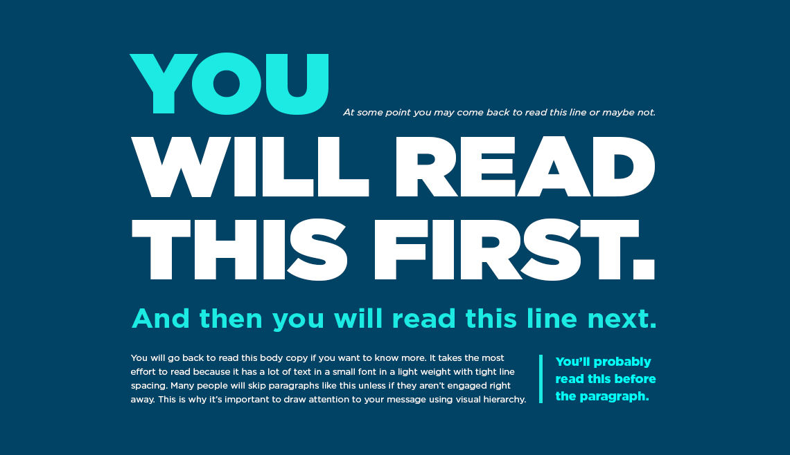
Make it easy for the readers to remember what is what.
But my research isn’t about bananas!
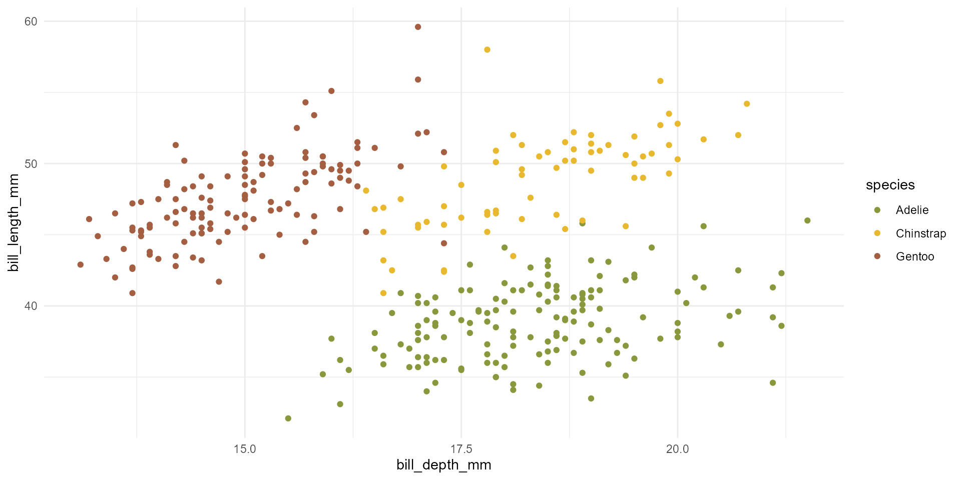
Ripeness & quantities, baking duration (bill depth), yumminess (bill length)
Ripeness & quantities, baking duration (bill depth), yumminess (bill length)
Ripeness & quantities, baking duration (bill depth), yumminess (bill length)
Ripeness & quantities, baking duration (bill depth), yumminess (bill length)
Ripeness & quantities, baking duration (bill depth), yumminess (bill length)
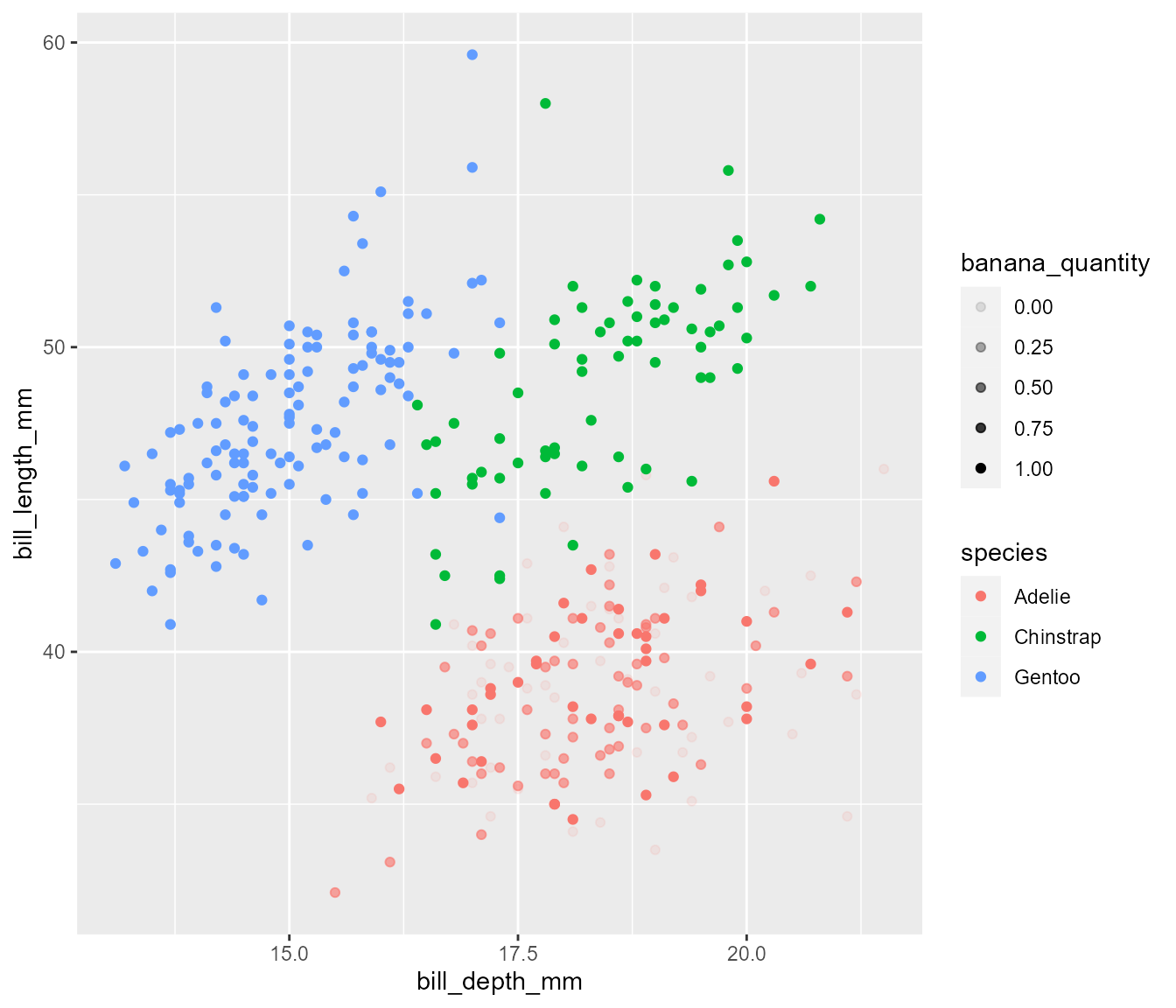
basic_plot <- ggplot(penguins,
aes(x = bill_depth_mm,
y = bill_length_mm,
colour = species)) +
geom_point(aes(alpha = banana_quantity)) +
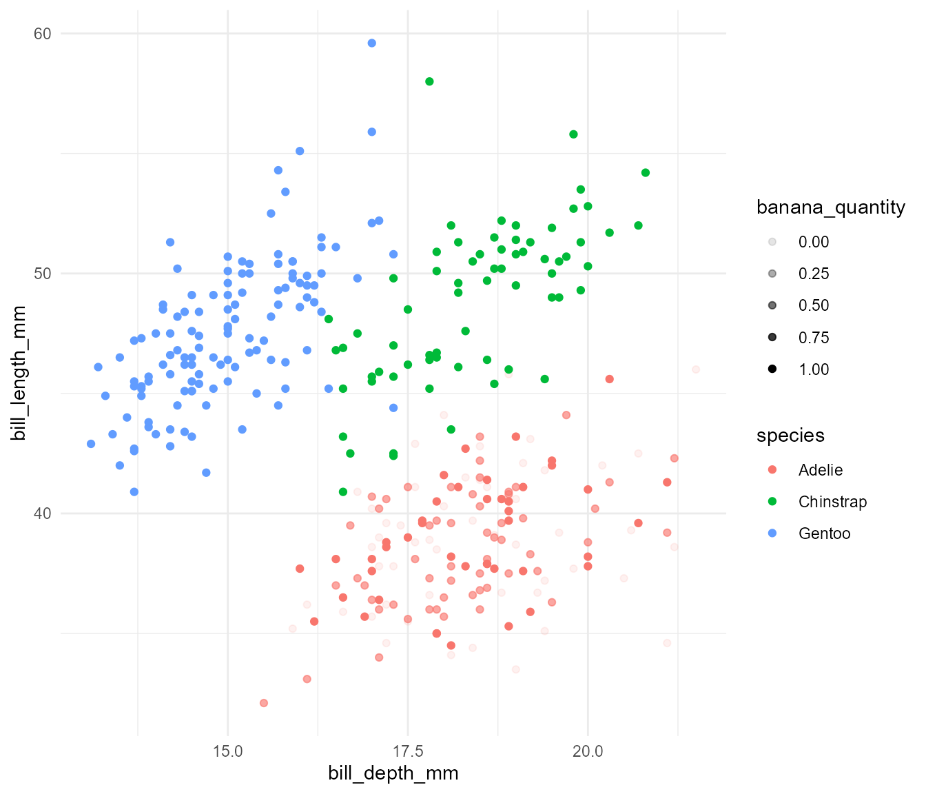
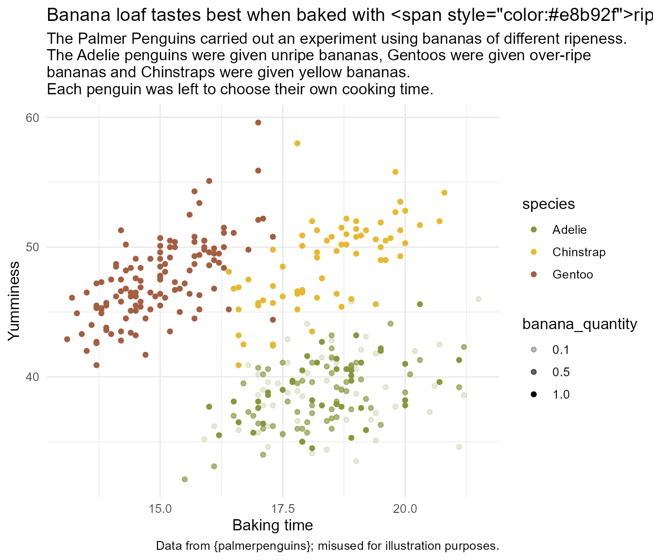
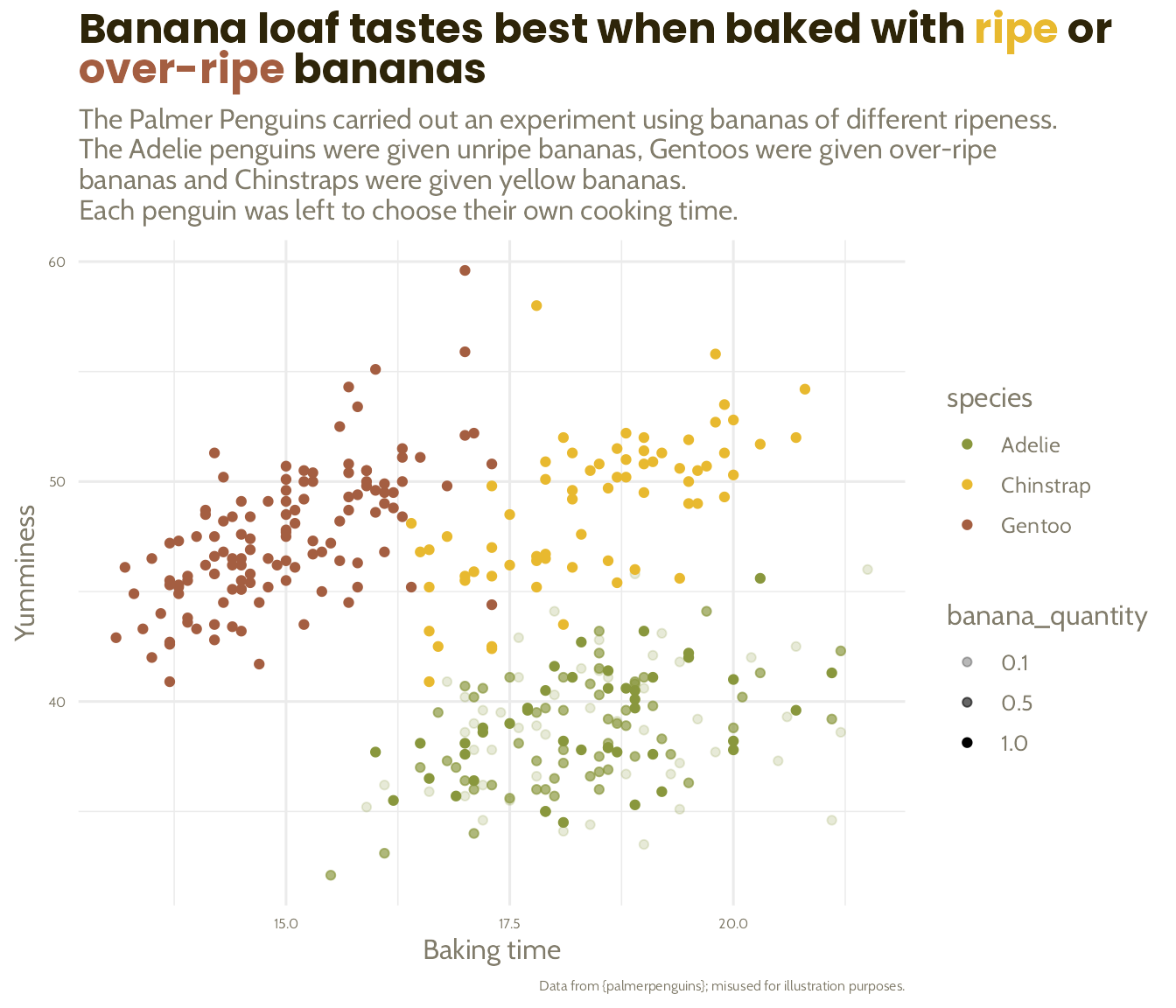
labs(title = "Banana loaf tastes best when baked with ripe or over-ripe bananas",
subtitle = "The Palmer Penguins carried out an experiment using bananas of different ripeness.
The Adelie penguins were given unripe bananas, Gentoos were given over-ripe
bananas and Chinstraps were given yellow bananas.
Each penguin was left to choose their own cooking time.",
x = "Baking time",
y = "Yumminess",
caption = "Data from {palmerpenguins}; misused for illustration purposes.") +
scale_alpha(range = c(0.2, 1),
breaks = c(0.1, 0.5, 1)) +
theme_minimal(base_size = 12)
basic_plot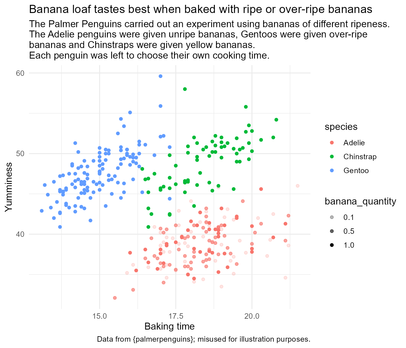
Adelie = Unripe, Chinstrap = Ripe, Gentoo = Over-ripe
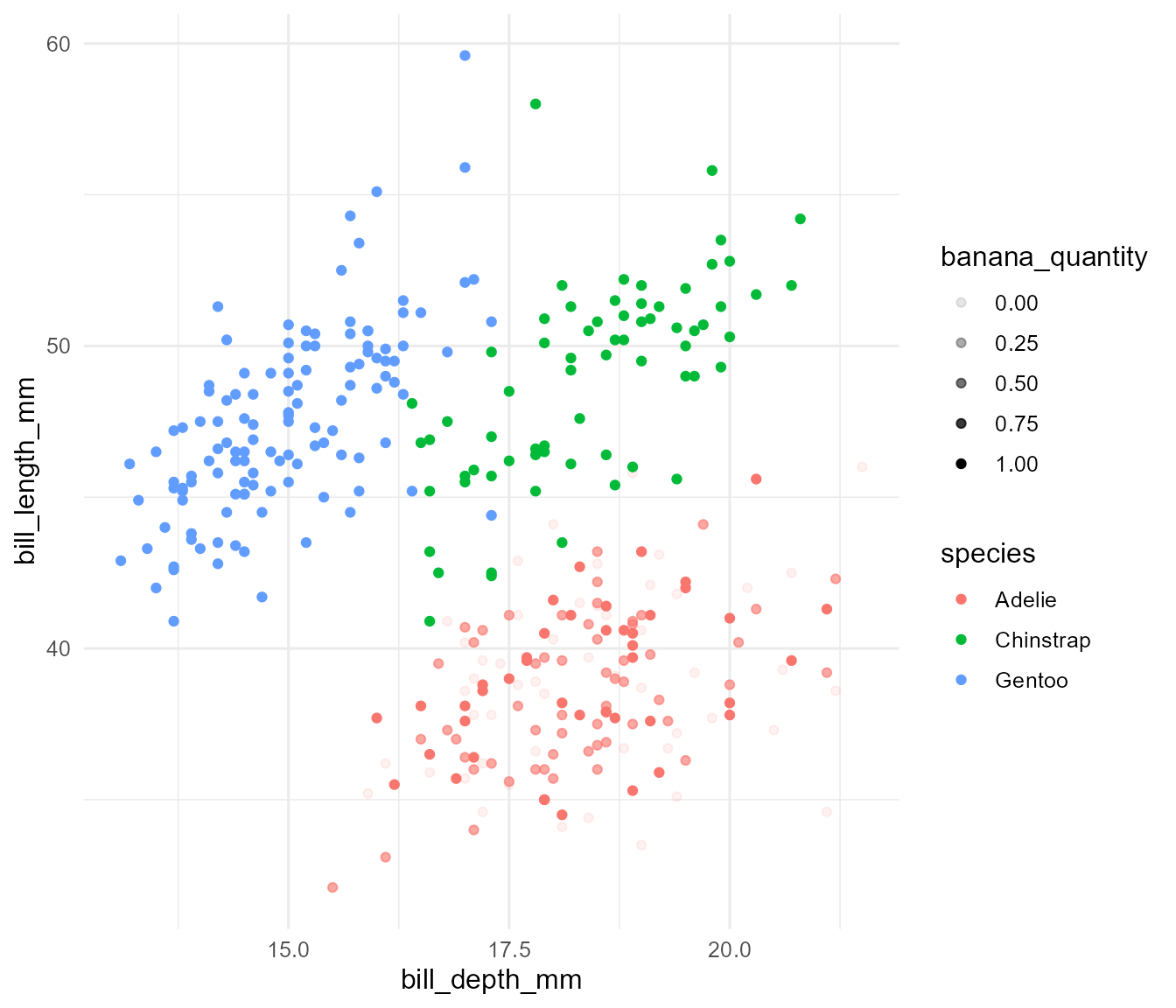
The quick fix…
… might be a dangerous shortcut!
ggplot(penguins %>%
         # Oh, that should be a factor,
         # let me fix that for you!
         mutate(species =
                  factor(species,
                         levels = c("Chinstrap",
                                    "Gentoo",
                                    "Adelie"))),
       aes(x = bill_depth_mm,
           y = bill_length_mm,
           colour = species)) +
  geom_point() +
  theme_minimal() +
  scale_colour_manual(values = c("#89973d",
                                 "#e8b92f",
                                 "#a45e41"))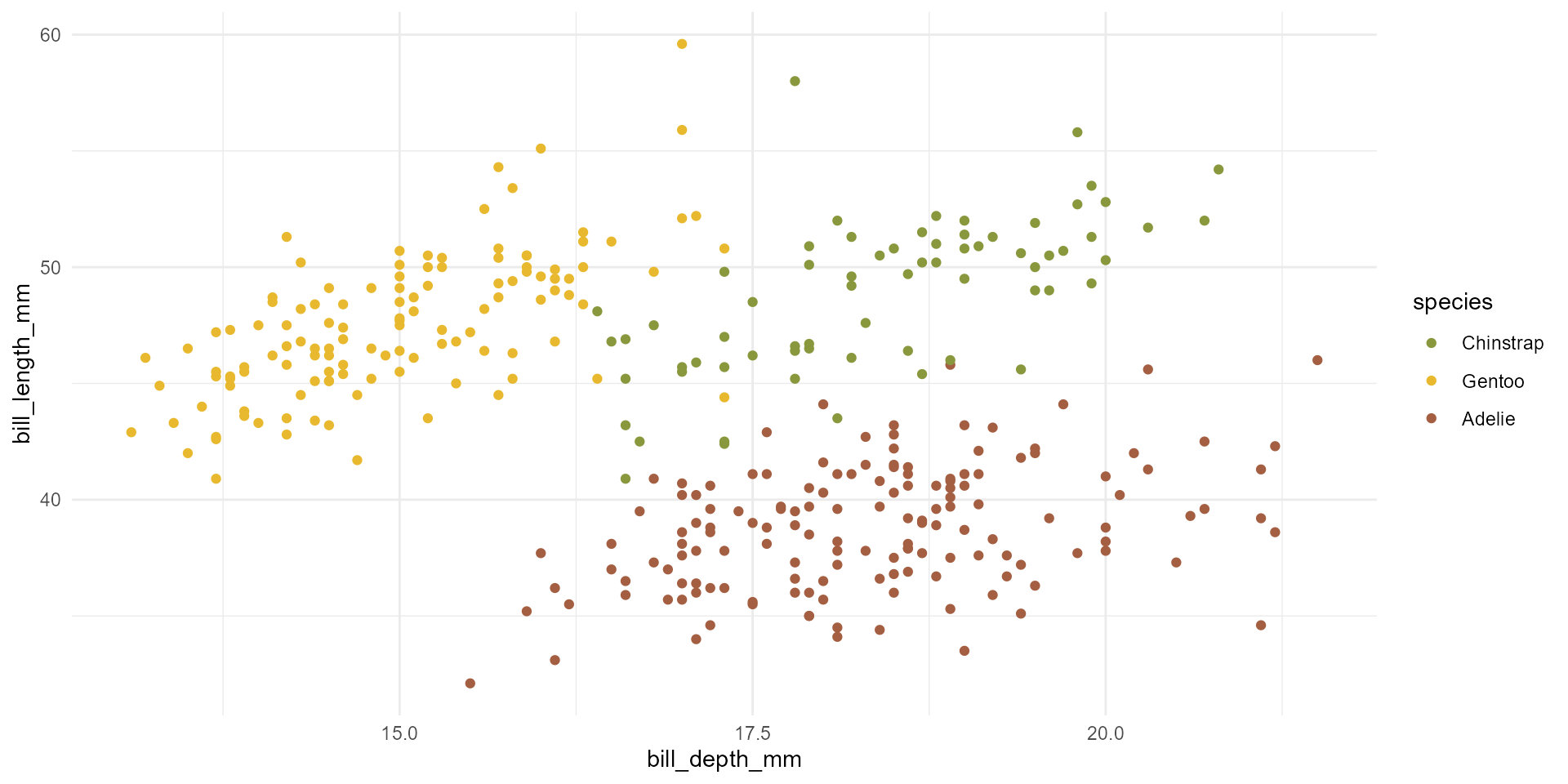
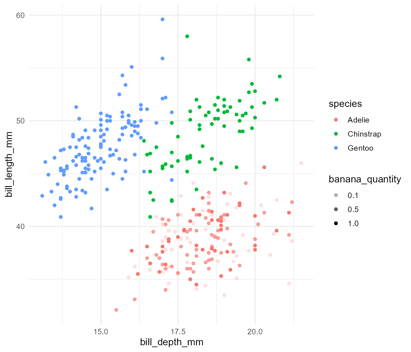
Create a named list!
Create a named list!
banana_colours <- list("Adelie" = "#89973d",
                       "Chinstrap" = "#e8b92f",
                       "Gentoo" = "#a45e41")

ggplot(penguins %>%
         # Oh, that should be a factor,
         # let me fix that for you!
         mutate(species =
                  factor(species,
                         levels = c("Chinstrap",
                                    "Gentoo",
                                    "Adelie"))),
       aes(x = bill_depth_mm,
           y = bill_length_mm,
           colour = species)) +
  geom_point() +
  theme_minimal() +
  scale_colour_manual(values = banana_colours)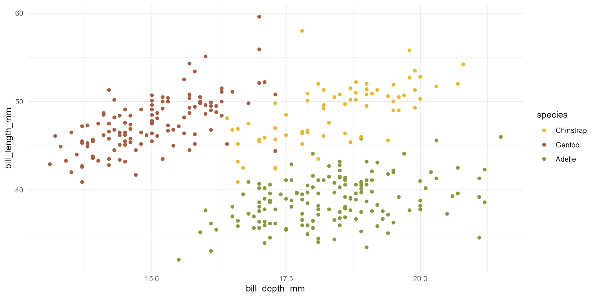
Create a named list!


We’ve done this already!
Say hello to 📦 {ggtext}
Say hello to 📦 {ggtext}
basic_plot +
  scale_colour_manual(values = banana_colours) +
  labs(title = paste0(
    "Banana loaf tastes best when baked with ",
    "<span style=\"color:", banana_colours$Chinstrap,
    "\">ripe</span> or <span style=\"color:",
banana_colours$Gentoo, "\">over-ripe</span> bananas")) +
theme(plot.title = ggtext::element_markdown())
When using colour, make sure the text is still readable; use “bold” if needed
basic_plot +
  scale_colour_manual(values = banana_colours) +
  labs(title = paste0(
    "Banana loaf tastes best when baked with ",
    "<span style=\"color:", banana_colours$Chinstrap,
    "\">**ripe**</span> or <span style=\"color:",
    banana_colours$Gentoo, "\">**over-ripe**</span> bananas")) +
  theme(plot.title = ggtext::element_markdown())


Two more colours for our palette - Starting from the main banana colour, we go darker for dark text - We then go lighter from there to create a light text colour
dark_text <- monochromeR::generate_palette(
  banana_colours$Chinstrap, "go_darker",
  n_colours = 2)[2]

light_text <-  monochromeR::generate_palette(
  dark_text, "go_lighter",
  n_colours = 3)[2]

banana_colours <- list("Adelie" = "#89973d",
                       "Chinstrap" = "#e8b92f",
                       "Gentoo" = "#a45e41",
                       "dark_text" = dark_text,
                       "light_text" = light_text)

monochromeR::view_palette(banana_colours)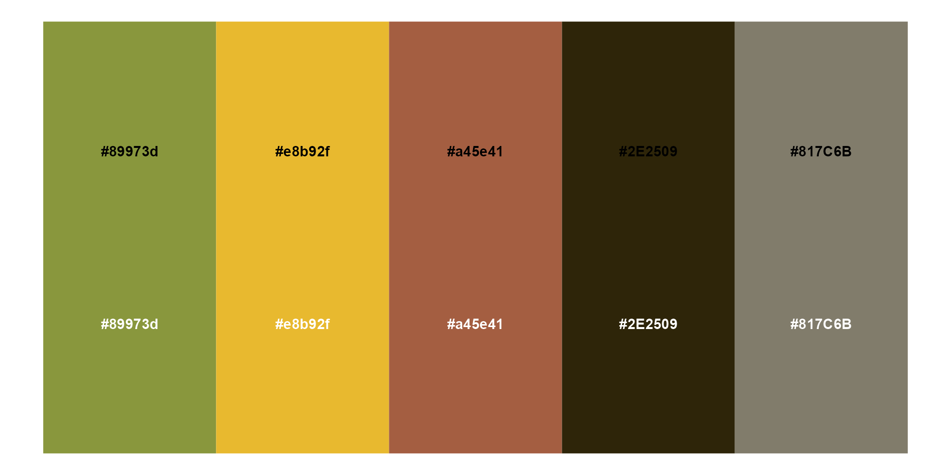
Make sure they don’t appear in the legend!
basic_plot +
  scale_colour_manual(values = banana_colours,
                      limits = force) +
  labs(title = paste0(
    "Banana loaf tastes best when baked with ",
    "<span style=\"color:", banana_colours$Chinstrap,
    "\">**ripe**</span> or <span style=\"color:",
    banana_colours$Gentoo, "\">**over-ripe**</span> bananas")) +
  theme(plot.title = ggtext::element_markdown())
Add a base colour and font for text
basic_plot +
  scale_colour_manual(values = banana_colours, limits = force) +
  labs(title = paste0(
    "Banana loaf tastes best when baked with ",
    "<span style=\"color:", banana_colours$Chinstrap,
    "\">**ripe**</span> or <span style=\"color:",
    banana_colours$Gentoo, "\">**over-ripe**</span> bananas")) +
  theme(text = element_text(family = "Cabin",
                            colour = banana_colours$light_text),
        plot.title = ggtext::element_markdown())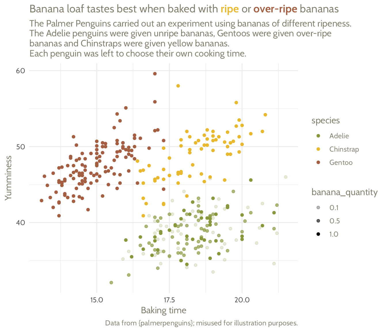
Override it in the title and change the font and size of the title
basic_plot +
  scale_colour_manual(values = banana_colours, limits = force) +
  labs(title = paste0(
    "Banana loaf tastes best when baked with ",
    "<span style=\"color:", banana_colours$Chinstrap,
    "\">**ripe**</span> or <span style=\"color:",
    banana_colours$Gentoo, "\">**over-ripe**</span> bananas")) +
  theme(text = element_text(family = "Cabin",
                            colour = banana_colours$light_text),
        plot.title = ggtext::element_markdown(colour = banana_colours$dark_text))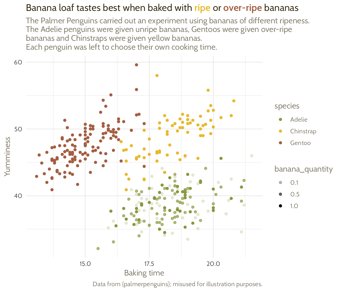
Add a line<br>eak where needed!
basic_plot +
  scale_colour_manual(values = banana_colours, limits = force) +
  labs(title = paste0(
    "Banana loaf tastes best when baked with ",
    "<span style=\"color:", banana_colours$Chinstrap,
    "\">**ripe**</span> or<br><span style=\"color:",
    banana_colours$Gentoo, "\">**over-ripe**</span> bananas")) +
  theme(text = element_text(family = "Cabin",
                            colour = banana_colours$light_text),
        plot.title = ggtext::element_markdown(
          size = 18,
          family = "Poppins",
          colour = banana_colours$dark_text,
          face = "bold")
  )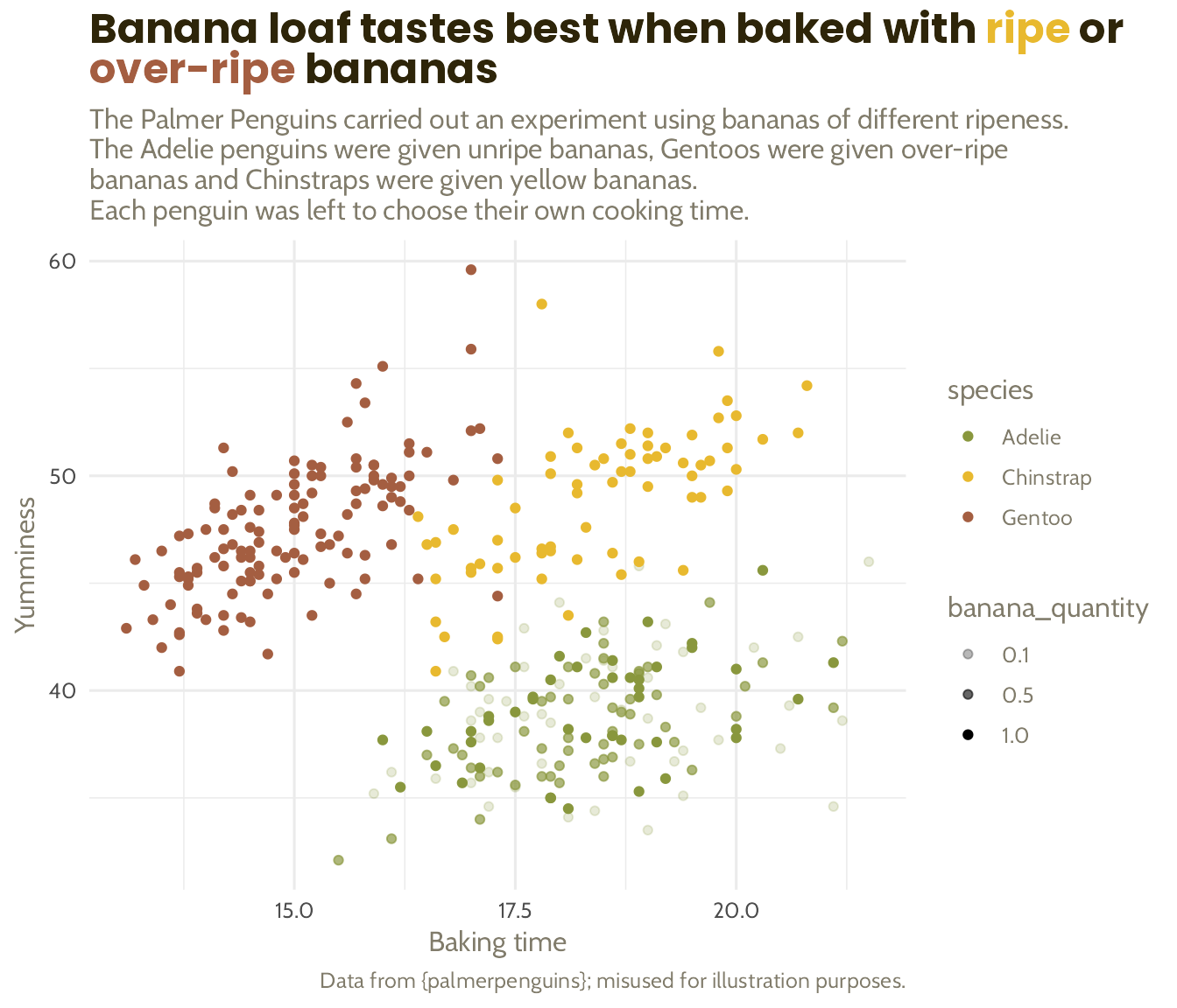
Apply the same principle to the axes and caption
basic_plot +
  scale_colour_manual(values = banana_colours, limits = force) +
  labs(title = paste0(
    "Banana loaf tastes best when baked with ",
    "<span style=\"color:", banana_colours$Chinstrap,
    "\">ripe</span> or<br><span style=\"color:",
    banana_colours$Gentoo, "\">over-ripe</span> bananas")) +
  theme(text = element_text(family = "Cabin",
                            colour = banana_colours$light_text),
        plot.title = ggtext::element_markdown(
          size = 18,
          family = "Poppins",
          colour = banana_colours$dark_text,
          face = "bold"),
        axis.text = element_text(size = 6,
                                 colour = banana_colours$light_text),
        plot.caption = element_text(size = 6))
Getting custom fonts to work can be frustrating!
Install fonts locally +
{ragg}+{systemfonts}+{textshaping}+ Set graphics device to “AGG” + 🤞

See reference-scripts/02_setting-up-fonts.R to get you started!
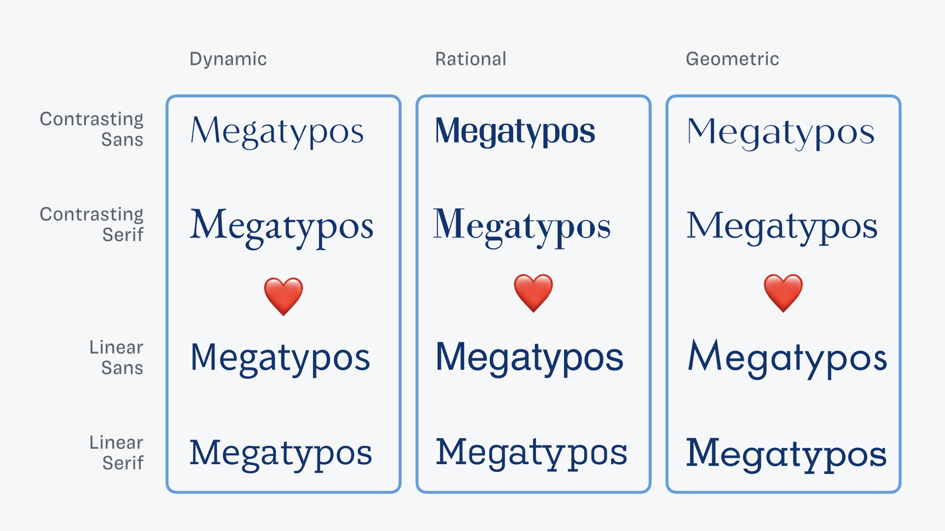
Choosing fonts can be tricky!

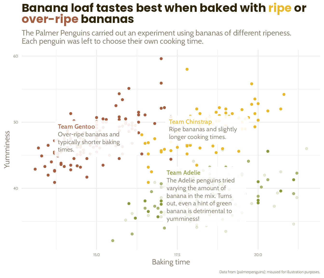
Combine all the above to create text boxes instead of a legend!
basic_plot +
  scale_colour_manual(values = banana_colours, limits = force) +
  labs(title = paste0("Banana loaf tastes best when baked with <span style=\"color:", banana_colours$Chinstrap, "\">ripe</span> or<br><span style=\"color:", banana_colours$Gentoo, "\">over-ripe</span> bananas")) +
  theme(text = element_text(family = "Cabin", colour = banana_colours$light_text),
        plot.title = ggtext::element_markdown(size = 18, family = "Poppins", colour = banana_colours$dark_text, face = "bold"),
        axis.text = element_text(size = 6, colour = banana_colours$light_text),
        plot.caption = element_text(size = 6))
Combine all the above to create text boxes instead of a legend!
basic_plot +
  scale_colour_manual(values = banana_colours, limits = force) +
  labs(title = paste0("Banana loaf tastes best when baked with <span style=\"color:", banana_colours$Chinstrap, "\">ripe</span> or<br><span style=\"color:", banana_colours$Gentoo, "\">over-ripe</span> bananas")) +
  ggtext::geom_textbox(data = penguin_summaries,
                       aes(label = paste0(
                         "**Team ", species, "**",
                         "<br><span style = \"color:",
                         banana_colours$light_text,
                         "\">", commentary, "</span>"))) +
  theme(text = element_text(family = "Cabin", colour = banana_colours$light_text),
        plot.title = ggtext::element_markdown(size = 18, family = "Poppins", colour = banana_colours$dark_text, face = "bold"),
        axis.text = element_text(size = 6, colour = banana_colours$light_text),
        plot.caption = element_text(size = 6))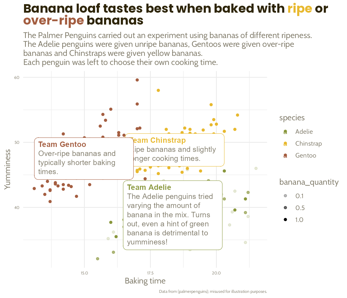
Combine all the above to create text boxes instead of a legend!
basic_plot +
  scale_colour_manual(values = banana_colours, limits = force) +
  labs(title = paste0("Banana loaf tastes best when baked with <span style=\"color:", banana_colours$Chinstrap, "\">ripe</span> or<br><span style=\"color:", banana_colours$Gentoo, "\">over-ripe</span> bananas")) +
  ggtext::geom_textbox(data = penguin_summaries,
                       aes(label = paste0(
                         "**Team ", species, "**",
                         "<br><span style = \"color:",
                         banana_colours$light_text,
                         "\">", commentary, "</span>")),
                       family = "Cabin",
                       size = 3.5,
                       width = unit(9, "line"),
                       alpha = 0.9,
                       box.colour = NA) +
  theme(text = element_text(family = "Cabin", colour = banana_colours$light_text),
        plot.title = ggtext::element_markdown(size = 18, family = "Poppins", colour = banana_colours$dark_text, face = "bold"),
        axis.text = element_text(size = 6, colour = banana_colours$light_text),
        plot.caption = element_text(size = 6))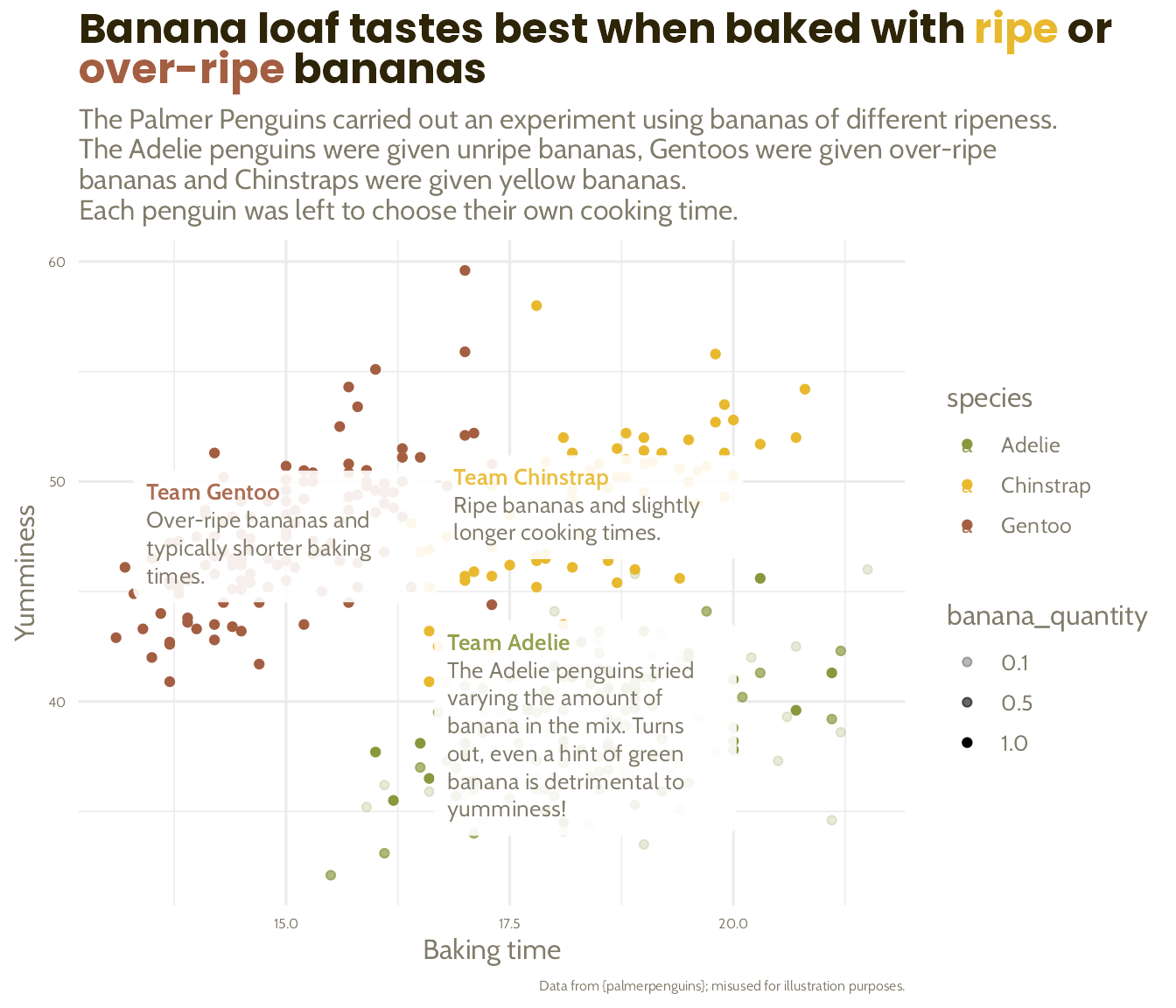
Combine all the above to create text boxes instead of a legend!
basic_plot +
  scale_colour_manual(values = banana_colours, limits = force) +
  labs(title = paste0("Banana loaf tastes best when baked with <span style=\"color:", banana_colours$Chinstrap, "\">ripe</span> or<br><span style=\"color:", banana_colours$Gentoo, "\">over-ripe</span> bananas"),
       subtitle = "The Palmer Penguins carried out an experiment using bananas of different ripeness.
Each penguin was left to choose their own cooking time.") +
  ggtext::geom_textbox(data = penguin_summaries,
                       aes(label = paste0(
                         "**Team ", species, "**",
                         "<br><span style = \"color:",
                         banana_colours$light_text,
                         "\">", commentary, "</span>")),
                       family = "Cabin",
                       size = 3.5,
                       width = unit(9, "line"),
                       alpha = 0.9,
                       box.colour = NA) +
  theme(text = element_text(family = "Cabin", colour = banana_colours$light_text),
        plot.title = ggtext::element_markdown(size = 18, family = "Poppins", colour = banana_colours$dark_text, face = "bold"),
        axis.text = element_text(size = 6, colour = banana_colours$light_text),
        plot.caption = element_text(size = 6),
        legend.position = "none")


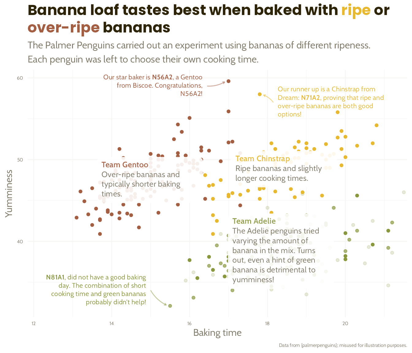
Next, let’s work out where we want our labels…
Let’s add the annotations…
basic_plot +
  scale_colour_manual(values = banana_colours) +
  labs(title = paste0("Banana loaf tastes best when baked with <span style=\"color:", banana_colours$Chinstrap, "\">ripe</span> or<br><span style=\"color:", banana_colours$Gentoo, "\">over-ripe</span> bananas"),
       subtitle = "The Palmer Penguins carried out an experiment using bananas of different ripeness. \nEach penguin was left to choose their own cooking time.") +
  ggtext::geom_textbox(data = penguin_summaries,
                       aes(label = paste0("**Team ", species, "**", "<br><span style = \"color:", banana_colours$light_text, "\">", commentary, "</span>")),
                       family = "Cabin", size = 3.5, width = unit(9, "line"), alpha = 0.9, box.colour = NA) +
  theme(text = element_text(family = "Cabin", colour = banana_colours$light_text),
        plot.title = ggtext::element_markdown(size = 18, family = "Poppins", colour = banana_colours$dark_text, face = "bold"),
        axis.text = element_text(size = 6, colour = banana_colours$light_text),
        plot.caption = element_text(size = 6),
        legend.position = "none")
Let’s add the annotations…
basic_plot +
  scale_colour_manual(values = banana_colours) +
  labs(title = paste0("Banana loaf tastes best when baked with <span style=\"color:", banana_colours$Chinstrap, "\">ripe</span> or<br><span style=\"color:", banana_colours$Gentoo, "\">over-ripe</span> bananas"),
       subtitle = "The Palmer Penguins carried out an experiment using bananas of different ripeness. \nEach penguin was left to choose their own cooking time.") +
  ggtext::geom_textbox(data = penguin_summaries,
                       aes(label = paste0("**Team ", species, "**", "<br><span style = \"color:", banana_colours$light_text, "\">", commentary, "</span>")),
                       family = "Cabin", size = 3.5, width = unit(9, "line"), alpha = 0.9, box.colour = NA) +
  ggtext::geom_textbox(data = penguin_highlights,
                       aes(label = commentary,
                           x = label_x,
                           y = label_y,
                           # alignment of the box with the box coordinate
                           hjust = left_to_right),
                       family = "Cabin",
                       size = 3,
                       fill = NA,
                       box.colour = NA) +
  theme(text = element_text(family = "Cabin", colour = banana_colours$light_text),
        plot.title = ggtext::element_markdown(size = 18, family = "Poppins", colour = banana_colours$dark_text, face = "bold"),
        axis.text = element_text(size = 6, colour = banana_colours$light_text),
        plot.caption = element_text(size = 6),
        legend.position = "none")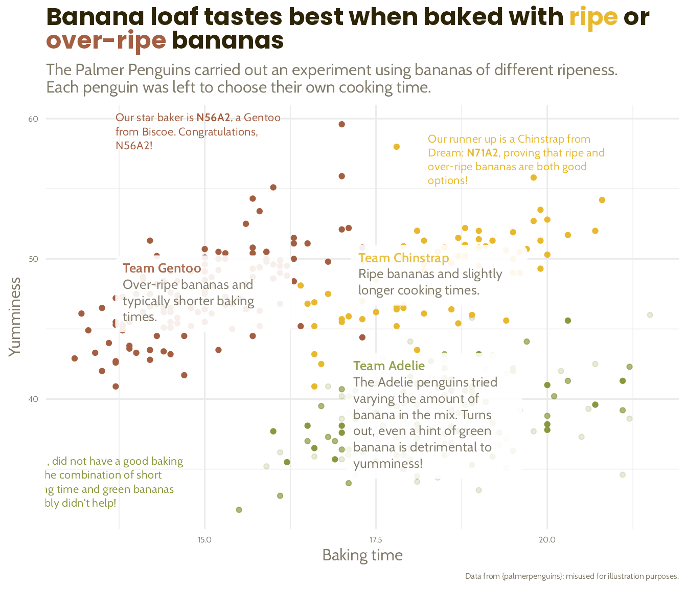
… using arrows and alignments to emphasise the story
basic_plot +
  scale_colour_manual(values = banana_colours) +
  labs(title = paste0("Banana loaf tastes best when baked with <span style=\"color:", banana_colours$Chinstrap, "\">ripe</span> or<br><span style=\"color:", banana_colours$Gentoo, "\">over-ripe</span> bananas"),
       subtitle = "The Palmer Penguins carried out an experiment using bananas of different ripeness. \nEach penguin was left to choose their own cooking time.") +
  ggtext::geom_textbox(data = penguin_summaries,
                       aes(label = paste0("**Team ", species, "**", "<br><span style = \"color:", banana_colours$light_text, "\">", commentary, "</span>")),
                       family = "Cabin", size = 3.5, width = unit(9, "line"), alpha = 0.9, box.colour = NA) +
  ggtext::geom_textbox(data = penguin_highlights,
                       aes(label = commentary, x = label_x, y = label_y, hjust = left_to_right),
                       family = "Cabin", size = 3, fill = NA, box.colour = NA) +
  geom_curve(data = penguin_highlights,
             aes(x = label_x, xend = arrow_x_end,
                 y = label_y, yend = arrow_y_end),
             arrow = arrow(length = unit(0.1, "cm")),
             curvature = 0.15,
             alpha = 0.5) +
  theme(text = element_text(family = "Cabin", colour = banana_colours$light_text),
        plot.title = ggtext::element_markdown(size = 18, family = "Poppins", colour = banana_colours$dark_text, face = "bold"),
        axis.text = element_text(size = 6, colour = banana_colours$light_text),
        plot.caption = element_text(size = 6),
        legend.position = "none")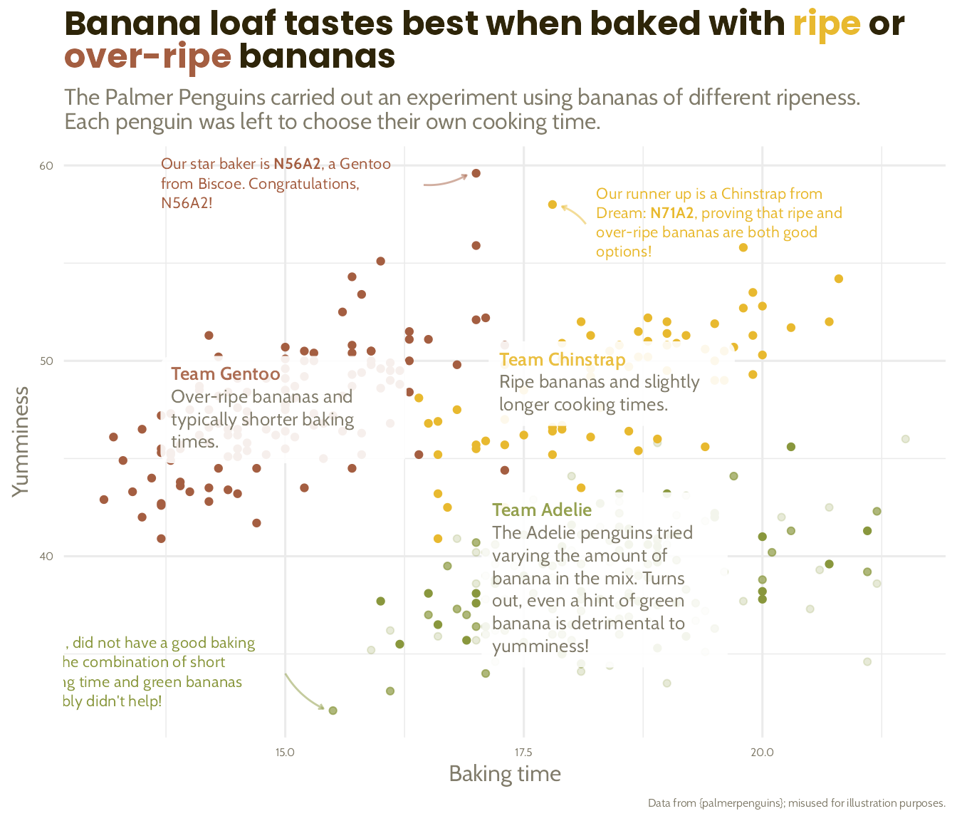
… using arrows and alignments to emphasise the story
basic_plot +
  scale_colour_manual(values = banana_colours) +
  labs(title = paste0("Banana loaf tastes best when baked with <span style=\"color:", banana_colours$Chinstrap, "\">ripe</span> or<br><span style=\"color:", banana_colours$Gentoo, "\">over-ripe</span> bananas"),
       subtitle = "The Palmer Penguins carried out an experiment using bananas of different ripeness. \nEach penguin was left to choose their own cooking time.") +
  ggtext::geom_textbox(data = penguin_summaries,
                       aes(label = paste0("**Team ", species, "**", "<br><span style = \"color:", banana_colours$light_text, "\">", commentary, "</span>")),
                       family = "Cabin", size = 3.5, width = unit(9, "line"), alpha = 0.9, box.colour = NA) +
  ggtext::geom_textbox(data = penguin_highlights,
                       aes(label = commentary, x = label_x, y = label_y, hjust = left_to_right,
                           halign = left_to_right),
                       family = "Cabin", size = 3, fill = NA, box.colour = NA) +
  geom_curve(data = penguin_highlights,
             aes(x = label_x, xend = arrow_x_end,
                 y = label_y, yend = arrow_y_end),
             arrow = arrow(length = unit(0.1, "cm")),
             curvature = 0.15,
             alpha = 0.5) +
  theme(text = element_text(family = "Cabin", colour = banana_colours$light_text),
        plot.title = ggtext::element_markdown(size = 18, family = "Poppins", colour = banana_colours$dark_text, face = "bold"),
        axis.text = element_text(size = 6, colour = banana_colours$light_text),
        plot.caption = element_text(size = 6),
        legend.position = "none")

Increase lineheight, reduce distractions
basic_plot +
  scale_colour_manual(values = banana_colours) +
  labs(title = paste0("Banana loaf tastes best when baked with <span style=\"color:", banana_colours$Chinstrap, "\">ripe</span> or<br><span style=\"color:", banana_colours$Gentoo, "\">over-ripe</span> bananas"),
       subtitle = "The Palmer Penguins carried out an experiment using bananas of different ripeness. \nEach penguin was left to choose their own cooking time.") +
  ggtext::geom_textbox(data = penguin_summaries,
                       aes(label = paste0("**Team ", species, "**", "<br><span style = \"color:", banana_colours$light_text, "\">", commentary, "</span>")),
                       family = "Cabin", size = 3.5, width = unit(9, "line"), alpha = 0.9, box.colour = NA) +
  ggtext::geom_textbox(data = penguin_highlights,
                       aes(label = commentary, x = label_x, y = label_y, hjust = left_to_right, halign = left_to_right),
                       family = "Cabin", size = 3, fill = NA, box.colour = NA) +
  geom_curve(data = penguin_highlights,
             aes(x = label_x, xend = arrow_x_end, y = label_y, yend = arrow_y_end),
             arrow = arrow(length = unit(0.1, "cm")), curvature = 0.15, alpha = 0.5) +
  theme(text = element_text(family = "Cabin", colour = banana_colours$light_text),
        plot.title = ggtext::element_markdown(size = 18, family = "Poppins", colour = banana_colours$dark_text, face = "bold"),
        axis.text = element_text(size = 6, colour = banana_colours$light_text),
        plot.caption = element_text(size = 6),
        legend.position = "none")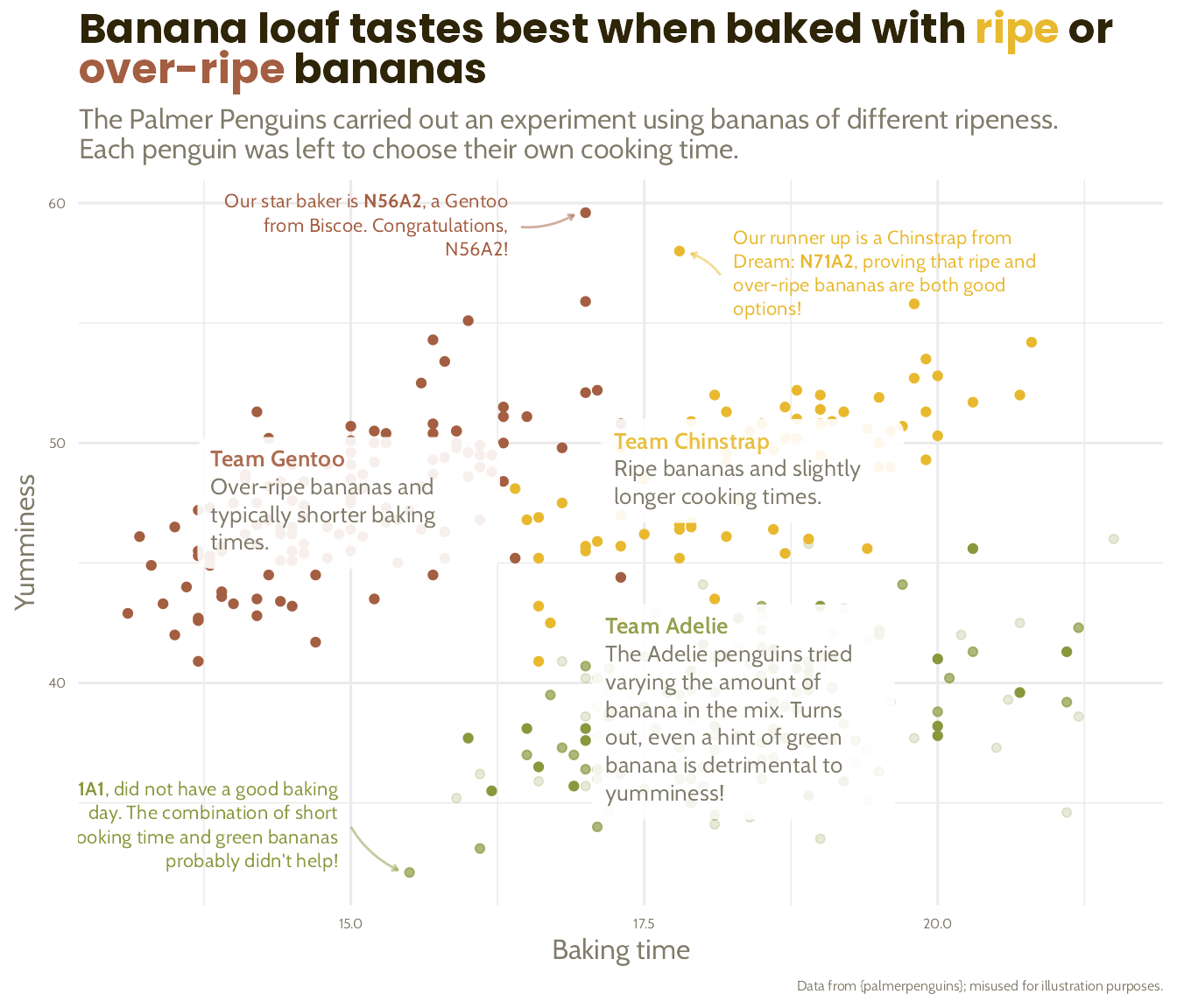
Increase lineheight, reduce distractions
basic_plot +
  scale_colour_manual(values = banana_colours) +
  labs(title = paste0("Banana loaf tastes best when baked with <span style=\"color:", banana_colours$Chinstrap, "\">ripe</span> or<br><span style=\"color:", banana_colours$Gentoo, "\">over-ripe</span> bananas"),
       subtitle = "The Palmer Penguins carried out an experiment using bananas of different ripeness. \nEach penguin was left to choose their own cooking time.") +
  ggtext::geom_textbox(data = penguin_summaries,
                       aes(label = paste0("**Team ", species, "**", "<br><span style = \"color:", banana_colours$light_text, "\">", commentary, "</span>")),
                       family = "Cabin", size = 3.5, width = unit(9, "line"), alpha = 0.9, box.colour = NA) +
  ggtext::geom_textbox(data = penguin_highlights,
                       aes(label = commentary, x = label_x, y = label_y, hjust = left_to_right, halign = left_to_right),
                       family = "Cabin", size = 3, fill = NA, box.colour = NA) +
  geom_curve(data = penguin_highlights,
             aes(x = label_x, xend = arrow_x_end, y = label_y, yend = arrow_y_end),
             arrow = arrow(length = unit(0.1, "cm")), curvature = 0.15, alpha = 0.5) +
  theme(text = element_text(family = "Cabin", colour = banana_colours$light_text,
                            lineheight = 1.2),
        plot.title = ggtext::element_markdown(size = 18, family = "Poppins", colour = banana_colours$dark_text, face = "bold"),
        axis.text = element_text(size = 6, colour = banana_colours$light_text),
        plot.caption = element_text(size = 6),
        legend.position = "none")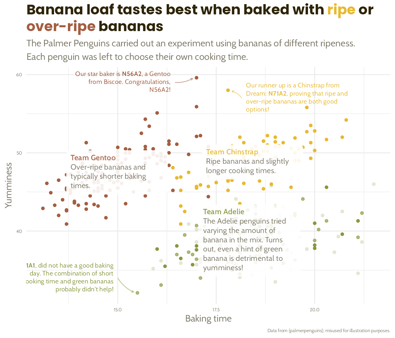
Increase lineheight, reduce distractions
basic_plot +
  scale_colour_manual(values = banana_colours) +
  labs(title = paste0("Banana loaf tastes best when baked with <span style=\"color:", banana_colours$Chinstrap, "\">ripe</span> or<br><span style=\"color:", banana_colours$Gentoo, "\">over-ripe</span> bananas"),
       subtitle = "The Palmer Penguins carried out an experiment using bananas of different ripeness. \nEach penguin was left to choose their own cooking time.") +
  ggtext::geom_textbox(data = penguin_summaries,
                       aes(label = paste0("**Team ", species, "**", "<br><span style = \"color:", banana_colours$light_text, "\">", commentary, "</span>")),
                       family = "Cabin", size = 3.5, width = unit(9, "line"), alpha = 0.9, box.colour = NA) +
  ggtext::geom_textbox(data = penguin_highlights,
                       aes(label = commentary, x = label_x, y = label_y, hjust = left_to_right, halign = left_to_right),
                       family = "Cabin", size = 3, fill = NA, box.colour = NA) +
  geom_curve(data = penguin_highlights,
             aes(x = label_x, xend = arrow_x_end, y = label_y, yend = arrow_y_end),
             arrow = arrow(length = unit(0.1, "cm")), curvature = 0.15, alpha = 0.5) +
  theme(text = element_text(family = "Cabin", colour = banana_colours$light_text,
                            lineheight = 1.2),
        plot.title = ggtext::element_markdown(size = 18, family = "Poppins", colour = banana_colours$dark_text, face = "bold"),
        axis.text = element_text(size = 6, colour = banana_colours$light_text),
        plot.caption = element_text(size = 6),
        panel.grid = element_line(colour = "#F6F6F5"),
        legend.position = "none")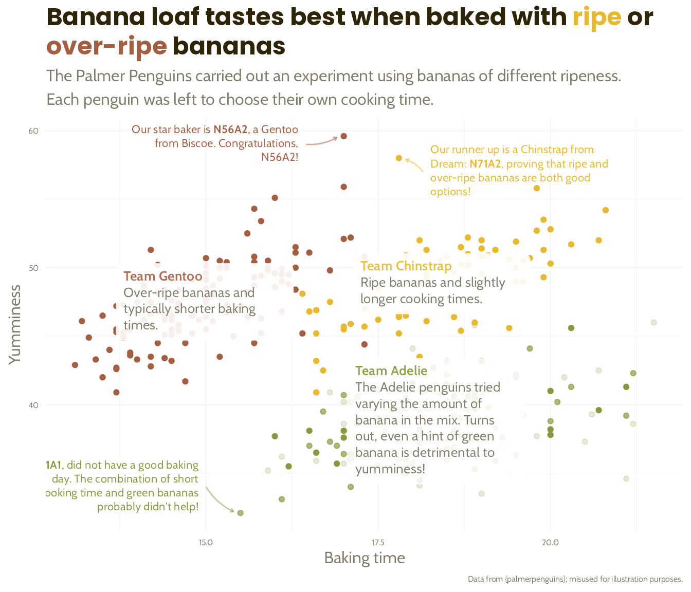
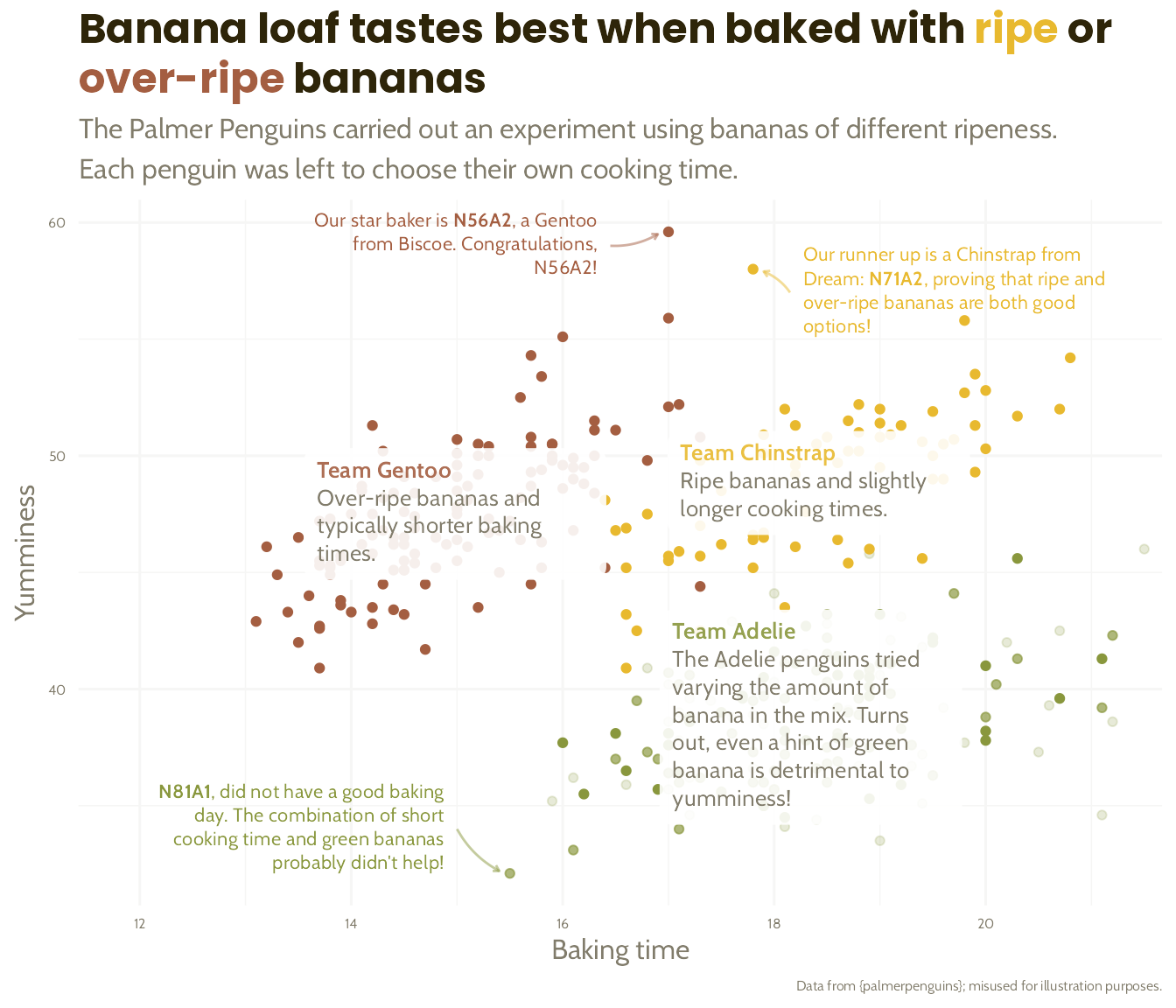
Increase lineheight, reduce distractions, check everything fits!
basic_plot +
  scale_colour_manual(values = banana_colours) +
  labs(title = paste0("Banana loaf tastes best when baked with <span style=\"color:", banana_colours$Chinstrap, "\">ripe</span> or<br><span style=\"color:", banana_colours$Gentoo, "\">over-ripe</span> bananas"),
       subtitle = "The Palmer Penguins carried out an experiment using bananas of different ripeness. \nEach penguin was left to choose their own cooking time.") +
  ggtext::geom_textbox(data = penguin_summaries,
                       aes(label = paste0("**Team ", species, "**", "<br><span style = \"color:", banana_colours$light_text, "\">", commentary, "</span>")),
                       family = "Cabin", size = 3.5, width = unit(9, "line"), alpha = 0.9, box.colour = NA) +
  ggtext::geom_textbox(data = penguin_highlights,
                       aes(label = commentary, x = label_x, y = label_y, hjust = left_to_right, halign = left_to_right),
                       family = "Cabin", size = 3, fill = NA, box.colour = NA) +
  geom_curve(data = penguin_highlights,
             aes(x = label_x, xend = arrow_x_end, y = label_y, yend = arrow_y_end),
             arrow = arrow(length = unit(0.1, "cm")), curvature = 0.15, alpha = 0.5) +
  scale_x_continuous(expand = expansion(mult = c(0.2, 0.02))) +
  theme(text = element_text(family = "Cabin", colour = banana_colours$light_text,
                            lineheight = 1.2),
        plot.title = ggtext::element_markdown(size = 18, family = "Poppins", colour = banana_colours$dark_text, face = "bold"),
        axis.text = element_text(size = 6, colour = banana_colours$light_text),
        plot.caption = element_text(size = 6),
        panel.grid = element_line(colour = "#F6F6F5"),
        legend.position = "none")