Palatable Palettes: Creating and applying bespoke colour schemes
Cara Thompson | NHS-R 2022 Conference | 17th November 2022

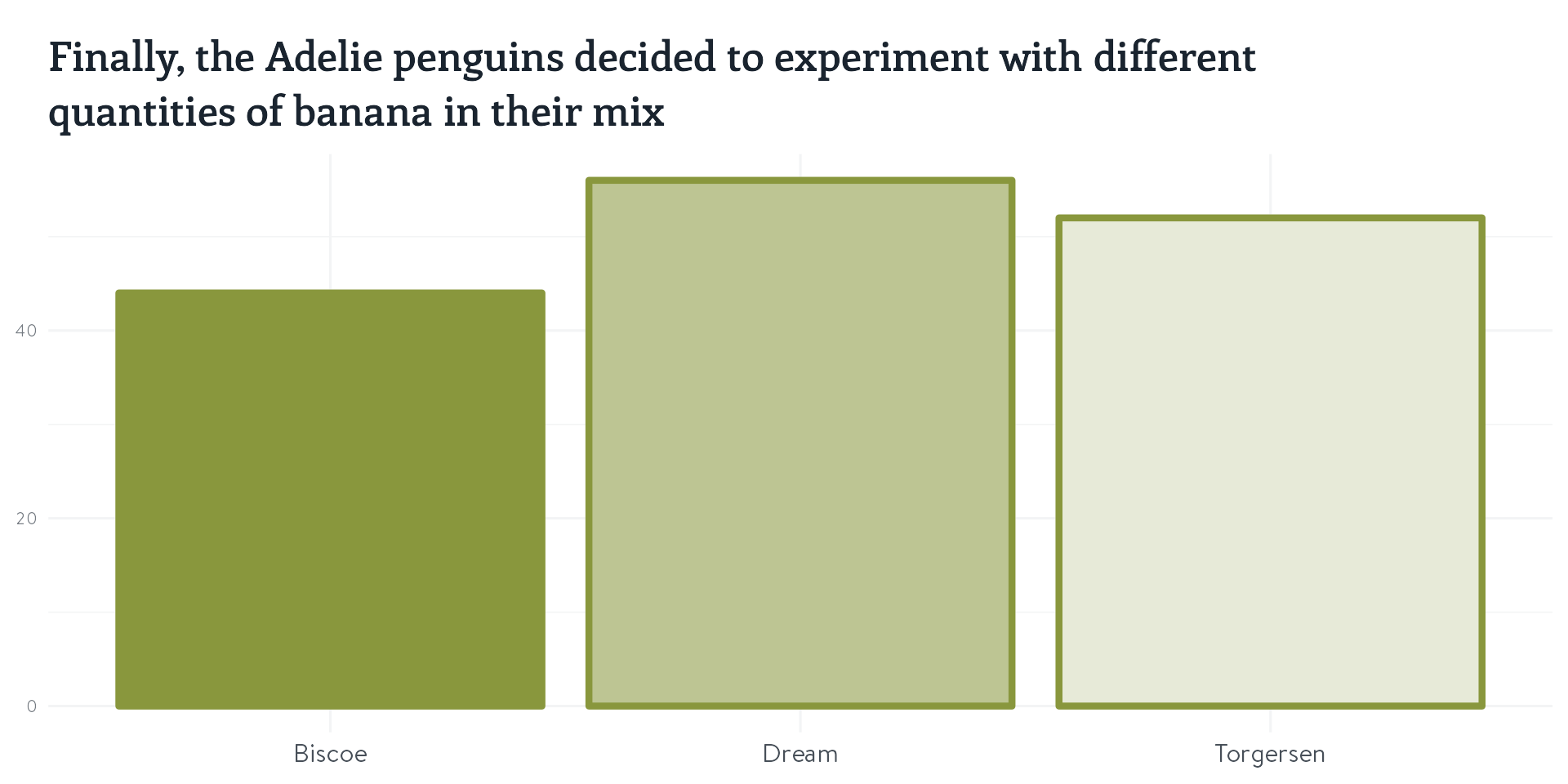
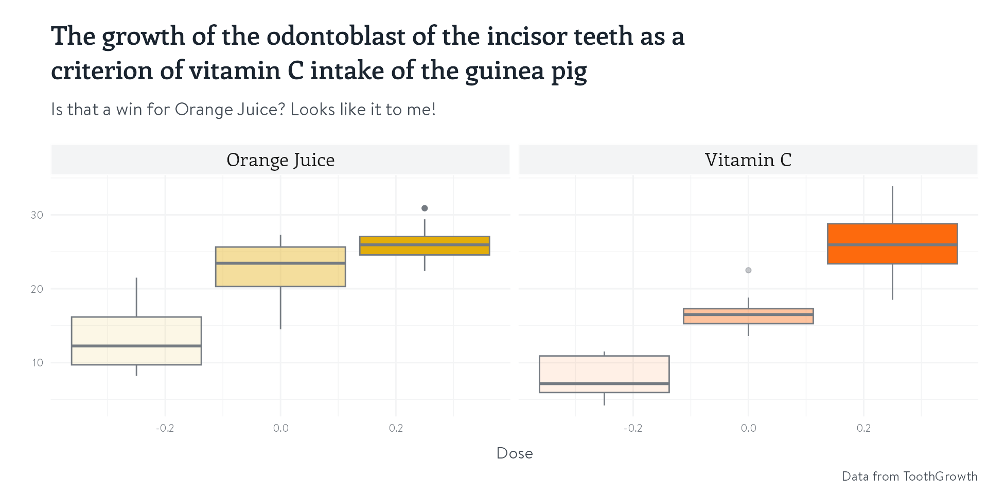
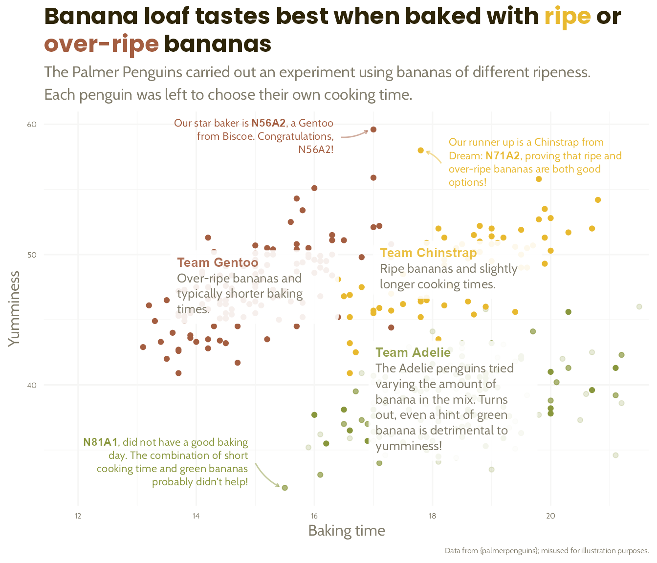
The Great Penguin Bake Off
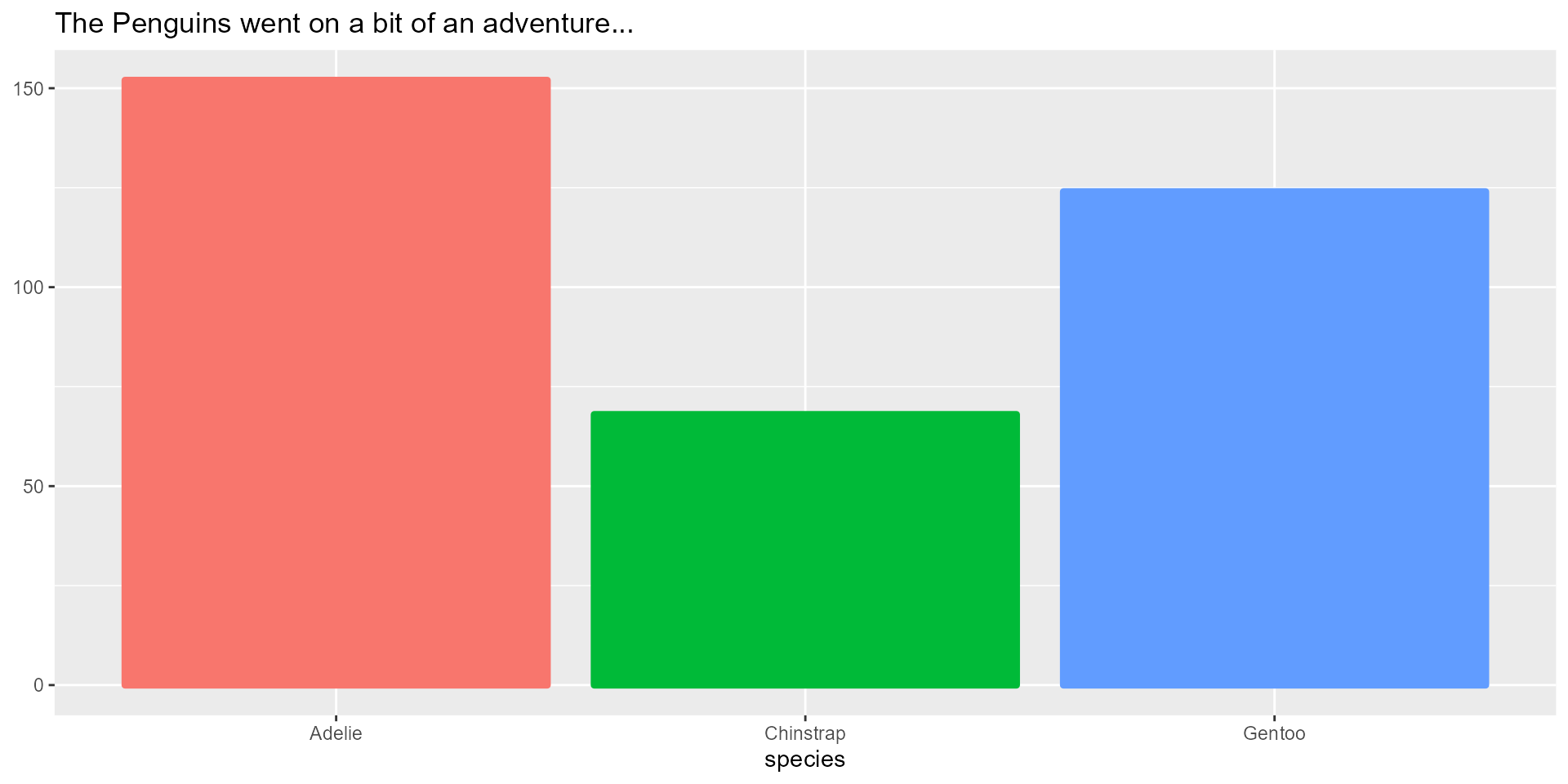
The Great Penguin Bake Off
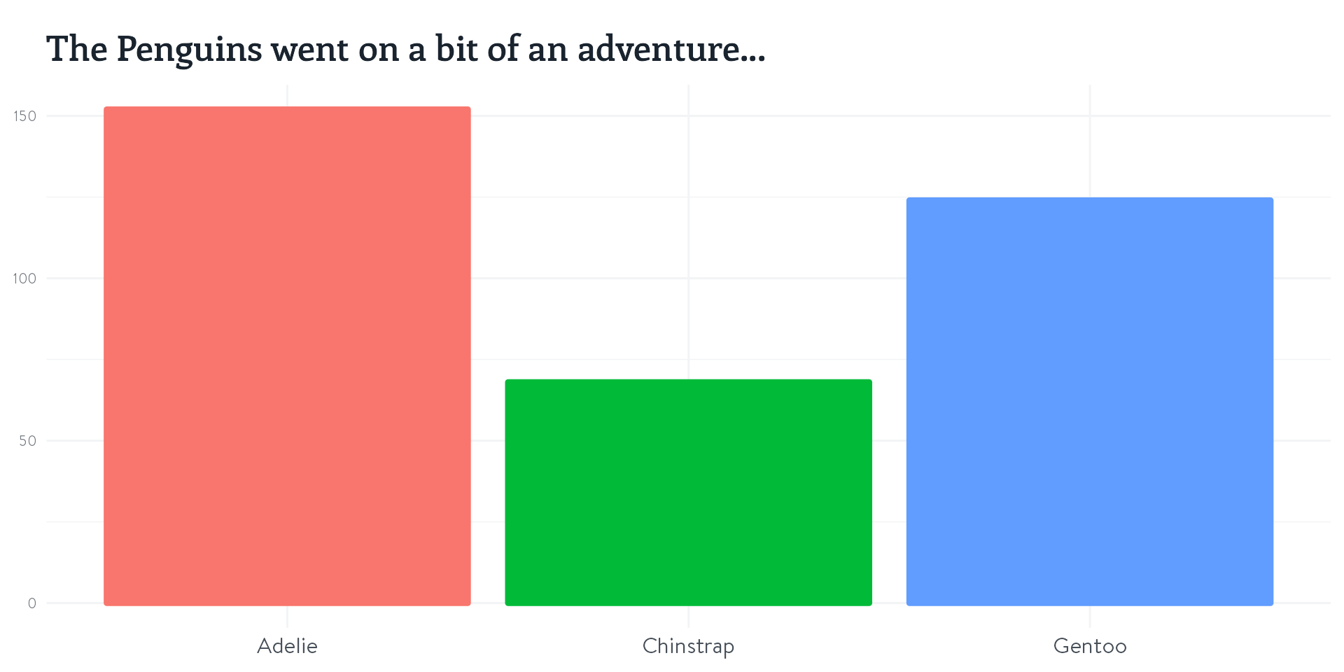
The Great Penguin Bake Off

The Great Penguin Bake Off
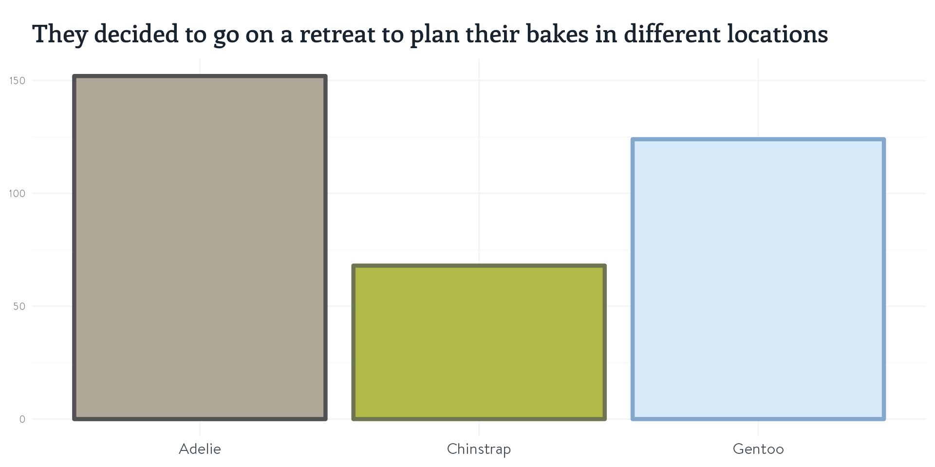
The Great Penguin Bake Off

The Great Penguin Bake Off
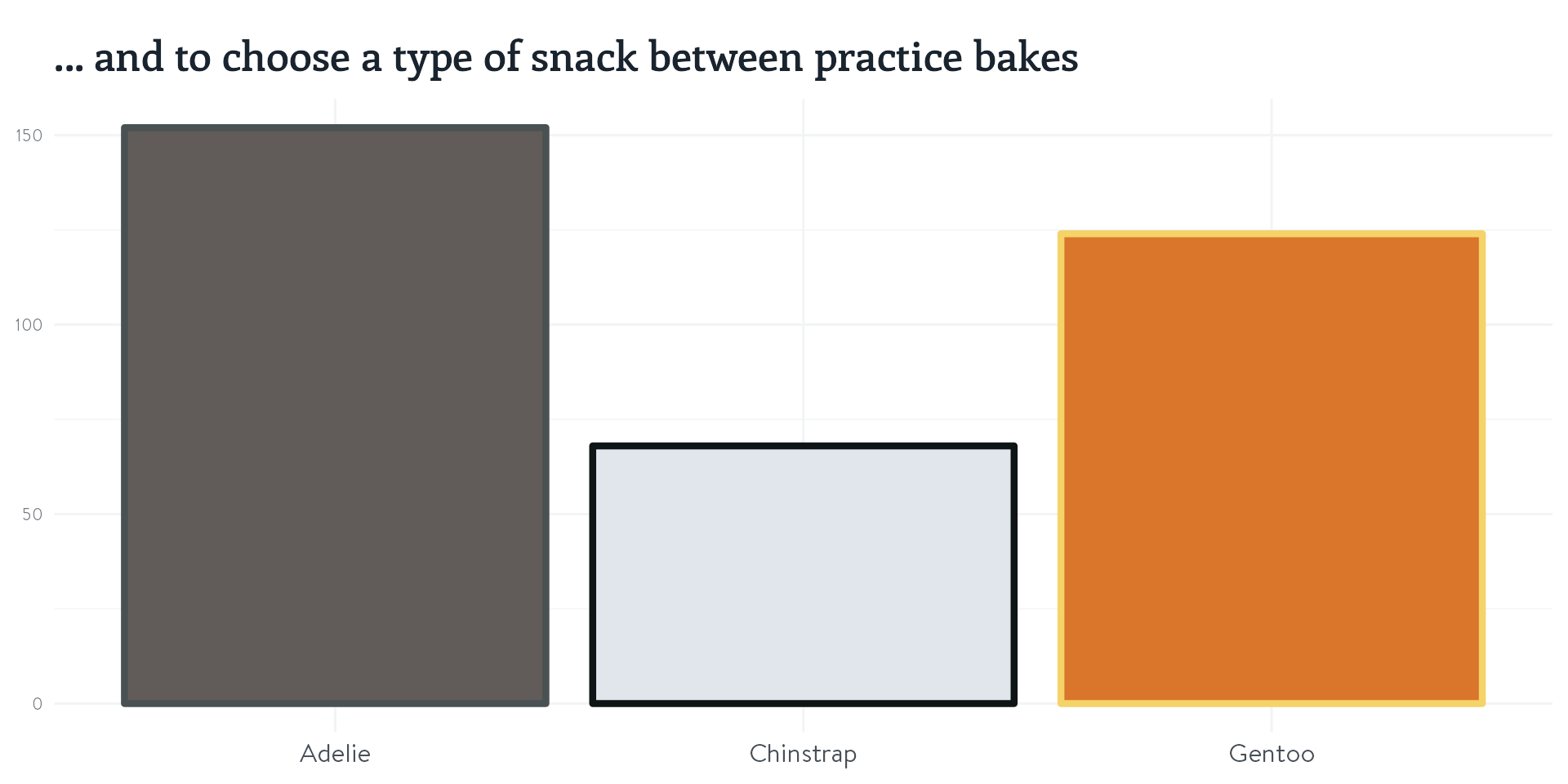
The Great Penguin Bake Off
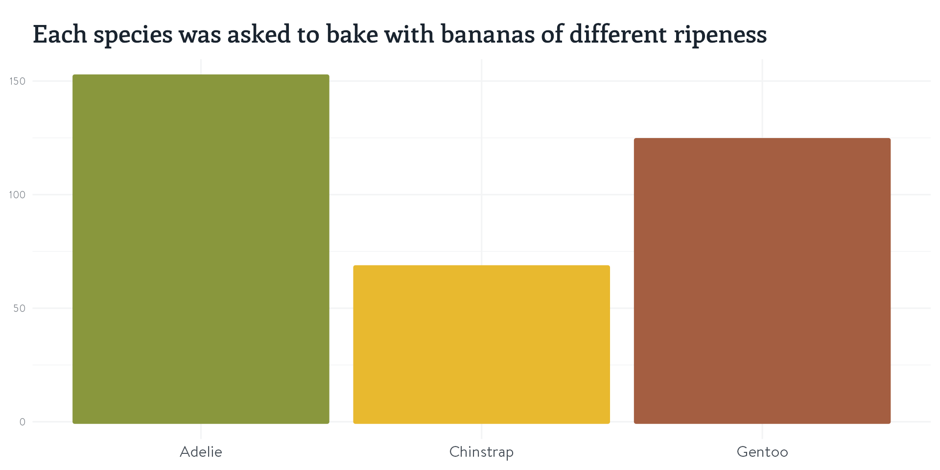
#1 - Use colour purposefully
Make it easy for the readers to remember what is what.
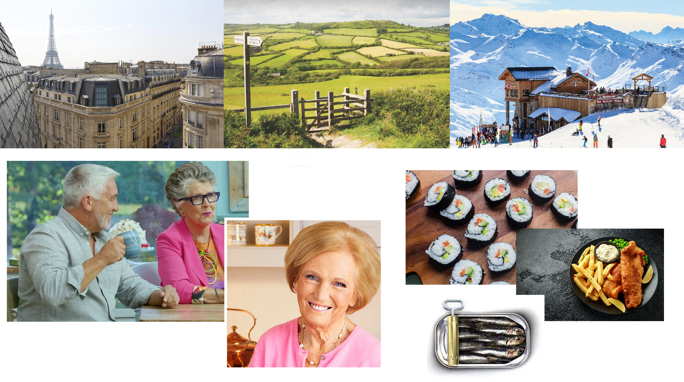
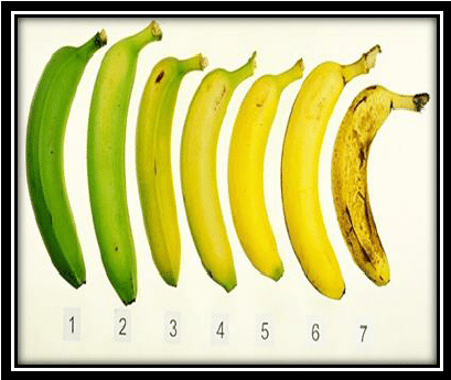
But my graphs aren’t about penguins baking banana bread!

#1 - Use colour purposefully
#1 - Use colour purposefully
Make it easy for the readers to remember what is what.
#2 - Let others help you
#2 - Let others help you
#2 - Let others help you

#2 - Let others help you
#2 - Let others help you
#2 - Let others help you
#3 - Apply colours using a named vector
Once you’ve found your colours, the quick fix…

#3 - Apply colours using a named vector
… might be a dangerous shortcut!
ggplot(penguins %>%
         # Oh, that should be a factor,
         # let me fix that for you!
         mutate(species =
                  factor(species,
                         levels = c("Chinstrap",
                                    "Gentoo",
                                    "Adelie"))),
       aes(x = bill_depth_mm,
           y = bill_length_mm,
           colour = species)) +
  geom_point(size = 5) +
  labs(x = "Baking duration",
       y = "Yumminess") +
  theme_nhsr_demo() +
  scale_colour_manual(values = c("#89973d",
                                 "#e8b92f",
                                 "#a45e41"))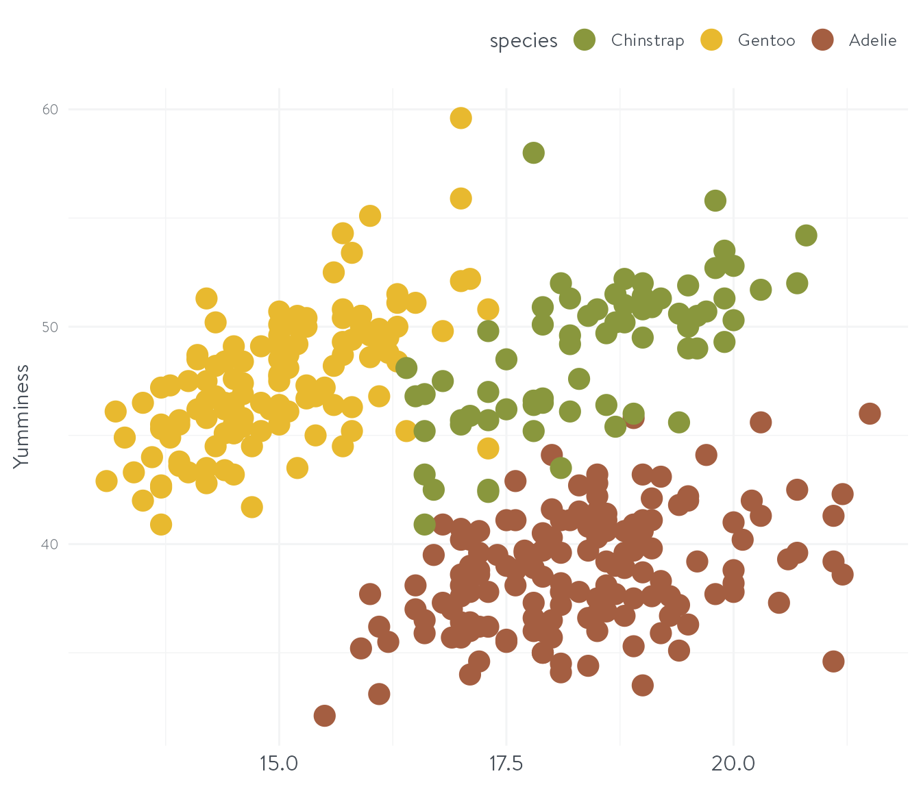
#3 - Apply colours using a named vector
Create a named vector
banana_colours <- c("Adelie" = "#89973d",
                    "Chinstrap" = "#e8b92f",
                    "Gentoo" = "#a45e41")

ggplot(penguins,
       aes(x = bill_depth_mm,
           y = bill_length_mm,
           colour = species)) +
  geom_point(size = 5) +
  labs(x = "Baking duration",
       y = "Yumminess") +
  theme_nhsr_demo() +
  scale_colour_manual(values = banana_colours)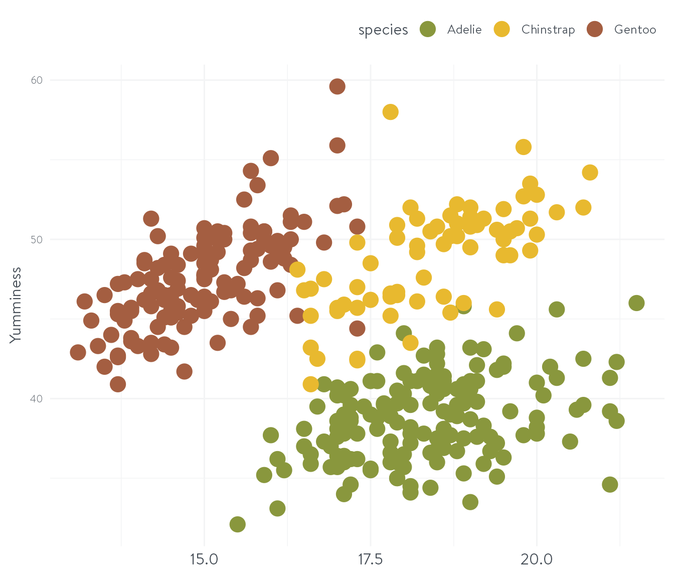
#3 - Apply colours using a named vector
Create a named vector
banana_colours <- c("Adelie" = "#89973d",
                    "Chinstrap" = "#e8b92f",
                    "Gentoo" = "#a45e41")

ggplot(penguins %>%
         # Oh, that should be a factor,
         # let me fix that for you!
         mutate(species =
                  factor(species,
                         levels = c("Chinstrap",
                                    "Gentoo",
                                    "Adelie"))),
       aes(x = bill_depth_mm,
           y = bill_length_mm,
           colour = species)) +
  geom_point(size = 5) +
  labs(x = "Baking duration",
       y = "Yumminess") +
  theme_nhsr_demo() +
  scale_colour_manual(values = banana_colours)
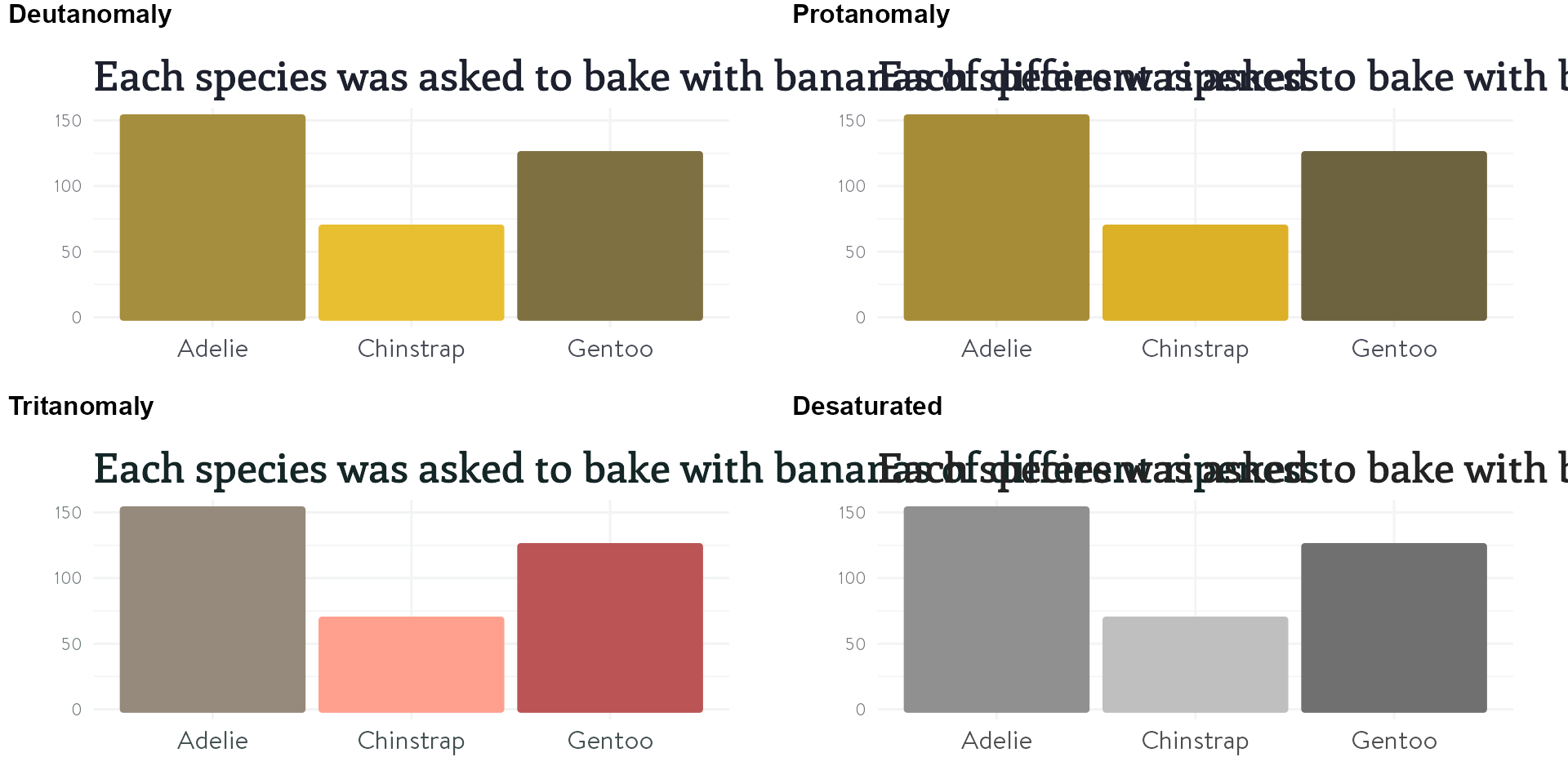
#4 - Check for accessibility
#4 - Check for accessibility
#5 - Make use of colour interpolation
my_anchor_colours <- c("green", "blue", "purple")

palmerpenguins::penguins %>%
  mutate(island_fm = paste0(island, sex)) %>%
  ggplot() +
  geom_point(aes(x = bill_length_mm,
                 y = bill_depth_mm,
                 colour = island_fm,
                 size = body_mass_g),
             show.legend = FALSE) +
  theme_nhsr_demo() +
  scale_color_manual(
    values = colorRampPalette(
      my_anchor_colours)(9))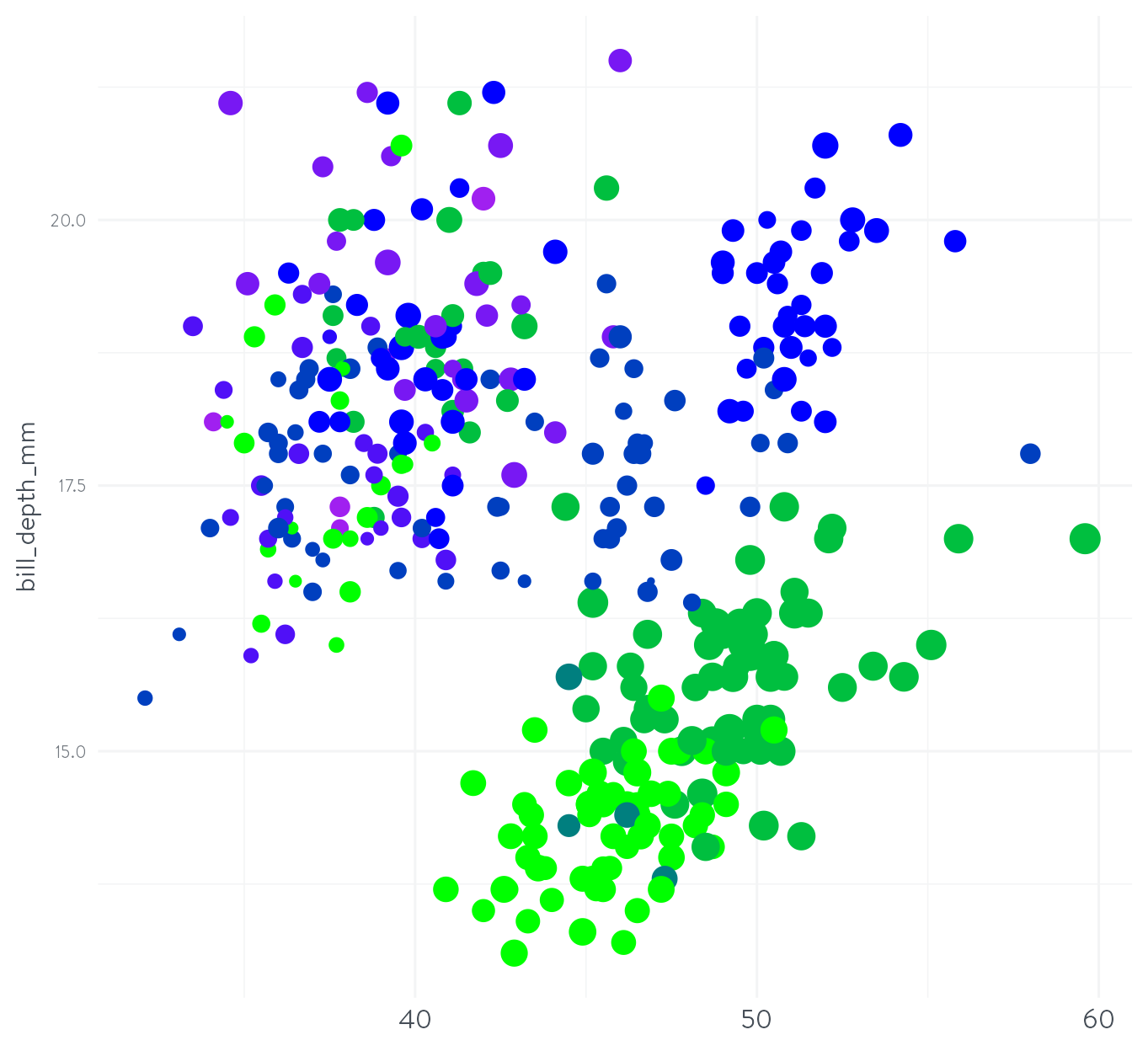
#5 - Make use of colour interpolation
imagecolorpicker.com + Chroma.js Color Palette Helper
#5 - Make use of colour interpolation
my_anchor_colours <- c("#4f3c78", "#d3970a", "#c0979c")

palmerpenguins::penguins %>%
  ggplot() +
  geom_point(aes(x = bill_length_mm,
                 y = bill_depth_mm,
                 colour = island,
                 size = body_mass_g),
             show.legend = FALSE) +
  theme_nhsr_demo() +
  scale_color_manual(
    values = colorRampPalette(
      my_anchor_colours)(3))
#5 - Make use of colour interpolation
my_anchor_colours <- c("#4f3c78", "#d3970a", "#c0979c")

palmerpenguins::penguins %>%
  mutate(island_fm = paste0(island, sex)) %>%
  ggplot() +
  geom_point(aes(x = bill_length_mm,
                 y = bill_depth_mm,
                 colour = island_fm,
                 size = body_mass_g),
             show.legend = FALSE) +
  theme_nhsr_demo() +
  scale_color_manual(
    values = colorRampPalette(
      my_anchor_colours)(9))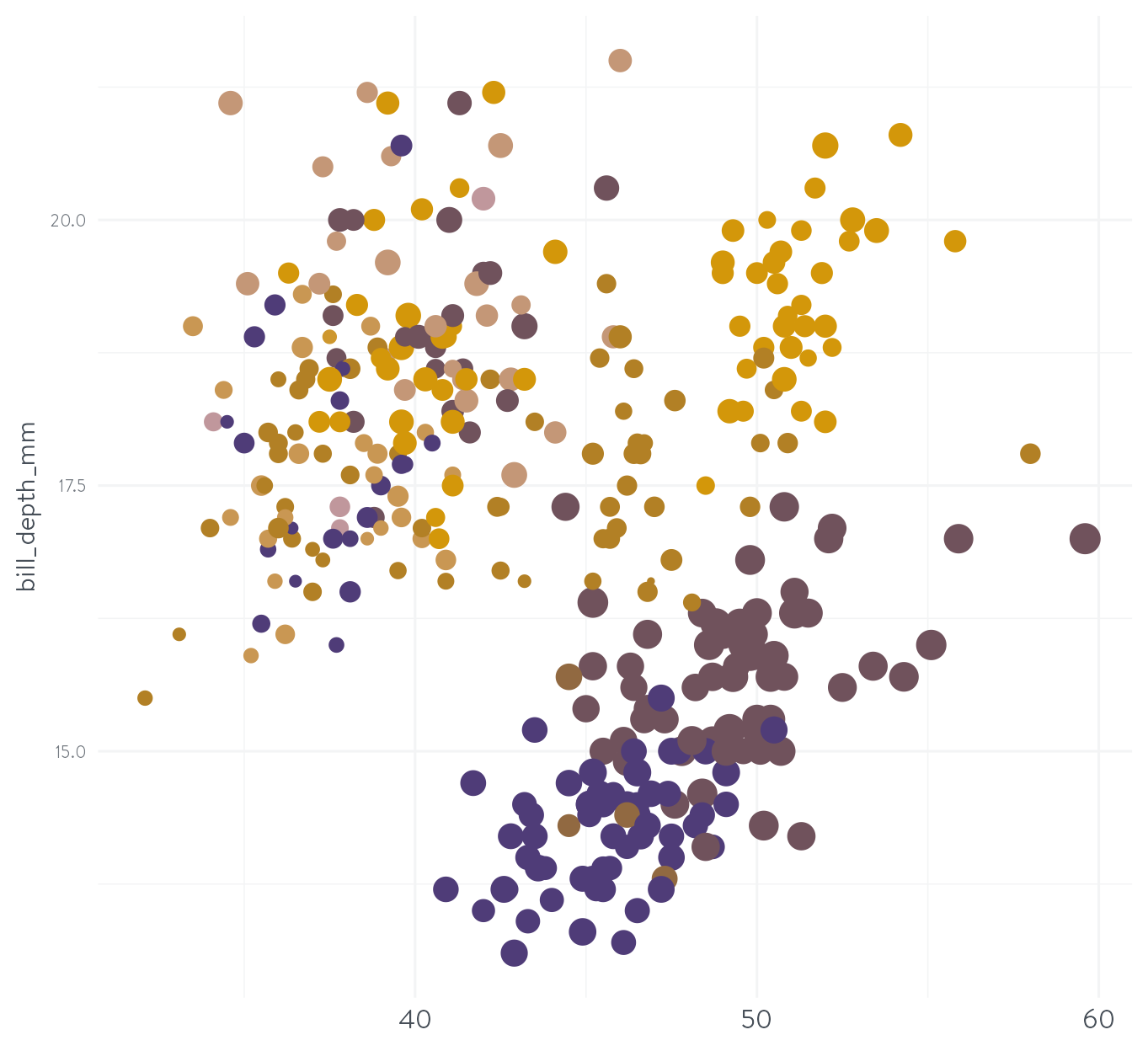
#5 - Make use of colour interpolation
my_anchor_colours <- c("#375248", "#d3970a", "#7691b1")

palmerpenguins::penguins %>%
  mutate(island_fm = paste0(island, sex)) %>%
  ggplot() +
  geom_point(aes(x = bill_length_mm,
                 y = bill_depth_mm,
                 colour = island_fm,
                 size = body_mass_g),
             show.legend = FALSE) +
  theme_nhsr_demo() +
  scale_color_manual(
    values = colorRampPalette(
      my_anchor_colours)(9))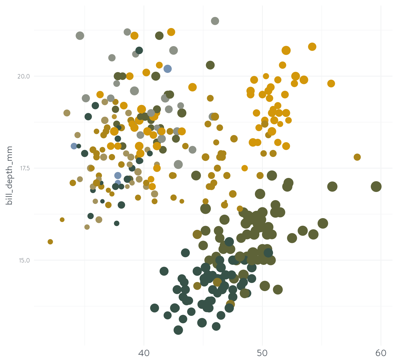
#5 - Make use of colour interpolation
There are only so many colours you can use in a plot!
- Could other approaches work (facets?)
- Try using different shapes (you can use letters / emoji!)
There’s so much more we could talk about!
- Packaging up your palette for easy reuse
carartemplates::carar_colours()

- Creating your own
scale_nhsdemo_colour/fill()functions - You can even have several palettes!
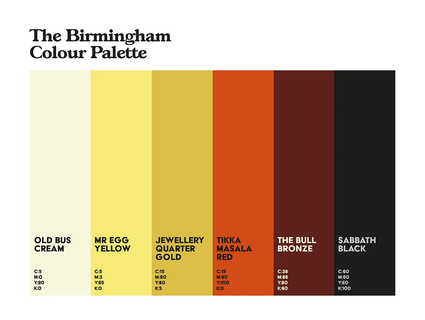
scale_nhsdemo_colour("Birmingham")?
- Basing your “dark text” colour on the central / most important colour in your palette