

Level up your plots
NHS-R Conference 2023 | 4th October 2023
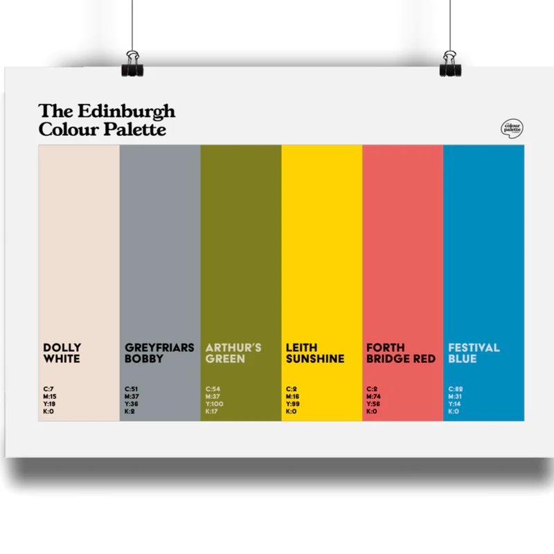
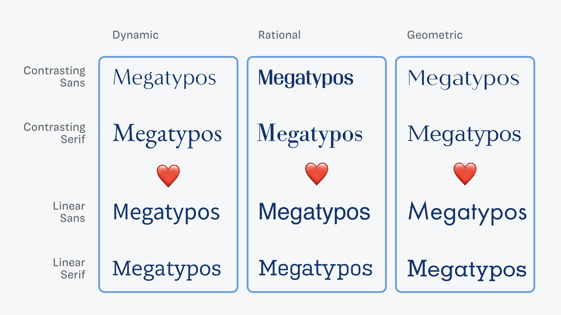
“Intuitive colour palettes?”

“Intuitive colour palettes?”


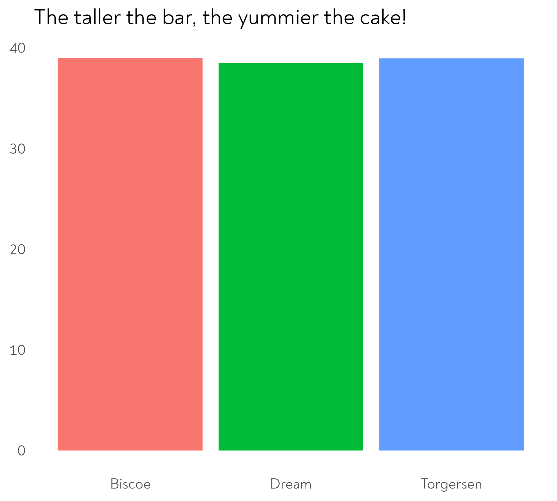
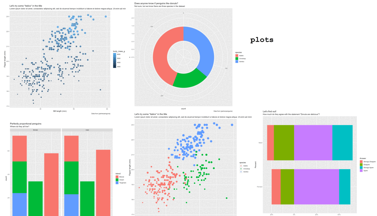
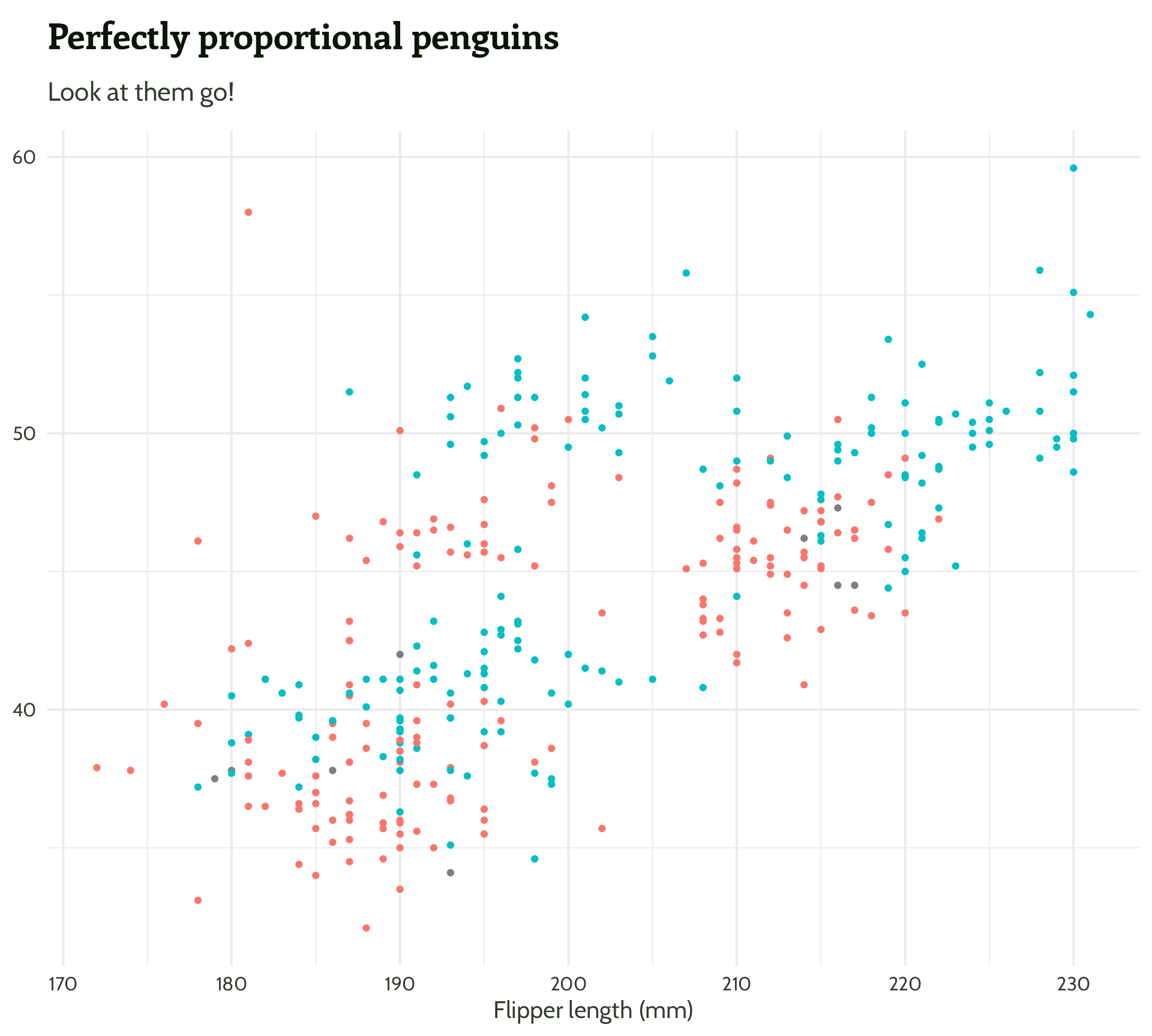
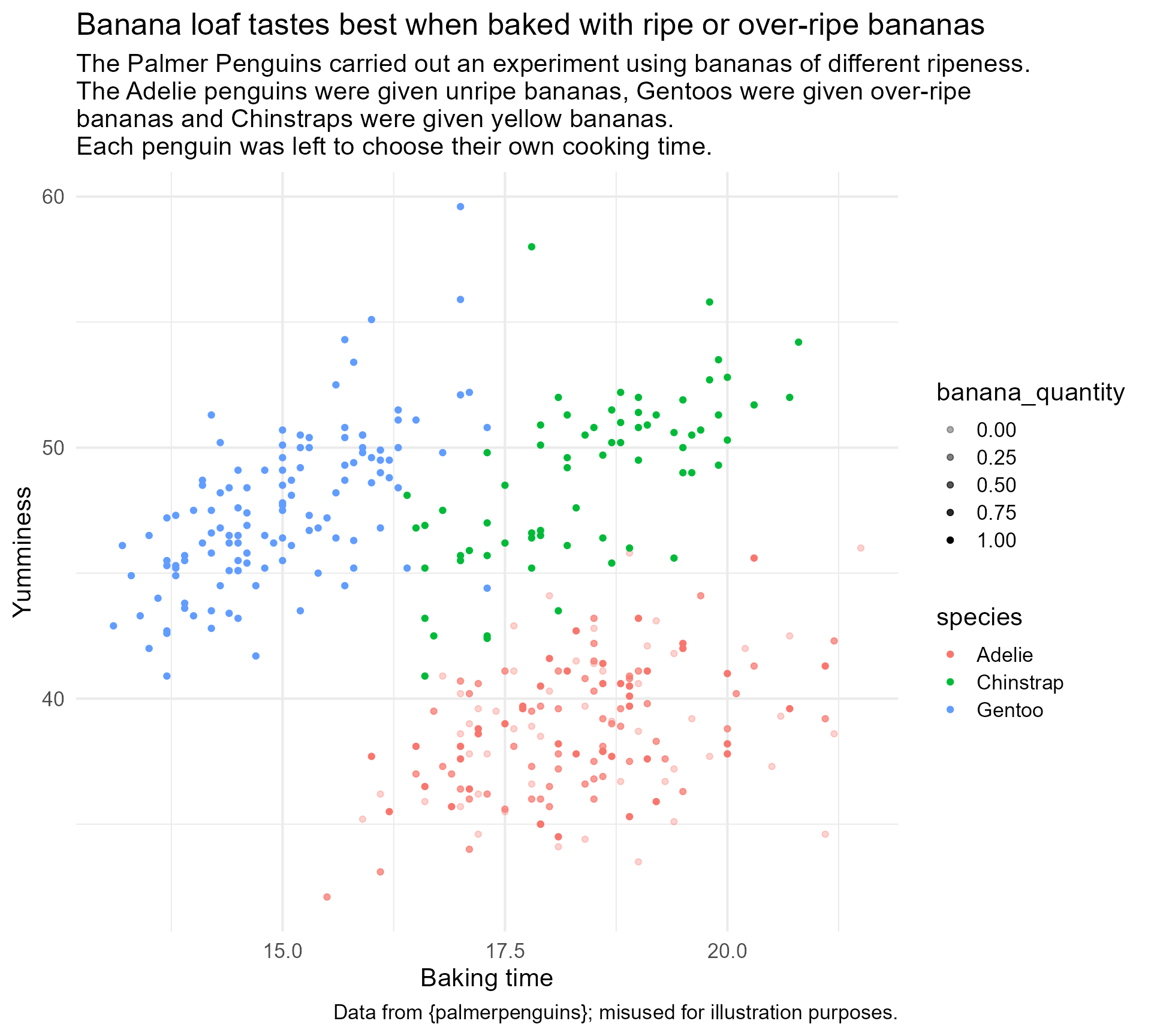
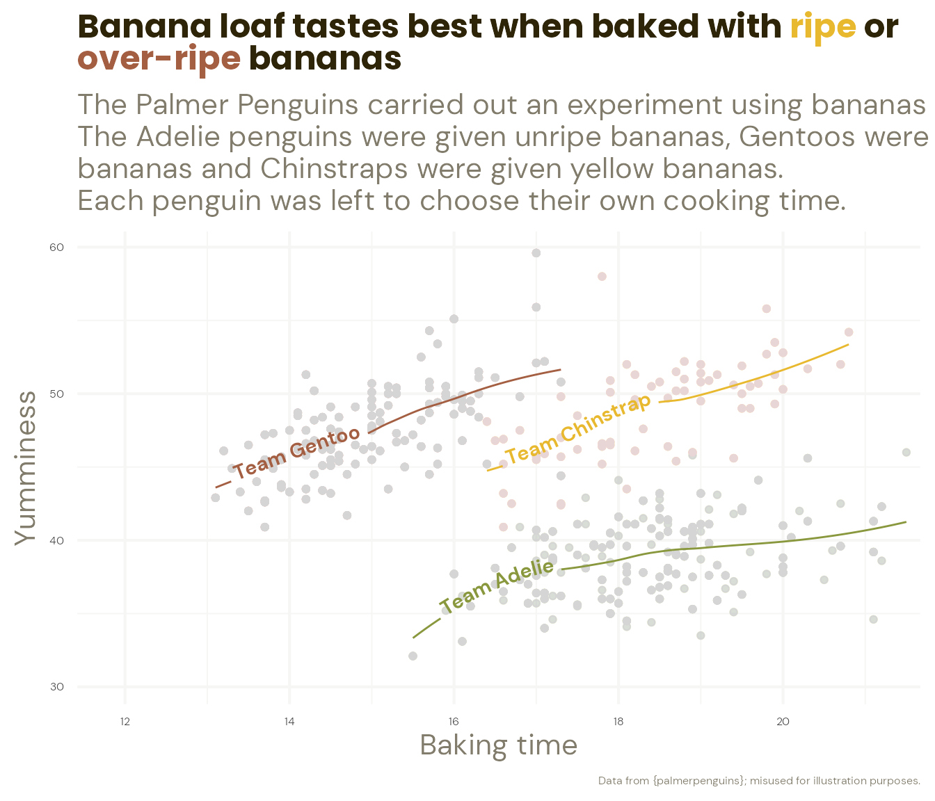
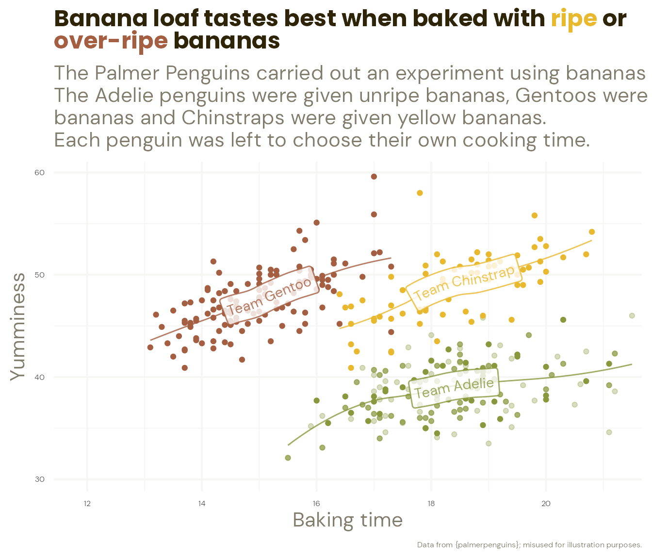
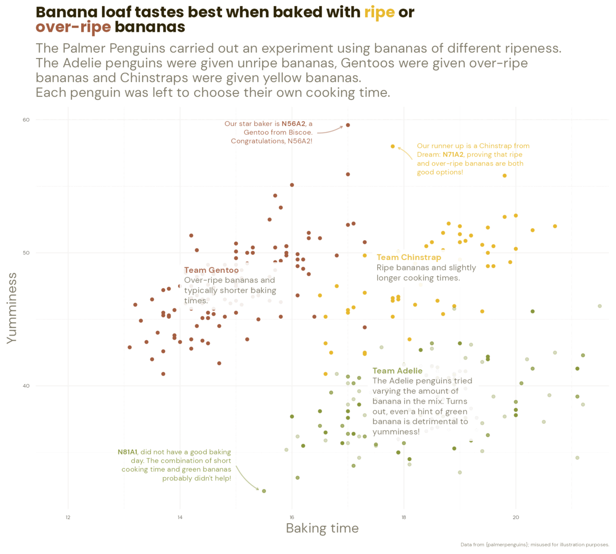
The Great Penguin Bake Off
The penguins had a baking competition to see which species could make the best banana loaf. Each species was given bananas of a different level of ripeness.
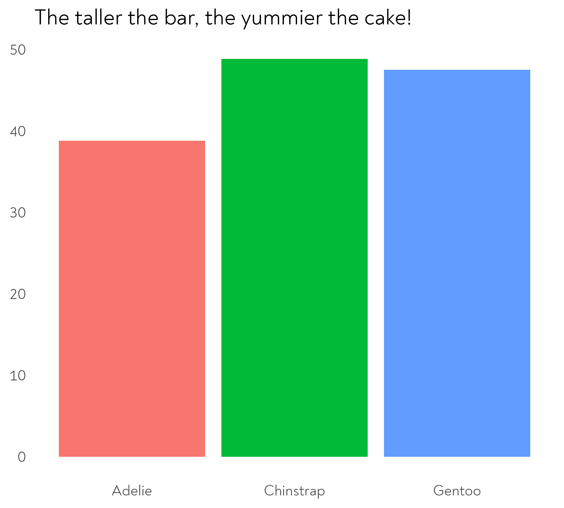
The Great Penguin Bake Off
The penguins had a baking competition to see which species could make the best banana loaf. Each species was given bananas of a different level of ripeness.
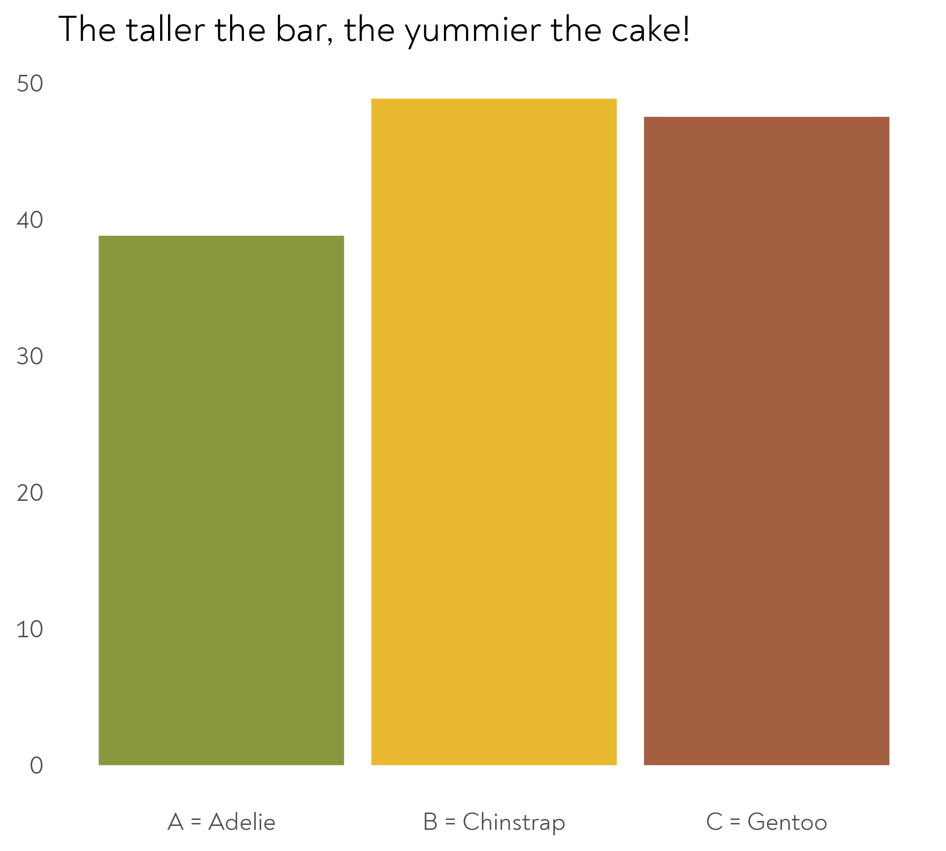
The Great Penguin Bake Off
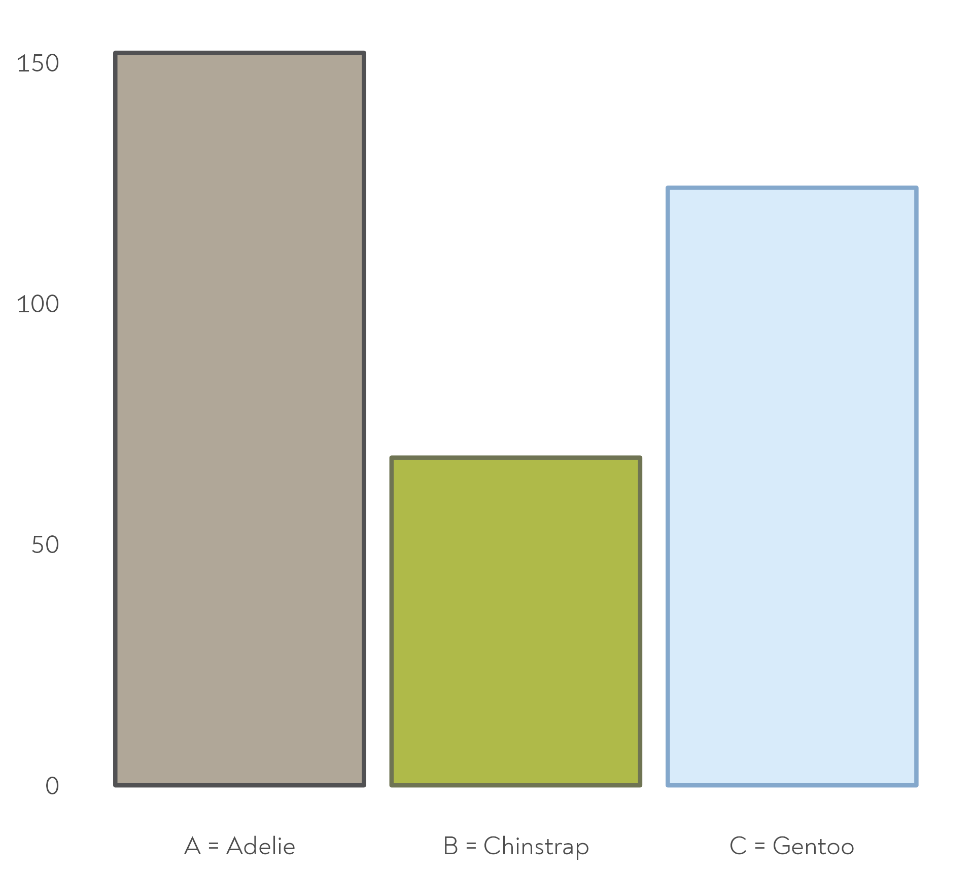
The Adelie penguins decided to experiment with different quantities of banana in their mix. Each island chose a different quantity.
The Great Penguin Bake Off
The Adelie penguins decided to experiment with different quantities of unripe banana in their mix. Each island chose a different quantity.

The Great Penguin Bake Off
They decided to go on a retreat to plan their bakes in different locations
The Great Penguin Bake Off
Each species was allowed to invite a different mentor…
The Great Penguin Bake Off
… and to choose a type of snack between practice bakes
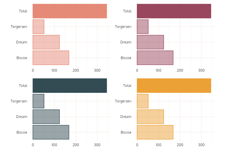
The Great Penguin Bake Off - Bonus round!
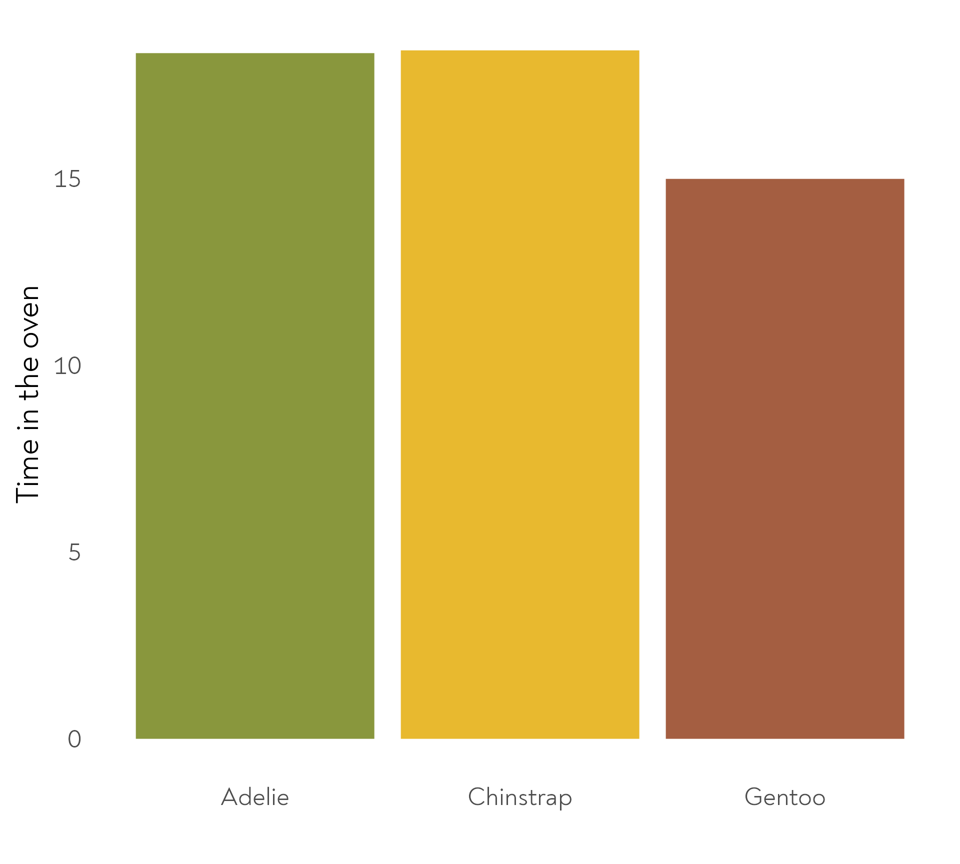
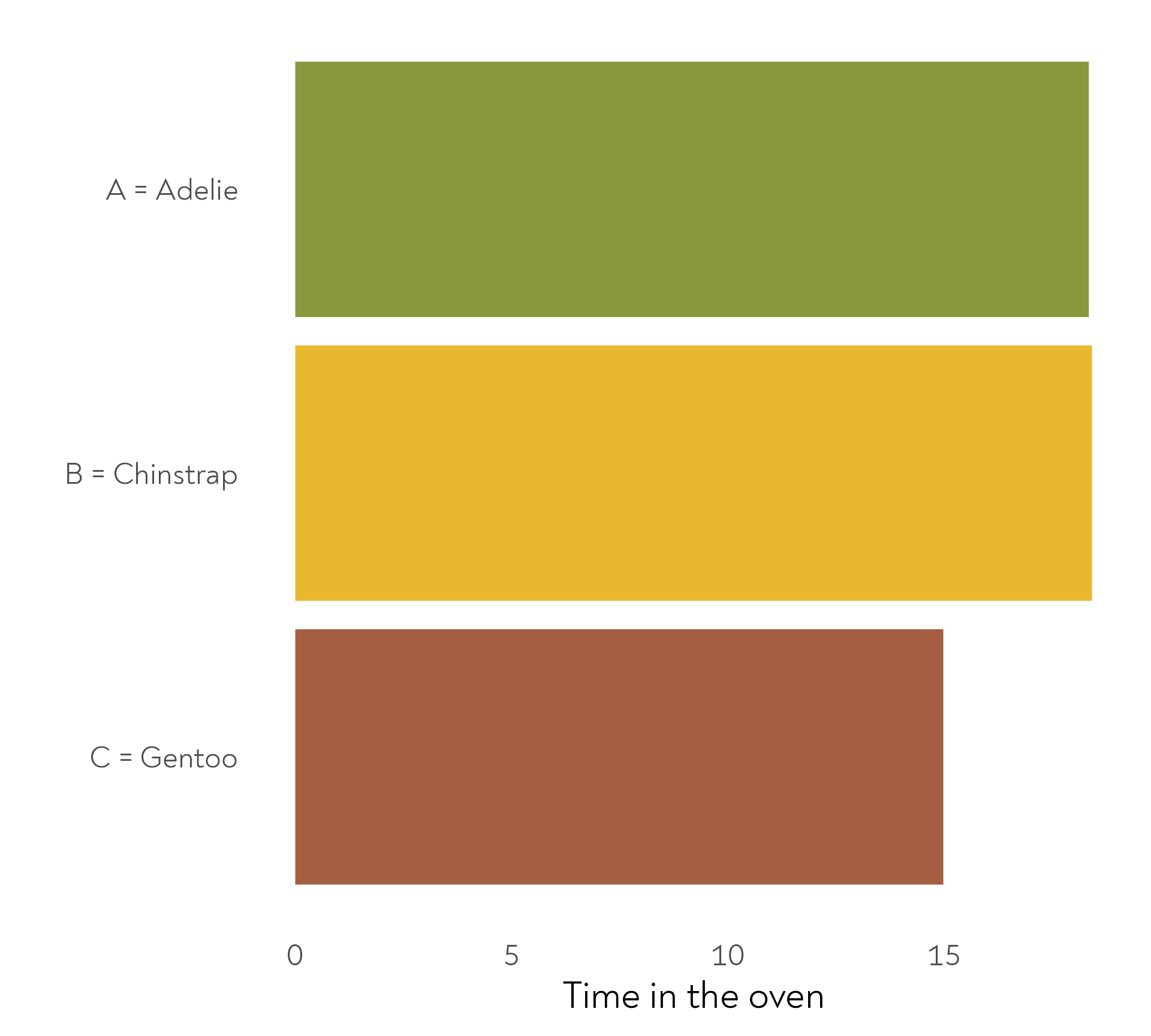
The penguins also baked their cakes for different amounts of time. Here are the mean durations per species.
The Great Penguin Bake Off - Bonus round!
The penguins also baked their cakes for different amounts of time. Here are the mean durations per species.
Setting up our first plot
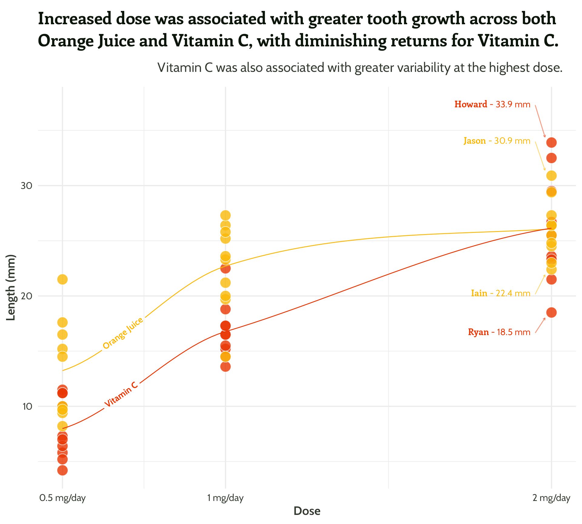
Using the ToothGrowth dataset
- Build into R for easy “codealongability”
- Intriguing dataset (
?ToothGrowth) - Excuse for a cute GIF –>
Setting up our first plot
With a few tips along the way
Setting up our first plot
With a few tips along the way
Setting up our first plot
With a few tips along the way
Setting up our first plot
Mini tip: get rid of abbreviations
ToothGrowth %>%
  mutate(supplement =
           case_when(supp == "OJ" ~ "Orange Juice",
                     supp == "VC" ~ "Vitamin C",
                     TRUE ~ as.character(supp))) %>%
  group_by(supplement, dose) %>%
  summarise(mean_length = mean(len)) %>%
  ggplot(aes(x = dose,
             y = mean_length,
             fill = supplement)) +
  geom_bar(stat = "identity",
           position = "dodge",
           colour = "#FFFFFF",
           size = 2)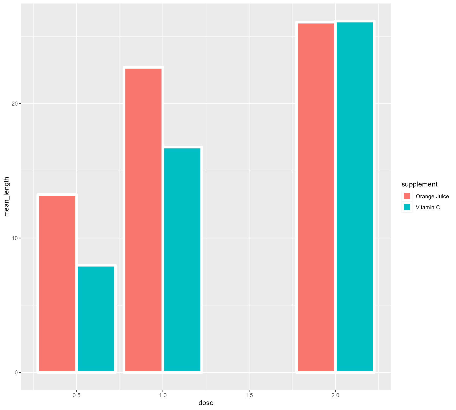
Setting up our first plot
Mini tip: theme_minimal()
ToothGrowth %>%
  mutate(supplement =
           case_when(supp == "OJ" ~ "Orange Juice", supp == "VC" ~ "Vitamin C", TRUE ~ as.character(supp))) %>%
  group_by(supplement, dose) %>%
  summarise(mean_length = mean(len)) %>%
  ggplot(aes(x = dose,
             y = mean_length,
             fill = supplement)) +
  geom_bar(stat = "identity",
           position = "dodge",
           colour = "#FFFFFF",
           size = 2) +
  theme_minimal()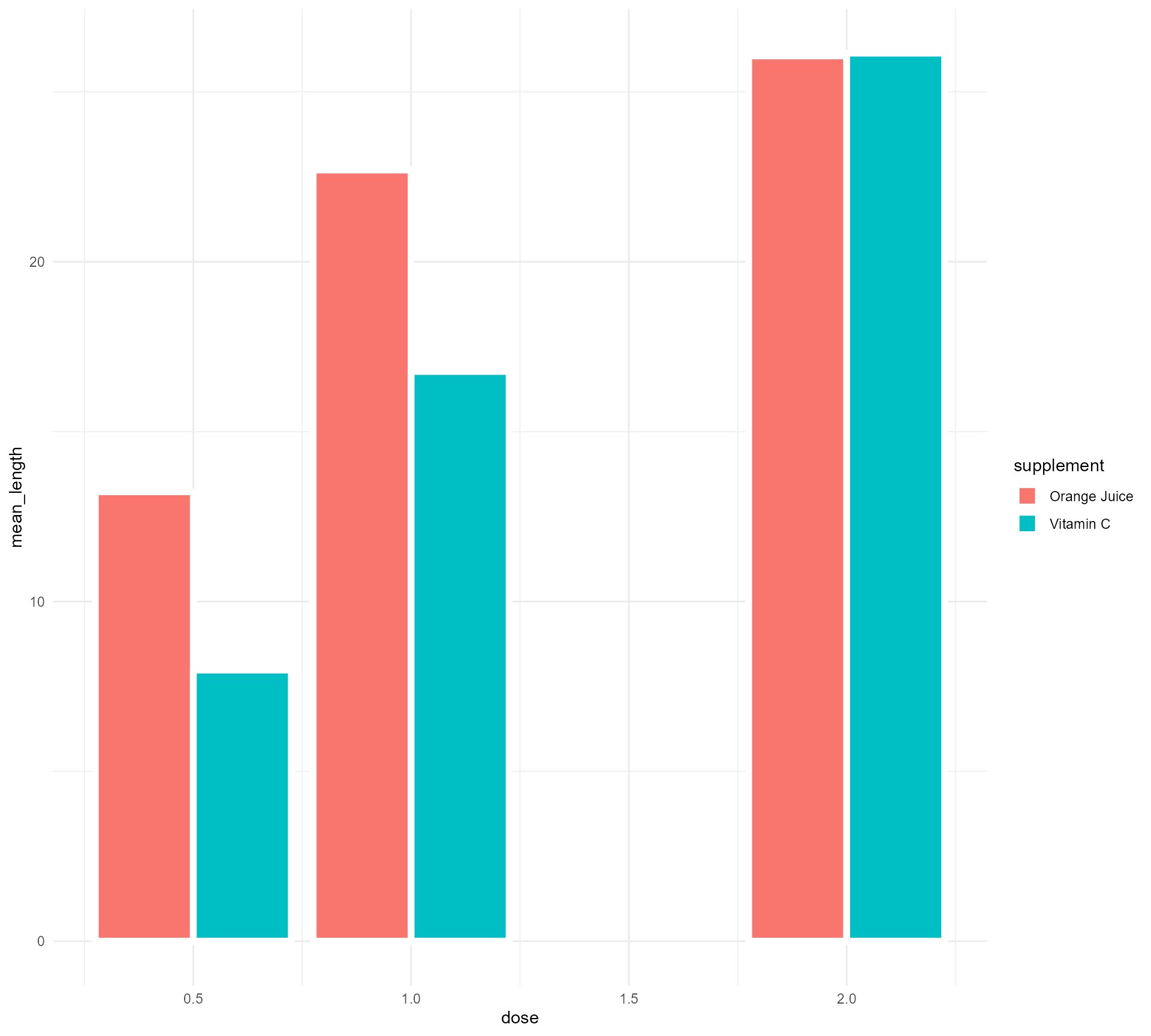
Setting up our first plot
Turning Dose into a categorical variable (fear not!)
ToothGrowth %>%
  mutate(supplement = case_when(supp == "OJ" ~ "Orange Juice", supp == "VC" ~ "Vitamin C", TRUE ~ as.character(supp))) %>%
  group_by(supplement, dose) %>%
  summarise(mean_length = mean(len)) %>%
  mutate(categorical_dose = factor(dose)) %>%
  ggplot(aes(x = categorical_dose,
             y = mean_length,
             fill = supplement)) +
  geom_bar(stat = "identity",
           position = "dodge",
           colour = "#FFFFFF",
           size = 2) +
  theme_minimal()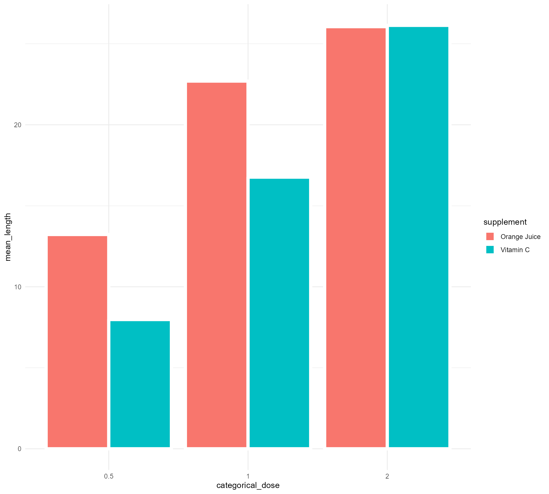
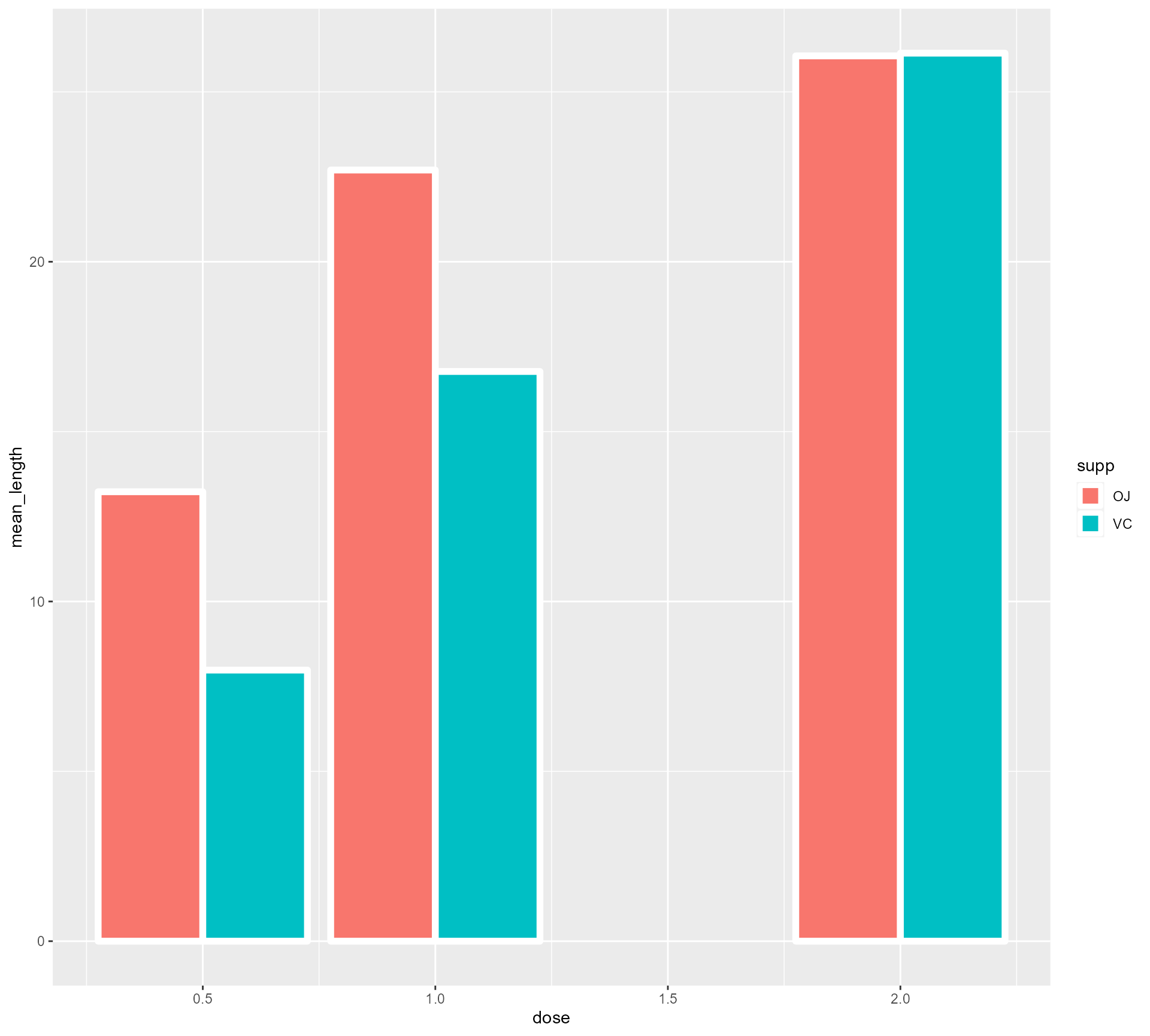
Setting up our first plot
Turning Dose into a categorical variable (fear not!) + facetting
ToothGrowth %>%
  mutate(supplement = case_when(supp == "OJ" ~ "Orange Juice", supp == "VC" ~ "Vitamin C", TRUE ~ as.character(supp))) %>%
  group_by(supplement, dose) %>%
  summarise(mean_length = mean(len)) %>%
  mutate(categorical_dose = factor(dose)) %>%
  ggplot(aes(x = categorical_dose,
             y = mean_length,
             fill = supplement)) +
  geom_bar(stat = "identity",
           colour = "#FFFFFF",
           size = 2) +
  facet_wrap(supplement ~ ., ncol = 1) +
  theme_minimal()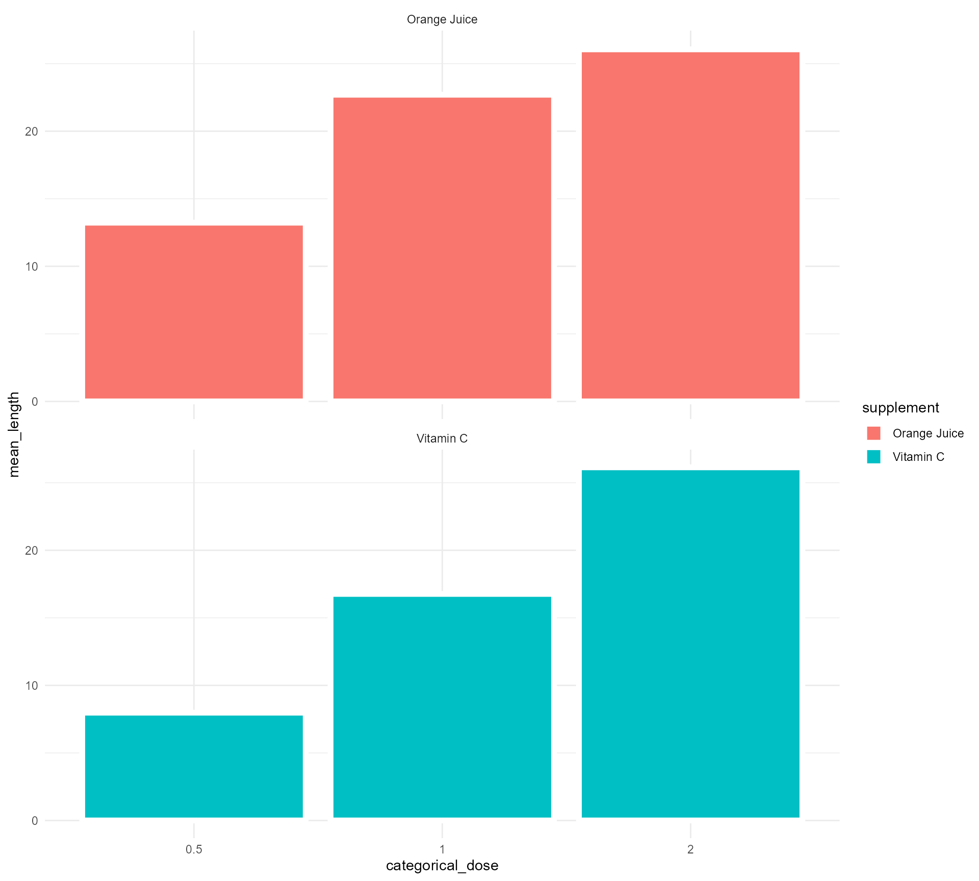
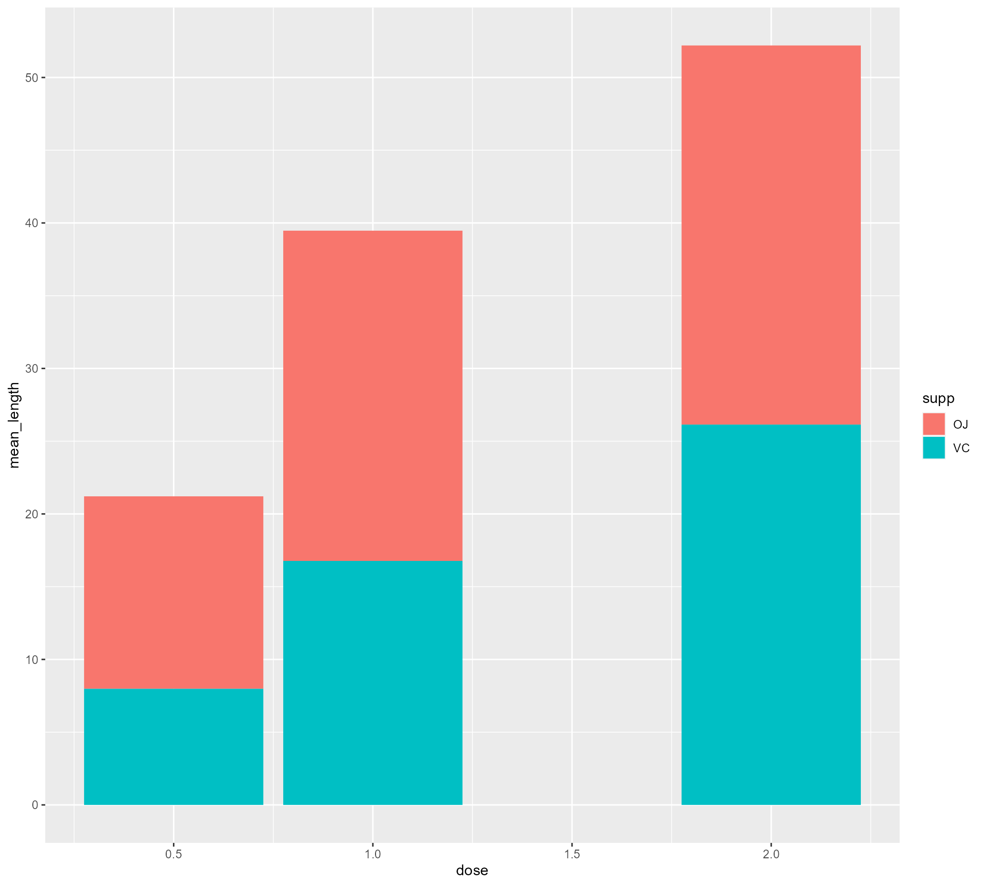
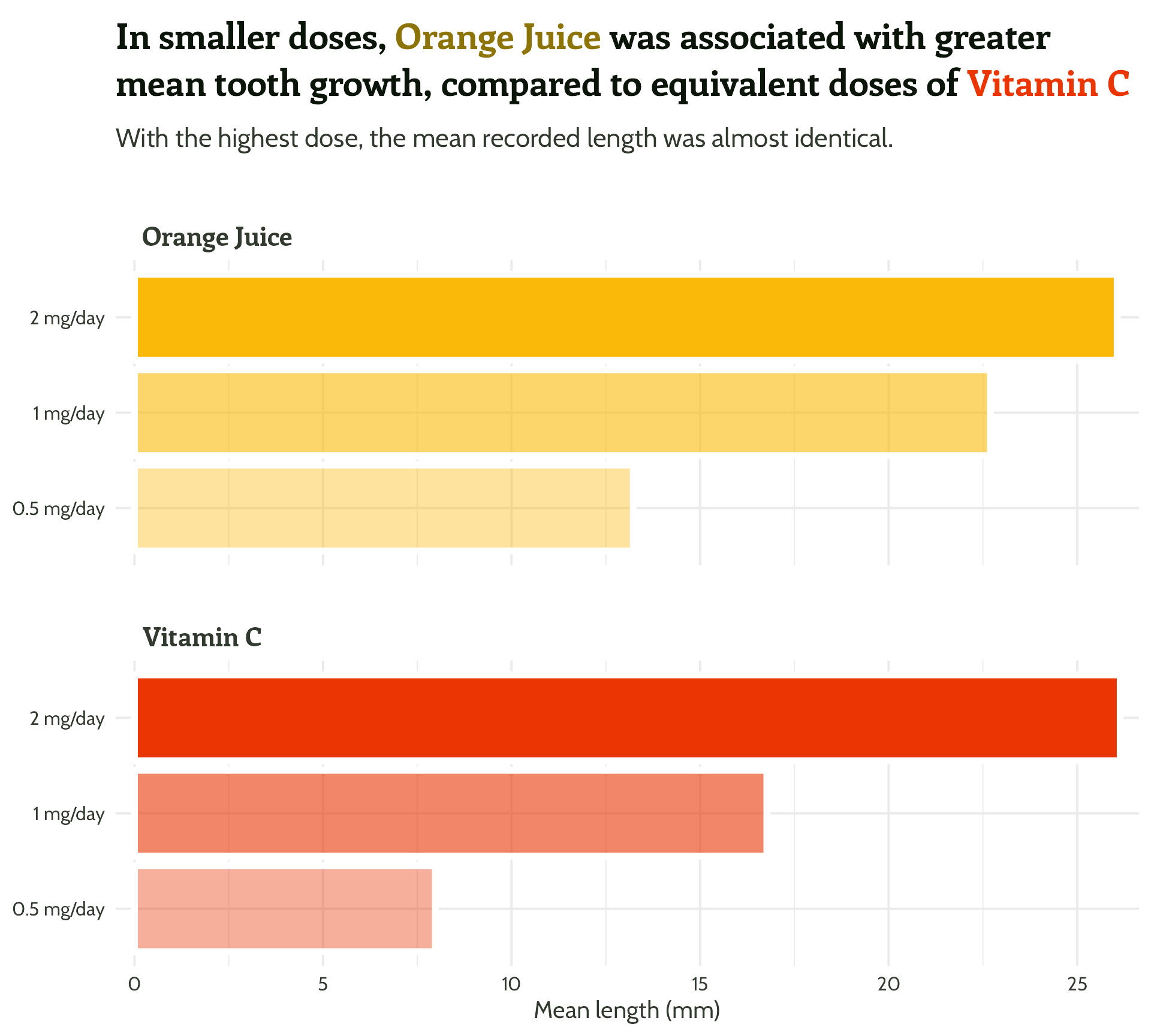
Setting up our first plot
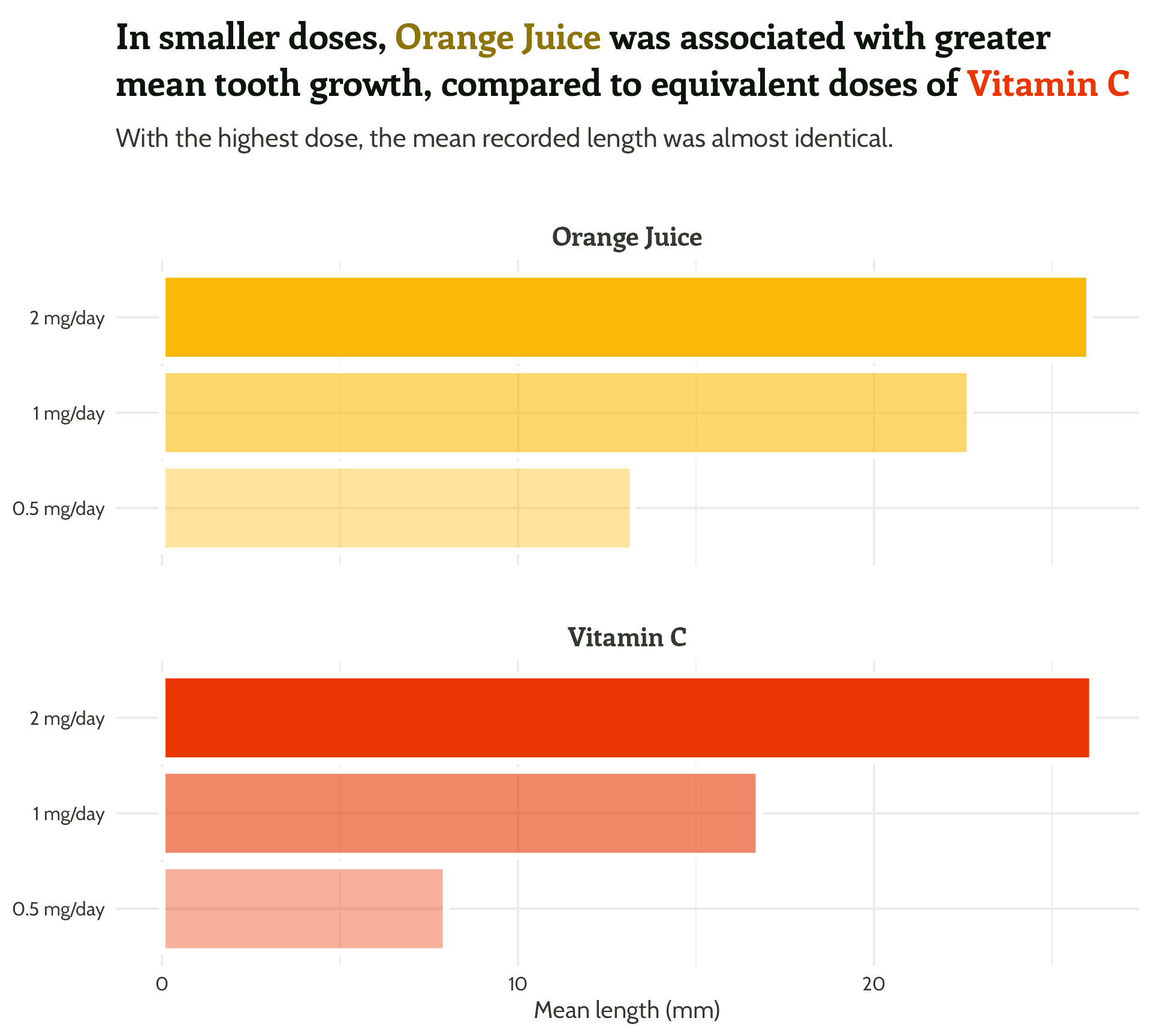
Adding some text (finally!)
ToothGrowth %>%
mutate(supplement = case_when(supp == "OJ" ~ "Orange Juice", supp == "VC" ~ "Vitamin C", TRUE ~ as.character(supp))) %>%
group_by(supplement, dose) %>%
summarise(mean_length = mean(len)) %>%
mutate(categorical_dose = factor(dose)) %>%
ggplot(aes(x = categorical_dose,
y = mean_length,
fill = supplement)) +
geom_bar(stat = "identity",
colour = "#FFFFFF",
size = 2) +
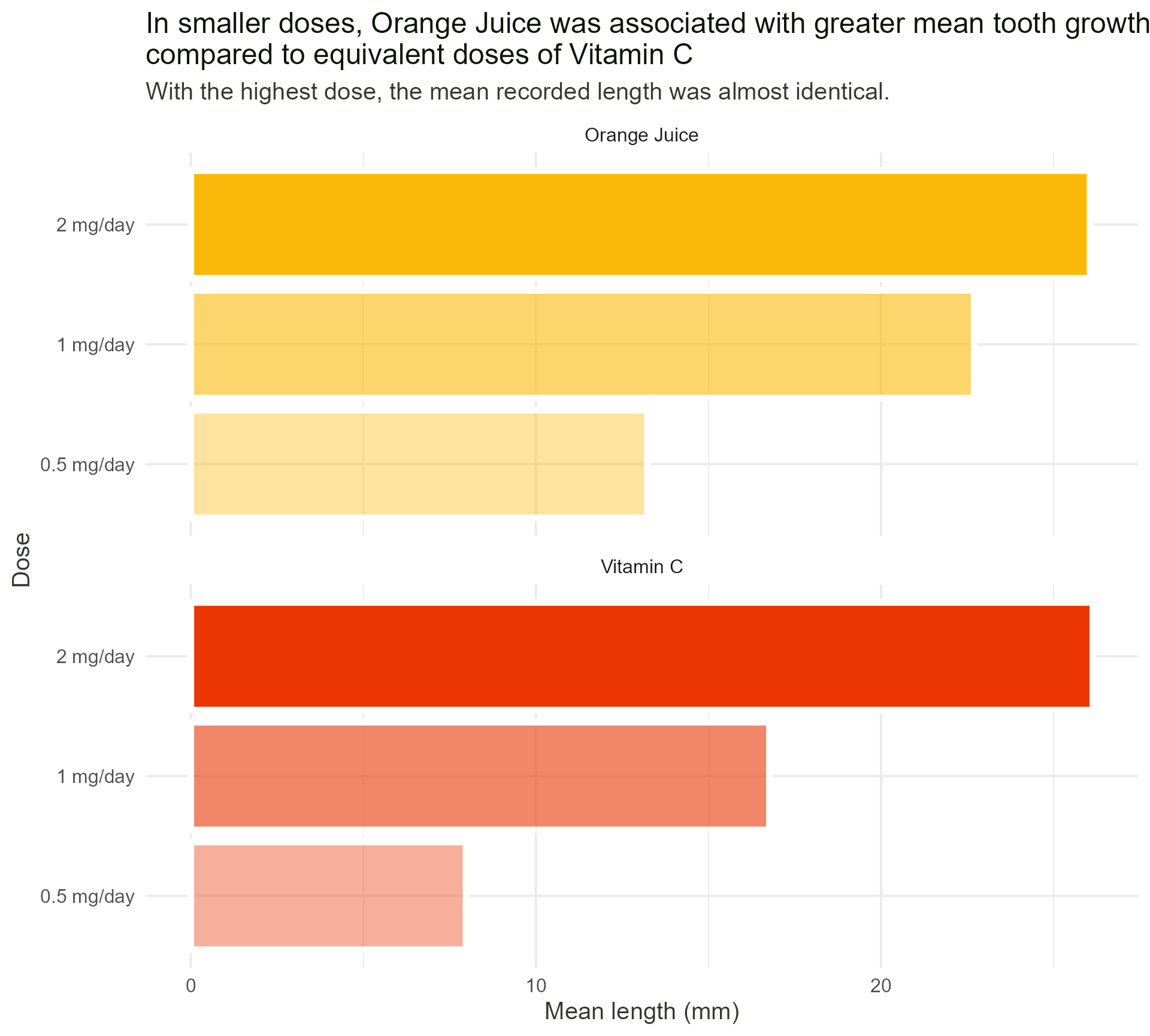
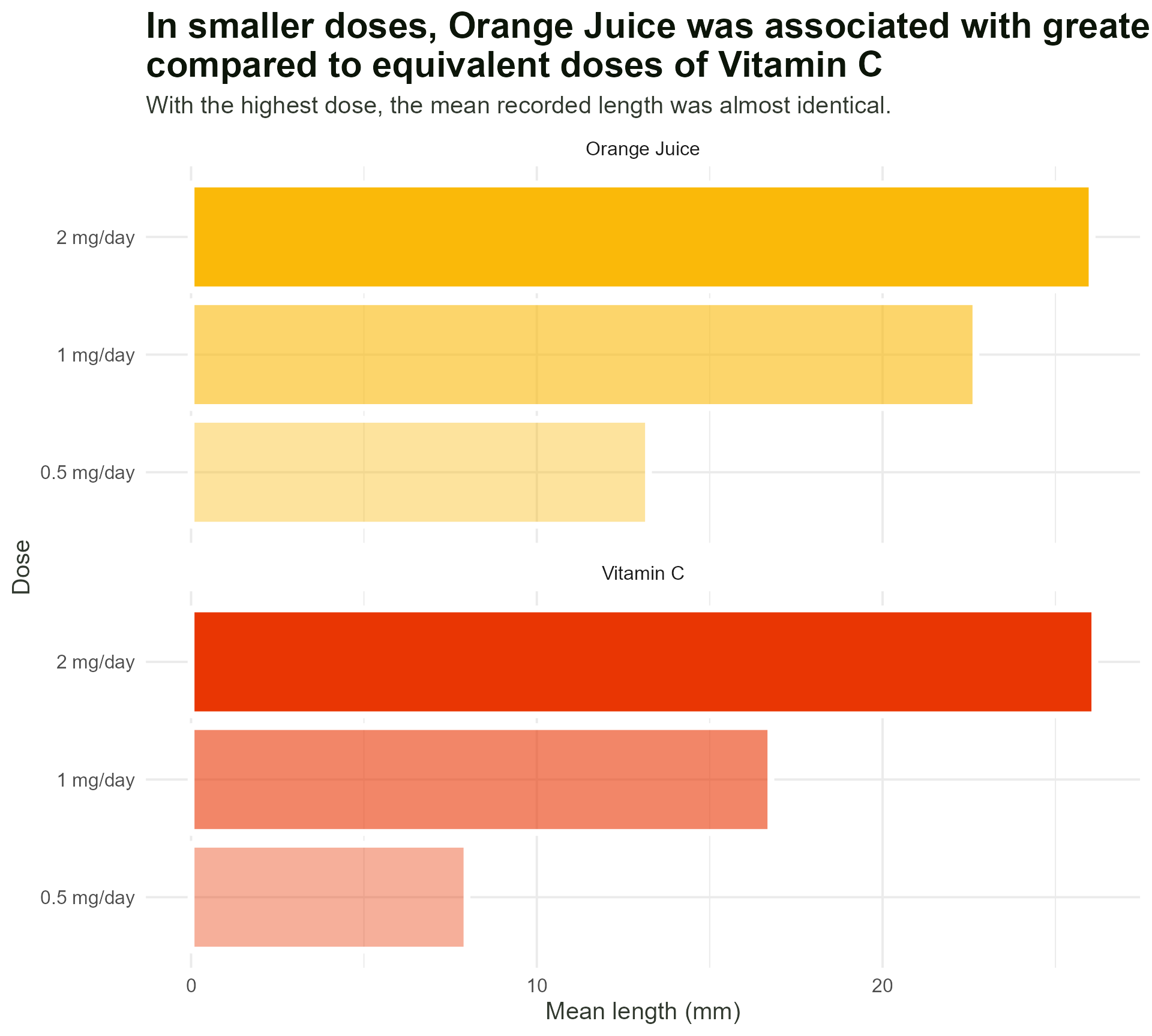
labs(x = "Dose",
y = "Mean length (mm)",
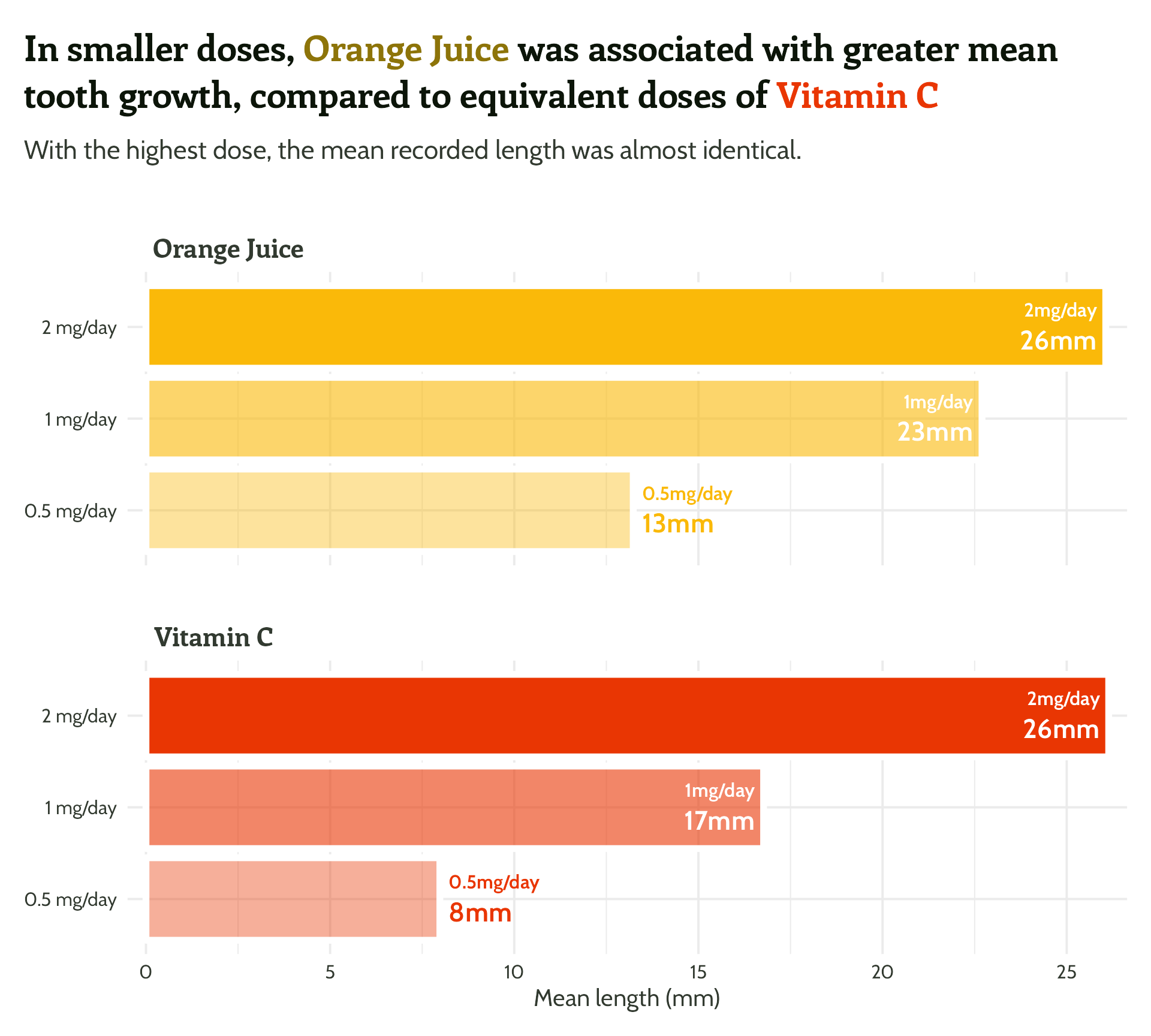
title = "In smaller doses, Orange Juice was associated with greater mean tooth growth,
compared to equivalent doses of Vitamin C",
subtitle = "With the highest dose, the mean recorded length was almost identical.") +
facet_wrap(supplement ~ ., ncol = 1) +
theme_minimal()
Setting up our first plot
Legend + facet strip + colour + title… Wait, which one is which?

#1 - Use colour purposefully
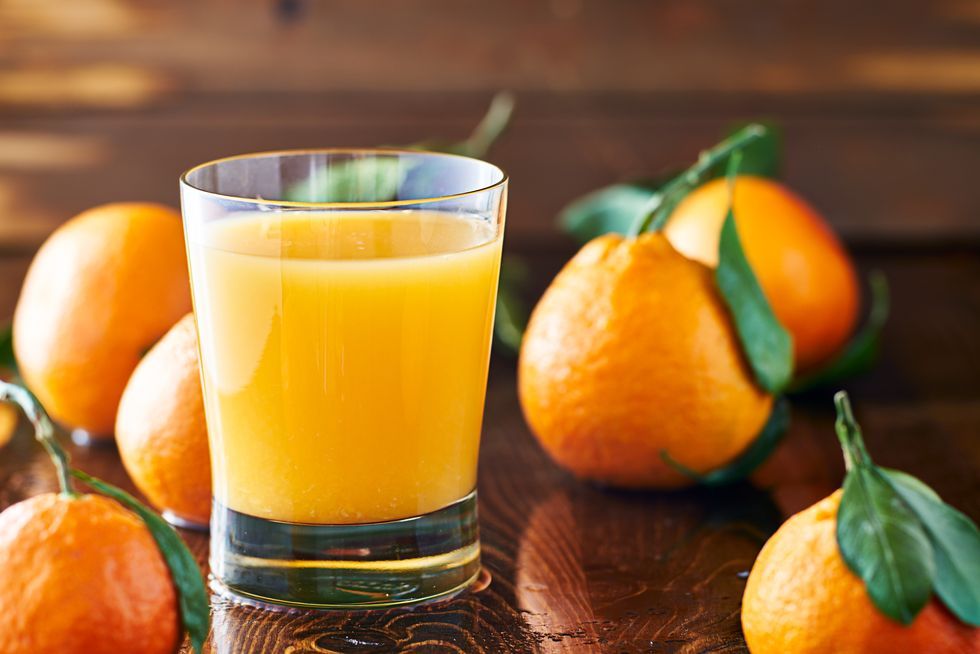
- Orange juice is… orange!
- Vitamin C is… also orange, but more red and “aggressive”
- Those green leaves look nice with those colours…
- imagecolorpicker.com
#1 - Use colour purposefully
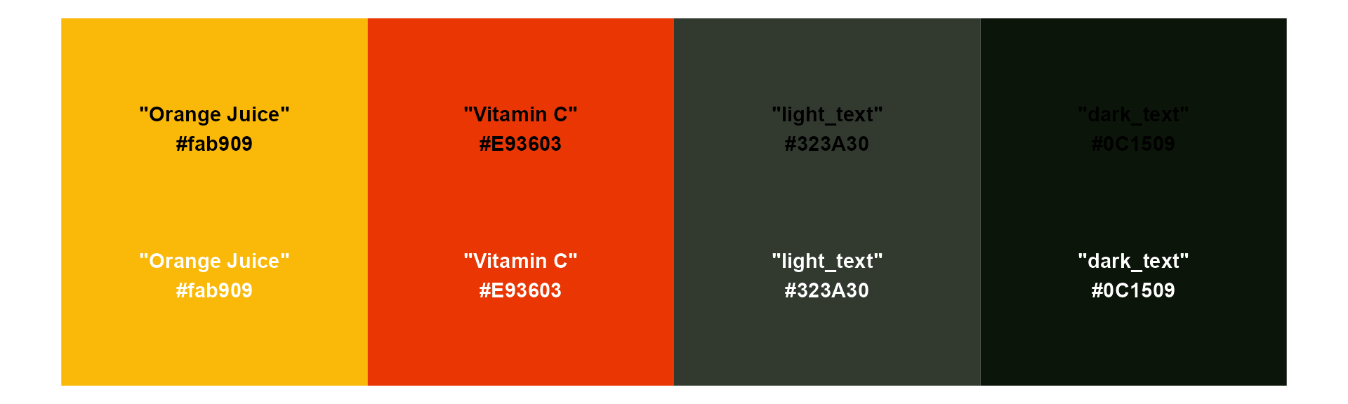
Generating a colour palette, starting with orange juice! #fab909

[1] "#DB5A05" "#E93603" "#F71201"
[1] "#3C6B30" "#0C1509"
[1] "#0C1509" "#323A30" "#595F57" "#80857F" "#A7AAA6" "#CED0CD"#1 - Use colour purposefully
Creating a named vector
#1 - Use colour purposefully
Back to the plot!
ToothGrowth %>%
  mutate(supplement = case_when(supp == "OJ" ~ "Orange Juice", supp == "VC" ~ "Vitamin C", TRUE ~ as.character(supp))) %>%
  group_by(supplement, dose) %>%
  summarise(mean_length = mean(len)) %>%
  mutate(categorical_dose = factor(dose)) %>%
  ggplot(aes(x = categorical_dose,
             y = mean_length,
             fill = supplement)) +
  geom_bar(stat = "identity",
           colour = "#FFFFFF",
           size = 2) +
  labs(x = "Dose",
       y = "Mean length (mm)",
       title = "In smaller doses, Orange Juice was associated with greater mean tooth growth,
compared to equivalent doses of Vitamin C",
subtitle = "With the highest dose, the mean recorded length was almost identical.") +
  facet_wrap(supplement ~ ., ncol = 1) +
  theme_minimal()
#1 - Use colour purposefully
Add in our colours
ToothGrowth %>%
  mutate(supplement = case_when(supp == "OJ" ~ "Orange Juice", supp == "VC" ~ "Vitamin C", TRUE ~ as.character(supp))) %>%
  group_by(supplement, dose) %>%
  summarise(mean_length = mean(len)) %>%
  mutate(categorical_dose = factor(dose)) %>%
  ggplot(aes(x = categorical_dose,
             y = mean_length,
             fill = supplement)) +
  geom_bar(stat = "identity",
           colour = "#FFFFFF",
           size = 2) +
  labs(x = "Dose",
       y = "Mean length (mm)",
       title = "In smaller doses, Orange Juice was associated with greater mean tooth growth,
compared to equivalent doses of Vitamin C",
subtitle = "With the highest dose, the mean recorded length was almost identical.") +
  scale_fill_manual(values = c("#fab909",
                               "#E93603")) +
  facet_wrap(supplement ~ ., ncol = 1) +
  theme_minimal()
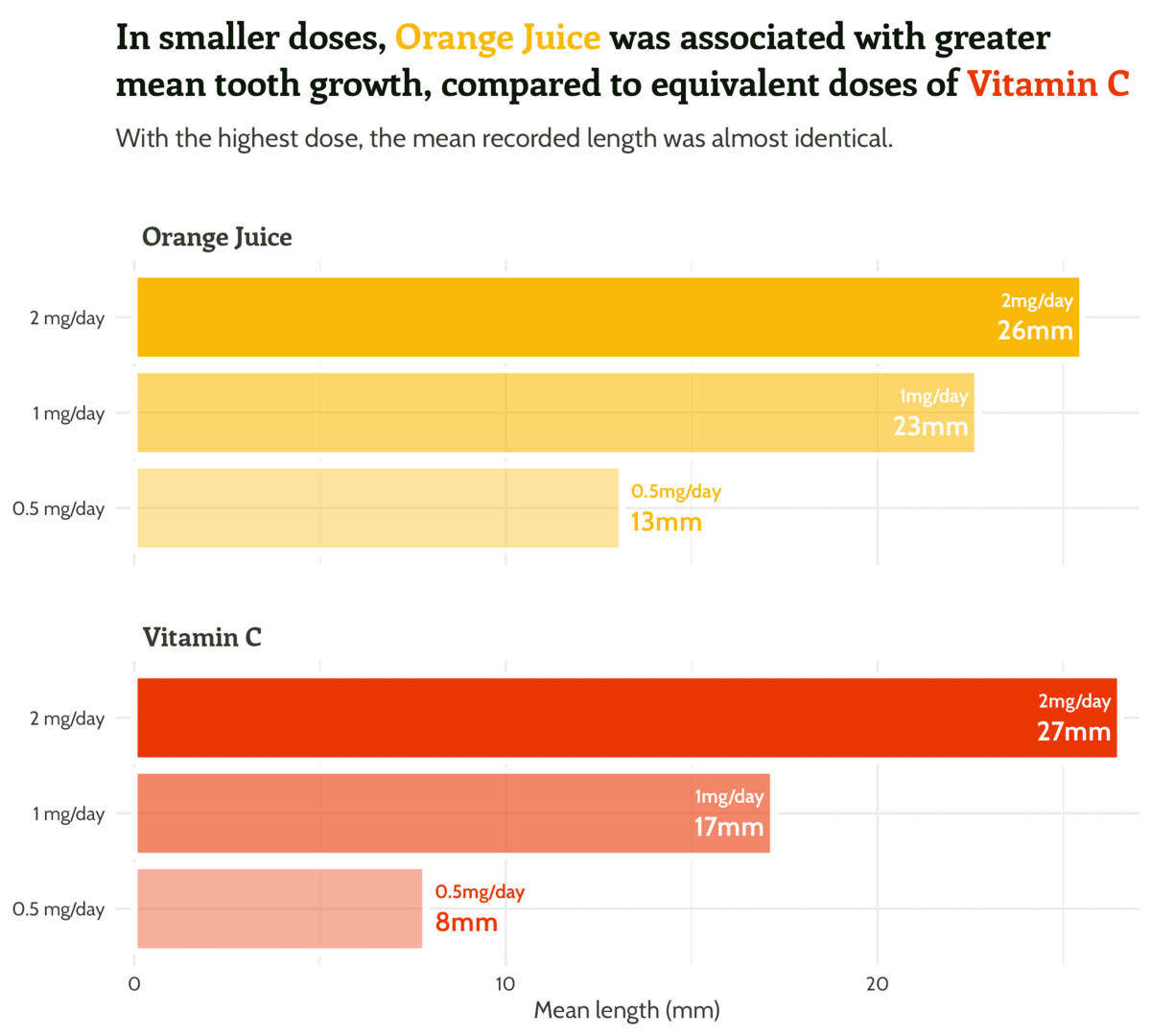
#1 - Use colour purposefully
Add in our colours - wait, what?
ToothGrowth %>%
  mutate(supplement = case_when(supp == "OJ" ~ "Orange Juice", supp == "VC" ~ "Vitamin C", TRUE ~ as.character(supp))) %>%
  group_by(supplement, dose) %>%
  summarise(mean_length = mean(len)) %>%
  mutate(categorical_dose = factor(dose),
         supplement =
           factor(supplement,
                  levels = c("Vitamin C",
                             "Orange Juice"))) %>%
  ggplot(aes(x = categorical_dose,
             y = mean_length,
             fill = supplement)) +
  geom_bar(stat = "identity",
           colour = "#FFFFFF",
           size = 2) +
  labs(x = "Dose",
       y = "Mean length (mm)",
       title = "In smaller doses, Orange Juice was associated with greater mean tooth growth,
compared to equivalent doses of Vitamin C",
subtitle = "With the highest dose, the mean recorded length was almost identical.") +
  scale_fill_manual(values = c("#fab909",
                               "#E93603")) +
  facet_wrap(supplement ~ ., ncol = 1) +
  theme_minimal()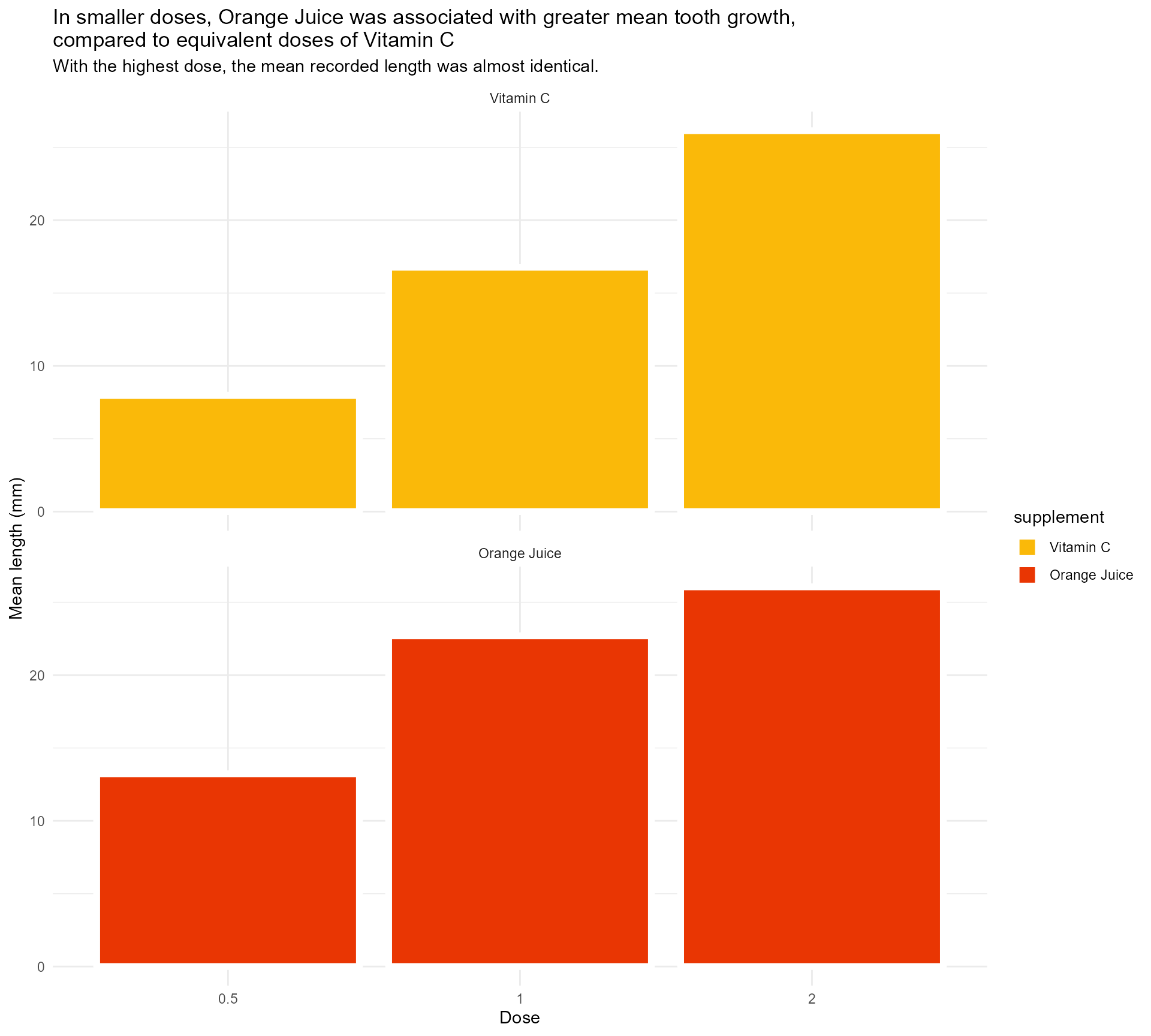
#1 - Use colour purposefully
Add in our colours - named vector to the rescue!
ToothGrowth %>%
  mutate(supplement = case_when(supp == "OJ" ~ "Orange Juice", supp == "VC" ~ "Vitamin C", TRUE ~ as.character(supp))) %>%
  group_by(supplement, dose) %>%
  summarise(mean_length = mean(len)) %>%
  mutate(categorical_dose = factor(dose),
         supplement =
           factor(supplement,
                  levels = c("Vitamin C",
                             "Orange Juice"))) %>%
  ggplot(aes(x = categorical_dose,
             y = mean_length,
             fill = supplement)) +
  geom_bar(stat = "identity",
           colour = "#FFFFFF",
           size = 2) +
  labs(x = "Dose",
       y = "Mean length (mm)",
       title = "In smaller doses, Orange Juice was associated with greater mean tooth growth,
compared to equivalent doses of Vitamin C",
subtitle = "With the highest dose, the mean recorded length was almost identical.") +
  scale_fill_manual(values = vit_c_palette) +
  facet_wrap(supplement ~ ., ncol = 1) +
  theme_minimal()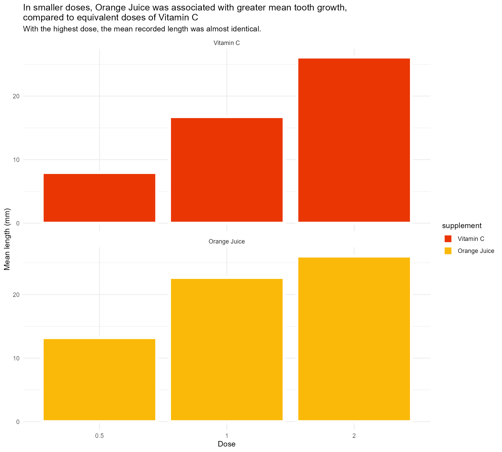
#1 - Use colour purposefully
Get rid of unused colours
ToothGrowth %>%
  mutate(supplement = case_when(supp == "OJ" ~ "Orange Juice", supp == "VC" ~ "Vitamin C", TRUE ~ as.character(supp))) %>%
  group_by(supplement, dose) %>%
  summarise(mean_length = mean(len)) %>%
  mutate(categorical_dose = factor(dose)) %>%
  ggplot(aes(x = categorical_dose,
             y = mean_length,
             fill = supplement)) +
  geom_bar(stat = "identity",
           colour = "#FFFFFF",
           size = 2) +
  labs(x = "Dose",
       y = "Mean length (mm)",
       title = "In smaller doses, Orange Juice was associated with greater mean tooth growth,
compared to equivalent doses of Vitamin C",
subtitle = "With the highest dose, the mean recorded length was almost identical.") +
  scale_fill_manual(values = vit_c_palette,
                    limits = force) +
  facet_wrap(supplement ~ ., ncol = 1) +
  theme_minimal()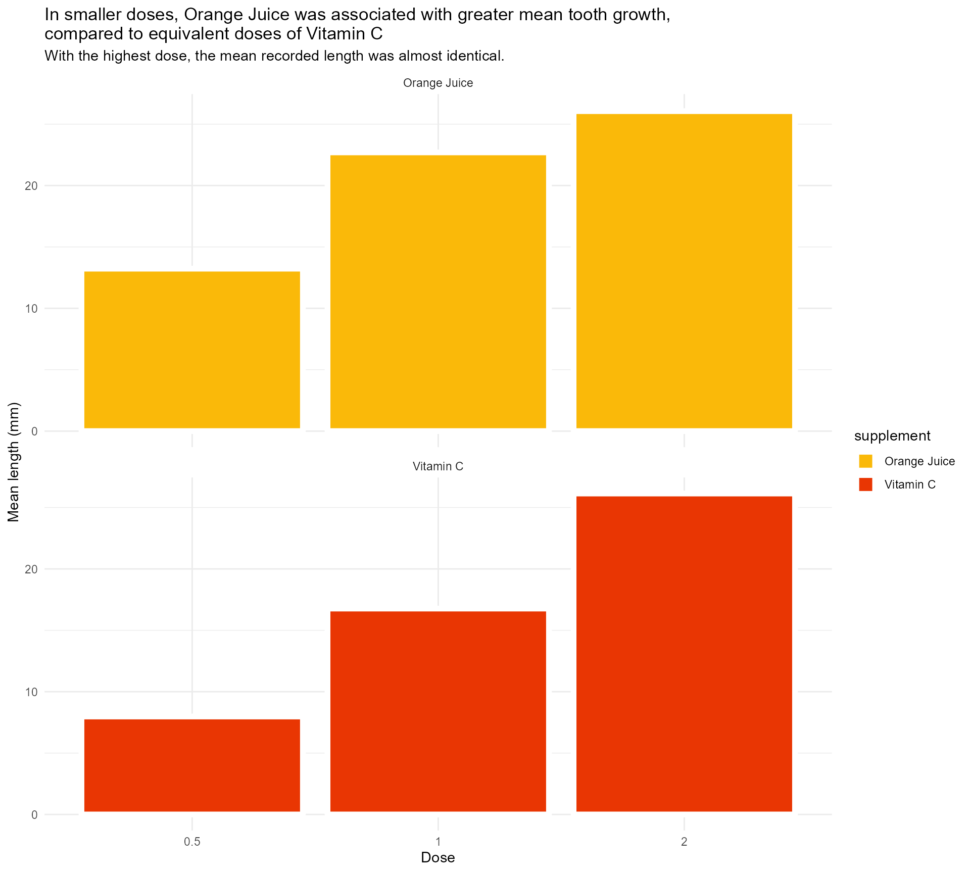
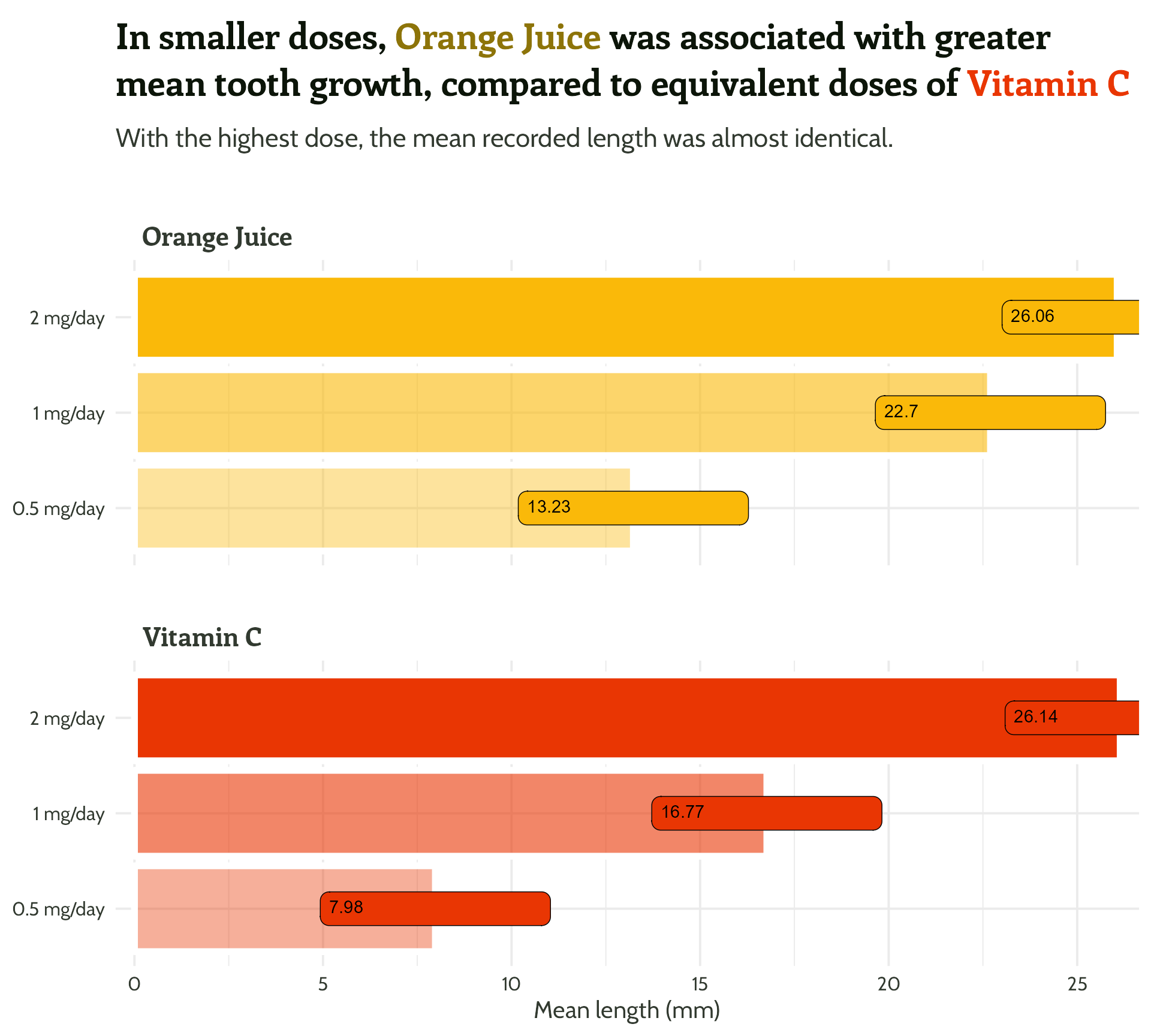
#1 - Use colour purposefully
Use transparency to indicate dose
ToothGrowth %>%
  mutate(supplement = case_when(supp == "OJ" ~ "Orange Juice", supp == "VC" ~ "Vitamin C", TRUE ~ as.character(supp))) %>%
  group_by(supplement, dose) %>%
  summarise(mean_length = mean(len)) %>%
  mutate(categorical_dose = factor(dose)) %>%
  ggplot(aes(x = categorical_dose,
             y = mean_length,
             fill = supplement)) +
  geom_bar(aes(alpha = dose),
           stat = "identity",
           colour = "#FFFFFF",
           size = 2) +
  labs(x = "Dose",
       y = "Mean length (mm)",
       title = "In smaller doses, Orange Juice was associated with greater mean tooth growth,
compared to equivalent doses of Vitamin C",
subtitle = "With the highest dose, the mean recorded length was almost identical.") +
  scale_fill_manual(values = vit_c_palette, limits = force) +
  facet_wrap(supplement ~ ., ncol = 1) +
  theme_minimal()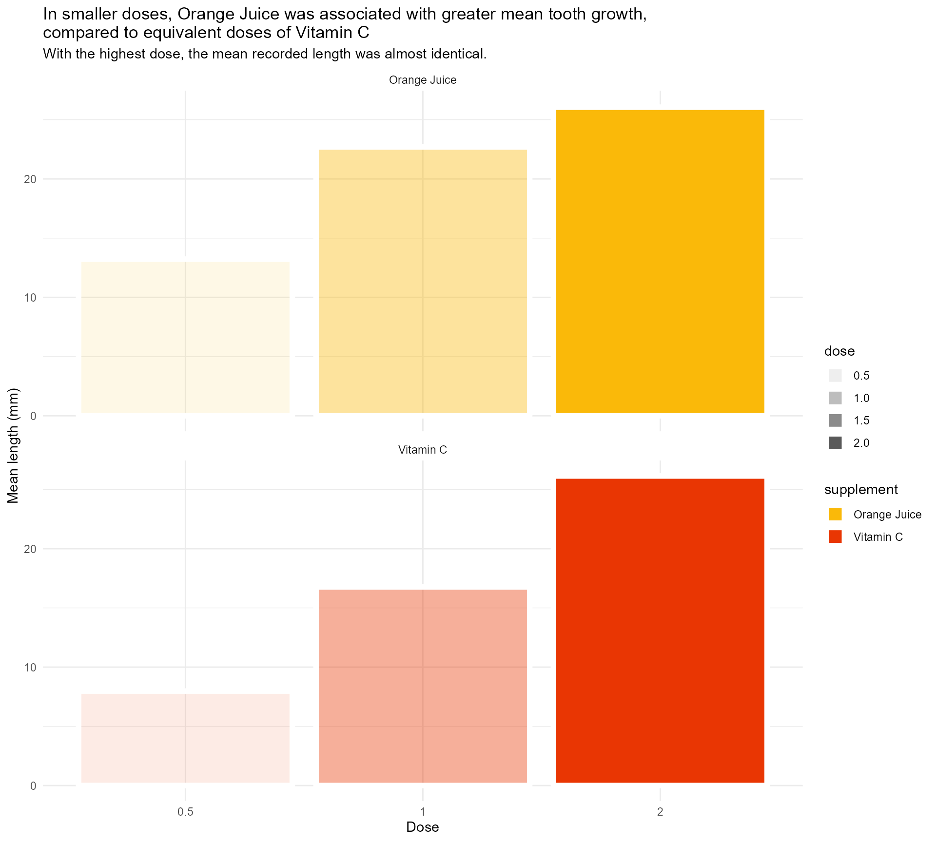
#1 - Use colour purposefully
Use transparency to indicate dose - within limits
ToothGrowth %>%
  mutate(supplement = case_when(supp == "OJ" ~ "Orange Juice", supp == "VC" ~ "Vitamin C", TRUE ~ as.character(supp))) %>%
  group_by(supplement, dose) %>%
  summarise(mean_length = mean(len)) %>%
  mutate(categorical_dose = factor(dose)) %>%
  ggplot(aes(x = categorical_dose,
             y = mean_length,
             fill = supplement)) +
  geom_bar(aes(alpha = dose),
           stat = "identity",
           colour = "#FFFFFF",
           size = 2) +
  labs(x = "Dose",
       y = "Mean length (mm)",
       title = "In smaller doses, Orange Juice was associated with greater mean tooth growth,
compared to equivalent doses of Vitamin C",
subtitle = "With the highest dose, the mean recorded length was almost identical.") +
  scale_fill_manual(values = vit_c_palette, limits = force) +
  scale_alpha(range = c(0.33, 1)) +
  facet_wrap(supplement ~ ., ncol = 1) +
  theme_minimal()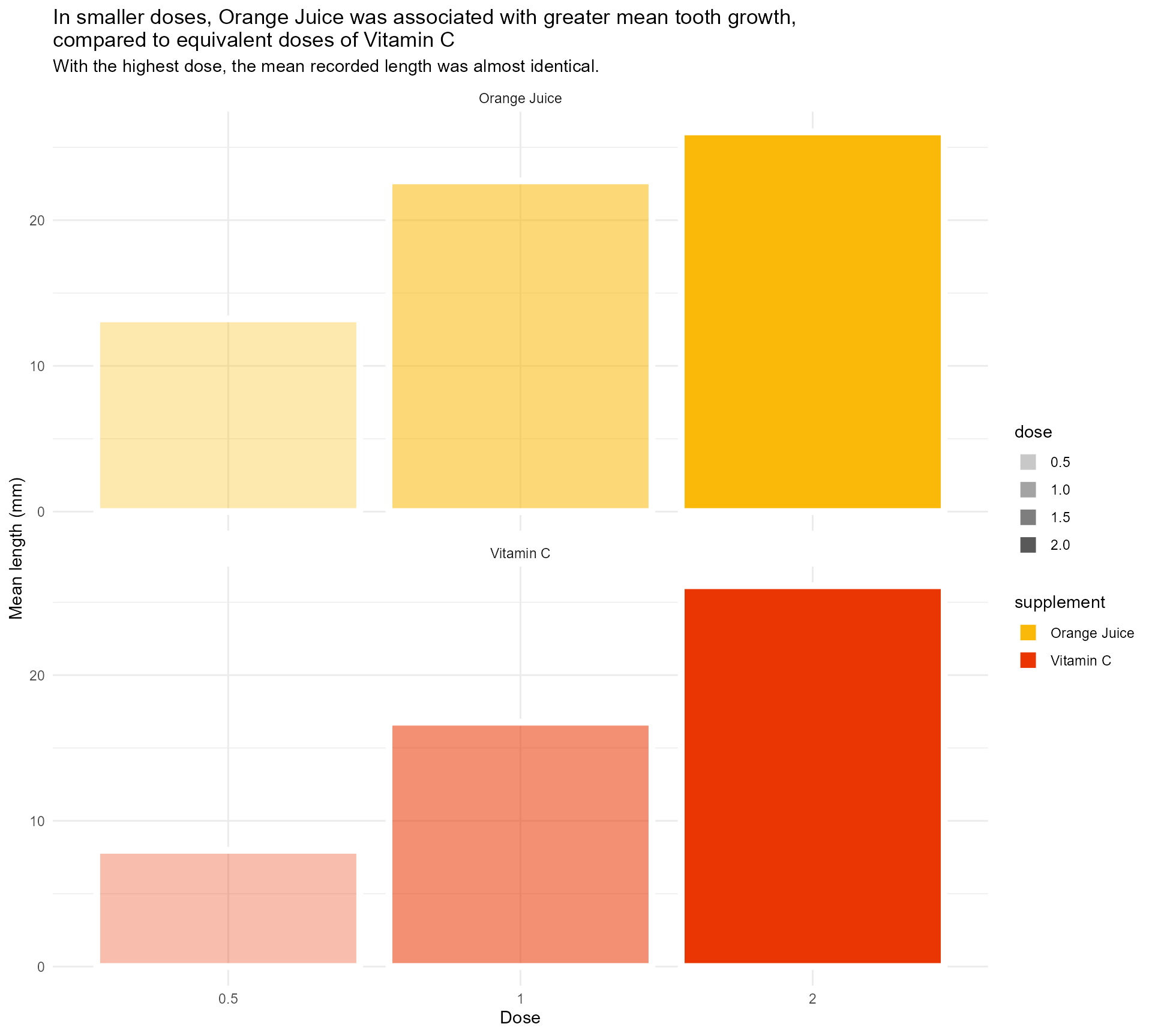
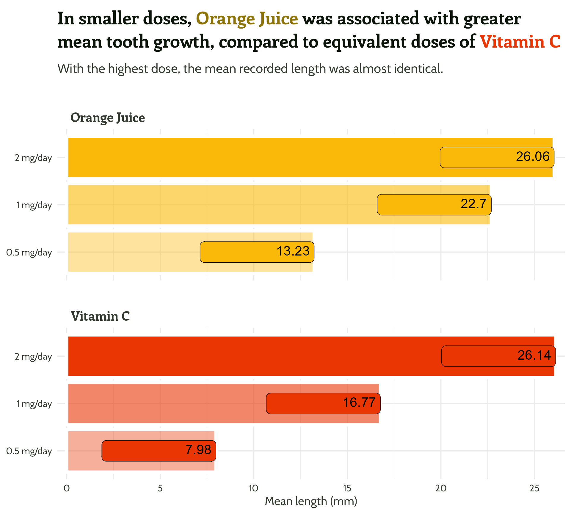
#1 - Use colour purposefully
What is the dose unit again? ?ToothGrowth
ToothGrowth %>%
  mutate(supplement = case_when(supp == "OJ" ~ "Orange Juice", supp == "VC" ~ "Vitamin C", TRUE ~ as.character(supp))) %>%
  group_by(supplement, dose) %>%
  summarise(mean_length = mean(len)) %>%
  mutate(categorical_dose = factor(dose)) %>%
  ggplot(aes(x = categorical_dose,
             y = mean_length,
             fill = supplement)) +
  geom_bar(aes(alpha = dose),
           stat = "identity",
           colour = "#FFFFFF",
           size = 2) +
  labs(x = "Dose",
       y = "Mean length (mm)",
       title = "In smaller doses, Orange Juice was associated with greater mean tooth growth,
compared to equivalent doses of Vitamin C",
subtitle = "With the highest dose, the mean recorded length was almost identical.") +
  scale_fill_manual(values = vit_c_palette, limits = force) +
  scale_alpha(range = c(0.33, 1)) +
  scale_x_discrete(breaks = c("0.5", "1", "2"),
                   labels = function(x)
                     paste0(x, " mg/day")) +
  facet_wrap(supplement ~ ., ncol = 1) +
  theme_minimal()
#1 - Use colour purposefully
Legend has always been redundant!
ToothGrowth %>%
  mutate(supplement = case_when(supp == "OJ" ~ "Orange Juice", supp == "VC" ~ "Vitamin C", TRUE ~ as.character(supp))) %>%
  group_by(supplement, dose) %>%
  summarise(mean_length = mean(len)) %>%
  mutate(categorical_dose = factor(dose)) %>%
  ggplot(aes(x = categorical_dose,
             y = mean_length,
             fill = supplement)) +
  geom_bar(aes(alpha = dose),
           stat = "identity",
           colour = "#FFFFFF",
           size = 2) +
  labs(x = "Dose",
       y = "Mean length (mm)",
       title = "In smaller doses, Orange Juice was associated with greater mean tooth growth,
compared to equivalent doses of Vitamin C",
subtitle = "With the highest dose, the mean recorded length was almost identical.") +
  scale_fill_manual(values = vit_c_palette, limits = force) +
  scale_alpha(range = c(0.33, 1)) +
  facet_wrap(supplement ~ ., ncol = 1) +
  scale_x_discrete(breaks = c("0.5", "1", "2"), labels = function(x) paste0(x, " mg/day")) +
  theme_minimal() +
  theme(legend.position = "none")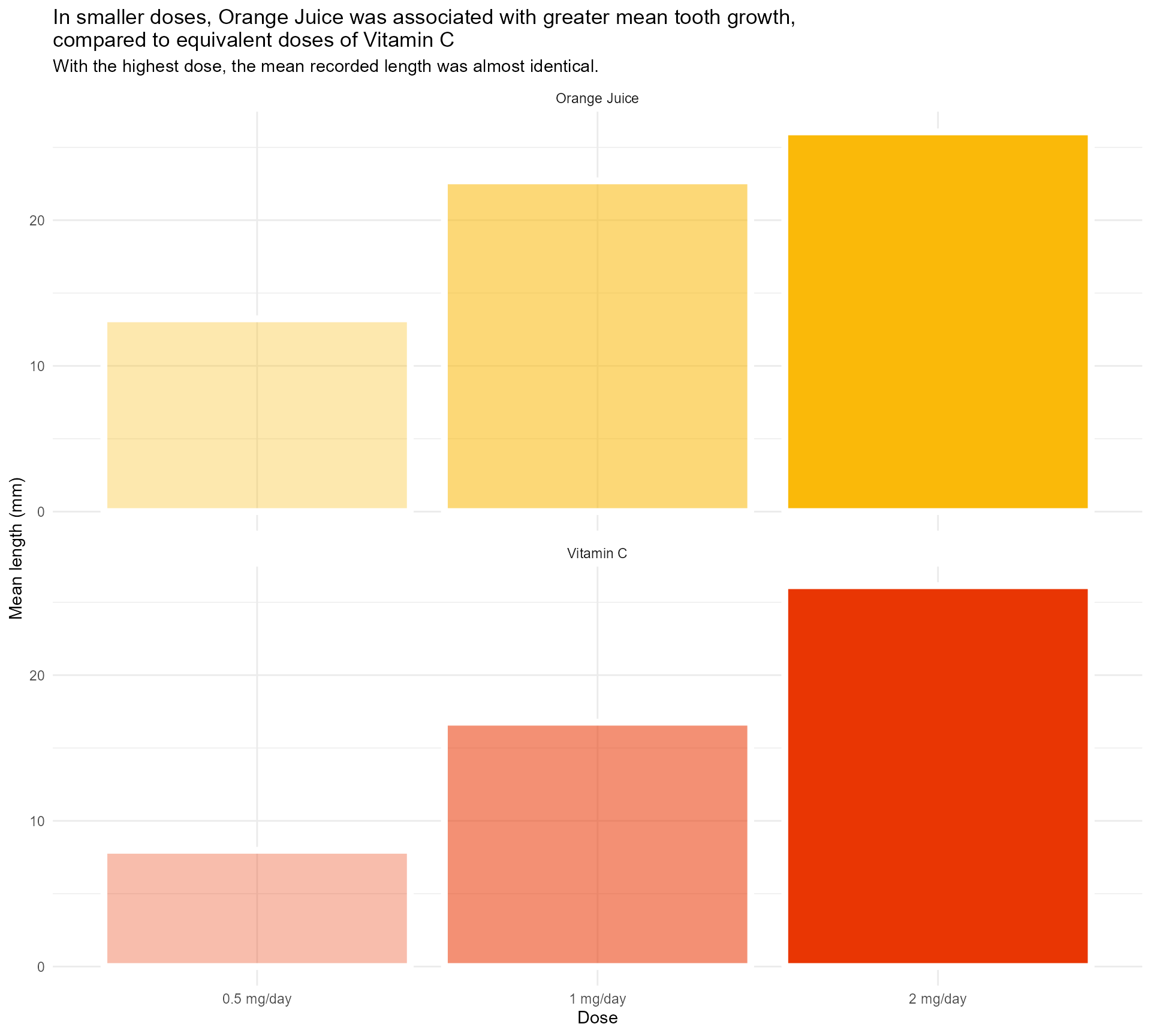
#1 - Use colour purposefully
And I find this so much less confusing!
ToothGrowth %>%
  mutate(supplement = case_when(supp == "OJ" ~ "Orange Juice", supp == "VC" ~ "Vitamin C", TRUE ~ as.character(supp))) %>%
  group_by(supplement, dose) %>%
  summarise(mean_length = mean(len)) %>%
  mutate(categorical_dose = factor(dose)) %>%
  ggplot(aes(x = categorical_dose,
             y = mean_length,
             fill = supplement)) +
  geom_bar(aes(alpha = dose),
           stat = "identity",
           colour = "#FFFFFF",
           size = 2) +
  labs(x = "Dose",
       y = "Mean length (mm)",
       title = "In smaller doses, Orange Juice was associated with greater mean tooth growth,
compared to equivalent doses of Vitamin C",
subtitle = "With the highest dose, the mean recorded length was almost identical.") +
  scale_fill_manual(values = vit_c_palette, limits = force) +
  scale_alpha(range = c(0.4, 1)) +
  scale_x_discrete(breaks = c("0.5", "1", "2"), labels = function(x) paste0(x, " mg/day")) +
  coord_flip() +
  facet_wrap(supplement ~ ., ncol = 1) +
  theme_minimal() +
  theme(legend.position = "none")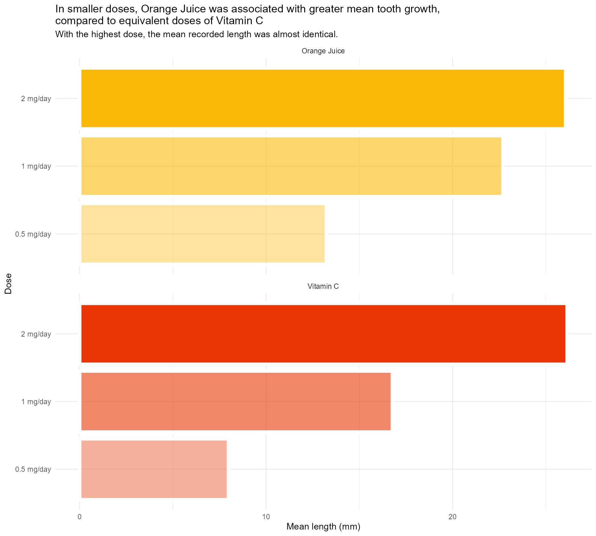
#1 - Use colour (and orientation) purposefully
So much clearer, and we haven’t even done any annotating!


#1 Use colour purposefully
#1 Use colour purposefully


#1 Use colour purposefully
#1 Use colour purposefully


#1 Use colour purposefully

#1 Use colour purposefully

#1 Use colour purposefully
#1 Use colour purposefully
Quick tip: Viewing your colours
#1 Use colour purposefully
Quick tip: Naming and viewing your colours
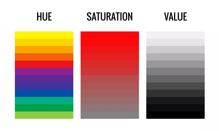
Manipulating colours - Terminology
- Hue: “what colour”?
- Saturation: “how colourful?”
- Value: “how light?”
Manipulating colours | Amounts
Back to the bake-off… Value / transparency (blank background!)
Manipulating colours | Cumulative effect
Transparency with outlines
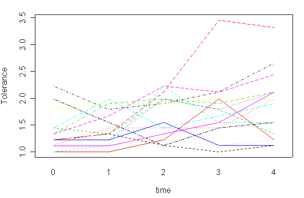
Manipulating colours | Recency
Which line shows the most recent data?
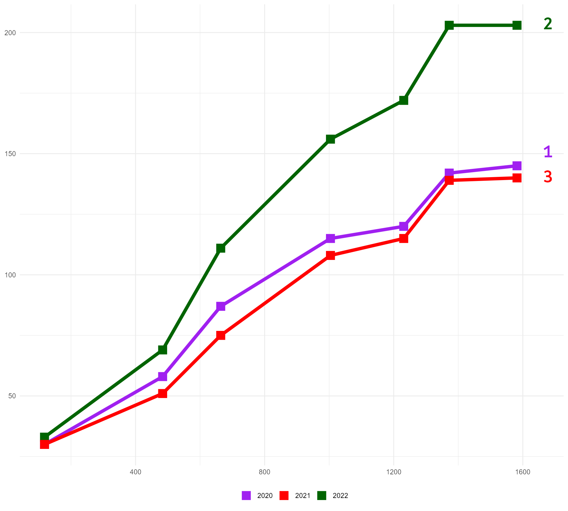
Manipulating colours | Recency
Manipulating colours | Recency
Playing with value (a “lighter” green)
Manipulating colours | Recency
Playing with saturation (a “less green” green)
Manipulating colours | Recency (“Going grey”)
Combining the two
Manipulating colours | Recency (“Going grey”)
[1] "#3D6946" "#597C60" "#76907B" "#92A496" "#AFB8B1"
Now also a shiny app! cararthompson.shinyapps.io/monochromeR
#1 Use colour purposefully
Final colour hack: Test it out with text and background

#1 Use colour purposefully
Final colour hack: Test it out with text and background

#1 Use colour purposefully
Final colour hack: Test it out with text and background

{monochromeR} can help!
#1 Use colour purposefully
A few extra things to bear in mind
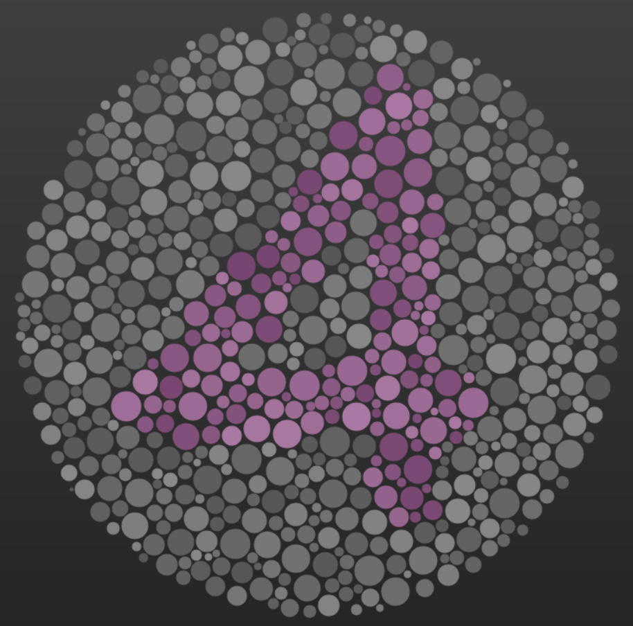
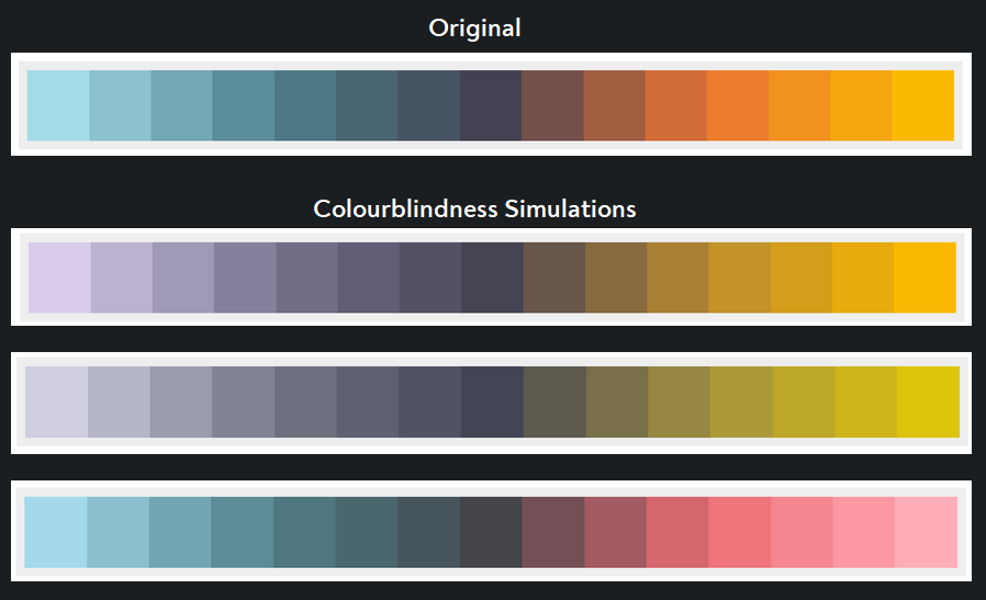
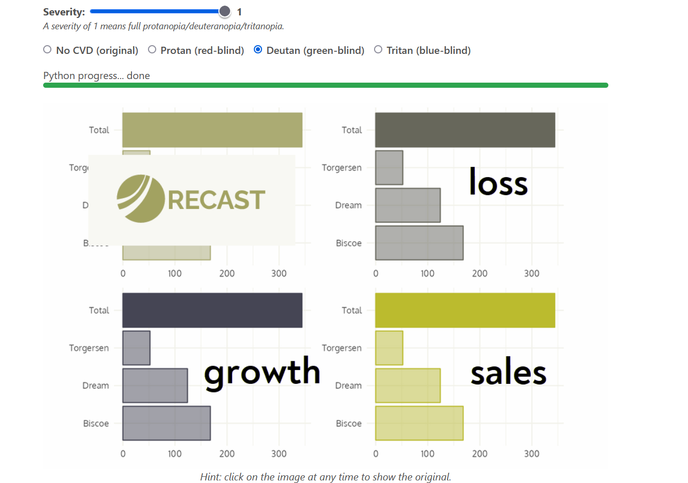
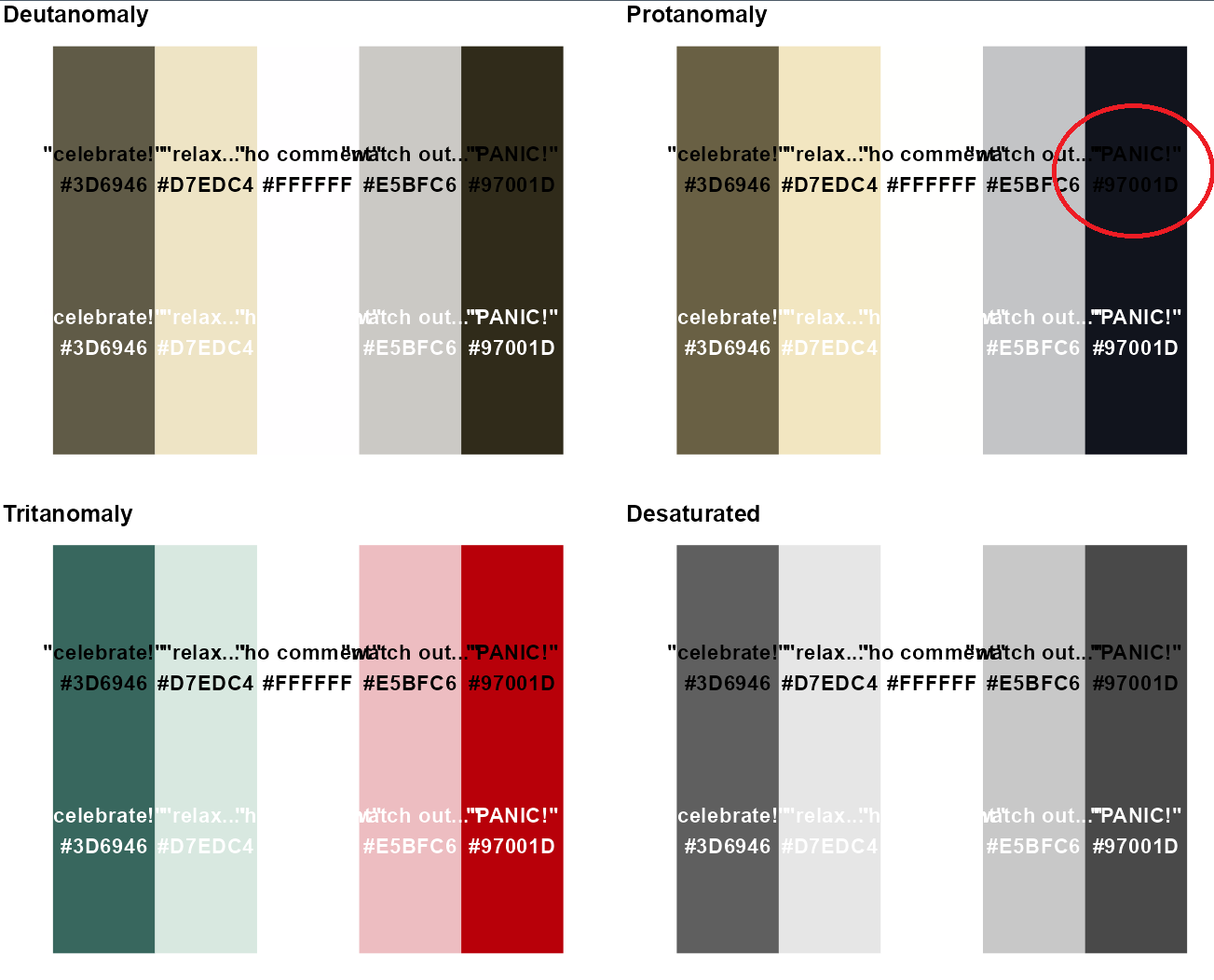
- Accessibility
colorblindr::cvd_grid()remotes::install_github("clauswilke/colorblindr")

More than green and red!
Distinguishable colours
R: {monochromeR} + {colorblindr}
Distinguishable colours
Distinguishable colours
Distinguishable colours
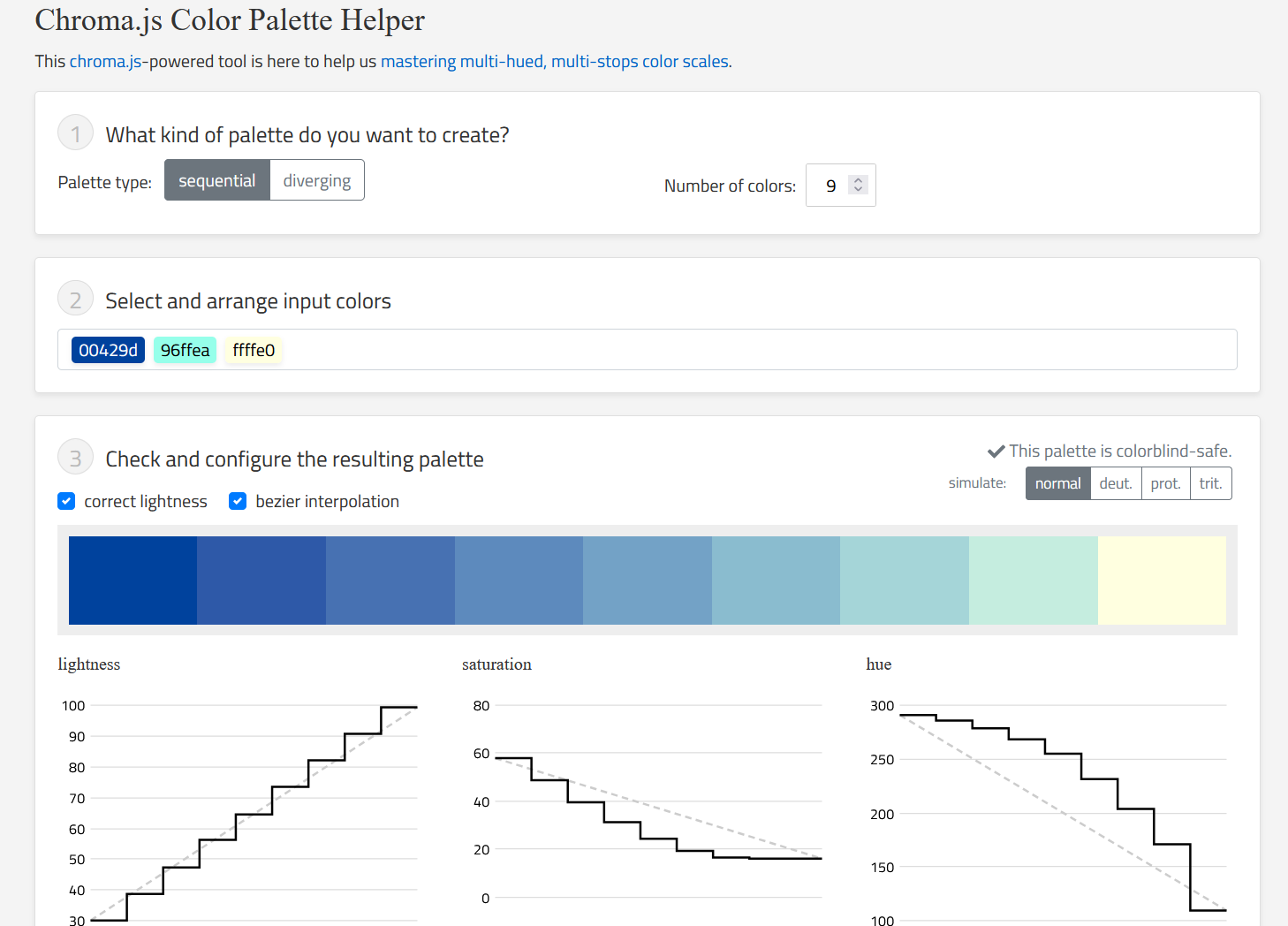
- Interpolate between “anchor colours”
- Check for “friendliness”
- Tweak colours as required to make them work


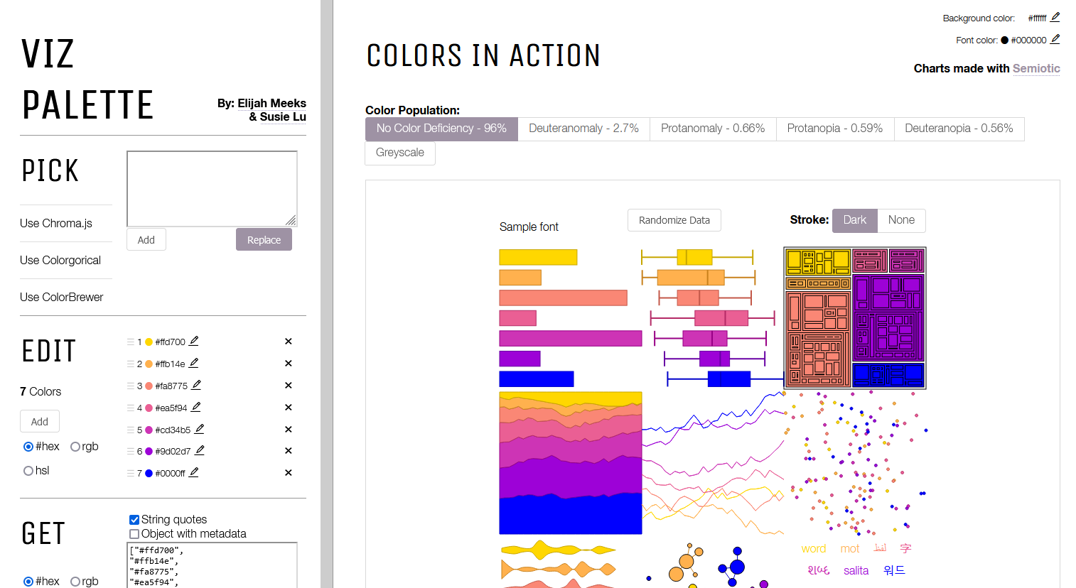
Testing with real graphs
projects.susielu.com/viz-palette
Testing with (your!) real graphs
daltonlens.org/colorblindness-simulator
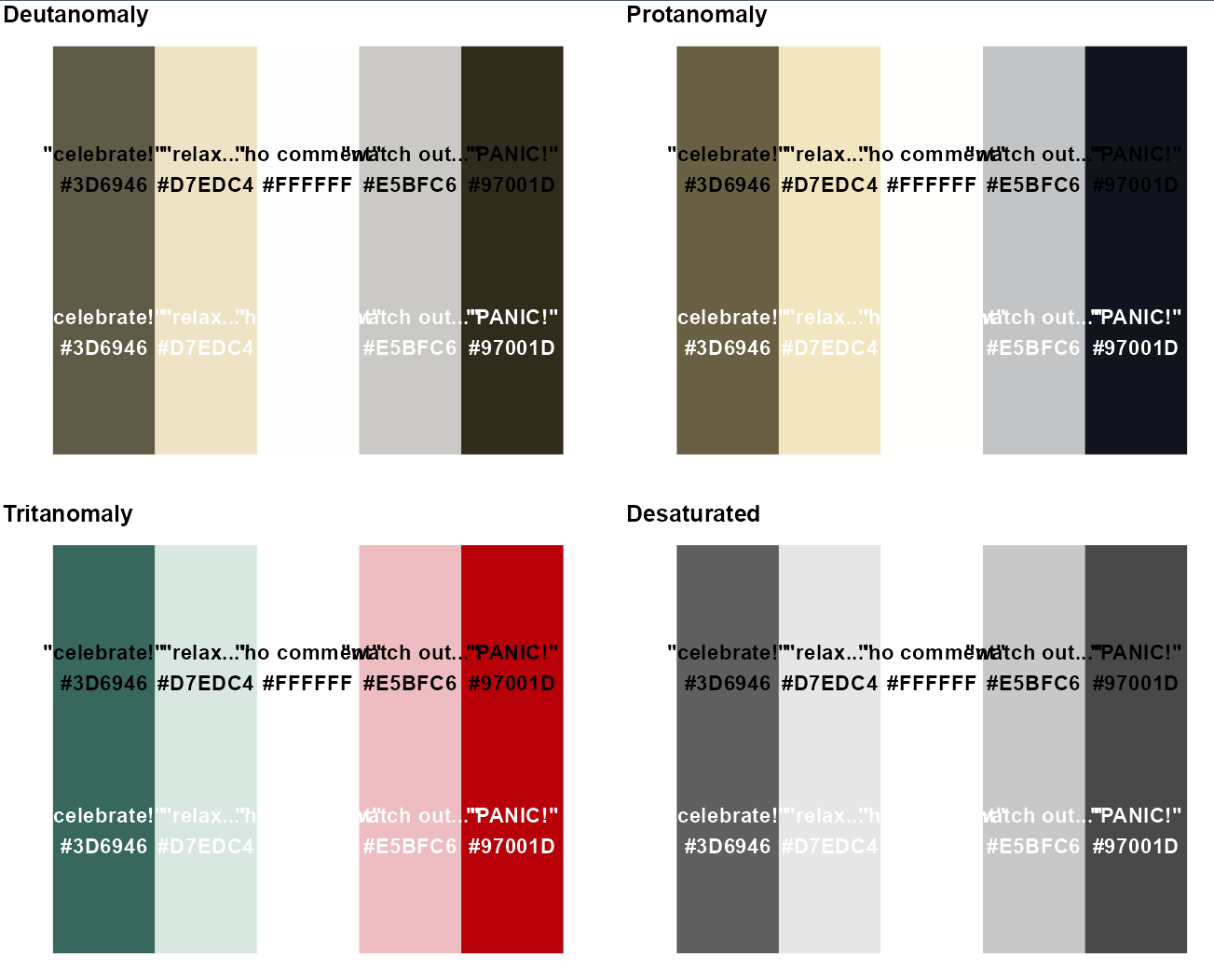
Text and colour contrast

Text and colour contrast
Text and colour contrast
Text and colour contrast
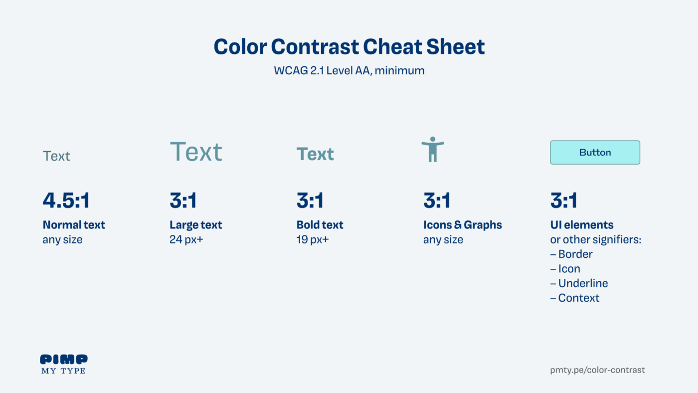
Text and colour contrasts
#2 - Add text hierarchy
#2 - Add text hierarchy
Time to start playing with theme()!
basic_plot <- ToothGrowth %>%
  mutate(supplement = case_when(supp == "OJ" ~ "Orange Juice", supp == "VC" ~ "Vitamin C", TRUE ~ as.character(supp))) %>%
  group_by(supplement, dose) %>%
  summarise(mean_length = mean(len)) %>%
  mutate(categorical_dose = factor(dose)) %>%
  ggplot(aes(x = categorical_dose, y = mean_length, fill = supplement)) +
  geom_bar(aes(alpha = dose), stat = "identity", colour = "#FFFFFF", size = 2) +
  labs(x = "Dose",
       y = "Mean length (mm)",
       title = "In smaller doses, Orange Juice was associated with greater mean tooth growth,
compared to equivalent doses of Vitamin C",
subtitle = "With the highest dose, the mean recorded length was almost identical.") +
  scale_fill_manual(values = vit_c_palette, limits = force) +
  scale_alpha(range = c(0.4, 1)) +
  scale_x_discrete(breaks = c("0.5", "1", "2"), labels = function(x) paste0(x, " mg/day")) +
  coord_flip() +
  facet_wrap(supplement ~ ., ncol = 1) +
  theme_minimal(base_size = 15)

basic_plot
#2 - Add text hierarchy
Time to start playing with theme()!

#2 - Add text hierarchy
Time to start playing with theme()!

#2 - Add text hierarchy
Time to start playing with theme()!
#2 - Add text hierarchy
Time to start playing with theme()!
#2 - Add text hierarchy
Move away from the default fonts

#2 - Add text hierarchy
Move away from the default fonts
basic_plot +
  theme(legend.position = "none",
        text = element_text(colour = vit_c_palette["light_text"],
                            family = "Cabin"),
        plot.title = element_text(colour = vit_c_palette["dark_text"],
                                  size = rel(1.5),
                                  face = "bold",
                                  family = "Enriqueta"),
        strip.text = element_text(family = "Enriqueta",
                                  colour = vit_c_palette["light_text"],
                                  size = rel(1.1), face = "bold"),
        axis.text = element_text(colour = vit_c_palette["light_text"]))
#2 - Add text hierarchy
Choosing fonts can be tricky!
- Brand guidelines
- Datawrapper guidance - avoid fonts that are too wide/narrow!
- Websites + inspector tool
- Oliver Schöndorfer’s exploration of the Font Matrix
#2 - Add text hierarchy
Getting custom fonts to work can be frustrating!
Install fonts locally, restart R Studio + 📦
{systemfonts}({ragg}+{textshaping}) + Set graphics device to “AGG” + 🤞

knitr::opts_chunk$set(dev = “ragg_png”)

#2 - Add text hierarchy
Give everything some space to breathe
basic_plot +
  theme(legend.position = "none",
        text = element_text(colour = vit_c_palette["light_text"],
                            family = "Cabin"),
        plot.title = element_text(colour = vit_c_palette["dark_text"],
                                  size = rel(1.5),
                                  face = "bold",
                                  family = "Enriqueta"),
        strip.text = element_text(family = "Enriqueta",
                                  colour = vit_c_palette["light_text"],
                                  size = rel(1.1), face = "bold"),
        axis.text = element_text(colour = vit_c_palette["light_text"]))
#2 - Add text hierarchy
Give everything some space to breathe
basic_plot +
  theme(legend.position = "none",
        text = element_text(colour = vit_c_palette["light_text"],
                            family = "Cabin"),
        plot.title = element_text(colour = vit_c_palette["dark_text"],
                                  size = rel(1.5),
                                  face = "bold",
                                  family = "Enriqueta",
                                  lineheight = 1.3,
                                  margin = margin(0.5, 0, 1, 0, "lines")),
        plot.subtitle = element_text(size = rel(1.1), lineheight = 1.3,
                                     margin = margin(0, 0, 1, 0, "lines")),
        strip.text = element_text(family = "Enriqueta",
                                  colour = vit_c_palette["light_text"],
                                  size = rel(1.1), face = "bold",
                                  margin = margin(2, 0, 0.5, 0, "lines")),
        axis.text = element_text(colour = vit_c_palette["light_text"]))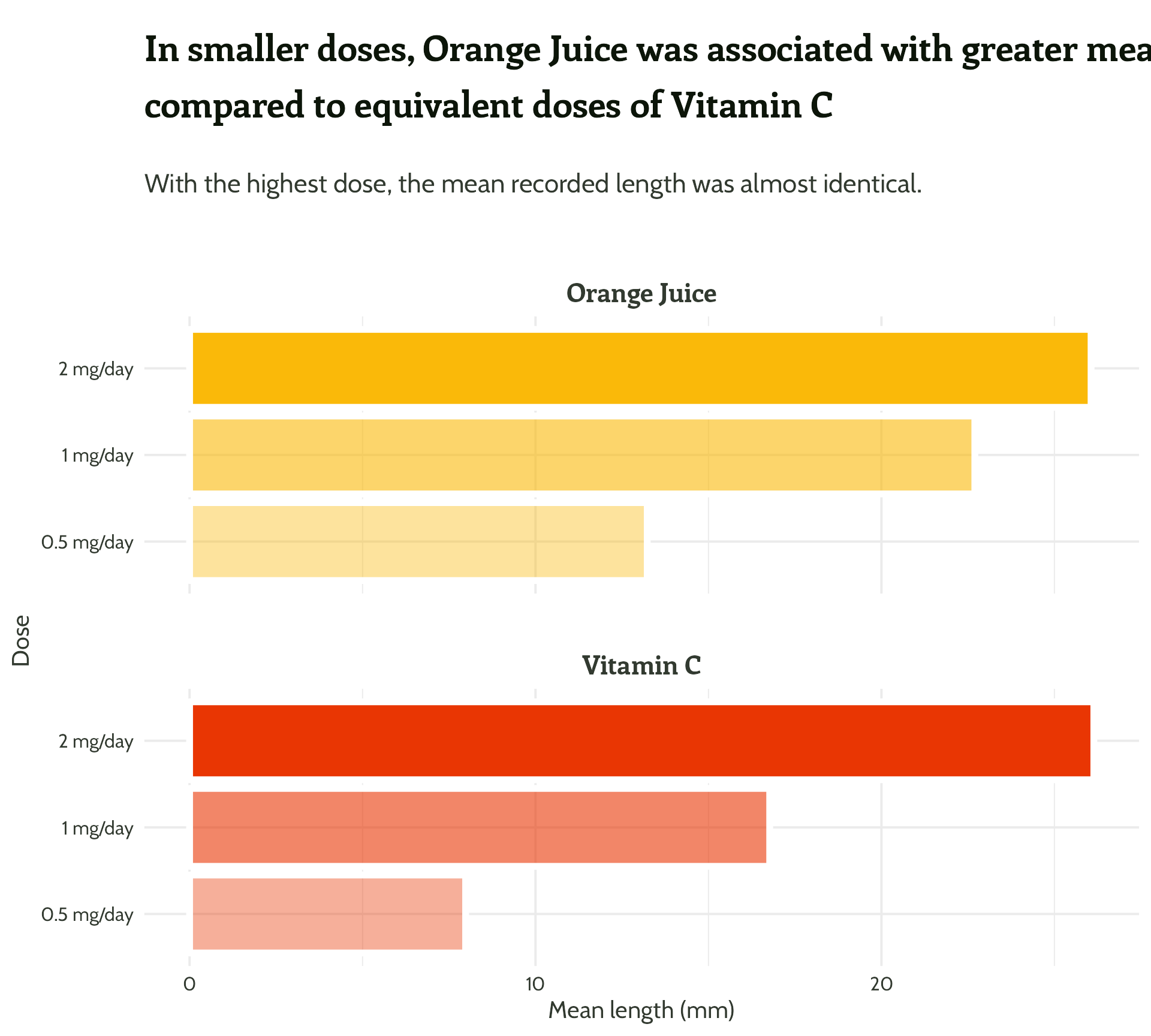
#2 - Add text hierarchy
Remove unnecessary text
basic_plot +
  theme(legend.position = "none",
        text = element_text(colour = vit_c_palette["light_text"],
                            family = "Cabin"),
        axis.title.y = element_blank(),
        plot.title = element_text(colour = vit_c_palette["dark_text"],
                                  size = rel(1.5),
                                  face = "bold",
                                  family = "Enriqueta",
                                  lineheight = 1.3,
                                  margin = margin(0.5, 0, 1, 0, "lines")),
        plot.subtitle = element_text(size = rel(1.1), lineheight = 1.3,
                                     margin = margin(0, 0, 1, 0, "lines")),
        strip.text = element_text(family = "Enriqueta",
                                  colour = vit_c_palette["light_text"],
                                  size = rel(1.1), face = "bold",
                                  margin = margin(2, 0, 0.5, 0, "lines")),
        axis.text = element_text(colour = vit_c_palette["light_text"]))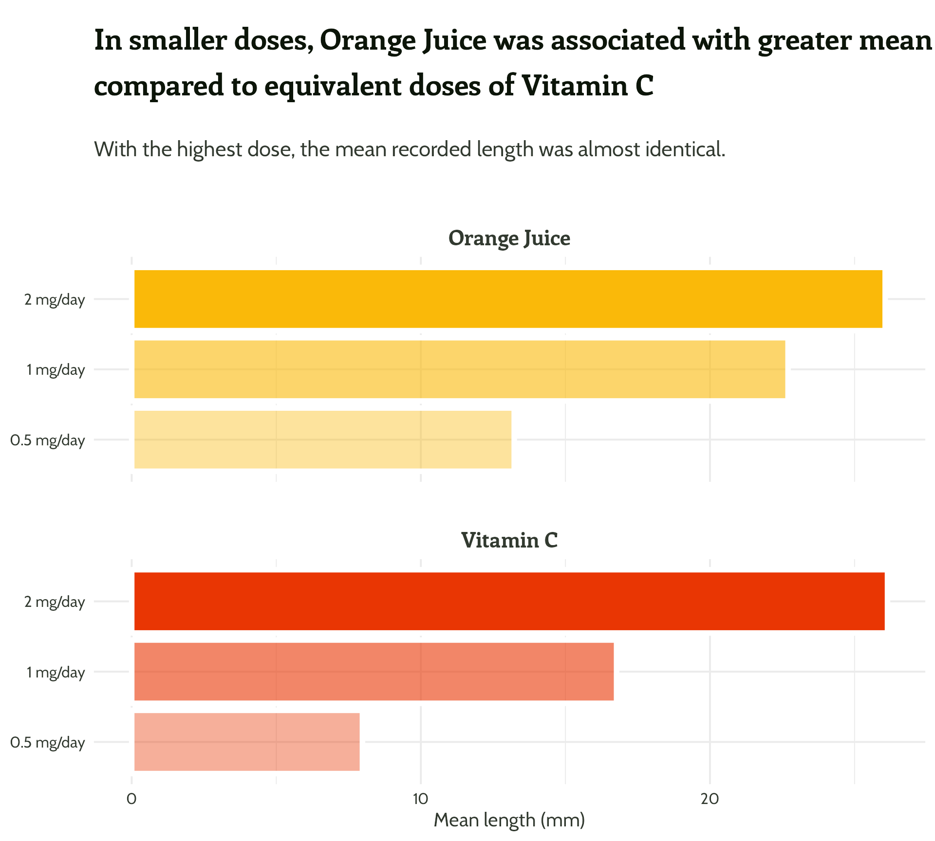
#2 - Add text hierarchy
Watch out for that title!
basic_plot +
  labs(title = "In smaller doses, Orange Juice was associated with greater mean tooth growth,
compared to equivalent doses of Vitamin C") +
  theme(legend.position = "none",
        text = element_text(colour = vit_c_palette["light_text"],
                            family = "Cabin"),
        axis.title.y = element_blank(),
        plot.title = element_text(colour = vit_c_palette["dark_text"],
                                  size = 36,
                                  face = "bold",
                                  family = "Enriqueta",
                                  lineheight = 1.3,
                                  margin = margin(0.5, 0, 1, 0, "lines")),
        plot.subtitle = element_text(size = rel(1.1), lineheight = 1.3,
                                     margin = margin(0, 0, 1, 0, "lines")),
        strip.text = element_text(family = "Enriqueta",
                                  colour = vit_c_palette["light_text"],
                                  size = rel(1.1), face = "bold",
                                  margin = margin(2, 0, 0.5, 0, "lines")),
        axis.text = element_text(colour = vit_c_palette["light_text"]))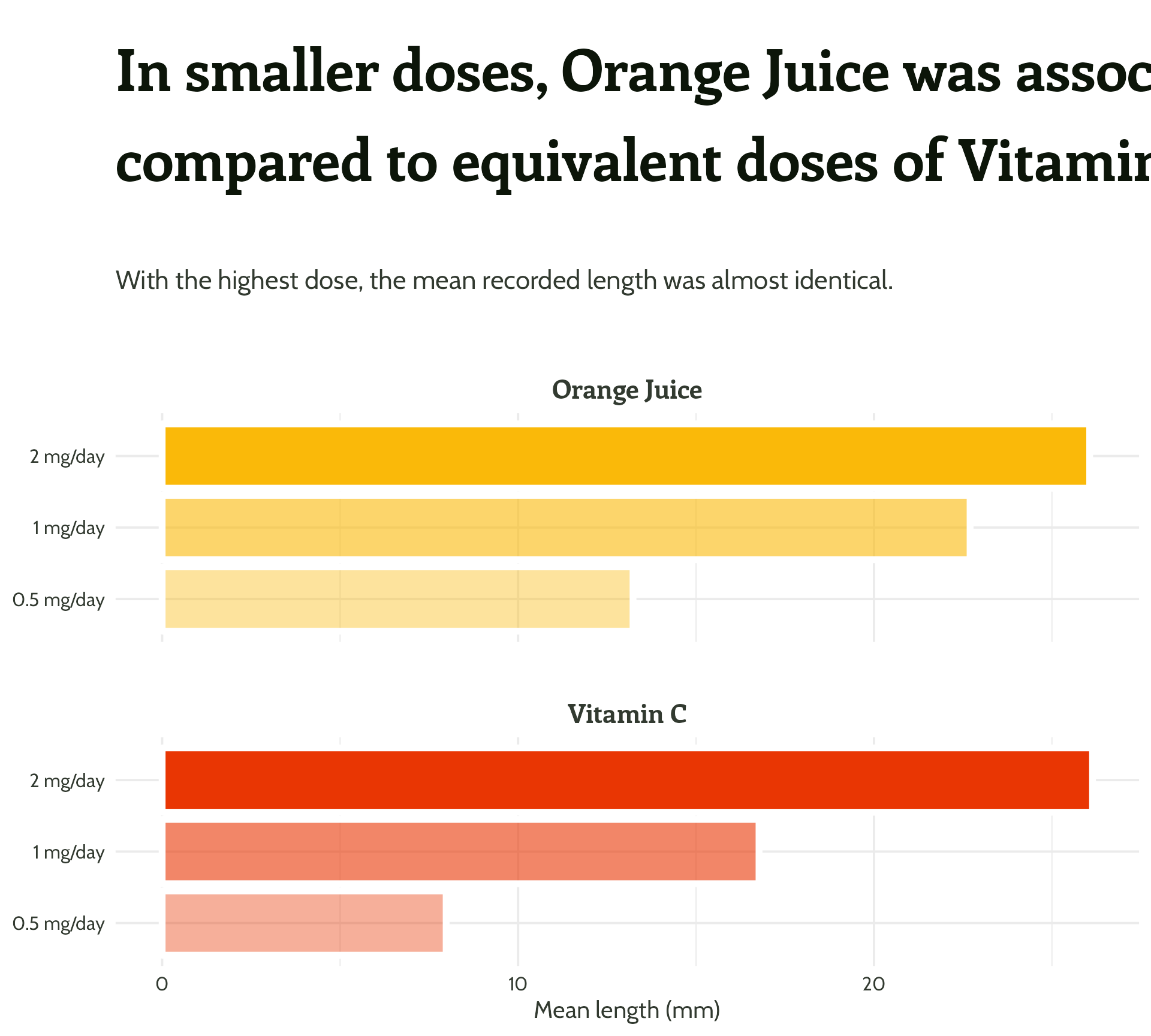
#2 - Add text hierarchy
Watch out for that title!
basic_plot +
  labs(title = "In smaller doses, Orange Juice was associated with greater mean tooth growth, compared to equivalent doses of Vitamin C") +
  theme(legend.position = "none",
        text = element_text(colour = vit_c_palette["light_text"],
                            family = "Cabin"),
        axis.title.y = element_blank(),
        plot.title = element_text(colour = vit_c_palette["dark_text"],
                                  size = rel(1.5),
                                  face = "bold",
                                  family = "Enriqueta",
                                  lineheight = 1.3,
                                  margin = margin(0.5, 0, 1, 0, "lines")),
        plot.subtitle = element_text(size = rel(1.1), lineheight = 1.3,
                                     margin = margin(0, 0, 1, 0, "lines")),
        strip.text = element_text(family = "Enriqueta",
                                  colour = vit_c_palette["light_text"],
                                  size = rel(1.1), face = "bold",
                                  margin = margin(2, 0, 0.5, 0, "lines")),
        axis.text = element_text(colour = vit_c_palette["light_text"]))
#2 - Add text hierarchy
I ❤️ 📦 {ggtext}
basic_plot +
  labs(title = "In smaller doses, Orange Juice was associated with greater mean tooth growth, compared to equivalent doses of Vitamin C") +
  theme(legend.position = "none",
        text = element_text(colour = vit_c_palette["light_text"],
                            family = "Cabin"),
        axis.title.y = element_blank(),
        plot.title = ggtext::element_textbox_simple(
          colour = vit_c_palette["dark_text"],
          size = rel(1.5),
          face = "bold",
          family = "Enriqueta",
          lineheight = 1.3,
          margin = margin(0.5, 0, 1, 0, "lines")),
        plot.subtitle = ggtext::element_textbox_simple(
          size = rel(1.1),
          lineheight = 1.3,
          margin = margin(0, 0, 1, 0, "lines")),
        strip.text = element_text(family = "Enriqueta",
                                  colour = vit_c_palette["light_text"],
                                  size = rel(1.1), face = "bold",
                                  margin = margin(2, 0, 0.5, 0, "lines")),
        axis.text = element_text(colour = vit_c_palette["light_text"]))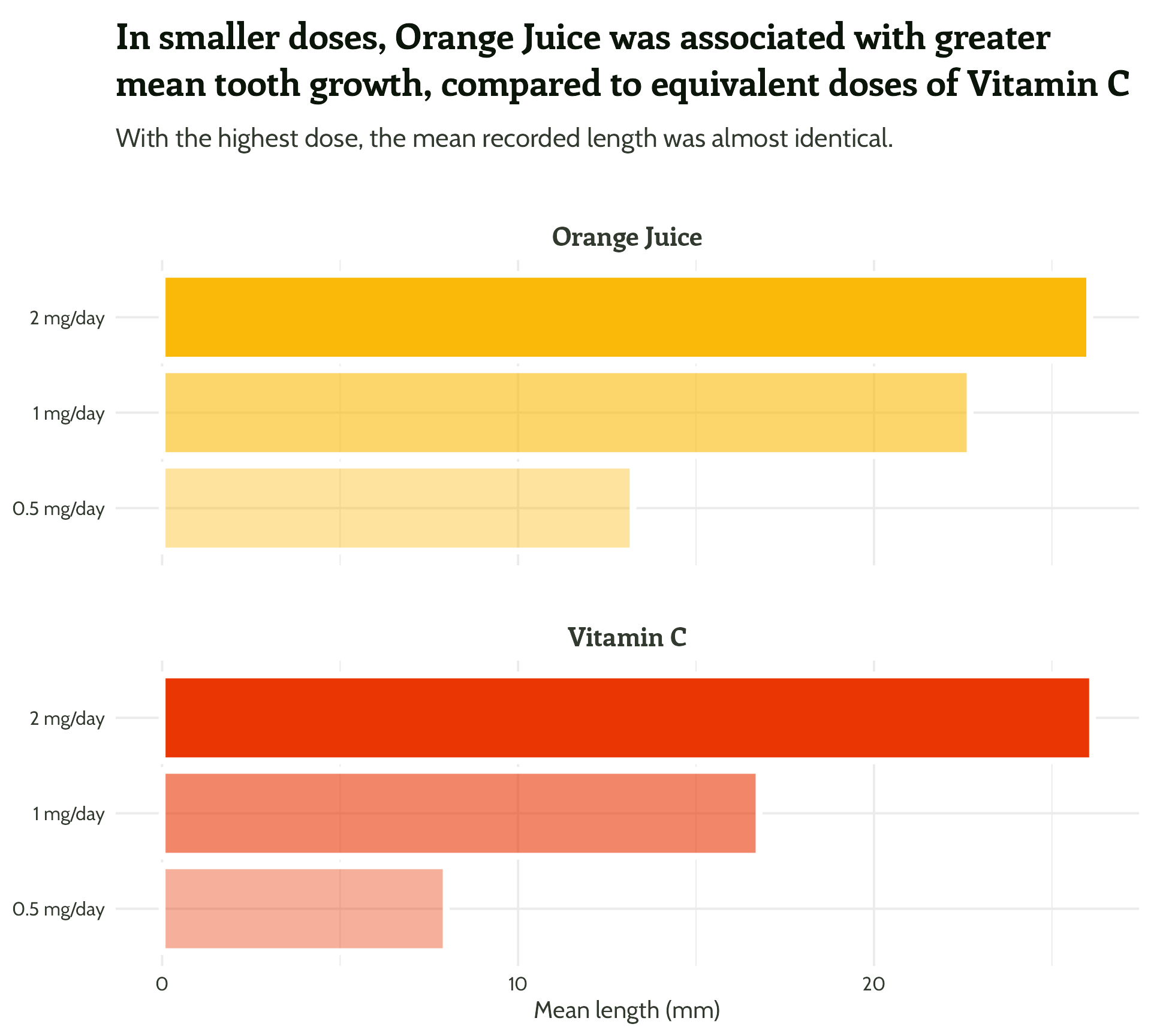
#2 - Add text hierarchy + colour!
I ❤️ 📦 {ggtext}
basic_plot +
  labs(title =
         paste0("In smaller doses, **<span style='color:",
                vit_c_palette["Orange Juice"], "'>Orange Juice</span>**
                      was associated with greater mean tooth growth,
                      compared to equivalent doses of **<span style='color:",
                vit_c_palette["Vitamin C"], "'>Vitamin C</span>**")
  ) +
  theme(legend.position = "none",
        text = element_text(colour = vit_c_palette["light_text"],
                            family = "Cabin"),
        axis.title.y = element_blank(),
        plot.title = ggtext::element_textbox_simple(colour = vit_c_palette["dark_text"],
                                                    size = rel(1.5),
                                                    face = "bold",
                                                    family = "Enriqueta",
                                                    lineheight = 1.3,
                                                    margin = margin(0.5, 0, 1, 0, "lines")),
        plot.subtitle = ggtext::element_textbox_simple(family = "Cabin", size = rel(1.1), lineheight = 1.3,
                                                       margin = margin(0, 0, 1, 0, "lines")),
        strip.text = element_text(family = "Enriqueta",
                                  colour = vit_c_palette["light_text"],
                                  size = rel(1.1), face = "bold",
                                  margin = margin(2, 0, 0.5, 0, "lines")),
        axis.text = element_text(colour = vit_c_palette["light_text"]))
#2 - Add text hierarchy + colour!
Wait, that yellow… #fab909
#2 - Add text hierarchy + colour!
Wait, that yellow…

#2 - Add text hierarchy + colour!
basic_plot +
  labs(title =
         paste0("In smaller doses, **<span style='color:",
                vit_c_palette["Orange Juice text"], "'>Orange Juice</span>**
                      was associated with greater mean tooth growth,
                      compared to equivalent doses of **<span style='color:",
                vit_c_palette["Vitamin C"], "'>Vitamin C</span>**")
  ) +
  theme(legend.position = "none",
        text = element_text(colour = vit_c_palette["light_text"],
                            family = "Cabin"),
        axis.title.y = element_blank(),
        plot.title = ggtext::element_textbox_simple(colour = vit_c_palette["dark_text"],
                                                    size = rel(1.5),
                                                    face = "bold",
                                                    family = "Enriqueta",
                                                    lineheight = 1.3,
                                                    margin = margin(0.5, 0, 1, 0, "lines")),
        plot.subtitle = ggtext::element_textbox_simple(family = "Cabin", size = rel(1.1), lineheight = 1.3,
                                                       margin = margin(0, 0, 1, 0, "lines")),
        strip.text = element_text(family = "Enriqueta",
                                  colour = vit_c_palette["light_text"],
                                  size = rel(1.1), face = "bold",
                                  margin = margin(2, 0, 0.5, 0, "lines")),
        axis.text = element_text(colour = vit_c_palette["light_text"]))
#2 - Add text hierarchy + colour!
See for yourselves!


Quiz time!

… but do we?
Do we need a legend?
- ?
Do we need a legend?
- No Colour = Y axis labels, no additional information
Do we need a legend?

- ?
Do we need a legend?
- Yes: No other way of telling; also, nicely in the right order
Do we need a legend?
- ?
Do we need a legend?
- Yes - or line-end annotations… or a different plot type? (👀 small multiples)
Do we need a legend?
- ?
Do we need a legend?
- No - the annotations say it all (and are much clearer)
Do we need a legend?

- ?
Do we need a legend?
- No - But legend adds more information… Consider turning the legend into a table
Does it need a legend?

- ?
Does it need a legend?
- Yes, but I’d rethink it
Packaging up
- Package development is a whole other workshop (but it’s easier than you think!)
- 📦
{usethis}
- 📦
- Any function or object you create can be added to a package
Packaging up

Packaging up
#3 - Reduce unnecessary eye movement
We’ve made it easy to see what’s what. Now, let’s make it even easier to compare values.
#3 - Reduce unnecessary eye movement
We’ve made it easy to see what’s what. Now, let’s make it even easier to compare values.

#3 - Reduce unnecessary eye movement
We’ve made it easy to see what’s what. Now, let’s make it even easier to compare values.
#3 - Reduce unnecessary eye movement
Time to add some text boxes!
#3 - Reduce unnecessary eye movement
Time to add some text boxes!
#3 - Reduce unnecessary eye movement
Time to add some text boxes!

#3 - Reduce unnecessary eye movement
Time to add some text boxes!

#3 - Reduce unnecessary eye movement
Now for the fun stuff…
themed_plot +
scale_y_continuous(expand = c(0, 0.5)) +
theme(strip.text = element_text(hjust = 0.03)) +
ggtext::geom_textbox(aes(
label = mean_length,
hjust = case_when(mean_length < 15 ~ 0,
TRUE ~ 1),
halign = case_when(mean_length < 15 ~ 0,
TRUE ~ 1)),
size = 6,
fill = NA,
box.colour = NA,
family = "Cabin",
fontface = "bold")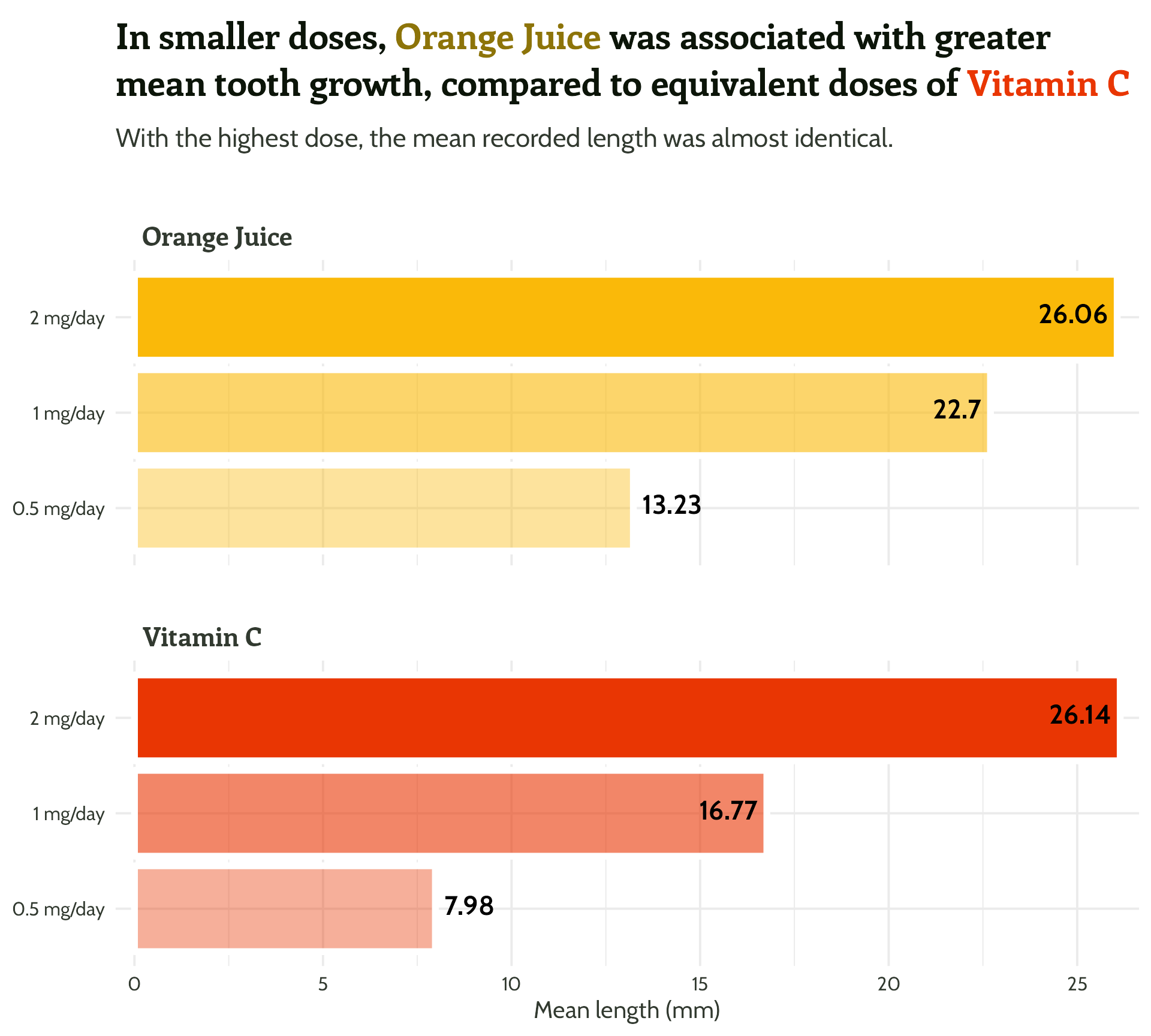
#3 - Reduce unnecessary eye movement
Now for the fun stuff…
themed_plot +
  scale_y_continuous(expand = c(0, 0.5)) +
theme(strip.text = element_text(hjust = 0.03)) +
ggtext::geom_textbox(aes(
label = mean_length,
hjust = case_when(mean_length < 15 ~ 0,
TRUE ~ 1),
halign = case_when(mean_length < 15 ~ 0,
TRUE ~ 1),
colour = case_when(mean_length > 15 ~ "#FFFFFF",
TRUE ~ vit_c_palette[supplement])),
size = 6,
fill = NA,
box.colour = NA,
family = "Cabin",
fontface = "bold")
#3 - Reduce unnecessary eye movement
??????
themed_plot +
  scale_y_continuous(expand = c(0, 0.5)) +
  theme(strip.text = element_text(hjust = 0.03)) +
  ggtext::geom_textbox(aes(
    label = mean_length,
    hjust = case_when(mean_length < 15 ~ 0,
                      TRUE ~ 1),
    halign = case_when(mean_length < 15 ~ 0,
                       TRUE ~ 1),
    colour = case_when(mean_length > 15 ~ "#FFFFFF",
                       TRUE ~ vit_c_palette[supplement])),
    size = 6,
    fill = NA,
    box.colour = NA,
    family = "Cabin",
    fontface = "bold")
#3 - Reduce unnecessary eye movement
scale_colour_identity() required!
themed_plot +
  scale_y_continuous(expand = c(0, 0.5)) +
  theme(strip.text = element_text(hjust = 0.03)) +
  scale_colour_identity() +
  ggtext::geom_textbox(aes(
    label = mean_length,
    hjust = case_when(mean_length < 15 ~ 0,
                      TRUE ~ 1),
    halign = case_when(mean_length < 15 ~ 0,
                       TRUE ~ 1),
    colour = case_when(mean_length > 15 ~ "#FFFFFF",
                       TRUE ~ vit_c_palette[supplement])),
    size = 6,
    fill = NA,
    box.colour = NA,
    family = "Cabin",
    fontface = "bold")
#3 - Reduce unnecessary eye movement
We might as well add a bit of extra info (with text hierarchy!) to our labels…
themed_plot +
  scale_y_continuous(expand = c(0, 0.5)) +
  theme(strip.text = element_text(hjust = 0.03)) +
  scale_colour_identity() +
  ggtext::geom_textbox(aes(
    label = paste0("<span style=font-size:12pt>",
                   dose, "mg/day</span><br>",
                   mean_length, "mm"),
    hjust = case_when(mean_length < 15 ~ 0,
                      TRUE ~ 1),
    halign = case_when(mean_length < 15 ~ 0,
                       TRUE ~ 1),
    colour = case_when(mean_length > 15 ~ "#FFFFFF",
                       TRUE ~ vit_c_palette[supplement])),
    size = 6,
    fill = NA,
    box.colour = NA,
    family = "Cabin",
    fontface = "bold")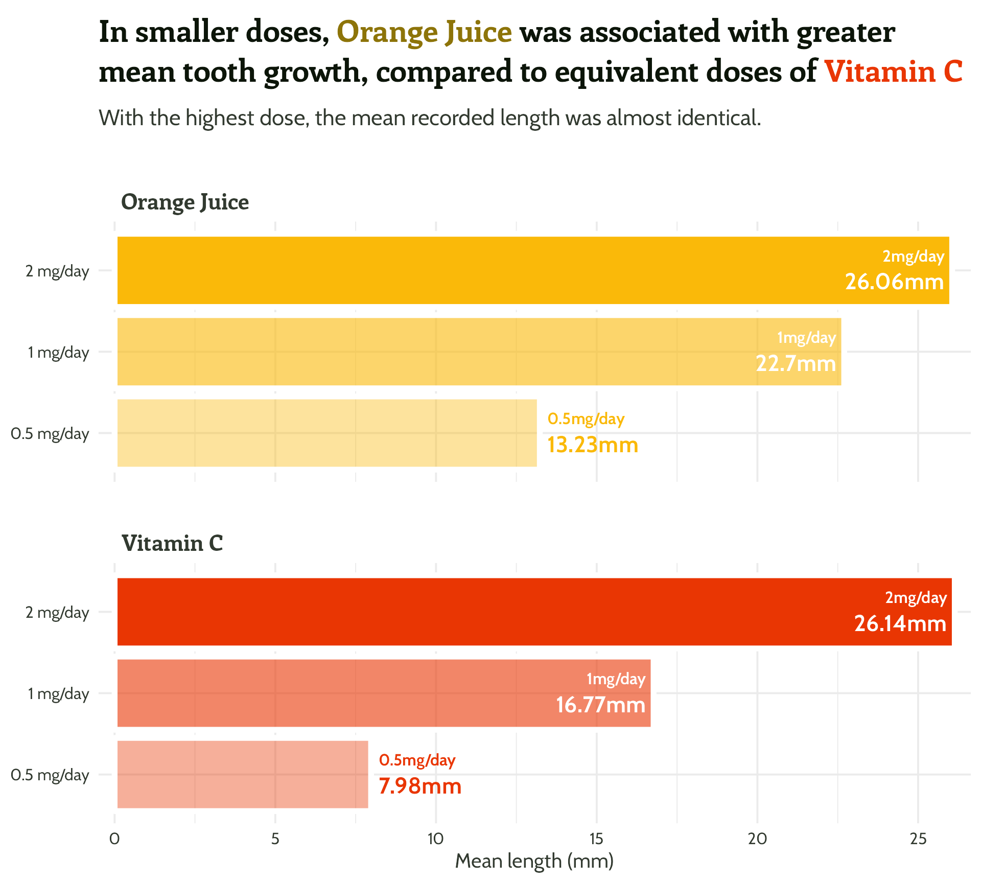
#3 - Reduce unnecessary eye movement
We might as well add a bit of extra info (with text hierarchy!) to our labels…
themed_plot +
  scale_y_continuous(expand = c(0, 0.5)) +
  theme(strip.text = element_text(hjust = 0.03)) +
  scale_colour_identity() +
  ggtext::geom_textbox(aes(
    label = paste0("<span style=font-size:12pt>",
                   dose, "mg/day</span><br>",
                   janitor::round_half_up(mean_length),
                   "mm"),
    hjust = case_when(mean_length < 15 ~ 0,
                      TRUE ~ 1),
    halign = case_when(mean_length < 15 ~ 0,
                       TRUE ~ 1),
    colour = case_when(mean_length > 15 ~ "#FFFFFF",
                       TRUE ~ vit_c_palette[supplement])),
    size = 6,
    fill = NA,
    box.colour = NA,
    family = "Cabin",
    fontface = "bold")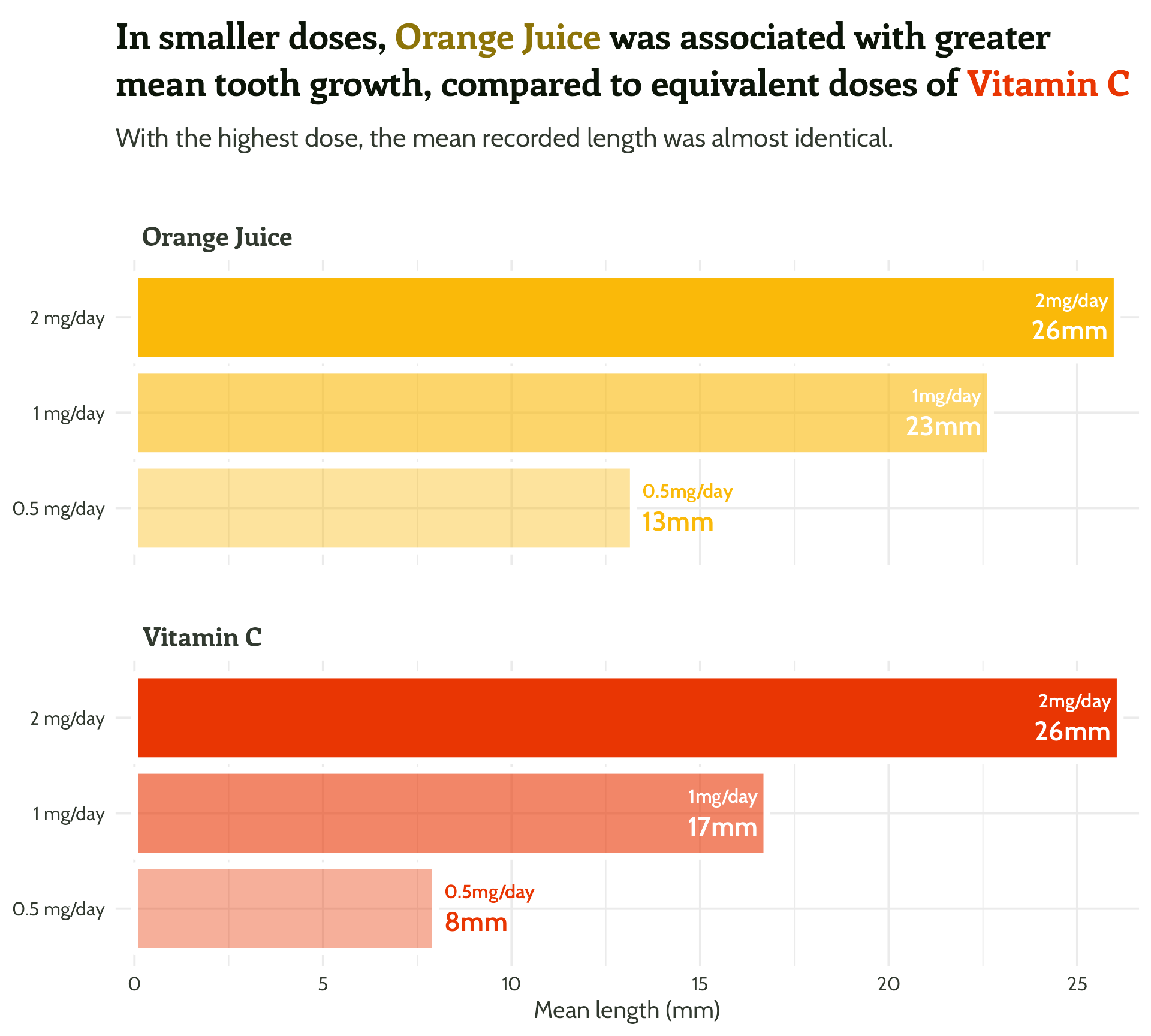
Wait, but why?

Wait, but why?
new_data %>% guinea_pig_plot()
#3 - Reduce unnecessary eye movement
Let’s fix that alignment…
themed_plot +
  scale_y_continuous(expand = c(0, 0.5)) +
  scale_colour_identity() +
  ggtext::geom_textbox(aes(
    label = paste0("<span style=font-size:12pt>",
                   dose, "mg/day</span><br>",
                   janitor::round_half_up(mean_length),
                   "mm"),
    hjust = case_when(mean_length < 15 ~ 0,
                      TRUE ~ 1),
    halign = case_when(mean_length < 15 ~ 0,
                       TRUE ~ 1),
    colour = case_when(mean_length > 15 ~ "#FFFFFF",
                       TRUE ~ vit_c_palette[supplement])),
    size = 6,
    fill = NA,
    box.colour = NA,
    family = "Cabin",
    fontface = "bold") +
  theme(strip.text = element_text(hjust = 0.03),
        plot.title.position = "plot")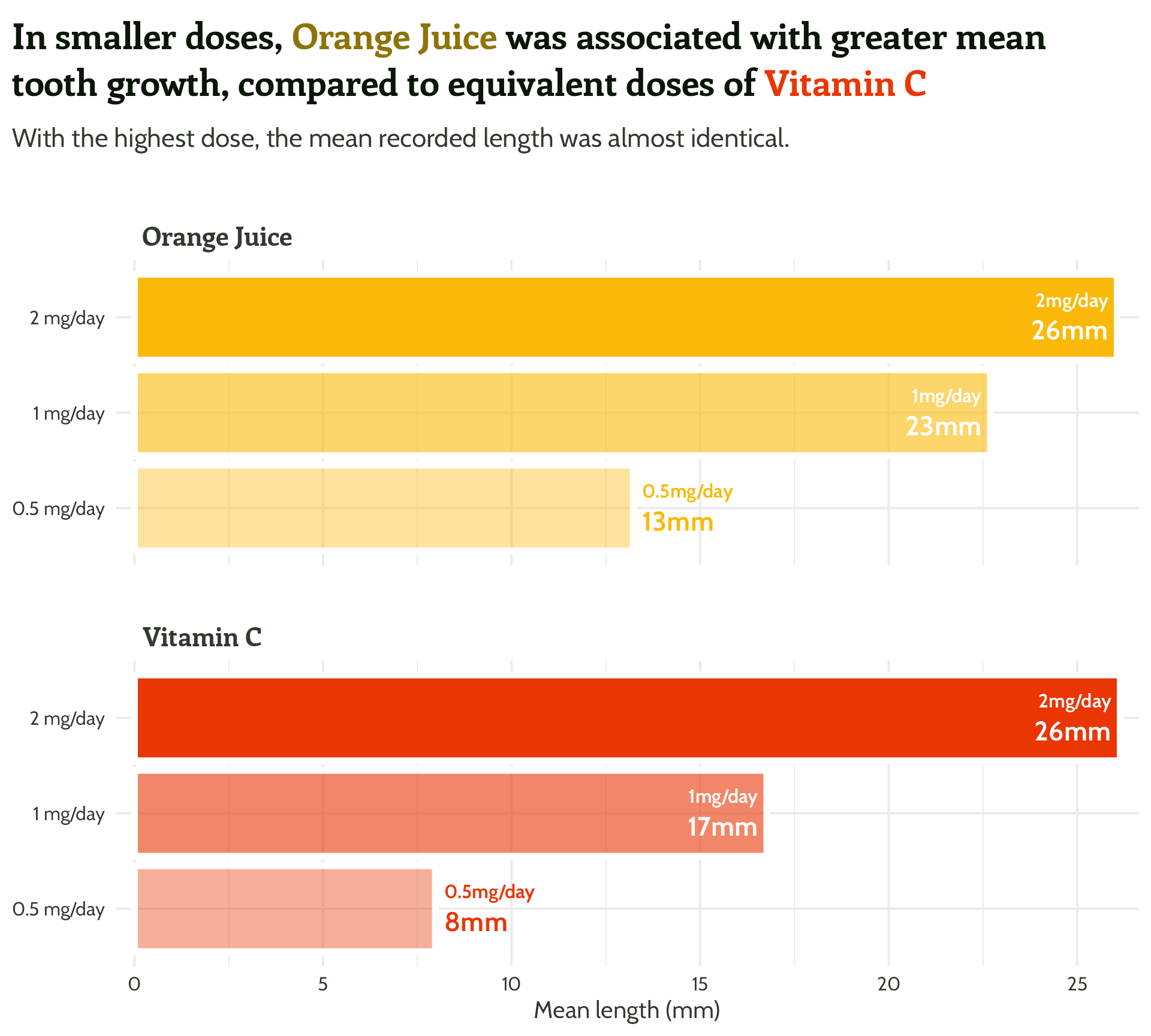
#3 - Reduce unnecessary eye movement
And add some breathing space around the plot…
themed_plot +
  scale_y_continuous(expand = c(0, 0.5)) +
  scale_colour_identity() +
  ggtext::geom_textbox(aes(
    label = paste0("<span style=font-size:12pt>",
                   dose, "mg/day</span><br>",
                   janitor::round_half_up(mean_length),
                   "mm"),
    hjust = case_when(mean_length < 15 ~ 0,
                      TRUE ~ 1),
    halign = case_when(mean_length < 15 ~ 0,
                       TRUE ~ 1),
    colour = case_when(mean_length > 15 ~ "#FFFFFF",
                       TRUE ~ vit_c_palette[supplement])),
    size = 6,
    fill = NA,
    box.colour = NA,
    family = "Cabin",
    fontface = "bold") +
  theme(strip.text = element_text(hjust = 0.03),
        plot.title.position = "plot",
        plot.margin = margin(rep(15, 4)))
#3 - Reduce unnecessary eye movement
Easier than you think and makes a big difference! 🦸

#4 - Highlight important patterns
How did those penguins get on anyway…?
- Means, trends, key data points

#4 - Highlight important patterns | means
Consider text boxes instead of a legend…
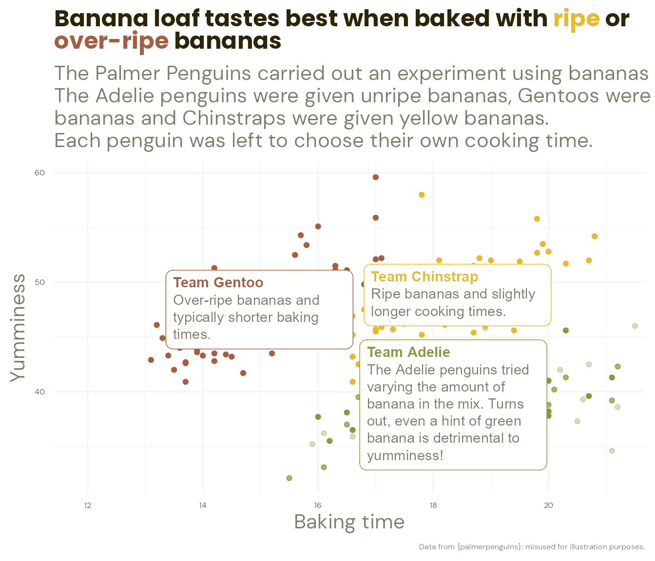
#4 - Highlight important patterns | means
Consider text boxes instead of a legend…

#4 - Highlight important patterns | trends
I ❤️ 📦 {geomtextpath}
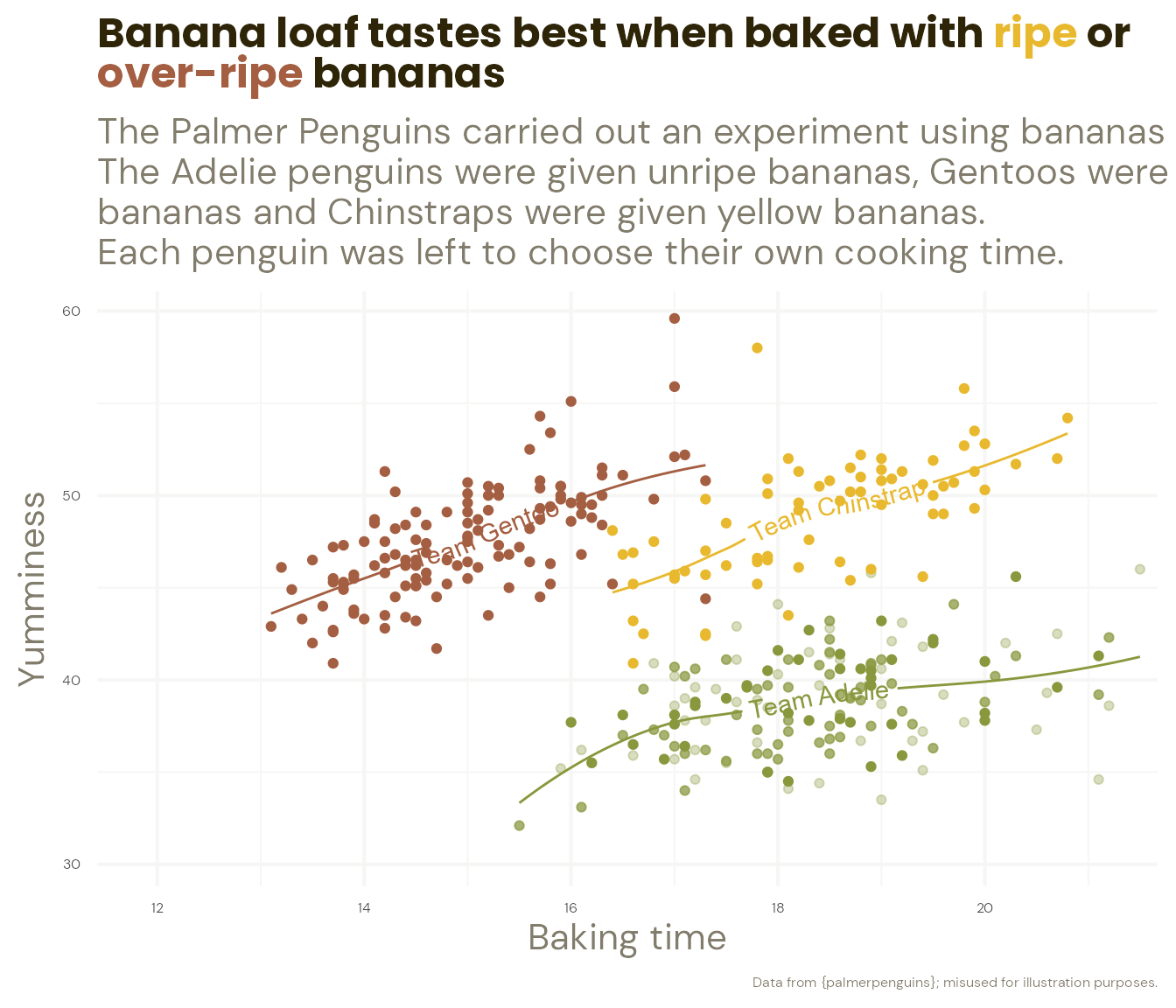
#4 - Highlight important patterns | trends
I ❤️ 📦 {geomtextpath}

#4 - Highlight important patterns | trends
I ❤️ 📦 {geomtextpath}
#4 - Highlight important patterns | trends
I ❤️ 📦 {geomtextpath}
#4 - Highlight important patterns | trends
I ❤️ 📦 {geomtextpath}
#4 - Highlight important patterns | trends
I ❤️ 📦 {geomtextpath}
#4 - Highlight important patterns | points
Next, let’s work out where we want our labels…
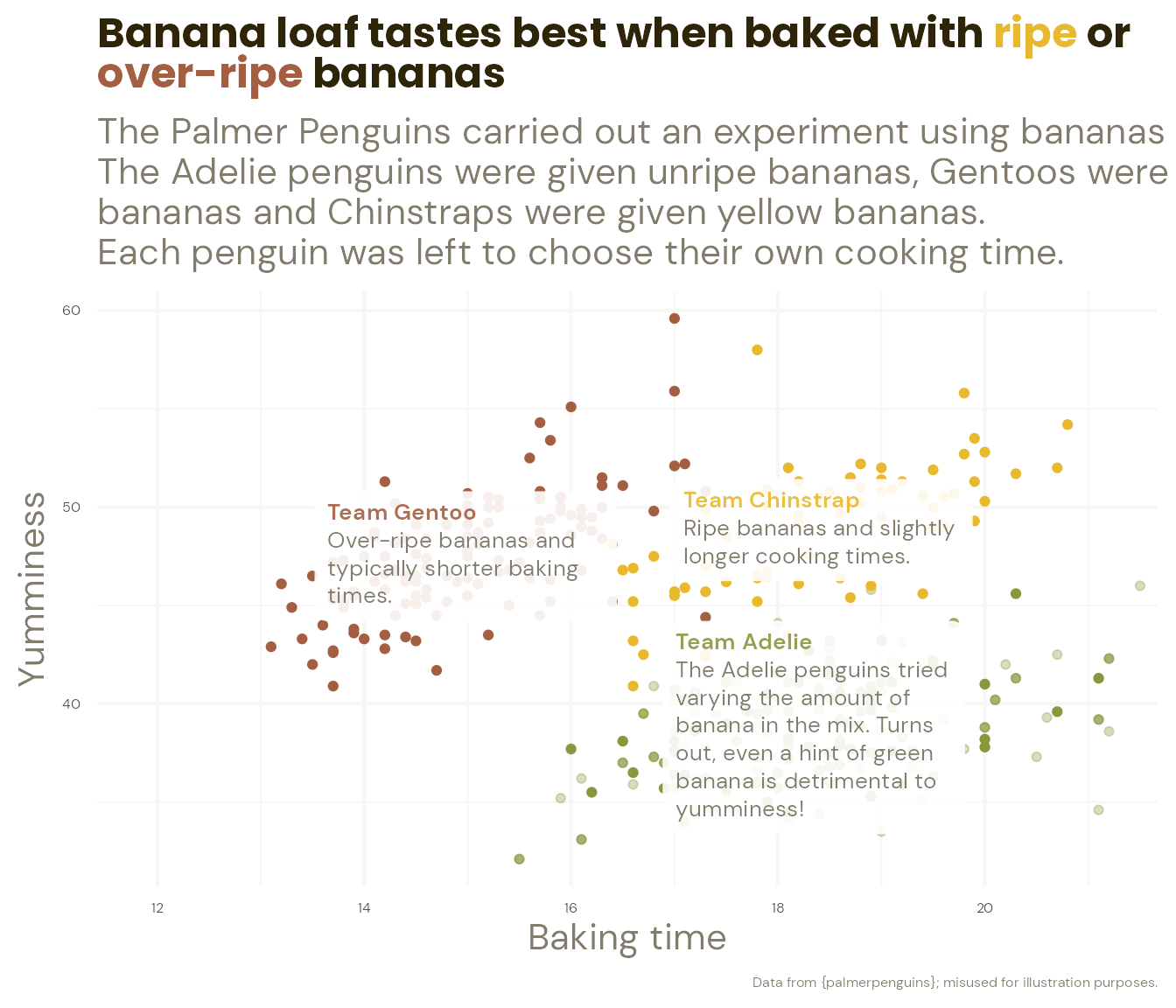
#4 - Highlight important patterns | points
Let’s add the annotations…

#4 - Highlight important patterns | points
Let’s add the annotations…
penguins_themed_plot +
  ggtext::geom_textbox(data = penguin_summaries,
               aes(label = paste0("**Team ", species, "**", "<br><span style = \"color:", banana_colours$light_text, "\">", commentary, "</span>")),
family = "DM Sans", size = 3.5, width = unit(9, "line"), alpha = 0.9, box.colour = NA) +
ggtext::geom_textbox(data = penguin_highlights,
aes(label = commentary,
x = label_x,
y = label_y,
hjust = left_to_right),
family = "DM Sans",
size = 3,
fill = NA,
box.colour = NA)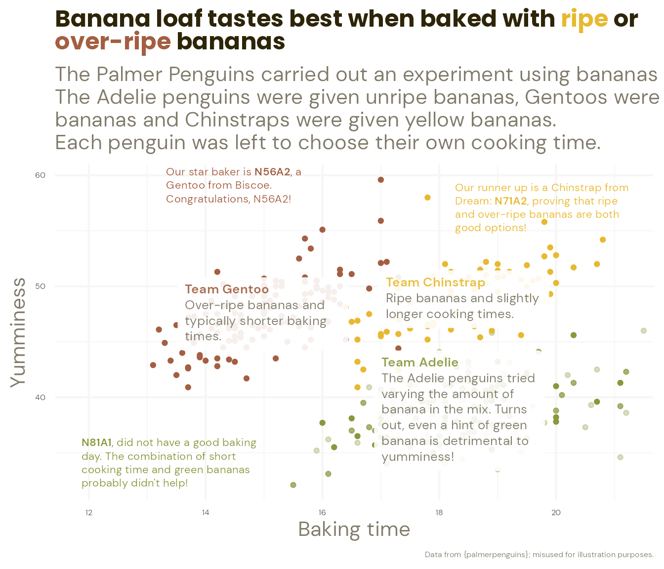
#4 - Highlight important patterns | points
… using arrows and alignments to emphasise the story
penguins_themed_plot +
ggtext::geom_textbox(data = penguin_summaries,
aes(label = paste0("**Team ", species, "**", "<br><span style = \"color:", banana_colours$light_text, "\">", commentary, "</span>")),
family = "DM Sans", size = 3.5, width = unit(9, "line"), alpha = 0.9, box.colour = NA) +
ggtext::geom_textbox(data = penguin_highlights,
aes(label = commentary, x = label_x, y = label_y, hjust = left_to_right),
family = "DM Sans", size = 3, fill = NA, box.colour = NA) +
geom_curve(data = penguin_highlights,
aes(x = label_x, xend = arrow_x_end,
y = label_y, yend = arrow_y_end,
hjust = left_to_right),
arrow = arrow(length = unit(0.1, "cm")),
curvature = list(0.15),
alpha = 0.5)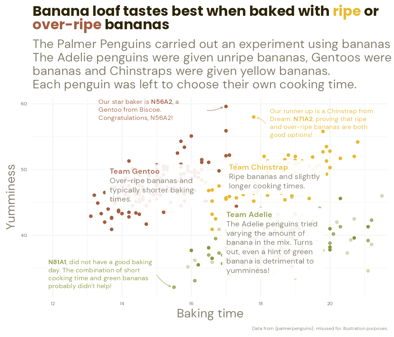
#4 - Highlight important patterns | points
… using arrows and alignments to emphasise the story
penguins_themed_plot +
  ggtext::geom_textbox(data = penguin_summaries,
               aes(label = paste0("**Team ", species, "**", "<br><span style = \"color:", banana_colours$light_text, "\">", commentary, "</span>")),
               family = "DM Sans", size = 3.5, width = unit(9, "line"), alpha = 0.9, box.colour = NA) +
  ggtext::geom_textbox(data = penguin_highlights,
               aes(label = commentary, x = label_x, y = label_y, hjust = left_to_right,
                   halign = left_to_right),
               family = "DM Sans", size = 3, fill = NA, box.colour = NA) +
  geom_curve(data = penguin_highlights,
             aes(x = label_x, xend = arrow_x_end,
                 y = label_y, yend = arrow_y_end),
             arrow = arrow(length = unit(0.1, "cm")),
             curvature = list(0.15),
             alpha = 0.5)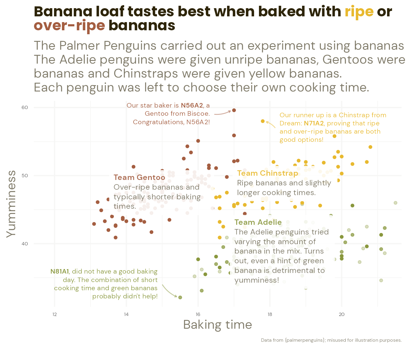
#4 - Highlight important patterns


Wait, but why again?
new_data %>% penguin_plot()
Wait, but why again?
new_data %>% time_comparisons_plot()
Level up your plots
The possibilities are endless!


Level up your plots
The possibilities are endless!


Level up your plots
The possibilities are endless!


Level up your plots
The possibilities are endless!


Over to you!
hello@cararthompson.com
Tw/Li: cararthompson