Rows: 235
Columns: 19
$ preOp_gender           <dbl> 0, 0, 0, 0, 0, 0, 0, 0, 0, 0, 0, 0, 0, 0, 0, 0,…
$ preOp_asa              <dbl> 3, 2, 2, 2, 1, 2, 3, 2, 3, 3, 2, 2, 2, 2, 3, 2,…
$ preOp_calcBMI          <dbl> 32.98, 23.66, 26.83, 28.39, 30.45, 35.49, 25.50…
$ preOp_age              <dbl> 67, 76, 58, 59, 73, 61, 66, 61, 83, 69, 31, 72,…
$ preOp_mallampati       <dbl> 2, 2, 2, 2, 1, 3, 1, 2, 1, 2, 1, 2, 2, 1, 2, 2,…
$ preOp_smoking          <dbl> 1, 2, 1, 1, 2, 1, 1, 1, 1, 3, 1, 2, 3, 3, 3, 1,…
$ preOp_pain             <dbl> 0, 0, 0, 0, 0, 0, 0, 0, 0, 0, 0, 0, 0, 0, 0, 0,…
$ treat                  <dbl> 1, 1, 1, 1, 1, 1, 1, 1, 1, 1, 1, 1, 1, 1, 1, 1,…
$ intraOp_surgerySize    <dbl> 2, 1, 2, 3, 2, 3, 3, 1, 1, 2, 2, 1, 1, 2, 2, 2,…
$ extubation_cough       <dbl> 0, 0, 0, 0, 0, 0, 0, 0, 0, 0, 0, 0, 0, 0, 0, 0,…
$ pacu30min_cough        <dbl> 0, 0, 0, 0, 0, 0, 0, 0, 0, 0, 0, 0, 0, 0, 0, 0,…
$ pacu30min_throatPain   <dbl> 0, 0, 0, 0, 0, 0, 0, 0, 0, 0, 0, 0, 0, 0, 0, 0,…
$ pacu30min_swallowPain  <dbl> 0, 0, 0, 0, 0, 0, 0, 0, 0, 0, 0, 0, 0, 0, 0, 0,…
$ pacu90min_cough        <dbl> 0, 0, 0, 0, 0, 0, 0, 0, 0, 0, 0, 0, 0, 0, 0, 0,…
$ pacu90min_throatPain   <dbl> 0, 0, 0, 0, 0, 0, 0, 0, 0, 0, 0, 0, 0, 0, 0, 0,…
$ postOp4hour_cough      <dbl> 0, 0, 0, 0, 0, 0, 0, 0, 0, 0, 0, 0, 0, 0, 0, 0,…
$ postOp4hour_throatPain <dbl> 0, 0, 0, 0, 0, 0, 0, 0, 0, 0, 0, 0, 0, 0, 0, 0,…
$ pod1am_cough           <dbl> 0, 0, 0, 0, 0, 0, 0, 0, 0, 0, 0, 0, 0, 0, 0, 0,…
$ pod1am_throatPain <dbl> 0, 0, 0, 0, 0, 0, 0, 0, 0, 0, 0, 0, 0, 0, 0, 0,…Clarity, Creativity, Accessibility with R and ggplot2
RMedicine | 6th May 2026
My happy place
Let’s make a graph
We could do this…
Let’s make a graph
Let’s try that again…
Let’s make a graph
But let’s make it a bit easier to understand
Let’s make a graph
But let’s make it a bit easier to understand
Let’s make a graph
But let’s make it a bit easier to understand - 💙

Let’s make a graph
But let’s make it a bit easier to understand - 💙
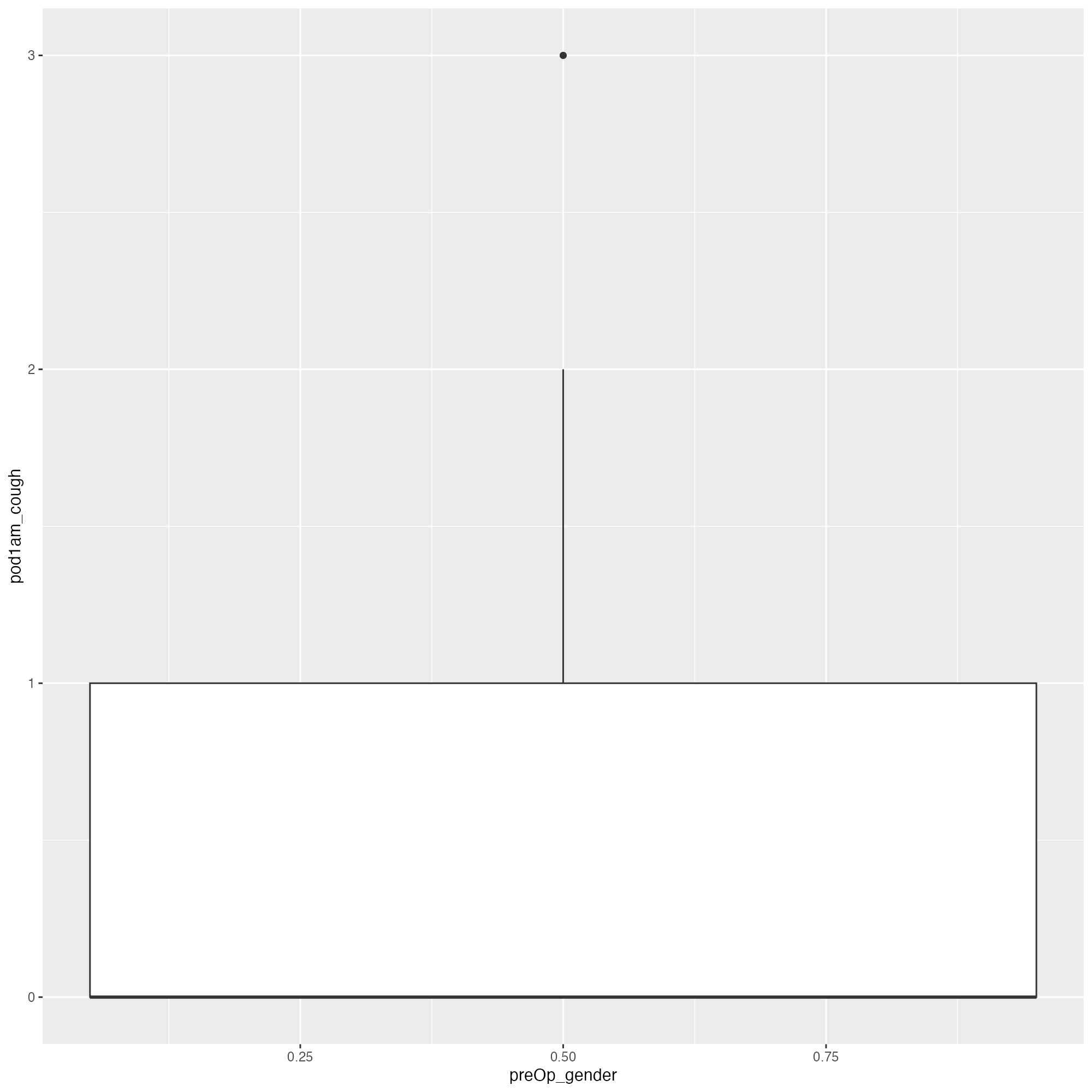
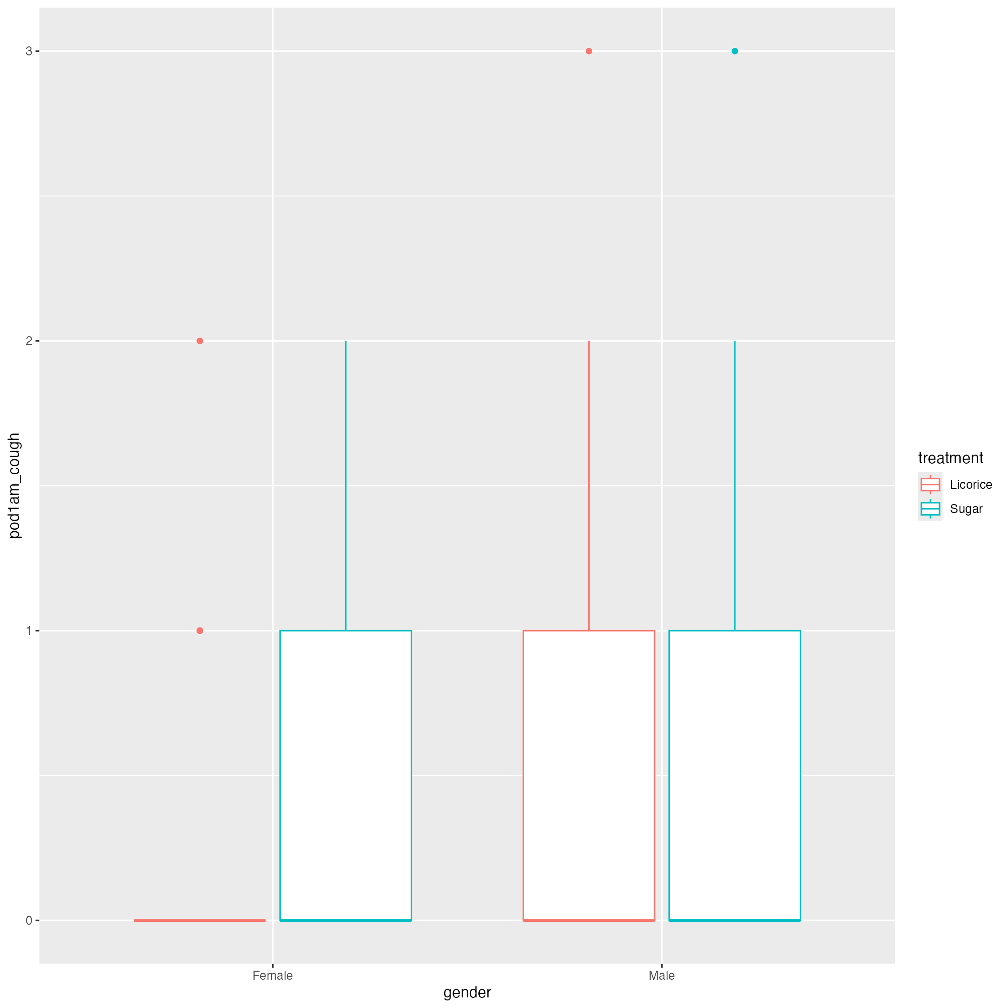
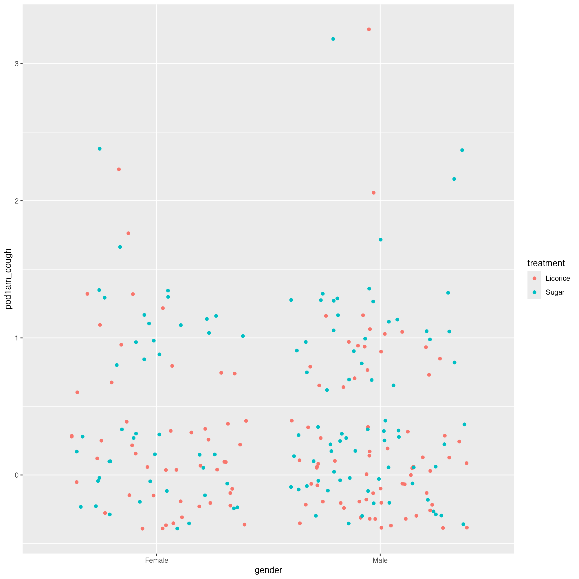
ggplot(tidied_data, aes(x = gender, y = pod1am_cough, colour = treatment)) +
geom_jitter(height = 0.1, width = 0.1, alpha = 0.8) +
stat_summary(
aes(ymin = after_stat(y), ymax = after_stat(y)),
fun = function(x) mean(x, na.rm = TRUE),
geom = "crossbar",
width = 0.5
) +
stat_summary(
aes(
label = janitor::round_half_up(after_stat(y), 2)
),
fun = function(x) mean(x, na.rm = TRUE),
geom = "text",
position = position_nudge(y = 0.05)
)
Let’s make a graph
But let’s make it a bit easier to understand - 💙
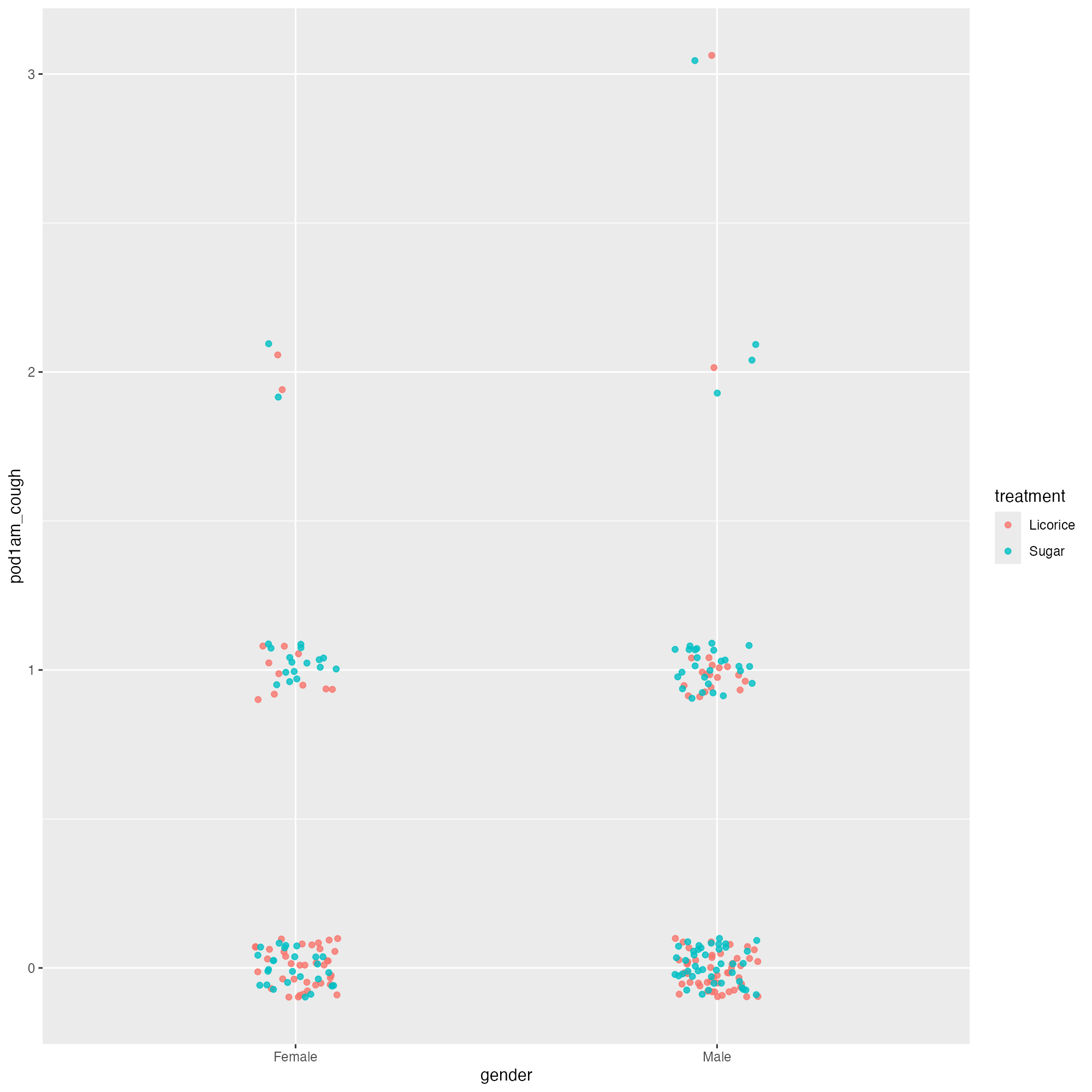
ggplot(tidied_data, aes(x = gender, y = pod1am_cough, colour = treatment)) +
  geom_jitter(height = 0.1, width = 0.1, alpha = 0.8) +
  stat_summary(
    aes(ymin = after_stat(y), ymax = after_stat(y)),
    fun = function(x) mean(x, na.rm = TRUE),
    geom = "crossbar",
    width = 0.5
) +
stat_summary(
aes(
label = janitor::round_half_up(after_stat(y), 2)
),
fun = function(x) mean(x, na.rm = TRUE),
geom = "text",
position = position_nudge(y = 0.05),
colour = "black"
)
Let’s make a graph
But let’s make it a bit easier to understand - 💙
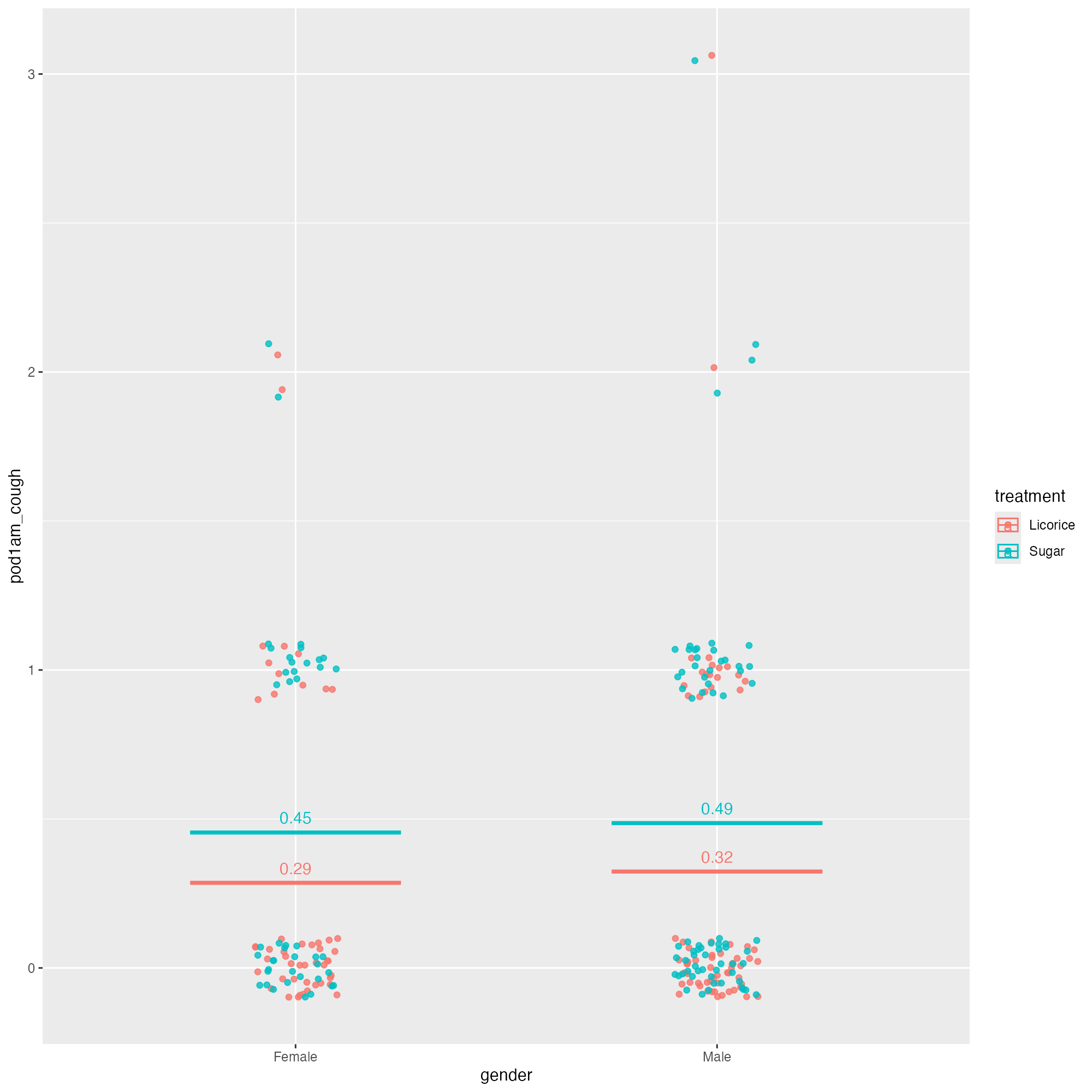
ggplot(tidied_data, aes(x = gender, y = pod1am_cough, colour = treatment)) +
  geom_jitter(height = 0.1, width = 0.1, alpha = 0.8) +
  stat_summary(
    aes(ymin = after_stat(y), ymax = after_stat(y)),
    fun = function(x) mean(x, na.rm = TRUE),
    geom = "crossbar",
    width = 0.5
  ) +
  stat_summary(
    aes(
      label = janitor::round_half_up(after_stat(y), 2),
      group = treatment
    ),
    fun = function(x) mean(x, na.rm = TRUE),
    geom = "text",
    position = position_nudge(y = 0.05),
    colour = "black"
  )
Let’s make a graph
Let’s fix the text size
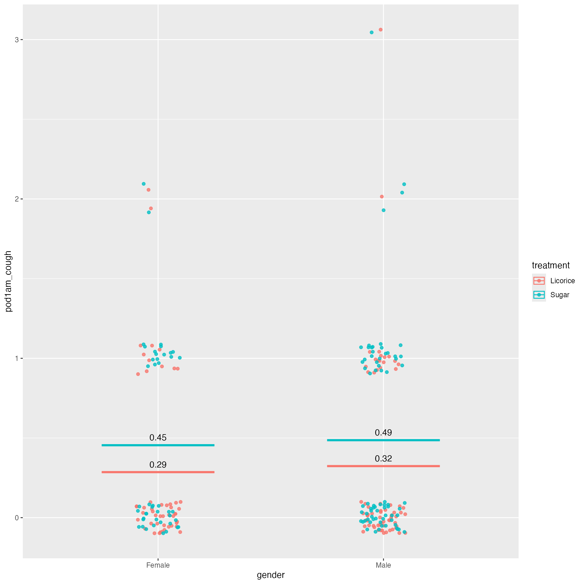
ggplot(tidied_data, aes(x = gender, y = pod1am_cough, colour = treatment)) +
  geom_jitter(height = 0.1, width = 0.1, alpha = 0.8) +
  stat_summary(
    aes(ymin = after_stat(y), ymax = after_stat(y)),
    fun = function(x) mean(x, na.rm = TRUE),
    geom = "crossbar",
    width = 0.5
  ) +
  stat_summary(
    aes(
      label = janitor::round_half_up(after_stat(y), 2),
      group = treatment
    ),
    fun = function(x) mean(x, na.rm = TRUE),
    geom = "text",
    position = position_nudge(y = 0.05),
    colour = "black"
  ) +
  theme_minimal(base_size = 20)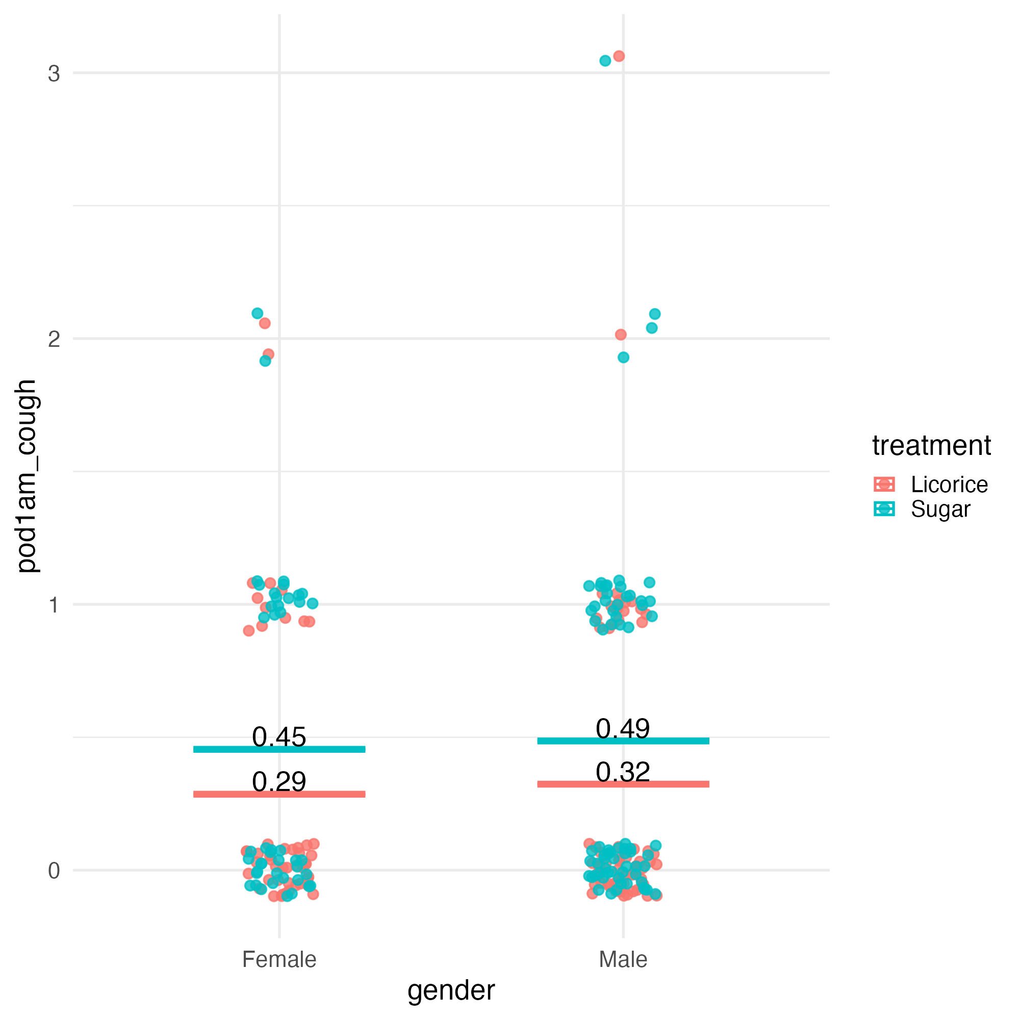
Let’s make a graph
Let’s fix the text size
ggplot(tidied_data, aes(x = gender, y = pod1am_cough, colour = treatment)) +
  geom_jitter(height = 0.1, width = 0.1, alpha = 0.8) +
  stat_summary(
    aes(ymin = after_stat(y), ymax = after_stat(y)),
    fun = function(x) mean(x, na.rm = TRUE),
    geom = "crossbar",
    width = 0.5
  ) +
  stat_summary(
    aes(
      label = janitor::round_half_up(after_stat(y), 2),
      group = treatment
    ),
    fun = function(x) mean(x, na.rm = TRUE),
    geom = "text",
    position = position_nudge(y = 0.05),
    colour = "black",
    size = 20
  ) +
  theme_minimal(base_size = 20)
Let’s make a graph
Let’s fix the text size - 💙 size.unit = "pt"
ggplot(tidied_data, aes(x = gender, y = pod1am_cough, colour = treatment)) +
  geom_jitter(height = 0.1, width = 0.1, alpha = 0.8) +
  stat_summary(
    aes(ymin = after_stat(y), ymax = after_stat(y)),
    fun = function(x) mean(x, na.rm = TRUE),
    geom = "crossbar",
    width = 0.5
  ) +
  stat_summary(
    aes(
      label = janitor::round_half_up(after_stat(y), 2),
      group = treatment
    ),
    fun = function(x) mean(x, na.rm = TRUE),
    geom = "text",
    position = position_nudge(y = 0.06),
    colour = "black",
    size = 20,
    size.unit = "pt"
  ) +
  theme_minimal(base_size = 20)
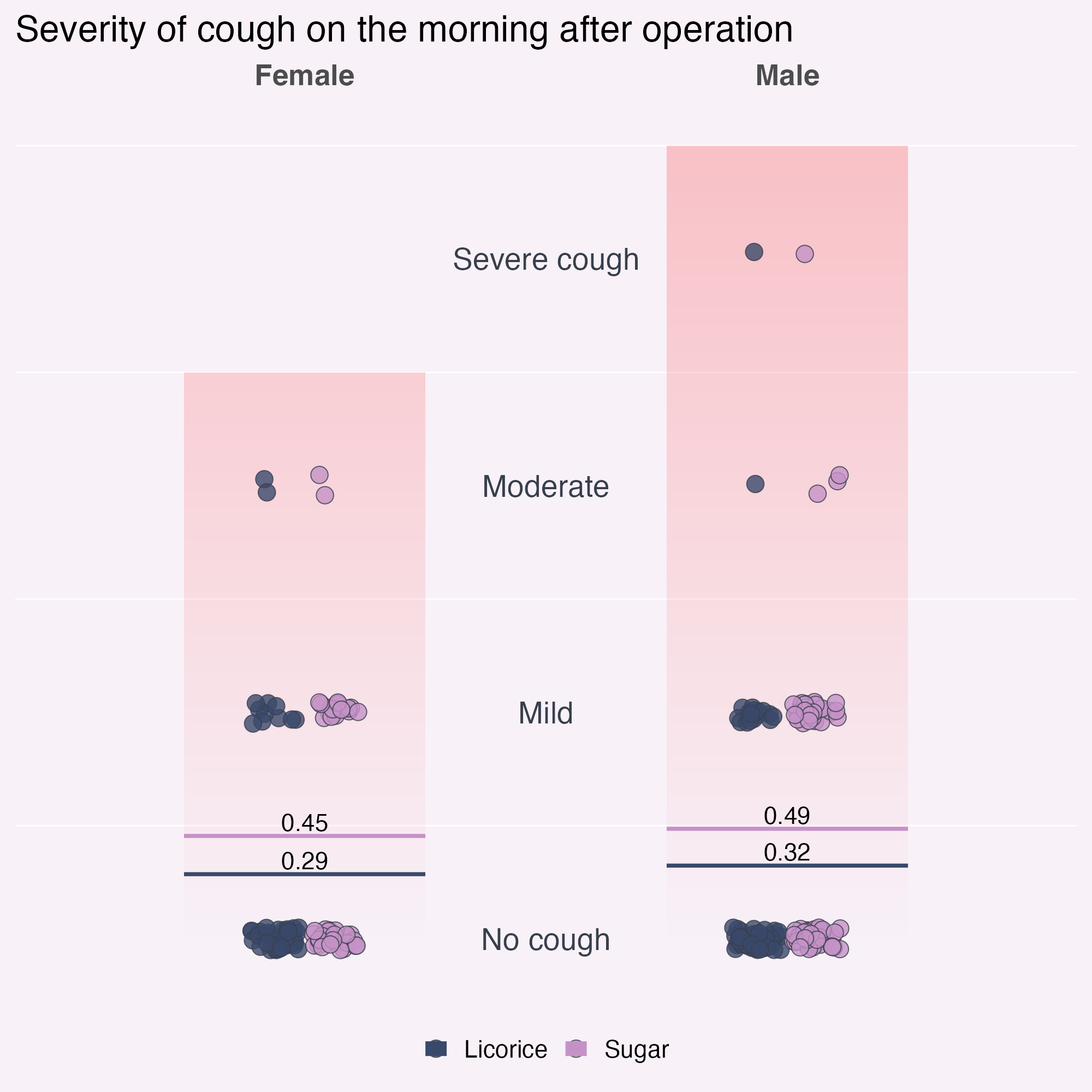
Let’s make a graph
Let’s fix the text size - 💙
ggplot(tidied_data, aes(x = gender, y = pod1am_cough, colour = treatment)) +
  geom_jitter(height = 0.1, width = 0.1, alpha = 0.8) +
  stat_summary(
    aes(ymin = after_stat(y), ymax = after_stat(y)),
    fun = function(x) mean(x, na.rm = TRUE),
    geom = "crossbar",
    width = 0.5
  ) +
  stat_summary(
    aes(
      label = janitor::round_half_up(after_stat(y), 2),
      group = treatment
    ),
    fun = function(x) mean(x, na.rm = TRUE),
    geom = "text",
    position = position_nudge(y = 0.06),
    colour = "black",
    size = 16,
    size.unit = "pt"
  ) +
  labs(title = "Severity of cough on the morning after operation") +
  theme_minimal(base_size = 20)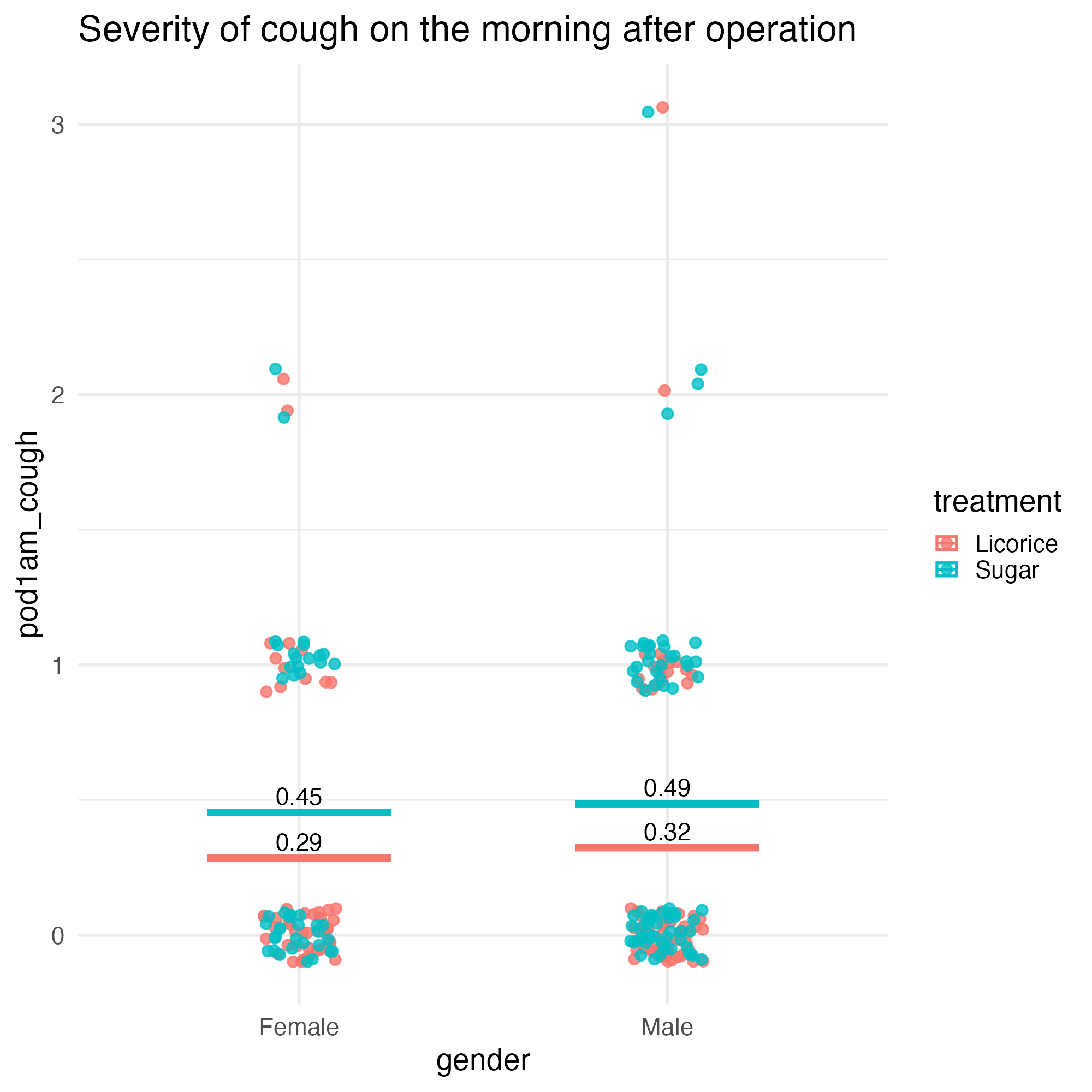
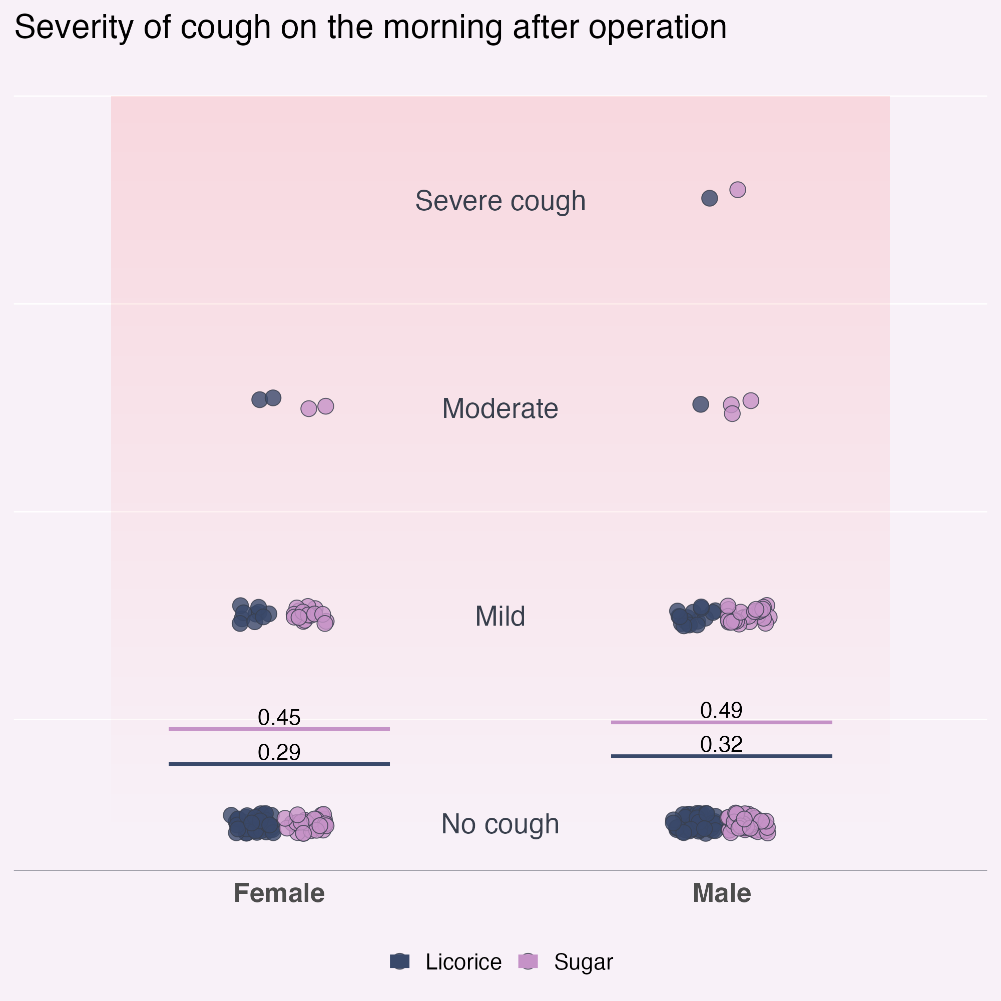
Style it
- Licorice
- Sugar
- Highlight colour
Style it
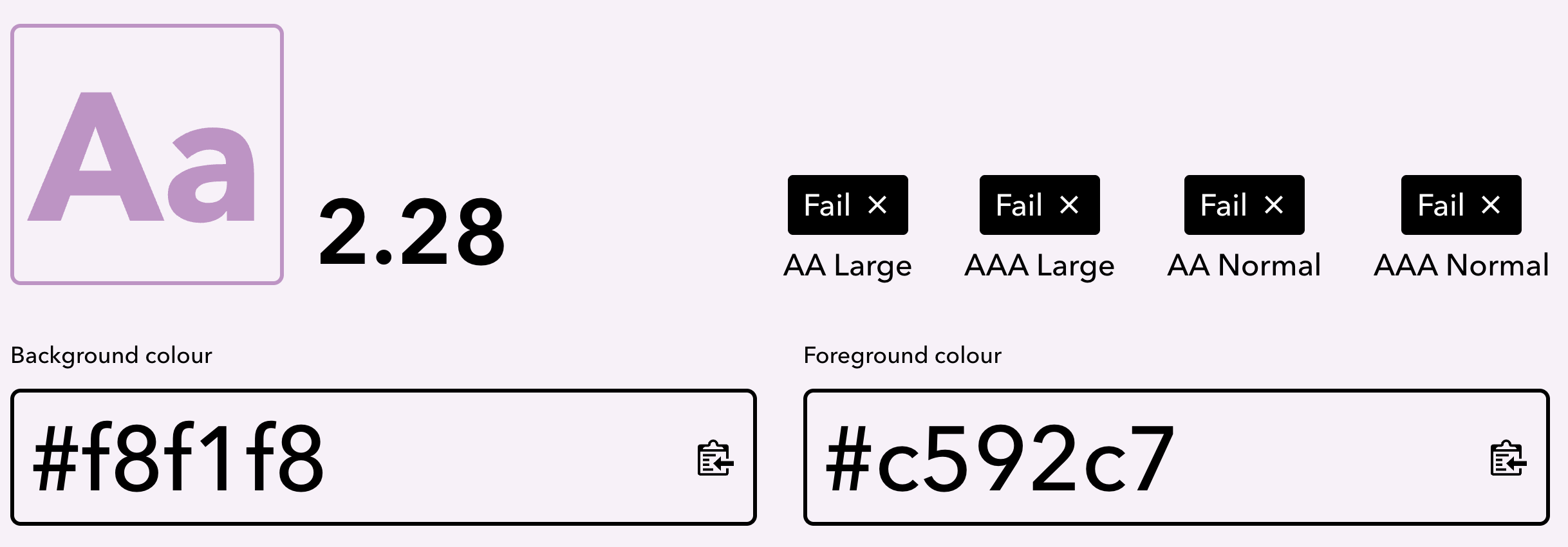
- Licorice - #39496a
- Sugar - #c592c7
- Highlight colour - #f8f28b
Add a bit more style
Starting point: Licorice - #39496a
- Dark text
- Light text
- Background
Implementation
Add colours
licorice_gargle_colours <- c(
  "Licorice" = "#39496a",
  "Sugar" = "#c592c7",
  "Highlight" = "#f8f28b",
  "Dark text" = "#1A2231",
  "Light text" = "#383F4C",
  "Background" = "#F8F1F8"
)

ggplot(
  tidied_data,
  aes(x = gender, y = pod1am_cough, colour = treatment)
) +
  geom_jitter(height = 0.1, width = 0.1, alpha = 0.8) +
  stat_summary(
    aes(ymin = after_stat(y), ymax = after_stat(y)),
    fun = function(x) mean(x, na.rm = TRUE),
    geom = "crossbar",
    width = 0.5
  ) +
  stat_summary(
    aes(
      label = janitor::round_half_up(after_stat(y), 2),
      group = treatment
    ),
    fun = function(x) mean(x, na.rm = TRUE),
    geom = "text",
    position = position_nudge(y = 0.06),
    colour = "black",
    size = 16,
    size.unit = "pt"
  ) +
  scale_colour_manual(values = licorice_gargle_colours) +
  labs(title = "Severity of cough on the morning after operation") +
  theme_minimal(base_size = 20)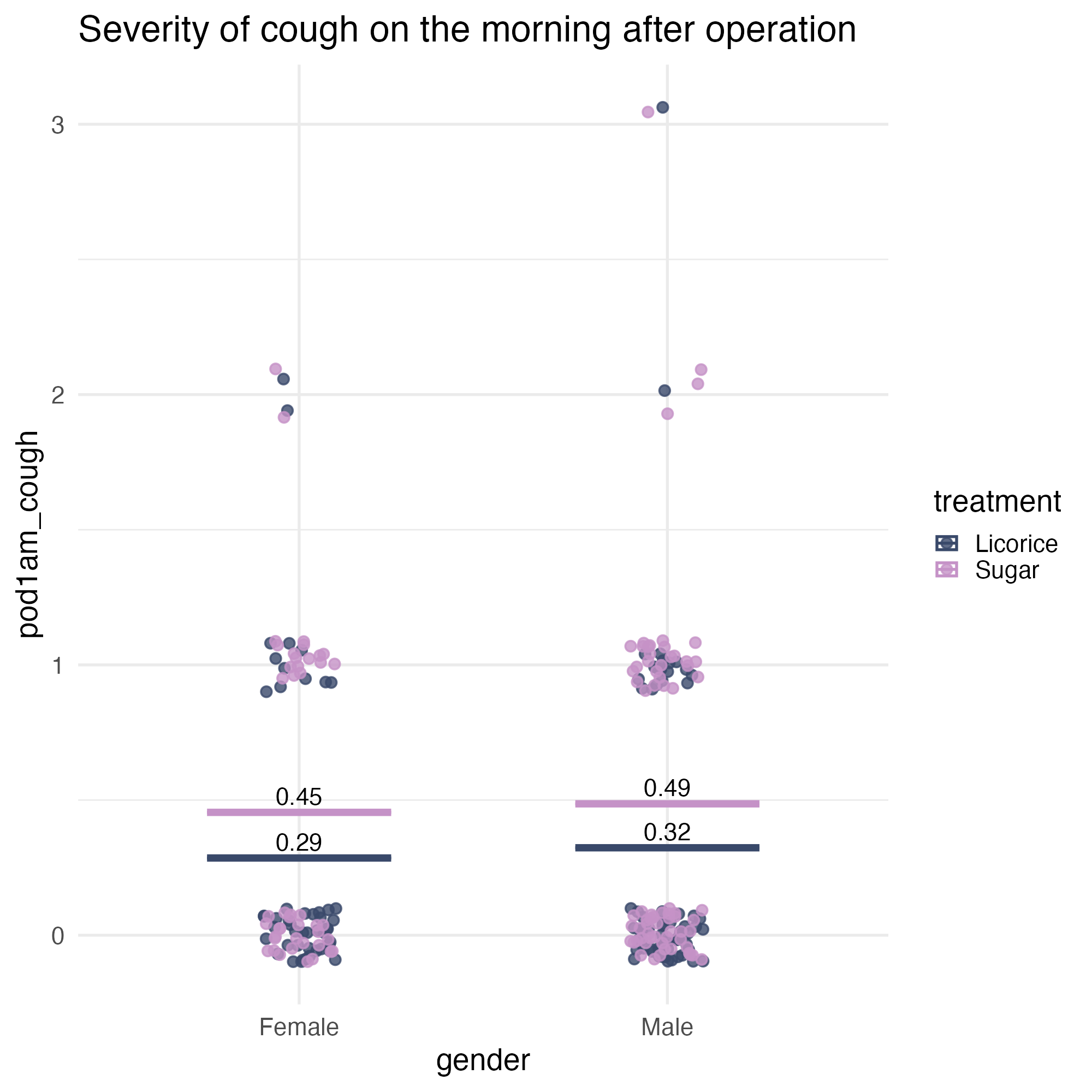
Implementation
Add colours - and shuffle the dots! 💙
ggplot(
  tidied_data |> dplyr::slice_sample(prop = 1),
  aes(x = gender, y = pod1am_cough, colour = treatment)
) +
  geom_jitter(height = 0.1, width = 0.1, alpha = 0.8) +
  stat_summary(
    aes(ymin = after_stat(y), ymax = after_stat(y)),
    fun = function(x) mean(x, na.rm = TRUE),
    geom = "crossbar",
    width = 0.5
  ) +
  stat_summary(
    aes(
      label = janitor::round_half_up(after_stat(y), 2),
      group = treatment
    ),
    fun = function(x) mean(x, na.rm = TRUE),
    geom = "text",
    position = position_nudge(y = 0.06),
    colour = "black",
    size = 16,
    size.unit = "pt"
  ) +
  scale_colour_manual(values = licorice_gargle_colours) +
  labs(title = "Severity of cough on the morning after operation") +
  theme_minimal(base_size = 20)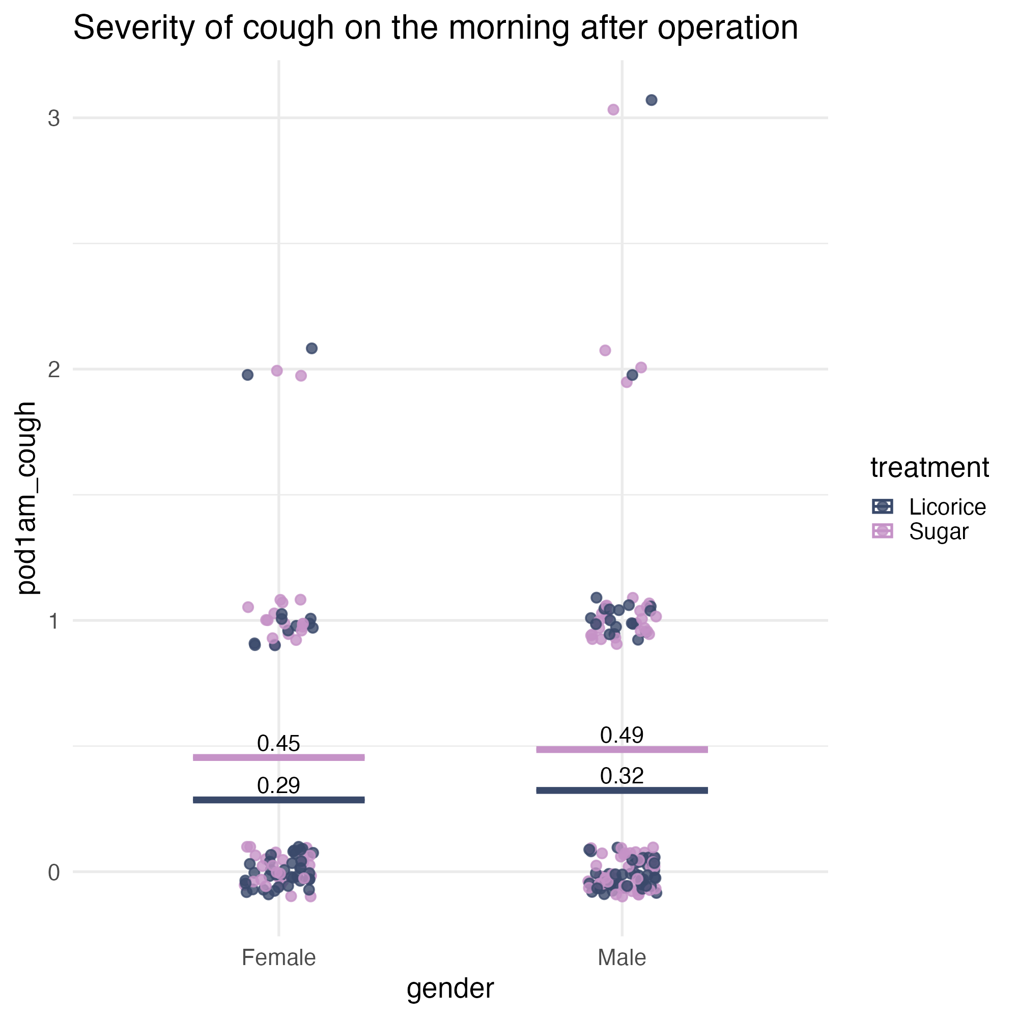
Implementation
Or jitter + dodge - position_jitterdodge() 💙
ggplot(
  tidied_data,
  aes(x = gender, y = pod1am_cough, colour = treatment)
) +
  geom_point(
    alpha = 0.8,
    position = position_jitterdodge(
      jitter.height = 0.05,
      jitter.width = 0.2,
      dodge.width = 0.25
    )
  ) +
  stat_summary(
    aes(ymin = after_stat(y), ymax = after_stat(y)),
    fun = function(x) mean(x, na.rm = TRUE),
    geom = "crossbar",
    width = 0.5
  ) +
  stat_summary(
    aes(
      label = janitor::round_half_up(after_stat(y), 2),
      group = treatment
    ),
    fun = function(x) mean(x, na.rm = TRUE),
    geom = "text",
    position = position_nudge(y = 0.06),
    colour = "black",
    size = 16,
    size.unit = "pt"
  ) +
  scale_colour_manual(values = licorice_gargle_colours) +
  labs(title = "Severity of cough on the morning after operation") +
  theme_minimal(base_size = 20)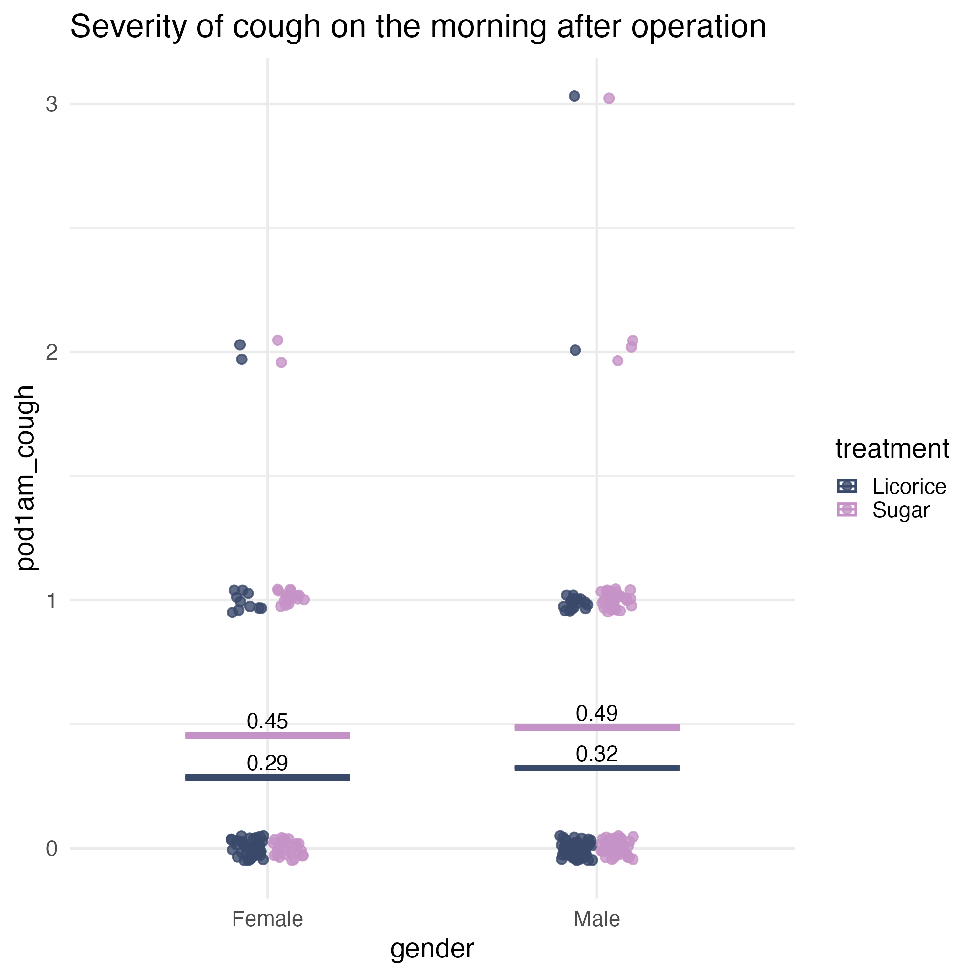
Accessibility check
- Are the colours different from each other?
Accessibility check
- Do they stand out enough from the background?
Accessibility fix
Change the shape, to add a contour
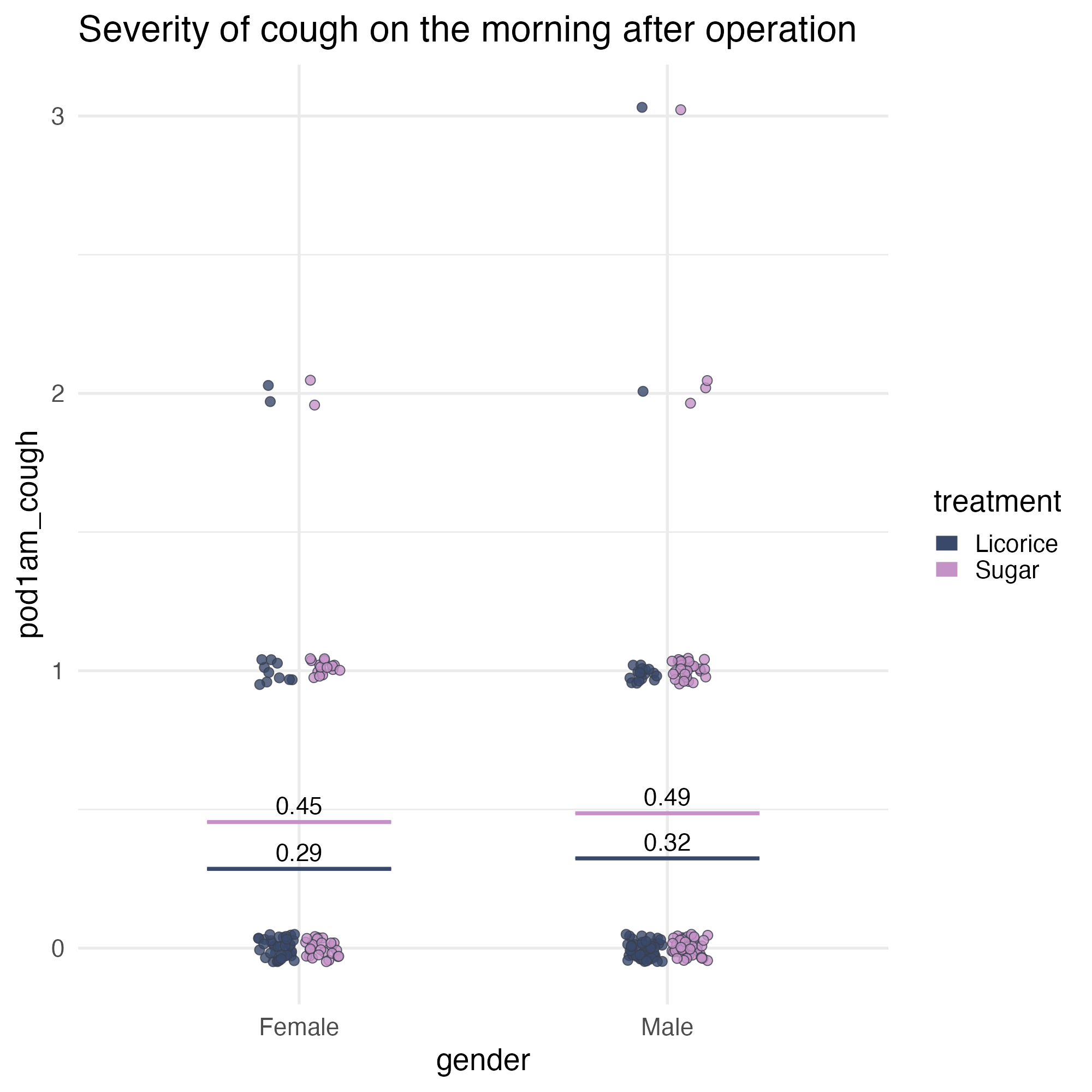
ggplot(
  tidied_data,
  aes(x = gender, y = pod1am_cough, colour = treatment)
) +
  geom_point(
    alpha = 0.8,
    position = position_jitterdodge(
      jitter.height = 0.05,
      jitter.width = 0.2,
      dodge.width = 0.25
    ),
    shape = 21
  ) +
  stat_summary(
    aes(ymin = after_stat(y), ymax = after_stat(y)),
    fun = function(x) mean(x, na.rm = TRUE),
    geom = "crossbar",
    width = 0.5
  ) +
  stat_summary(
    aes(
      label = janitor::round_half_up(after_stat(y), 2),
      group = treatment
    ),
    fun = function(x) mean(x, na.rm = TRUE),
    geom = "text",
    position = position_nudge(y = 0.06),
    colour = "black",
    size = 16,
    size.unit = "pt"
  ) +
  scale_colour_manual(values = licorice_gargle_colours) +
  labs(title = "Severity of cough on the morning after operation") +
  theme_minimal(base_size = 20)
Accessibility fix
Change the shape, to add a contour
ggplot(
  tidied_data,
  aes(x = gender, y = pod1am_cough, fill = treatment)
) +
  geom_point(
    alpha = 0.8,
    position = position_jitterdodge(
      jitter.height = 0.05,
      jitter.width = 0.2,
      dodge.width = 0.25
    ),
    shape = 21
  ) +
  stat_summary(
    aes(ymin = after_stat(y), ymax = after_stat(y)),
    fun = function(x) mean(x, na.rm = TRUE),
    geom = "crossbar",
    width = 0.5
  ) +
  stat_summary(
    aes(
      label = janitor::round_half_up(after_stat(y), 2),
      group = treatment
    ),
    fun = function(x) mean(x, na.rm = TRUE),
    geom = "text",
    position = position_nudge(y = 0.06),
    colour = "black",
    size = 16,
    size.unit = "pt"
  ) +
  scale_fill_manual(values = licorice_gargle_colours) +
  labs(title = "Severity of cough on the morning after operation") +
  theme_minimal(base_size = 20)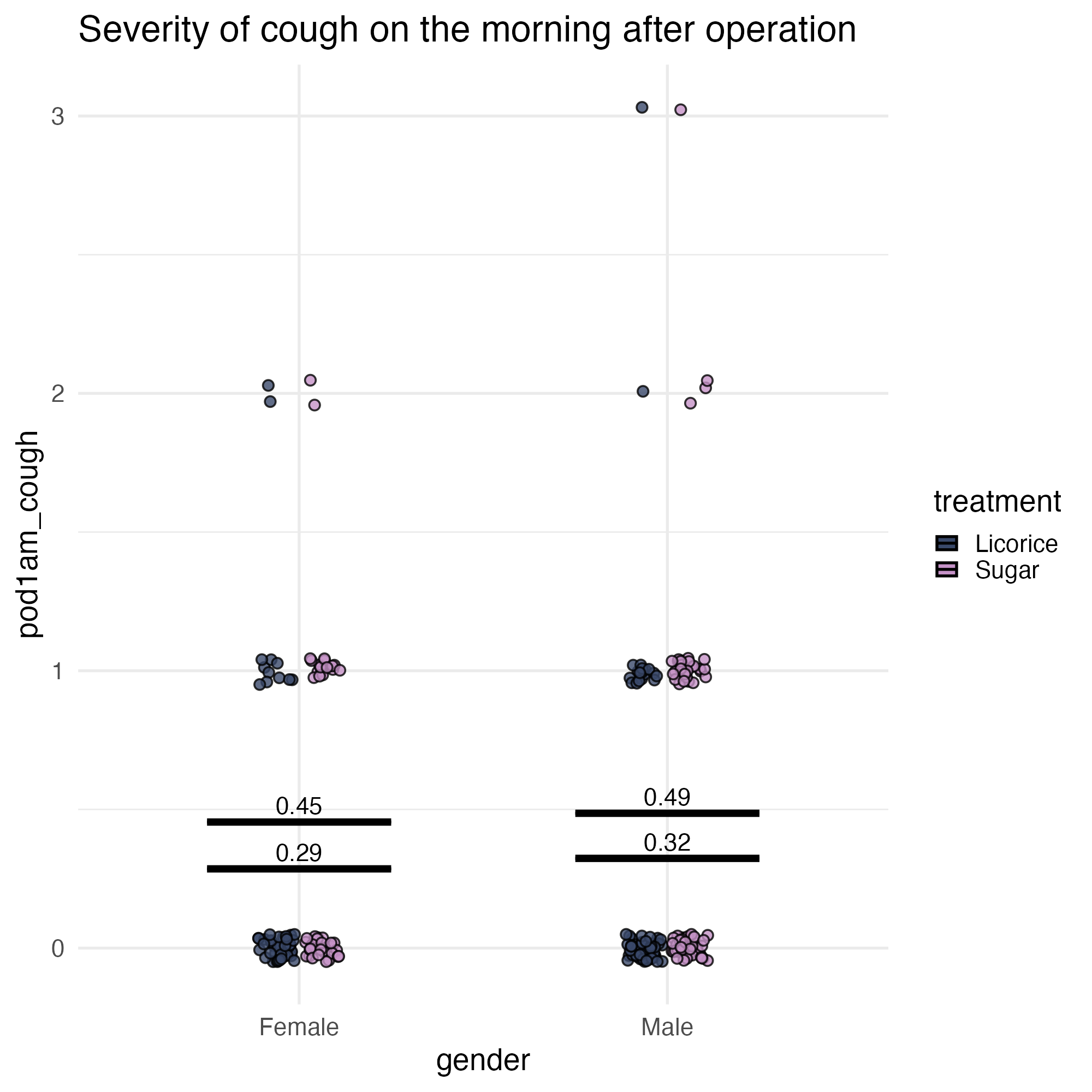
Set default styles for contours
theme(geom = element_geom()) 💙
ggplot(
  tidied_data,
  aes(x = gender, y = pod1am_cough, fill = treatment)
) +
  geom_point(
    alpha = 0.8,
    position = position_jitterdodge(
      jitter.height = 0.05,
      jitter.width = 0.2,
      dodge.width = 0.25
    ),
    shape = 21
  ) +
  stat_summary(
    aes(ymin = after_stat(y), ymax = after_stat(y), colour = treatment),
    fun = function(x) mean(x, na.rm = TRUE),
    geom = "crossbar",
    width = 0.5
  ) +
  stat_summary(
    aes(
      label = janitor::round_half_up(after_stat(y), 2),
      group = treatment
    ),
    fun = function(x) mean(x, na.rm = TRUE),
    geom = "text",
    position = position_nudge(y = 0.06),
    colour = "black",
    size = 16,
    size.unit = "pt"
  ) +
  scale_fill_manual(values = licorice_gargle_colours) +
  scale_colour_manual(values = licorice_gargle_colours) +
  labs(title = "Severity of cough on the morning after operation") +
  theme_minimal(base_size = 20) +
  theme(
    geom = element_geom(
      ink = licorice_gargle_colours["Light text"],
      size = 5,
      borderwidth = 0.5, # not `stroke`
      linewidth = 0.2
    )
  )
Add a background colour
theme() - we’ll do more in a minute!
ggplot(
  tidied_data,
  aes(x = gender, y = pod1am_cough, fill = treatment)
) +
  geom_point(
    alpha = 0.8,
    position = position_jitterdodge(
      jitter.height = 0.05,
      jitter.width = 0.2,
      dodge.width = 0.25
    ),
    shape = 21,
    size = 5
  ) +
  stat_summary(
    aes(ymin = after_stat(y), ymax = after_stat(y), colour = treatment),
    fun = function(x) mean(x, na.rm = TRUE),
    geom = "crossbar",
    width = 0.5
  ) +
  stat_summary(
    aes(
      ymin = after_stat(y),
      ymax = after_stat(y),
      label = janitor::round_half_up(after_stat(y), 2),
      group = treatment
    ),
    fun = function(x) mean(x, na.rm = TRUE),
    geom = "text",
    width = 0.5,
    position = position_nudge(y = 0.06),
    colour = "black",
    size = 16,
    size.unit = "pt"
  ) +
  scale_fill_manual(values = licorice_gargle_colours) +
  scale_colour_manual(values = licorice_gargle_colours) +
  labs(title = "Severity of cough on the morning after operation") +
  theme_minimal(base_size = 20) +
  theme(
    geom = element_geom(
      ink = licorice_gargle_colours["Light text"],
      borderwidth = 0.5,
      linewidth = 0.2
    ),
    plot.background = element_rect(
      fill = licorice_gargle_colours["Background"],
      colour = licorice_gargle_colours["Background"]
    ),
    panel.grid = element_line(colour = "white")
  )
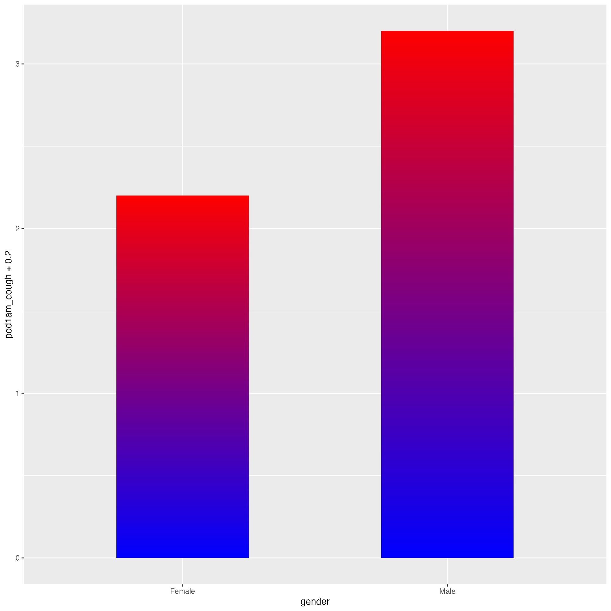
Use gradients for emphasis
First, we need to create a gradient
blue_to_red <- grid::linearGradient(
  colours = c("blue", "red"),
  x1 = 0,
  y1 = 0,
  x2 = 0,
  y2 = 1,
  group = FALSE
)

ggplot(tidied_data) +
  geom_bar(
    data = tidied_data |>
      dplyr::group_by(gender) |>
      dplyr::filter(pod1am_cough == max(pod1am_cough, na.rm = TRUE)) |>
      dplyr::select(gender, pod1am_cough) |>
      unique(),
    aes(x = gender, y = pod1am_cough + 0.2),
    stat = "identity",
    position = "dodge",
    fill = blue_to_red,
    width = 0.5,
    alpha = 1
  )
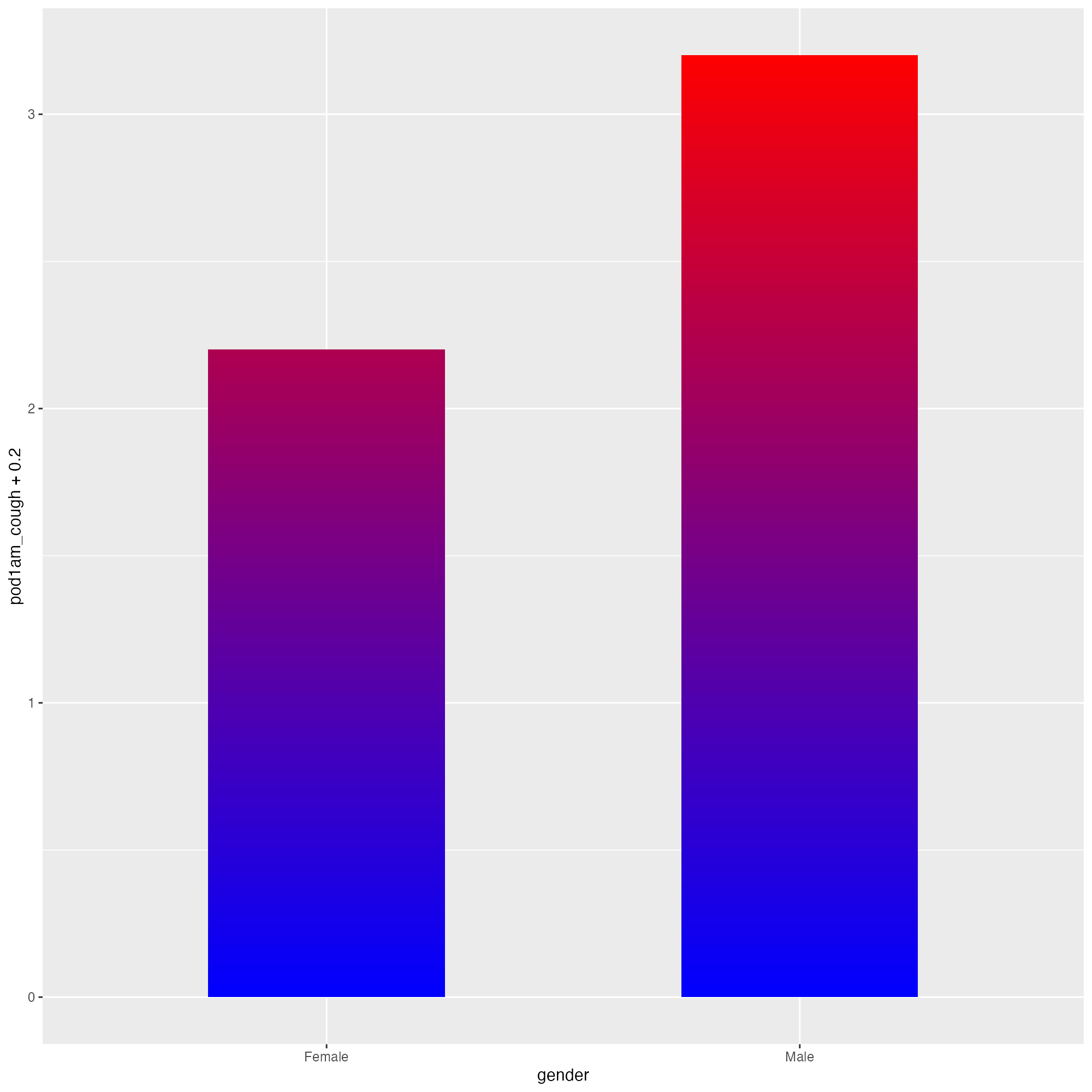
Use gradients for emphasis
First, we need to create a gradient
blue_to_red <- grid::linearGradient(
  colours = c("blue", "red"),
  x1 = 0,
  y1 = 0,
  x2 = 0,
  y2 = 1,
  group = TRUE # default
)

ggplot(tidied_data) +
  geom_bar(
    data = tidied_data |>
      dplyr::group_by(gender) |>
      dplyr::filter(pod1am_cough == max(pod1am_cough, na.rm = TRUE)) |>
      dplyr::select(gender, pod1am_cough) |>
      unique(),
    aes(x = gender, y = pod1am_cough + 0.2),
    stat = "identity",
    position = "dodge",
    fill = blue_to_red,
    width = 0.5,
    alpha = 1
  )
Use gradients for emphasis
And now, some subtlety!
bg_to_red <- grid::linearGradient(
  colours = c(licorice_gargle_colours["Background"], "red"),
  x1 = 0,
  y1 = 0,
  x2 = 0,
  y2 = 1,
  group = TRUE
)

ggplot(
  tidied_data,
  aes(x = gender, y = pod1am_cough, fill = treatment)
) +
  geom_bar(
    data = tidied_data |>
      dplyr::group_by(gender) |>
      dplyr::filter(pod1am_cough == max(pod1am_cough, na.rm = TRUE)) |>
      dplyr::select(gender, pod1am_cough) |>
      unique(),
    aes(x = gender, y = pod1am_cough + 0.2),
    stat = "identity",
    position = "dodge",
    fill = bg_to_red,
    width = 0.5,
    alpha = 0.2
  ) +
  geom_point(
    alpha = 0.8,
    position = position_jitterdodge(
      jitter.height = 0.05,
      jitter.width = 0.2,
      dodge.width = 0.25
    ),
    shape = 21,
    size = 5
  ) +
  stat_summary(
    aes(ymin = after_stat(y), ymax = after_stat(y), colour = treatment),
    fun = function(x) mean(x, na.rm = TRUE),
    geom = "crossbar",
    width = 0.5
  ) +
  stat_summary(
    aes(
      label = janitor::round_half_up(after_stat(y), 2),
      group = treatment
    ),
    fun = function(x) mean(x, na.rm = TRUE),
    geom = "text",
    position = position_nudge(y = 0.06),
    colour = "black",
    size = 16,
    size.unit = "pt"
  ) +
  scale_fill_manual(values = licorice_gargle_colours) +
  scale_colour_manual(values = licorice_gargle_colours) +
  labs(title = "Severity of cough on the morning after operation") +
  theme_minimal(base_size = 20) +
  theme(
    geom = element_geom(
      ink = licorice_gargle_colours["Light text"],
      borderwidth = 0.5,
      linewidth = 0.2
    ),
    plot.background = element_rect(
      fill = licorice_gargle_colours["Background"],
      colour = licorice_gargle_colours["Background"]
    ),
    panel.grid = element_line(colour = "white")
  )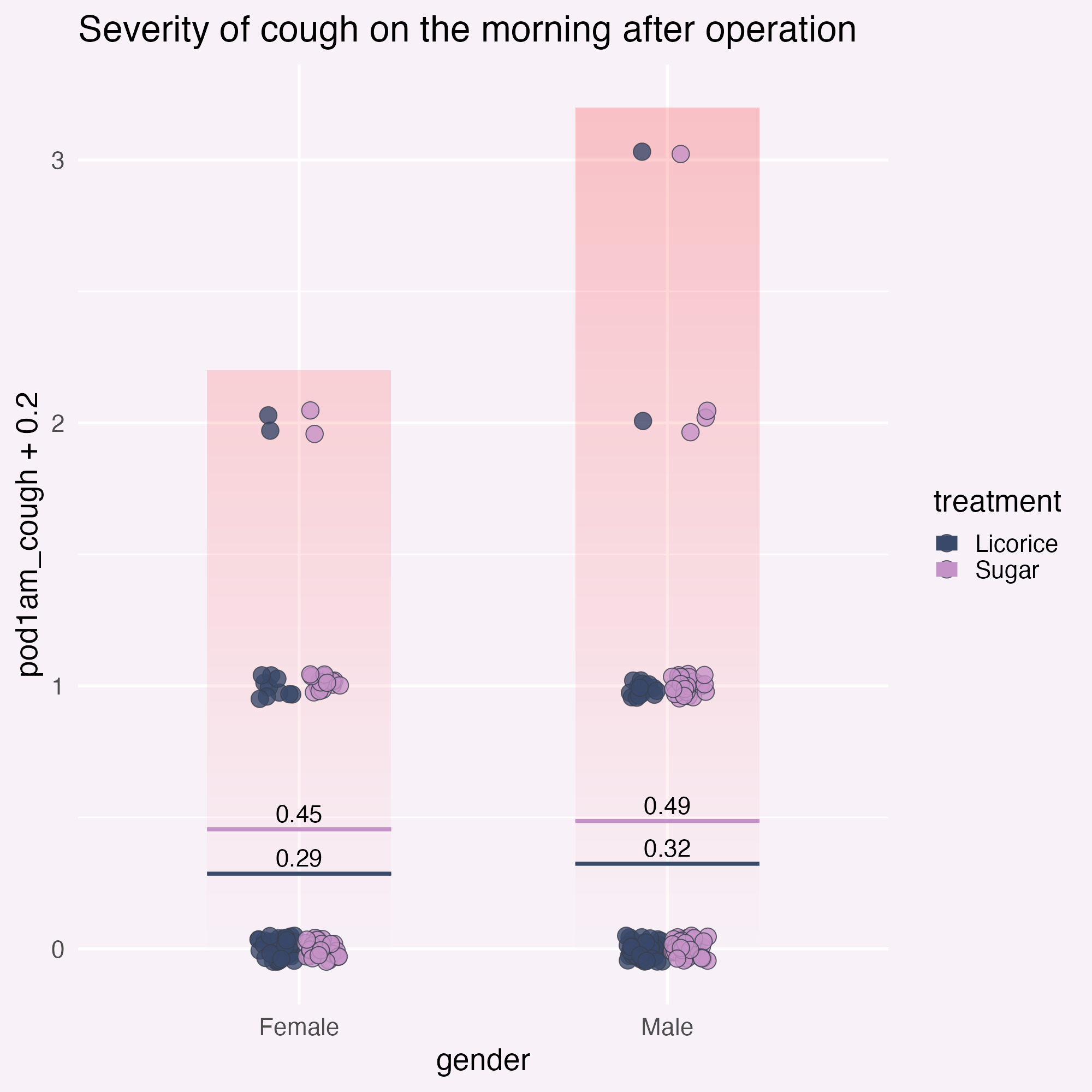
Add annotations for clarity
… and position them relative to the graph!
ggplot(
  tidied_data,
  aes(x = gender, y = pod1am_cough, fill = treatment)
) +
  geom_bar(
    data = tidied_data |>
      dplyr::group_by(gender) |>
      dplyr::filter(pod1am_cough == max(pod1am_cough, na.rm = TRUE)) |>
      dplyr::select(gender, pod1am_cough) |>
      unique(),
    aes(x = gender, y = pod1am_cough + 0.2),
    stat = "identity",
    position = "dodge",
    fill = bg_to_red,
    width = 0.5,
    alpha = 0.2
  ) +
  geom_point(
    alpha = 0.8,
    position = position_jitterdodge(
      jitter.height = 0.05,
      jitter.width = 0.2,
      dodge.width = 0.25
    ),
    shape = 21,
    size = 5
  ) +
  stat_summary(
    aes(ymin = after_stat(y), ymax = after_stat(y), colour = treatment),
    fun = function(x) mean(x, na.rm = TRUE),
    geom = "crossbar",
    width = 0.5
  ) +
  stat_summary(
    aes(
      label = janitor::round_half_up(after_stat(y), 2),
      group = treatment
    ),
    fun = function(x) mean(x, na.rm = TRUE),
    geom = "text",
    position = position_nudge(y = 0.06),
    colour = "black",
    size = 16,
    size.unit = "pt"
  ) +
  geom_text(
    data = data.frame(),
    aes(
      x = I(0.5),
      y = 3,
      label = "These people did\na lot of coughing",
      fill = NULL
    )
  ) +
  scale_fill_manual(values = licorice_gargle_colours) +
  scale_colour_manual(values = licorice_gargle_colours) +
  labs(title = "Severity of cough on the morning after operation") +
  theme_minimal(base_size = 20) +
  theme(
    geom = element_geom(
      ink = licorice_gargle_colours["Light text"],
      borderwidth = 0.5,
      linewidth = 0.2
    ),
    plot.background = element_rect(
      fill = licorice_gargle_colours["Background"],
      colour = licorice_gargle_colours["Background"]
    ),
    panel.grid = element_line(colour = "white")
  )
Add annotations for clarity
Sort out the legend position.
ggplot(
tidied_data,
aes(x = gender, y = pod1am_cough, fill = treatment)
) +
geom_bar(
data = tidied_data |>
dplyr::group_by(gender) |>
dplyr::filter(pod1am_cough == max(pod1am_cough, na.rm = TRUE)) |>
dplyr::select(gender, pod1am_cough) |>
unique(),
aes(x = gender, y = pod1am_cough + 0.2),
stat = "identity",
position = "dodge",
fill = bg_to_red,
width = 0.5,
alpha = 0.2
) +
geom_point(
alpha = 0.8,
position = position_jitterdodge(
jitter.height = 0.05,
jitter.width = 0.2,
dodge.width = 0.25
),
shape = 21,
size = 5
) +
stat_summary(
aes(ymin = after_stat(y), ymax = after_stat(y), colour = treatment),
fun = function(x) mean(x, na.rm = TRUE),
geom = "crossbar",
width = 0.5
) +
stat_summary(
aes(
label = janitor::round_half_up(after_stat(y), 2),
group = treatment
),
fun = function(x) mean(x, na.rm = TRUE),
geom = "text",
position = position_nudge(y = 0.06),
colour = "black",
size = 16,
size.unit = "pt"
) +
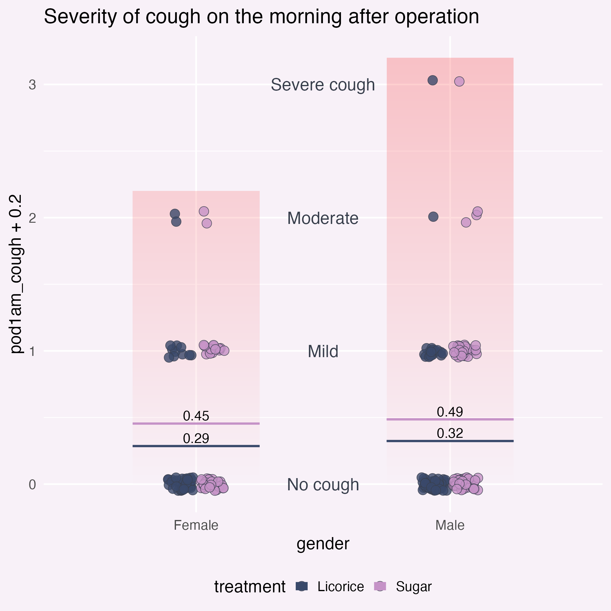
geom_text(
data = tibble::tibble(
y_coord = c(0, 1, 2, 3),
severity = c("No cough", "Mild", "Moderate", "Severe cough")
),
aes(
x = I(0.5),
y = y_coord,
label = severity,
fill = NULL
)
) +
scale_fill_manual(values = licorice_gargle_colours) +
scale_colour_manual(values = licorice_gargle_colours) +
labs(title = "Severity of cough on the morning after operation") +
theme_minimal(base_size = 20) +
theme(
geom = element_geom(
ink = licorice_gargle_colours["Light text"],
borderwidth = 0.5,
linewidth = 0.2
),
plot.background = element_rect(
fill = licorice_gargle_colours["Background"],
colour = licorice_gargle_colours["Background"]
),
panel.grid = element_line(colour = "white"),
legend.position = "bottom"
)
Add annotations for clarity
Wait a minute… 👀
ggplot(
  tidied_data,
  aes(x = gender, y = pod1am_cough, fill = treatment)
) +
  geom_bar(
    data = tidied_data |>
      dplyr::group_by(gender) |>
      dplyr::filter(pod1am_cough == max(pod1am_cough, na.rm = TRUE)) |>
      dplyr::select(gender, pod1am_cough) |>
      unique(),
    # Culprit is here!
    aes(x = gender, y = pod1am_cough + 0.2),
    stat = "identity",
    position = "dodge",
    fill = bg_to_red,
    width = 0.5,
    alpha = 0.2
  ) +
  geom_point(
    alpha = 0.8,
    position = position_jitterdodge(
      jitter.height = 0.05,
      jitter.width = 0.2,
      dodge.width = 0.25
    ),
    shape = 21,
    size = 5
  ) +
  stat_summary(
    aes(ymin = after_stat(y), ymax = after_stat(y), colour = treatment),
    fun = function(x) mean(x, na.rm = TRUE),
    geom = "crossbar",
    width = 0.5
  ) +
  stat_summary(
    aes(
      label = janitor::round_half_up(after_stat(y), 2),
      group = treatment
    ),
    fun = function(x) mean(x, na.rm = TRUE),
    geom = "text",
    position = position_nudge(y = 0.06),
    colour = "black",
    size = 16,
    size.unit = "pt"
  ) +
  geom_text(
    data = tibble::tibble(
      y_coord = c(0, 1, 2, 3),
      severity = c("No cough", "Mild", "Moderate", "Severe cough")
    ),
    aes(
      x = I(0.5),
      y = y_coord,
      label = severity,
      fill = NULL
    )
  ) +
  scale_fill_manual(values = licorice_gargle_colours) +
  scale_colour_manual(values = licorice_gargle_colours) +
  labs(title = "Severity of cough on the morning after operation") +
  theme_minimal(base_size = 20) +
  theme(
    geom = element_geom(
      ink = licorice_gargle_colours["Light text"],
      borderwidth = 0.5,
      linewidth = 0.2
    ),
    plot.background = element_rect(
      fill = licorice_gargle_colours["Background"],
      colour = licorice_gargle_colours["Background"]
    ),
    panel.grid = element_line(colour = "white"),
    legend.position = "bottom"
  )
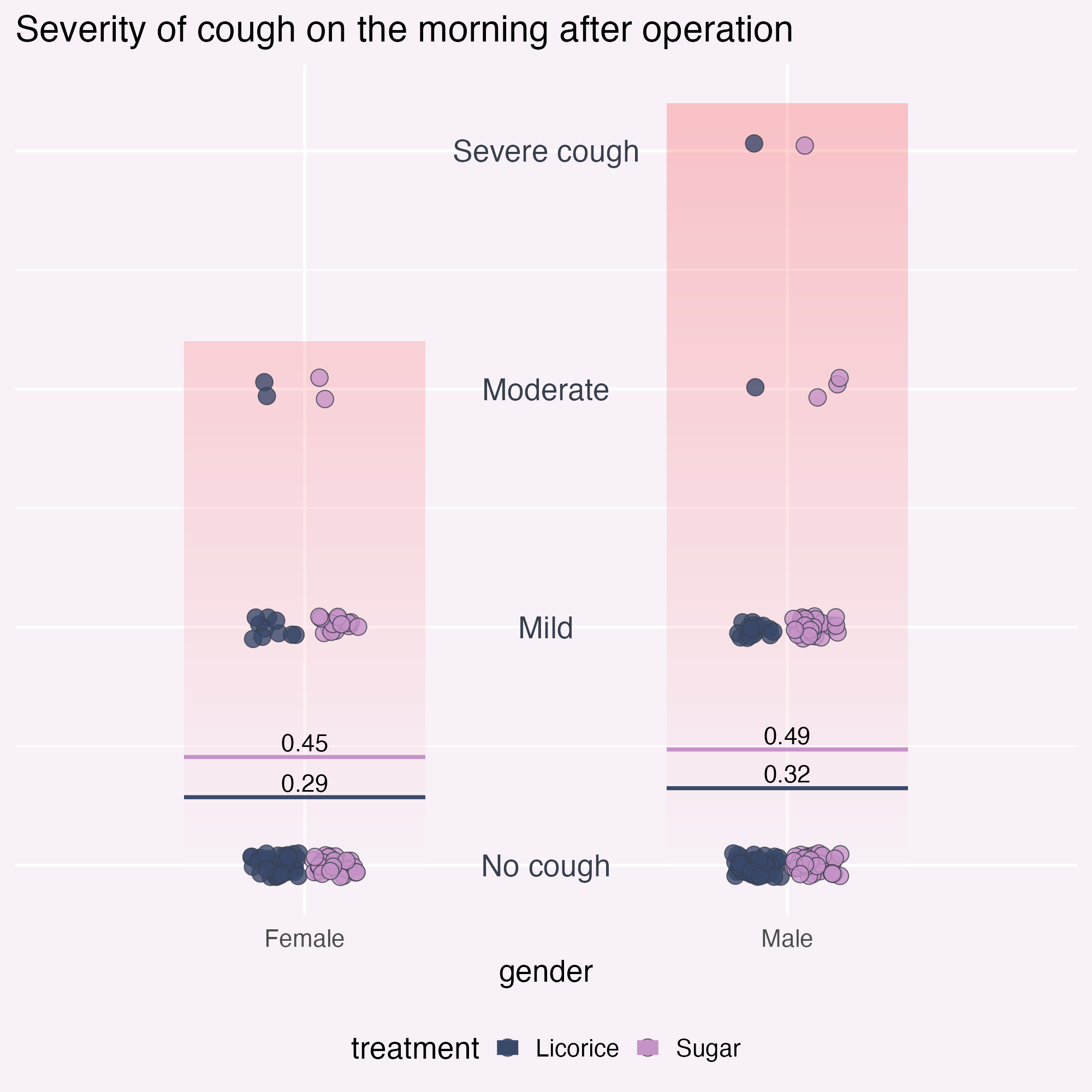
Add annotations for clarity
Declutter! What else?
ggplot(
  tidied_data,
  aes(x = gender, y = pod1am_cough, fill = treatment)
) +
  geom_bar(
    data = tidied_data |>
      dplyr::group_by(gender) |>
      dplyr::filter(pod1am_cough == max(pod1am_cough, na.rm = TRUE)) |>
      dplyr::select(gender, pod1am_cough) |>
      unique(),
    # Culprit is here!
    aes(x = gender, y = pod1am_cough + 0.2),
    stat = "identity",
    position = "dodge",
    fill = bg_to_red,
    width = 0.5,
    alpha = 0.2
  ) +
  geom_point(
    alpha = 0.8,
    position = position_jitterdodge(
      jitter.height = 0.05,
      jitter.width = 0.2,
      dodge.width = 0.25
    ),
    shape = 21,
    size = 5
  ) +
  stat_summary(
    aes(ymin = after_stat(y), ymax = after_stat(y), colour = treatment),
    fun = function(x) mean(x, na.rm = TRUE),
    geom = "crossbar",
    width = 0.5
  ) +
  stat_summary(
    aes(
      label = janitor::round_half_up(after_stat(y), 2),
      group = treatment
    ),
    fun = function(x) mean(x, na.rm = TRUE),
    geom = "text",
    position = position_nudge(y = 0.06),
    colour = "black",
    size = 16,
    size.unit = "pt"
  ) +
  geom_text(
    data = tibble::tibble(
      y_coord = c(0, 1, 2, 3),
      severity = c("No cough", "Mild", "Moderate", "Severe cough")
    ),
    aes(
      x = I(0.5),
      y = y_coord,
      label = severity,
      fill = NULL
    )
  ) +
  scale_fill_manual(values = licorice_gargle_colours) +
  scale_colour_manual(values = licorice_gargle_colours) +
  labs(title = "Severity of cough on the morning after operation") +
  theme_minimal(base_size = 20) +
  theme(
    geom = element_geom(
      ink = licorice_gargle_colours["Light text"],
      borderwidth = 0.5,
      linewidth = 0.2
    ),
    plot.background = element_rect(
      fill = licorice_gargle_colours["Background"],
      colour = licorice_gargle_colours["Background"]
    ),
    panel.grid = element_line(colour = "white"),
    legend.position = "bottom",
    axis.title.y = element_blank(),
    axis.text.y = element_blank()
  )
Add annotations for clarity
Declutter! What else?
ggplot(
  tidied_data,
  aes(x = gender, y = pod1am_cough, fill = treatment)
) +
  geom_bar(
    data = tidied_data |>
      dplyr::group_by(gender) |>
      dplyr::filter(pod1am_cough == max(pod1am_cough, na.rm = TRUE)) |>
      dplyr::select(gender, pod1am_cough) |>
      unique(),
    # Culprit is here!
    aes(x = gender, y = pod1am_cough + 0.5),
    stat = "identity",
    position = "dodge",
    fill = bg_to_red,
    width = 0.5,
    alpha = 0.2
  ) +
  geom_point(
    alpha = 0.8,
    position = position_jitterdodge(
      jitter.height = 0.05,
      jitter.width = 0.2,
      dodge.width = 0.25
    ),
    shape = 21,
    size = 5
  ) +
  stat_summary(
    aes(ymin = after_stat(y), ymax = after_stat(y), colour = treatment),
    fun = function(x) mean(x, na.rm = TRUE),
    geom = "crossbar",
    width = 0.5
  ) +
  stat_summary(
    aes(
      label = janitor::round_half_up(after_stat(y), 2),
      group = treatment
    ),
    fun = function(x) mean(x, na.rm = TRUE),
    geom = "text",
    position = position_nudge(y = 0.06),
    colour = "black",
    size = 16,
    size.unit = "pt"
  ) +
  geom_text(
    data = tibble::tibble(
      y_coord = c(0, 1, 2, 3),
      severity = c("No cough", "Mild", "Moderate", "Severe cough")
    ),
    aes(
      x = I(0.5),
      y = y_coord,
      label = severity,
      fill = NULL
    )
  ) +
  scale_fill_manual(values = licorice_gargle_colours) +
  scale_colour_manual(values = licorice_gargle_colours) +
  labs(title = "Severity of cough on the morning after operation") +
  theme_minimal(base_size = 20) +
  theme(
    geom = element_geom(
      ink = licorice_gargle_colours["Light text"],
      borderwidth = 0.5,
      linewidth = 0.2
    ),
    plot.background = element_rect(
      fill = licorice_gargle_colours["Background"],
      colour = licorice_gargle_colours["Background"]
    ),
    panel.grid = element_line(colour = "white"),
    legend.position = "bottom",
    axis.title.y = element_blank(),
    axis.text.y = element_blank(),
    axis.title.x = element_blank(),
    legend.title = element_blank(),
    panel.grid.major.x = element_blank(),
    panel.grid.major.y = element_blank(),
    axis.line.x = element_line(
      colour = licorice_gargle_colours["Light text"],
      linewidth = 0.2
    )
  )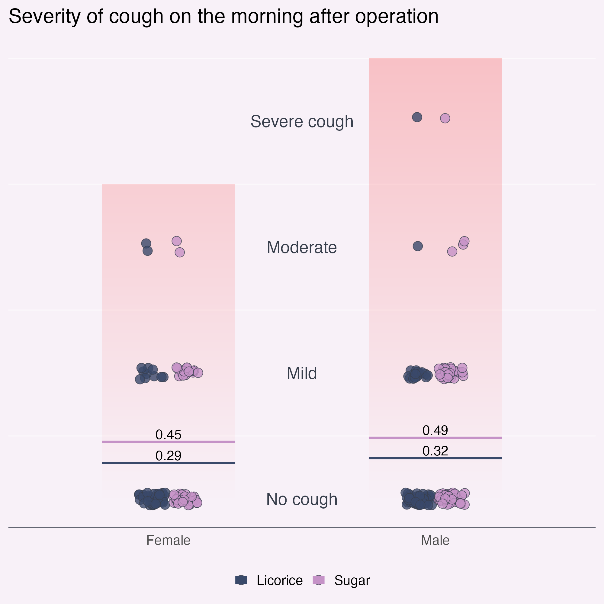
What am I finding confusing?
Declutter! What else?
ggplot(
  tidied_data,
  aes(x = gender, y = pod1am_cough, fill = treatment)
) +
  geom_bar(
    data = tidied_data |>
      dplyr::group_by(gender) |>
      dplyr::filter(pod1am_cough == max(pod1am_cough, na.rm = TRUE)) |>
      dplyr::select(gender, pod1am_cough) |>
      unique(),
    # Culprit is here!
    aes(x = gender, y = pod1am_cough + 0.5),
    stat = "identity",
    position = "dodge",
    fill = bg_to_red,
    width = 0.5,
    alpha = 0.2
  ) +
  geom_point(
    alpha = 0.8,
    position = position_jitterdodge(
      jitter.height = 0.05,
      jitter.width = 0.2,
      dodge.width = 0.25
    ),
    shape = 21,
    size = 5
  ) +
  stat_summary(
    aes(ymin = after_stat(y), ymax = after_stat(y), colour = treatment),
    fun = function(x) mean(x, na.rm = TRUE),
    geom = "crossbar",
    width = 0.5
  ) +
  stat_summary(
    aes(
      label = janitor::round_half_up(after_stat(y), 2),
      group = treatment
    ),
    fun = function(x) mean(x, na.rm = TRUE),
    geom = "text",
    position = position_nudge(y = 0.06),
    colour = "black",
    size = 16,
    size.unit = "pt"
  ) +
  geom_text(
    data = tibble::tibble(
      y_coord = c(0, 1, 2, 3),
      severity = c("No cough", "Mild", "Moderate", "Severe cough")
    ),
    aes(
      x = I(0.5),
      y = y_coord,
      label = severity,
      fill = NULL
    )
  ) +
  scale_fill_manual(values = licorice_gargle_colours) +
  scale_colour_manual(values = licorice_gargle_colours) +
  labs(title = "Severity of cough on the morning after operation") +
  theme_minimal(base_size = 20) +
  theme(
    geom = element_geom(
      ink = licorice_gargle_colours["Light text"],
      borderwidth = 0.5,
      linewidth = 0.2
    ),
    plot.background = element_rect(
      fill = licorice_gargle_colours["Background"],
      colour = licorice_gargle_colours["Background"]
    ),
    panel.grid = element_line(colour = "white"),
    legend.position = "bottom",
    axis.title.y = element_blank(),
    axis.text.y = element_blank(),
    axis.title.x = element_blank(),
    legend.title = element_blank(),
    panel.grid.major.x = element_blank(),
    panel.grid.major.y = element_blank(),
    axis.line.x = element_line(
      colour = licorice_gargle_colours["Light text"],
      linewidth = 0.2
    ),
    axis.text.x = element_text(size = rel(1.2), face = "bold")
  )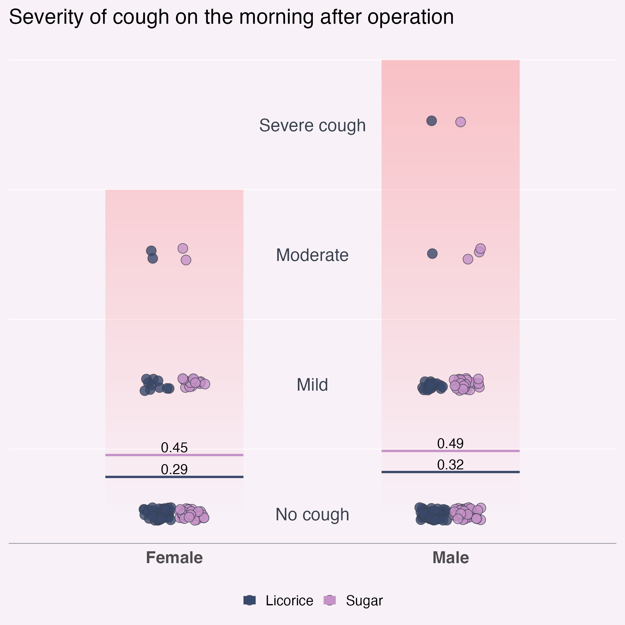
What am I finding confusing?
Declutter! What else?
ggplot(
  tidied_data,
  aes(x = gender, y = pod1am_cough, fill = treatment)
) +
  geom_bar(
    data = tidied_data |>
      dplyr::group_by(gender) |>
      dplyr::filter(pod1am_cough == max(pod1am_cough, na.rm = TRUE)) |>
      dplyr::select(gender, pod1am_cough) |>
      unique(),
    # Culprit is here!
    aes(x = gender, y = pod1am_cough + 0.5),
    stat = "identity",
    position = "dodge",
    fill = bg_to_red,
    width = 0.5,
    alpha = 0.2
  ) +
  geom_point(
    alpha = 0.8,
    position = position_jitterdodge(
      jitter.height = 0.05,
      jitter.width = 0.2,
      dodge.width = 0.25
    ),
    shape = 21,
    size = 5
  ) +
  stat_summary(
    aes(ymin = after_stat(y), ymax = after_stat(y), colour = treatment),
    fun = function(x) mean(x, na.rm = TRUE),
    geom = "crossbar",
    width = 0.5
  ) +
  stat_summary(
    aes(
      label = janitor::round_half_up(after_stat(y), 2),
      group = treatment
    ),
    fun = function(x) mean(x, na.rm = TRUE),
    geom = "text",
    position = position_nudge(y = 0.06),
    colour = "black",
    size = 16,
    size.unit = "pt"
  ) +
  geom_text(
    data = tibble::tibble(
      y_coord = c(0, 1, 2, 3),
      severity = c("No cough", "Mild", "Moderate", "Severe cough")
    ),
    aes(
      x = I(0.5),
      y = y_coord,
      label = severity,
      fill = NULL
    )
  ) +
  scale_x_discrete(position = "top") +
  scale_fill_manual(values = licorice_gargle_colours) +
  scale_colour_manual(values = licorice_gargle_colours) +
  labs(title = "Severity of cough on the morning after operation") +
  theme_minimal(base_size = 20) +
  theme(
    geom = element_geom(
      ink = licorice_gargle_colours["Light text"],
      borderwidth = 0.5,
      linewidth = 0.2
    ),
    plot.background = element_rect(
      fill = licorice_gargle_colours["Background"],
      colour = licorice_gargle_colours["Background"]
    ),
    panel.grid = element_line(colour = "white"),
    legend.position = "bottom",
    axis.title.y = element_blank(),
    axis.text.y = element_blank(),
    axis.title.x = element_blank(),
    legend.title = element_blank(),
    panel.grid.major.x = element_blank(),
    panel.grid.major.y = element_blank(),
    axis.text.x = element_text(size = rel(1.2), face = "bold")
  )
What am I finding confusing?
Declutter! What else?
ggplot(
  tidied_data,
  aes(x = gender, y = pod1am_cough, fill = treatment)
) +
  # Annotate doesn't support the gradient fill, so we need geom_rect
  geom_rect(
    # To get the structure of the data but only one layer of rectangle
    data = tidied_data |> dplyr::sample_n(1),
    aes(xmin = I(0.1), xmax = I(0.9), ymin = 0, ymax = 3.5),
    fill = bg_to_red,
    alpha = 0.1
  ) +
  geom_point(
    alpha = 0.8,
    position = position_jitterdodge(
      jitter.height = 0.05,
      jitter.width = 0.2,
      dodge.width = 0.25
    ),
    shape = 21,
    size = 5
  ) +
  stat_summary(
    aes(ymin = after_stat(y), ymax = after_stat(y), colour = treatment),
    fun = function(x) mean(x, na.rm = TRUE),
    geom = "crossbar",
    width = 0.5
  ) +
  stat_summary(
    aes(
      label = janitor::round_half_up(after_stat(y), 2),
      group = treatment
    ),
    fun = function(x) mean(x, na.rm = TRUE),
    geom = "text",
    position = position_nudge(y = 0.06),
    colour = "black",
    size = 16,
    size.unit = "pt"
  ) +
  geom_text(
    data = tibble::tibble(
      y_coord = c(0, 1, 2, 3),
      severity = c("No cough", "Mild", "Moderate", "Severe cough")
    ),
    aes(
      x = I(0.5),
      y = y_coord,
      label = severity,
      fill = NULL
    )
  ) +
  scale_fill_manual(values = licorice_gargle_colours) +
  scale_colour_manual(values = licorice_gargle_colours) +
  labs(title = "Severity of cough on the morning after operation") +
  theme_minimal(base_size = 20) +
  theme(
    geom = element_geom(
      ink = licorice_gargle_colours["Light text"],
      borderwidth = 0.5,
      linewidth = 0.2
    ),
    plot.background = element_rect(
      fill = licorice_gargle_colours["Background"],
      colour = licorice_gargle_colours["Background"]
    ),
    panel.grid = element_line(colour = "white"),
    legend.position = "bottom",
    axis.title.y = element_blank(),
    axis.text.y = element_blank(),
    axis.title.x = element_blank(),
    legend.title = element_blank(),
    panel.grid.major.x = element_blank(),
    panel.grid.major.y = element_blank(),
    axis.line.x = element_line(
      colour = licorice_gargle_colours["Light text"],
      linewidth = 0.2
    ),
    axis.text.x = element_text(size = rel(1.2), face = "bold")
  )
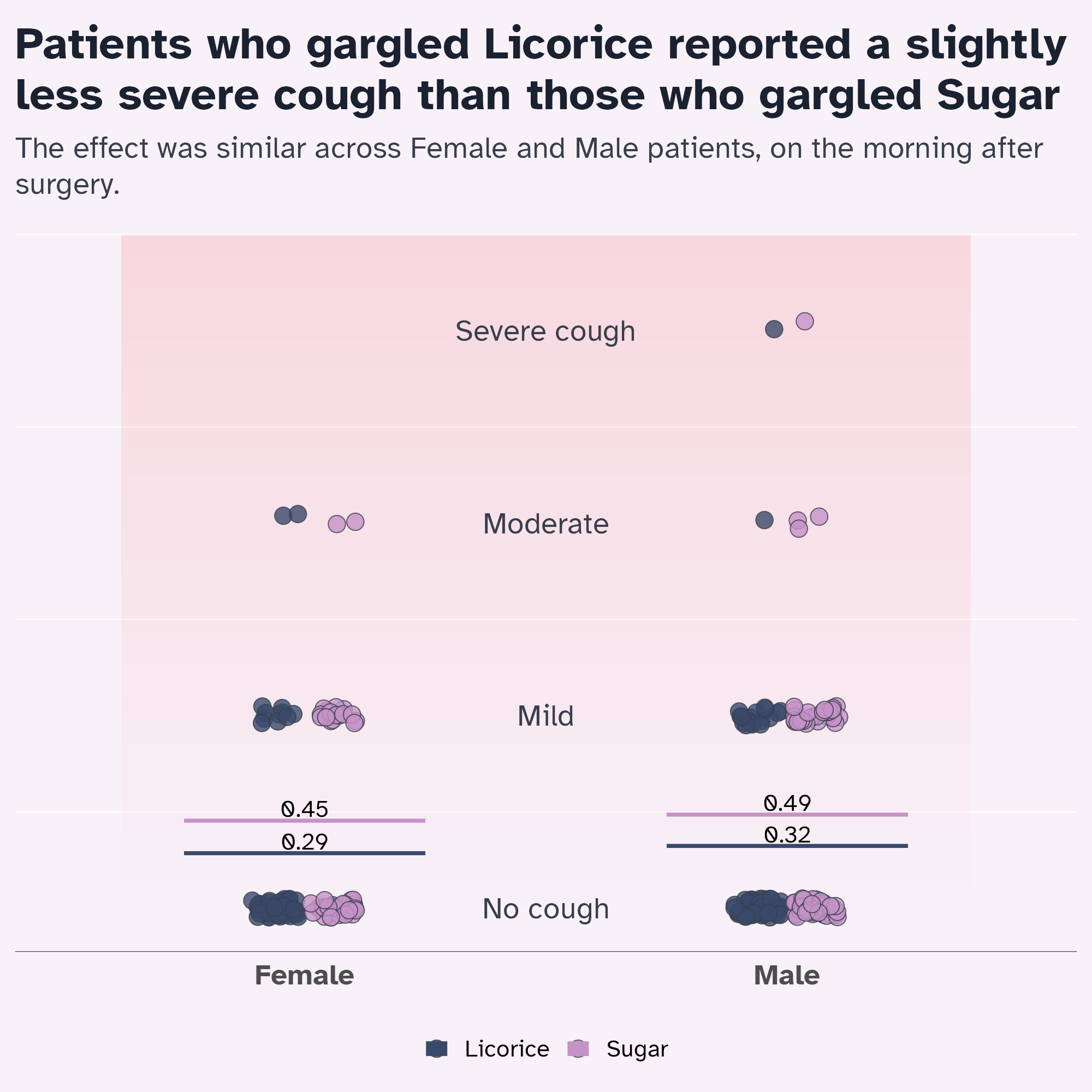
Optimise the text content
Descriptive vs. declarative title?
licorice_cough_plot <- ggplot(
  tidied_data,
  aes(x = gender, y = pod1am_cough, fill = treatment)
) +
  # Annotate doesn't support the gradient fill, so we need geom_rect
  geom_rect(
    # To get the structure of the data but only one layer of rectangle
    data = tidied_data |> dplyr::sample_n(1),
    aes(xmin = I(0.1), xmax = I(0.9), ymin = 0, ymax = 3.5),
    fill = bg_to_red,
    alpha = 0.1
  ) +
  geom_point(
    alpha = 0.8,
    position = position_jitterdodge(
      jitter.height = 0.05,
      jitter.width = 0.2,
      dodge.width = 0.25
    ),
    shape = 21,
    size = 5
  ) +
  stat_summary(
    aes(ymin = after_stat(y), ymax = after_stat(y), colour = treatment),
    fun = function(x) mean(x, na.rm = TRUE),
    geom = "crossbar",
    width = 0.5
  ) +
  stat_summary(
    aes(
      label = janitor::round_half_up(after_stat(y), 2),
      group = treatment
    ),
    fun = function(x) mean(x, na.rm = TRUE),
    geom = "text",
    position = position_nudge(y = 0.06),
    colour = "black",
    size = 16,
    size.unit = "pt"
  ) +
  geom_text(
    data = tibble::tibble(
      y_coord = c(0, 1, 2, 3),
      severity = c("No cough", "Mild", "Moderate", "Severe cough")
    ),
    aes(
      x = I(0.5),
      y = y_coord,
      label = severity,
      fill = NULL
    )
  ) +
  scale_fill_manual(values = licorice_gargle_colours) +
  scale_colour_manual(values = licorice_gargle_colours) +
  labs(title = "Severity of cough on the morning after operation") +
  theme_minimal(base_size = 20) +
  theme(
    geom = element_geom(
      ink = licorice_gargle_colours["Light text"],
      borderwidth = 0.5, #
      linewidth = 0.2
    ),
    plot.background = element_rect(
      fill = licorice_gargle_colours["Background"],
      colour = licorice_gargle_colours["Background"]
    ),
    panel.grid = element_line(colour = "white"),
    legend.position = "bottom",
    axis.title.y = element_blank(),
    axis.text.y = element_blank(),
    axis.title.x = element_blank(),
    legend.title = element_blank(),
    panel.grid.major.x = element_blank(),
    panel.grid.major.y = element_blank(),
    axis.line.x = element_line(
      colour = licorice_gargle_colours["Light text"],
      linewidth = 0.2
    ),
    axis.text.x = element_text(size = rel(1.2), face = "bold")
  )

licorice_cough_plot
Optimise the text content
Declarative title
Optimise the font
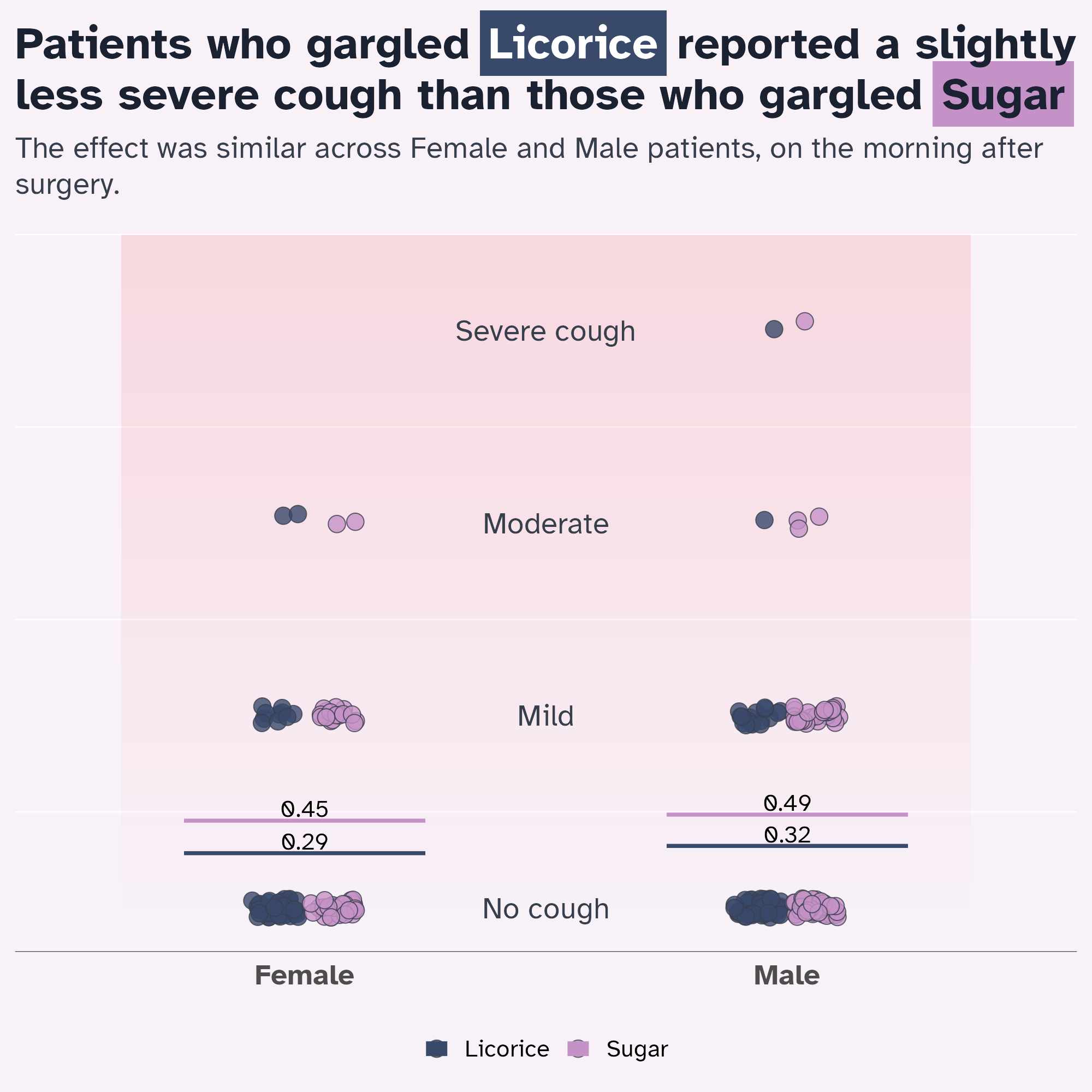
Personality without compromising on Accessibility
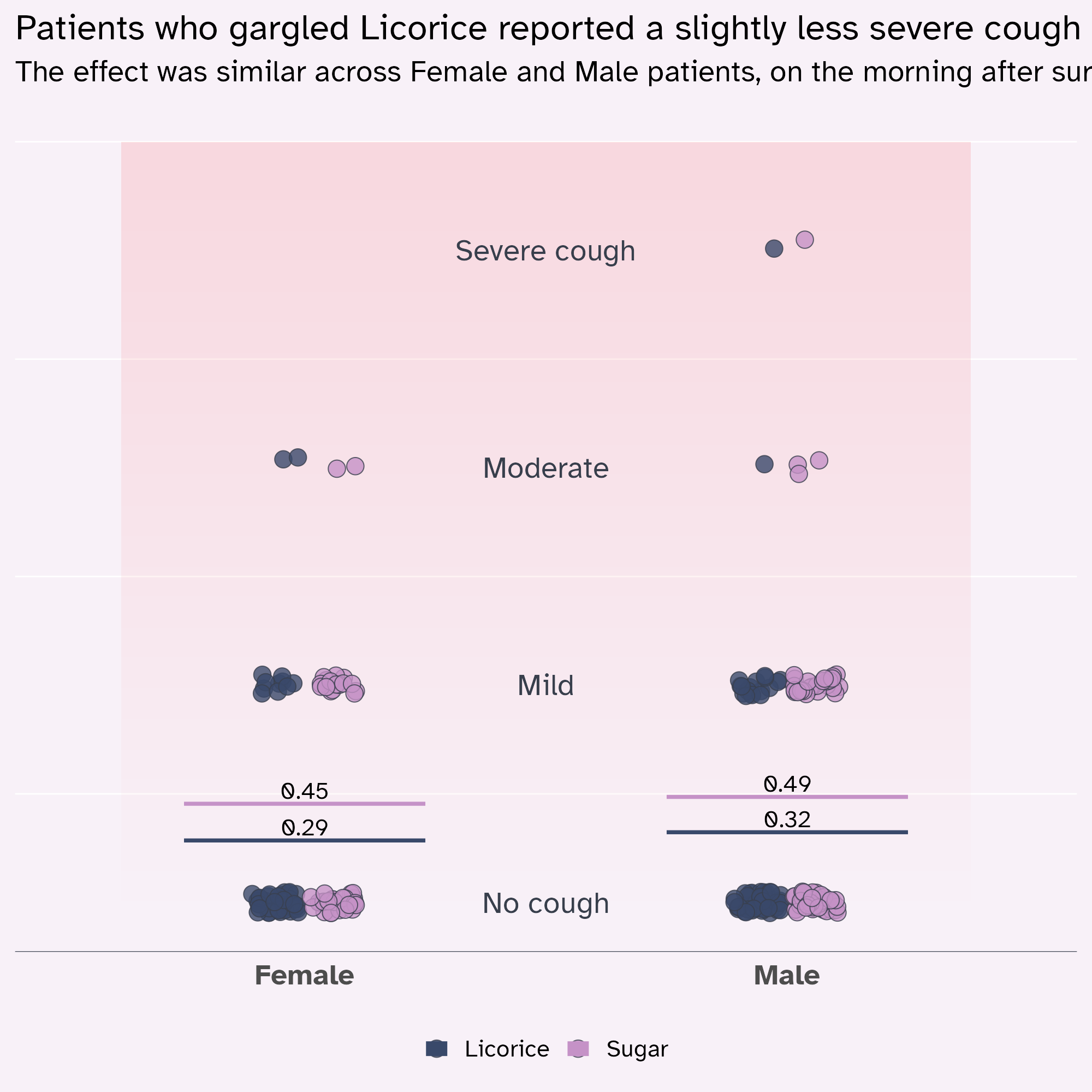
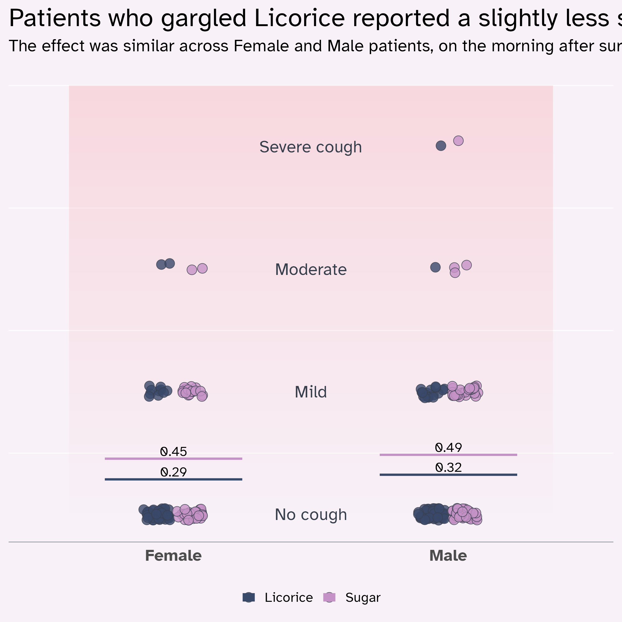
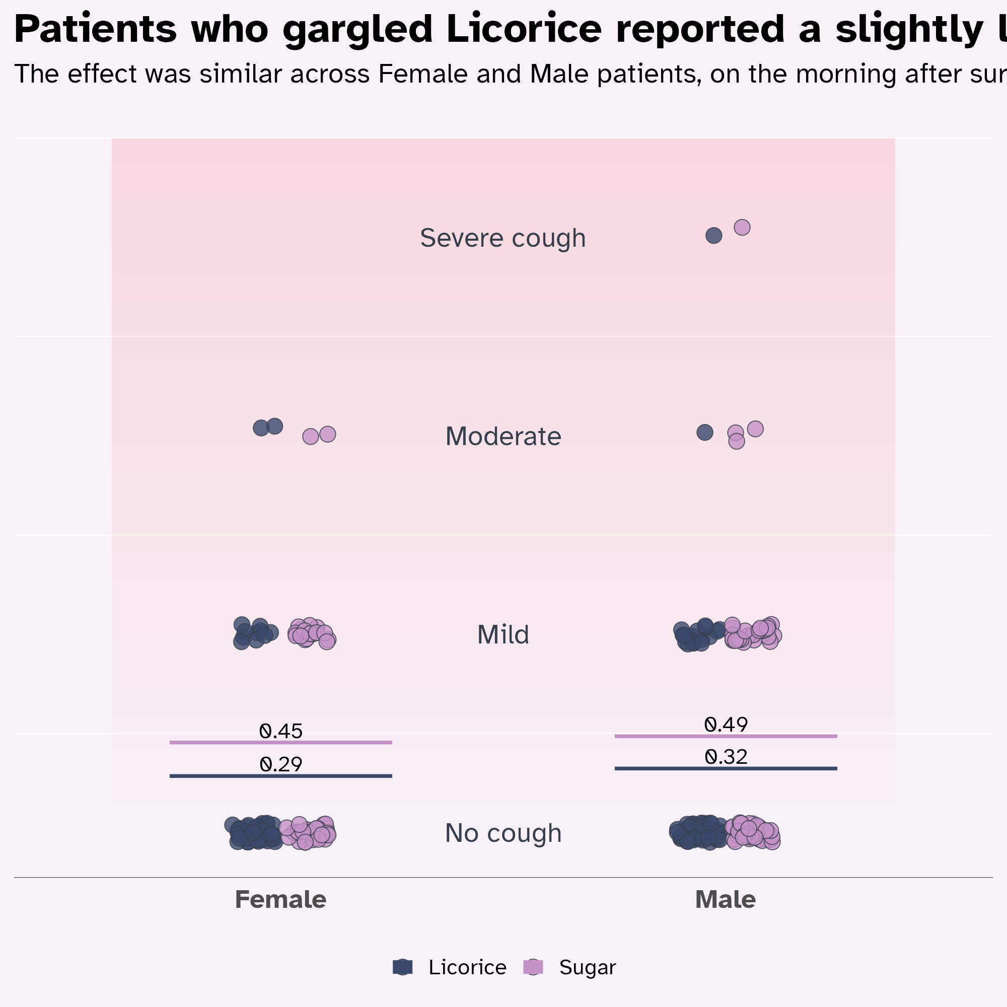
licorice_cough_plot +
  labs(
    title = "Patients who gargled Licorice reported a slightly less severe cough than those who gargled Sugar",
    subtitle = "The effect was similar across Female and Male patients, on the morning after surgery."
) +
theme(
text = element_text(family = "Atkinson Hyperlegible")
)
Optimise the font
theme(geom = element_geom()) has a family argument! 💙
licorice_cough_plot +
  labs(
    title = "Patients who gargled Licorice reported a slightly less severe cough than those who gargled Sugar",
    subtitle = "The effect was similar across Female and Male patients, on the morning after surgery."
  ) +
  theme(
    text = element_text(family = "Atkinson Hyperlegible"),
    geom = element_geom(family = "Atkinson Hyperlegible")
  )
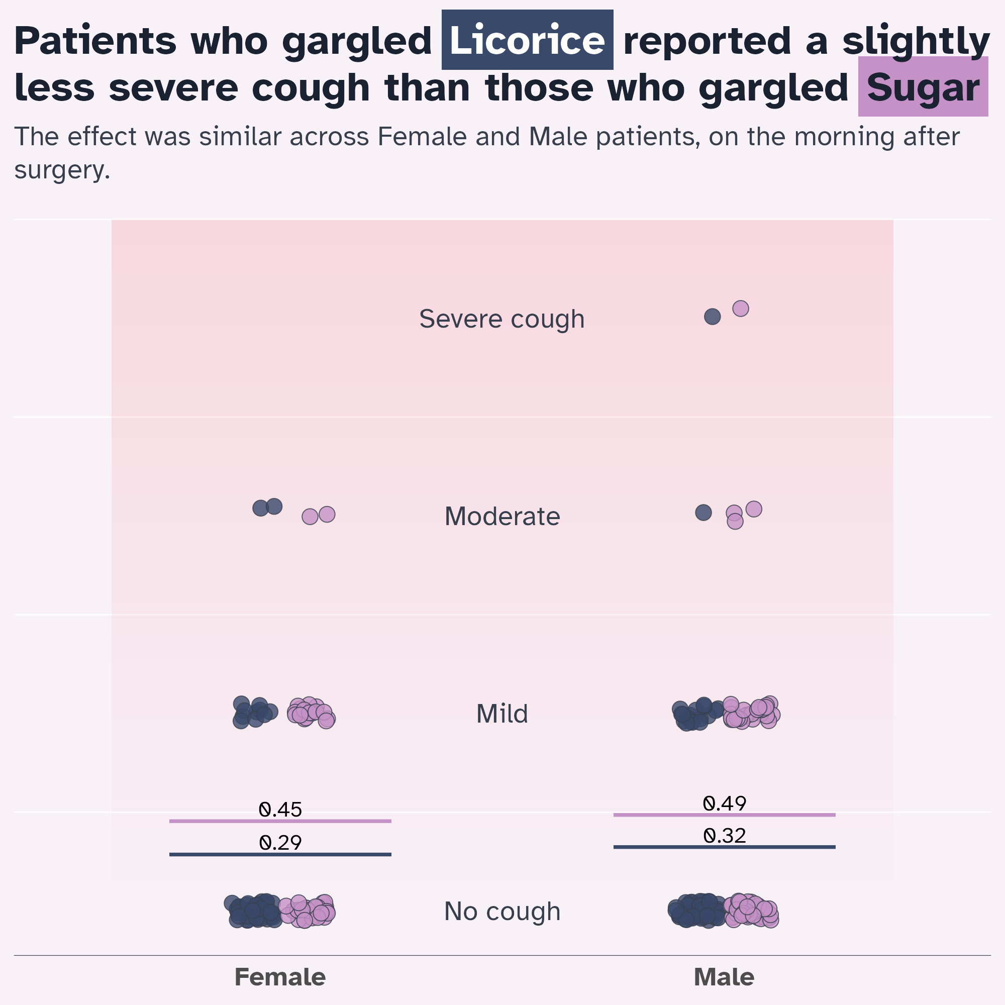
Optimise the text hierarchy
Optimise the text hierarchy
Starting point
licorice_cough_plot +
  labs(
    title = "Patients who gargled Licorice reported a slightly less severe cough than those who gargled Sugar",
    subtitle = "The effect was similar across Female and Male patients, on the morning after surgery."
  ) +
  theme(
    text = element_text(family = "Atkinson Hyperlegible"),
    geom = element_geom(family = "Atkinson Hyperlegible")
  )
Optimise the text hierarchy
rel() is your friend!
licorice_cough_plot +
  labs(
    title = "Patients who gargled Licorice reported a slightly less severe cough than those who gargled Sugar",
    subtitle = "The effect was similar across Female and Male patients, on the morning after surgery."
  ) +
  theme(
    text = element_text(family = "Atkinson Hyperlegible"),
    geom = element_geom(family = "Atkinson Hyperlegible"),
    plot.title = element_text(size = rel(1.5))
  )
Optimise the text hierarchy
rel() is your friend!
licorice_cough_plot +
  labs(
    title = "Patients who gargled Licorice reported a slightly less severe cough than those who gargled Sugar",
    subtitle = "The effect was similar across Female and Male patients, on the morning after surgery."
  ) +
  theme(
    text = element_text(family = "Atkinson Hyperlegible"),
    geom = element_geom(family = "Atkinson Hyperlegible"),
    plot.title = element_text(size = rel(1.5), face = "bold")
  )
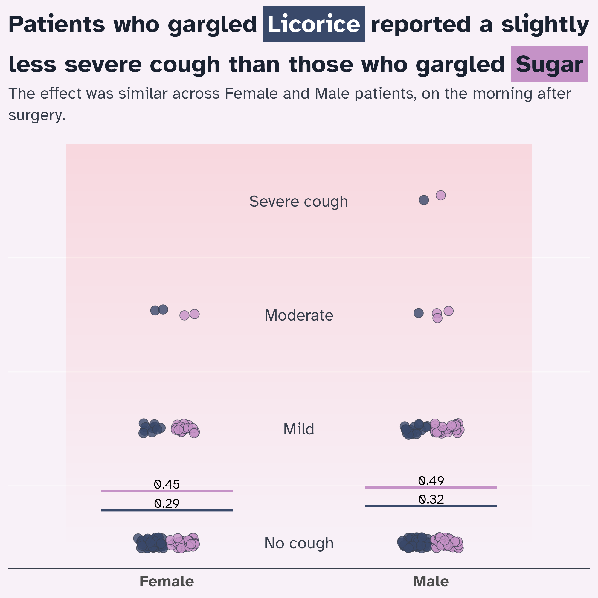
Optimise the text hierarchy
marquee::element_marquee or ggtext::element_textbox_simple wrap text for you
licorice_cough_plot +
  labs(
    title = "Patients who gargled Licorice reported a slightly less severe cough than those who gargled Sugar",
    subtitle = "The effect was similar across Female and Male patients, on the morning after surgery."
  ) +
  theme(
    text = element_text(family = "Atkinson Hyperlegible"),
    geom = element_geom(family = "Atkinson Hyperlegible"),
    plot.title = marquee::element_marquee(
      size = rel(1.5),
      width = 1,
      style = marquee::classic_style(weight = "bold")
    ),
    plot.subtitle = ggtext::element_textbox_simple()
  )
Optimise the text hierarchy
Optimise with colours
licorice_cough_plot +
  labs(
    title = "Patients who gargled Licorice reported a slightly less severe cough than those who gargled Sugar",
    subtitle = "The effect was similar across Female and Male patients, on the morning after surgery."
  ) +
  theme(
    text = element_text(family = "Atkinson Hyperlegible"),
    geom = element_geom(family = "Atkinson Hyperlegible"),
    plot.title = marquee::element_marquee(
      size = rel(1.5),
      colour = licorice_gargle_colours["Dark text"],
      width = 1,
      style = marquee::classic_style(weight = "bold")
    ),
    plot.subtitle = ggtext::element_textbox_simple(
      colour = licorice_gargle_colours["Light text"]
    )
  )
Optimise the signposting
Doing the legend a bit differently…
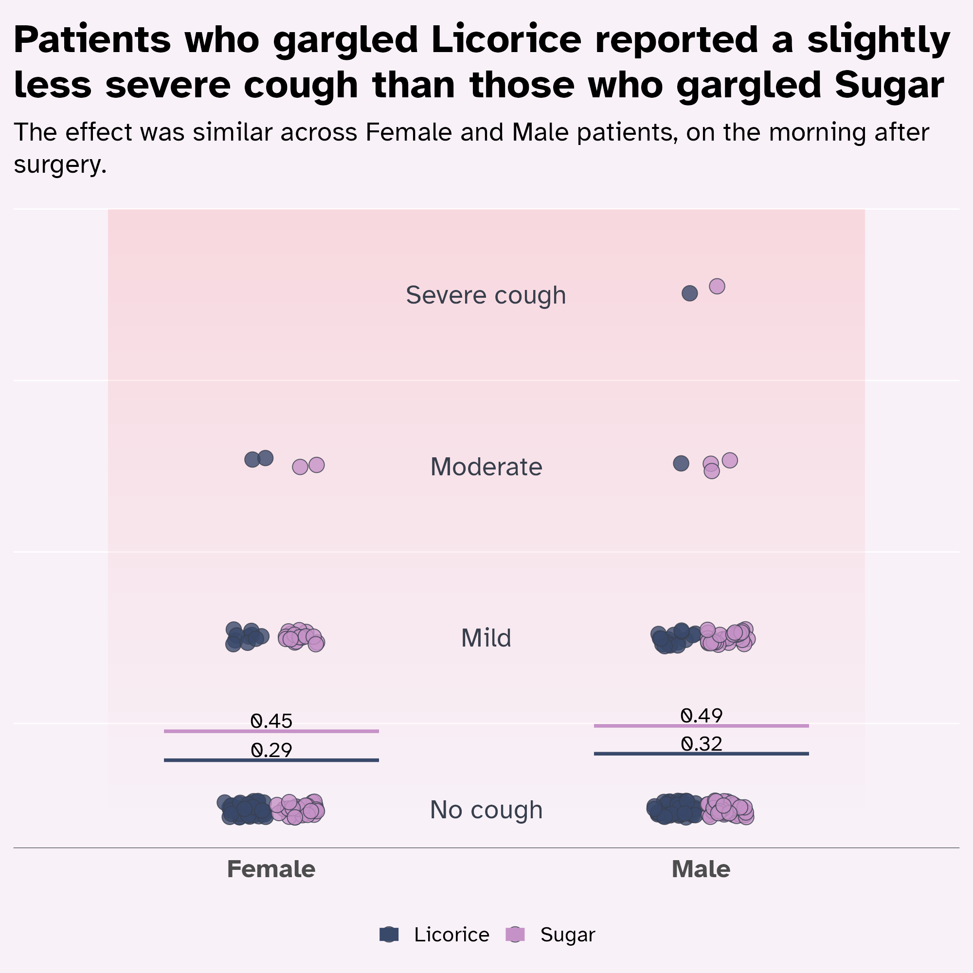
licorice_cough_plot +
labs(
title = "Patients who gargled {.licorice Licorice} reported a slightly less severe cough than those who gargled {.sugar Sugar}",
subtitle = "The effect was similar across Female and Male patients, on the morning after surgery."
) +
theme(
text = element_text(family = "Atkinson Hyperlegible"),
geom = element_geom(family = "Atkinson Hyperlegible"),
plot.title = marquee::element_marquee(
size = rel(1.5),
colour = licorice_gargle_colours["Dark text"],
width = 1,
style = highlight_style
),
plot.subtitle = ggtext::element_textbox_simple(
colour = licorice_gargle_colours["Light text"]
)
)
Optimise the signposting
Doing the legend a bit differently…
licorice_cough_plot +
labs(
title = "Patients who gargled {.licorice Licorice} reported a slightly less severe cough than those who gargled {.sugar Sugar}",
subtitle = "The effect was similar across Female and Male patients, on the morning after surgery."
) +
theme(
text = element_text(family = "Atkinson Hyperlegible"),
geom = element_geom(family = "Atkinson Hyperlegible"),
plot.title = marquee::element_marquee(
size = rel(1.5),
colour = licorice_gargle_colours["Dark text"],
width = 1,
style = highlight_style
),
plot.subtitle = ggtext::element_textbox_simple(
colour = licorice_gargle_colours["Light text"]
),
legend.position = "none"
)
Give everything some space to breathe
Lineheight 👀
licorice_cough_plot +
labs(
title = "Patients who gargled {.licorice Licorice} reported a slightly less severe cough than those who gargled {.sugar Sugar}",
subtitle = "The effect was similar across Female and Male patients, on the morning after surgery."
) +
theme(
text = element_text(family = "Atkinson Hyperlegible"),
geom = element_geom(family = "Atkinson Hyperlegible"),
plot.title = marquee::element_marquee(
size = rel(1.5),
colour = licorice_gargle_colours["Dark text"],
width = 1,
style = highlight_style,
lineheight = 1.3
),
plot.subtitle = ggtext::element_textbox_simple(
colour = licorice_gargle_colours["Light text"],
lineheight = 1.3
),
legend.position = "none"
)
Give everything space to breathe
“Eyeball” it!
licorice_cough_plot +
labs(
title = "Patients who gargled {.licorice Licorice} reported a slightly less severe cough than those who gargled {.sugar Sugar}",
subtitle = "The effect was similar across Female and Male patients, on the morning after surgery."
) +
theme(
text = element_text(family = "Atkinson Hyperlegible"),
geom = element_geom(family = "Atkinson Hyperlegible"),
plot.title = marquee::element_marquee(
size = rel(1.5),
colour = licorice_gargle_colours["Dark text"],
width = 1,
style = highlight_style,
lineheight = 1.05
),
plot.subtitle = ggtext::element_textbox_simple(
colour = licorice_gargle_colours["Light text"],
lineheight = 1.3
),
legend.position = "none"
)
Give everything space to breathe
Margins!
licorice_cough_plot +
labs(
title = "Patients who gargled {.licorice Licorice} reported a slightly less severe cough than those who gargled {.sugar Sugar}",
subtitle = "The effect was similar across Female and Male patients, on the morning after surgery."
) +
theme(
text = element_text(family = "Atkinson Hyperlegible"),
geom = element_geom(family = "Atkinson Hyperlegible"),
plot.title = marquee::element_marquee(
size = rel(1.5),
colour = licorice_gargle_colours["Dark text"],
width = 1,
style = highlight_style,
lineheight = 1.05
),
plot.subtitle = ggtext::element_textbox_simple(
colour = licorice_gargle_colours["Light text"],
lineheight = 1.3,
margin = margin(15, 0, 20, 0)
),
legend.position = "none",
plot.margin = margin_auto(30)
)
Give everything space to breathe
Margins!
licorice_cough_plot +
labs(
title = "Patients who gargled {.licorice Licorice} reported a slightly less severe cough than those who gargled {.sugar Sugar}",
subtitle = "The effect was similar across Female and Male patients, on the morning after surgery."
) +
theme(
text = element_text(family = "Atkinson Hyperlegible"),
geom = element_geom(family = "Atkinson Hyperlegible"),
plot.title = marquee::element_marquee(
size = rel(1.5),
colour = licorice_gargle_colours["Dark text"],
width = 1,
vjust = 0,
margin = margin(30, 0, 0, 0),
style = highlight_style,
lineheight = 1.05
),
plot.subtitle = ggtext::element_textbox_simple(
colour = licorice_gargle_colours["Light text"],
lineheight = 1.3,
margin = margin(15, 0, 20, 0)
),
legend.position = "none",
plot.margin = margin_auto(30)
)
Making the theme reusable
We’ve done a lot of theme modification!
highlight_style <- marquee::classic_style(weight = "bold") |>
  marquee::modify_style(
    "sugar",
    background = licorice_gargle_colours["Sugar"],
    # US spelling of colour/color required!
    color = licorice_gargle_colours["Dark text"],
    padding = marquee::trbl(marquee::em(0.1))
  ) |>
  marquee::modify_style(
    "licorice",
    background = licorice_gargle_colours["Licorice"],
    color = "white",
    padding = marquee::trbl(marquee::em(0.1))
  )
ggplot(
tidied_data,
aes(x = gender, y = pod1am_cough, fill = treatment)
) +
geom_rect(
data = tidied_data |> tail(1),
aes(xmin = I(0.1), xmax = I(0.9), ymin = 0, ymax = 3.5),
fill = bg_to_red,
alpha = 0.1
) +
geom_point(
alpha = 0.8,
position = position_jitterdodge(
jitter.height = 0.05,
jitter.width = 0.2,
dodge.width = 0.25
),
shape = 21,
size = 5
) +
stat_summary(
aes(ymin = after_stat(y), ymax = after_stat(y), colour = treatment),
fun = function(x) mean(x, na.rm = TRUE),
geom = "crossbar",
width = 0.5
) +
stat_summary(
aes(
label = janitor::round_half_up(after_stat(y), 2),
group = treatment
),
fun = function(x) mean(x, na.rm = TRUE),
geom = "text",
position = position_nudge(y = 0.06),
colour = "black",
size = 16,
size.unit = "pt"
) +
geom_text(
data = tibble::tibble(
y_coord = c(0, 1, 2, 3),
severity = c("No cough", "Mild", "Moderate", "Severe cough")
),
aes(
x = I(0.5),
y = y_coord,
label = severity,
fill = NULL
)
) +
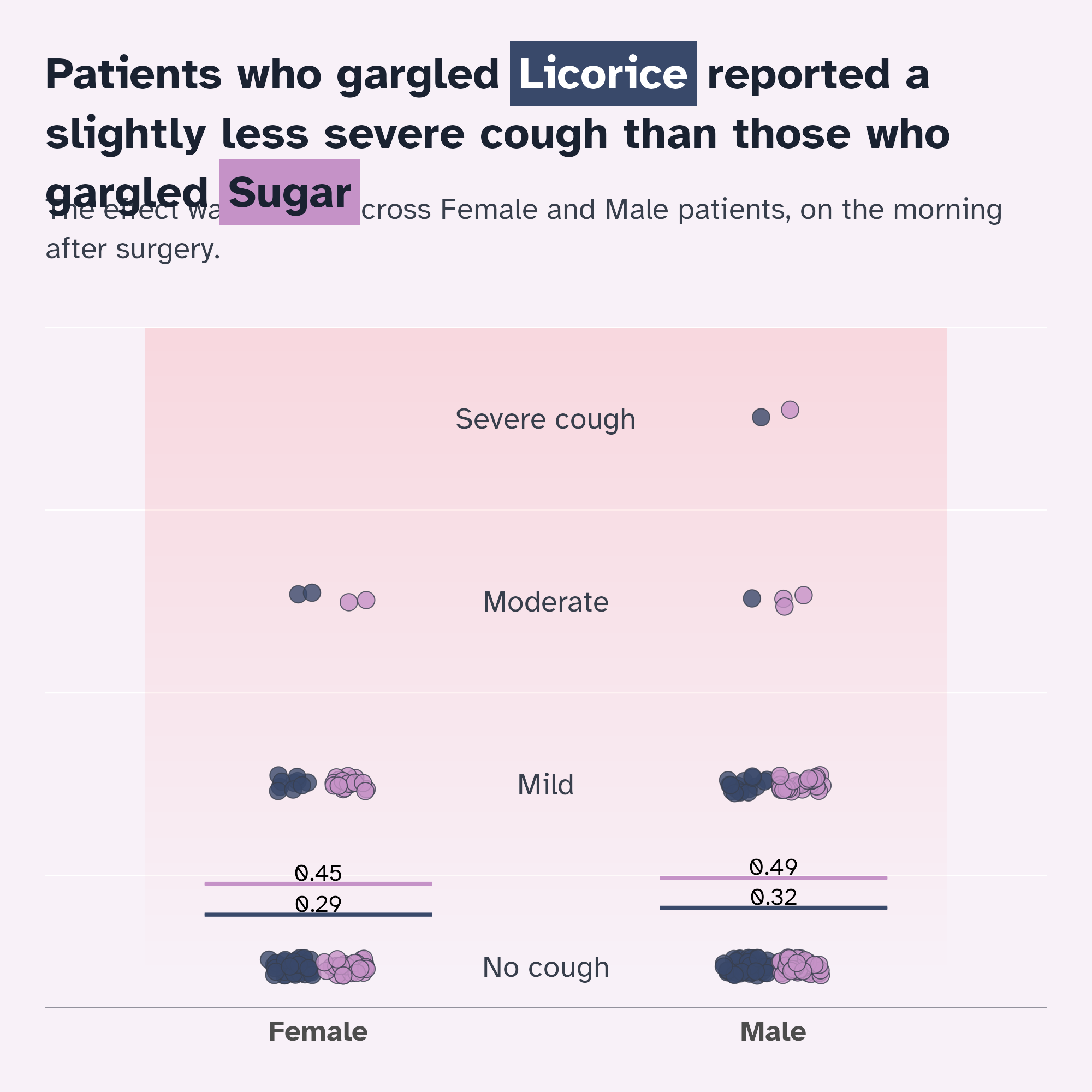
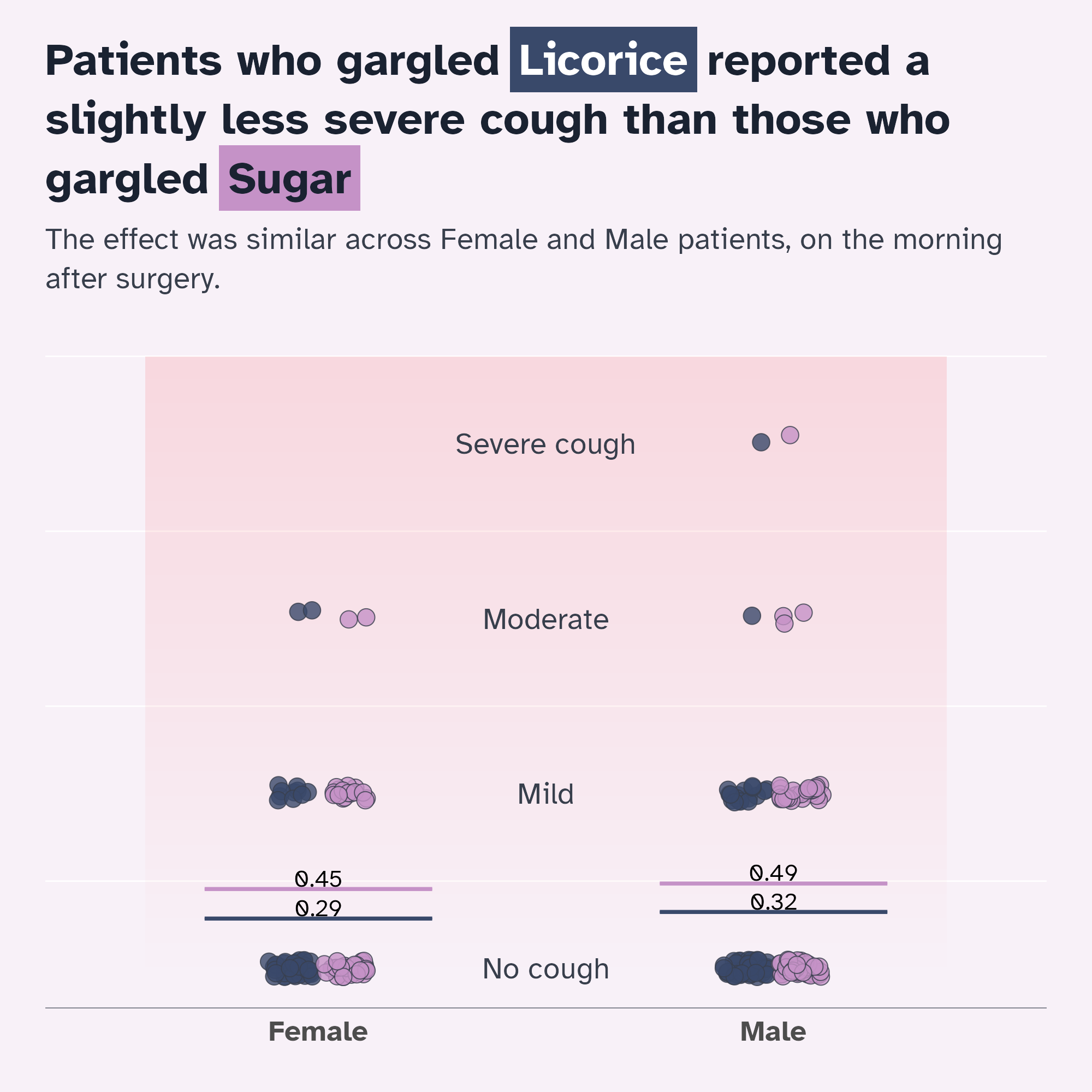
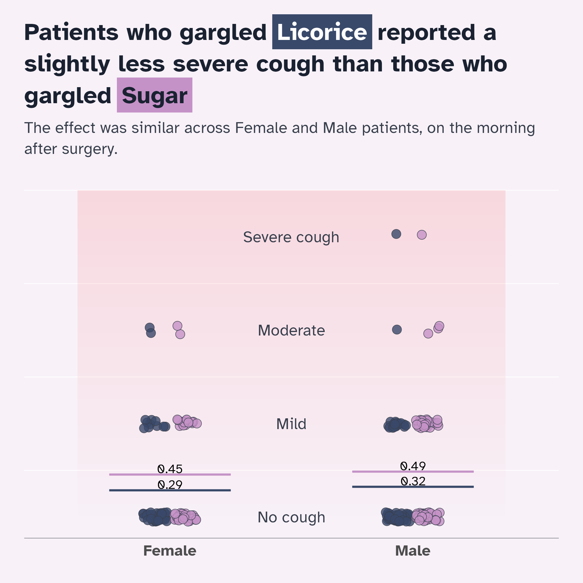
labs(
title = "Patients who gargled {.licorice Licorice} reported a slightly less severe cough than those who gargled {.sugar Sugar}",
subtitle = "The effect was similar across Female and Male patients, on the morning after surgery."
) +
scale_fill_manual(values = licorice_gargle_colours) +
scale_colour_manual(values = licorice_gargle_colours) +
theme_minimal(base_size = 20) +
theme(
text = element_text(family = "Atkinson Hyperlegible"),
geom = element_geom(
ink = licorice_gargle_colours["Light text"],
borderwidth = 0.5,
linewidth = 0.2,
family = "Atkinson Hyperlegible"
),
plot.background = element_rect(
fill = licorice_gargle_colours["Background"],
colour = licorice_gargle_colours["Background"]
),
panel.grid = element_line(colour = "white"),
axis.title.y = element_blank(),
axis.text.y = element_blank(),
axis.title.x = element_blank(),
legend.title = element_blank(),
panel.grid.major.x = element_blank(),
panel.grid.major.y = element_blank(),
axis.line.x = element_line(
colour = licorice_gargle_colours["Light text"],
linewidth = 0.2
),
axis.text.x = element_text(size = rel(1.2), face = "bold"),
plot.title = marquee::element_marquee(
size = rel(1.5),
colour = licorice_gargle_colours["Dark text"],
width = 1,
vjust = 0,
margin = margin(30, 0, 0, 0),
style = highlight_style,
lineheight = 1.05
),
plot.subtitle = ggtext::element_textbox_simple(
colour = licorice_gargle_colours["Light text"],
lineheight = 1.3,
margin = margin(15, 0, 20, 0)
),
legend.position = "none",
plot.margin = margin_auto(30)
)
Making the theme reusable
Give it a go!
Making the theme reusable
Give it a go!
Making the theme reusable
Give it a go!
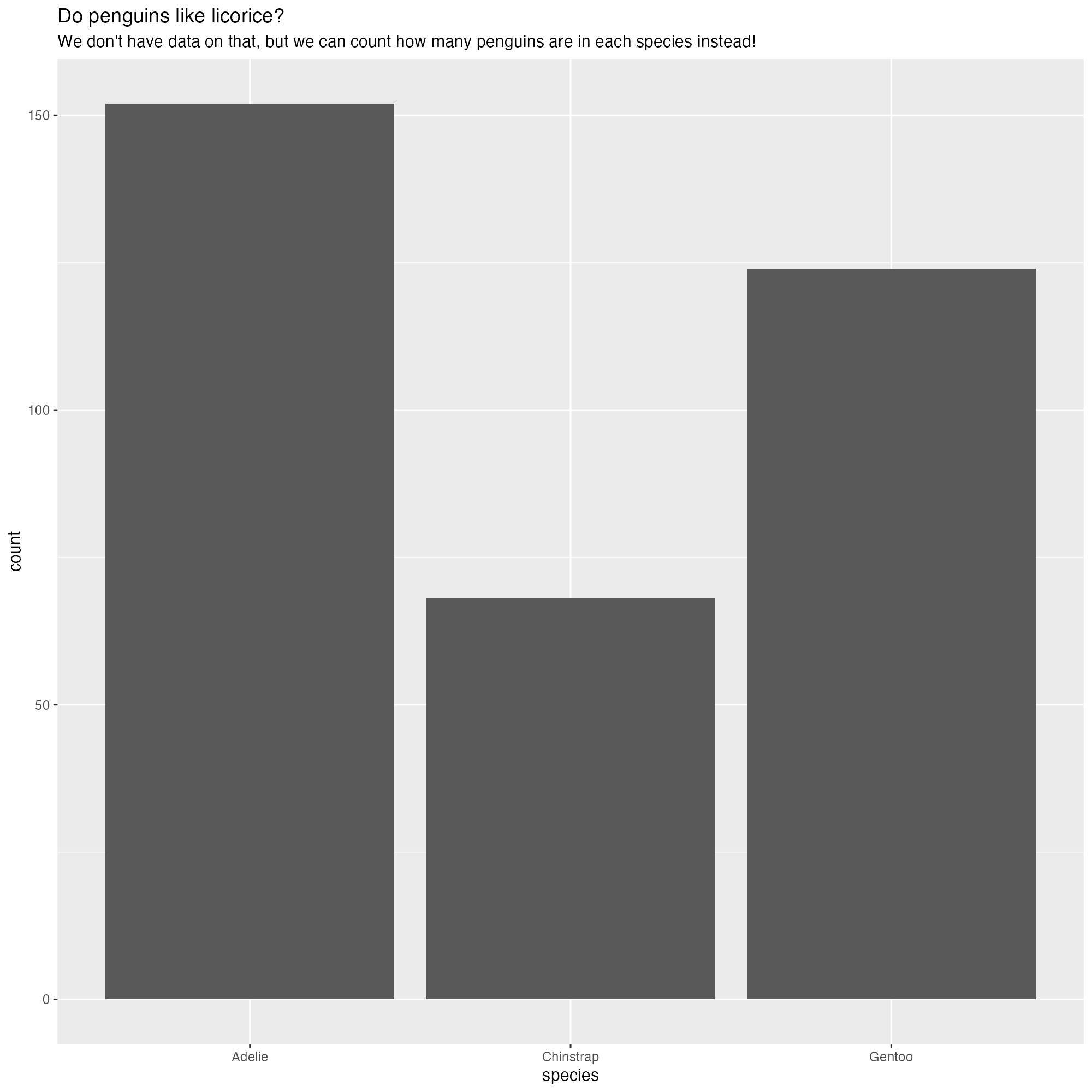
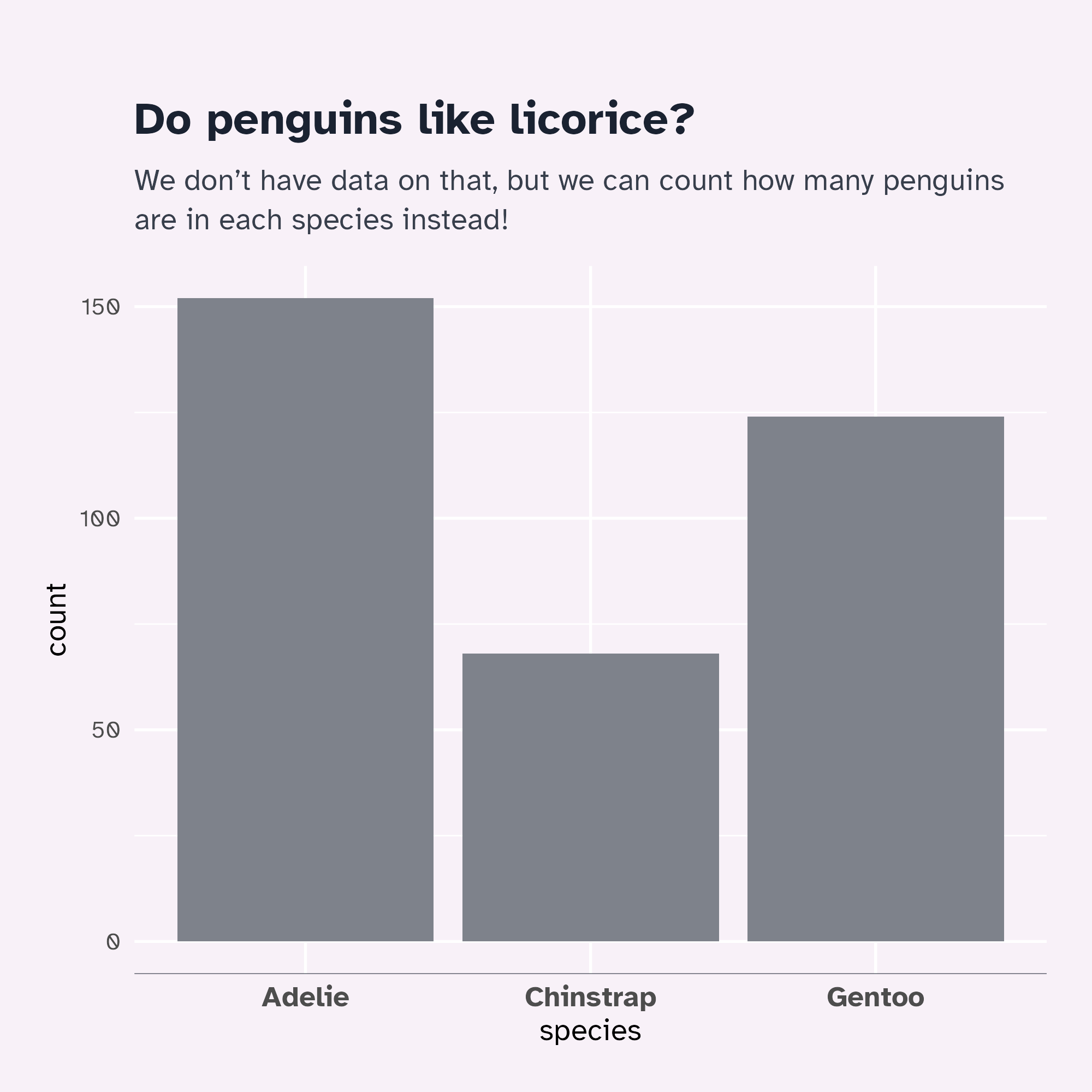
penguins |>
  ggplot() +
  geom_bar(aes(x = species), stat = "count") +
  labs(
    title = "Do penguins like licorice?",
    subtitle = "We don't have data on that, but we can count how many penguins are in each species instead!"
) +
theme_licorice() +
theme(
axis.title.y = element_blank(),
axis.title.x = element_blank(),
panel.grid.major.x = element_blank()
)
Make it interactive
Let’s modify our graph…
ggplot(
  tidied_data,
  aes(x = gender, y = pod1am_cough, fill = treatment)
) +
  geom_rect(
    data = tidied_data |> tail(1),
    aes(xmin = I(0.1), xmax = I(0.9), ymin = 0, ymax = 3.5),
    fill = bg_to_red,
    alpha = 0.1
  ) +
  geom_point(
    alpha = 0.8,
    position = position_jitterdodge(
      jitter.height = 0.05,
      jitter.width = 0.2,
      dodge.width = 0.25
    ),
    shape = 21,
    size = 5
  ) +
  stat_summary(
    aes(ymin = after_stat(y), ymax = after_stat(y), colour = treatment),
    fun = function(x) mean(x, na.rm = TRUE),
    geom = "crossbar",
    width = 0.5
  ) +
  stat_summary(
    aes(
      label = janitor::round_half_up(after_stat(y), 2),
      group = treatment
    ),
    fun = function(x) mean(x, na.rm = TRUE),
    geom = "text",
    position = position_nudge(y = 0.06),
    colour = "black",
    size = 16,
    size.unit = "pt"
  ) +
  geom_text(
    data = tibble::tibble(
      y_coord = c(0, 1, 2, 3),
      severity = c("No cough", "Mild", "Moderate", "Severe cough")
    ),
    aes(
      x = I(0.5),
      y = y_coord,
      label = severity,
      fill = NULL
    )
  ) +
  labs(
    title = "Patients who gargled {.licorice Licorice} reported a slightly less severe cough than those who gargled {.sugar Sugar}",
    subtitle = "The effect was similar across Female and Male patients, on the morning after surgery."
  ) +
  scale_fill_manual(values = licorice_gargle_colours) +
  scale_colour_manual(values = licorice_gargle_colours) +
  theme_licorice() +
  theme(
    axis.title.y = element_blank(),
    axis.text.y = element_blank(),
    axis.title.x = element_blank(),
    legend.title = element_blank(),
    panel.grid.major.x = element_blank(),
    panel.grid.major.y = element_blank()
  )
Another graph
The main idea
ggplot(timeline_data, aes(x = timeline, y = pain)) +
  geom_rect(
    data = mean_pain,
    aes(
      xmin = as.numeric(timeline) - 0.5,
      xmax = as.numeric(timeline) + 0.5,
      ymin = -Inf,
      ymax = Inf,
      fill = "red",
      alpha = mean_pain
    ),
    inherit.aes = FALSE
  ) +
  scale_alpha(range = c(0.05, 0.25)) +
  # Move lines to back for easier interaction
  ggiraph::geom_line_interactive(
    aes(group = name, colour = treatment, data_id = name, tooltip = name),
    alpha = 0.3
  ) +
  ggiraph::geom_jitter_interactive(
    aes(
      x = timeline,
      y = pain,
      colour = treatment,
      data_id = name,
      tooltip = name
    ),
    height = 0.1,
    width = 0.1,
    alpha = 0.6
  ) +
  scale_colour_manual(values = c("Sugar" = "#c592c7", "Licorice" = "#39496a")) +
  facet_grid(gender ~ treatment) +
  theme_minimal() +
  theme(legend.position = "none")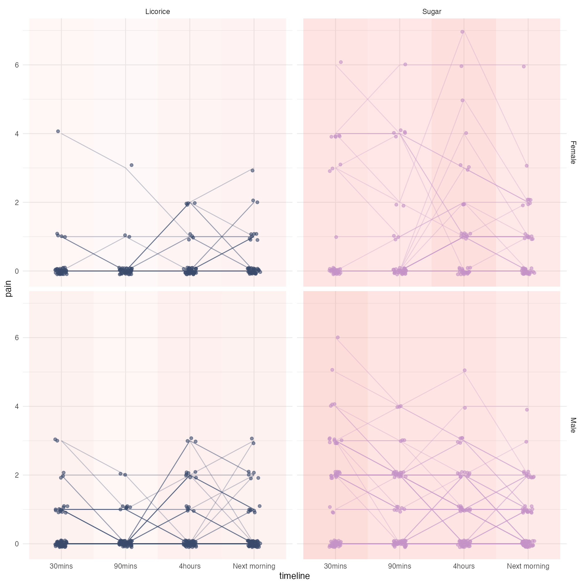
Another graph
Styled!
ggplot(timeline_data, aes(x = timeline, y = pain)) +
  geom_rect(
    data = mean_pain,
    aes(
      xmin = as.numeric(timeline) - 0.5,
      xmax = as.numeric(timeline) + 0.5,
      ymin = -Inf,
      ymax = Inf,
      fill = "red",
      alpha = mean_pain
    ),
    inherit.aes = FALSE
  ) +
  scale_alpha(range = c(0.05, 0.25)) +
  # Move lines to back for easier interaction
  ggiraph::geom_line_interactive(
    aes(group = name, colour = treatment, data_id = name, tooltip = name),
    alpha = 0.3
  ) +
  ggiraph::geom_jitter_interactive(
    aes(
      x = timeline,
      y = pain,
      colour = treatment,
      data_id = name,
      tooltip = name
    ),
    height = 0.1,
    width = 0.1,
    alpha = 0.6
  ) +
  scale_colour_manual(values = c("Sugar" = "#c592c7", "Licorice" = "#39496a")) +
  facet_grid(gender ~ treatment) +
  theme_licorice() +
  theme(legend.position = "none")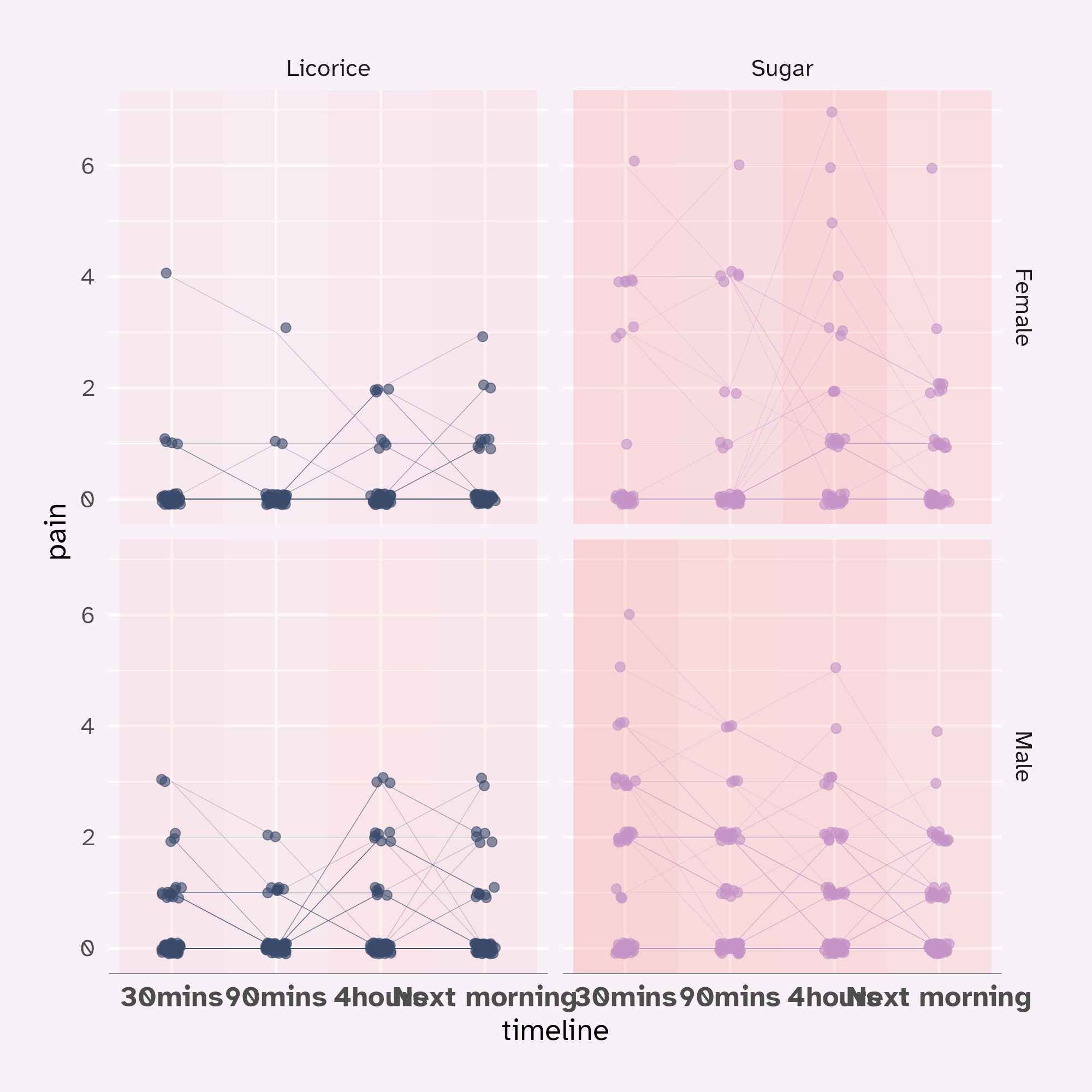
Another graph
Tweaked!
ggplot(timeline_data, aes(x = timeline, y = pain)) +
geom_rect(
data = mean_pain,
aes(
xmin = as.numeric(timeline) - 0.5,
xmax = as.numeric(timeline) + 0.5,
ymin = -Inf,
ymax = Inf,
fill = "red",
alpha = mean_pain
),
inherit.aes = FALSE
) +
scale_alpha(range = c(0.05, 0.25)) +
# Move lines to back for easier interaction
ggiraph::geom_line_interactive(
aes(
group = name,
colour = treatment,
data_id = name,
tooltip = paste0("<b>", name, "</b>, ", preOp_age, ", is ", praise)
),
alpha = 0.3
) +
ggiraph::geom_jitter_interactive(
aes(
x = timeline,
y = pain,
colour = treatment,
data_id = name,
tooltip = name
),
height = 0.1,
width = 0.1,
alpha = 0.6
) +
scale_colour_manual(values = c("Sugar" = "#c592c7", "Licorice" = "#39496a")) +
scale_x_discrete(labels = function(x) {
# Thank you, Claude!
stringr::str_wrap(gsub("([0-9])([a-zA-Z])", "\\1 \\2", x), 5)
}) +
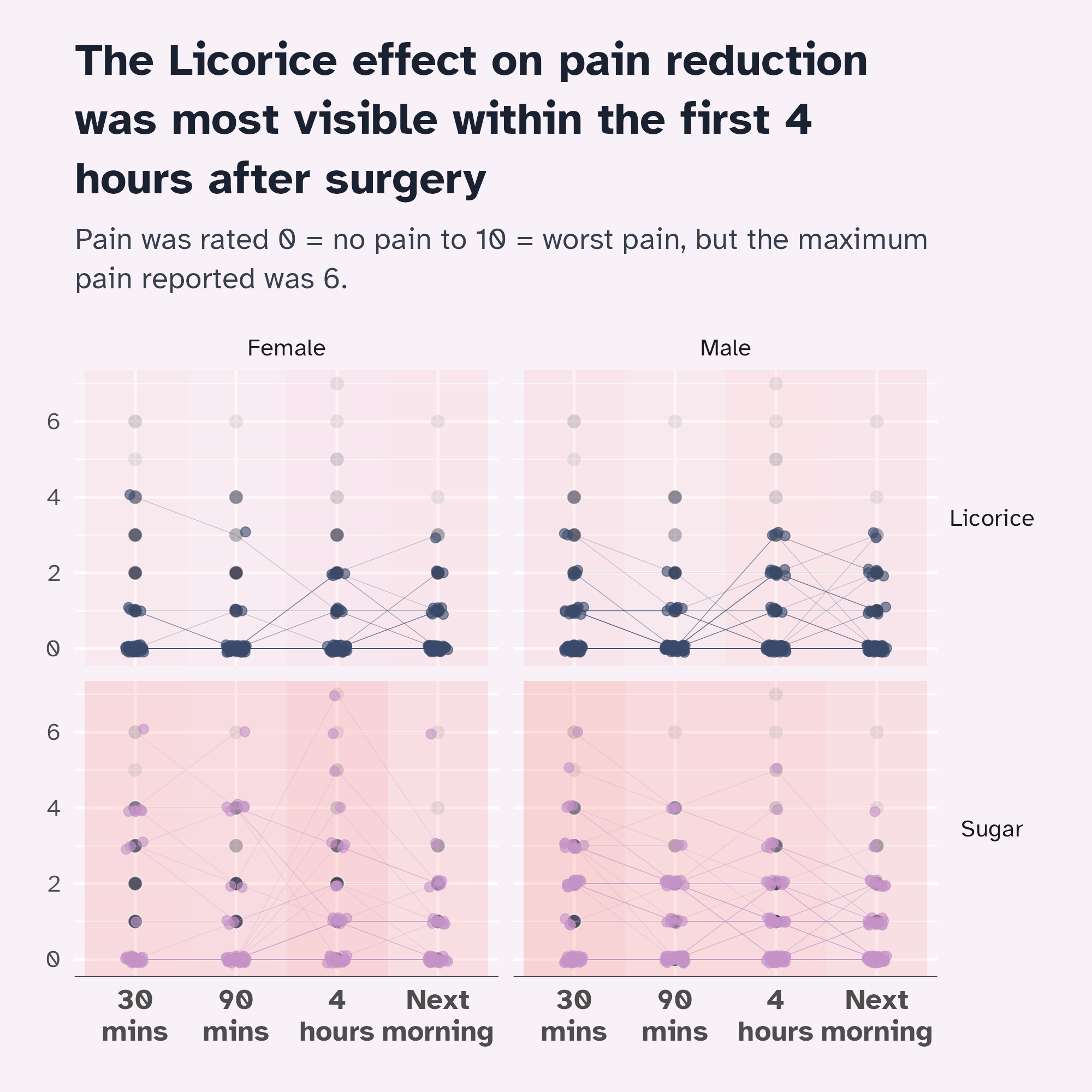
facet_grid(treatment ~ gender) +
labs(
title = "The Licorice effect on pain reduction was most visible within the first 4 hours after surgery",
subtitle = "Pain was rated 0 = no pain to 10 = worst pain, but the maximum pain reported was 6."
) +
theme_licorice() +
theme(
legend.position = "none",
axis.title.y = element_blank(),
axis.title.x = element_blank(),
strip.text.y = element_text(angle = 0)
)
Facets with highlights
Add the default geom in every facet
ggplot(timeline_data, aes(x = timeline, y = pain)) +
  geom_rect(
    data = mean_pain,
    aes(
      xmin = as.numeric(timeline) - 0.5,
      xmax = as.numeric(timeline) + 0.5,
      ymin = -Inf,
      ymax = Inf,
      fill = "red",
      alpha = mean_pain
    ),
    inherit.aes = FALSE
  ) +
  scale_alpha(range = c(0.05, 0.25)) +
  # Slight fudge!
  geom_point(
    layout = "fixed",
    alpha = 0.1
  ) +
  # Move lines to back for easier interaction
  ggiraph::geom_line_interactive(
    aes(
      group = name,
      colour = treatment,
      data_id = name,
      tooltip = paste0("<b>", name, "</b>, ", preOp_age, ", is ", praise)
    ),
    alpha = 0.3
  ) +
  ggiraph::geom_jitter_interactive(
    aes(
      x = timeline,
      y = pain,
      colour = treatment,
      data_id = name,
      tooltip = name
    ),
    height = 0.1,
    width = 0.1,
    alpha = 0.6
  ) +
  scale_colour_manual(values = c("Sugar" = "#c592c7", "Licorice" = "#39496a")) +
  scale_x_discrete(labels = function(x) {
    # Thank you, Claude!
    stringr::str_wrap(gsub("([0-9])([a-zA-Z])", "\\1 \\2", x), 5)
  }) +
  facet_grid(treatment ~ gender) +
  labs(
    title = "The Licorice effect on pain reduction was most visible within the first 4 hours after surgery",
    subtitle = "Pain was rated 0 = no pain to 10 = worst pain, but the maximum pain reported was 6."
  ) +
  theme_licorice() +
  theme(
    legend.position = "none",
    axis.title.y = element_blank(),
    axis.title.x = element_blank(),
    strip.text.y = element_text(angle = 0)
  )