More Than
Pretty Graphs
Tips, Tricks, and Resources to
Elevate Your Dataviz
DataLab | 18th November 2024
Hello 👋
👩 Cara Thompson
👩💻 Love for patterns in music & language, and a fascination with the human brain |>
Psychology PhD |>
Analysis of postgraduate medical examinations |>
Data Visualisation Consultant
💙 Helping others maximise the impact of their expertise
How did I end up here?
👩 Cara Thompson
👩💻 Love for patterns in music & language, and a fascination with the human brain |>
🥐 🥣 | 🎸 🎹 🎶 | 🎨 👩🎨
Psychology PhD |>
🧠 | 🎹 💬 💥 ✨
Analysis of postgraduate medical examinations |>
👩⚕️ 😨 👨⚕️ | 📈 💡
Data Visualisation Consultant
💙 Helping others maximise the impact of their expertise
How did I end up here?
👩 Cara Thompson
👩💻 Love for patterns in music & language, and a fascination with the human brain |>
Psychology PhD |>
Analysis of postgraduate medical examinations |>
if (year %in% c(2019, 2021)) {
family <- family + 👶
} |>
Data Visualisation Consultant
💙 Helping others maximise the impact of their expertise
How did I end up here?
How did I end up here?
How did I end up here?
The main aim for today
- Create a basic plot
- See how we can make it better
- Colour
- Text
- “The stuff no one looks at”
- Annotations
- Interactivity
The main aim for today
- Data from Scottish Environment Protection Agency
- https://www2.sepa.org.uk/rainfall/
- Using R +
{ggplot2}+ a few others - Focus on principles applicable across tools

Why dataviz?
Here’s my story…
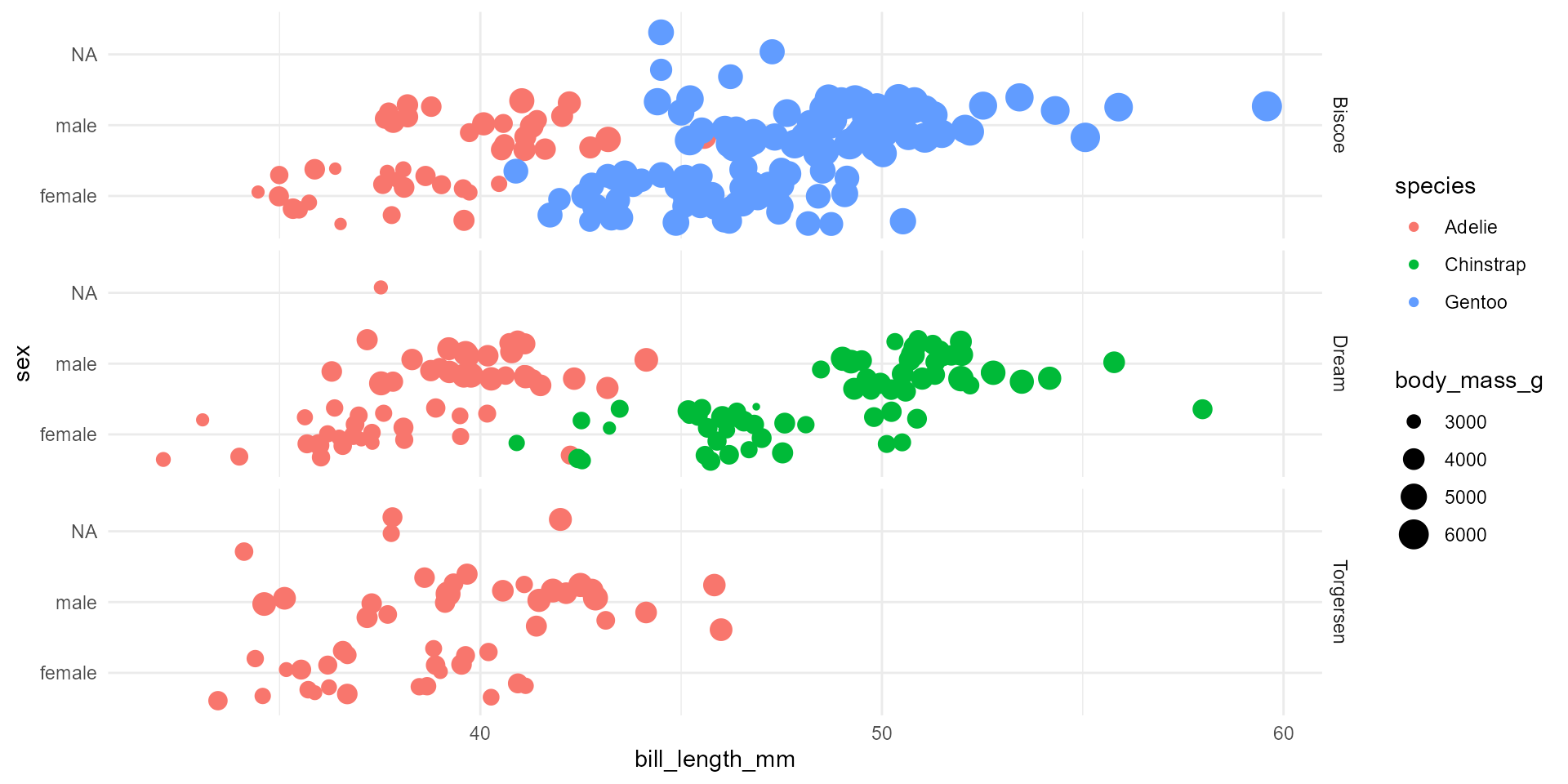
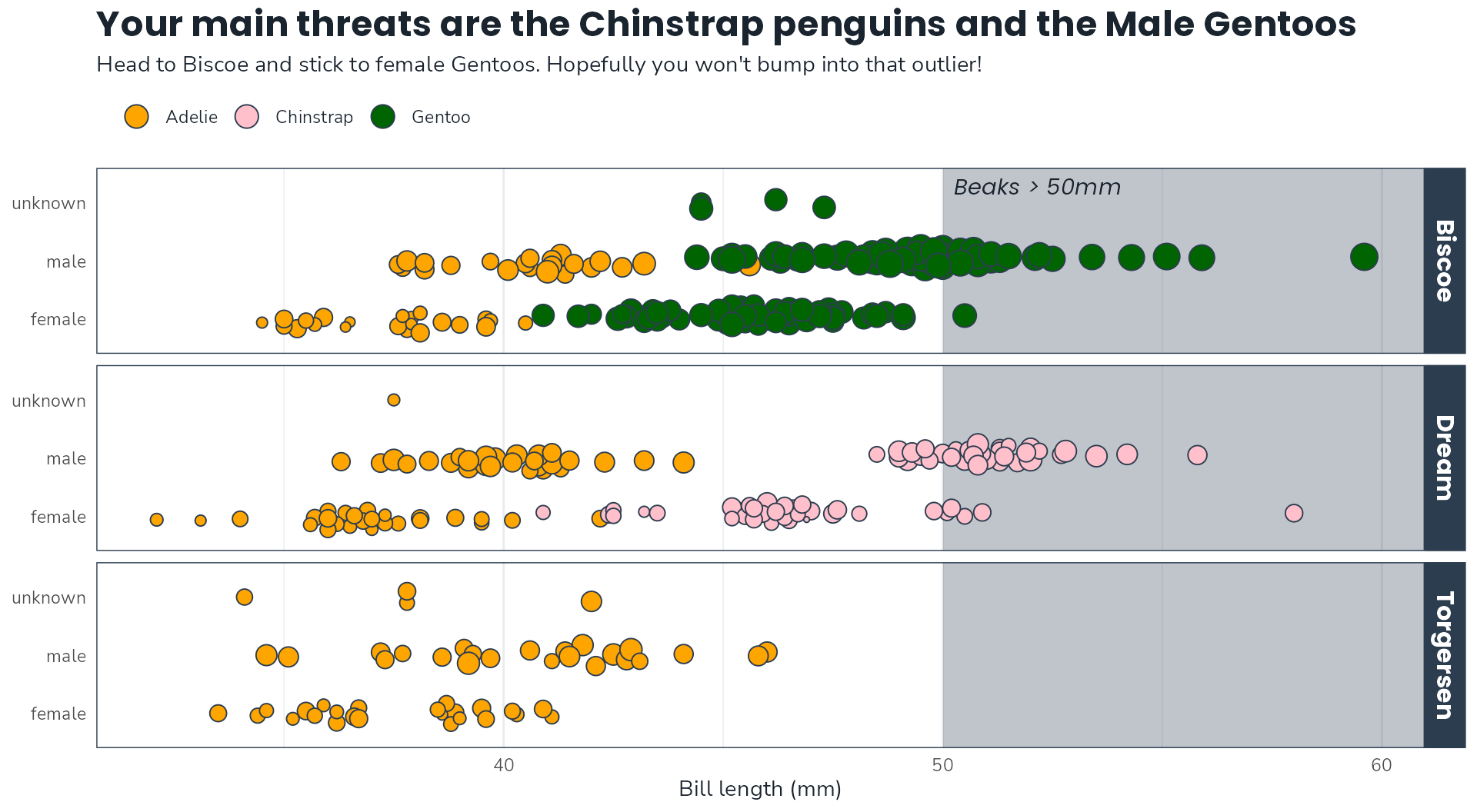
I’m planning an expedition to the islands where the Palmer Penguins live. I need to see at least 2 penguin species on my trip, but I can only go to one island.
I’m terrified of penguins with long beaks.
Help me plan my trip. You can only show me one slide.
Why dataviz?
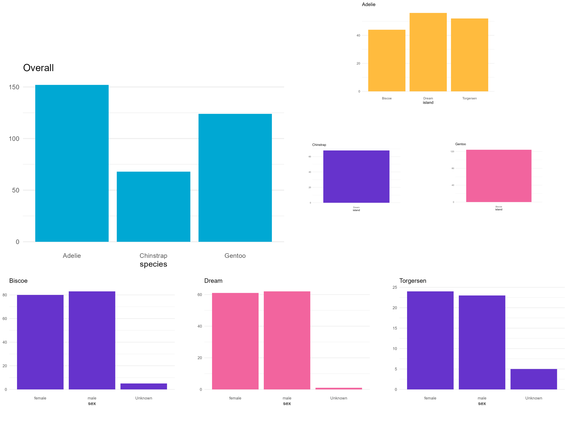
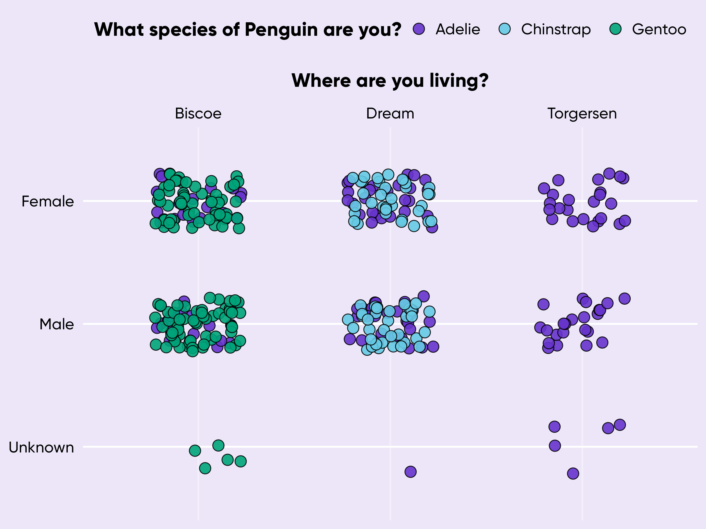
“We have collected data about 344 penguins who live on Biscoe, Dream and Torgersen. On Biscoe, we have 44 Adelie penguins (F = 22, M = 22) and 124 Gentoos (F = 58, M = 61, Unknown = 5). On Dream, we have 56 Adelie penguins (F = 27, M = 28, Unknown = 1) and 68 Chinstrap penguins (M = F = 34). On Torgersen, we only have Adelies (F = 24, M = 23, Unknown = 5).
The average beak lengths of the species are as follows:
- Adelie: F: 37.55 mm, M: 40.59mm
- Chinstrap: F: 46.57mm, M: 51.09mm
- Gentoo: F: 45.59mm, M: 49.47mm
Have a nice trip!”
Why dataviz?
“Does this help?”
Why dataviz?
“Ok, let me reorganise it a bit”
Why dataviz?
“Look, the data really speaks for itself… Here you go!”
Why dataviz better?
“Whoa that escalated quickly!”
Let’s get some data!
Let’s get some data
    X Timestamp month year Value      city
1   1  Jun 2014   Jun 2014  67.4 Edinburgh
2   2  Jul 2014   Jul 2014  35.2 Edinburgh
3   3  Aug 2014   Aug 2014  90.0 Edinburgh
4   4  Sep 2014   Sep 2014  20.6 Edinburgh
5   5  Oct 2014   Oct 2014  92.4 Edinburgh
6   6  Nov 2014   Nov 2014   9.8 Edinburgh
7   7  Dec 2014   Dec 2014  51.4 Edinburgh
8   8  Jan 2015   Jan 2015  50.2 Edinburgh
9   9  Feb 2015   Feb 2015  27.2 Edinburgh
10 10  Mar 2015   Mar 2015  51.2 Edinburgh
X Timestamp month year Value city
229 229 Jul 2023 Jul 2023 120.0 Glasgow
230 230 Aug 2023 Aug 2023 58.6 Glasgow
231 231 Sep 2023 Sep 2023 113.8 Glasgow
232 232 Oct 2023 Oct 2023 101.8 Glasgow
233 233 Nov 2023 Nov 2023 77.0 Glasgow
234 234 Dec 2023 Dec 2023 151.4 Glasgow
235 235 Jan 2024 Jan 2024 111.0 Glasgow
236 236 Feb 2024 Feb 2024 73.6 Glasgow
237 237 Mar 2024 Mar 2024 78.0 Glasgow
238 238 Apr 2024 Apr 2024 94.6 GlasgowNow for a basic plot…
Now for a basic plot
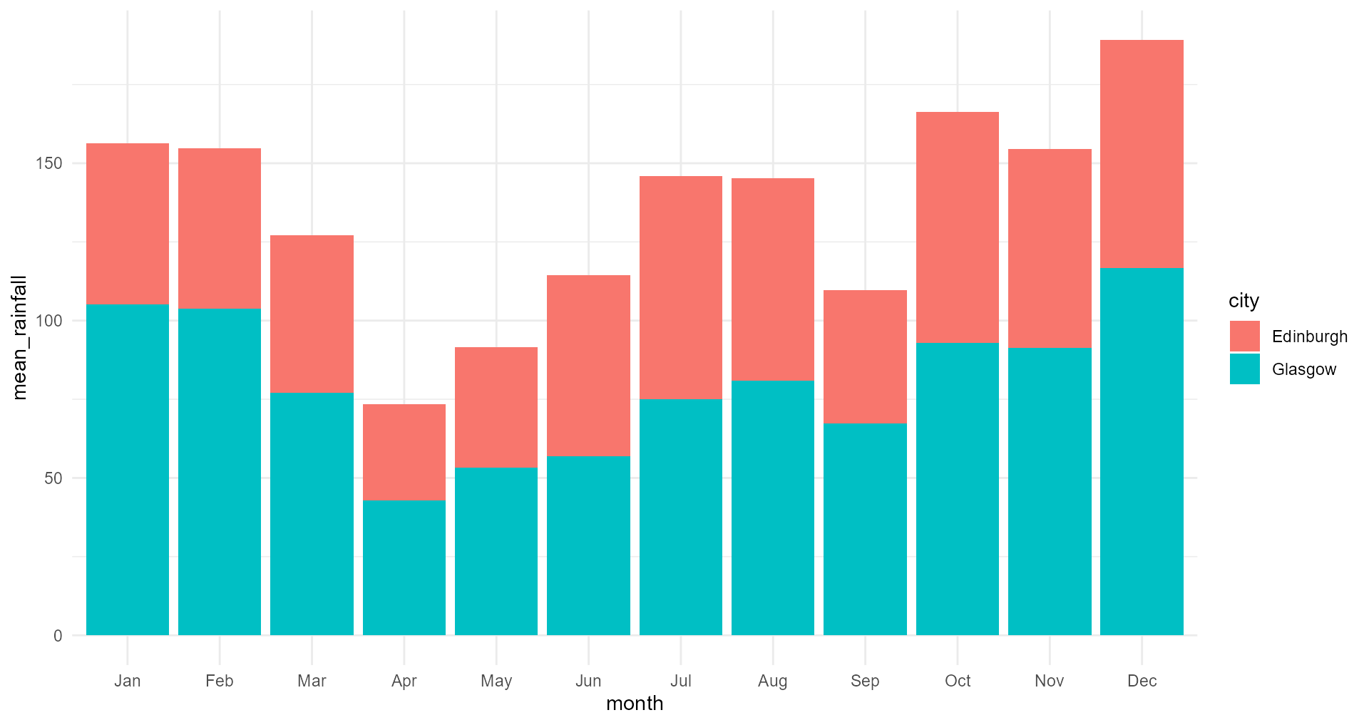
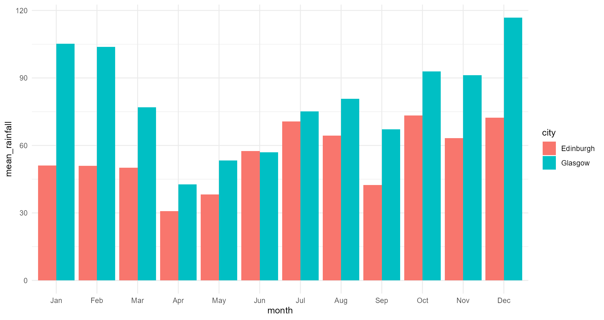
“Give me a graph of mean monthly rainfall in Glasgow and Edinburgh”
Now for a basic plot
Should the bars be stacked?
Now for a basic plot
Should the bars be stacked?
Now for a basic plot
Wait a minute, should these be bars in the first place?
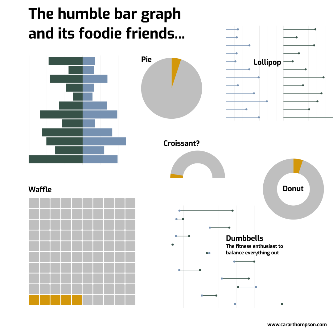
The bar graph and its foodie friends
- Pie
- Donut
- Waffle
- Croissant (gauge)
- Lollipop
- …
Now for a basic plot
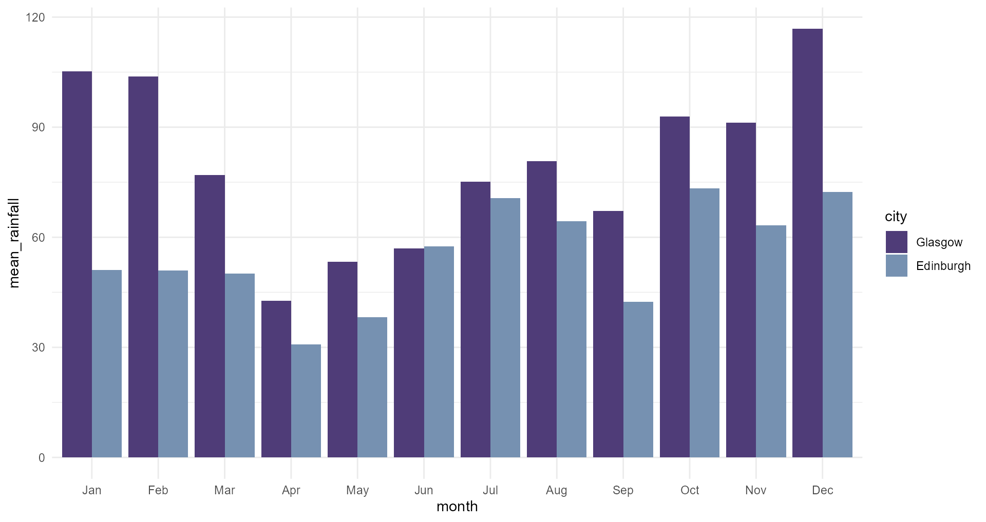
“It always rains more in Glasgow, you’re right!”
Now for a basic plot
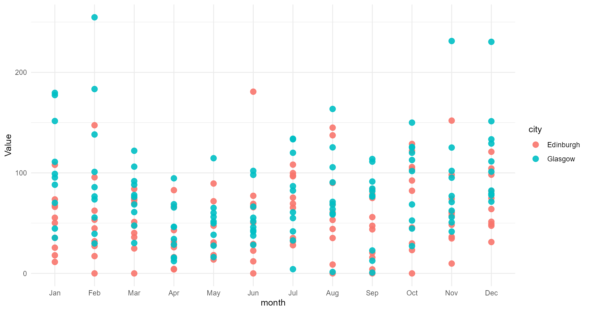
“Gosh, Edinburgh has really ‘hit and miss’ summers!”
Choosing the right type of graphs
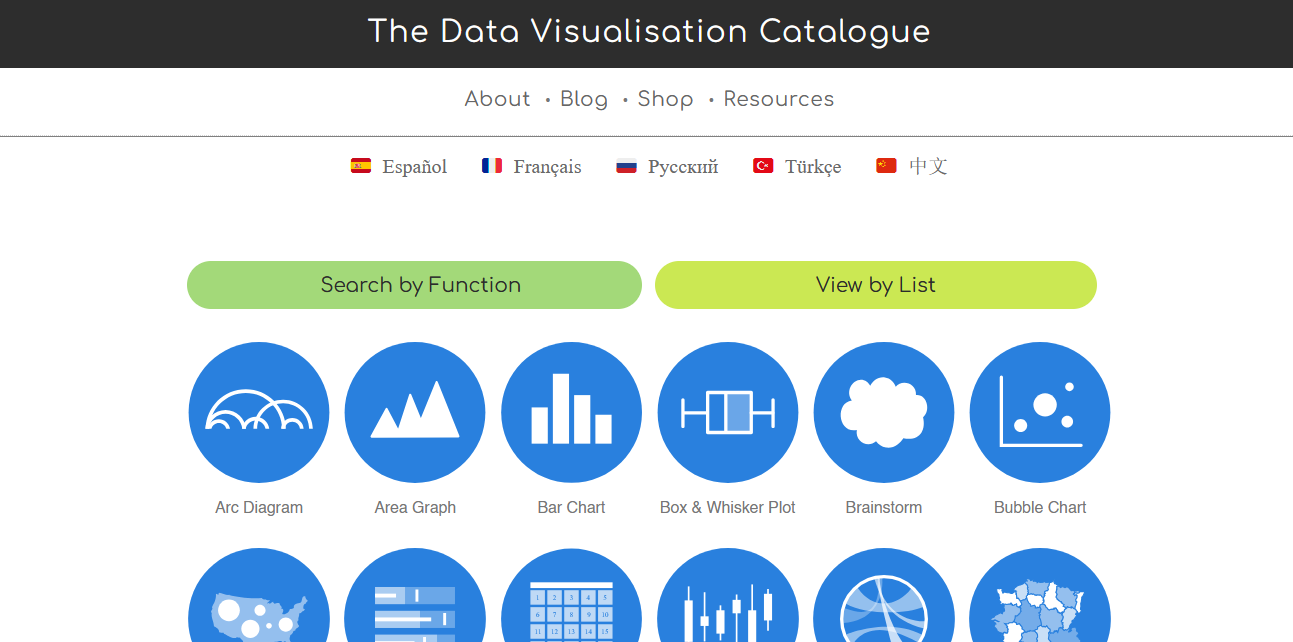
https://datavizcatalogue.com/
The importance of rooooar data
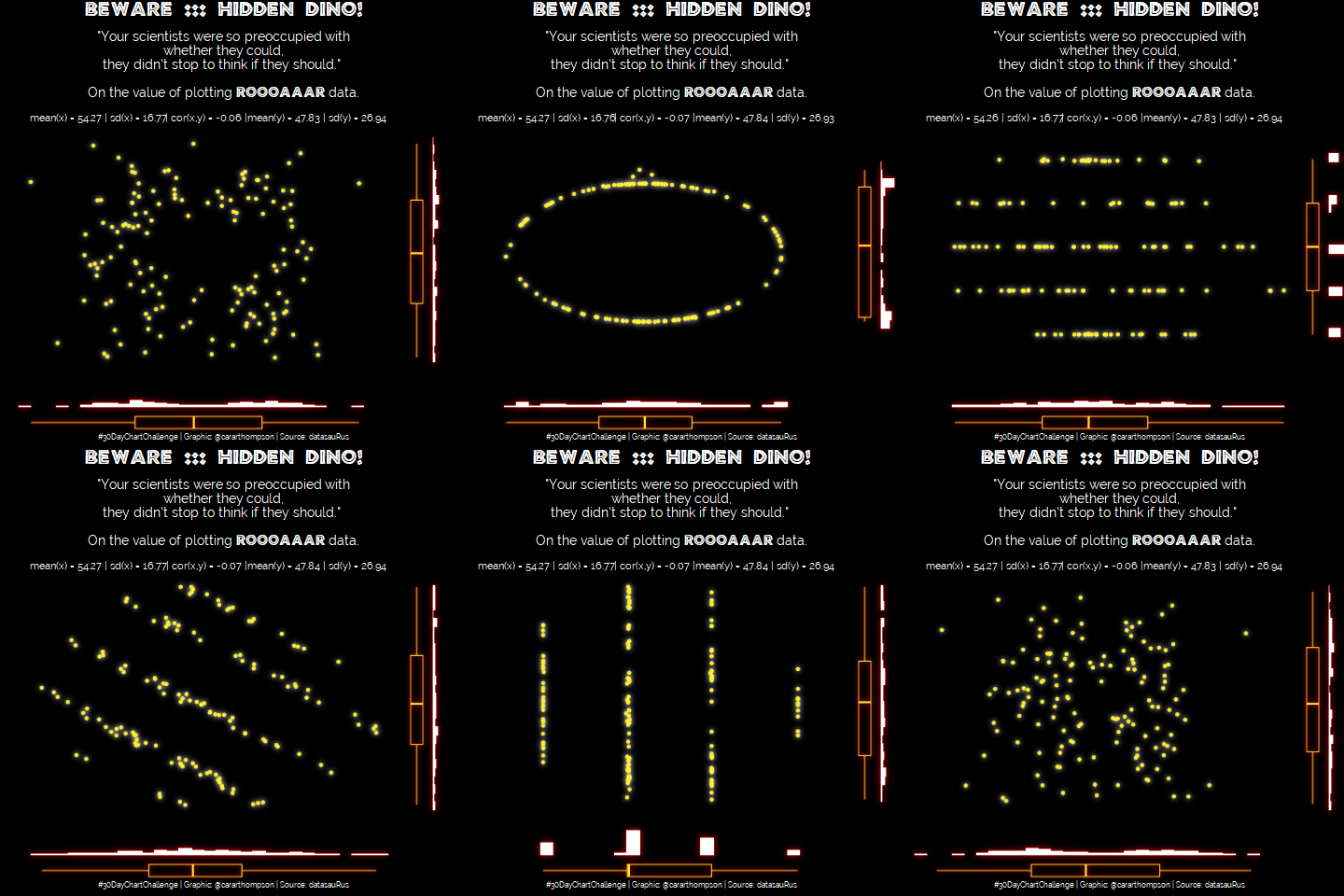
The simplicity of raw data
The simplicity of raw data
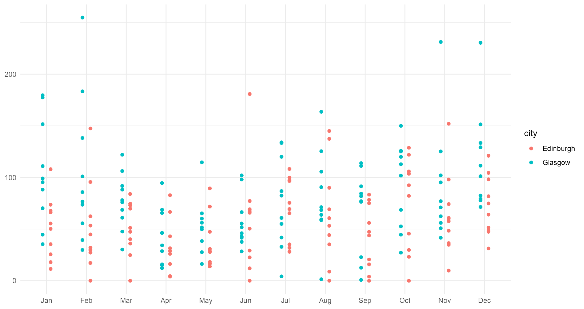
Back to our basic plot
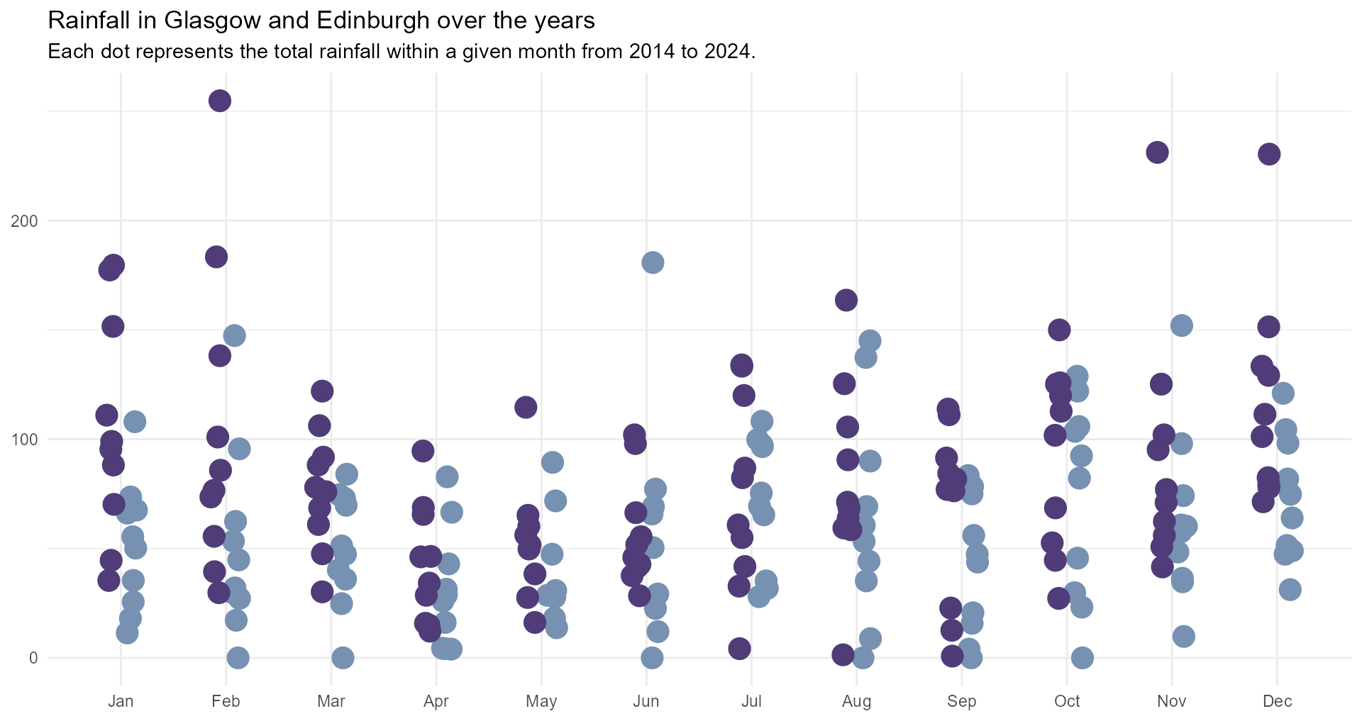
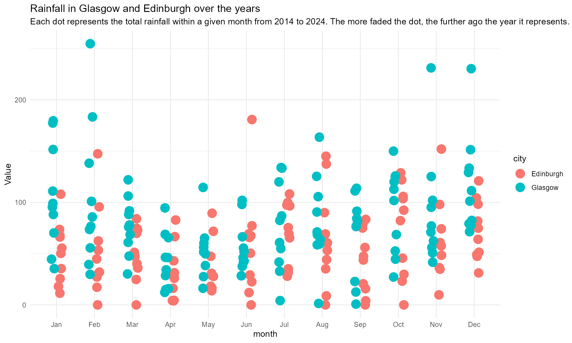
Let’s avoid the bars!
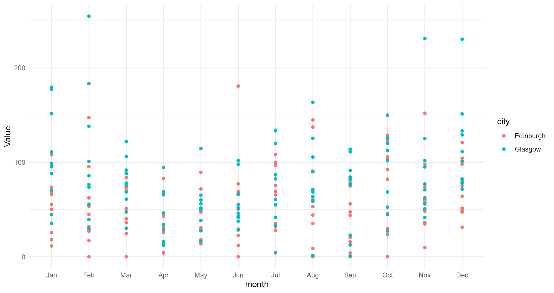
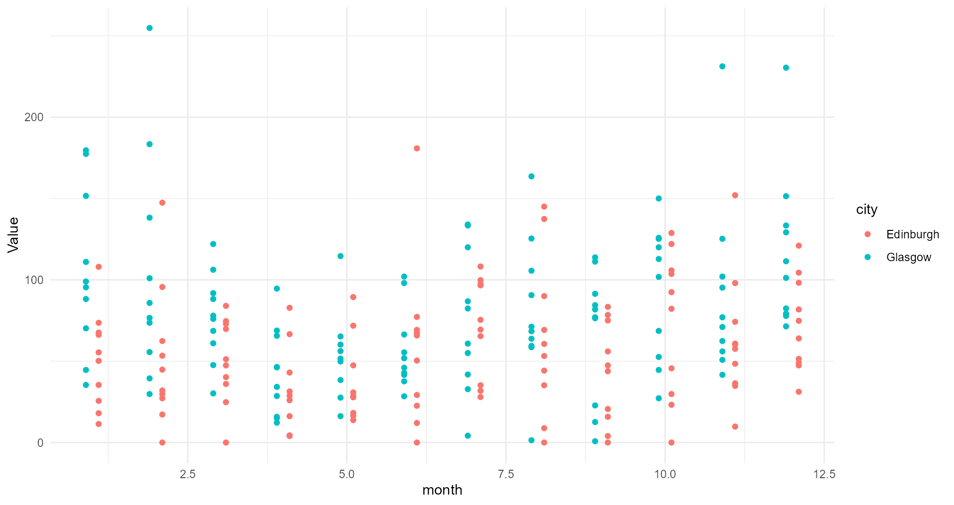
Back to our basic plot
Make it easier to distinguish between the cities
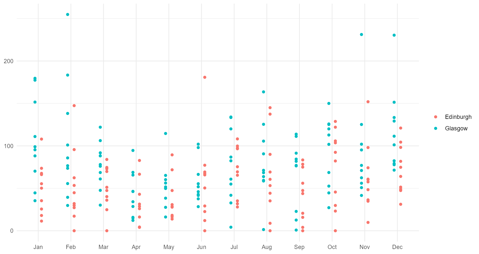
Back to our basic plot
Make the grid more useful
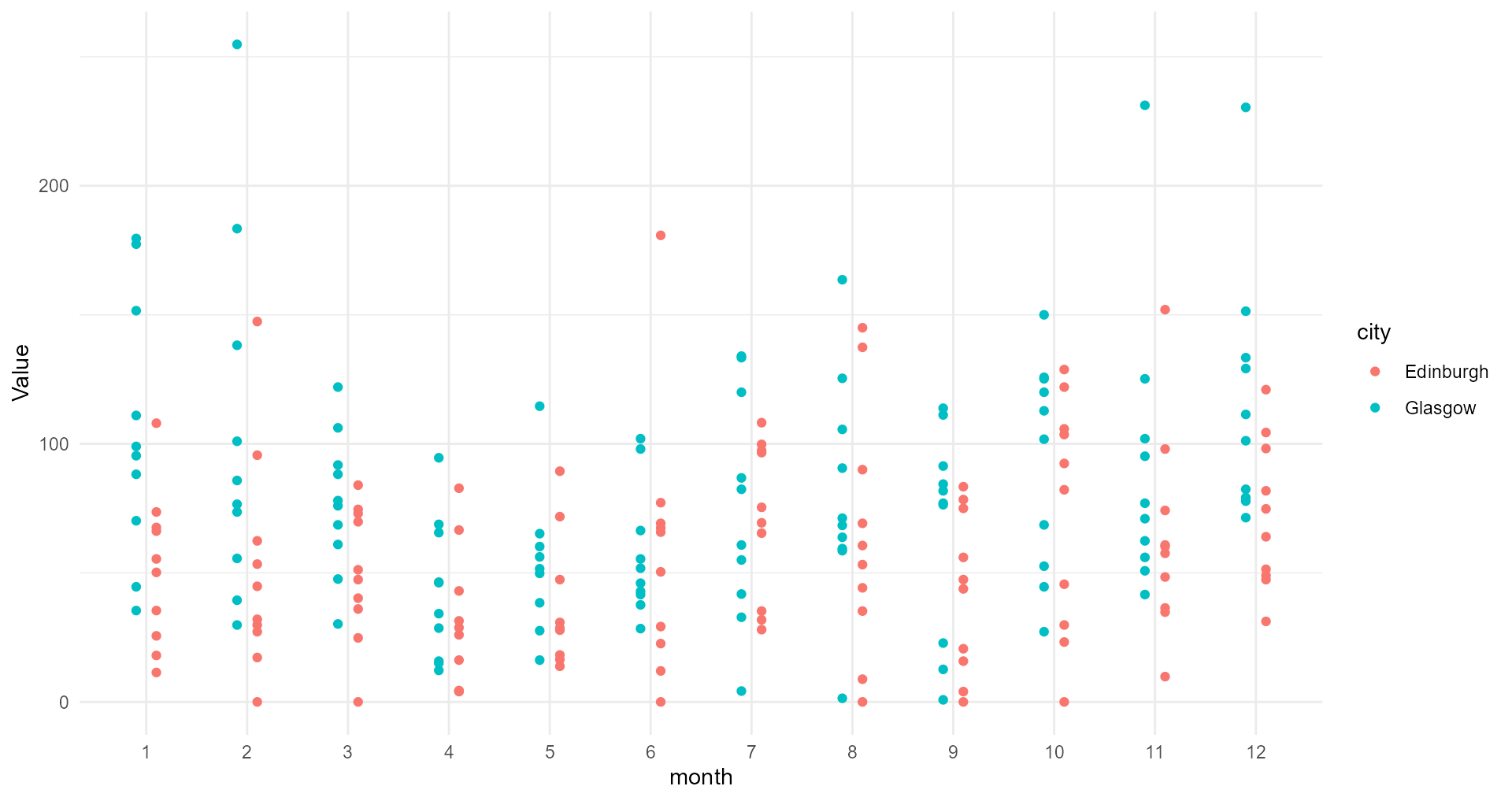
Back to our basic plot
Make the axis text more useful
Back to our basic plot
See if we can remove any text
Back to our basic plot
See if you can remove any text
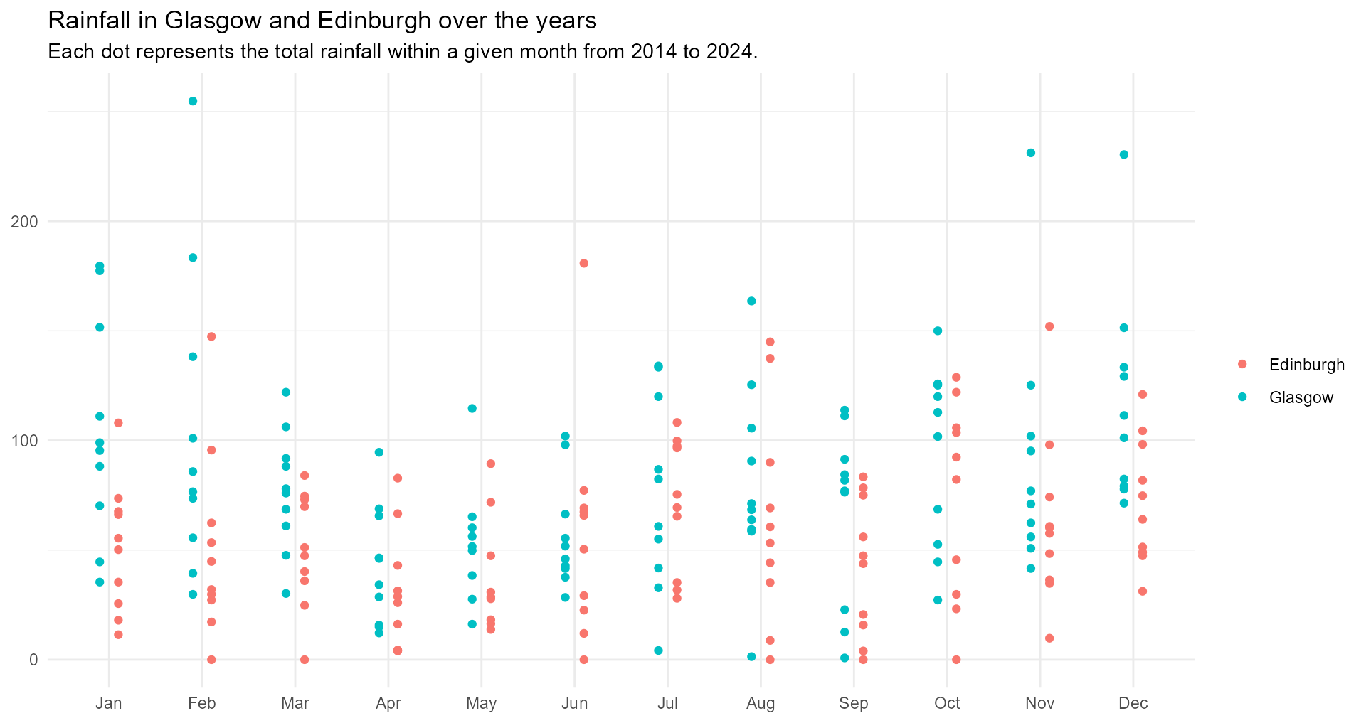
Back to our basic plot
We probably need to give it some context…
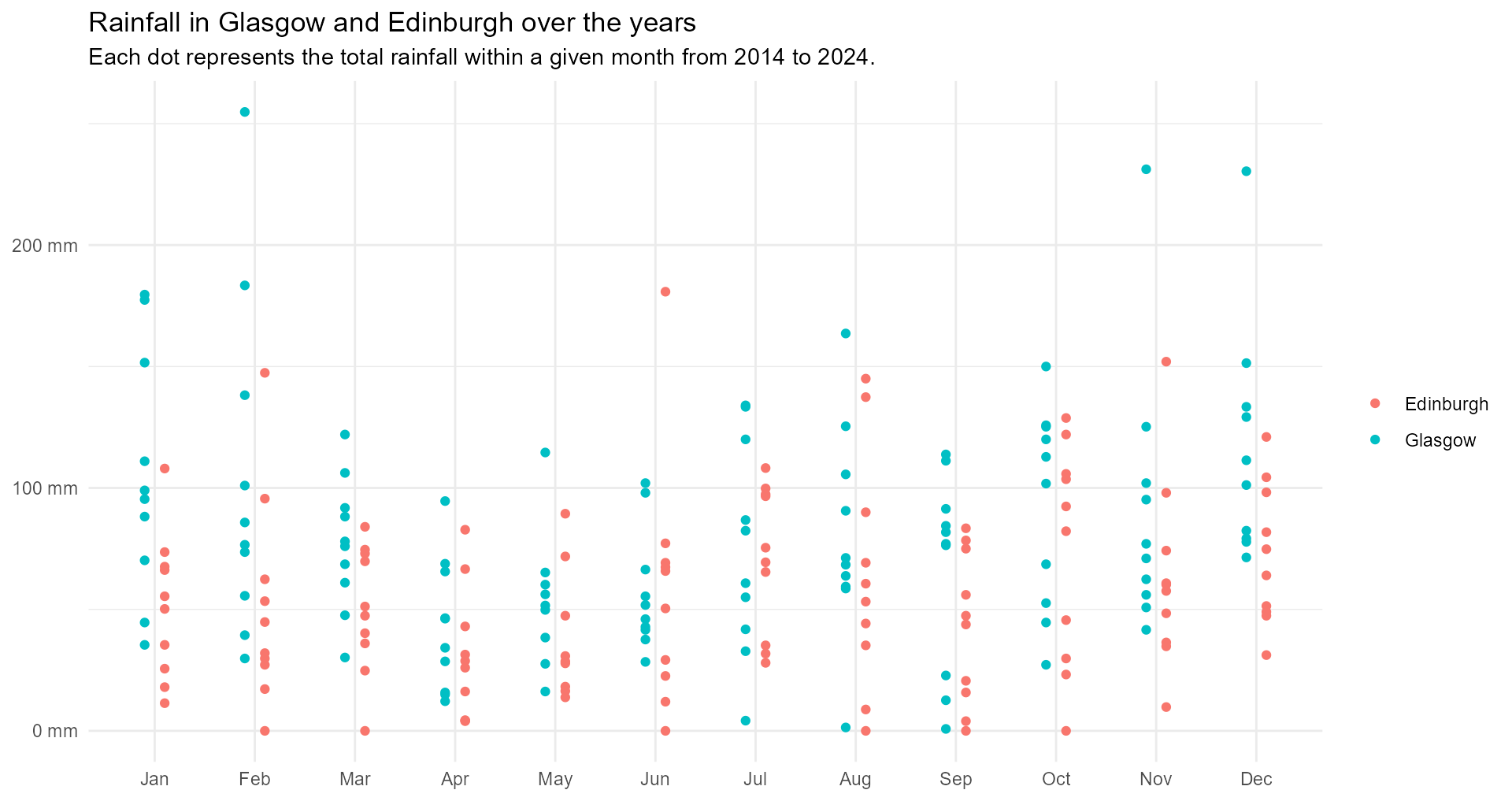
Now for a basic plot
Make the y axis clearer
Now for a basic plot
Now, let’s see what else we can do…
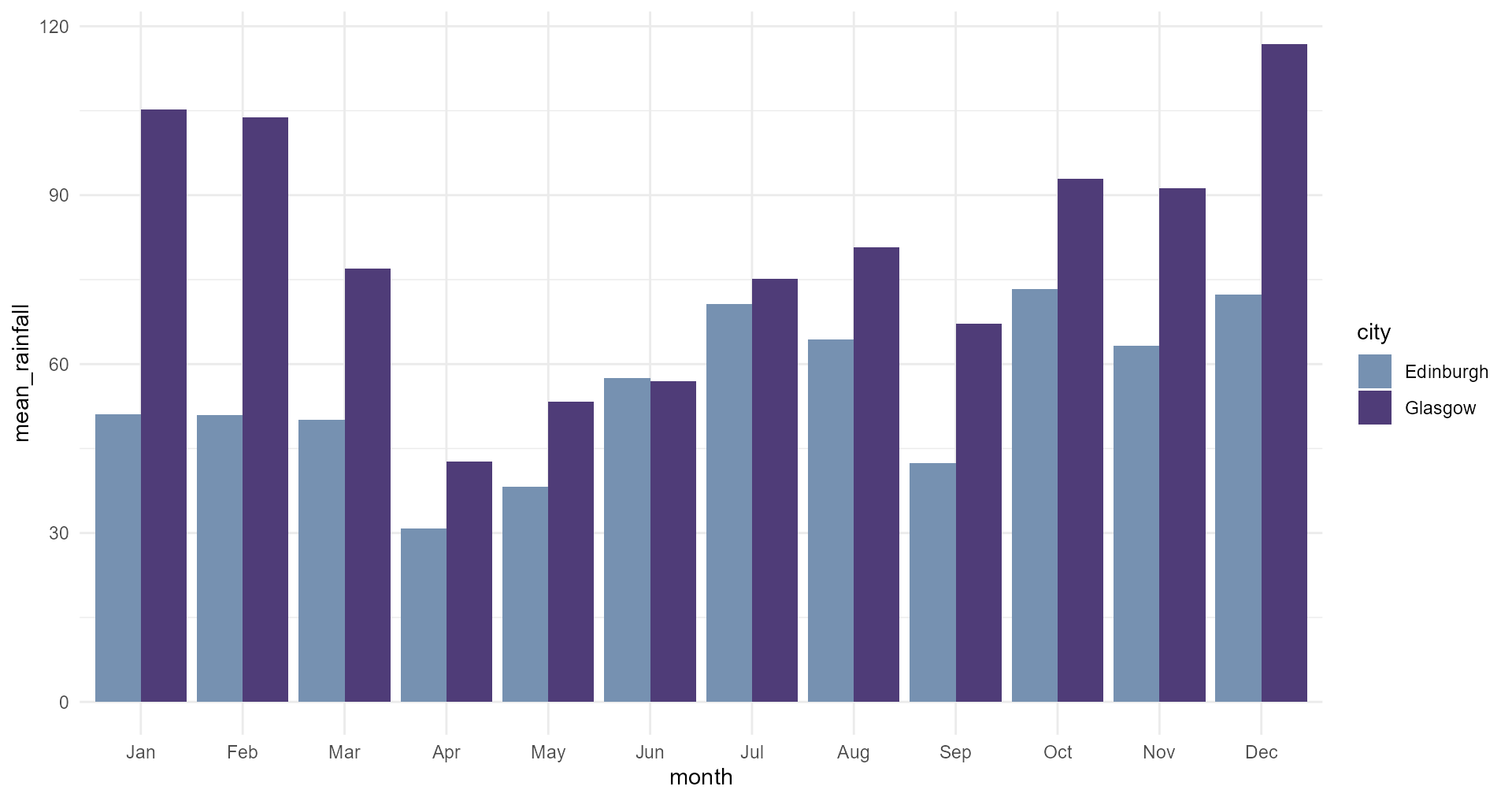
#1 Use meaningful colours
#1 Use meaningful colours
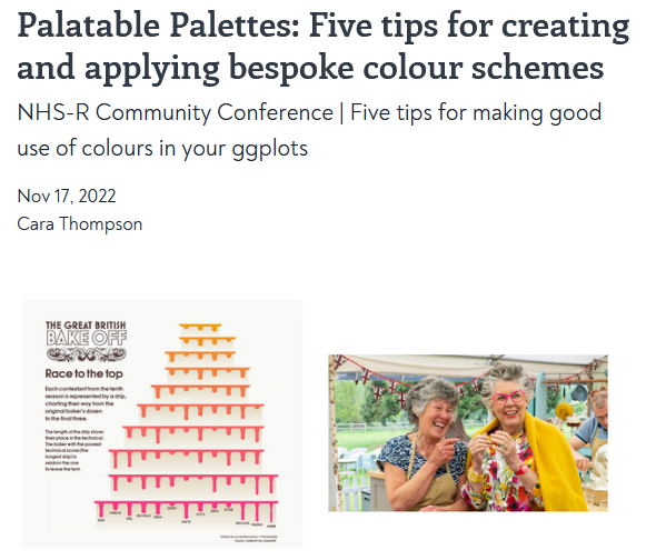
Find out more: cararthompson.com/talks/nhsr2022-palatable-palettes/
#1 Use meaningful colours
Glasgow and Edinburgh
#1 Use meaningful colours
Glasgow and Edinburgh
#1 Use meaningful colours
What about the order?
#1 Use meaningful colours
Glasgow and Edinburgh
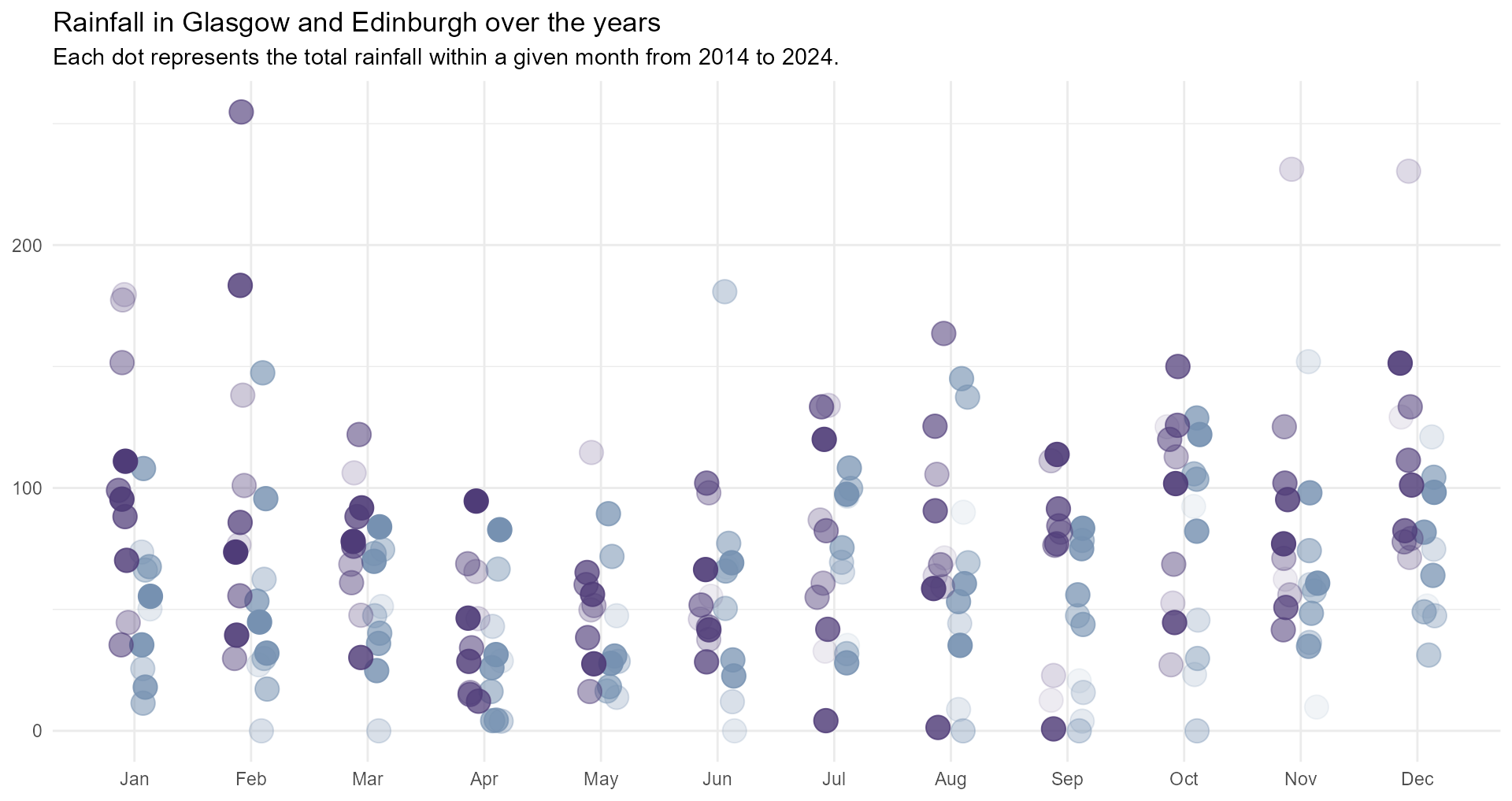
#1 Use meaningful colours
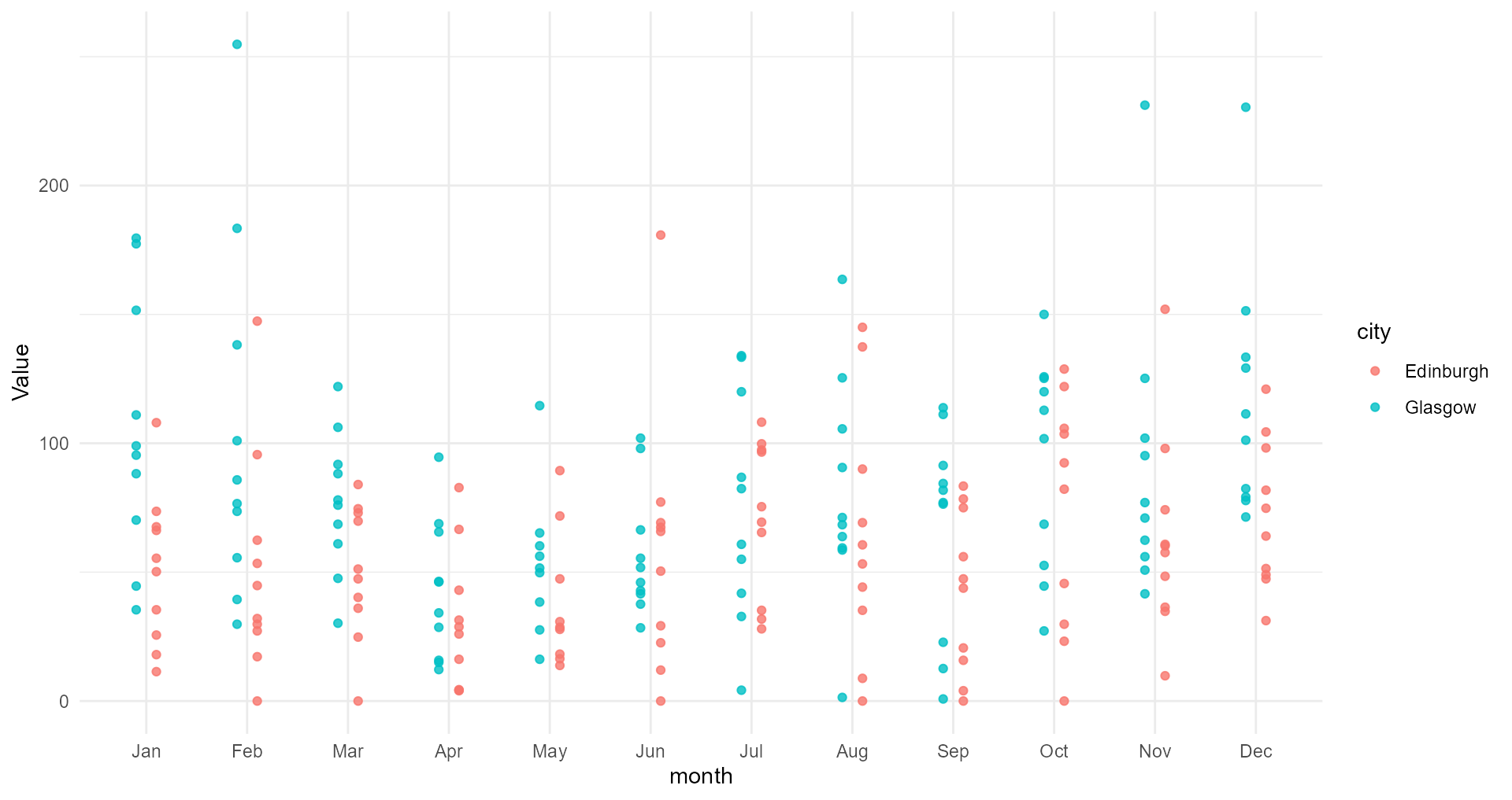
Glasgow and Edinburgh over the years
#1 Use meaningful colours
Glasgow and Edinburgh over the years
Avoiding clashes
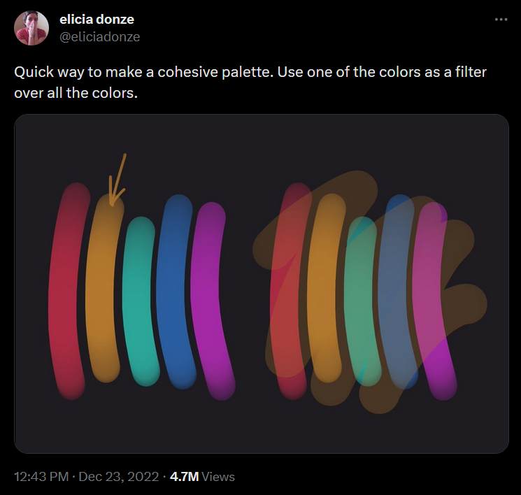
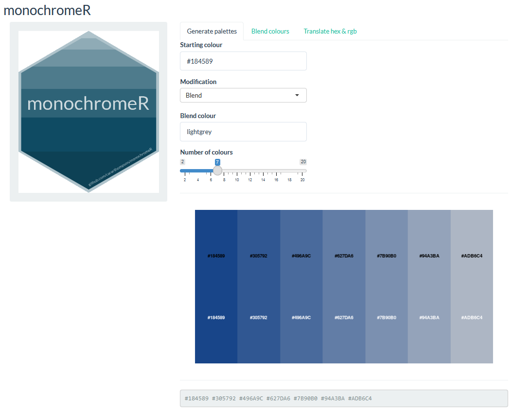
Avoiding clashes - monochromeR
cararthompson.shinyapps.io/monochromeR
- creating palettes between two colours
- blending in a brand colour (e.g.
#2c3d4f)
Avoiding clashes - monochromeR
cararthompson.shinyapps.io/monochromeR
- creating palettes between two colours
- blending in a brand colour (e.g.
#2c3d4f)
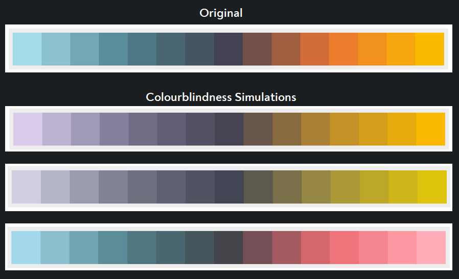
Checking for accessibility - vis4.net/palettes
So much more than red and green - vis4.net/palettes
#2 Optimise text
#2 Optimise text
Starting point
#2 Optimise text
Starting point
#2 Optimise text
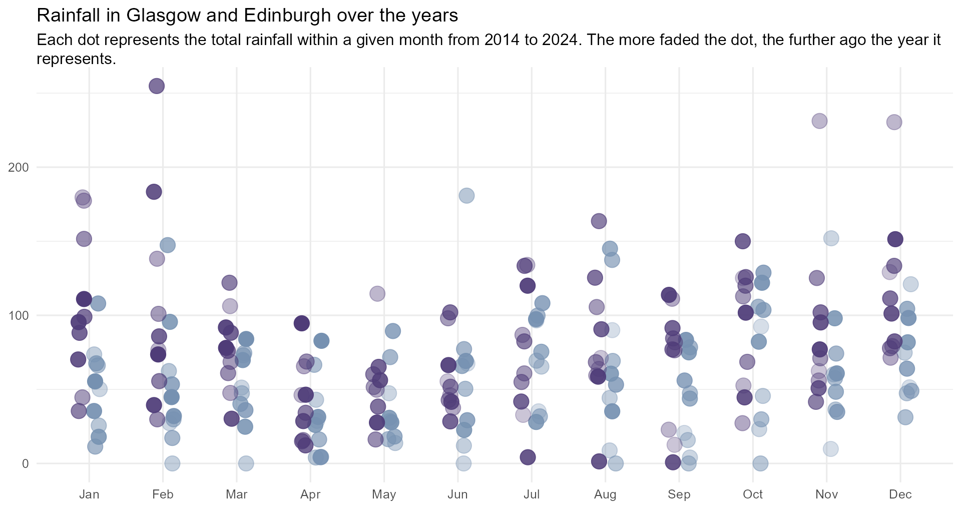
Make the text fit - the easy way!
#2 Optimise text
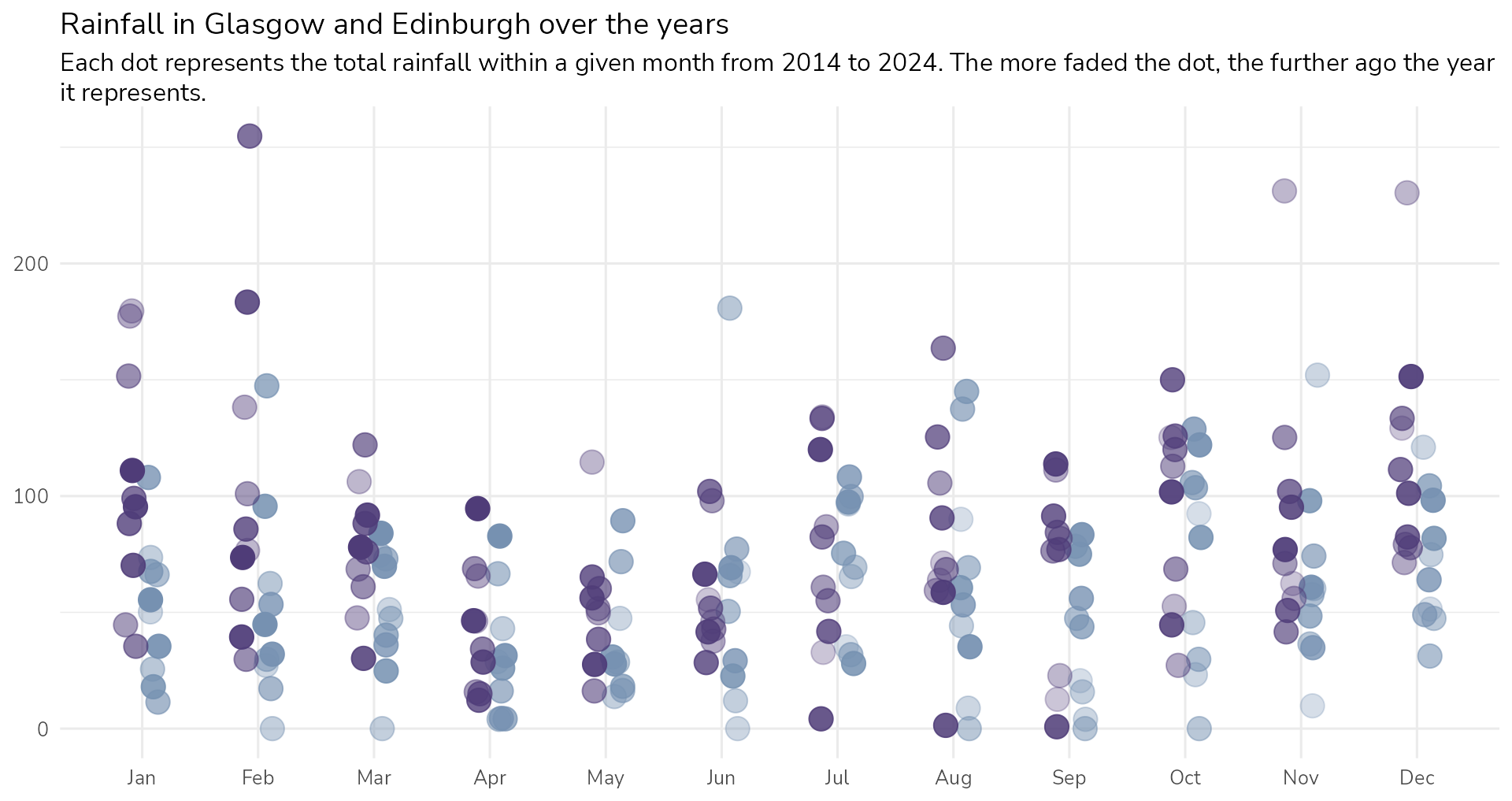
Let’s add some personality
#2 Optimise text
Let’s add some personality
#2 Optimise text
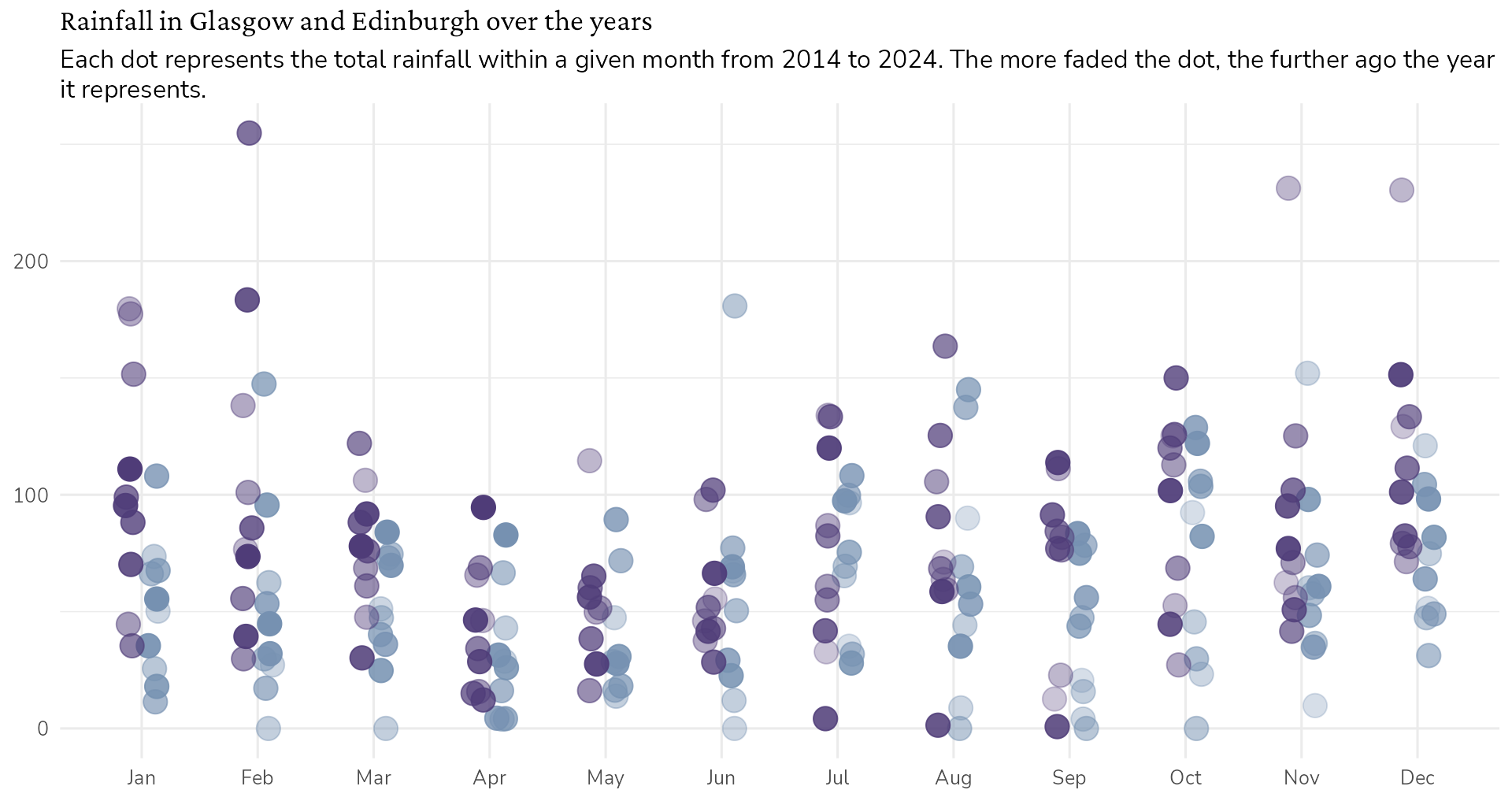
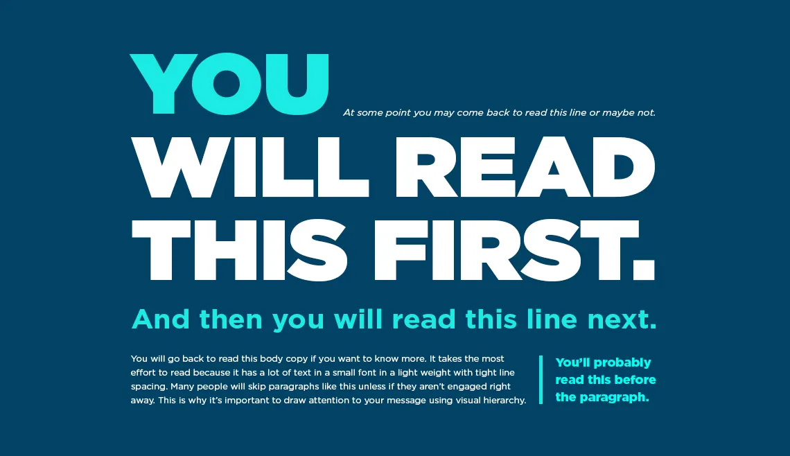
Let’s add some hierarchy
#2 Optimise text
Let’s add some hierarchy
#2 Optimise text
Let’s add some hierarchy
#2 Optimise text
Let’s add some hierarchy
#2 Optimise text
Let’s add some hierarchy
#2 Optimise text
Let’s add some hierarchy
#2 Optimise text
Let’s add some hierarchy
Find out more: Ten tips for better text
#3 Make it your own
#3 Make it your own
Starting point
#3 Make it your own
Nicer grid colour
#3 Make it your own
Add a background colour?
#3 Make it your own
Give everything some space to breathe
#3 Make it your own
Declutter, declutter, declutter
Shameless plug alert: I ❤️ creating toolkits
On-brand, accessible colour palettes (incl. text, gridlines and backgrounds)

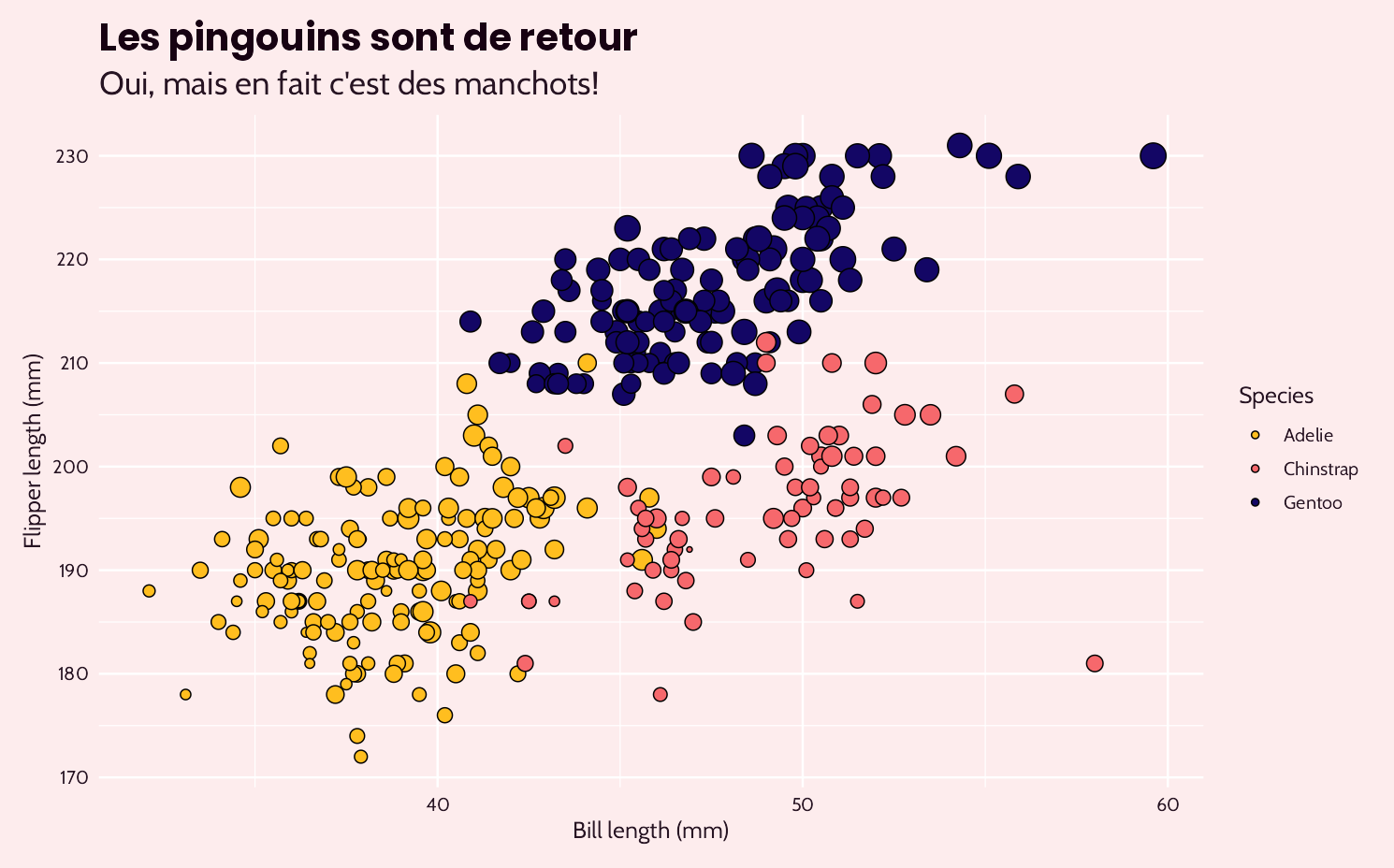
“Wow, I love it!! Thank you so much, this is so helpful - it takes a huge weight off my shoulders and will save me an incredible amount of time.”
Shameless plug alert: I ❤️ creating toolkits
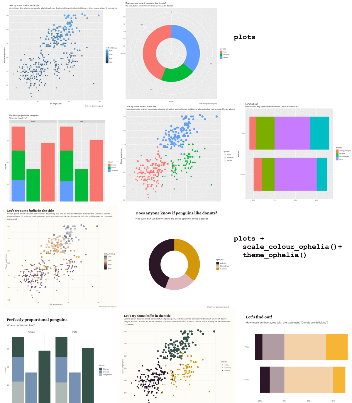
Bespoke dataviz design system packages | basic_plot
Find out more: cararthompson.com/services#dataviz-design-systems
Shameless plug alert: I ❤️ creating toolkits
Bespoke dataviz design system packages | basic_plot + theme_ophelia() + scale_colour_ophelia()
Find out more: cararthompson.com/services#dataviz-design-systems
#4 Add annotations for context
#4 Add annotations for context
Starting point
#4 Add annotations for context
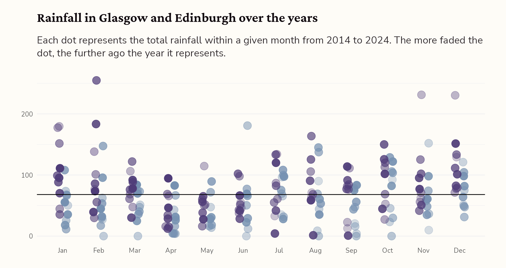
Add the mean monthly rainfall
#4 Add annotations for context
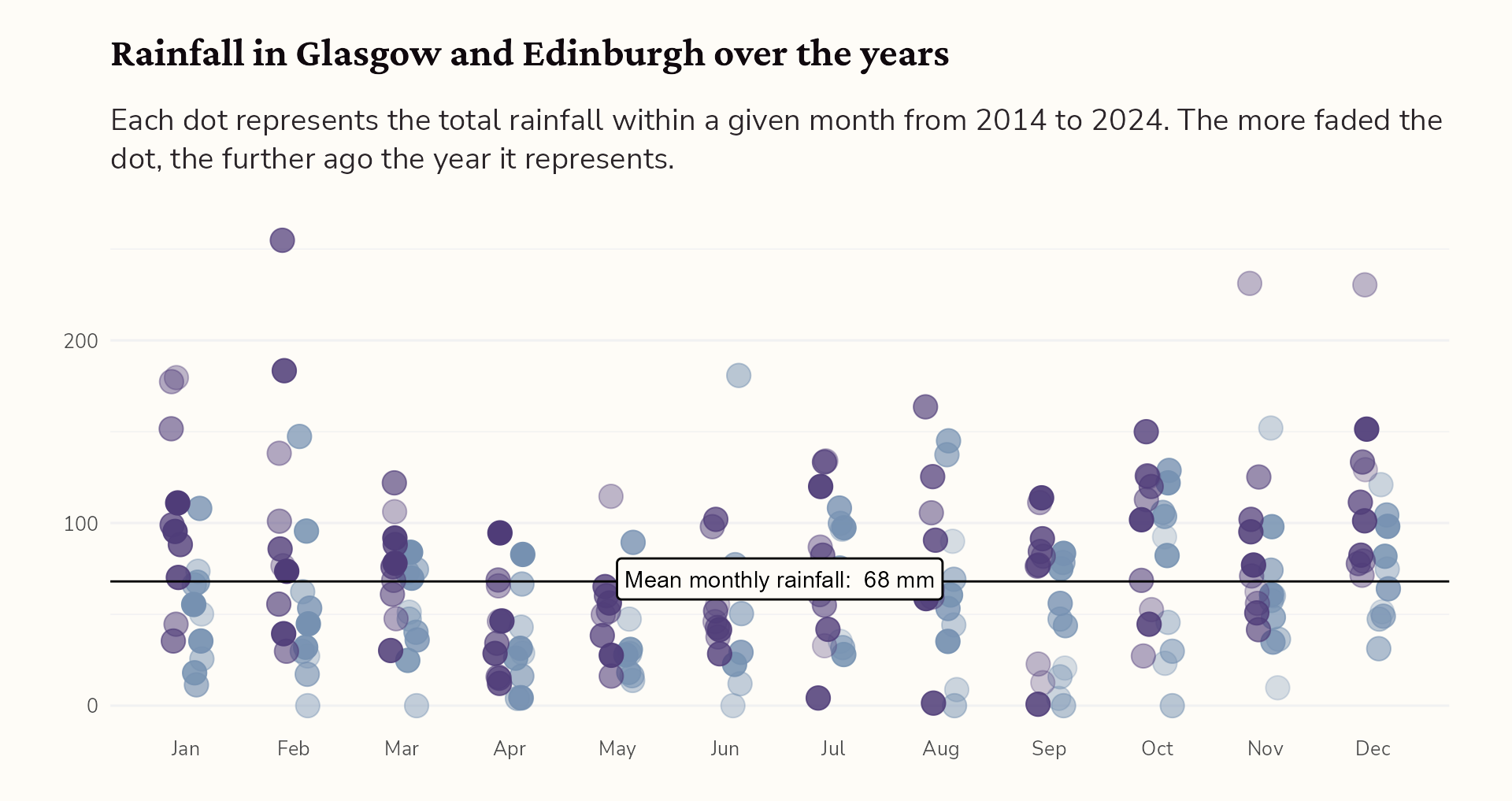
Hello {geomtextpath}!
#4 Add annotations for context
Style the label
#4 Add annotations for context
Adjust the position of the label
#4 Add annotations for context
Add the UK mean for comparison…
#4 Add annotations for context
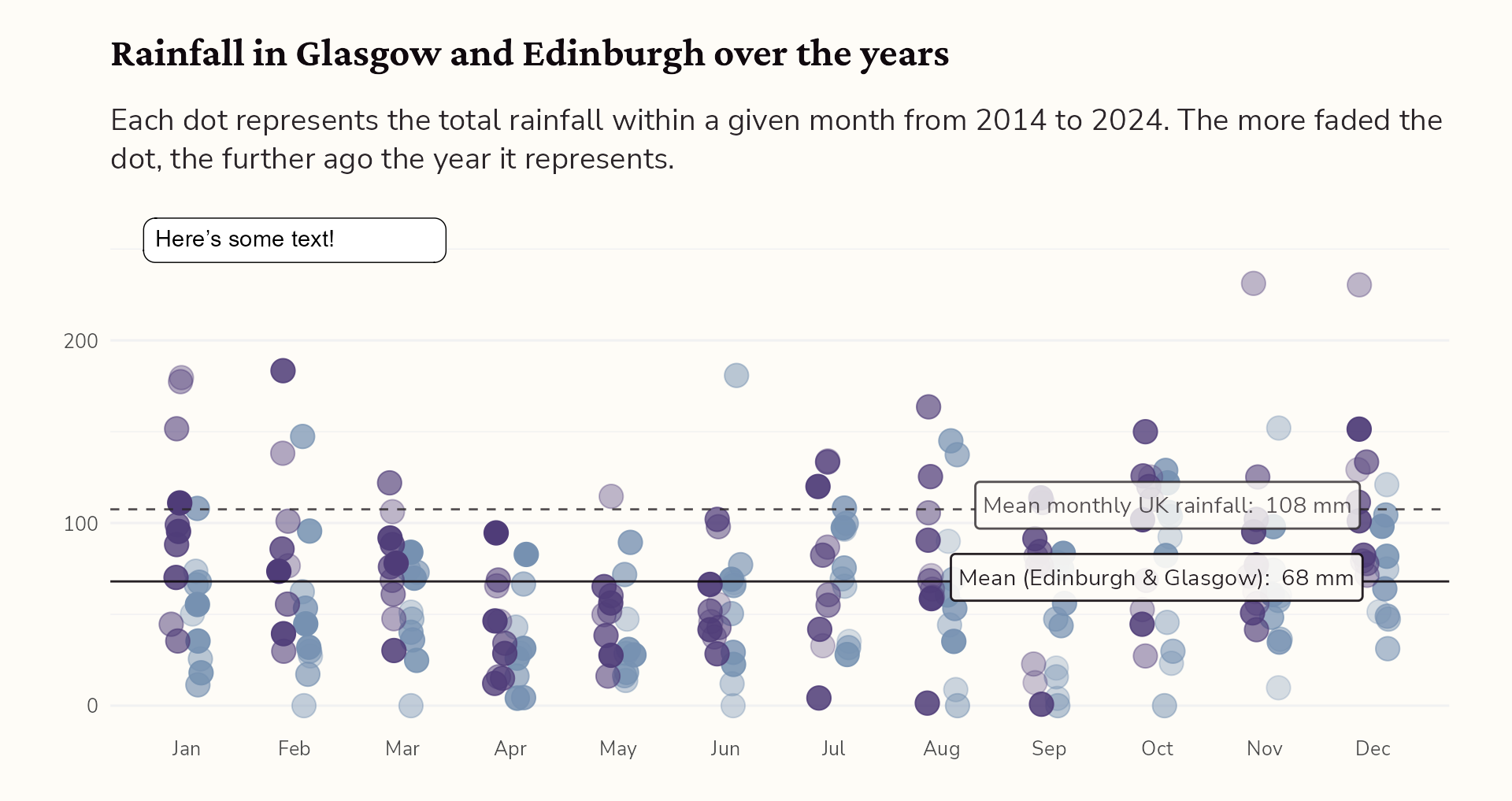
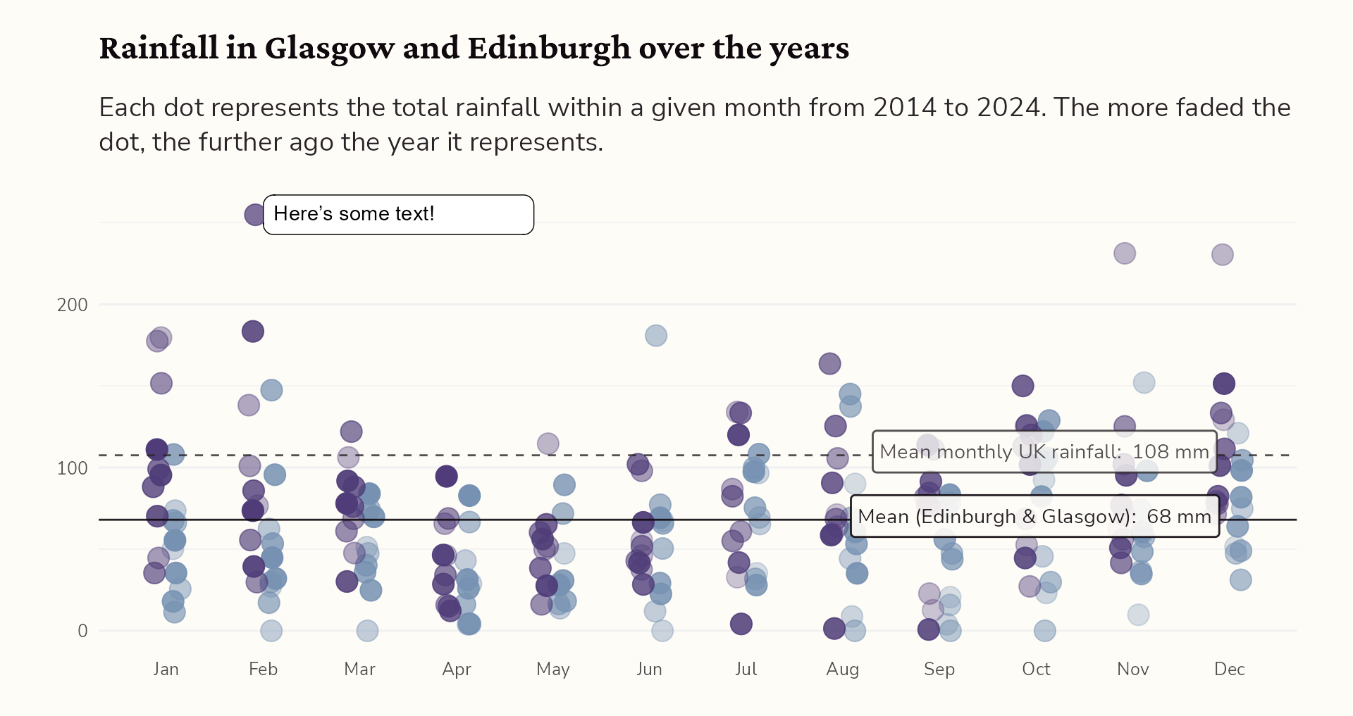
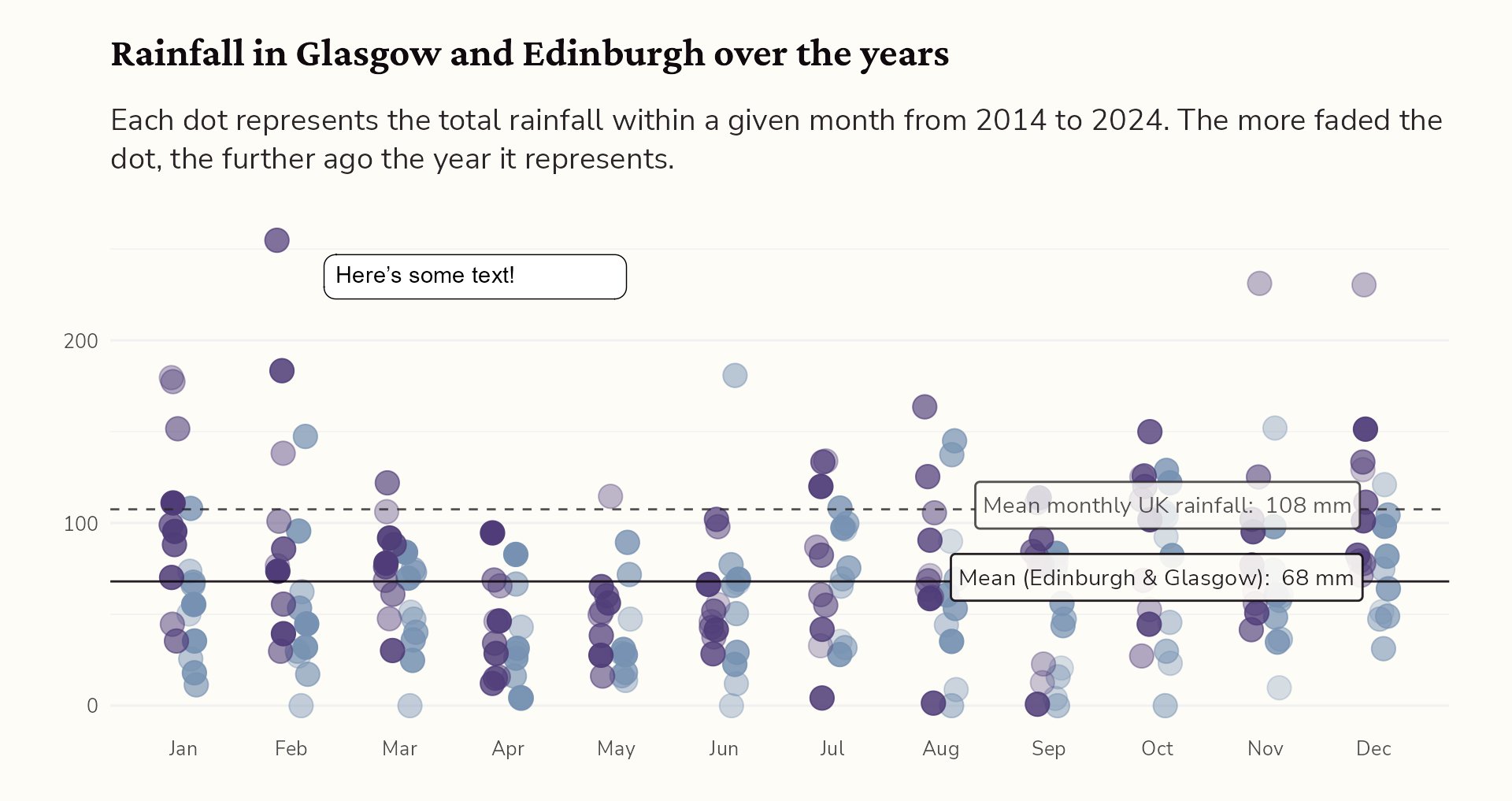
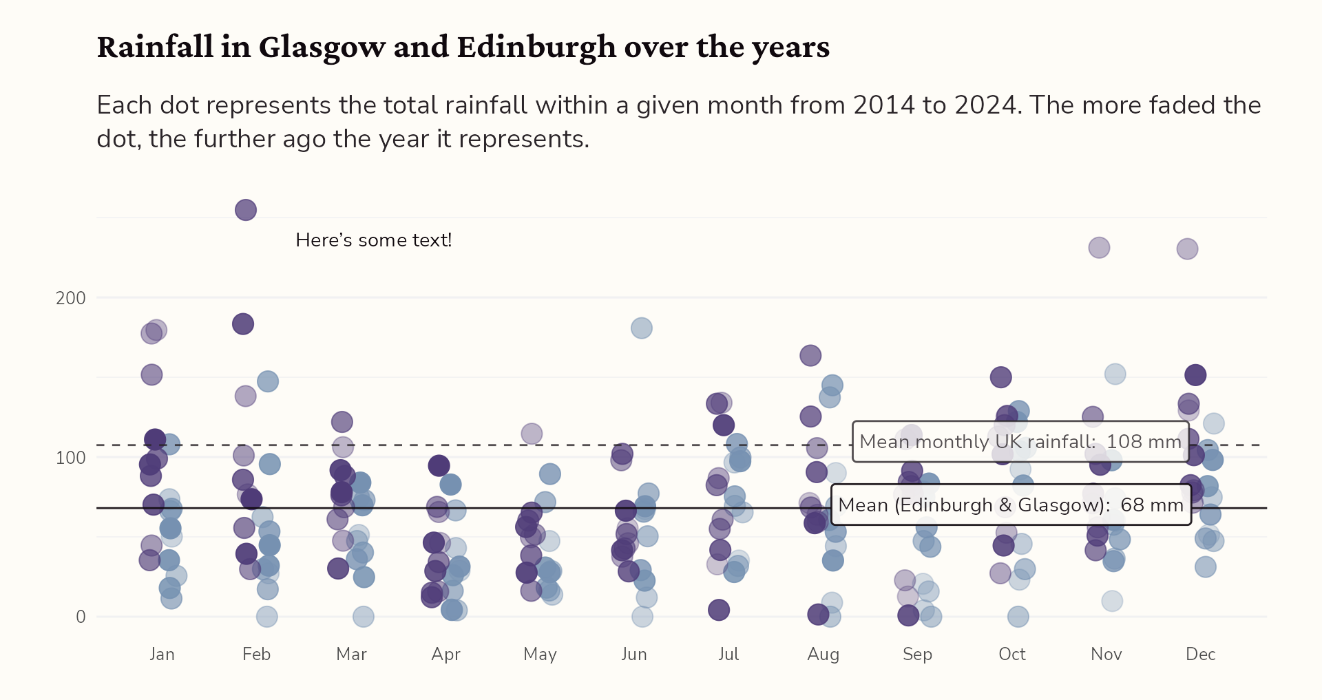
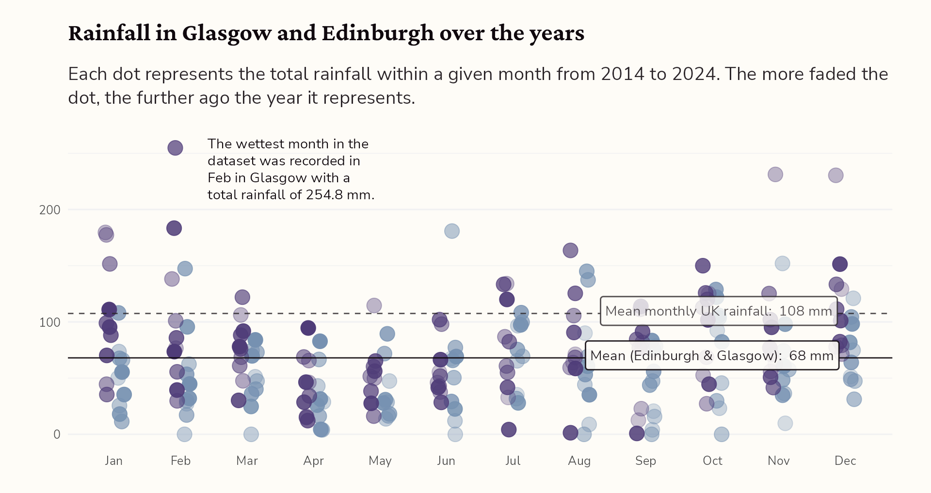
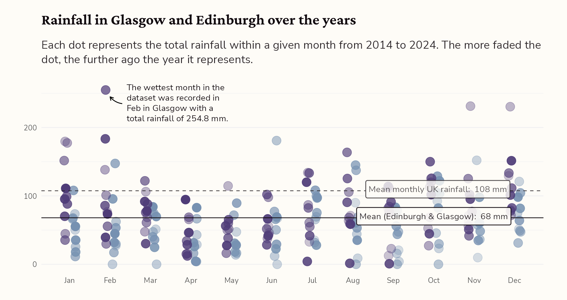
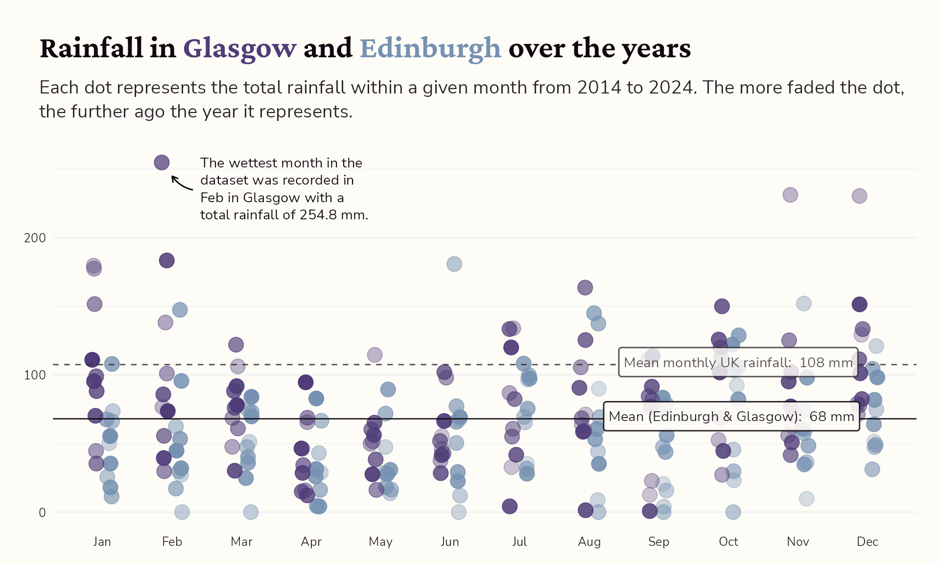
Highlight interesting observations
#4 Add annotations for context
Highlight interesting observations
#4 Add annotations for context
Highlight interesting observations
#4 Add annotations for context
Highlight interesting observations
#4 Add annotations for context
Highlight interesting observations
#4 Add annotations for context
Highlight interesting observations
Find out more: cararthompson.com/talks/shiny-dynamic-annotations
#4 Add annotations for context
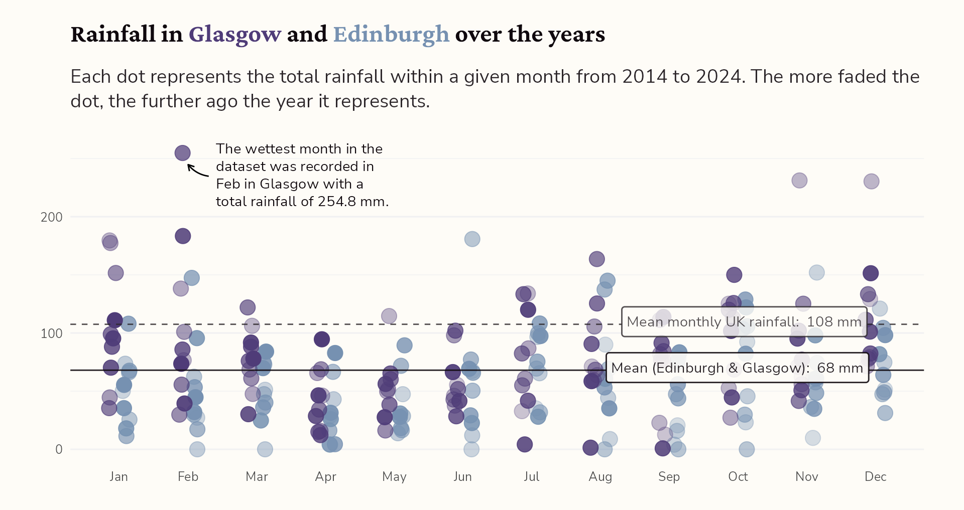
Place legend within the title
Find out more: cararthompson.com/talks/shiny-dynamic-annotations
Making the most of text
#5 Go interactive!
#5 Go interactive!
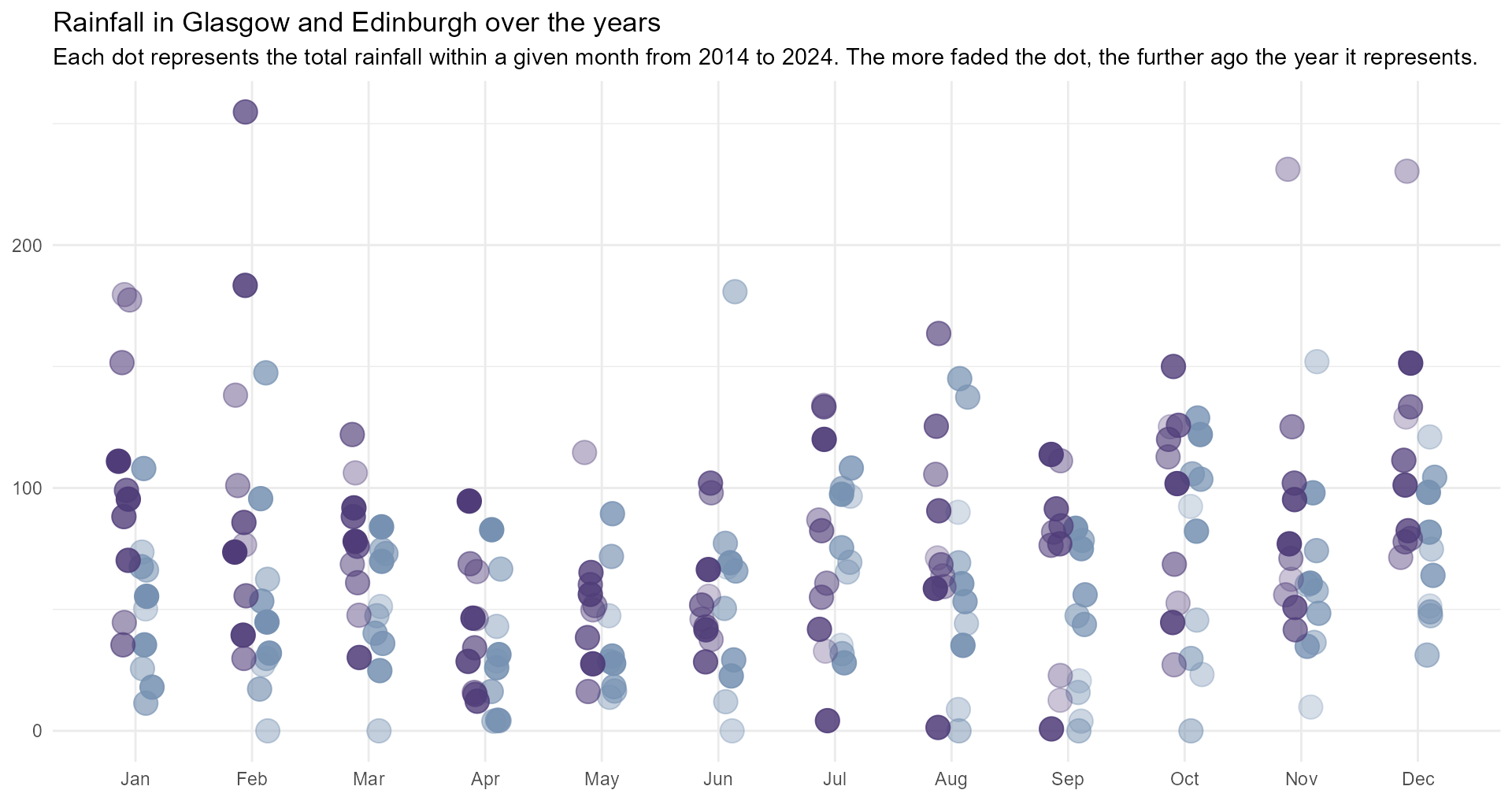
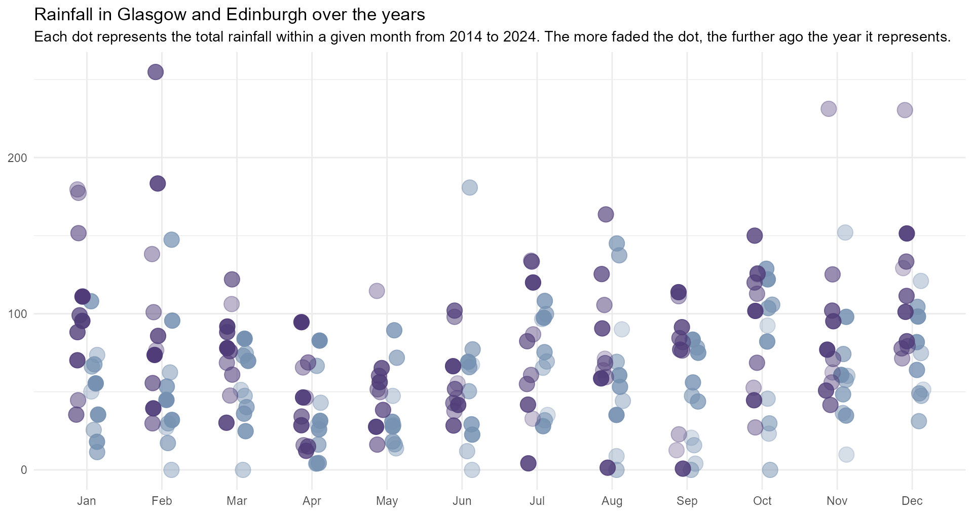
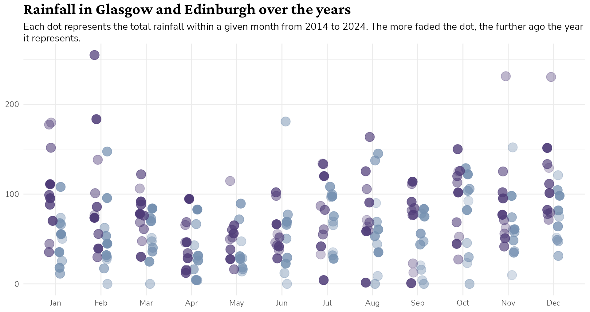
Our plot…
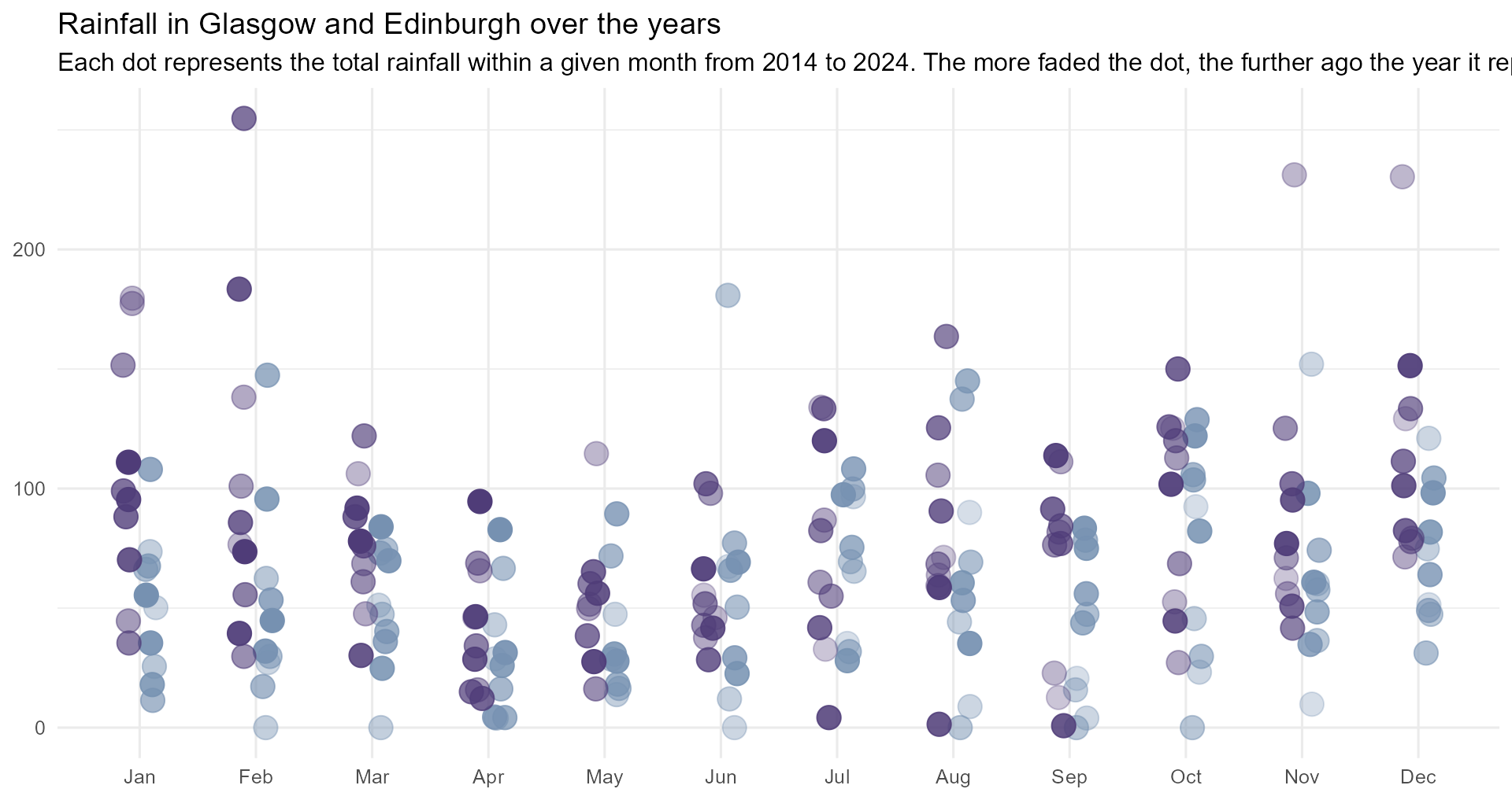
rain_data |>
  ggplot() +
  geom_jitter(
    aes(x = dplyr::case_when(city == "Glasgow" ~ as.numeric(month) - 0.1,
                             TRUE ~ as.numeric(month) + 0.1),
        y = Value,
        colour = city,
        alpha = year),
    size = 5,
    width = 0.05,
    height = 0) +
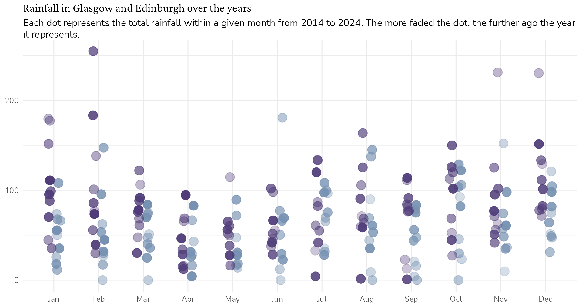
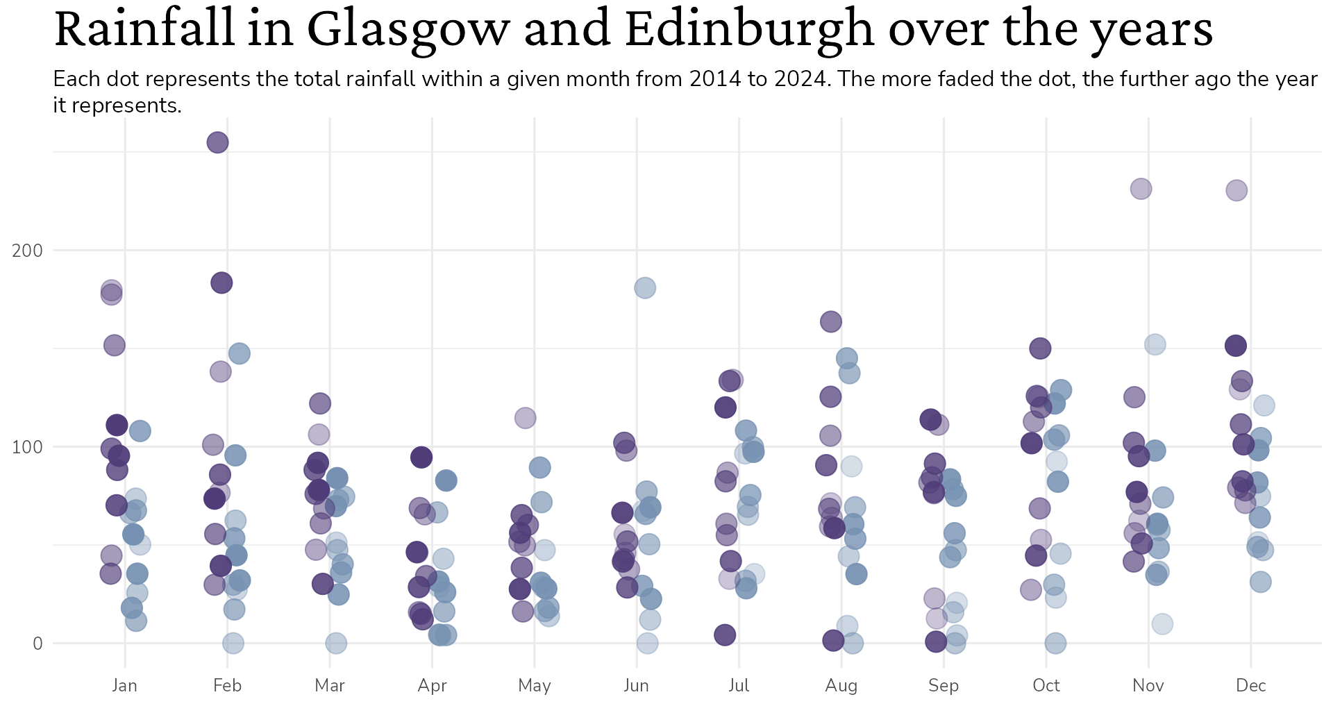
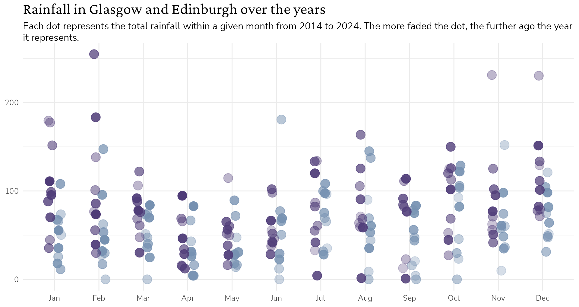
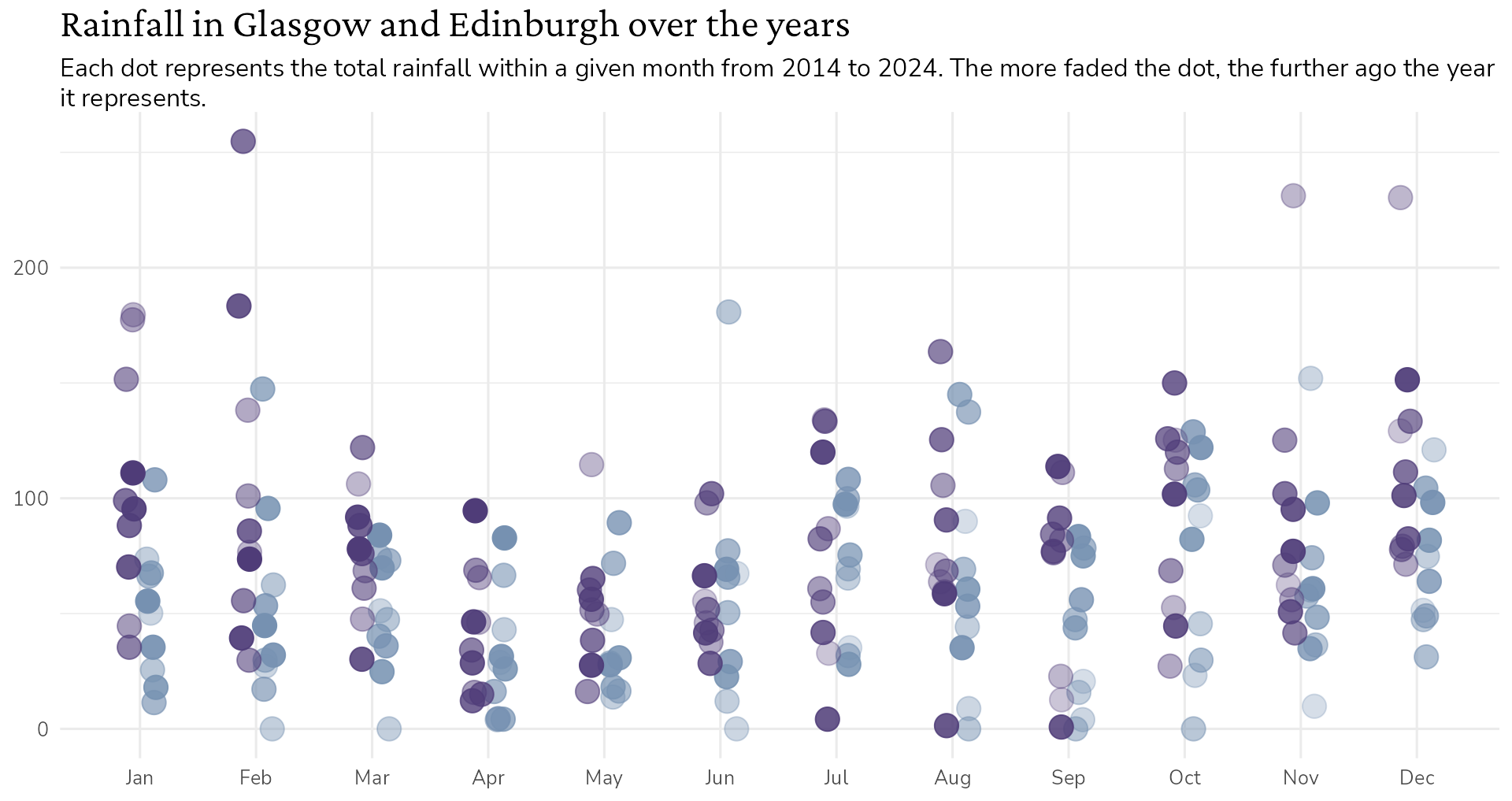
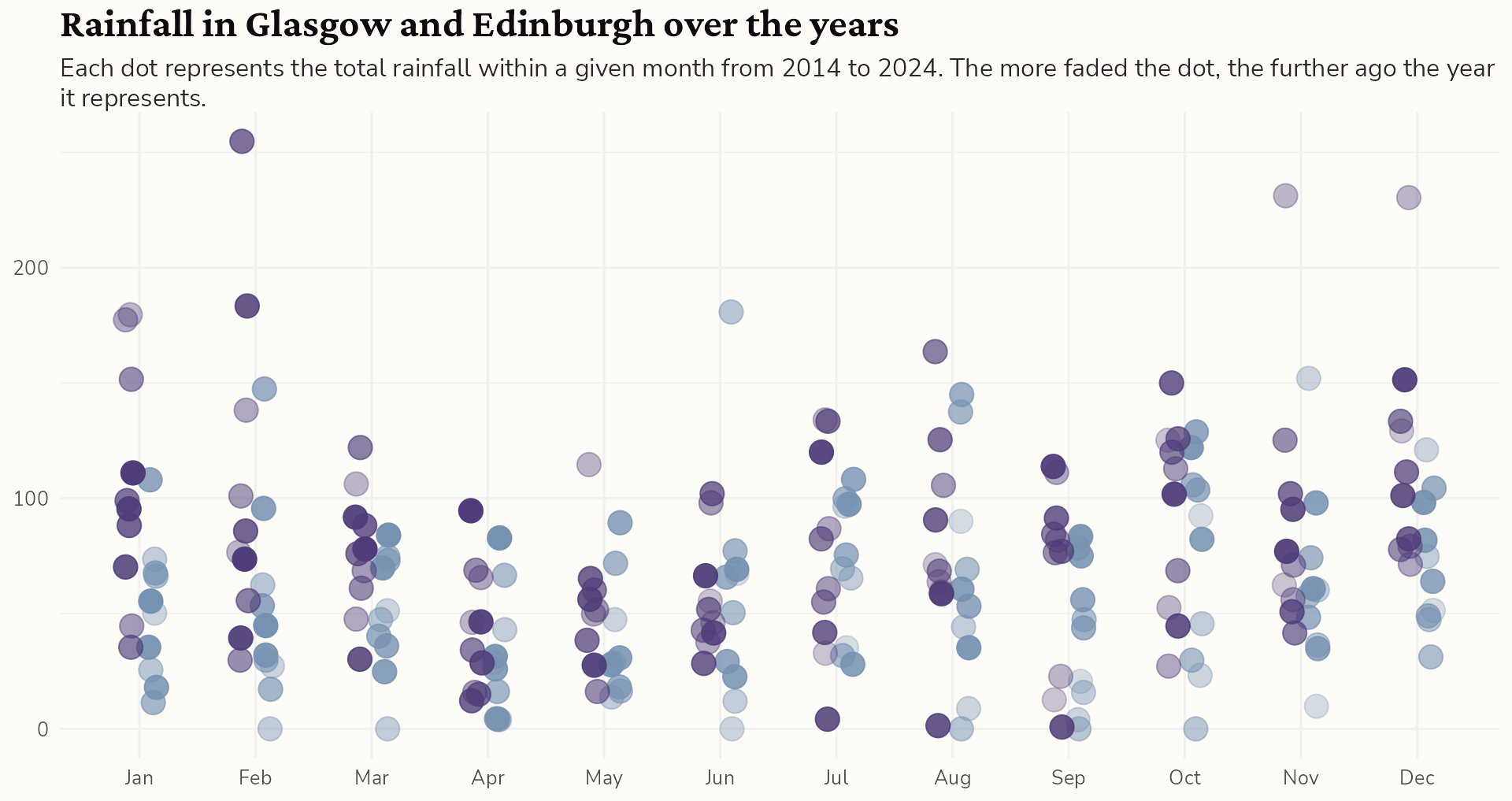
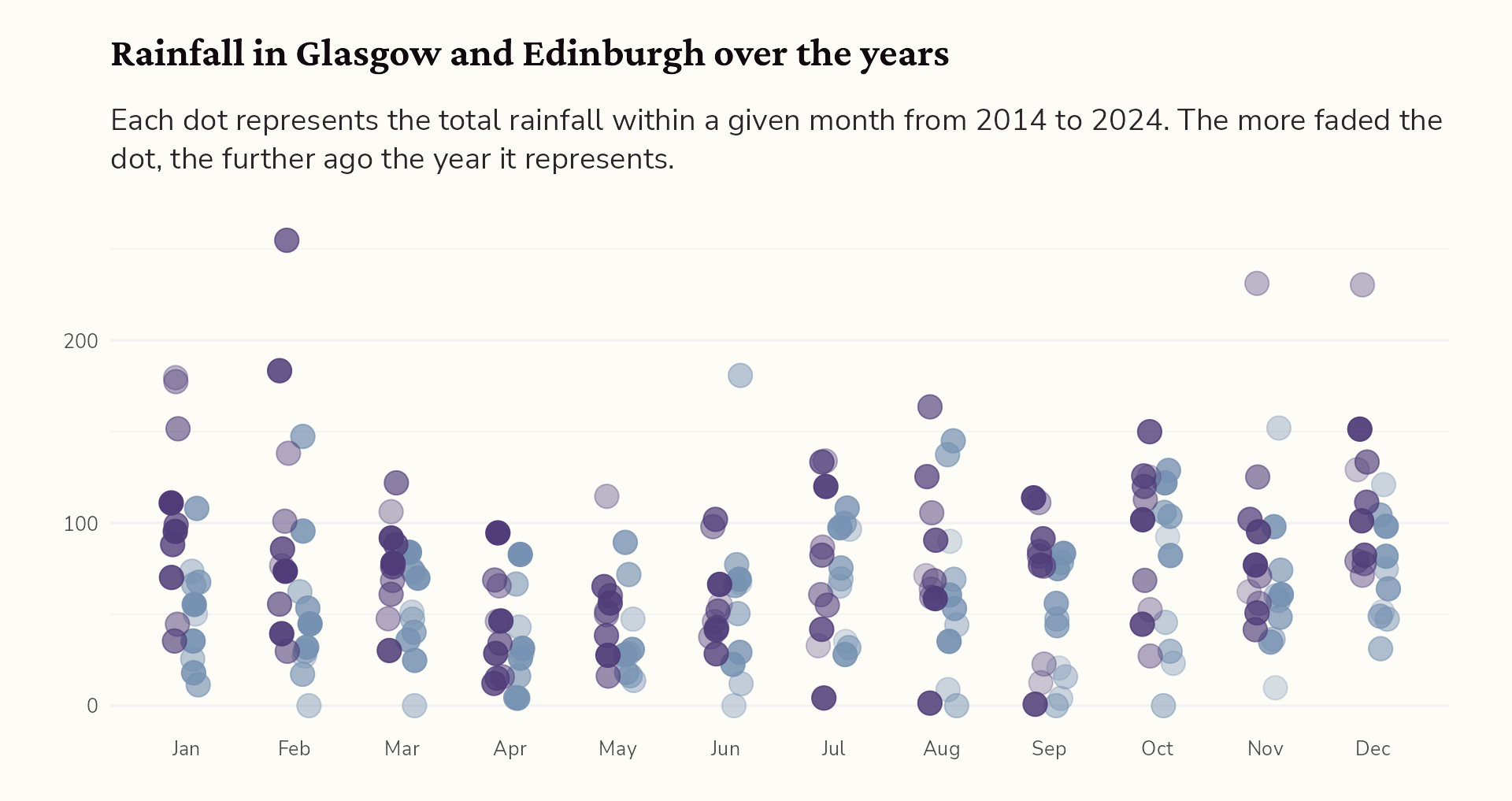
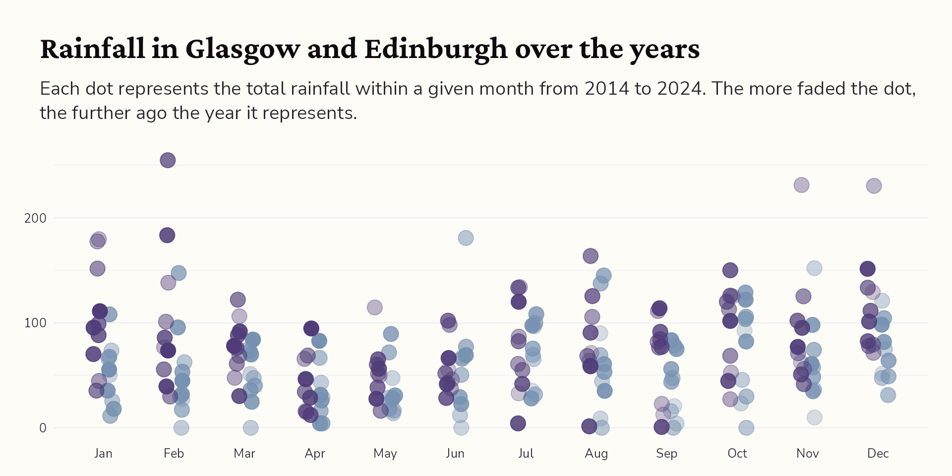
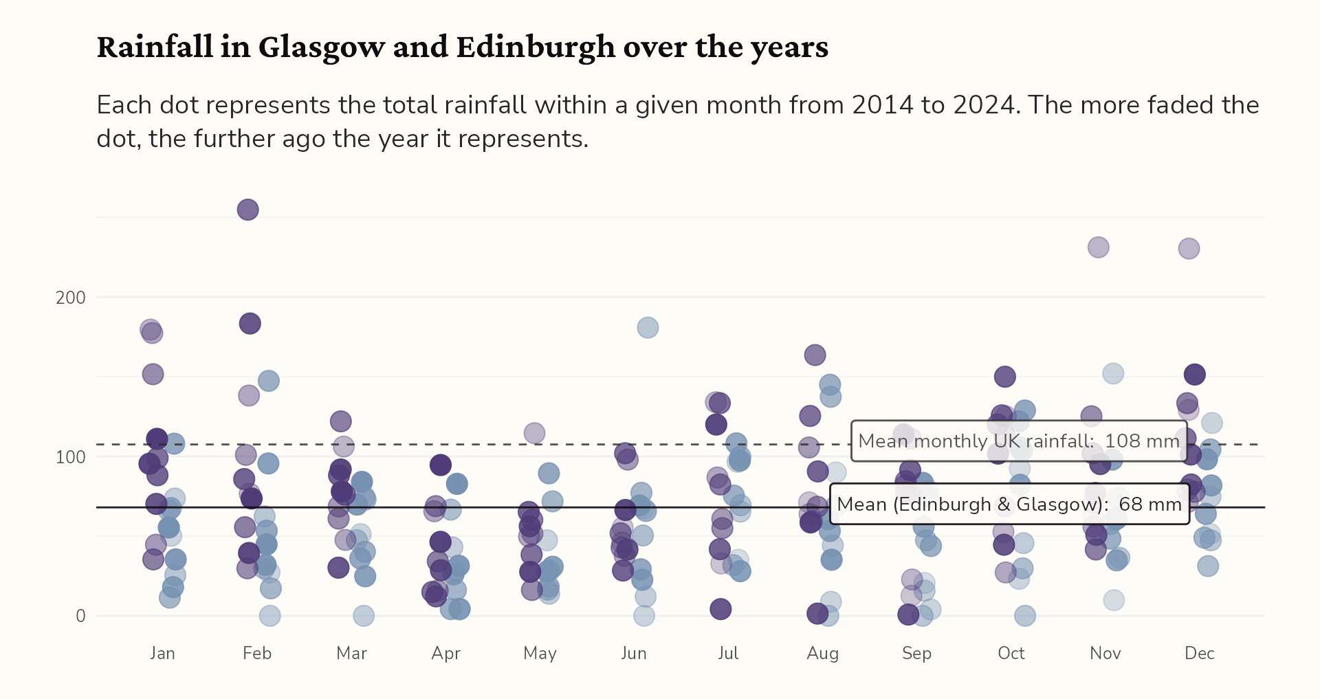
labs(title = "Rainfall in <span style='color:#4f3c78'>Glasgow</span> and <span style='color:#7691b1'>Edinburgh</span> over the years",
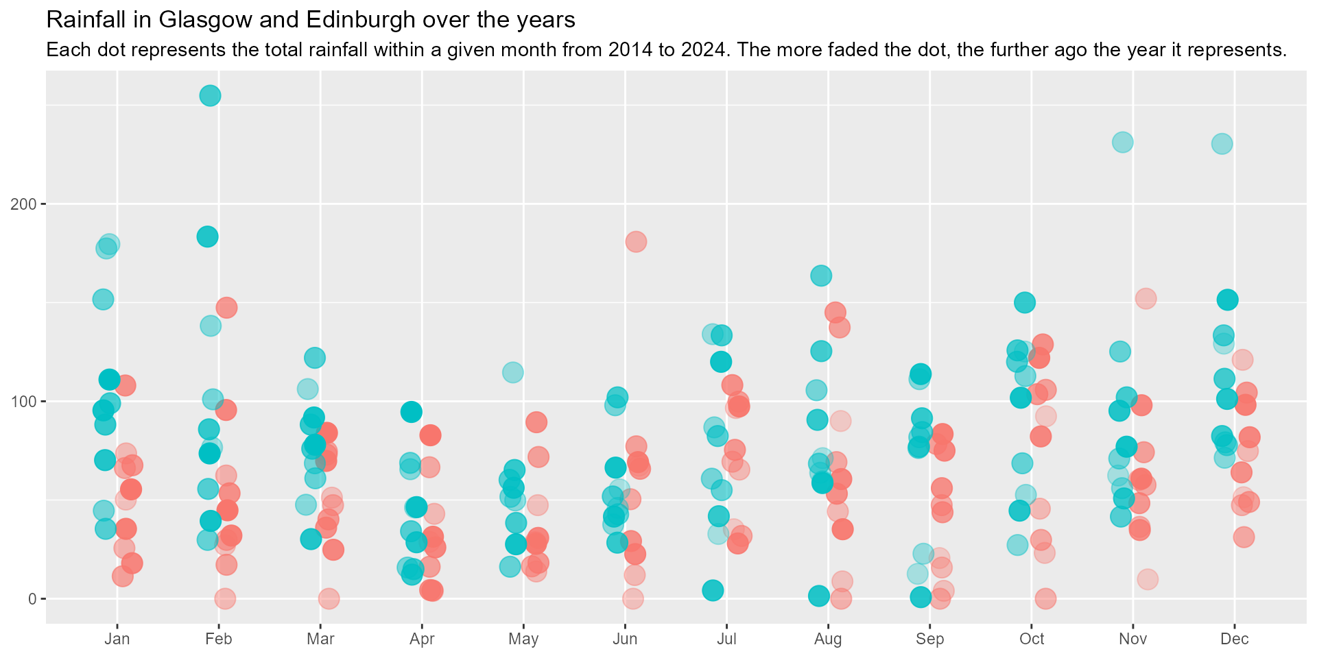
       subtitle = "Each dot represents the total rainfall within a given month from 2014 to 2024. The more faded the dot, the further ago the year it represents.") +
  scale_alpha(range = c(0.3, 1)) +
  scale_x_continuous(breaks = c(1:12), minor_breaks = NULL,
                     labels = month.abb[1:12]) +
  scale_colour_manual(values = c("Glasgow" = "#4f3c78",
                                 "Edinburgh" = "#7691b1")) +
  theme_minimal() +
  theme(axis.title = element_blank(),
        legend.position = "none") +
  ophelia::theme_ophelia() +
  theme(text = element_text(family = "Nunito Sans",
                            colour = "#2B2529"),
        axis.title = element_blank(),
        legend.position = "none",
        plot.title = element_text(family = "Crimson Pro",
                                  face = "bold",
                                  colour = "#10090E",
                                  size = rel(1.6)),
        plot.subtitle = ggtext::element_textbox_simple(
          size = ggplot2::rel(1.2),
          lineheight = 1.3,
          margin = ggplot2::margin(10, 0, 20, 0,
                                   unit = "points")),
        panel.grid = element_line(colour = "#F1F1F2"),
        panel.grid.major.x = element_blank(),
        plot.background = element_rect(colour = "#FEFCF7",
                                       fill = "#FEFCF7"),
        plot.margin = ggplot2::margin(20, 30, 20, 30,
                                      unit = "points"))
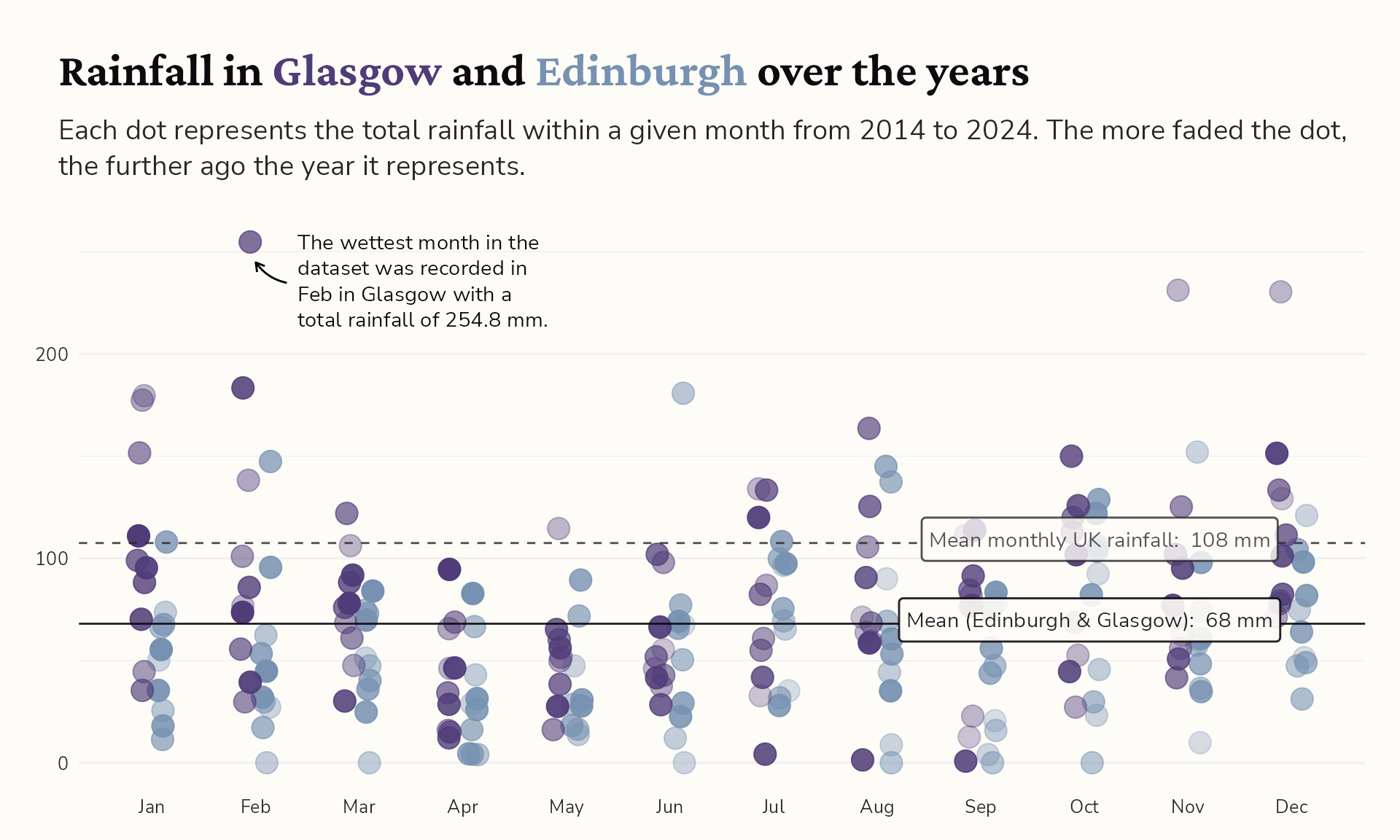
#5 Go interactive!
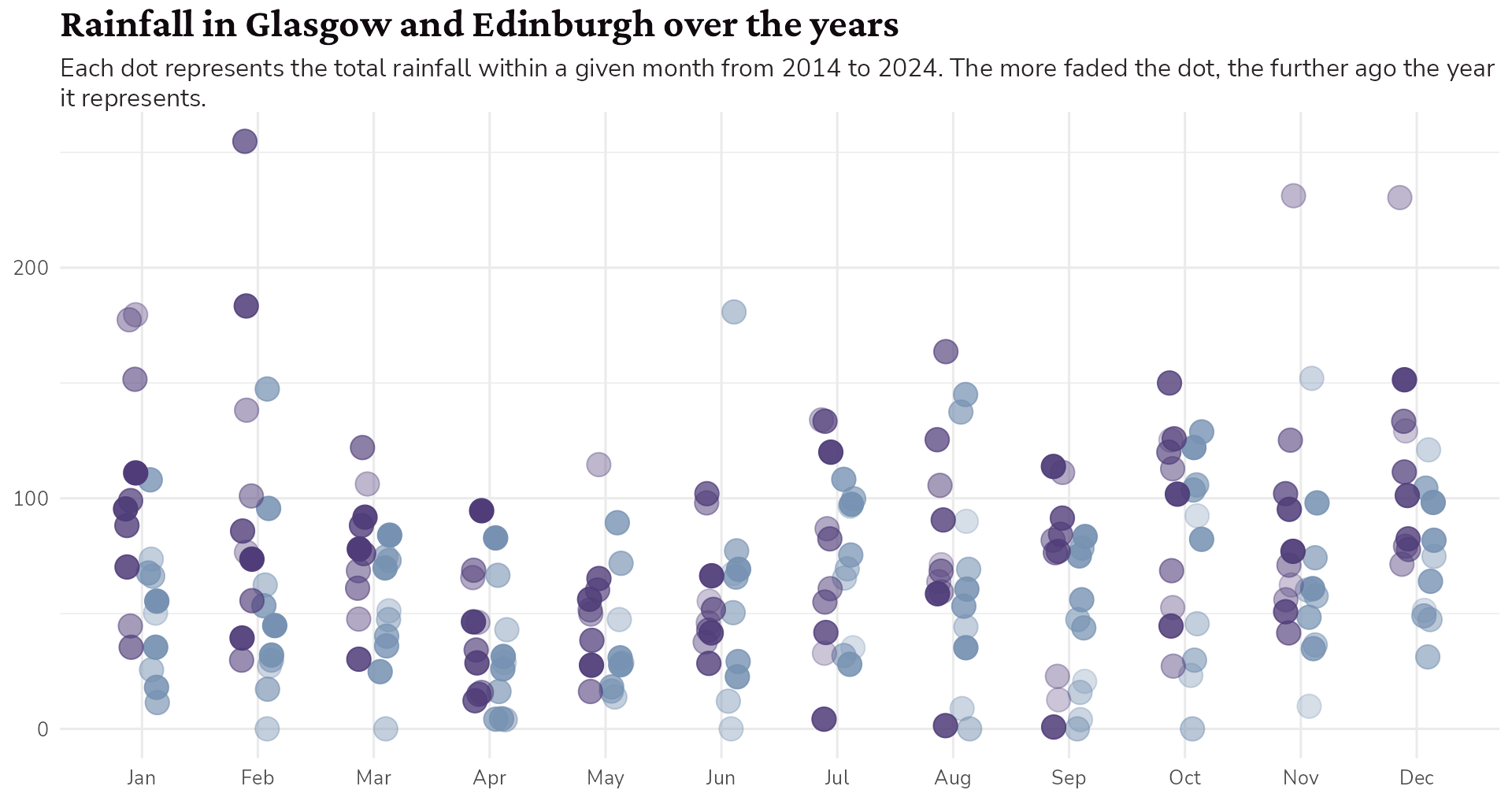
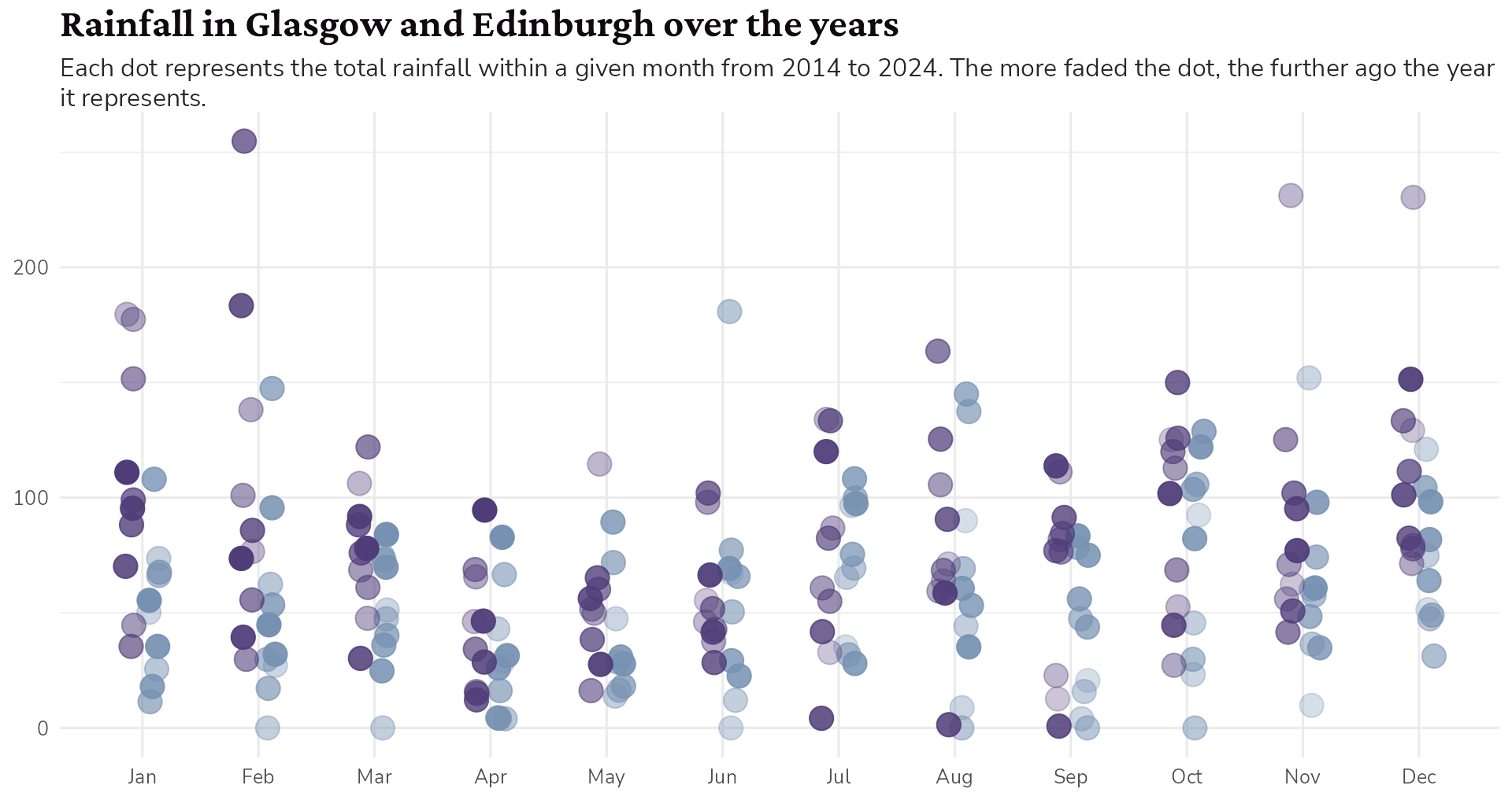
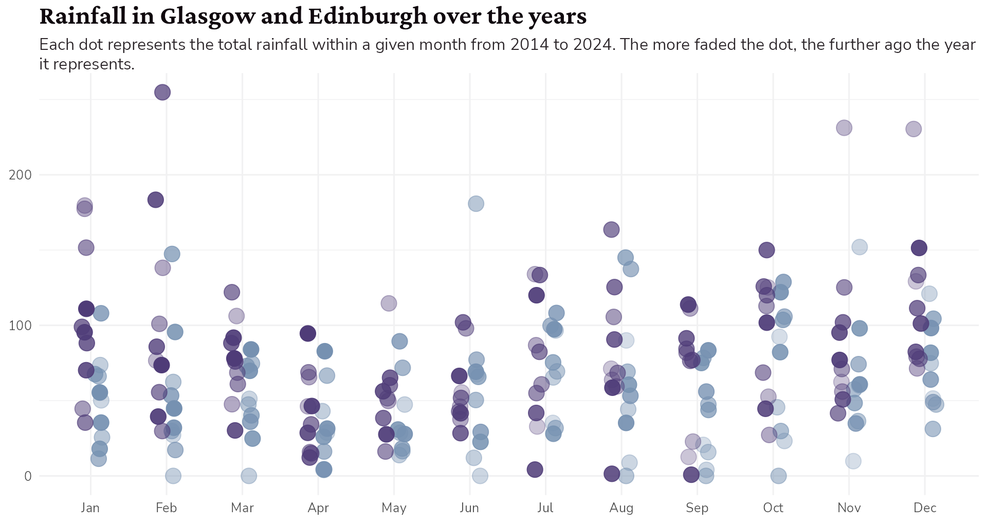
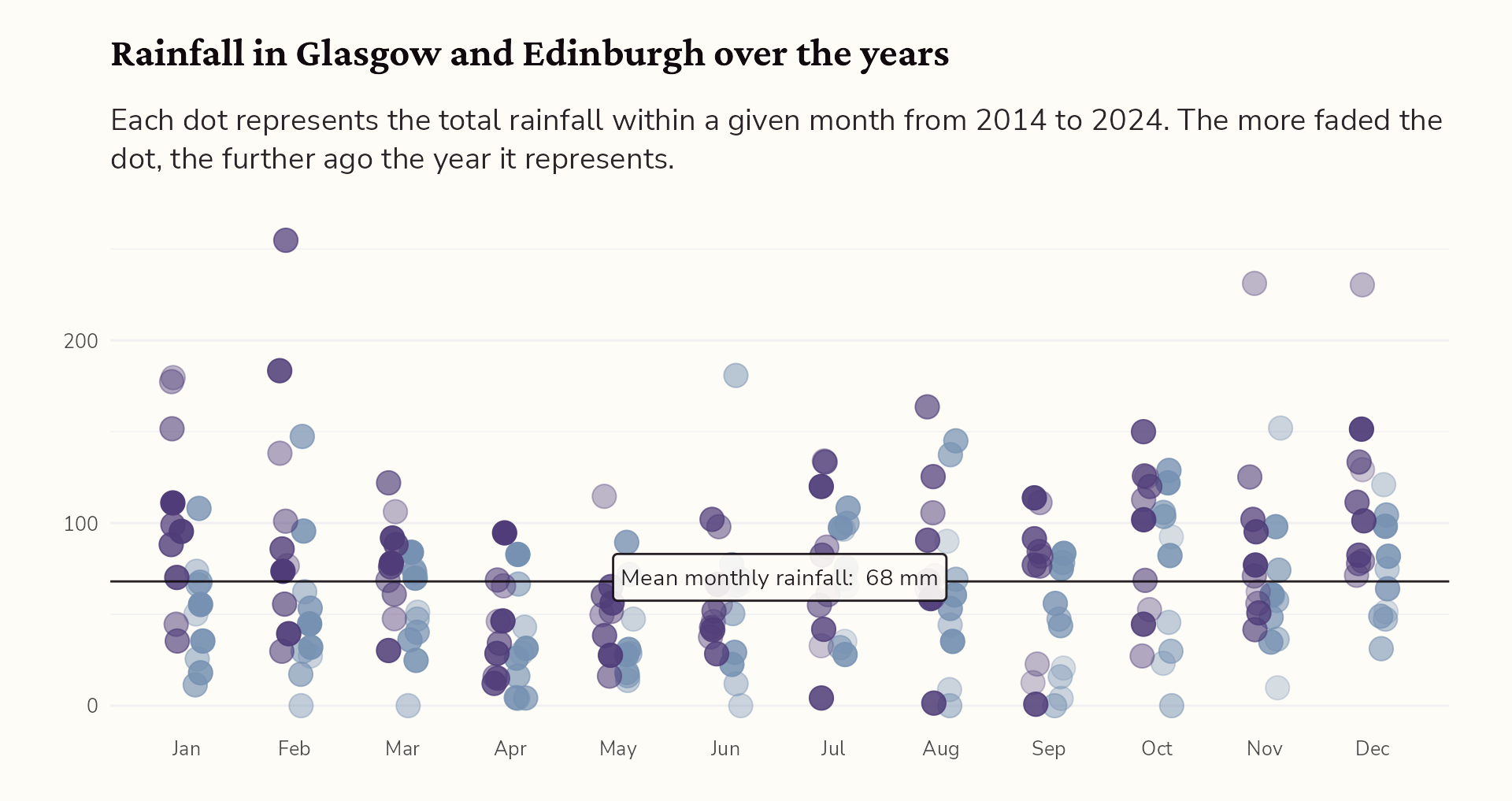
Hello, {ggiraph}!
rain_data |>
  ggplot() +
  ggiraph::geom_jitter_interactive(
    aes(x = dplyr::case_when(city == "Glasgow" ~ as.numeric(month) - 0.1,
                             TRUE ~ as.numeric(month) + 0.1),
        y = Value,
        colour = city,
        alpha = year),
    size = 5,
    width = 0.05,
    height = 0) +
  labs(title = "Rainfall in <span style='color:#4f3c78'>Glasgow</span> and <span style='color:#7691b1'>Edinburgh</span> over the years",
       subtitle = "Each dot represents the total rainfall within a given month from 2014 to 2024. The more faded the dot, the further ago the year it represents.") +
  scale_alpha(range = c(0.3, 1)) +
  scale_x_continuous(breaks = c(1:12), minor_breaks = NULL,
                     labels = month.abb[1:12]) +
  scale_colour_manual(values = c("Glasgow" = "#4f3c78",
                                 "Edinburgh" = "#7691b1")) +
  theme_minimal() +
  theme(axis.title = element_blank(),
        legend.position = "none") +
  ophelia::theme_ophelia() +
  theme(text = element_text(family = "Nunito Sans",
                            colour = "#2B2529"),
        axis.title = element_blank(),
        legend.position = "none",
        plot.title = element_text(family = "Crimson Pro",
                                  face = "bold",
                                  colour = "#10090E",
                                  size = rel(1.6)),
        plot.subtitle = ggtext::element_textbox_simple(
          size = ggplot2::rel(1.2),
          lineheight = 1.3,
          margin = ggplot2::margin(10, 0, 20, 0,
                                   unit = "points")),
        panel.grid = element_line(colour = "#F1F1F2"),
        panel.grid.major.x = element_blank(),
        plot.background = element_rect(colour = "#FEFCF7",
                                       fill = "#FEFCF7"),
        plot.margin = ggplot2::margin(20, 30, 20, 30,
                                      unit = "points"))

ggiraph::girafe(ggobj = interactive_version)
#5 Go interactive!
Hello, {ggiraph}!
#5 Go interactive!
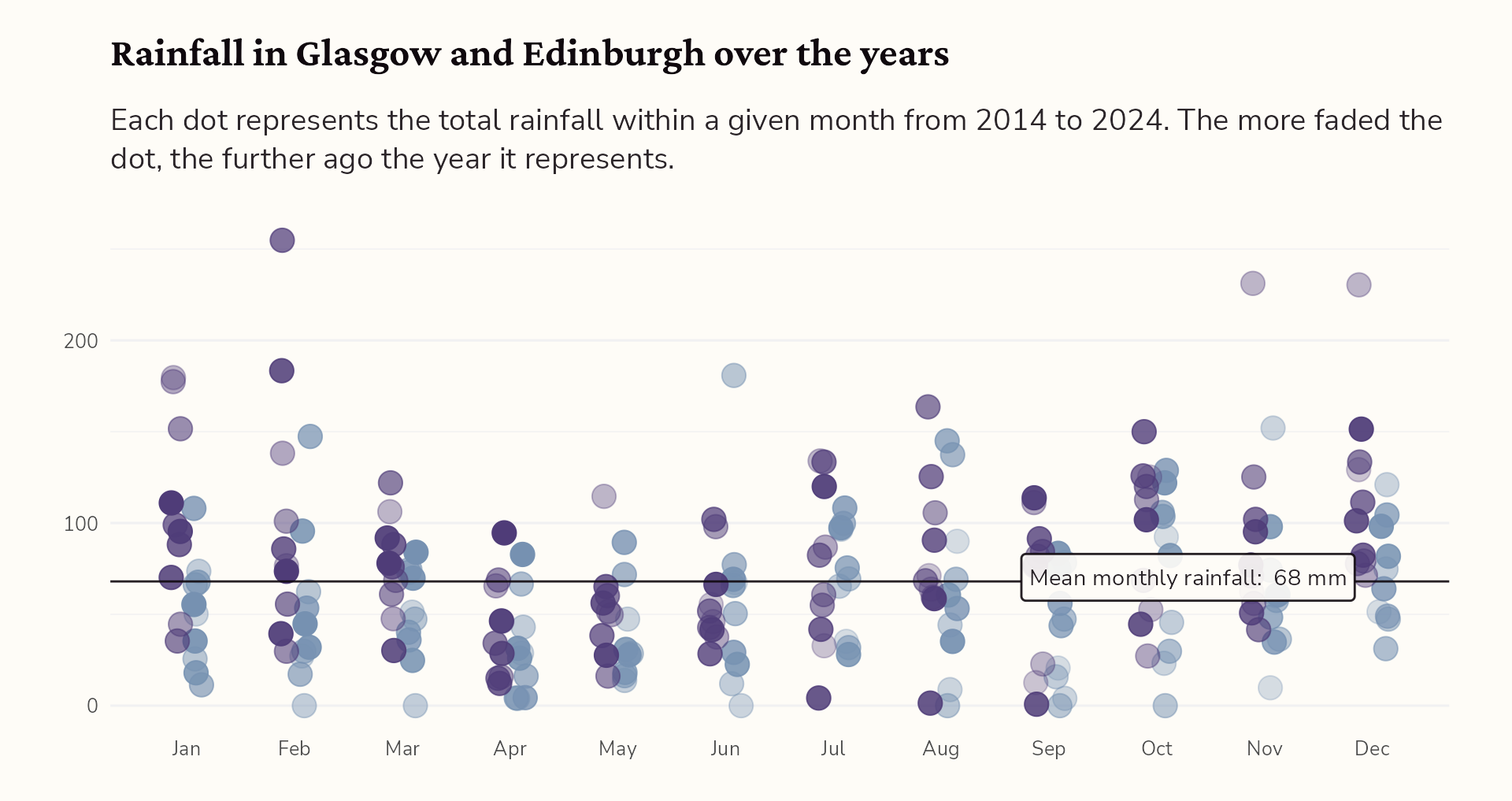
Style the tooltip…
From alright to all ready to publish
From alright to all ready to publish
From alright to all ready to publish
From alright to all ready to publish
From alright to all ready to publish
hello@cararthompson.comcararthompson.com/talks
Resources
Choosing the right data visualisation
What would be missing if this visualisation wasn’t included? How would you tell this story to someone over coffee? How can you replicate that story in the way you present the information?
- The datavisualisation catalogue allows you to explore different types of visualisations, read about their strengths and weaknesses, and follow links for tutorials and online tools
- For tutorials on creating different types of visualisations in Python, R and D3: data-to-viz.com
- Allison Horst’s blog post on lesser used dataviz options
- For inspiration, keep an eye out for #30DayChartChallenge and #TidyTuesday on social media
Building a colour palette
What do your colours represent? Do they look nice together? Do you need to tweak them so that they look “on brand”?
- Extracting colours from images: imagecolorpicker.com
- Creating palettes from scratch: paletton.com
- Blending colours: monochromeR
- Generally great advice on colours in dataviz: Datawrapper blog post on colours for dataviz style guides
Checking colours for accessibility
Is enough of dark-to-light variation between your colours? Have you used slightly blended colours? Have you run them through an colourblindness simulator?
- Colour palette checker: vis4.net/palettes
- Colour blindness simulator with pre-generated graphs: susielu.com/data-viz/viz-palette
- Colour blindness simulator where you can upload your own image: Dalton Lens
Typography resources
What kind of personality do you want to convey through the font? Have you checked it is legible in small print for all users? Have you checked the contrast between the text colour and the background colour?
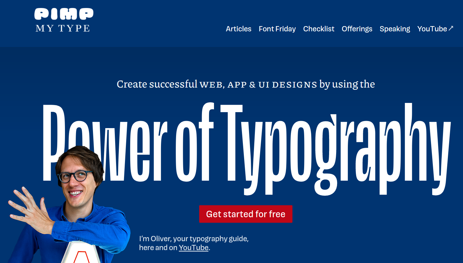
- Font inspiration: pimpmytype.com
- A talk I gave recently on making the most of text in dataviz: Ten tips for better text
- Google fonts
Data-to-viz workflow
Curate a set of data visualisation types that you know your users find helpful. If you are looking to automate your colours and fonts, there are a few tools at your disposal.
- Creating default Excel colour palettes and text styles
- Creating and making use of styles with figma.com - Figma is a free online tool
- I enjoy creating Dataviz Design Systems which can be either tool agnostic or implemented as an R package to change graphs from a basic ggplot to a ready-to-publish one.
From alright to all ready to publish
hello@cararthompson.comcararthompson.com/talks
