bake_off_plot <- function(plot_data = all_the_bakes) {
tibble(
component = c("Chocolate",
"Raspberry",
"Génoise or Sponge",
"Rhubarb"),
count = c(sum(grepl("chocolat", plot_data)),
sum(grepl("raspberr", plot_data)),
sum(grepl("sponge|genoise|génoise", plot_data)),
sum(grepl("rhubarb", plot_data)))
) %>%
arrange(count) %>%
mutate(component = factor(component,
levels = component)) %>%
ggplot(aes(x = component,
y = count,
fill = component,
colour = component)) +
geom_bar(stat = "identity",
colour = "white") +
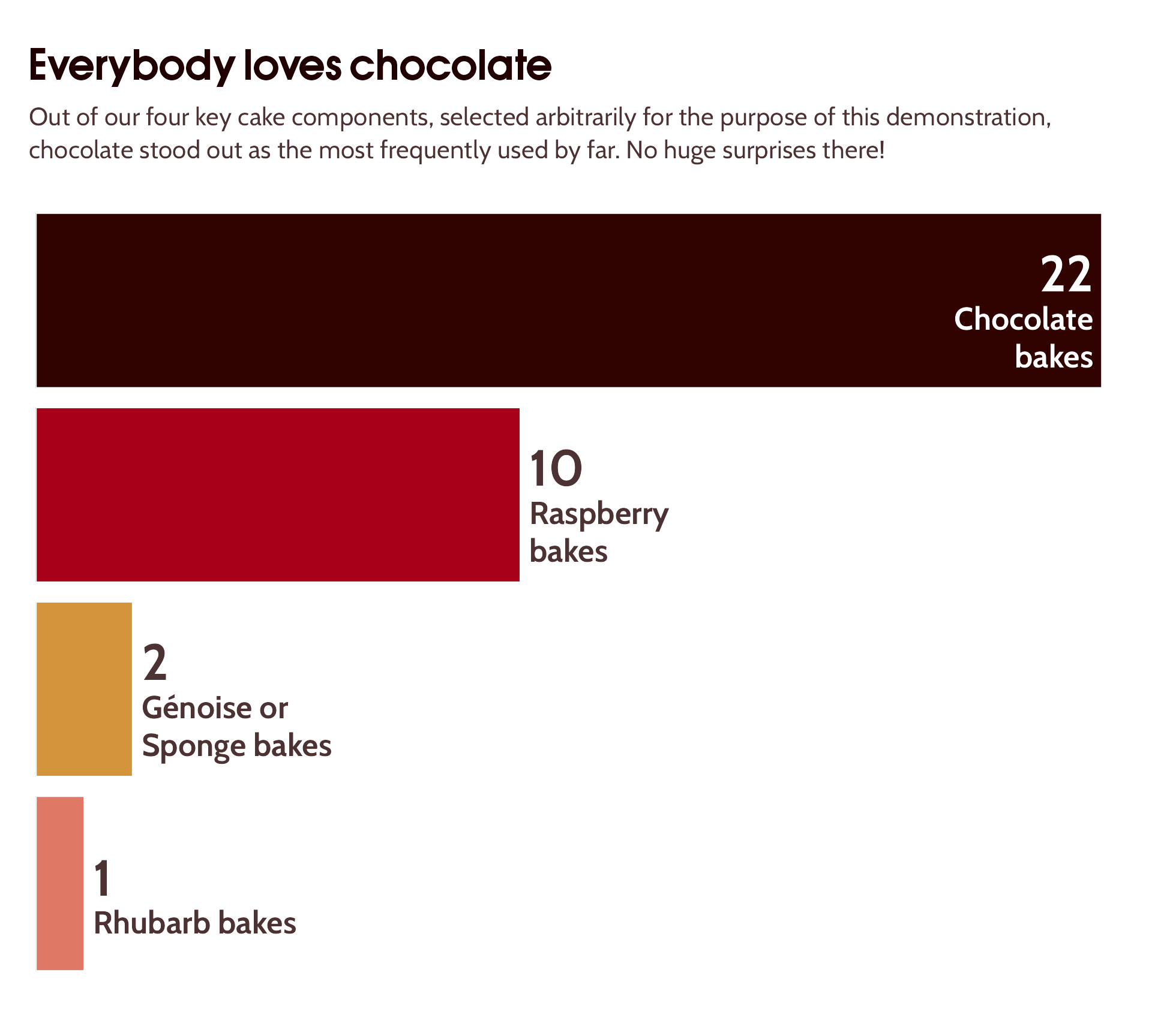
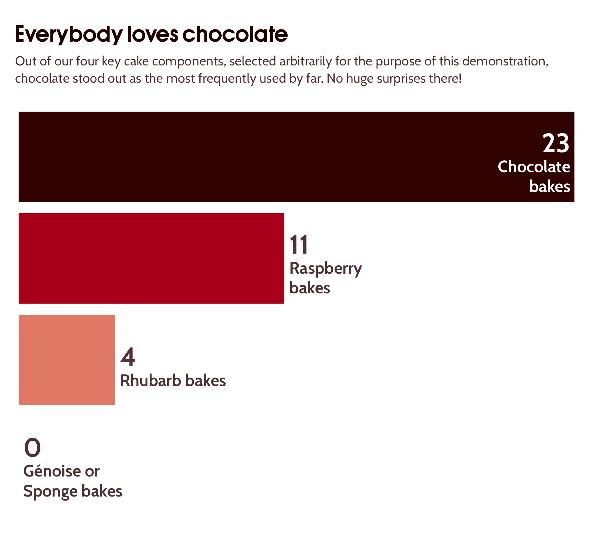
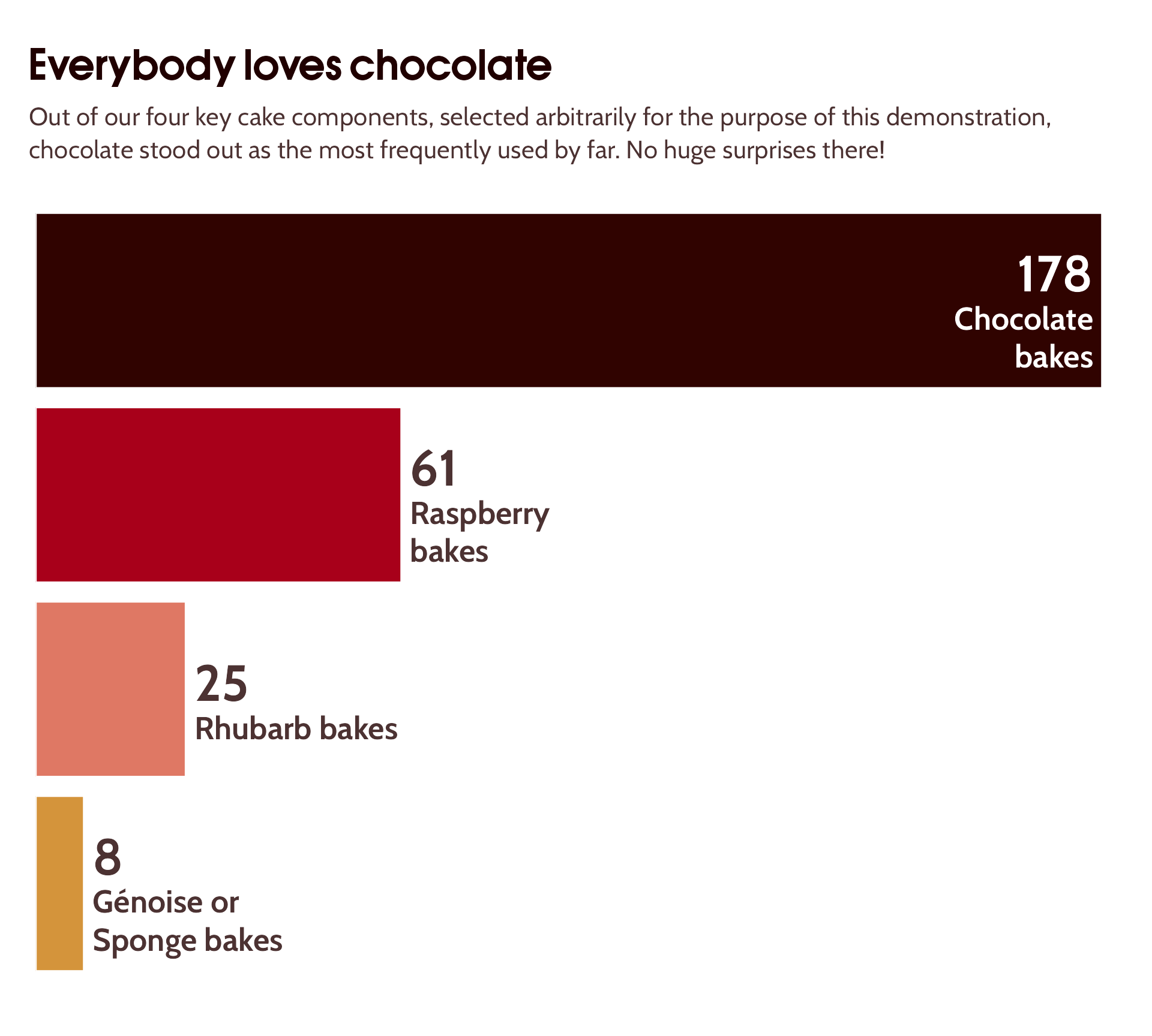
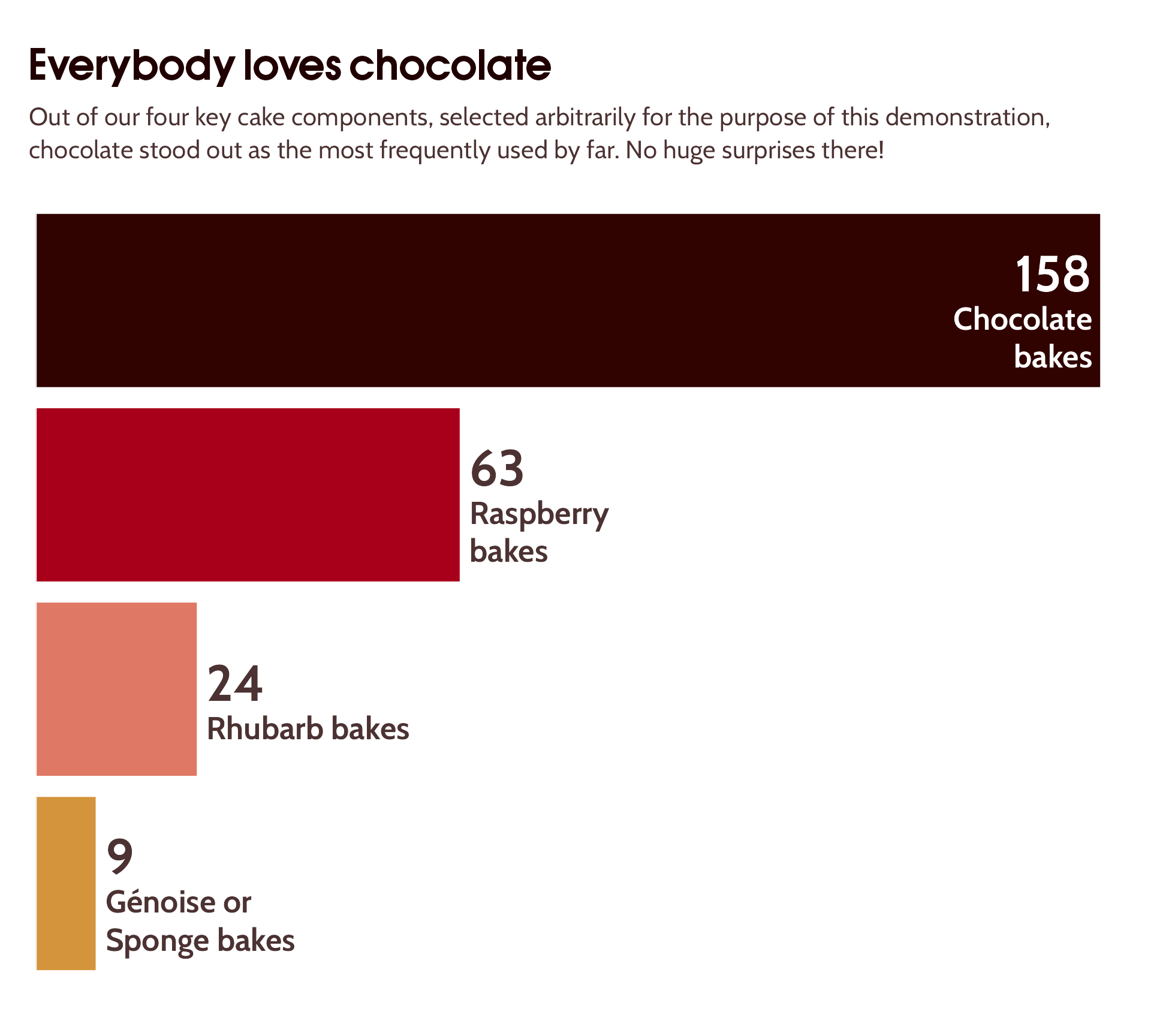
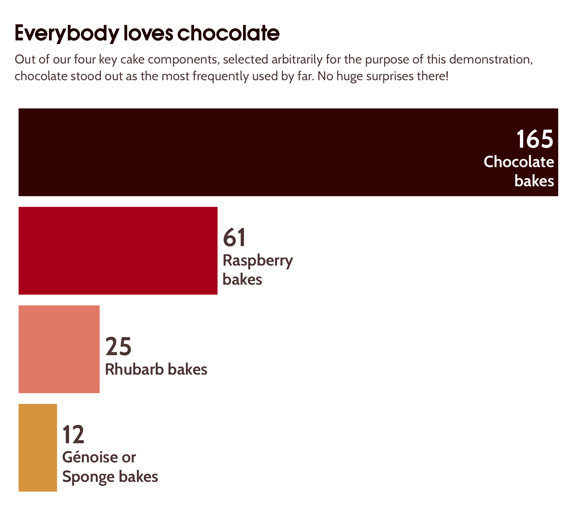
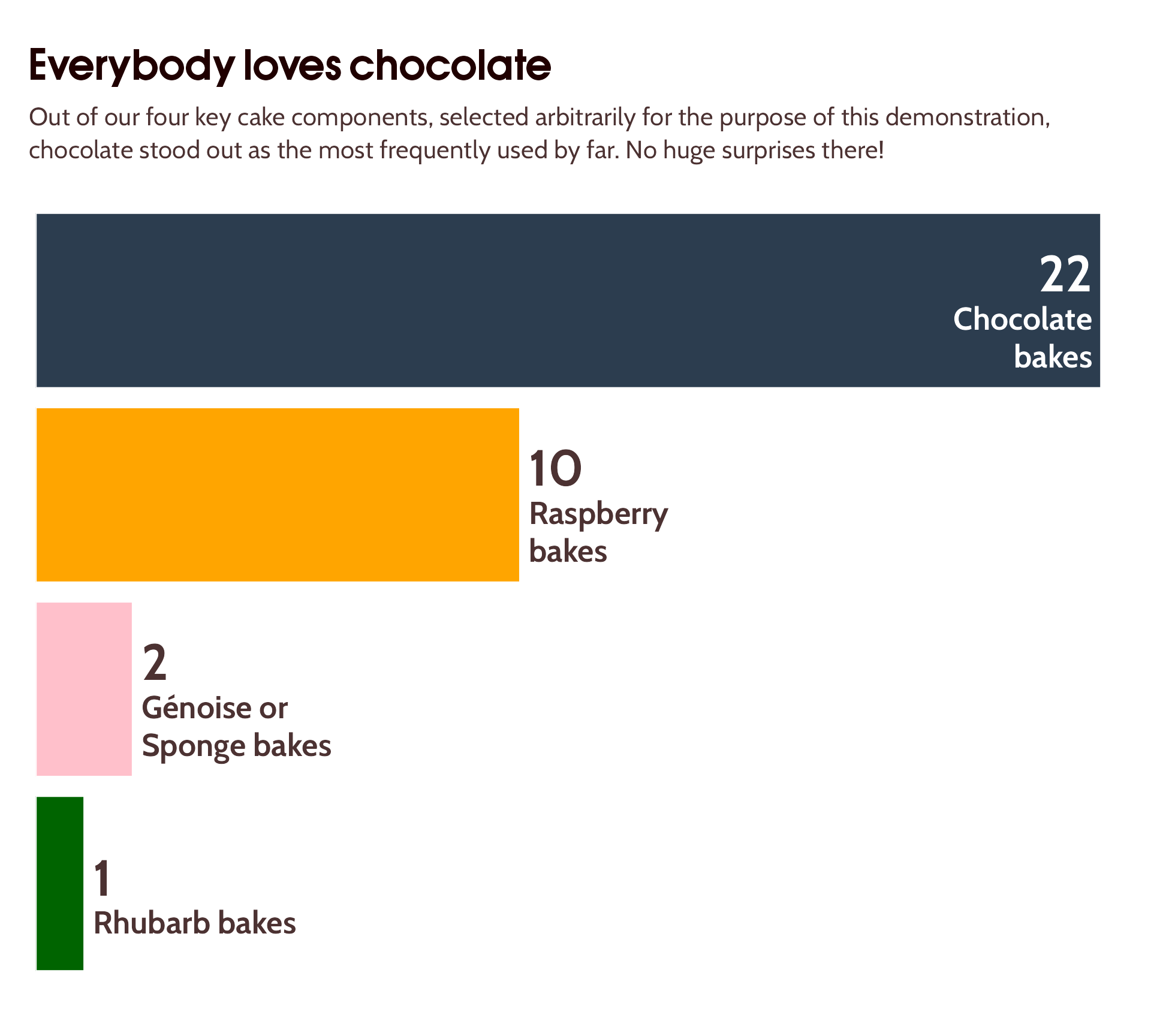
labs(title = "Everybody loves chocolate",
subtitle = "Out of our four key cake components, selected arbitrarily for the purpose of this demonstration, chocolate stood out as the most frequently used by far. No huge surprises there!",
y = "Number of bakes") +
theme_minimal(base_size = 18) +
coord_flip() +
scale_fill_manual(values = component_colours) +
scale_y_continuous(expand = expansion(c(0, 0.02))) +
ggtext::geom_textbox(aes(label = paste0("<span style='font-size:32pt'><br>",
count,
"<br></span>",
component, " bakes"),
hjust = case_when(count < max(count)/2 ~ 0,
TRUE ~ 1),
halign = case_when(count < max(count)/2 ~ 0,
TRUE ~ 1),
colour = case_when(count < max(count)/2 ~ "#4C3232",
TRUE ~ "white")),
vjust = 0.45,
size = 7,
fill = NA,
family = "Cabin",
box.colour = NA,
fontface = "bold") +
scale_colour_identity() +
theme(text = element_text(family = "Cabin",
size = 12,
colour = "#4C3232"),
legend.position = "none",
axis.title.y = element_blank(),
plot.title = element_text(family = "OPTIAuvantGothic-DemiBold",
size = 24,
face = "bold",
colour = "#200000",
margin = margin(12, 0, 12, 0)),
axis.text = element_text(colour = "#4C3232"),
axis.text.y = element_blank(),
plot.title.position = "plot",
axis.text.x = element_blank(),
axis.title.x = element_blank(),
panel.grid = element_blank(),
plot.margin = margin(rep(18, 4)),
plot.subtitle = ggtext::element_textbox_simple(
size = 16,
vjust = 1,
margin = margin(0, 0, 12, 0),
lineheight = 1.3))
}“So much more than pretty graphs”
Recent adventures in automating dataviz solutions
Cara Thompson | Building Stories with Data
The Data Lab Community | Women in Data & Ai Meetup
29th Feb 2024
Ok, but how?
Dataviz Training & Mentoring
with R or tool-agnostic
Dataviz Design Systems
implemented in R otherwise
Data-to-viz Commissions
incl. “parameterised” plots

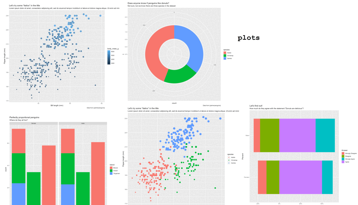
Data-to-viz


Data-to-viz


Data-to-viz

Data-to-viz
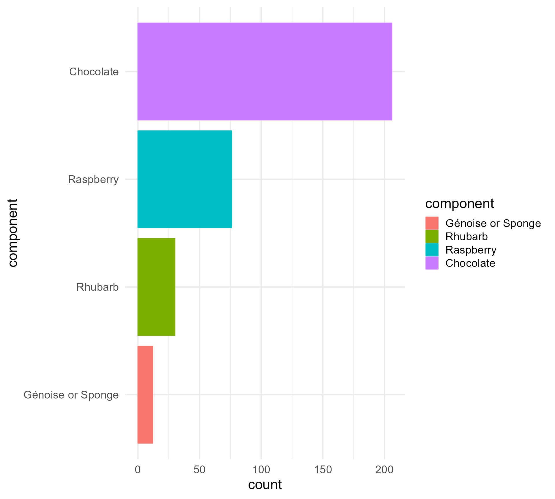
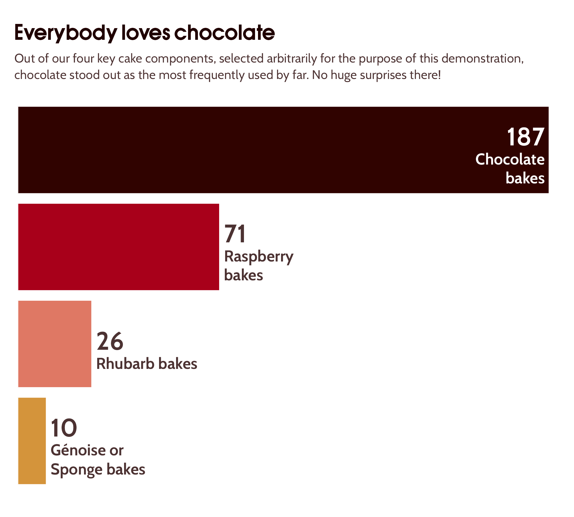
I ❤️ the Great British Bake Off - {bakeoff}
Data-to-viz
Let’s add some annotations and make it easier to read…
key_components %>%
arrange(count) %>%
mutate(component = factor(component,
levels = component)) %>%
ggplot(aes(x = component,
y = count,
fill = component,
colour = "white")) +
geom_bar(stat = "identity") +
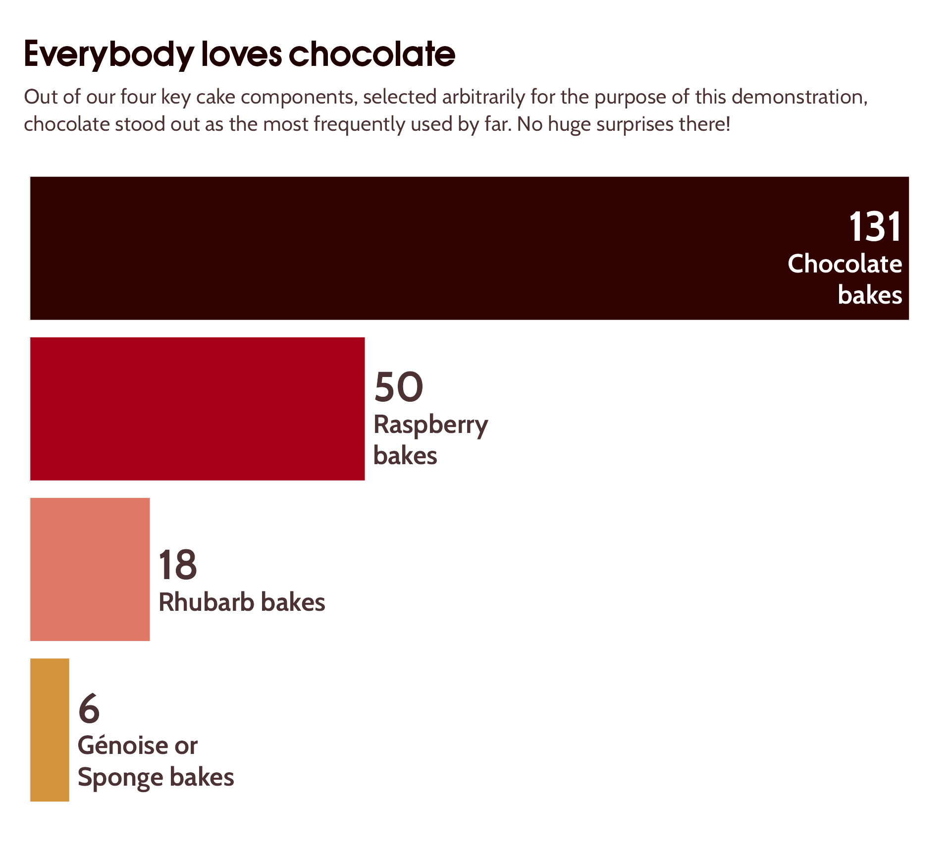
labs(title = "Everybody loves chocolate",
subtitle = "Out of our four key cake components, selected arbitrarily for the purpose of this demonstration, chocolate stood out as the most frequently used by far. No huge surprises there!",
y = "Number of bakes") +
theme_minimal(base_size = 18) +
coord_flip() +
theme(text = element_text(size = 12,
colour = "#4C3232"),
legend.position = "none",
axis.title.y = element_blank(),
plot.subtitle = ggtext::element_textbox_simple(size = 16,
vjust = 1,
margin = margin(0, 0, 12, 0)),
plot.title = element_text(size = 24,
face = "bold",
colour = "#200000",
margin = margin(12, 0, 12, 0)),
axis.text = element_text(colour = "#4C3232")) +
scale_y_continuous(expand = expansion(c(0, 0.02))) +
ggtext::geom_textbox(aes(label = paste0("<span style='font-size:32pt'><br>",
count,
"<br></span>",
component, " bakes"),
hjust = case_when(count < max(count)/2 ~ 0,
TRUE ~ 1),
halign = case_when(count < max(count)/2 ~ 0,
TRUE ~ 1),
colour = case_when(count < max(count)/2 ~ "#4C3232",
TRUE ~ "white")),
vjust = 0.45,
size = 7,
fill = NA,
box.colour = NA,
fontface = "bold") +
scale_colour_identity() +
theme(axis.text.y = element_blank(),
plot.title.position = "plot",
axis.text.x = element_blank(),
axis.title.x = element_blank(),
panel.grid = element_blank())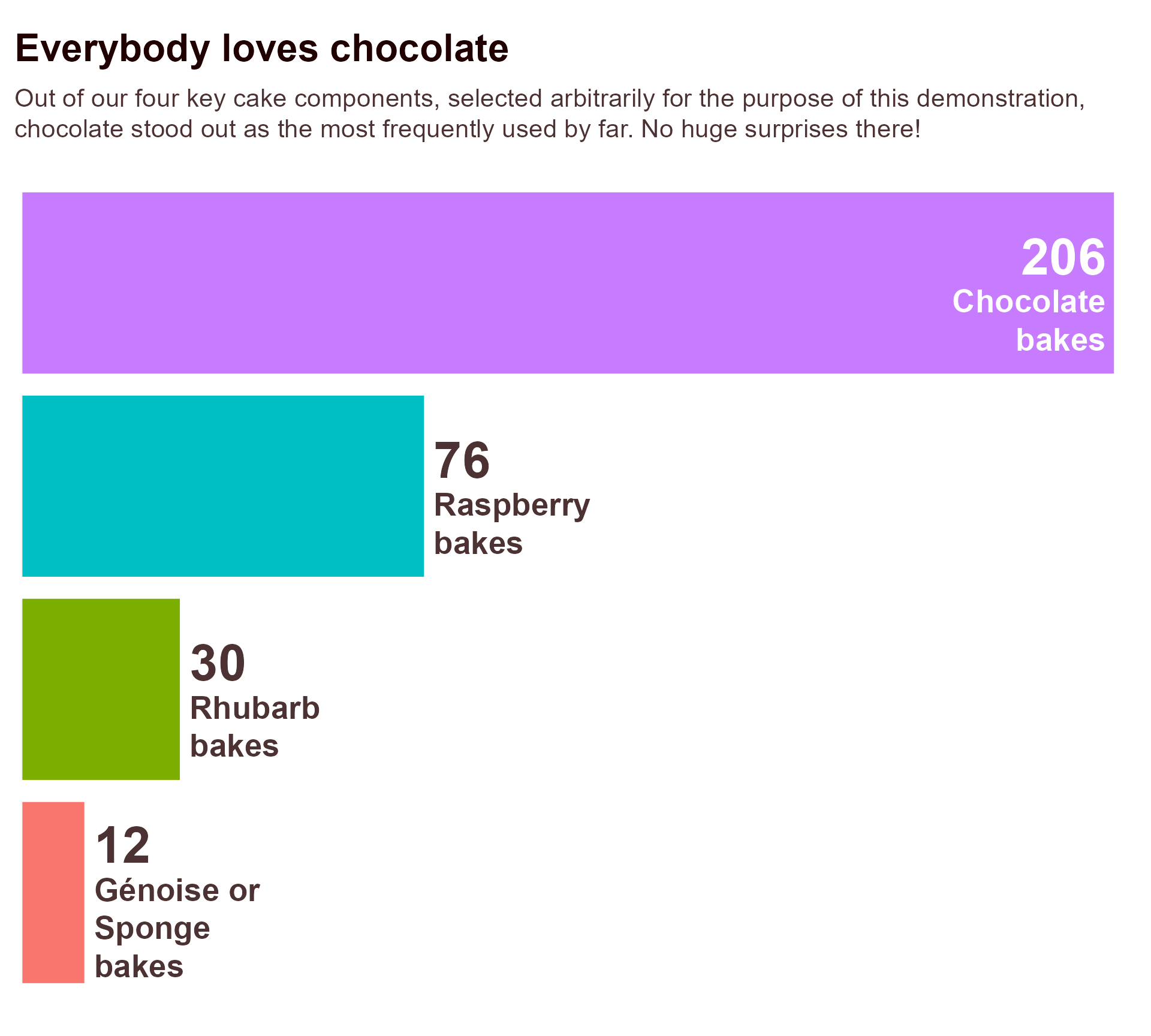
Data-to-viz
Let’s add some more meaningful colours, and a bit of personality…
component_colours <- c("Chocolate" = "#300300",
"Raspberry" = "#a8001a",
"Génoise or Sponge" = "#d4943b",
"Rhubarb" = "#df7864")
key_components %>%
arrange(count) %>%
mutate(component = factor(component,
levels = component)) %>%
ggplot(aes(x = component,
y = count,
fill = component,
colour = component)) +
geom_bar(stat = "identity",
colour = "white") +
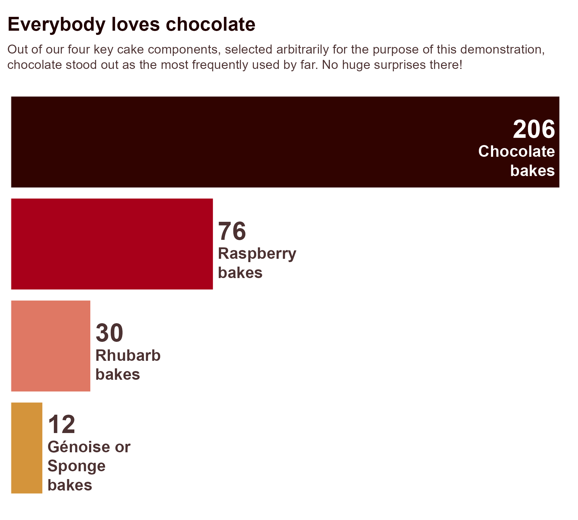
labs(title = "Everybody loves chocolate",
subtitle = "Out of our four key cake components, selected arbitrarily for the purpose of this demonstration, chocolate stood out as the most frequently used by far. No huge surprises there!",
y = "Number of bakes") +
theme_minimal(base_size = 18) +
coord_flip() +
scale_fill_manual(values = component_colours) +
scale_y_continuous(expand = expansion(c(0, 0.02))) +
ggtext::geom_textbox(aes(label = paste0("<span style='font-size:32pt'><br>",
count,
"<br></span>",
component, " bakes"),
hjust = case_when(count < max(count)/2 ~ 0,
TRUE ~ 1),
halign = case_when(count < max(count)/2 ~ 0,
TRUE ~ 1),
colour = case_when(count < max(count)/2 ~ "#4C3232",
TRUE ~ "white")),
vjust = 0.45,
size = 7,
fill = NA,
family = "Cabin",
box.colour = NA,
fontface = "bold") +
scale_colour_identity() +
theme(text = element_text(family = "Cabin",
size = 12,
colour = "#4C3232"),
legend.position = "none",
axis.title.y = element_blank(),
plot.title = element_text(family = "OPTIAuvantGothic-DemiBold",
size = 24,
face = "bold",
colour = "#200000",
margin = margin(12, 0, 12, 0)),
axis.text = element_text(colour = "#4C3232"),
axis.text.y = element_blank(),
plot.title.position = "plot",
axis.text.x = element_blank(),
axis.title.x = element_blank(),
panel.grid = element_blank(),
plot.margin = margin(rep(18, 4)),
plot.subtitle = ggtext::element_textbox_simple(
size = 16,
vjust = 1,
margin = margin(0, 0, 12, 0),
lineheight = 1.3))
Data-to-viz
And now, let’s turn it into a data-to-viz function!

Wait but why?


Wait but why?
Wait but why?
Parameterised plots
What if we exclude specific seasons of the Bake Off…?
Parameterised plots
What if we exclude specific seasons of the Bake Off…?

Parameterised plots
What if we exclude specific seasons of the Bake Off…?
Parameterised plots
What if we exclude specific seasons of the Bake Off…?


Parameterised plots
Dataviz Design System
A decision-making shortcut
![]()
Dataviz Design System
A decision-making shortcut
- What kind of colours would you like to be associated with your project?
- How much personality would you like to convey in the fonts?
- What is the maximum number of colours you typically need in your visualisations?

Dataviz Design System
A decision-making shortcut
- Are there any key concepts you report on regularly for which we should create a colour-semantic pairing?
- What type of visualisations do you use a lot?
- Are there any brand guidelines we can build on?
Semantics

Semantics
Semantics

Semantics
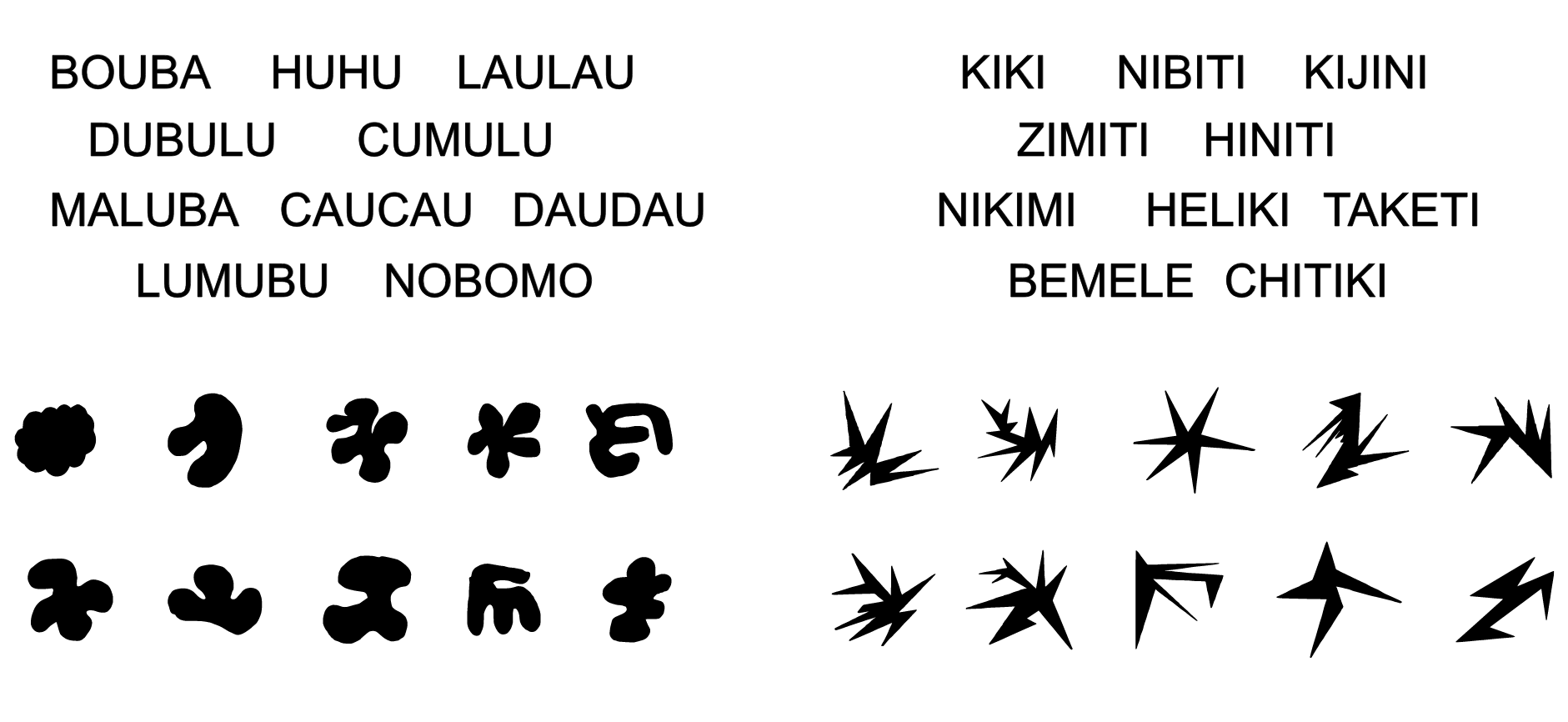
Which one is Kiki?

Semantics
Sound symbolism
Semantics
Which triangle is the happiest?

Brand colours / preferences
“Feminine but not too floral or sickly sweet…”
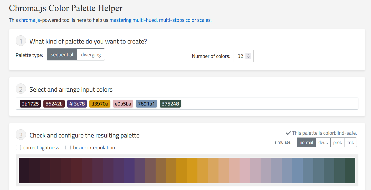
“I need about 20 colours…”
Semantics + branding
“Negative and positive, but not red and green”

Semantics + style + typography
Semantics + style + typography
Semantics + style + typography
Decision making shortcut
Semantics + style + typography + parameterisation
Quarto / Powerpoint templates
Dataviz Design System
Quarto / Powerpoint templates
Slides!
PowerBI Dashboards
Dataviz Design System
PowerBI Dashboards ❤️ Accidental Elmer
Dashboards!
Yes, before the end of the pipeline!
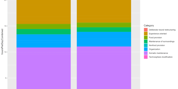
- Forces you to think carefully about what data you’ll collect
- Easily keep an eye on things as they develop
- Quickly present memorable graphs to internal stakeholders
- Was that Rhubarb or Génoise at the bottom?
- Quick turnaround once we have all the data

More than just a time saver!
- Accessibility baked in from the start
- Unified aesthetic across internal memos and external publications
- Brand recognition
- No more procrastinating picking colours
- or creating squirrels illustrations…
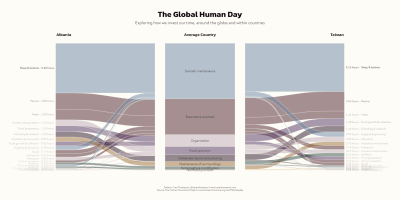
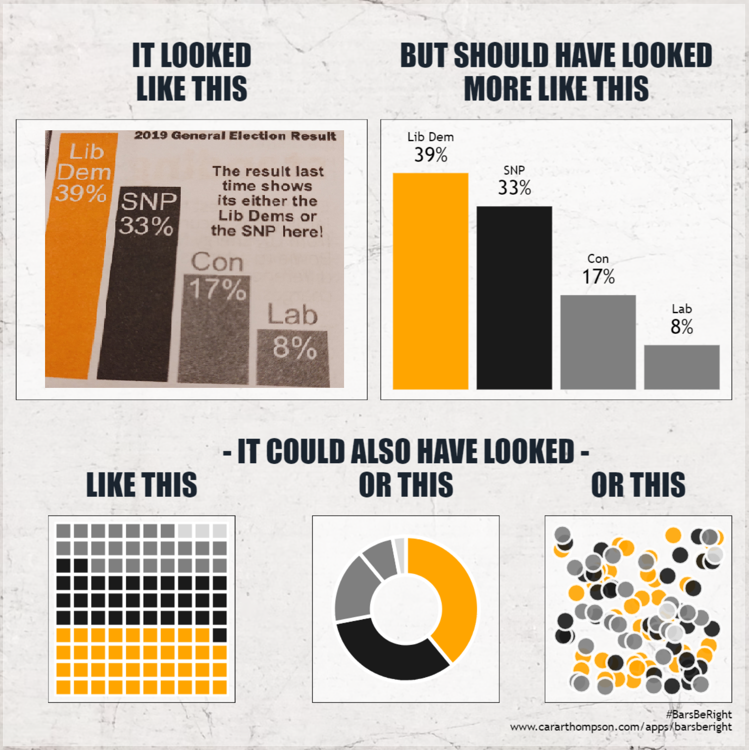
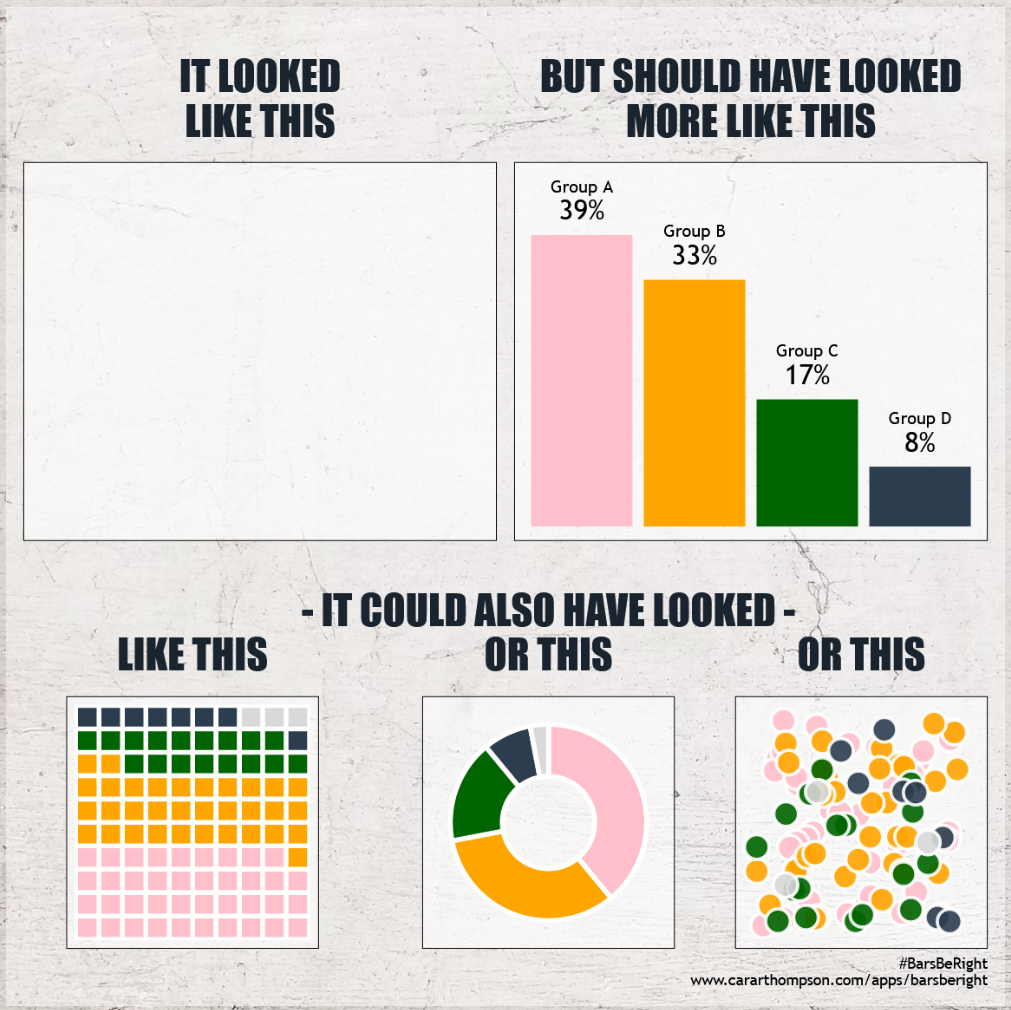
#BarsBeRight
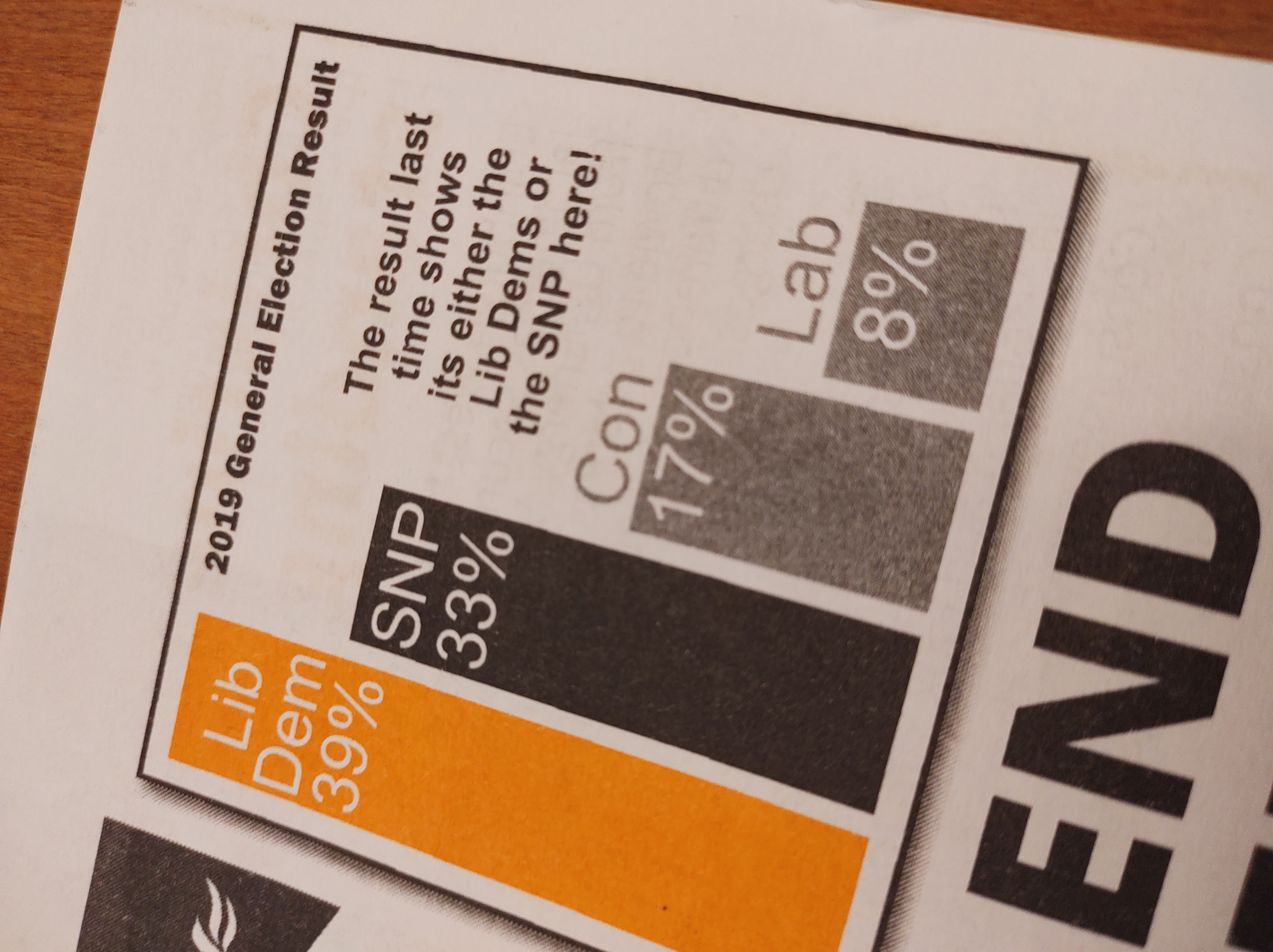
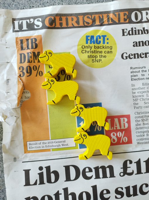
#BarsBeRight
What if…?
- there was an easier way of figuring this out
- that anyone could use
- so that we could check the accuracy of the bar lengths
- and also see what we might be missing by choosing bars
- and make use of the meme effect…
Wait a minute… WebR!
Styling
- The theme I created, which is applied to all the plots
theme_barsberight <- function(){
ggplot2::theme_void() +
ggplot2::theme(panel.background = ggplot2::element_rect(colour = "#000000", fill = "#FFFFFF95"),
plot.margin = ggplot2::unit(c(5, 5, 5, 5), "pt"),
# Using web safe fonts
plot.caption = ggplot2::element_text(family = "Trebuchet MS"),
plot.title = ggplot2::element_text(family = "Impact",
colour = "#1A242F",
size = 24,
hjust = 0.5,
margin = ggplot2::unit(c(20, 0, 12, 0), "pt")))
}
plot +
ggplot2::scale_fill_identity() +
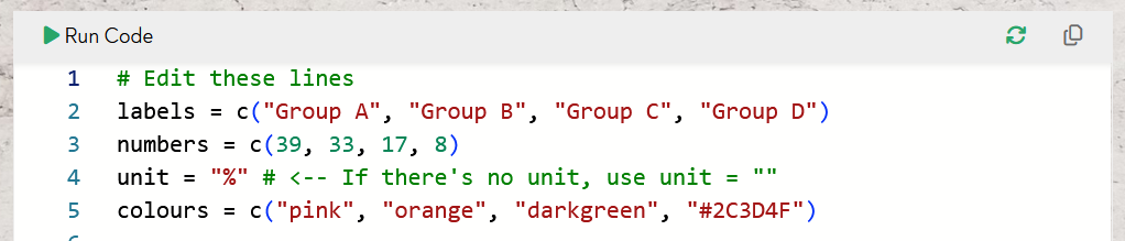
theme_barsberight()Parameterising the unknown
With all we’ve talked about, here’s the easy bit!
replace_data <- function() {
  dplyr::tibble(labels,
                numbers,
                unit,
                colours) |>
    # Getting everything to stay in the right order!
    dplyr::mutate(labels = factor(labels, levels = labels, ordered = TRUE))
}

theme_barsberight <- function() {
  # We looked at this earlier
}

make_graphs <- function(df = replace_data()) {
  # Create and assemble 5 plots,
  # making use of theme_barsberight()
  # for all of them!
}
Give it a go!
Having said all that…
It’s a win for Dataviz Design Systems!
Let’s chat!
- In person 😊
- hello@cararthompson.com


Let’s chat!
#BarsBeRight

Dataviz Design Questions

My Website

![]()