Beautifully reproducible dataviz
(mis)adventures in creating data-to-viz pipelines
Cara R Thompson | Building Stories with Data LTD
RPySOC 2025
I ❤️ parameterising dataviz
I ❤️ parameterising dataviz
“Could you just…?”


“Could you just…?”


“Et finalement… la dataviz!”
“It is possible to generate R code that you can paste into your script to consistently generate the same look.”
- Bruno Rodrigues, Building Reproducible Analytical Pipelines with R, p. 423
Ok… but is it?

“Can we use the new ggplot2 release…?”
No!
Yeeeessss…?
Axis limits
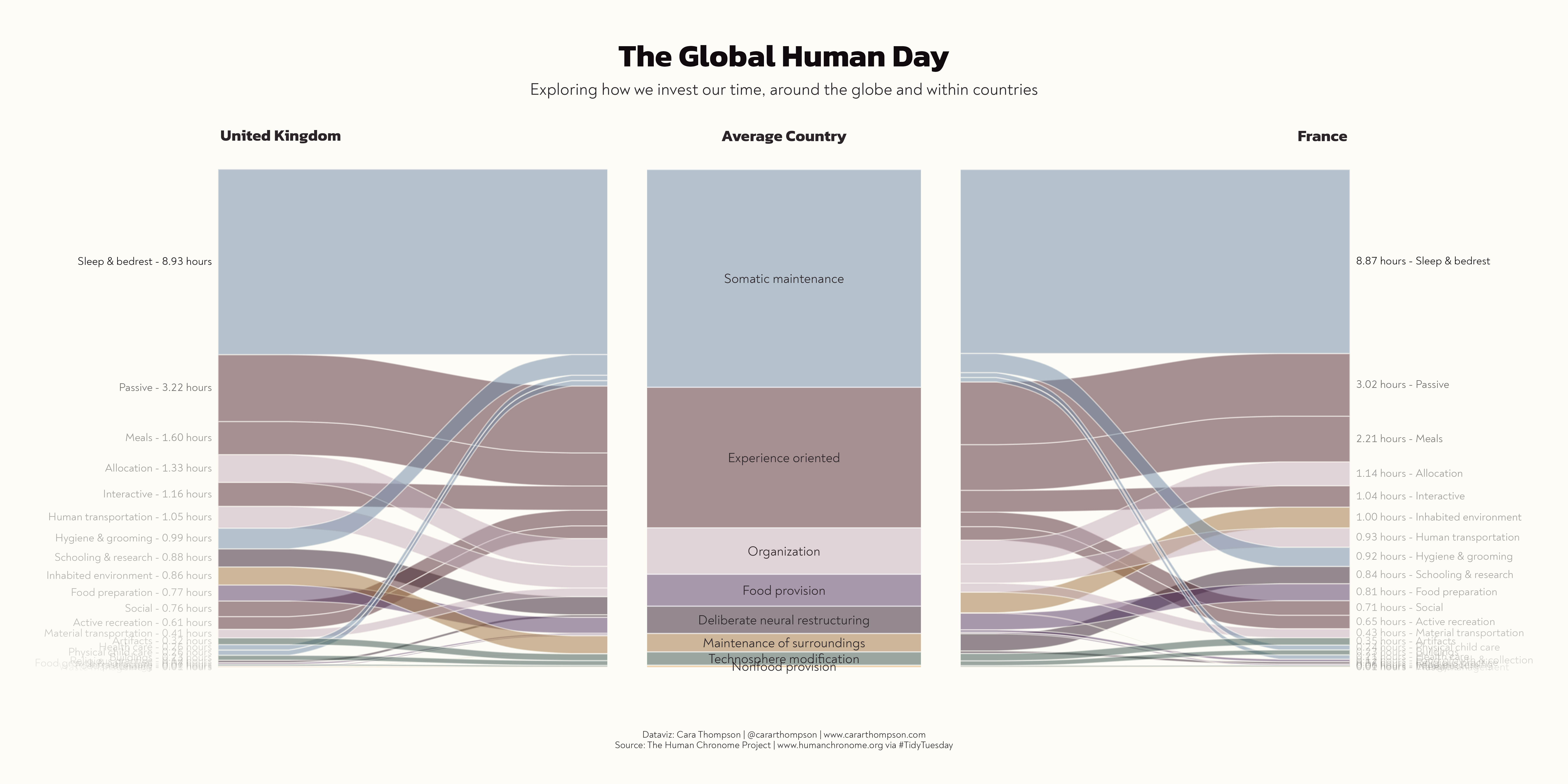
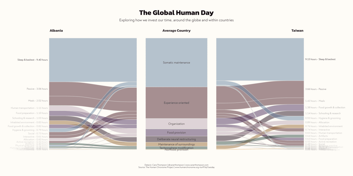
“We need all the plots to be easily comparable”

Axis limits
“We need all the plots to be easily comparable”
make_beak_plot <- function(
  df = penguin_df,
  colours = penguin_colours
) {
  beak_means_df <- df |>
    dplyr::group_by(species) |>
    dplyr::summarise(mean_length = mean(culmen_length_mm, na.rm = TRUE))

  beak_range_df <- df |>
    dplyr::filter(
      culmen_length_mm == max(culmen_length_mm, na.rm = TRUE) |
        culmen_length_mm == min(culmen_length_mm, na.rm = TRUE)
    )

  interactive_plot <- df |>
    ggplot(aes(x = culmen_length_mm, y = species)) +
    geom_vline(
      data = beak_range_df,
      aes(xintercept = culmen_length_mm),
      linetype = 3,
      colour = "#1A242F"
    ) +
    geom_segment(
      data = beak_means_df,
      aes(x = mean_length, xend = mean_length, y = -Inf, yend = species),
      linetype = 3
    ) +
    ggiraph::geom_jitter_interactive(
      aes(
        x = culmen_length_mm,
        y = species,
        fill = species,
        tooltip = paste0("<b>", individual_id, "</b> from ", island)
      ),
      shape = 21,
      width = 0,
      size = 8,
      height = 0.15,
      colour = "#1A242F",
      stroke = 0.5,
      alpha = 0.9
    ) +
    ggtext::geom_textbox(
      data = beak_range_df,
      aes(
        y = max(species),
        label = dplyr::case_when(
          culmen_length_mm == min(culmen_length_mm) ~
            paste0("🞀 ", culmen_length_mm, "mm"),
          TRUE ~ paste0(culmen_length_mm, "mm", " 🞂")
        ),
        hjust = dplyr::case_when(
          culmen_length_mm == min(culmen_length_mm) ~ 0,
          TRUE ~ 1
        ),
        halign = dplyr::case_when(
          culmen_length_mm == min(culmen_length_mm) ~ 0,
          TRUE ~ 1
        )
      ),
      family = "Work Sans",
      colour = "#1A242F",
      fontface = "bold",
      fill = NA,
      size = 8,
      box.padding = unit(0, "pt"),
      box.colour = NA,
      nudge_y = 0.33
    ) +
    ggtext::geom_textbox(
      data = beak_means_df,
      aes(
        x = mean_length,
        y = species,
        label = paste0(
          species,
          " mean<br>**",
          janitor::round_half_up(mean_length),
          "mm**"
        ),
        hjust = dplyr::case_when(mean_length > 45 ~ 1, .default = 0),
        halign = dplyr::case_when(mean_length > 45 ~ 1, .default = 0)
      ),
      nudge_y = -0.3,
      box.colour = NA,
      size = 6,
      family = "Work Sans",
      colour = "#1A242F",
      fill = NA
    ) +
    labs(title = "Beak lengths by species") +
    scale_fill_manual(values = colours) +
    scale_x_continuous(
      label = function(x) paste0(x, "mm"),
      limits = c(32, 60)
    ) +
    theme_penguins() +
    theme(axis.text.y = element_blank())

  ggiraph::girafe(
    ggobj = interactive_plot,
    options = list(ggiraph::opts_tooltip(
      css = "background-color:#1A242F;color:#F4F5F6;padding:7.5px;letter-spacing:0.025em;line-height:1.3;border-radius:5px;font-family:Work Sans;"
    )),
    height_svg = 9
  )
}
Axis limits
“We need all the plots to be easily comparable”

What’s going on with those labels?
Quick bug fix!
What’s going on with those labels?
Quick bug fix!
make_beak_plot <- function(
  df = penguin_df,
  colours = penguin_colours
) {
  beak_means_df <- df |>
    dplyr::group_by(species) |>
    dplyr::summarise(mean_length = mean(culmen_length_mm, na.rm = TRUE))

  beak_range_df <- df |>
    dplyr::filter(
      culmen_length_mm == max(culmen_length_mm, na.rm = TRUE) |
        culmen_length_mm == min(culmen_length_mm, na.rm = TRUE)
    )

  interactive_plot <- df |>
    ggplot(aes(x = culmen_length_mm, y = species)) +
    geom_vline(
      data = beak_range_df,
      aes(xintercept = culmen_length_mm),
      linetype = 3,
      colour = "#1A242F"
    ) +
    geom_segment(
      data = beak_means_df,
      aes(x = mean_length, xend = mean_length, y = -Inf, yend = species),
      linetype = 3
    ) +
    ggiraph::geom_jitter_interactive(
      aes(
        x = culmen_length_mm,
        y = species,
        fill = species,
        tooltip = paste0("<b>", individual_id, "</b> from ", island)
      ),
      shape = 21,
      width = 0,
      size = 8,
      height = 0.15,
      colour = "#1A242F",
      stroke = 0.5,
      alpha = 0.9
    ) +
    ggtext::geom_textbox(
      data = beak_range_df,
      aes(
        # Used to be max(species), from the beak_range_df
        y = max(df$species),
        label = dplyr::case_when(
          culmen_length_mm == min(culmen_length_mm) ~
            paste0("🞀 ", culmen_length_mm, "mm"),
          TRUE ~ paste0(culmen_length_mm, "mm", " 🞂")
        ),
        hjust = dplyr::case_when(
          culmen_length_mm == min(culmen_length_mm) ~ 0,
          TRUE ~ 1
        ),
        halign = dplyr::case_when(
          culmen_length_mm == min(culmen_length_mm) ~ 0,
          TRUE ~ 1
        )
      ),
      family = "Work Sans",
      colour = "#1A242F",
      fontface = "bold",
      fill = NA,
      size = 8,
      box.padding = unit(0, "pt"),
      box.colour = NA,
      nudge_y = 0.33
    ) +
    ggtext::geom_textbox(
      data = beak_means_df,
      aes(
        x = mean_length,
        y = species,
        label = paste0(
          species,
          " mean<br>**",
          janitor::round_half_up(mean_length),
          "mm**"
        ),
        hjust = dplyr::case_when(mean_length > 45 ~ 1, .default = 0),
        halign = dplyr::case_when(mean_length > 45 ~ 1, .default = 0)
      ),
      nudge_y = -0.3,
      box.colour = NA,
      size = 6,
      family = "Work Sans",
      colour = "#1A242F",
      fill = NA
    ) +
    labs(title = "Beak lengths by species") +
    scale_fill_manual(values = colours) +
    scale_x_continuous(
      label = function(x) paste0(x, "mm"),
      limits = c(32, 60)
    ) +
    theme_penguins() +
    theme(axis.text.y = element_blank())

  ggiraph::girafe(
    ggobj = interactive_plot,
    options = list(ggiraph::opts_tooltip(
      css = "background-color:#1A242F;color:#F4F5F6;padding:7.5px;letter-spacing:0.025em;line-height:1.3;border-radius:5px;font-family:Work Sans;"
    )),
    height_svg = 9
  )
}
What’s going on with those labels?
Quick bug fix!
Colours
“The penguin species should in overall length order”

Colours
“The penguin species should in overall length order”
Colours
“The penguin species should in overall length order”
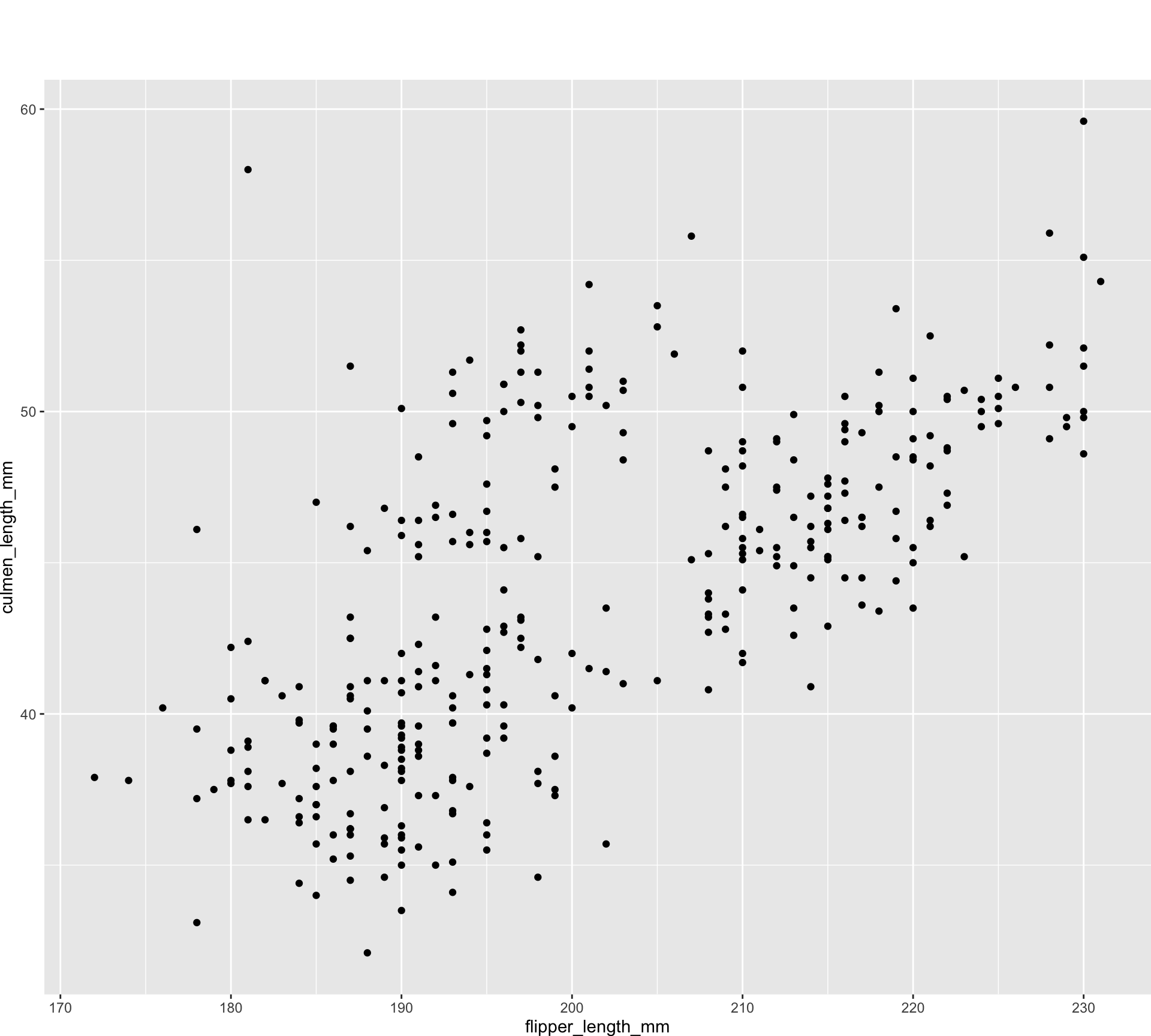
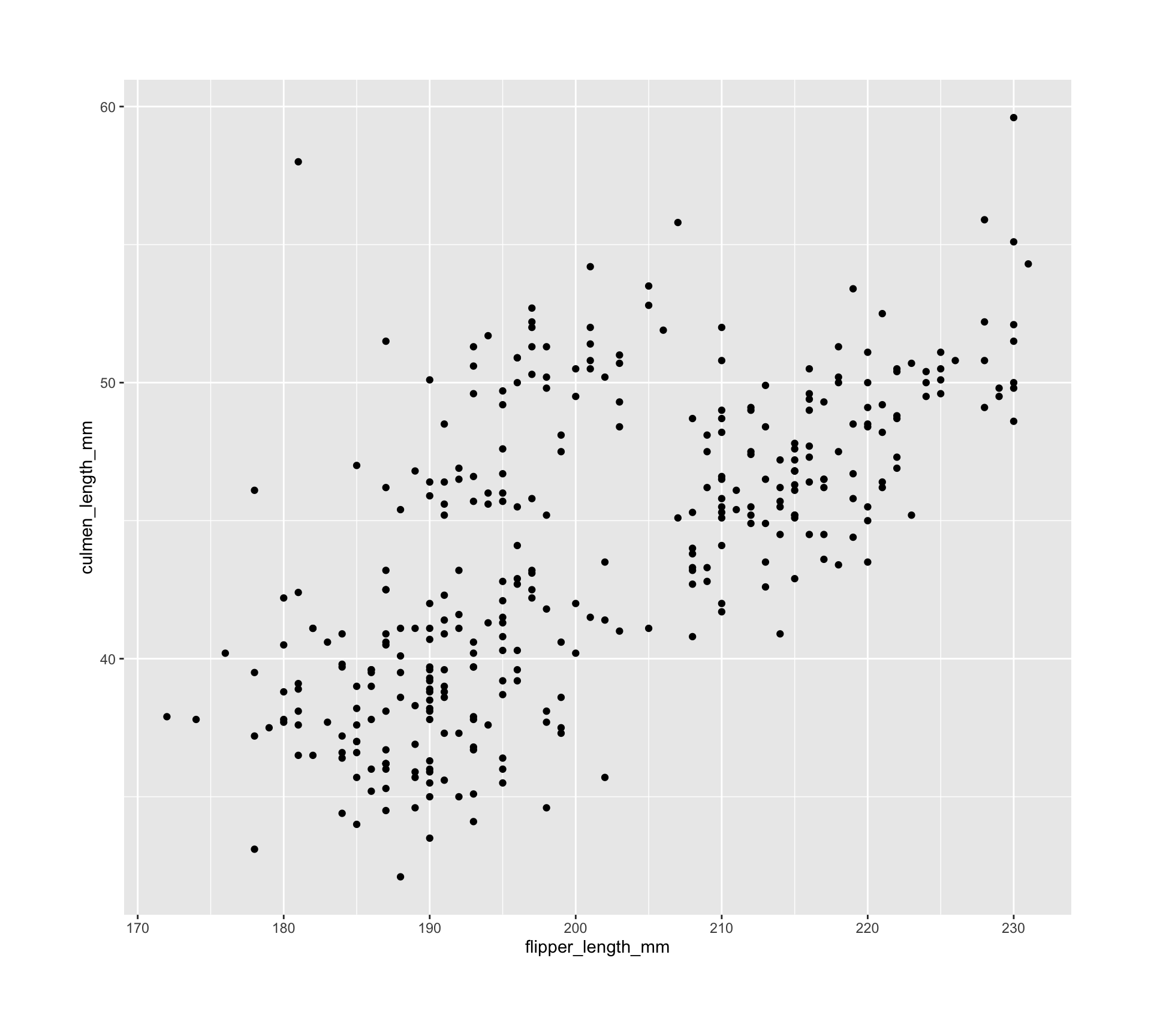
Why are the dots dancing around?
Jitter in geom_jitter or in the data?

Why are the dots dancing around?
Jitter in geom_jitter or in the data?
make_beak_plot <- function(
  df = penguin_df,
  colours = penguin_colours
) {
  beak_means_df <- df |>
    dplyr::group_by(species) |>
    dplyr::summarise(mean_length = mean(culmen_length_mm, na.rm = TRUE))

  beak_range_df <- df |>
    dplyr::filter(
      culmen_length_mm == max(culmen_length_mm, na.rm = TRUE) |
        culmen_length_mm == min(culmen_length_mm, na.rm = TRUE)
    )

  interactive_plot <- df |>
    ggplot(aes(x = culmen_length_mm, y = as.numeric(species))) +
    geom_vline(
      data = beak_range_df,
      aes(xintercept = culmen_length_mm),
      linetype = 3,
      colour = "#1A242F"
    ) +
    geom_segment(
      data = beak_means_df,
      aes(
        x = mean_length,
        xend = mean_length,
        y = -Inf,
        yend = as.numeric(species)
      ),
      linetype = 3
    ) +
    ggiraph::geom_point_interactive(
      aes(
        x = culmen_length_mm,
        y = as.numeric(species) + jitter_y,
        fill = species,
        tooltip = paste0("<b>", individual_id, "</b> from ", island)
      ),
      shape = 21,
      width = 0,
      size = 8,
      colour = "#1A242F",
      stroke = 0.5,
      alpha = 0.9
    ) +
    ggtext::geom_textbox(
      data = beak_range_df,
      aes(
        # Used to be max(species), from the beak_range_df
        y = max(as.numeric(df$species)),
        label = dplyr::case_when(
          culmen_length_mm == min(culmen_length_mm) ~
            paste0("🞀 ", culmen_length_mm, "mm"),
          TRUE ~ paste0(culmen_length_mm, "mm", " 🞂")
        ),
        hjust = dplyr::case_when(
          culmen_length_mm == min(culmen_length_mm) ~ 0,
          TRUE ~ 1
        ),
        halign = dplyr::case_when(
          culmen_length_mm == min(culmen_length_mm) ~ 0,
          TRUE ~ 1
        )
      ),
      family = "Work Sans",
      colour = "#1A242F",
      fontface = "bold",
      fill = NA,
      size = 8,
      box.padding = unit(0, "pt"),
      box.colour = NA,
      nudge_y = 0.33
    ) +
    ggtext::geom_textbox(
      data = beak_means_df,
      aes(
        x = mean_length,
        y = as.numeric(species),
        label = paste0(
          species,
          " mean<br>**",
          janitor::round_half_up(mean_length),
          "mm**"
        ),
        hjust = dplyr::case_when(mean_length > 45 ~ 1, .default = 0),
        halign = dplyr::case_when(mean_length > 45 ~ 1, .default = 0)
      ),
      nudge_y = -0.3,
      box.colour = NA,
      size = 6,
      family = "Work Sans",
      colour = "#1A242F",
      fill = NA
    ) +
    labs(title = "Beak lengths by species") +
    scale_fill_manual(values = colours) +
    scale_y_continuous(breaks = c(1, 2, 3)) +
    scale_x_continuous(
      label = function(x) paste0(x, "mm"),
      limits = c(32, 60)
    ) +
    theme_penguins() +
    theme(axis.text.y = element_blank(),
    panel.grid.minor.y = element_blank())

  ggiraph::girafe(
    ggobj = interactive_plot,
    options = list(ggiraph::opts_tooltip(
      css = "background-color:#1A242F;color:#F4F5F6;padding:7.5px;letter-spacing:0.025em;line-height:1.3;border-radius:5px;font-family:Work Sans;"
    )),
    height_svg = 9
  )
}
Why are the dots dancing around?
Jitter in geom_jitter or in the data?
Why are the dots dancing around?
Jitter in geom_jitter or in the data?
Why are the dots dancing around?
Jitter in geom_jitter or in the data?
(Very) different data

I thought you said “50ish?”
Different interactions


Different interactions
“The tooltips don’t work for me”

Different tools
RStudio vs Positron vs VS Code …
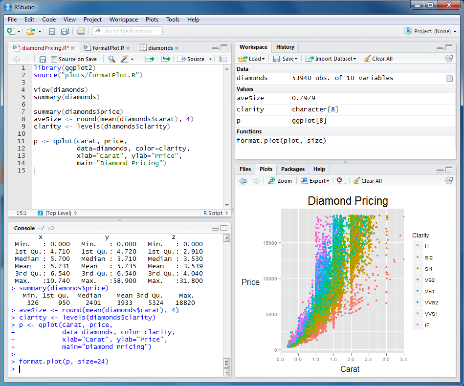
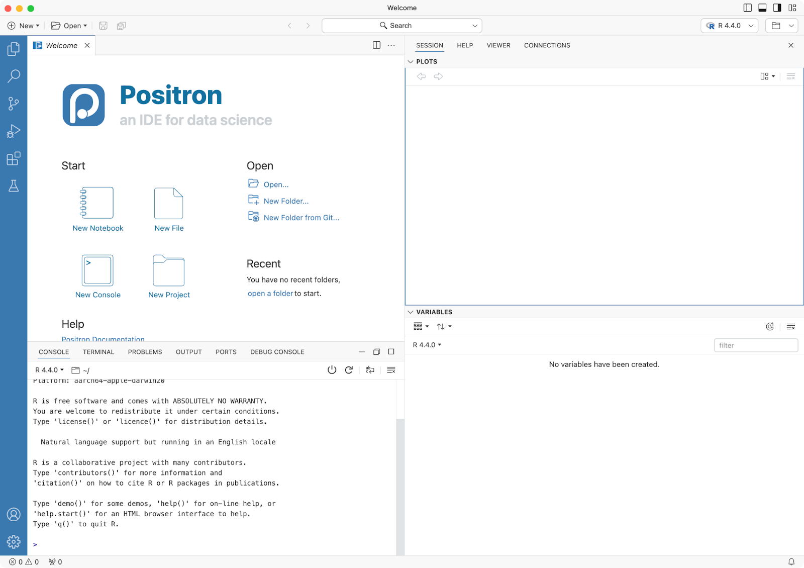
Fonts not installed
“Wait, it doesn’t look the same on my computer…”

Different… everything?
“I’m getting an error message…”
- Operating system
- R version
- Package versions
- Combination of the two
- …
New {ggplot2} release!
Testing, testing, 1-2-3
Unknown unknowns
Unknown unknowns


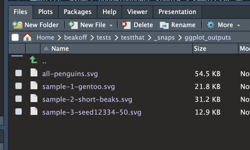
{vdiffr} - quick demo
mypackage/tests/testthat/_snaps/ggplot_outputs
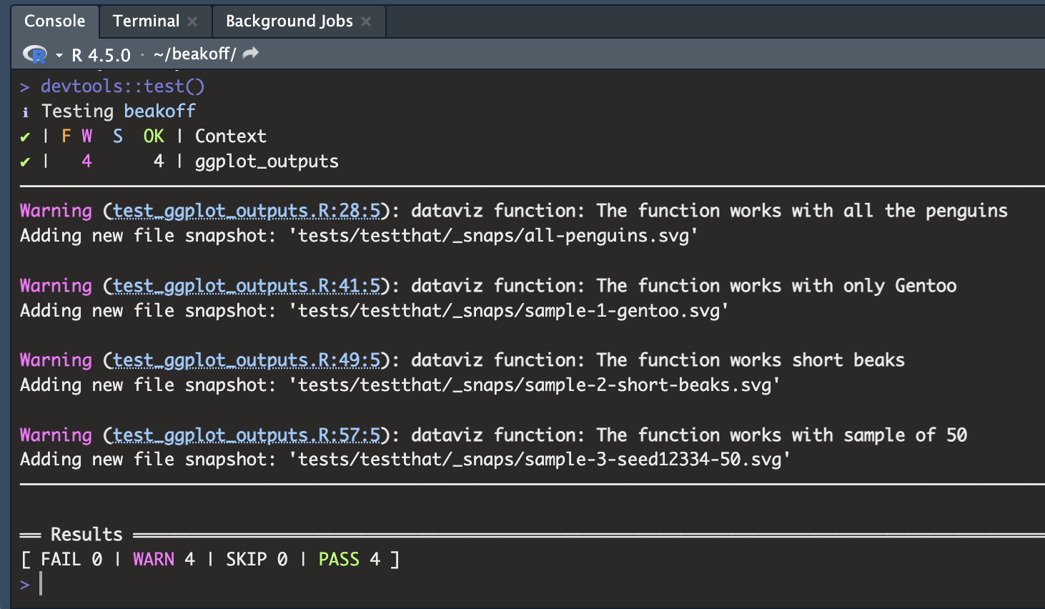
{vdiffr} - quick demo
It tells you what it’s doing 😊
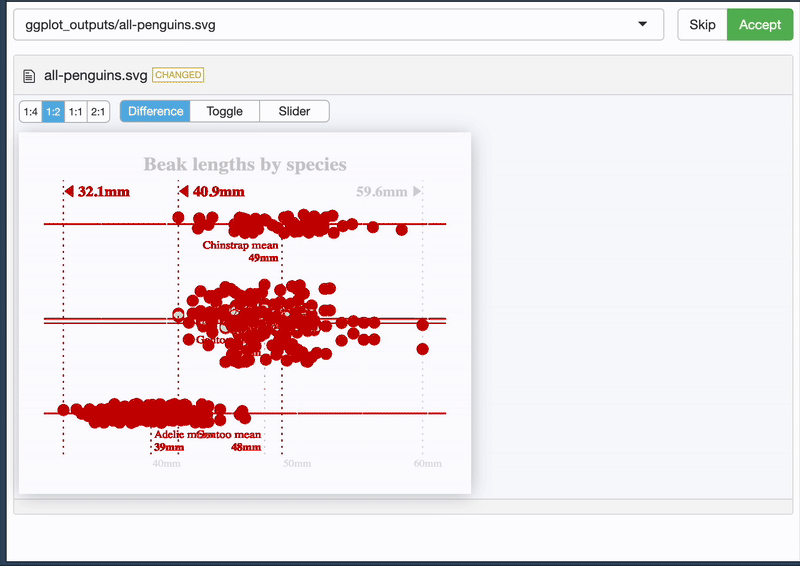
{vdiffr} - quick demo
And it allows you to see the difference 🥳
Bye bye, Boy-zer
- Use building blocks
- Spec thoroughly
- Automate sensible tests with sensible tools
- Lean on the community - we’re all learning together!
Bye bye, Boy-zer
- Use building blocks
- Spec thoroughly
- Automate sensible tests with sensible tools
- Lean on the community - we’re all learning together!
Let’s chat!
- 👋 ☕️ Coffee
hello@cararthompson.com- www.cararthompson.com