rain_data <- read.csv("https://www2.sepa.org.uk/rainfall/api/Month/15201?csv=true",
         header = T) |>
  dplyr::mutate(city = "Edinburgh") |>
  dplyr::bind_rows(read.csv("https://www2.sepa.org.uk/rainfall/api/Month/327234?csv=true",
                     header = T) |>
                     dplyr::mutate(city = "Glasgow")) |>
  # May data is incomplete
  dplyr::filter(Timestamp != "May 2024") |>
  tidyr::separate(Timestamp, into = c("month", "year"), remove = F) |>
  # Make the years back into numbers
  dplyr::mutate(year = as.numeric(as.character(year))) |>
  # Get month factor levels in right order
dplyr::mutate(month = factor(month, levels = month.abb))From alright to
all ready to
publish
RGlasgow | 23rd May 2024
Advanced Research Center (ARC), Glasgow
The main aim for today
- Data from Scottish Environment Protection Agency
- https://www2.sepa.org.uk/rainfall/
{ggplot2}- Namespacing
- ❌
library(dplyr) - ✔️
dplyr::mutate
- ❌

Now for a basic plot
Now for a basic plot
Now for a basic plot
Now for a basic plot
“Wait a minute…” | Check it’s the right type of plot!
Now for a basic plot
Make it easier to distinguish between the cities
Now for a basic plot
Make it the grid more useful
Now for a basic plot
Fix the labels
Now for a basic plot
Fix the labels - a safer way!
Now for a basic plot
See if you can remove any text
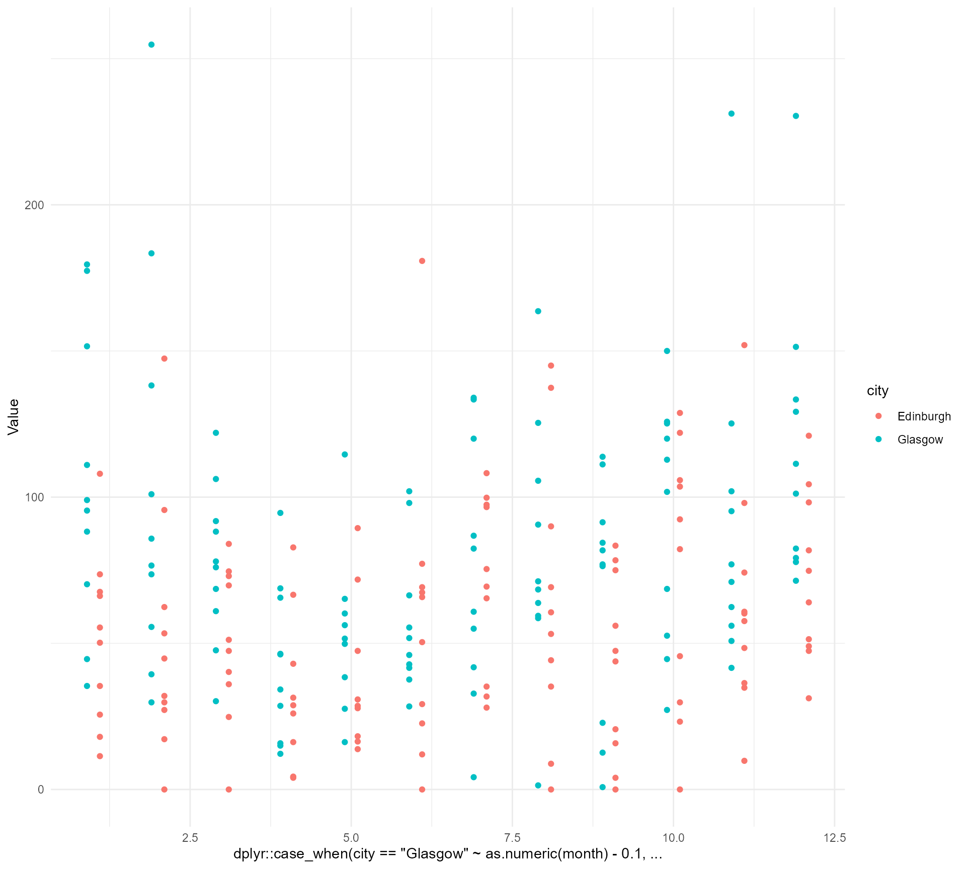
rain_data |>
  ggplot() +
  geom_point(aes(x = dplyr::case_when(city == "Glasgow" ~ as.numeric(month) - 0.1,
                                      TRUE ~ as.numeric(month) + 0.1),
                 y = Value,
                 colour = city)) +
theme_minimal() +
scale_x_continuous(breaks = c(1:12), minor_breaks = NULL,
labels = month.abb[1:12]) +
theme(axis.title = element_blank())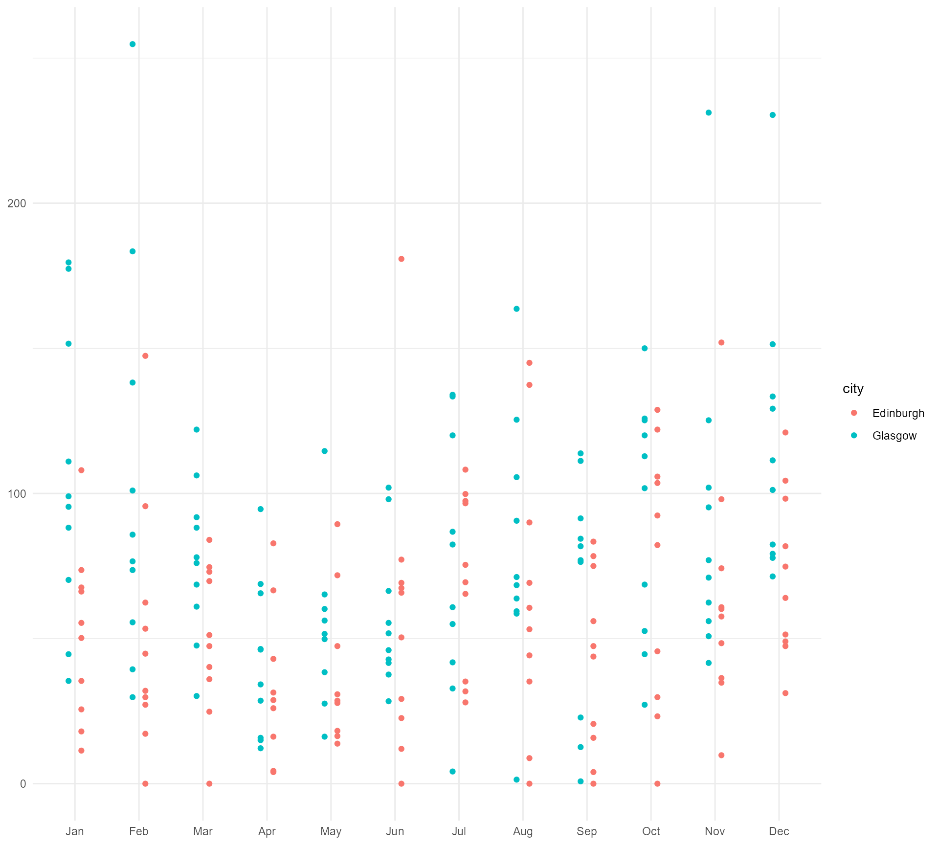
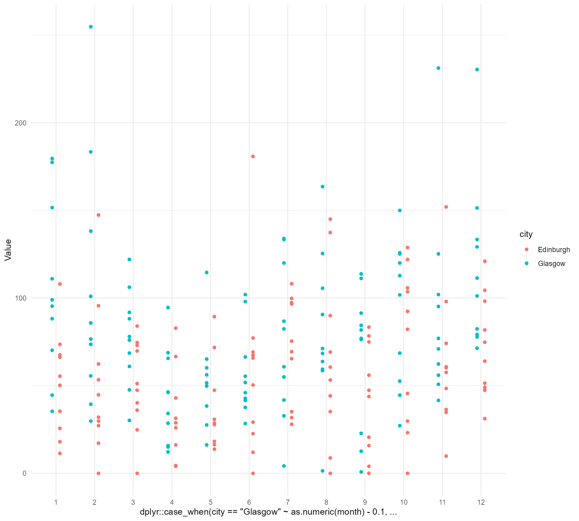
Now for a basic plot
See if you can remove any text
rain_data |>
  ggplot() +
  geom_point(aes(x = dplyr::case_when(city == "Glasgow" ~ as.numeric(month) - 0.1,
                                      TRUE ~ as.numeric(month) + 0.1),
                 y = Value,
                 colour = city)) +
  theme_minimal() +
  scale_x_continuous(breaks = c(1:12), minor_breaks = NULL,
                     labels = month.abb[1:12]) +
  theme(axis.title = element_blank(),
        legend.title = element_blank())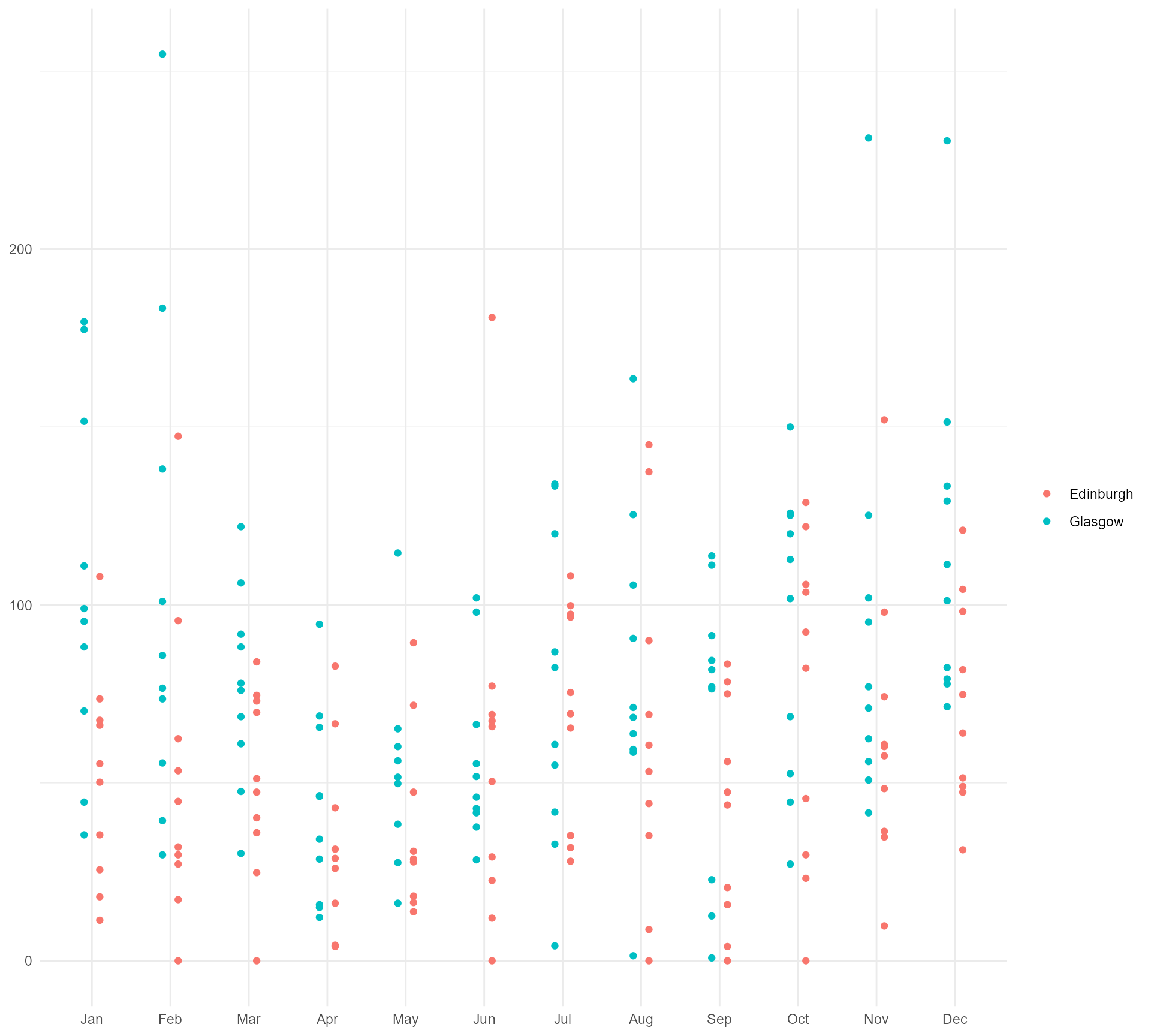
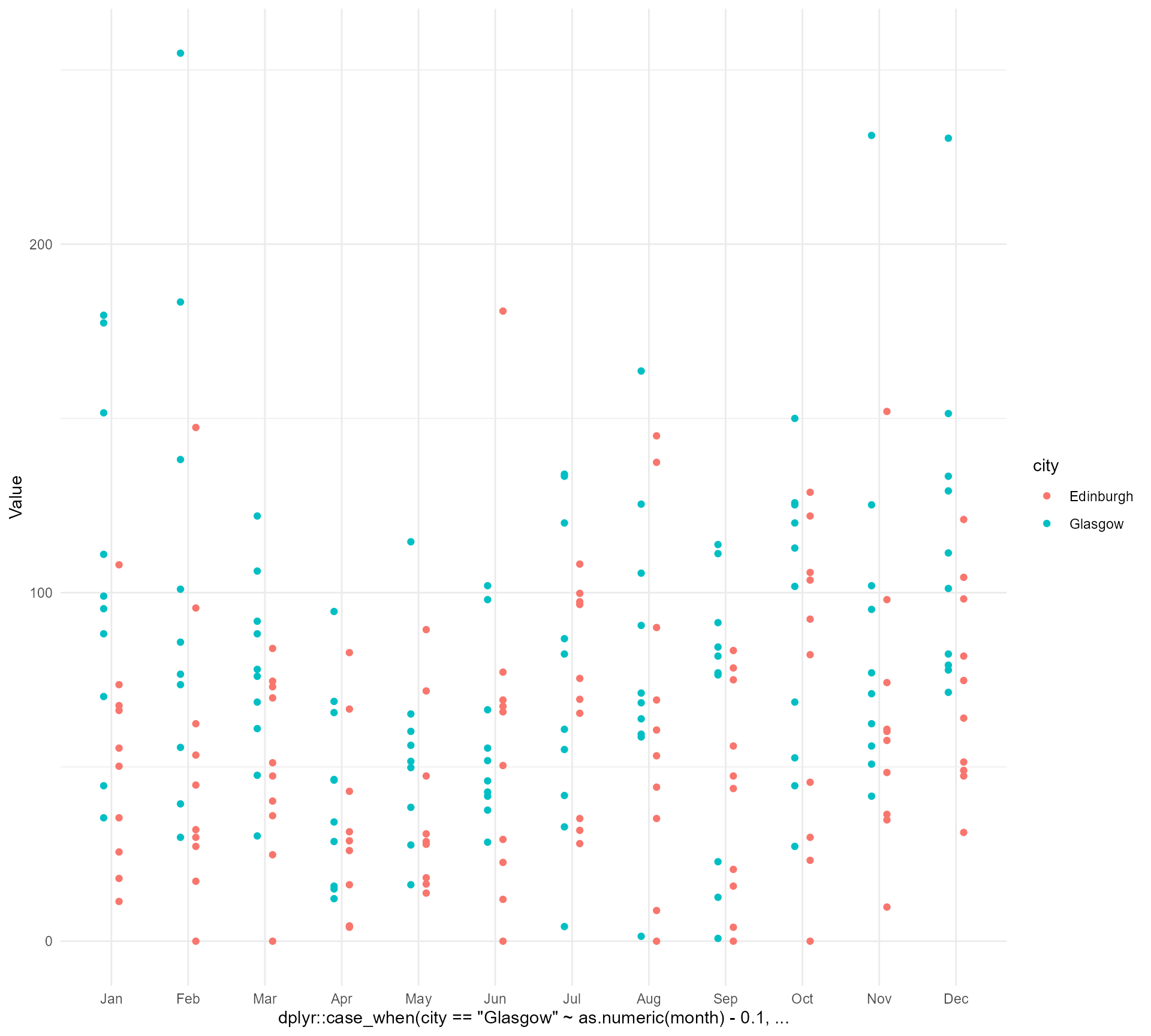
Now for a basic plot
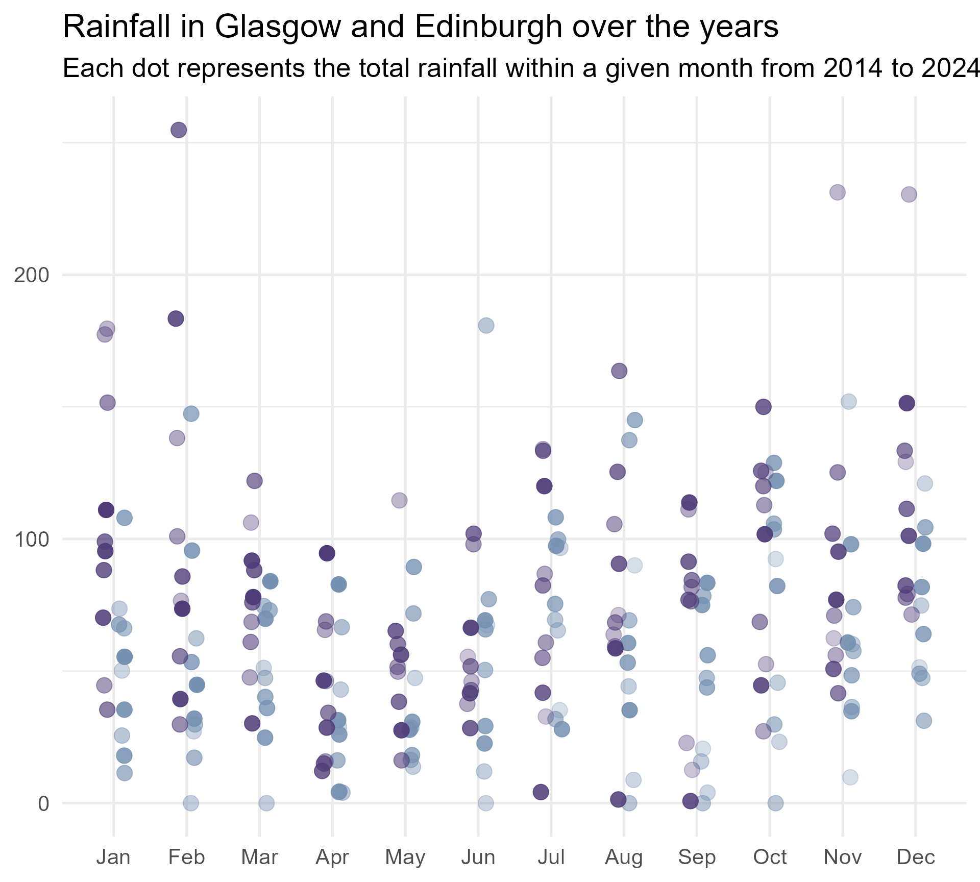
We probably need to give them some context
rain_data |>
  ggplot() +
  geom_point(aes(x = dplyr::case_when(city == "Glasgow" ~ as.numeric(month) - 0.1,
                                      TRUE ~ as.numeric(month) + 0.1),
                 y = Value,
                 colour = city)) +
  labs(title = "Rainfall in Glasgow and Edinburgh over the years",
       subtitle = "Each dot represents the total rainfall within a given month from 2014 to 2024.") +
  theme_minimal() +
  scale_x_continuous(breaks = c(1:12), minor_breaks = NULL,
                     labels = month.abb[1:12]) +
  theme(axis.title = element_blank(),
        legend.title = element_blank())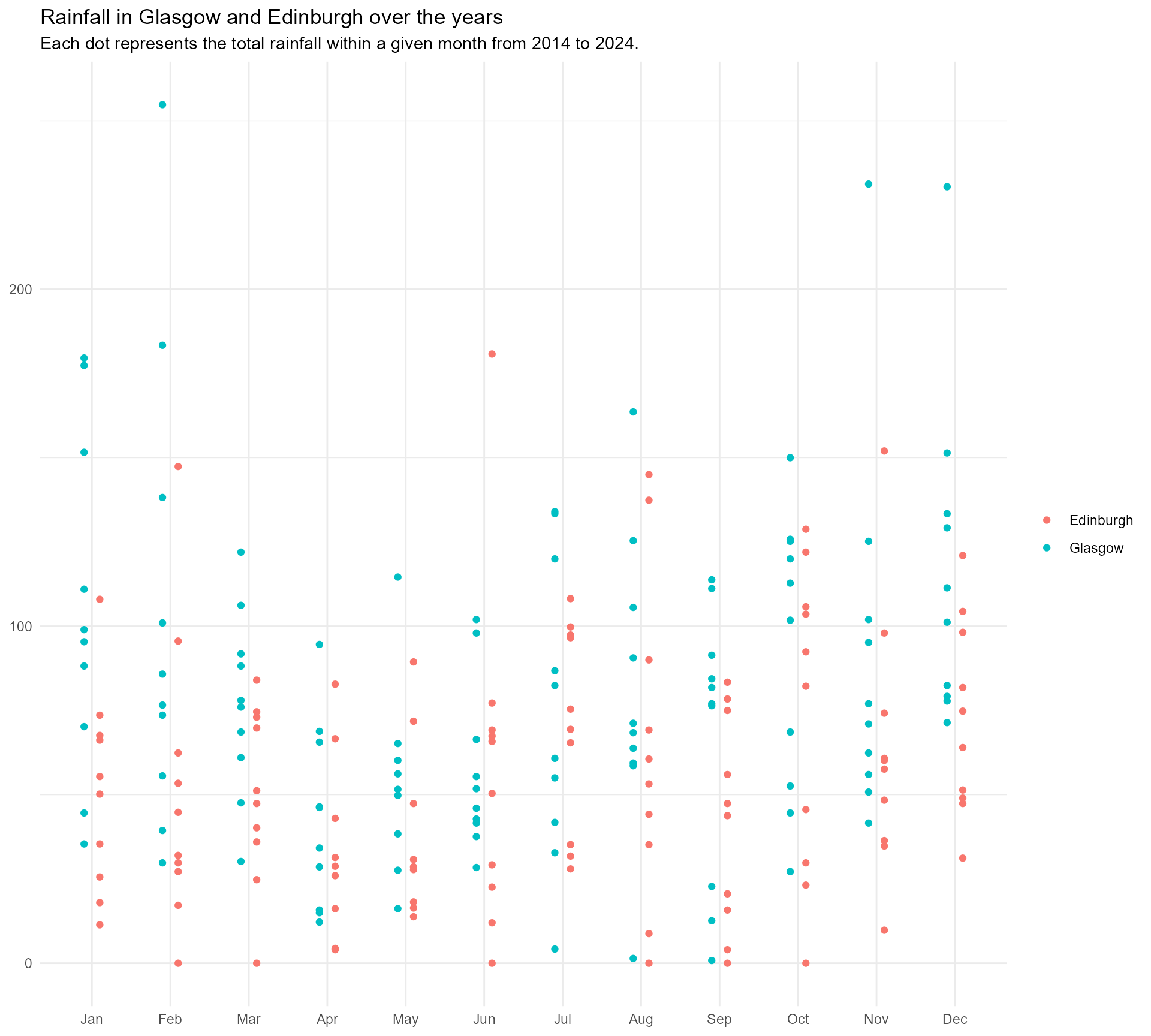
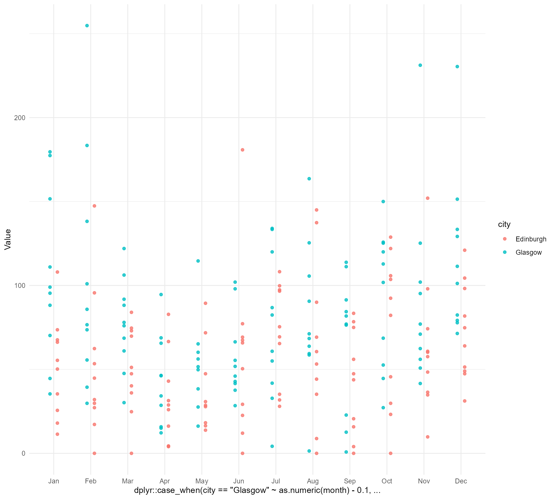
Now for a basic plot
Make the y axis clearer
rain_data |>
  ggplot() +
  geom_point(aes(x = dplyr::case_when(city == "Glasgow" ~ as.numeric(month) - 0.1,
                                      TRUE ~ as.numeric(month) + 0.1),
                 y = Value,
                 colour = city)) +
  labs(title = "Rainfall in Glasgow and Edinburgh over the years",
       subtitle = "Each dot represents the total rainfall within a given month from 2014 to 2024.") +
  theme_minimal() +
  scale_x_continuous(breaks = c(1:12), minor_breaks = NULL,
                     labels = month.abb[1:12]) +
  scale_y_continuous(labels = function(x) paste(x, "mm")) +
  theme(axis.title = element_blank(),
        legend.title = element_blank())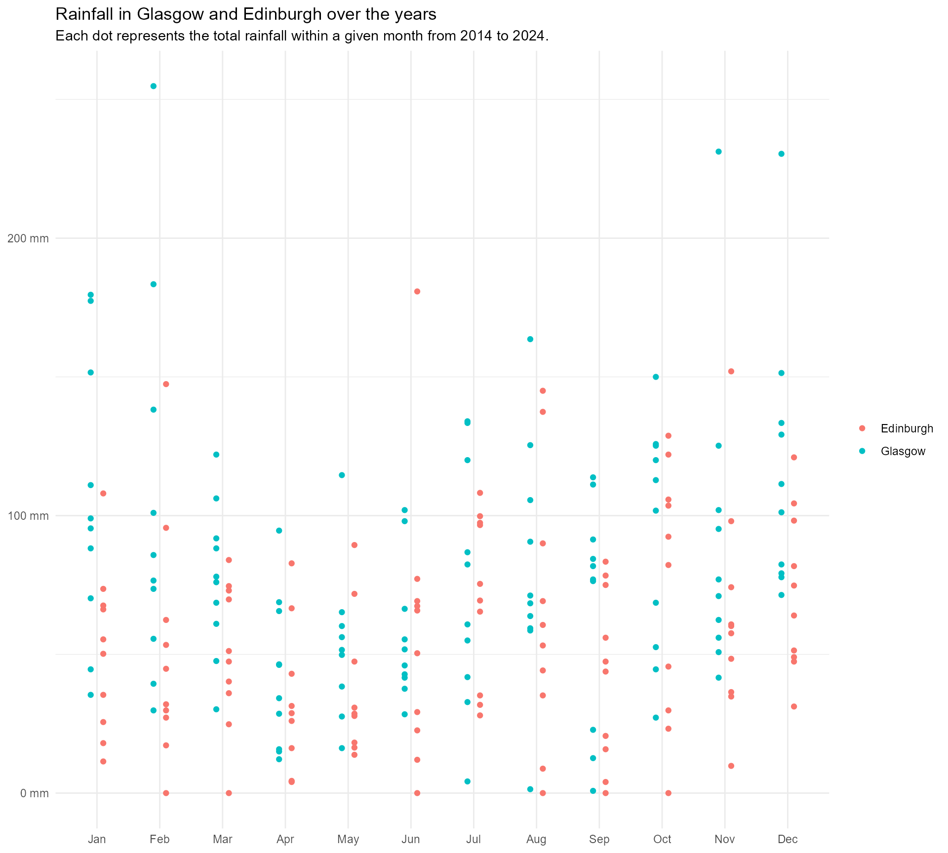
#1 Use meaningful colours
- Make it easier to remember what’s what
- Blend in some brand colours
- Check for accessibility
- Implement!
#1 Use meaningful colours
Glasgow and Edinburgh

#1 Use meaningful colours
Glasgow and Edinburgh
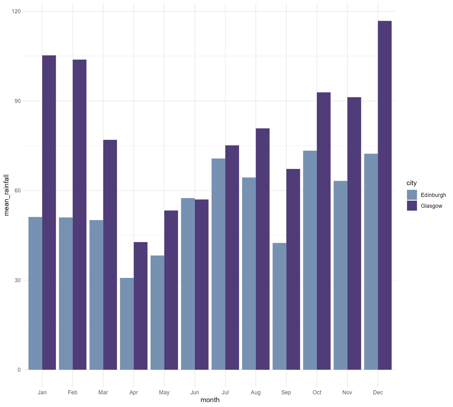
#1 Use meaningful colours
Glasgow and Edinburgh
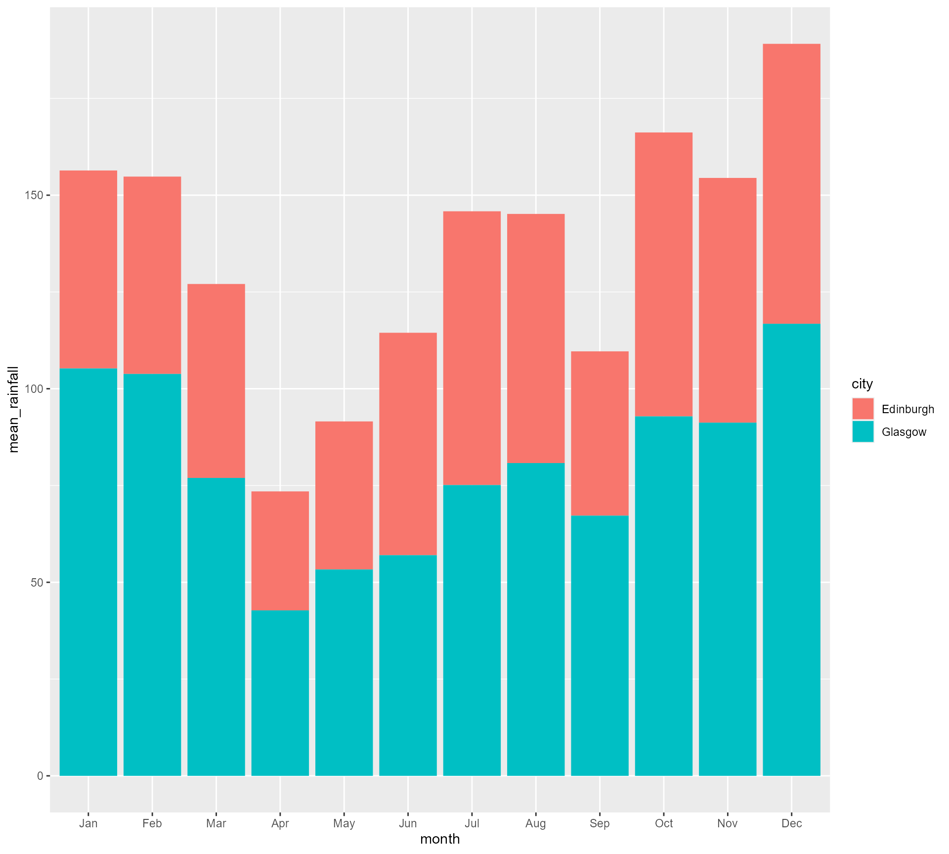
rain_data |>
  dplyr::group_by(month, city) |>
  dplyr::summarise(mean_rainfall = mean(Value)) |>
  dplyr::mutate(city = factor(city, levels = c("Glasgow", "Edinburgh"))) |>
  ggplot() +
  geom_bar(aes(x = month, y = mean_rainfall, fill = city),
           position = "dodge",
           stat = "identity") +
  scale_fill_manual(values = c("#7691b1",
                               "#4f3c78")) +
  theme_minimal()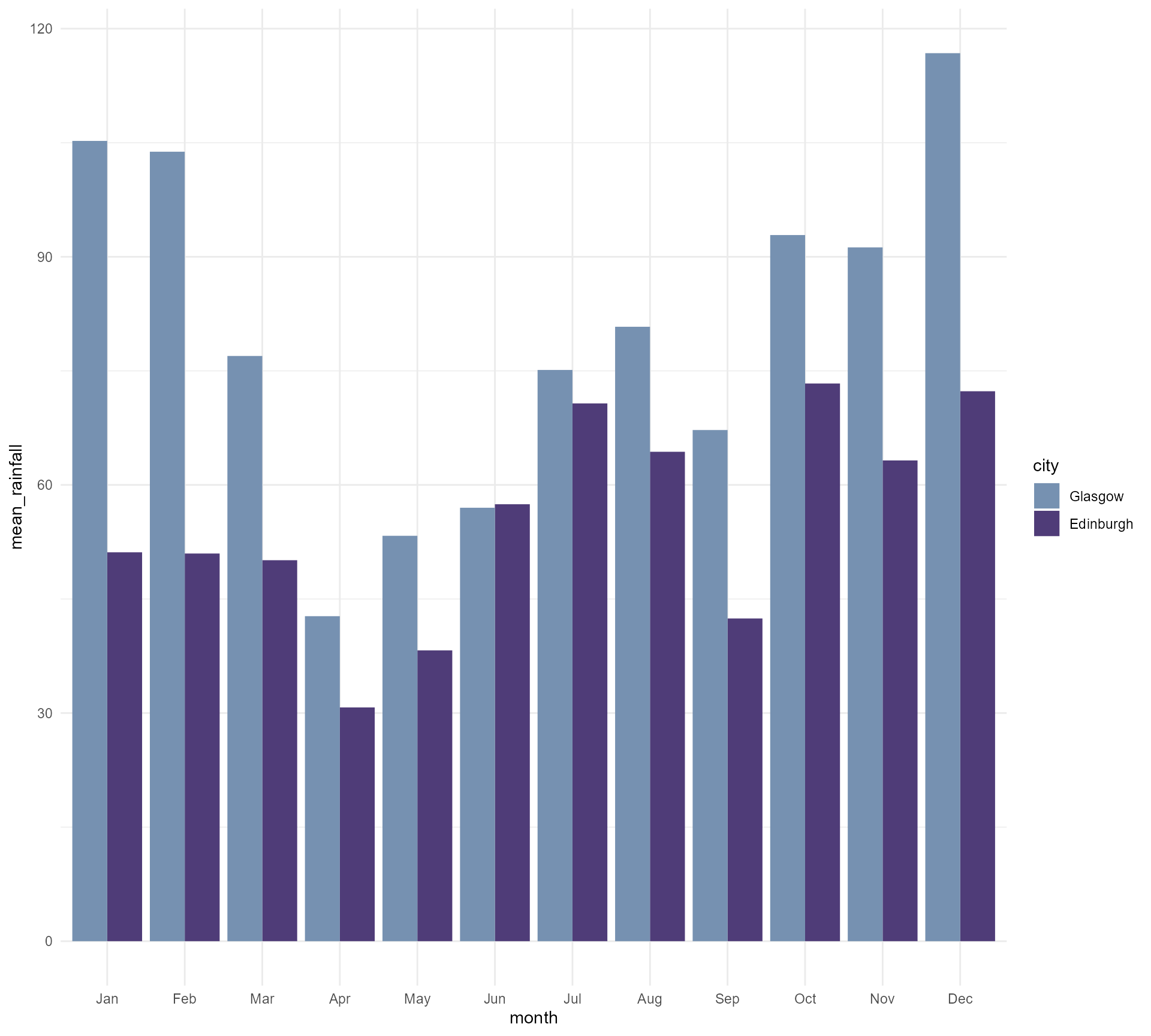
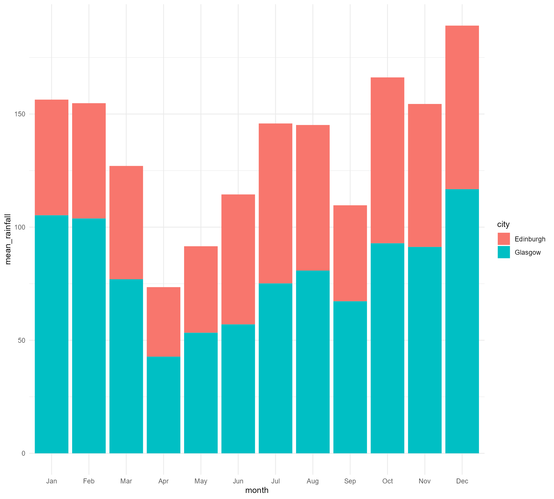
#1 Use meaningful colours
Glasgow and Edinburgh
rain_data |>
  dplyr::group_by(month, city) |>
  dplyr::summarise(mean_rainfall = mean(Value)) |>
  dplyr::mutate(city = factor(city, levels = c("Glasgow", "Edinburgh"))) |>
  ggplot() +
  geom_bar(aes(x = month, y = mean_rainfall, fill = city),
           position = "dodge",
           stat = "identity") +
  scale_fill_manual(values = c("Edinburgh" = "#7691b1",
                               "Glasgow" = "#4f3c78")) +
  theme_minimal()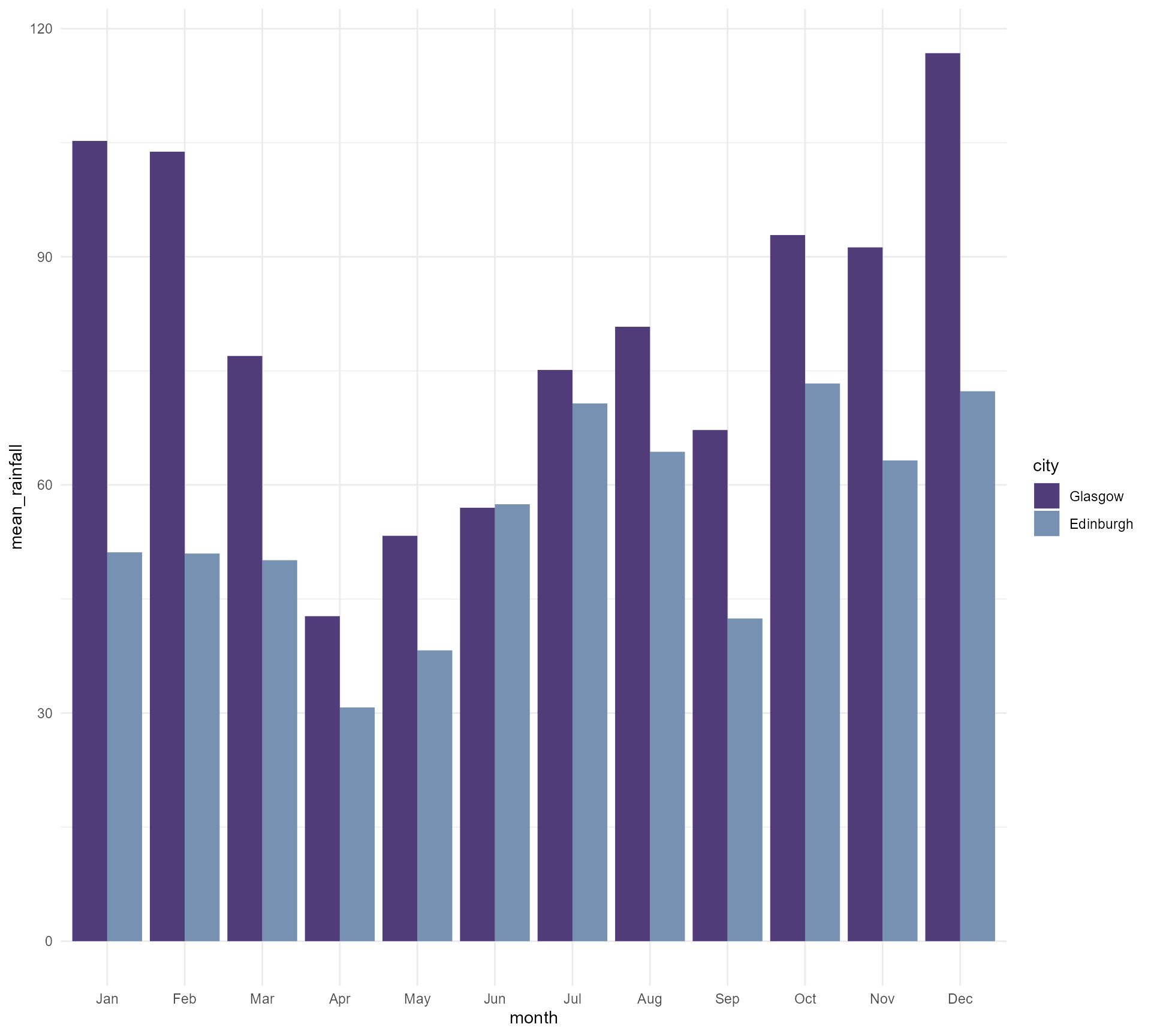
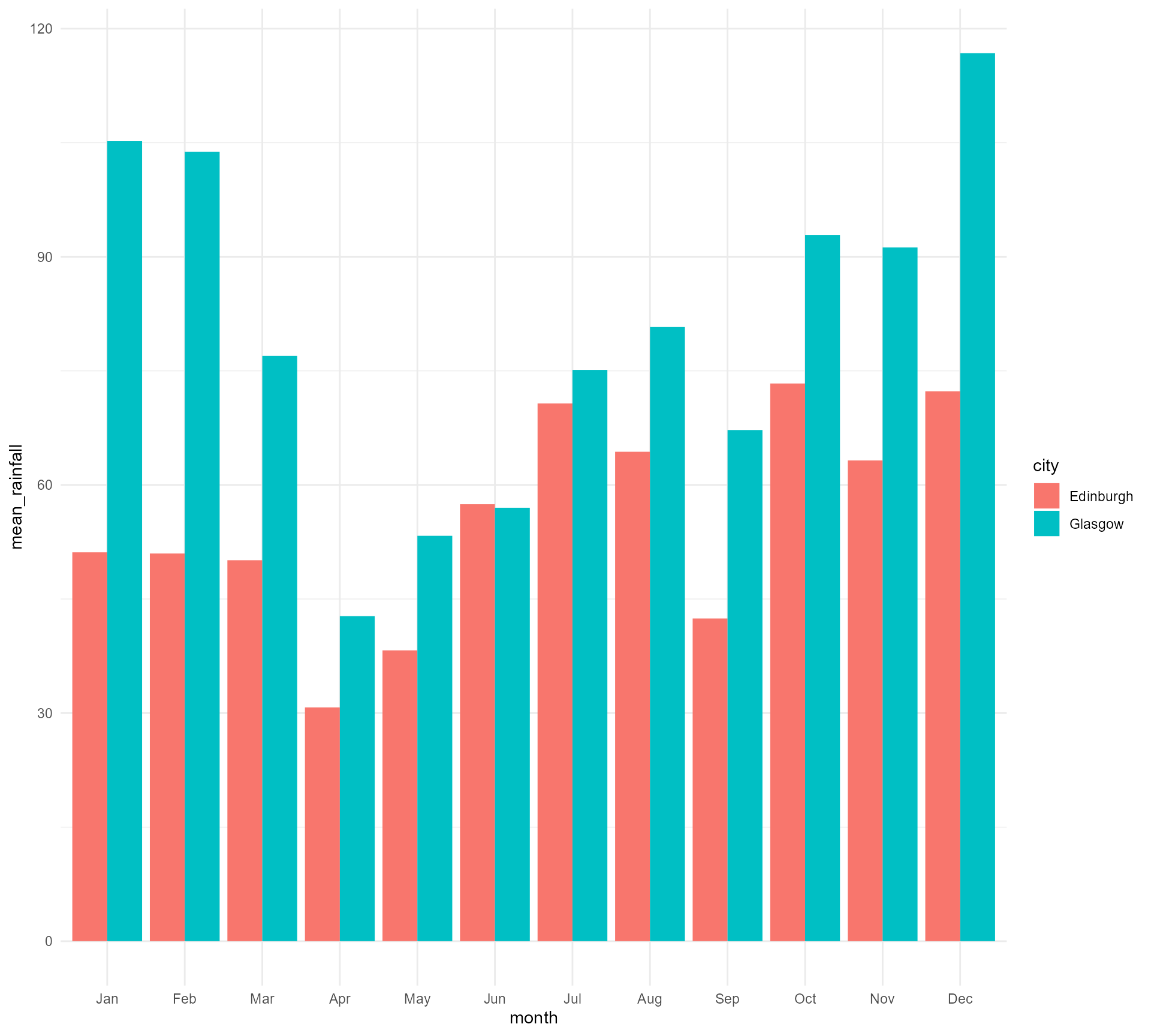
#1 Use meaningful colours
Glasgow and Edinburgh
rain_data |>
  ggplot() +
  geom_jitter(aes(x = dplyr::case_when(city == "Glasgow" ~ as.numeric(month) - 0.1,
                                       TRUE ~ as.numeric(month) + 0.1),
                  y = Value,
                  colour = city),
              size = 5,
              width = 0.05,
              height = 0) +
  labs(title = "Rainfall in Glasgow and Edinburgh over the years",
       subtitle = "Each dot represents the total rainfall within a given month from 2014 to 2024.") +
  scale_x_continuous(breaks = c(1:12), minor_breaks = NULL,
                     labels = month.abb[1:12]) +
  scale_colour_manual(values = c("Glasgow" = "#4f3c78",
                                 "Edinburgh" = "#7691b1")) +
  theme_minimal() +
  theme(axis.title = element_blank(),
        legend.position = "none")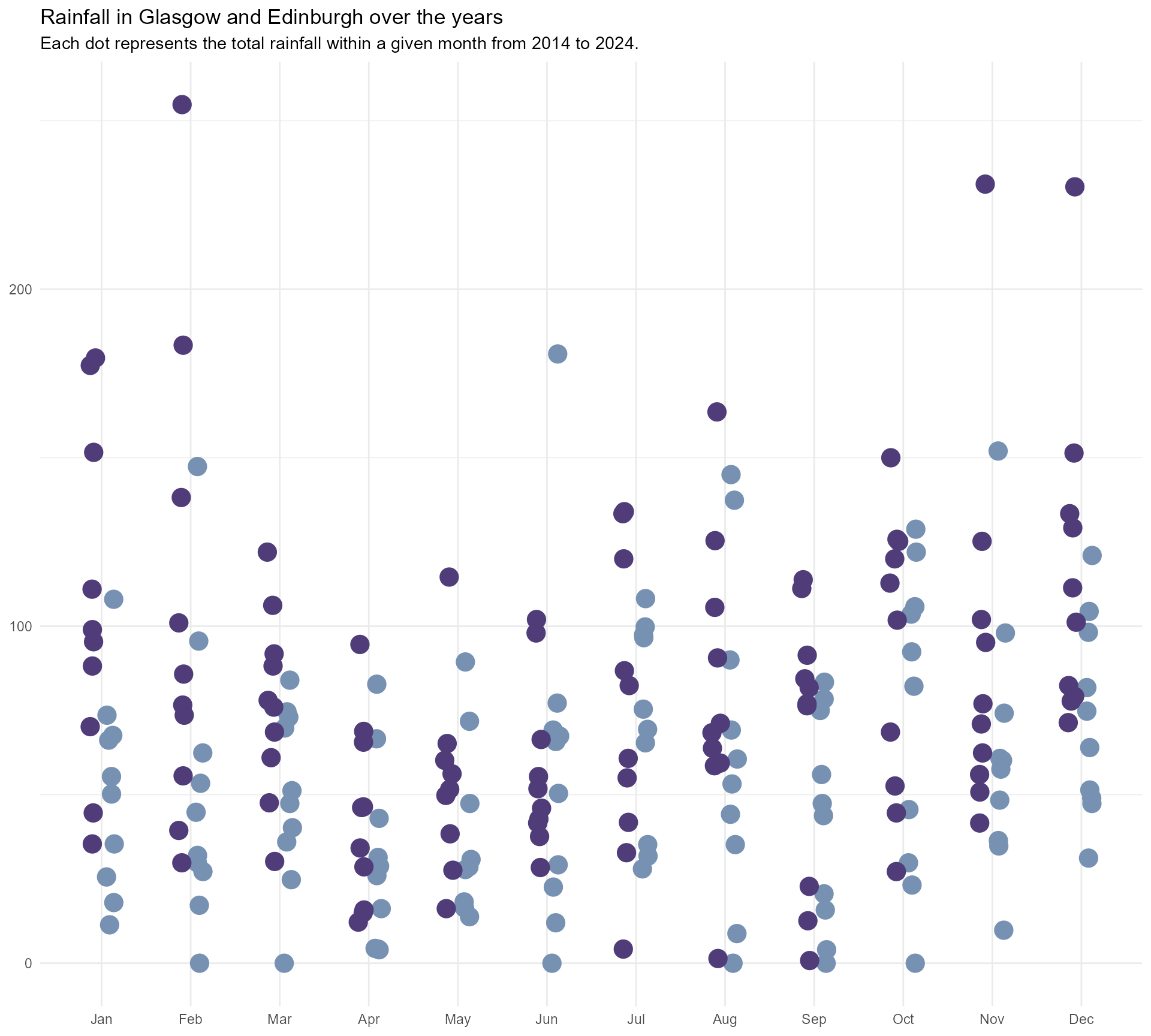
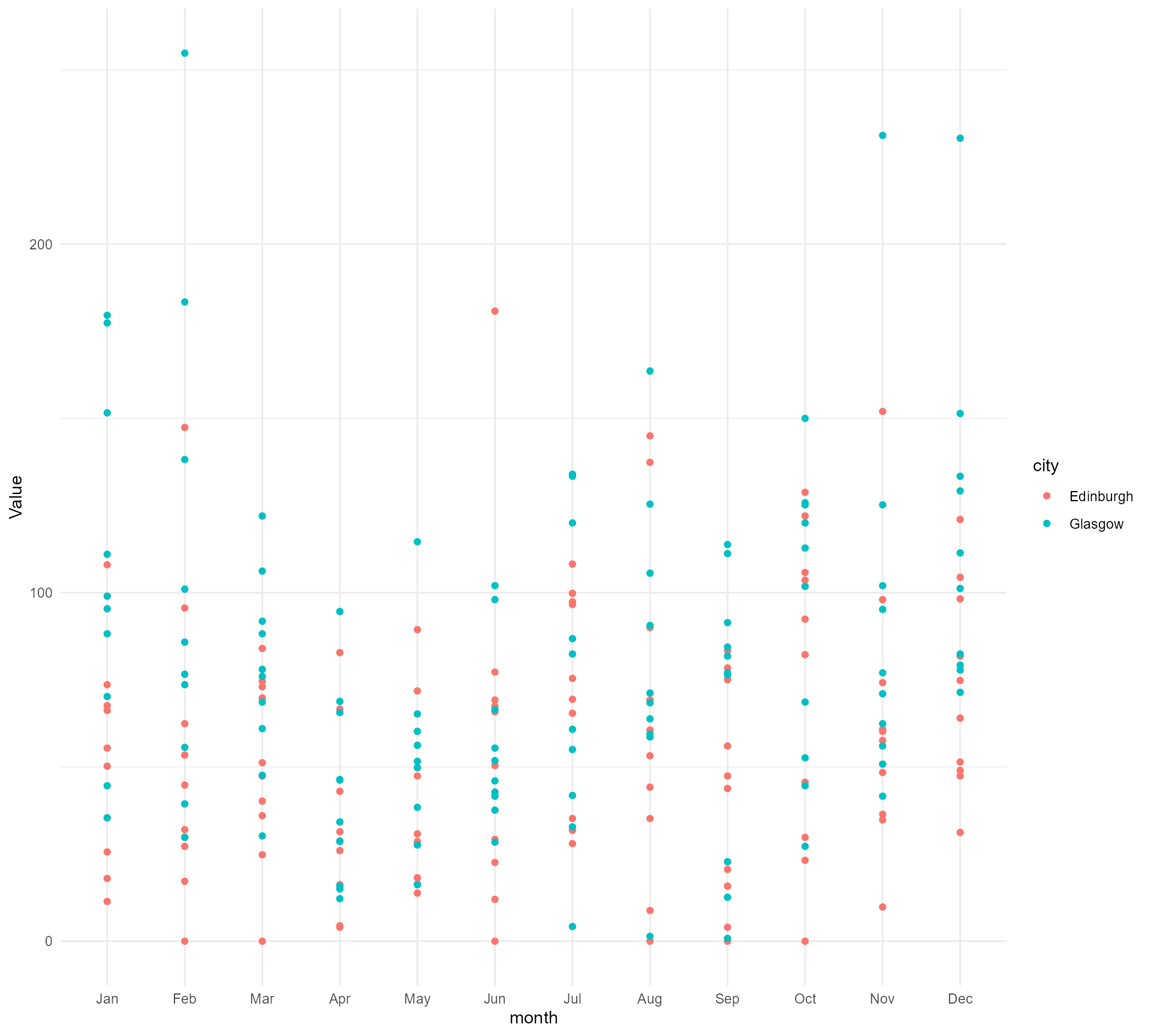
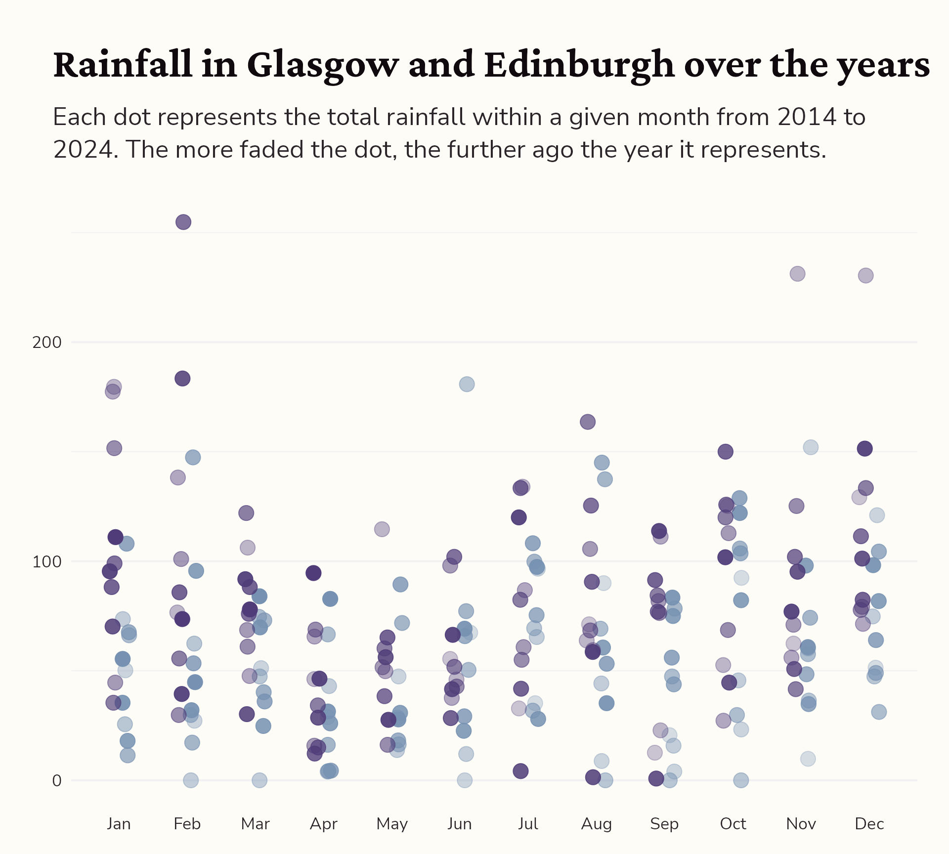
#1 Use meaningful colours
Glasgow and Edinburgh over the years
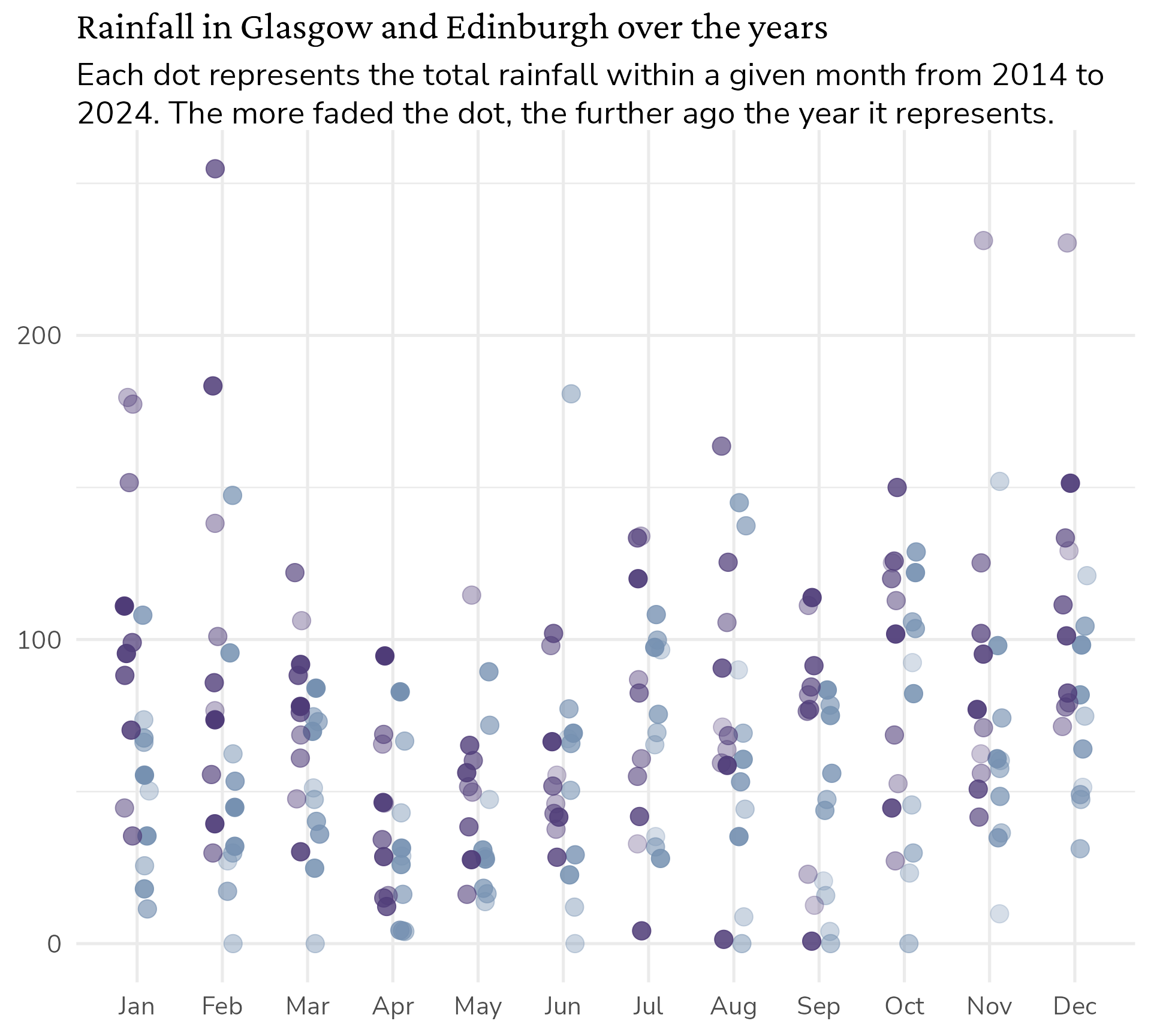
rain_data |>
  ggplot() +
  geom_jitter(aes(x = dplyr::case_when(city == "Glasgow" ~ as.numeric(month) - 0.1,
                                       TRUE ~ as.numeric(month) + 0.1),
                  y = Value,
                  colour = city,
                  alpha = year),
              size = 5,
              width = 0.05,
              height = 0) +
  labs(title = "Rainfall in Glasgow and Edinburgh over the years",
       subtitle = "Each dot represents the total rainfall within a given month from 2014 to 2024.") +
  scale_x_continuous(breaks = c(1:12), minor_breaks = NULL,
                     labels = month.abb[1:12]) +
  scale_colour_manual(values = c("Glasgow" = "#4f3c78",
                                 "Edinburgh" = "#7691b1")) +
  theme_minimal() +
  theme(axis.title = element_blank(),
        legend.position = "none")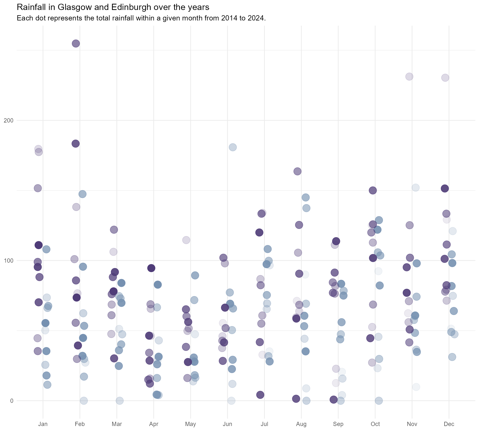
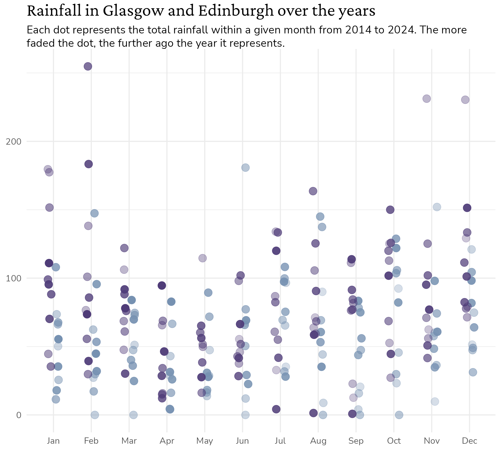
#1 Use meaningful colours
Glasgow and Edinburgh over the years
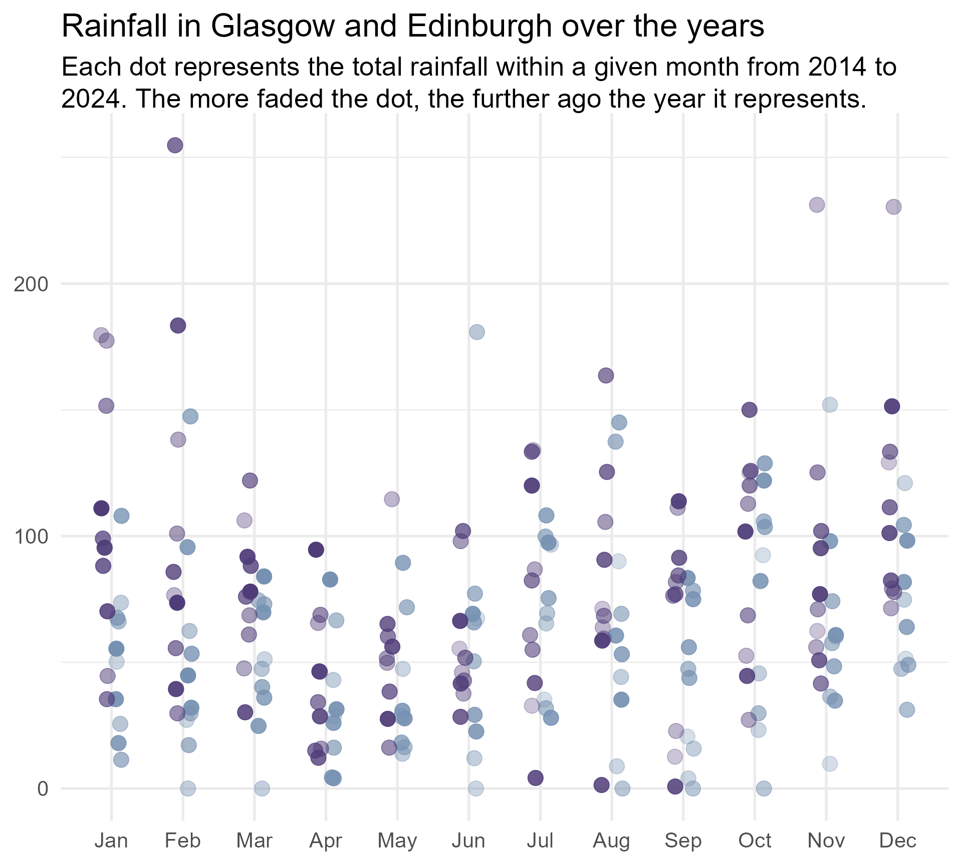
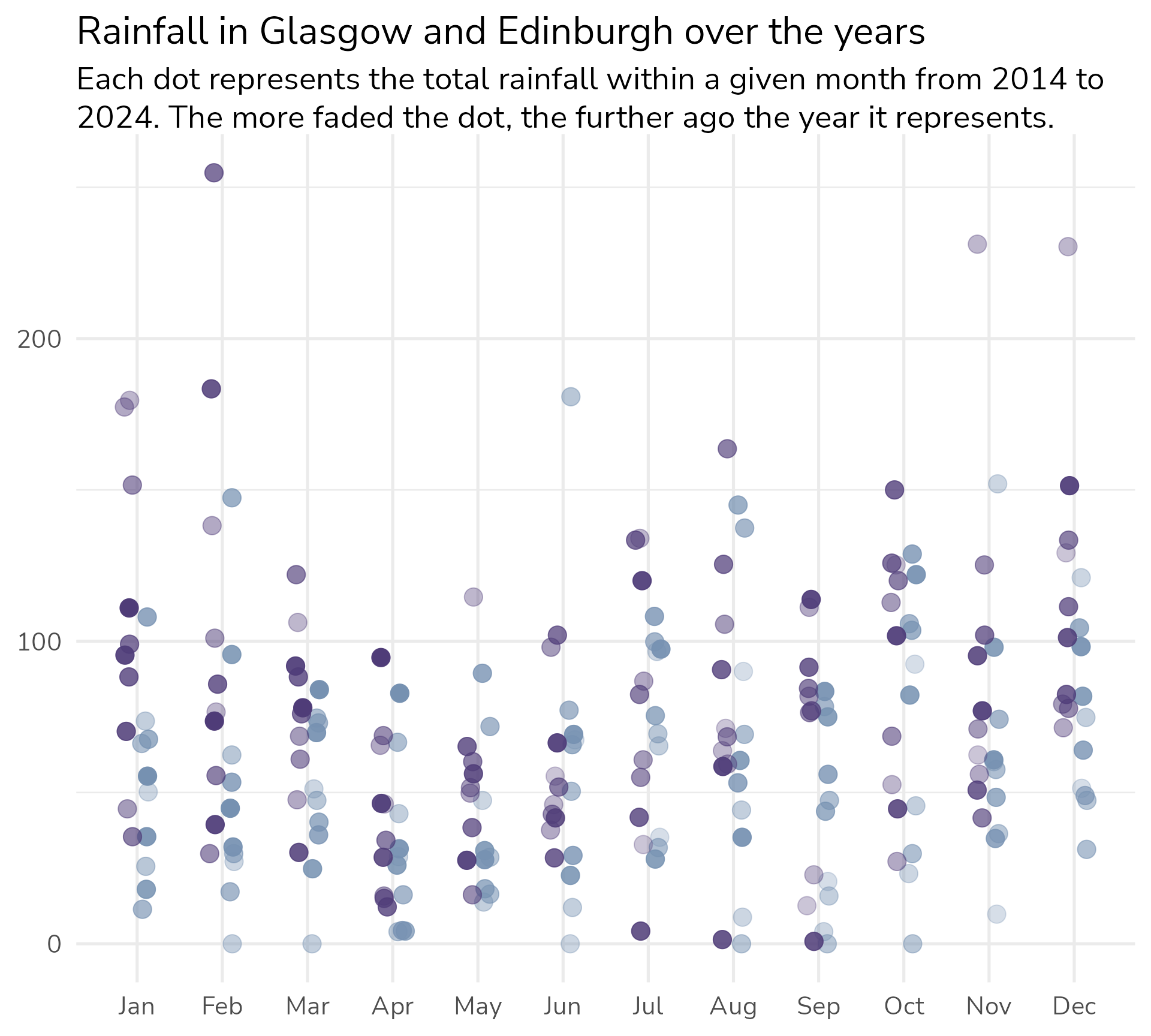
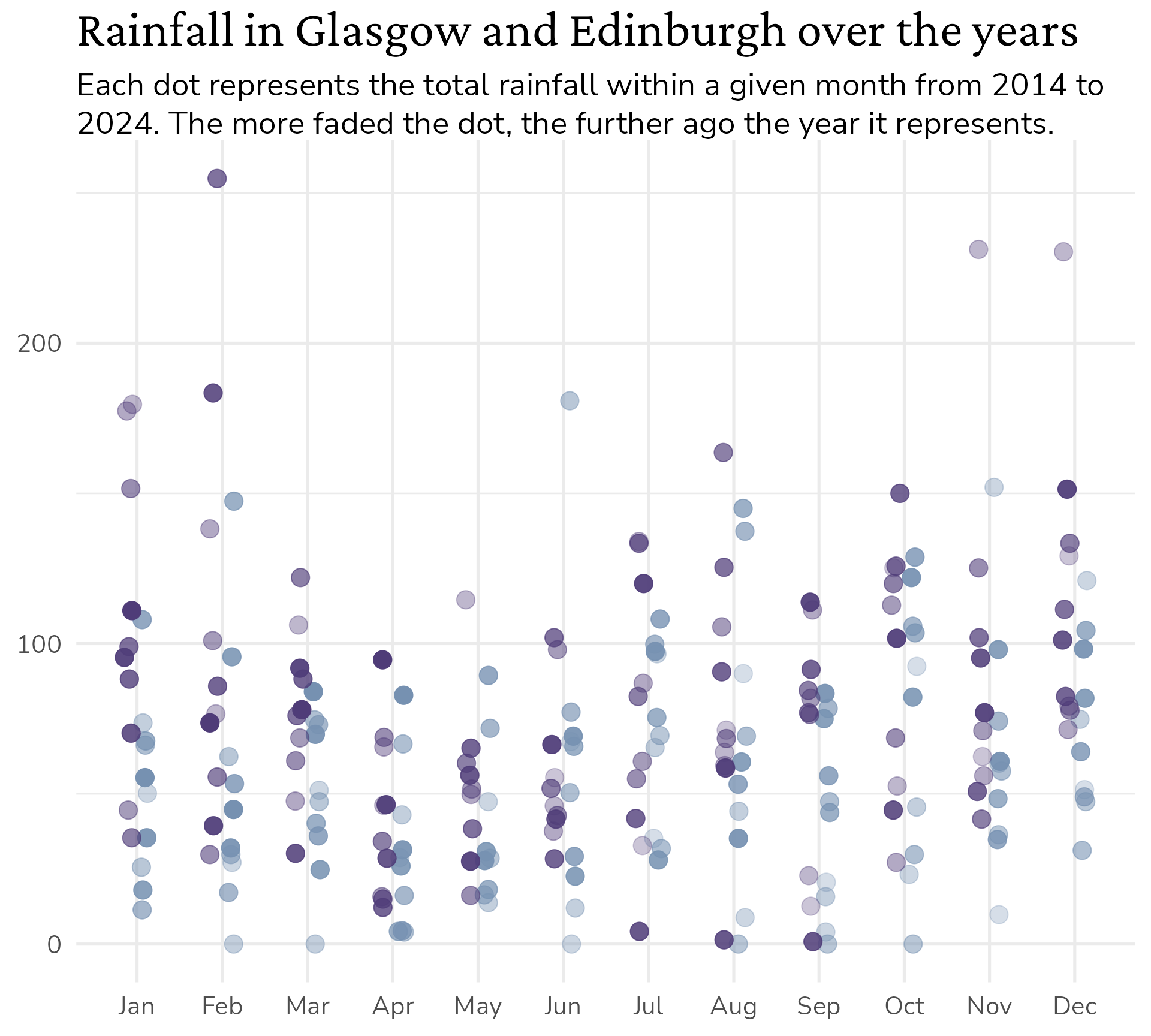
rain_data |>
  ggplot() +
  geom_jitter(aes(x = dplyr::case_when(city == "Glasgow" ~ as.numeric(month) - 0.1,
                                       TRUE ~ as.numeric(month) + 0.1),
                  y = Value,
                  colour = city,
                  alpha = year),
              size = 5,
              width = 0.05,
              height = 0) +
  labs(title = "Rainfall in Glasgow and Edinburgh over the years",
       subtitle = "Each dot represents the total rainfall within a given month from 2014 to 2024. The more faded the dot, the further ago the year it represents.") +
  scale_alpha(range = c(0.3, 1)) +
  scale_x_continuous(breaks = c(1:12), minor_breaks = NULL,
                     labels = month.abb[1:12]) +
  scale_colour_manual(values = c("Glasgow" = "#4f3c78",
                                 "Edinburgh" = "#7691b1")) +
  theme_minimal() +
  theme(axis.title = element_blank(),
        legend.position = "none")
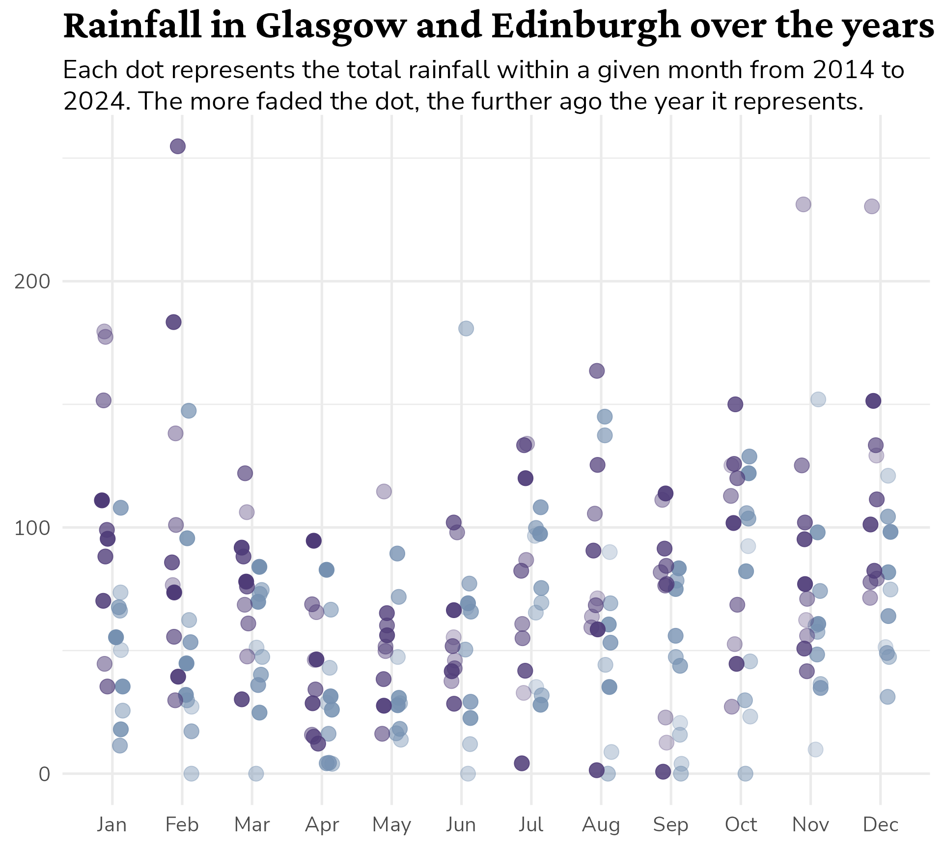
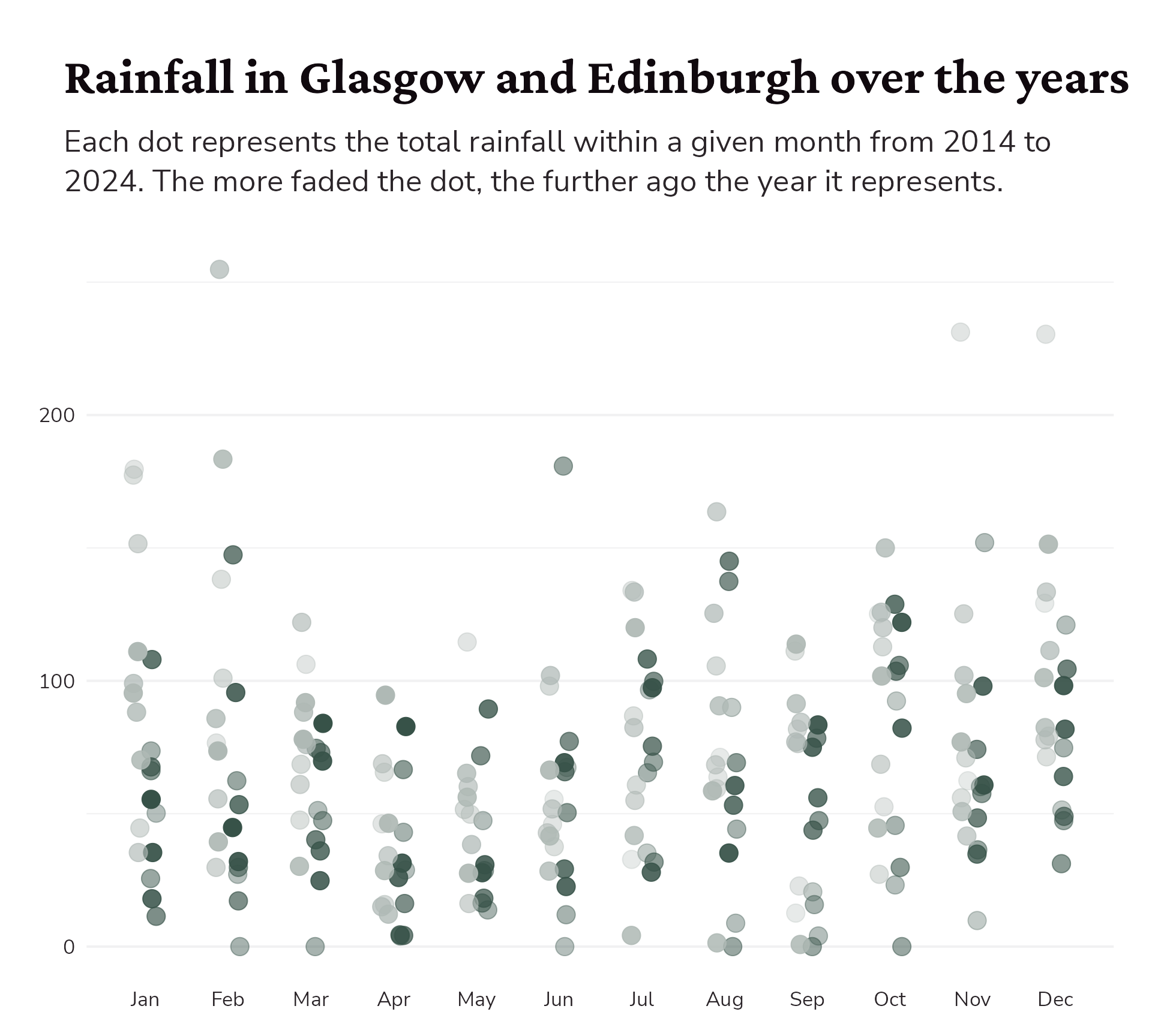
#2 Optimise text
Starting point
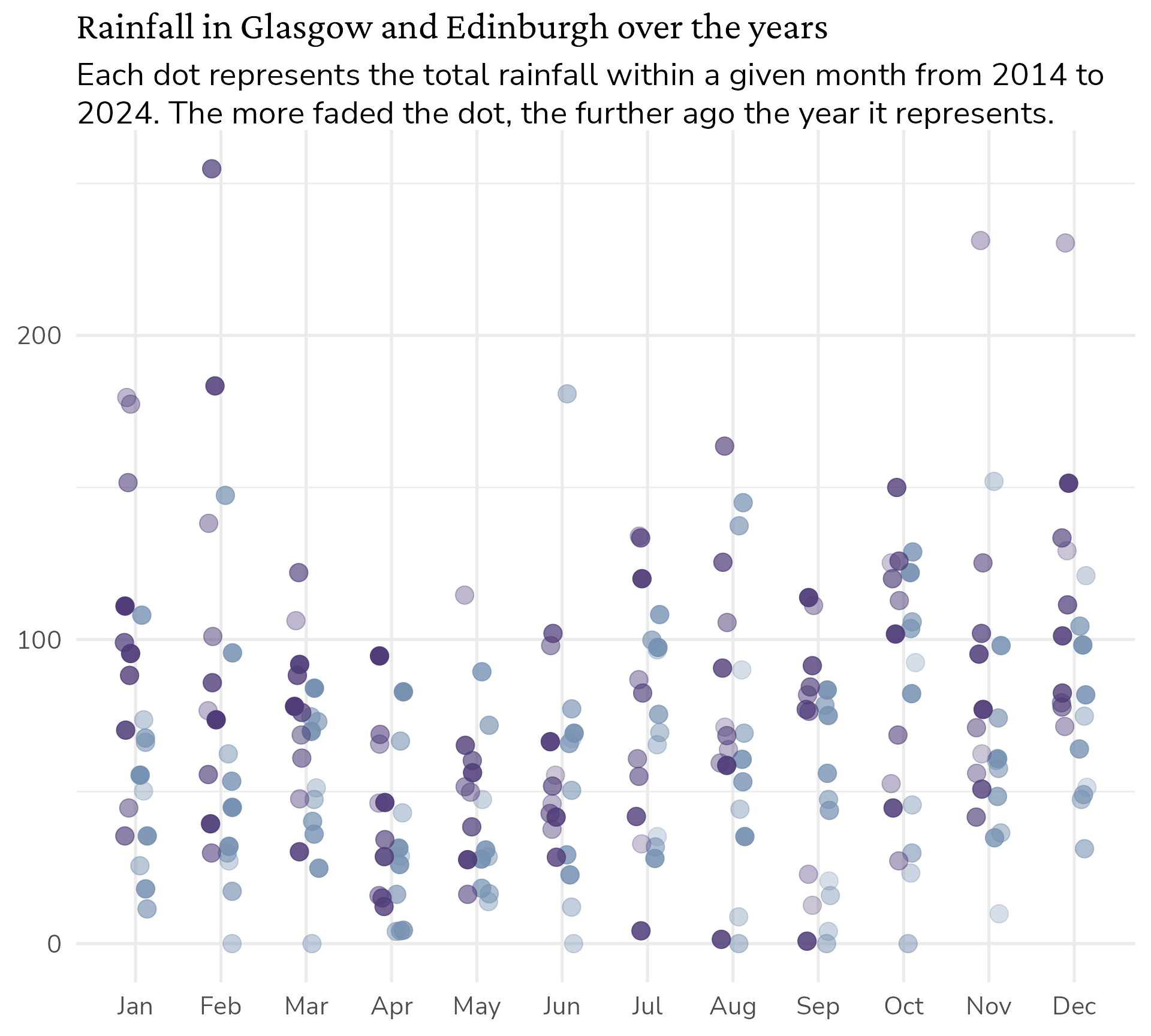
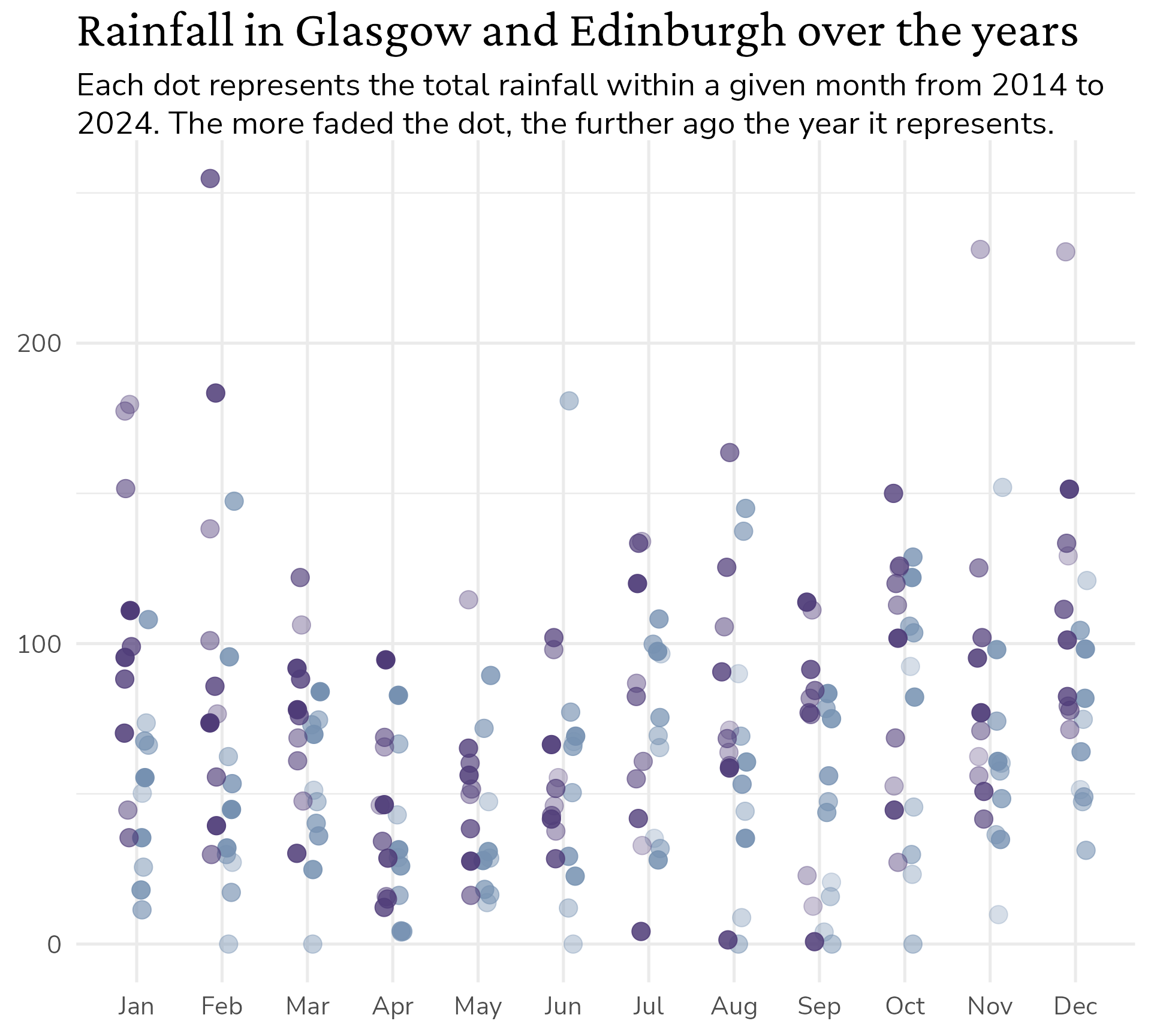
basic_plot <- rain_data |>
  ggplot() +
  geom_jitter(aes(x = dplyr::case_when(city == "Glasgow" ~ as.numeric(month) - 0.1,
                                       TRUE ~ as.numeric(month) + 0.1),
                  y = Value,
                  colour = city,
                  alpha = year),
              size = 5,
              width = 0.05,
              height = 0) +
  labs(title = "Rainfall in Glasgow and Edinburgh over the years",
       subtitle = "Each dot represents the total rainfall within a given month from 2014 to 2024. The more faded the dot, the further ago the year it represents.") +
  scale_alpha(range = c(0.3, 1)) +
  scale_x_continuous(breaks = c(1:12), minor_breaks = NULL,
                     labels = month.abb[1:12]) +
  scale_colour_manual(values = c("Glasgow" = "#4f3c78",
                                 "Edinburgh" = "#7691b1")) +
  theme_minimal() +
  theme(axis.title = element_blank(),
        legend.position = "none")

basic_plot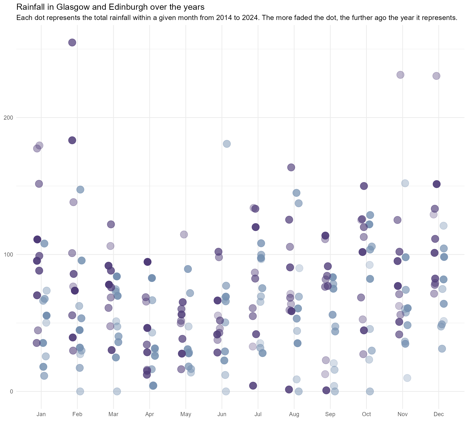
#2 Optimise text
Starting point
#2 Optimise text
Make the text fit - the easy way!
#2 Optimise text
Let’s add some personality
#2 Optimise text
Let’s add some personality
#2 Optimise text
Let’s add some hierarchy
#2 Optimise text
Let’s add some hierarchy
#2 Optimise text
Let’s add some hierarchy
#2 Optimise text
Let’s add some hierarchy
#2 Optimise text
Let’s add some hierarchy
#2 Optimise text
Let’s add some hierarchy
#2 Optimise text
Let’s add some hierarchy
basic_plot +
  theme_minimal(base_size = 20) +
  theme(text = element_text(family = "Nunito Sans",
                            colour = "#2B2529"),
        axis.title = element_blank(),
        legend.position = "none",
        plot.title = element_text(family = "Crimson Pro",
                                  face = "bold",
                                  colour = "#10090E",
                                  size = rel(1.6)),
        plot.subtitle = ggtext::element_textbox_simple())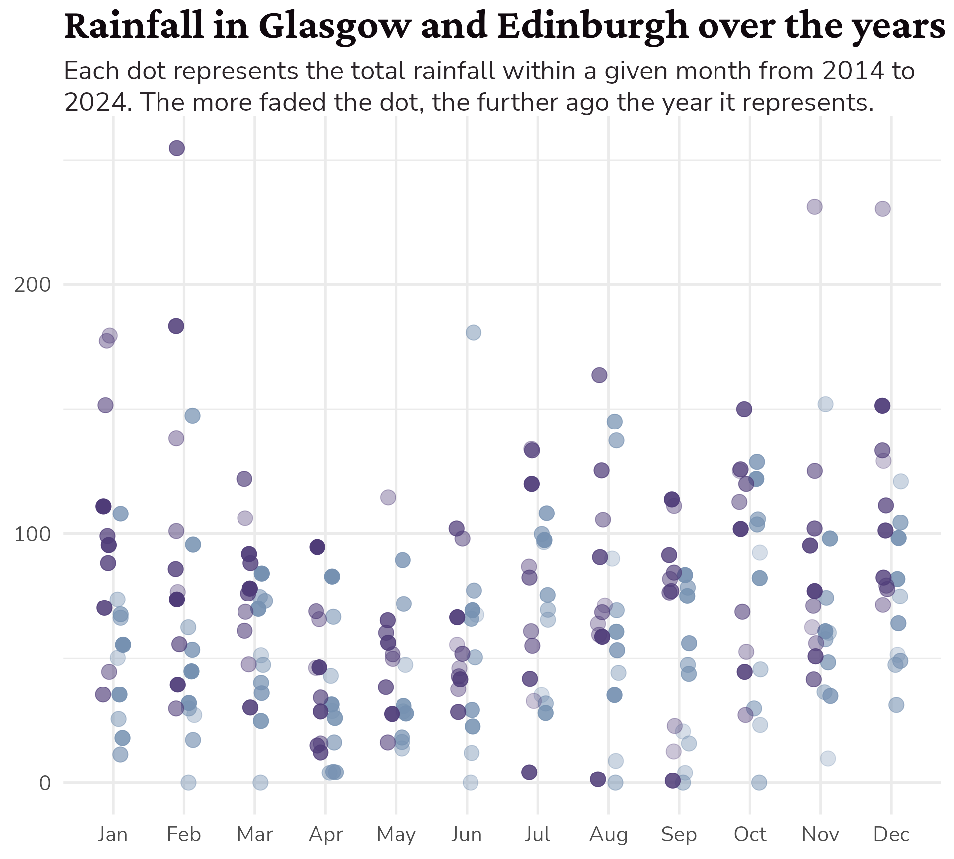
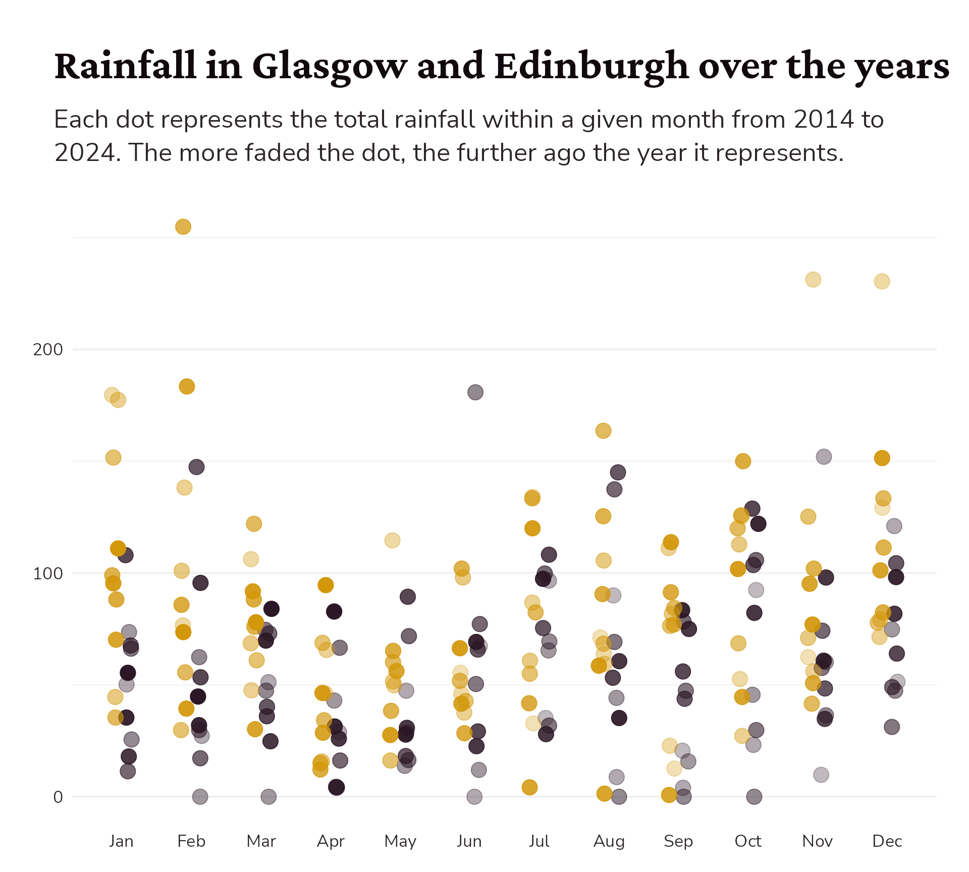
#3 Make it your own
Starting point
basic_plot +
  theme_minimal(base_size = 20) +
  theme(text = element_text(family = "Nunito Sans",
                            colour = "#2B2529"),
        axis.title = element_blank(),
        legend.position = "none",
        plot.title = element_text(family = "Crimson Pro",
                                  face = "bold",
                                  colour = "#10090E",
                                  size = rel(1.6)),
        plot.subtitle = ggtext::element_textbox_simple())
#3 Make it your own
Nicer grid colour
basic_plot +
  theme_minimal(base_size = 20) +
  theme(text = element_text(family = "Nunito Sans",
                            colour = "#2B2529"),
        axis.title = element_blank(),
        legend.position = "none",
        plot.title = element_text(family = "Crimson Pro",
                                  face = "bold",
                                  colour = "#10090E",
                                  size = rel(1.6)),
        plot.subtitle = ggtext::element_textbox_simple(),
        panel.grid = element_line(colour = "#F1F1F2"))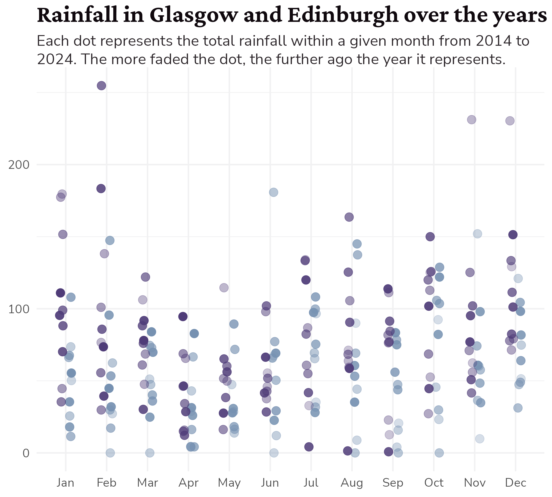
#3 Make it your own
Add a background colour?
basic_plot +
  theme_minimal(base_size = 20) +
  theme(text = element_text(family = "Nunito Sans",
                            colour = "#2B2529"),
        axis.title = element_blank(),
        legend.position = "none",
        plot.title = element_text(family = "Crimson Pro",
                                  face = "bold",
                                  colour = "#10090E",
                                  size = rel(1.6)),
        plot.subtitle = ggtext::element_textbox_simple(),
        panel.grid = element_line(colour = "#F1F1F2"),
        plot.background = element_rect(colour = "#FEFCF7",
                                       fill = "#FEFCF7"))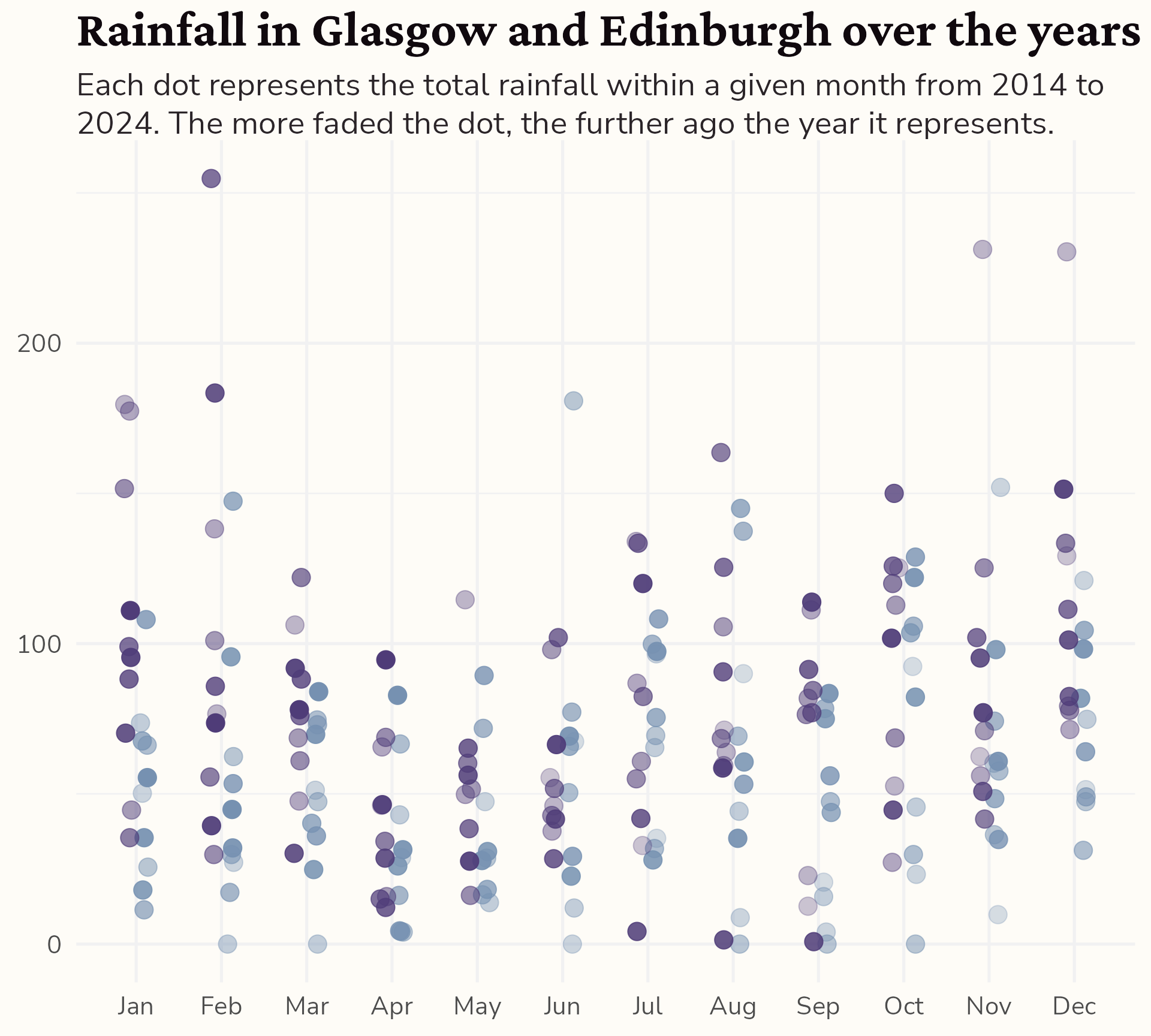
#3 Make it your own
Give everything some space to breathe
basic_plot +
  theme_minimal(base_size = 20) +
  theme(text = element_text(family = "Nunito Sans",
                            colour = "#2B2529"),
        axis.title = element_blank(),
        legend.position = "none",
        plot.title = element_text(family = "Crimson Pro",
                                  face = "bold",
                                  colour = "#10090E",
                                  size = rel(1.6)),
        plot.subtitle = ggtext::element_textbox_simple(
          size = ggplot2::rel(1.2),
          lineheight = 1.3,
          # Acronym: TRouBLe (Top, right, bottom, left)
          margin = ggplot2::margin(10, 0, 20, 0,
                                   unit = "points")),
        panel.grid = element_line(colour = "#F1F1F2"),
        plot.background = element_rect(colour = "#FEFCF7",
                                       fill = "#FEFCF7"),
        plot.margin = ggplot2::margin(20, 30, 20, 30,
                                      unit = "points"))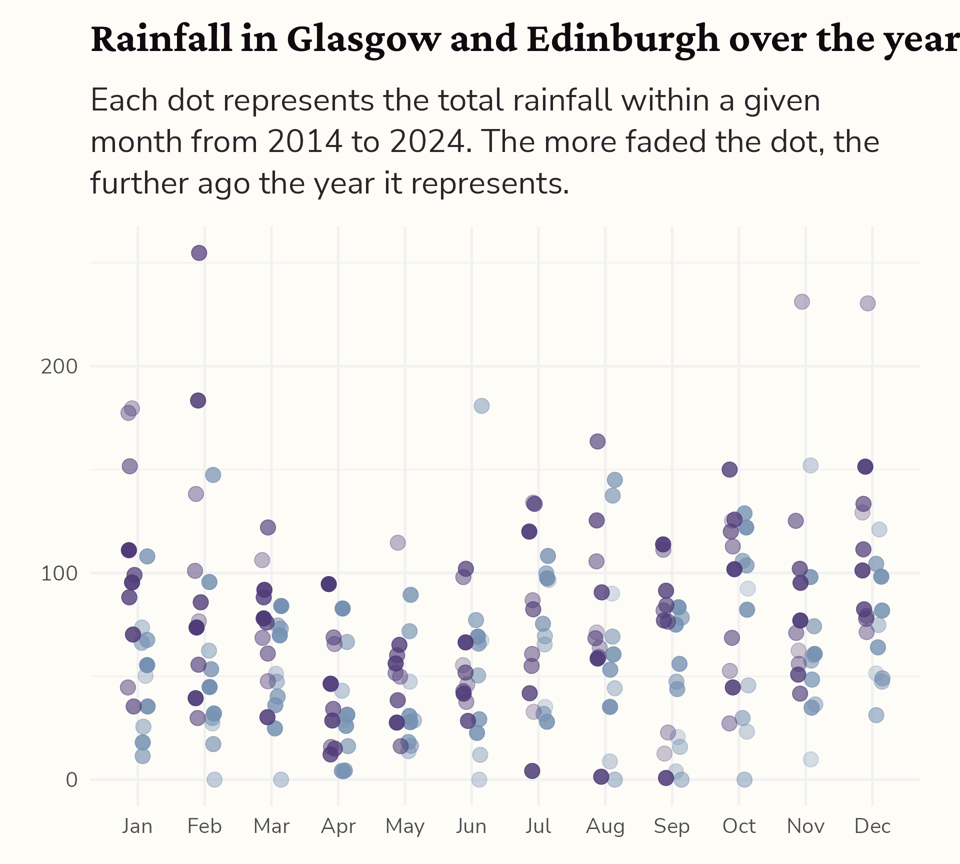
#3 Make it your own
Declutter, declutter, declutter
basic_plot +
  theme_minimal(base_size = 20) +
  theme(text = element_text(family = "Nunito Sans",
                            colour = "#2B2529"),
        axis.title = element_blank(),
        legend.position = "none",
        plot.title = element_text(family = "Crimson Pro",
                                  face = "bold",
                                  colour = "#10090E",
                                  size = rel(1.6)),
        plot.subtitle = ggtext::element_textbox_simple(
          size = ggplot2::rel(1.2),
          lineheight = 1.3,
          margin = ggplot2::margin(10, 0, 20, 0,
                                   unit = "points")),
        panel.grid = element_line(colour = "#F1F1F2"),
        panel.grid.major.x = element_blank(),
        plot.background = element_rect(colour = "#FEFCF7",
                                       fill = "#FEFCF7"),
        plot.margin = ggplot2::margin(20, 30, 20, 30,
                                      unit = "points"))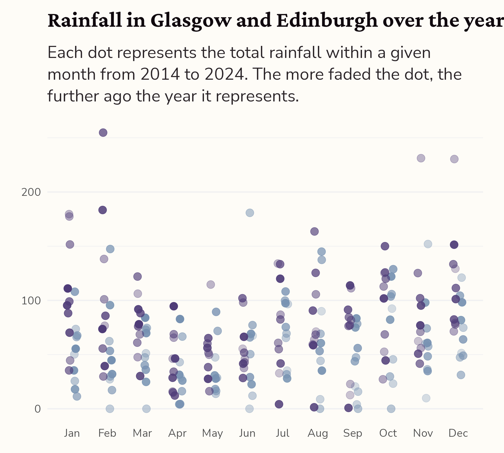
Shameless plug alert!
Bespoke dataviz design system packages
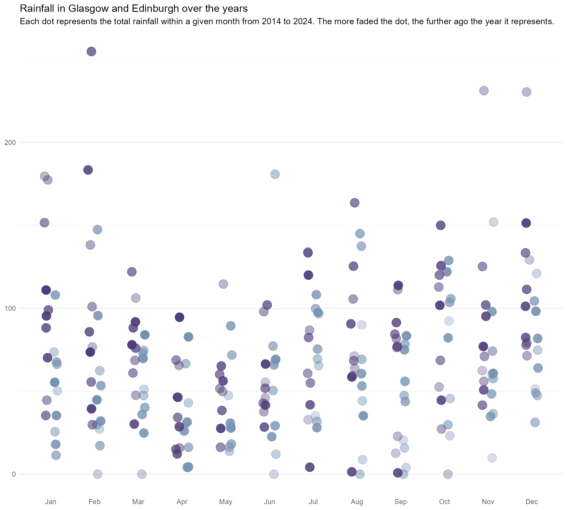
Shameless plug alert!
Bespoke dataviz design system packages
Shameless plug alert!
Bespoke dataviz design system packages
Shameless plug alert!
Bespoke dataviz design system packages
#4 Add annotations for context
Starting point
themed_plot <- basic_plot +
  theme_minimal(base_size = 16) +
  theme(text = element_text(family = "Nunito Sans",
                            colour = "#2B2529"),
        axis.title = element_blank(),
        legend.position = "none",
        plot.title = element_text(family = "Crimson Pro",
                                  face = "bold",
                                  colour = "#10090E",
                                  size = rel(1.6)),
        plot.subtitle = ggtext::element_textbox_simple(
          size = ggplot2::rel(1.2),
          lineheight = 1.3,
          margin = ggplot2::margin(10, 0, 20, 0,
                                   unit = "points")),
        panel.grid = element_line(colour = "#F1F1F2"),
        panel.grid.major.x = element_blank(),
        plot.background = element_rect(colour = "#FEFCF7",
                                       fill = "#FEFCF7"),
        plot.margin = ggplot2::margin(20, 30, 20, 30,
                                      unit = "points"))

themed_plot
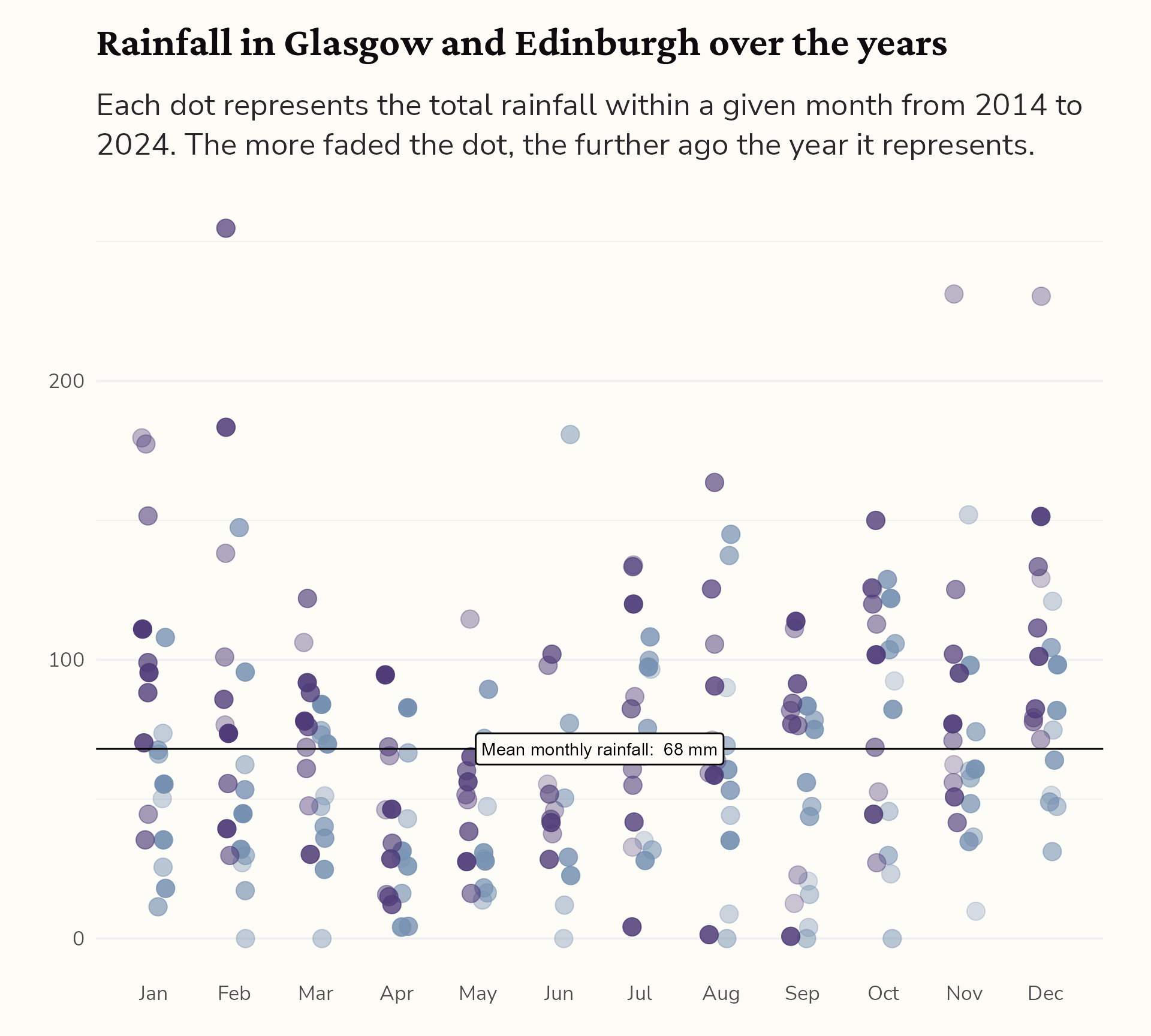
#4 Add annotations for context
Add the mean monthly rainfall
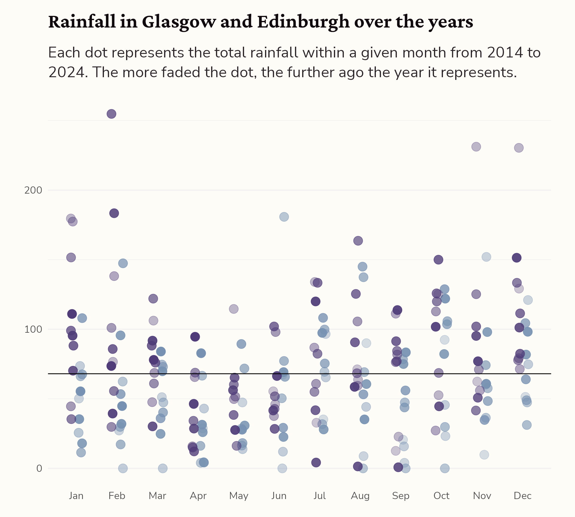
#4 Add annotations for context
Hello {geomtextpath}!
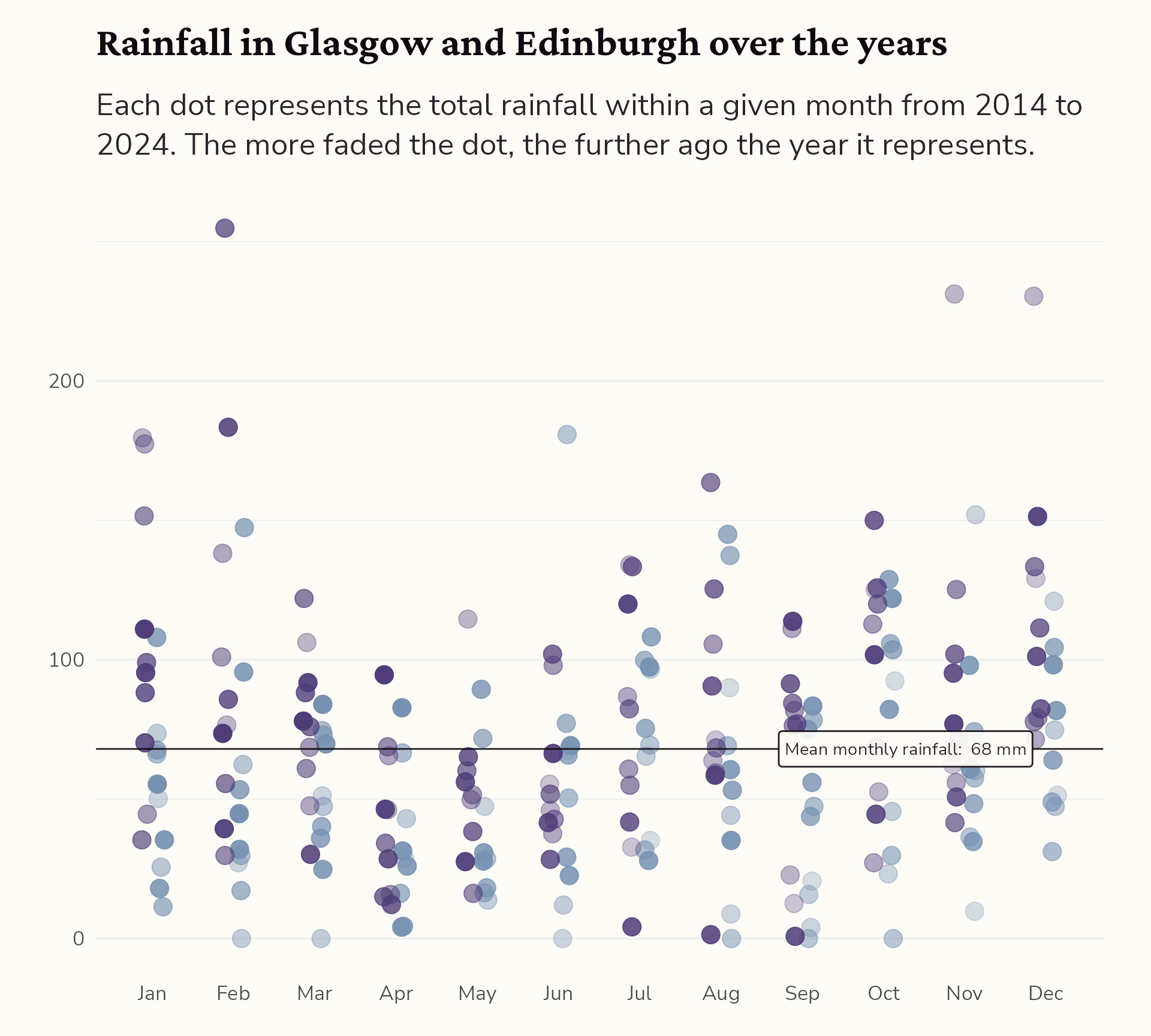
#4 Add annotations for context
Style the label
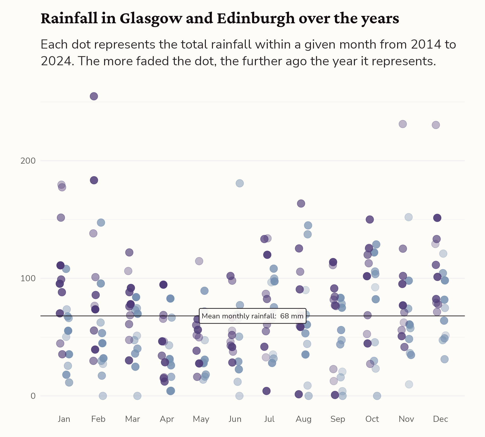
#4 Add annotations for context
Adjust the position of the label
#4 Add annotations for context
Add the UK mean for comparison…
themed_plot +
  geomtextpath::geom_labelhline(aes(yintercept = mean(Value),
                                    label = paste("Mean (Edinburgh & Glasgow): ", round(mean(Value)), "mm")),
                                fill = "#FEFCF7",
                                family = "Nunito Sans",
                                alpha = 0.9,
                                colour = "#10090E",
                                hjust = 0.9) +
  geomtextpath::geom_labelhline(aes(yintercept = 107.5,
                                    label = paste("Mean monthly UK rainfall: ", round(107.5), "mm")),
                                fill = "#FEFCF7",
                                family = "Nunito Sans",
                                alpha = 0.8,
                                linetype = 2,
                                colour = "#2B2529",
                                hjust = 0.9)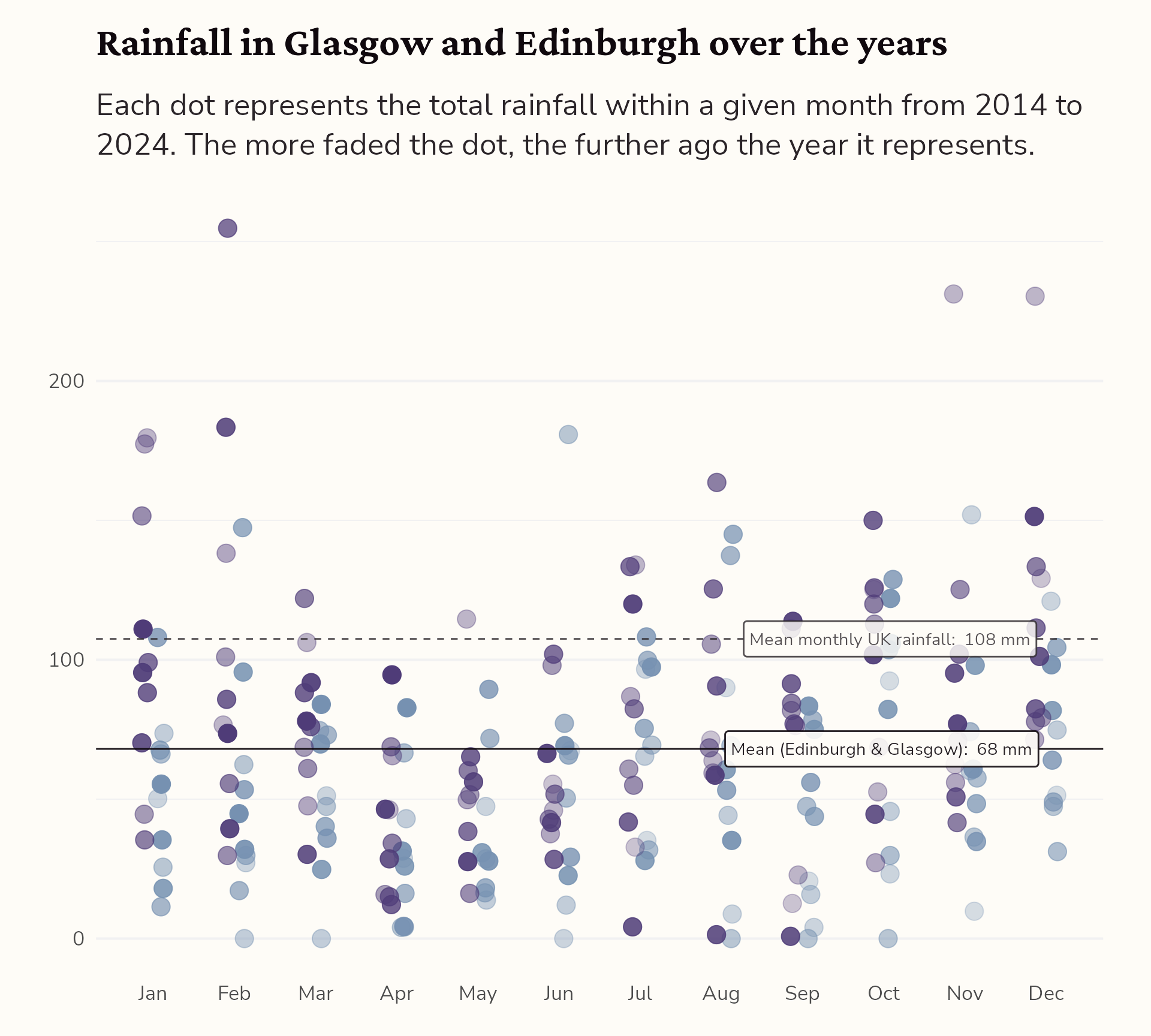
#4 Add annotations for context
Highlight interesting observations
themed_plot +
  geomtextpath::geom_labelhline(aes(yintercept = mean(Value),
                                    label = paste("Mean (Edinburgh & Glasgow): ", round(mean(Value)), "mm")),
                                fill = "#FEFCF7",
                                family = "Nunito Sans",
                                alpha = 0.9,
                                colour = "#10090E",
                                hjust = 0.9) +
  geomtextpath::geom_labelhline(aes(yintercept = 107.5,
                                    label = paste("Mean monthly UK rainfall: ", round(107.5), "mm")),
                                fill = "#FEFCF7",
                                family = "Nunito Sans",
                                alpha = 0.8,
                                linetype = 2,
                                colour = "#2B2529",
                                hjust = 0.9) +
  ggtext::geom_textbox(data = dplyr::filter(rain_data, Value == max(Value)),
                       aes(x = as.numeric(month), y = Value, label = "Here's some text!"))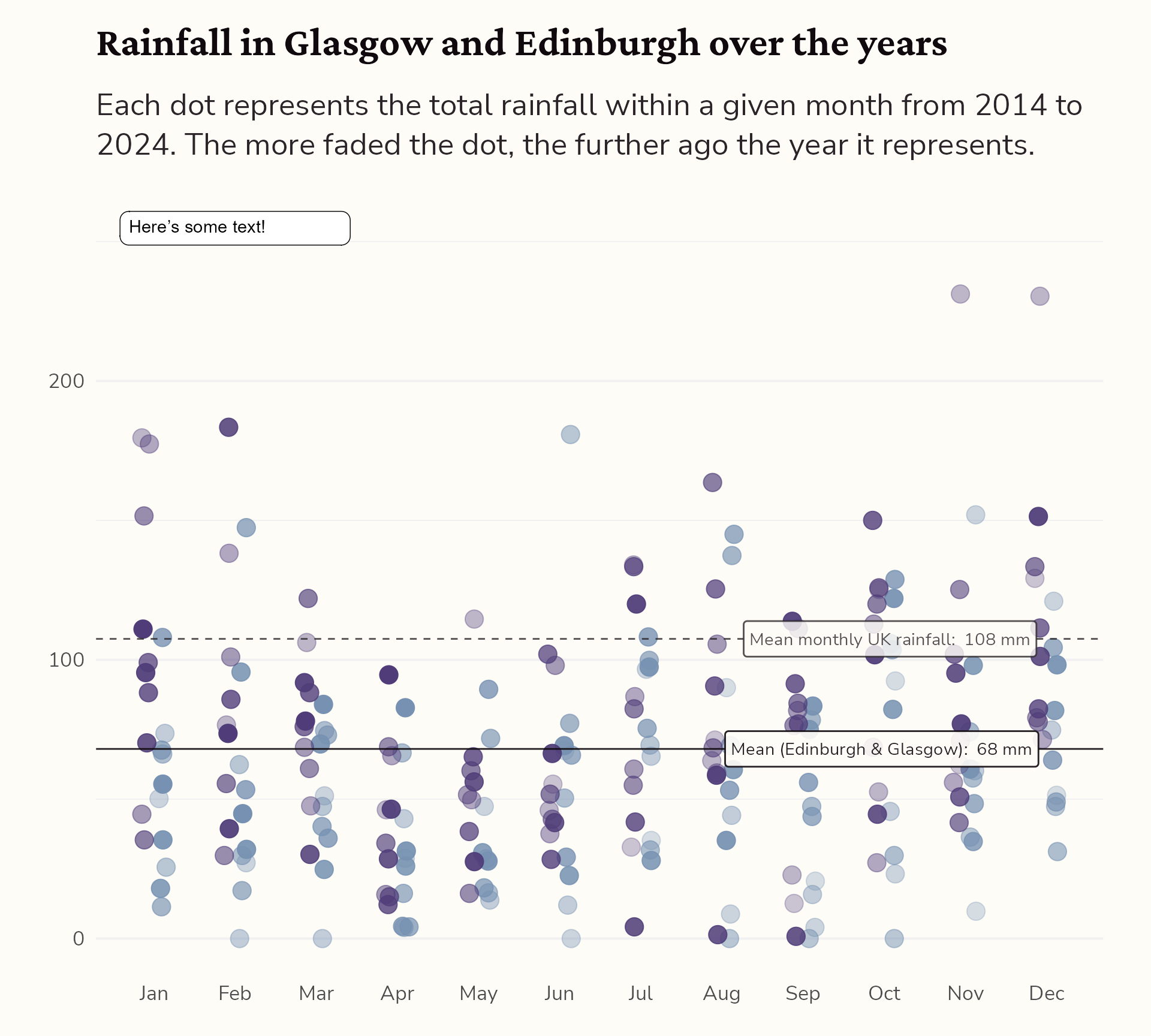
#4 Add annotations for context
Highlight interesting observations
themed_plot +
  geomtextpath::geom_labelhline(aes(yintercept = mean(Value),
                                    label = paste("Mean (Edinburgh & Glasgow): ", round(mean(Value)), "mm")),
                                fill = "#FEFCF7",
                                family = "Nunito Sans",
                                alpha = 0.9,
                                colour = "#10090E",
                                hjust = 0.9) +
  geomtextpath::geom_labelhline(aes(yintercept = 107.5,
                                    label = paste("Mean monthly UK rainfall: ", round(107.5), "mm")),
                                fill = "#FEFCF7",
                                family = "Nunito Sans",
                                alpha = 0.8,
                                linetype = 2,
                                colour = "#2B2529",
                                hjust = 0.9) +
  ggtext::geom_textbox(data = dplyr::filter(rain_data, Value == max(Value)),
                       aes(x = as.numeric(month), y = Value, label = "Here's some text!"),
                       hjust = 0, halign = 0)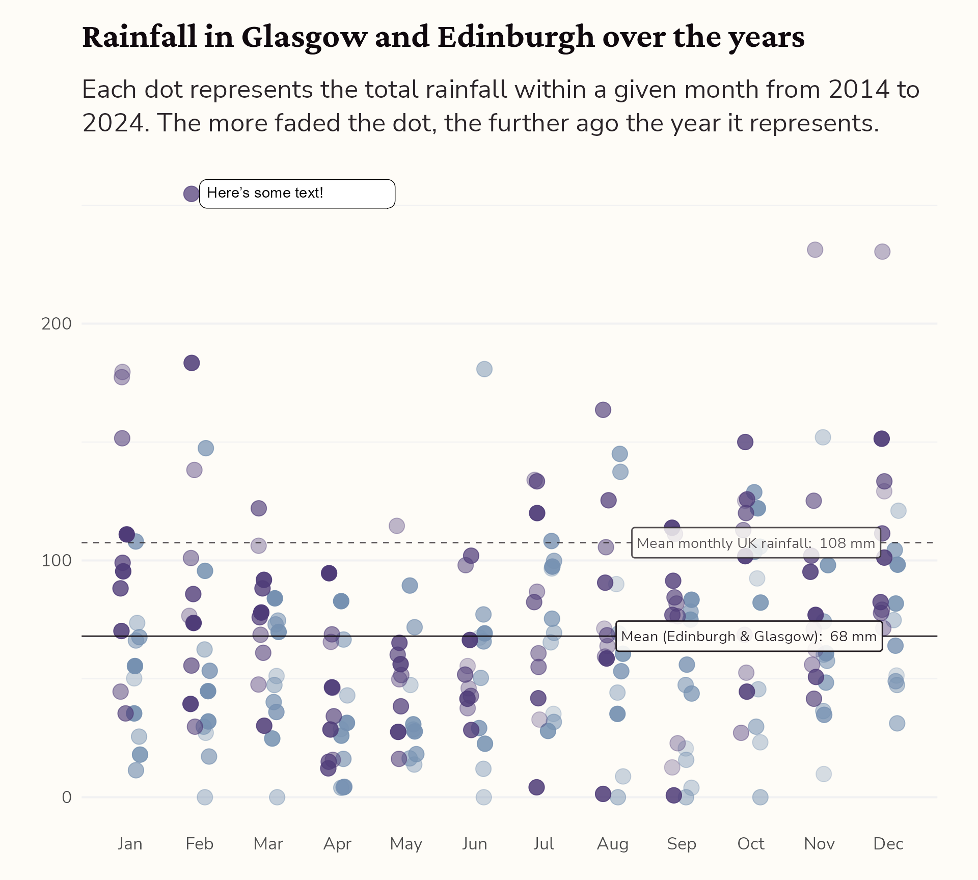
#4 Add annotations for context
Highlight interesting observations
themed_plot +
  geomtextpath::geom_labelhline(aes(yintercept = mean(Value),
                                    label = paste("Mean (Edinburgh & Glasgow): ", round(mean(Value)), "mm")),
                                fill = "#FEFCF7",
                                family = "Nunito Sans",
                                alpha = 0.9,
                                colour = "#10090E",
                                hjust = 0.9) +
  geomtextpath::geom_labelhline(aes(yintercept = 107.5,
                                    label = paste("Mean monthly UK rainfall: ", round(107.5), "mm")),
                                fill = "#FEFCF7",
                                family = "Nunito Sans",
                                alpha = 0.8,
                                linetype = 2,
                                colour = "#2B2529",
                                hjust = 0.9) +
  ggtext::geom_textbox(data = dplyr::filter(rain_data, Value == max(Value)),
                       aes(x = as.numeric(month) + 0.3, y = Value - 20, label = "Here's some text!"),
                       hjust = 0, halign = 0)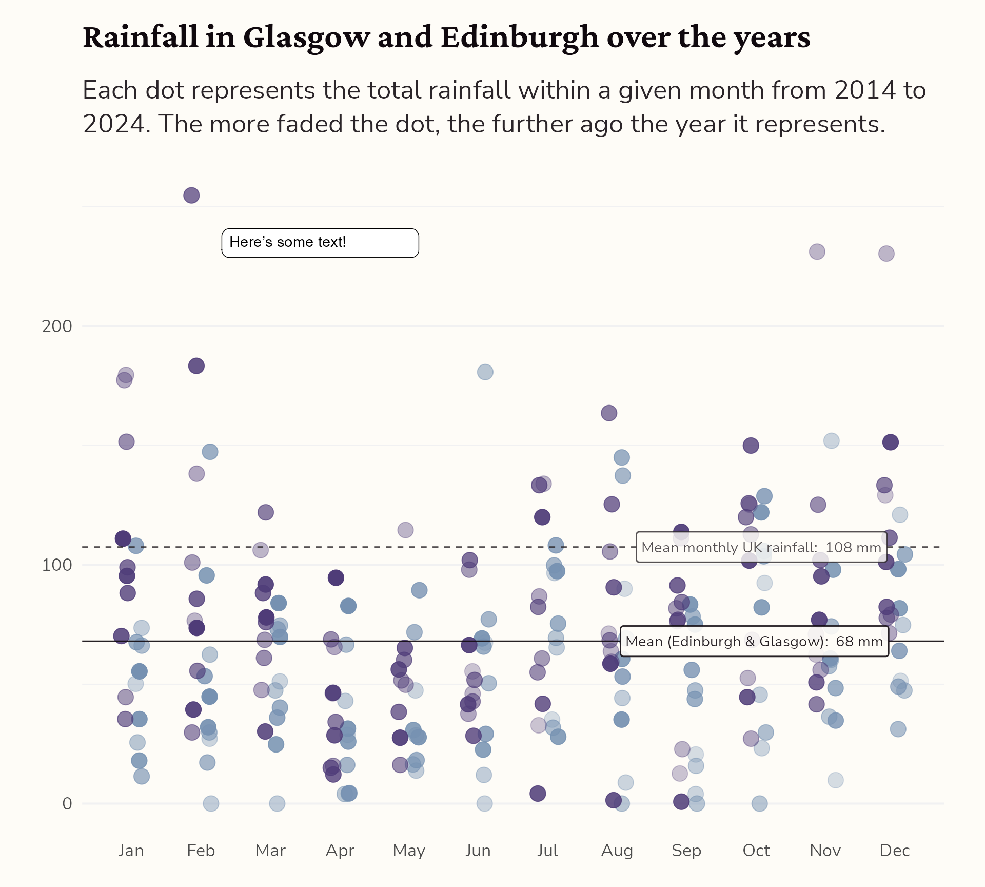
#4 Add annotations for context
Highlight interesting observations
themed_plot +
  geomtextpath::geom_labelhline(aes(yintercept = mean(Value),
                                    label = paste("Mean (Edinburgh & Glasgow): ", round(mean(Value)), "mm")),
                                fill = "#FEFCF7",
                                family = "Nunito Sans",
                                alpha = 0.9,
                                colour = "#10090E",
                                hjust = 0.9) +
  geomtextpath::geom_labelhline(aes(yintercept = 107.5,
                                    label = paste("Mean monthly UK rainfall: ", round(107.5), "mm")),
                                fill = "#FEFCF7",
                                family = "Nunito Sans",
                                alpha = 0.8,
                                linetype = 2,
                                colour = "#2B2529",
                                hjust = 0.9) +
  ggtext::geom_textbox(data = dplyr::filter(rain_data, Value == max(Value)),
                       aes(x = as.numeric(month) + 0.3, y = Value - 20, label = "Here's some text!"),
                       hjust = 0, halign = 0,
                       fill = NA, box.colour = NA,
                       colour = "#10090E",
                       family = "Nunito Sans")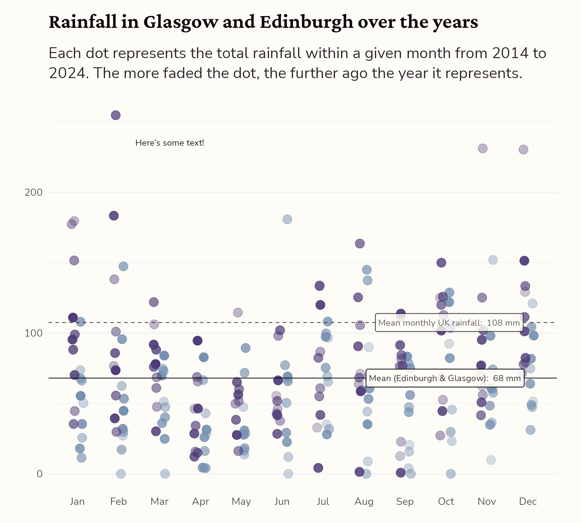
#4 Add annotations for context
Highlight interesting observations
themed_plot +
  geomtextpath::geom_labelhline(aes(yintercept = mean(Value),
                                    label = paste("Mean (Edinburgh & Glasgow): ", round(mean(Value)), "mm")),
                                fill = "#FEFCF7",
                                family = "Nunito Sans",
                                alpha = 0.9,
                                colour = "#10090E",
                                hjust = 0.9) +
  geomtextpath::geom_labelhline(aes(yintercept = 107.5,
                                    label = paste("Mean monthly UK rainfall: ", round(107.5), "mm")),
                                fill = "#FEFCF7",
                                family = "Nunito Sans",
                                alpha = 0.8,
                                linetype = 2,
                                colour = "#2B2529",
                                hjust = 0.9) +
  ggtext::geom_textbox(data = dplyr::filter(rain_data, Value == max(Value)),
                       aes(x = as.numeric(month) + 0.3, y = Value - 20,
                           label = paste0("The wettest month in the dataset was recorded in ",
                                          month, " in ", city, " with a total rainfall of ",
                                          Value, " mm.")),
                       hjust = 0, halign = 0,
                       fill = NA, box.colour = NA,
                       colour = "#10090E",
                       family = "Nunito Sans")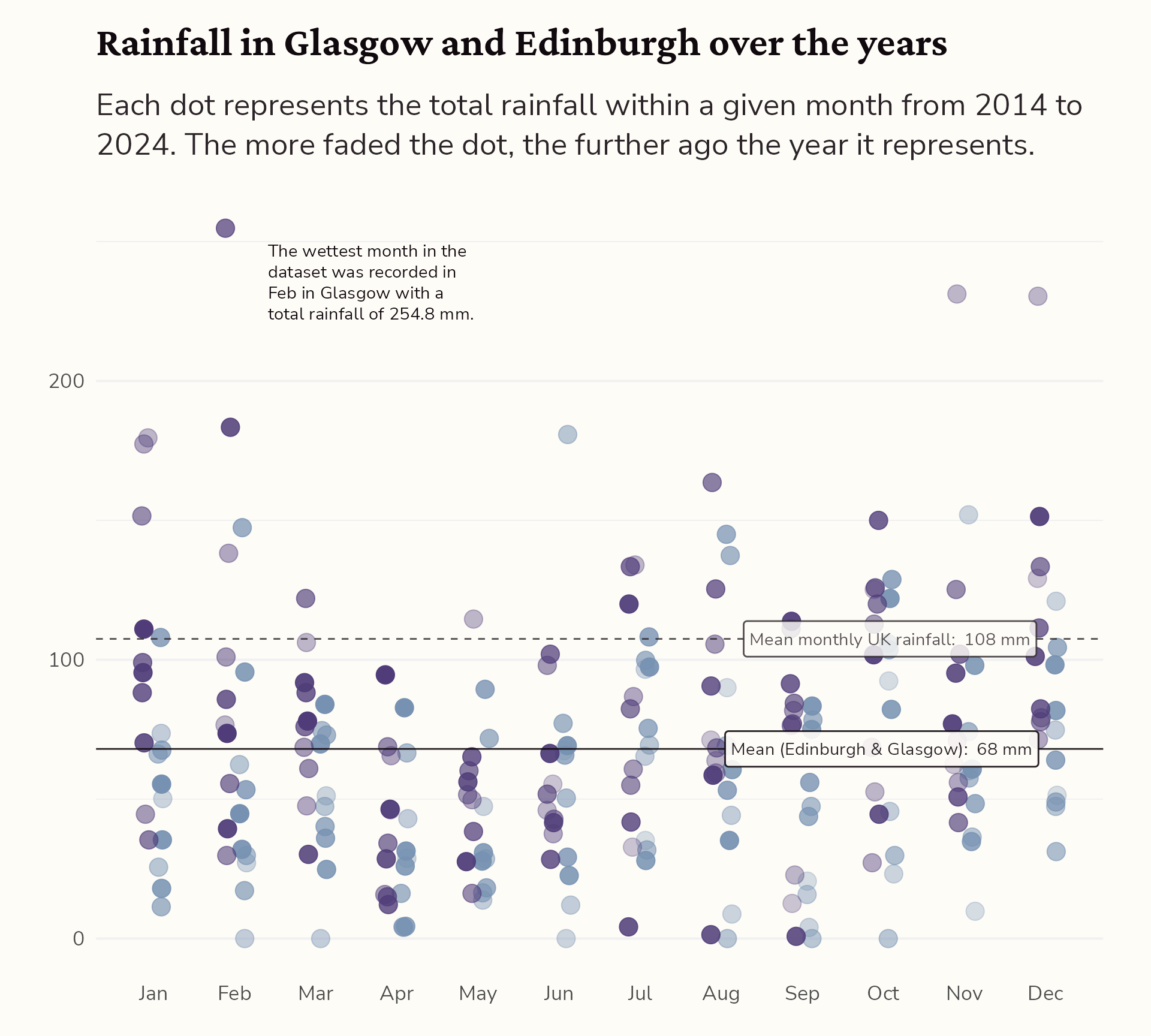
#4 Add annotations for context
Highlight interesting observations
themed_plot +
  geomtextpath::geom_labelhline(aes(yintercept = mean(Value),
                                    label = paste("Mean (Edinburgh & Glasgow): ", round(mean(Value)), "mm")),
                                fill = "#FEFCF7",
                                family = "Nunito Sans",
                                alpha = 0.9,
                                colour = "#10090E",
                                hjust = 0.9) +
  geomtextpath::geom_labelhline(aes(yintercept = 107.5,
                                    label = paste("Mean monthly UK rainfall: ", round(107.5), "mm")),
                                fill = "#FEFCF7",
                                family = "Nunito Sans",
                                alpha = 0.8,
                                linetype = 2,
                                colour = "#2B2529",
                                hjust = 0.9) +
  ggtext::geom_textbox(data = dplyr::filter(rain_data, Value == max(Value)),
                       aes(x = as.numeric(month) + 0.3, y = Value - 20,
                           label = paste0("The wettest month in the dataset was recorded in ",
                                          month, " in ", city, " with a total rainfall of ",
                                          Value, " mm.")),
                       hjust = 0, halign = 0,
                       fill = NA, box.colour = NA,
                       colour = "#10090E",
                       family = "Nunito Sans") +
  geom_curve(data = dplyr::filter(rain_data, Value == max(Value)),
             aes(x = as.numeric(month) + 0.3, y = Value - 20,
             xend = as.numeric(month), yend = Value - 10),
             arrow = arrow(length = unit(5, "pt")),
             curvature = -0.2)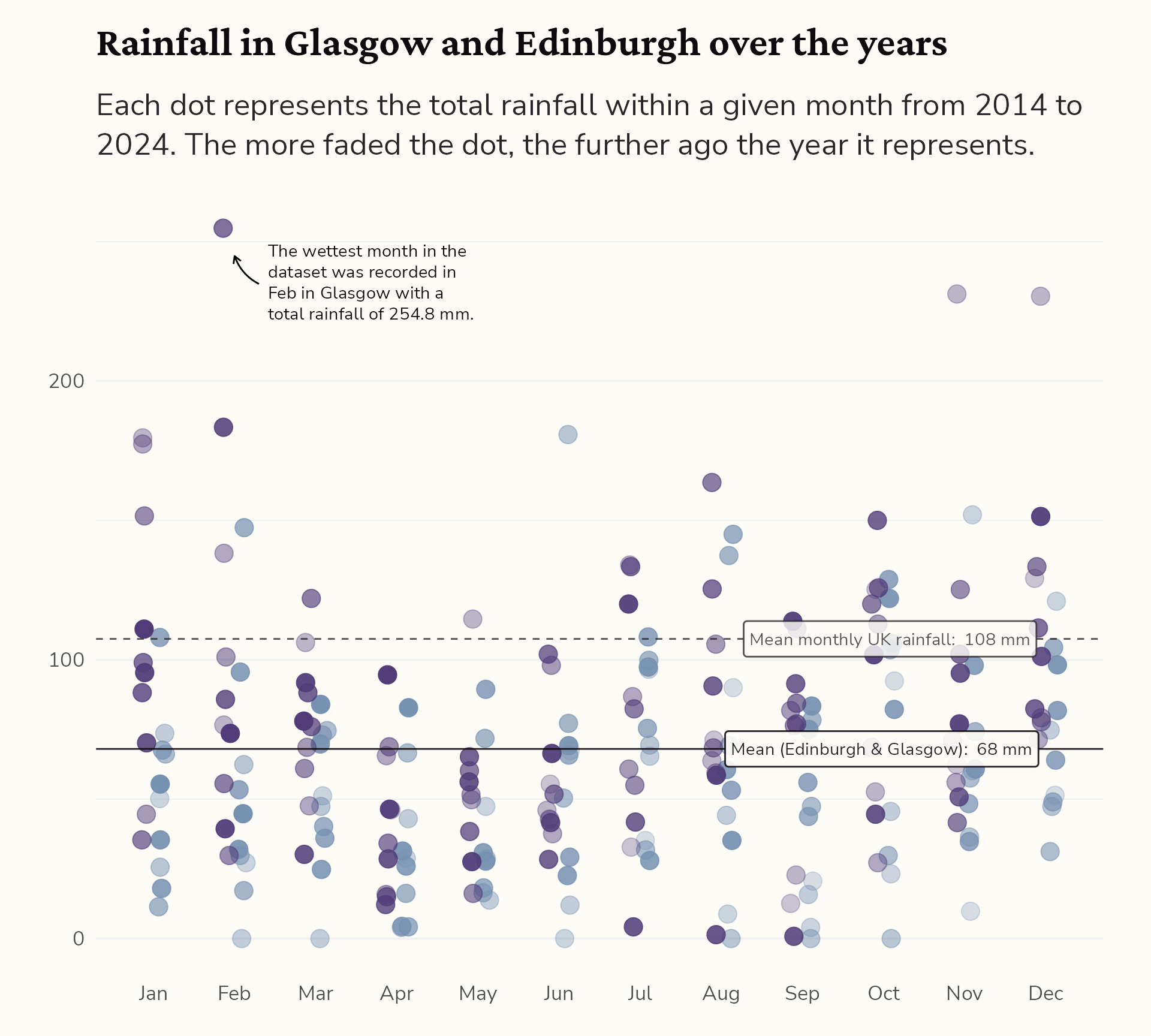
#4 Add annotations for context
Place legend within the title
themed_plot +
  geomtextpath::geom_labelhline(aes(yintercept = mean(Value),
                                    label = paste("Mean (Edinburgh & Glasgow): ", round(mean(Value)), "mm")),
                                fill = "#FEFCF7",
                                family = "Nunito Sans",
                                alpha = 0.9,
                                colour = "#10090E",
                                hjust = 0.9) +
  geomtextpath::geom_labelhline(aes(yintercept = 107.5,
                                    label = paste("Mean monthly UK rainfall: ", round(107.5), "mm")),
                                fill = "#FEFCF7",
                                family = "Nunito Sans",
                                alpha = 0.8,
                                linetype = 2,
                                colour = "#2B2529",
                                hjust = 0.9) +
  ggtext::geom_textbox(data = dplyr::filter(rain_data, Value == max(Value)),
                       aes(x = as.numeric(month) + 0.3, y = Value - 20,
                           label = paste0("The wettest month in the dataset was recorded in ",
                                          month, " in ", city, " with a total rainfall of ",
                                          Value, " mm.")),
                       hjust = 0, halign = 0,
                       fill = NA, box.colour = NA,
                       colour = "#10090E",
                       family = "Nunito Sans") +
  labs(title = "Rainfall in <span style='color:#4f3c78'>Glasgow</span> and <span style='color:#7691b1'>Edinburgh</span> over the years") +
  geom_curve(data = dplyr::filter(rain_data, Value == max(Value)),
             aes(x = as.numeric(month) + 0.3, y = Value - 20,
                 xend = as.numeric(month), yend = Value - 10),
             arrow = arrow(length = unit(5, "pt")),
             curvature = -0.2) +
  theme(plot.title = ggtext::element_markdown(family = "Crimson Pro",
                                      face = "bold",
                                      colour = "#10090E",
                                      size = rel(1.6)))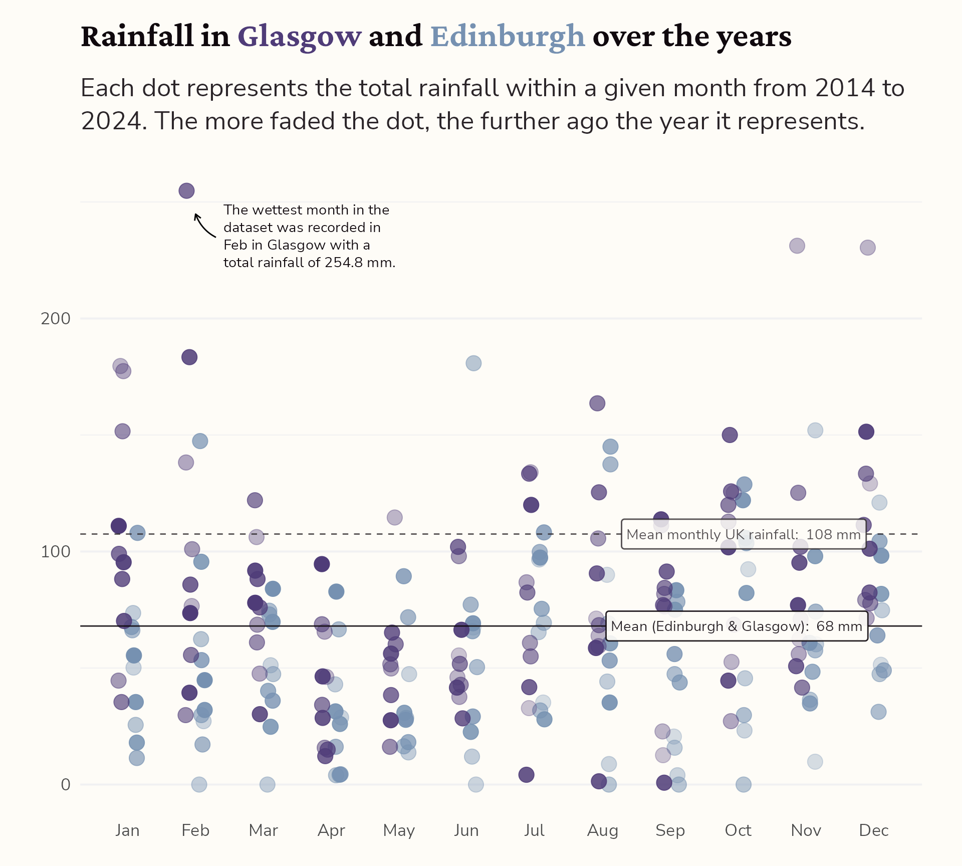
From alright to all ready to publish
- Colours
- Text
- Theme
- Annotations
- Interactivity
hello@cararthompson.com
![]()